


Light Summer Color Analysis: Unlocking Your Perfect Palette for Effortless Style
May 28, 2025

Hi, Friend! Jen Glantz here. I’m a bestselling author, the first ever bridesmaid for hire and have been hired by hundreds of brides all over the world. Let’s talk about light summer color analysis.
According to recent color psychology research, 83% of people who dress in their most flattering colors report higher confidence levels in professional settings. I discovered this firsthand when I switched to a Light Summer palette last year. The transformation wasn’t just about looking better in photos—my entire presence shifted. Light Summer color analysis goes beyond basic fashion advice; it’s a comprehensive approach to visual harmony that can transform your wardrobe, makeup choices, and even your living space. This guide will help you understand if you’re a Light Summer, how to implement this palette effectively, and why these subtle, softened hues might be your perfect match.
Quick Resources:
- Use our AI Color Analysis Tool
- Color Analysis Quiz
- Color Analysis Deep Dive
- Personal Style Color Analysis
Light Summer is characterized by medium-high value (lightness), low-medium chroma (saturation), and cool-neutral temperature that creates a softened pastel effect. This palette sits at the intersection of True Summer (70%) and True Spring (30%), creating colors that maintain Summer’s cool undertones with a slight warming influence from Spring.
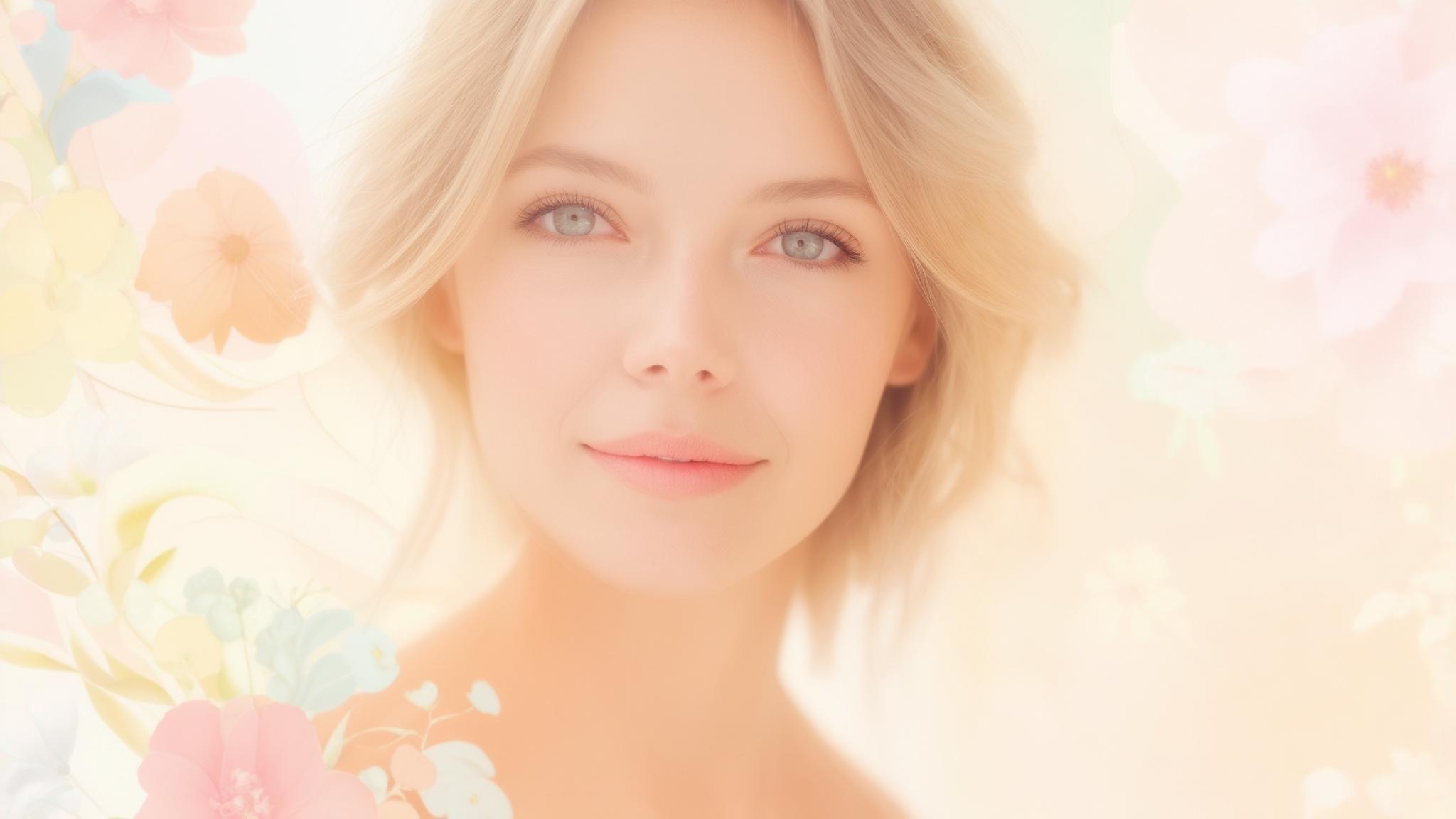
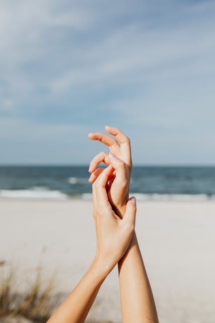
People with Light Summer coloring typically present with low-contrast features, ash-toned hair, soft-colored eyes (blue-gray, gray-green, soft hazel), and neutral to slightly cool skin undertones. According to a comprehensive study by The Concept Wardrobe, Light Summer combines 70% Summer (cool-neutral) and 30% Spring (warm-neutral) influences, creating a palette that’s predominantly cool but with a slight warming effect.
“Wow, you’re really going for a look,” writes one fashion blogger whose husband noticed her closet transformation to cream tops, muted sky blues and cotton candy pinks that had replaced burnt oranges, deep greens, blacks, and stark whites. As she notes in her journey of color discovery, “I wanted to feel like myself in my clothes—through silhouettes that reflect my style, fabrics that are comfortable and easy to move in, and colors that enhance my natural features.” Color Analysis: How to Find Your Season via Camille Styles

Understanding Light Summer Fundamentals
Light Summer exists at the intersection of seasonal color theory, blending the cool qualities of Summer with subtle warmth from Spring. This creates a distinctive palette with specific technical properties that set it apart from other seasonal types. Understanding these foundations helps you recognize Light Summer coloring in yourself and others, making it easier to implement the palette effectively in various aspects of your life.
The palette combines 70% Summer (cool-neutral) and 30% Spring (warm-neutral) influences, creating colors that are predominantly cool but with a slight warming effect. The technical properties include medium-high value (lightness), low-medium chroma (saturation), and cool-neutral temperature that appears softened rather than icy.

Get your color analysis today >>
The Color Theory Foundation
Light Summer emerges from established color theory principles but has distinct properties that create its signature look. These technical characteristics explain why certain colors harmonize with Light Summer coloring while others create visual discord. By understanding these properties, you’ll develop an eye for identifying Light Summer colors even without a reference card.
Light Summer colors appear as if viewed through a soft morning mist—clear but gently diffused, never deeply saturated or extremely cool. The palette maintains Summer’s cool undertones but is slightly warmed and brightened by Spring’s influence, creating a delicate balance between coolness and warmth.
These colors reflect approximately 70-85% of light (high value) while absorbing 15-30% of light (low-medium saturation), creating their characteristic soft luminosity. This balance is what gives Light Summer colors their distinctive appearance—bright enough to be clear but soft enough to be gentle.
| Light Summer Technical Properties | Description | Visual Effect |
|---|---|---|
| Value (Lightness) | Medium-high (70-85% light reflection) | Creates a soft, luminous appearance |
| Chroma (Saturation) | Low-medium (15-30% color absorption) | Appears clear but gently diffused |
| Temperature | Cool-neutral (predominantly cool with slight warmth) | Creates a softened rather than icy effect |
| Contrast Level | Low to medium (30-50% value difference) | Harmonizes with the natural low contrast of Light Summer individuals |
Seasonal Blend Origins
Light Summer doesn’t exist in isolation—it’s part of a continuous spectrum of seasonal color types. Its position between True Summer and True Spring explains its distinctive characteristics. This blended nature means Light Summer incorporates elements from both parent seasons while maintaining its own unique identity, with a stronger pull toward Summer’s coolness than Spring’s warmth.
Light Summer sits between True Summer and True Spring on the seasonal color wheel, leaning approximately 70% Summer and 30% Spring. This positioning creates colors that maintain Summer’s cool undertones but are slightly warmed and brightened by Spring’s influence.
The Spring influence prevents Light Summer colors from becoming too cool or muted, while the dominant Summer influence keeps them from becoming too warm or bright. This balance is what makes Light Summer colors so versatile and flattering for those with this coloring.

Technical Color Properties
Three primary characteristics define Light Summer colors: their lightness (value), their saturation level (chroma), and their temperature. These technical properties create the signature “softened pastel” effect that makes Light Summer colors instantly recognizable once you train your eye. Understanding these properties helps you evaluate whether a color truly belongs in the Light Summer palette.
Light Summer colors feature medium-high value (lightness), low-medium chroma (saturation), and cool-neutral temperature (slightly cool but not icy). The combination of high value with moderate saturation creates colors that appear soft and luminous rather than intense or muted.
These colors never reach maximum saturation or minimum value—they maintain a consistent level of softness and lightness across the entire palette. According to color analysis experts at Radiantly Dressed, Light Summer is characterized by “light value – typically light to medium in value. These individuals can wear the lightest pastel shades of cool colors and not look washed out” and “medium chroma – one of the brightest summer types, borrowing some of the contrast from its sister season of light spring.”
Get your color analysis today >>
Identifying Light Summer Coloring
Recognizing Light Summer coloring in yourself or others requires observing specific visual cues. Light Summer individuals typically display a low-contrast appearance with soft coloring that lacks sharp definition. Their features harmonize with the palette’s inherent softness and slight coolness, creating a natural affinity for Light Summer colors that enhances rather than competes with their natural coloring.
Light Summer individuals present with naturally ash-toned hair ranging from light blonde to medium brown, eyes in soft muted colors, and skin with neutral to slightly cool undertones. The overall impression is one of delicate harmony rather than dramatic contrast, with features that appear softly defined rather than sharp or bold.
This natural coloring creates an affinity for colors with similar properties—soft, slightly cool, and medium-high in value. If you’re curious about how your personal coloring affects your wedding day look, check out our guide on how to feel more confident in your bridesmaid dress, where we explore how choosing the right colors can transform your confidence.
Visual Harmony Indicators
Light Summer individuals share certain visual characteristics that create harmony with their optimal color palette. Their natural coloring typically features ash-toned hair, soft-colored eyes, and skin with neutral to slightly cool undertones. The overall impression is one of delicate harmony rather than dramatic contrast, with features that appear softly defined rather than sharp or bold.
When identifying Light Summer coloring, look for naturally ash-toned hair (light to medium blonde, light brown, or ash brown) without golden or reddish undertones. Eyes typically appear in soft muted colors (often blue-gray, gray-green, or soft hazel) rather than intense or dark colors. Skin presents with a neutral to slightly cool undertone that may have delicate rosy qualities but lacks pronounced warmth or coolness.
Sarah, a natural Light Summer, always received compliments when wearing her light blue-gray sweater but looked tired and washed out in a burnt orange top she loved. After analyzing her features—ash blonde hair, soft blue-gray eyes, and fair skin with slight pink undertones—she realized the harmony between her natural coloring and the Light Summer palette explained why certain colors made her look vibrant while others dulled her complexion. This awareness transformed her shopping habits, as she now gravitates toward soft periwinkles and muted roses that enhance rather than compete with her delicate coloring.
Differentiating from Similar Seasons
Light Summer is frequently confused with Light Spring, Soft Summer, and True Summer due to shared characteristics. Learning to spot the differences helps you accurately identify your seasonal type. When comparing similar seasons, focus on how colors interact with the individual’s natural coloring—Light Summer types look harmonious in softened pastels but appear drained by intense colors, overpowered by deep colors, and discolored by warm golden tones.
Light Summer differs from Light Spring by lacking the clear yellow undertone; Light Spring individuals look vibrant in clear, slightly warm pastels while Light Summer types look better in softly cooled pastels. Light Summer is lighter and less muted than Soft Summer; Soft Summer individuals need more grayed, medium-depth colors while Light Summer types need lighter, clearer options.
Light Summer has slightly more warmth and less bluish coolness than True Summer; True Summer individuals look best in distinctly cool colors while Light Summer types need slightly neutralized cool colors. These subtle differences can make a significant impact on how flattering the colors are for each type.
Implementing the Light Summer Palette
Applying the Light Summer palette extends beyond basic color matching. It involves understanding how these colors interact with each other and your personal coloring to create a cohesive aesthetic. This section explores the core color spectrum of Light Summer and provides practical guidance for implementing these colors across various aspects of your life.
The Light Summer palette encompasses specific color families that share common characteristics while offering variety for personal expression. Effective implementation requires understanding both individual colors and how they work together in combinations.
When selecting the perfect Light Summer colors for special occasions, you might wonder about appropriate wedding attire. Our guide on 4 colors you should avoid wearing as a guest at a wedding can help you navigate color choices while respecting wedding traditions.
According to color analyst Justine Glaser, “After studying photographs of Princess Kate, I believe she is a Soft Summer (Summer that leans towards Autumn). She looks best in colors that are cool, soft, and smoky. Princess Kate absolutely glows when she wears cool olive green, soft burgundy, plum, soft forest green, navy blue, and smoky teal.” A Color Analyst Reveals The Royal Family’s True Seasons via Glam
The Core Color Spectrum
The Light Summer palette includes a specific range of colors that share common characteristics while offering variety for personal expression. These colors appear as if viewed through a soft morning mist—clear but gently diffused. Understanding the signature hues and color families within Light Summer helps you recognize palette-appropriate options and avoid colors that create disharmony with Light Summer coloring.
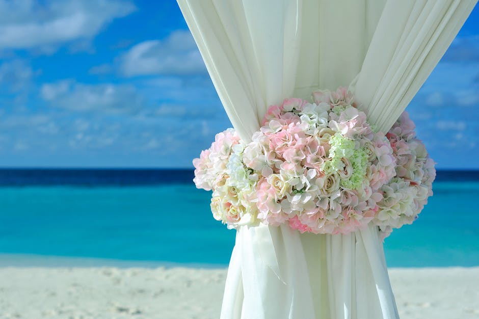
Light Summer’s signature colors include soft periwinkle blue, muted raspberry, seafoam green, lavender gray, powder blue, rose pink, sage, and soft plum. The palette’s neutrals center around dove gray, soft navy, light taupe, and cool beige, avoiding pure black and bright white.
The palette avoids orange-based hues, heavily saturated colors, and deeply muted tones that fall outside the palette’s characteristic lightness and soft clarity. This focused approach creates a cohesive collection of colors that work harmoniously together and with Light Summer coloring.

Get your color analysis today >>
Signature Hues and Color Families
Light Summer’s signature colors create its distinctive aesthetic. These include soft periwinkle blue, muted raspberry, seafoam green, lavender gray, powder blue, rose pink, sage, and soft plum. The palette’s neutrals center around dove gray, soft navy, light taupe, and cool beige. Each color appears softly luminous rather than intense or muted, creating the palette’s characteristic gentle radiance.
Light Summer blues range from powder blue to periwinkle, maintaining a soft quality without becoming icy (too blue-white) or navy (too deep). Pinks and purples in the Light Summer palette include rose pink, soft raspberry, lavender, and soft plum, all with a cool-neutral undertone rather than warm or intense cool.
Greens include seafoam, sage, and mint variations that appear softly muted rather than bright or deeply grayed. These color families create a cohesive palette that offers variety while maintaining the essential Light Summer characteristics.
| Color Family | Light Summer Variations | Colors to Avoid |
|---|---|---|
| Blues | Powder blue, periwinkle, soft denim, seafoam | Navy, royal blue, icy blue |
| Pinks/Purples | Rose pink, soft raspberry, lavender, soft plum | Hot pink, burgundy, magenta |
| Greens | Seafoam, sage, mint, light teal | Forest green, olive, lime |
| Neutrals | Dove gray, soft navy, light taupe, cool beige | Black, chocolate brown, bright white |
| Yellows | Soft lemon, pale butter | Gold, mustard, bright yellow |
Creating Color Combinations
Light Summer colors work best in low to medium contrast combinations that maintain the palette’s inherent softness. Pairing lighter colors with medium tones creates more harmonious looks than high-contrast combinations. Monochromatic schemes using different values of the same color family create elegant, sophisticated looks, while analogous combinations of neighboring colors create harmonious, peaceful aesthetics.
Light Summer color combinations work best with low to medium contrast levels (approximately 30-50% value difference) rather than stark contrasts that exceed the palette’s natural contrast level. Monochromatic schemes using different values of the same color family (like light periwinkle with medium periwinkle) create elegant, sophisticated looks that honor the palette’s inherent harmony.
Analogous combinations of neighboring colors on the color wheel (like soft blue with lavender) create cohesive, peaceful aesthetics that maintain the palette’s gentle quality. These thoughtful combinations enhance the overall effect of Light Summer colors, creating looks that feel intentional and harmonious.
Beyond Clothing Applications
The Light Summer palette extends to all visual aspects of your presentation. From hair color to makeup and accessories, maintaining palette consistency creates a harmonious overall impression. This comprehensive approach ensures that all elements work together rather than competing or creating dissonance.
Extending Light Summer principles beyond clothing creates a cohesive aesthetic that enhances natural beauty through consistent color harmony. Hair color, makeup, and accessories that align with Light Summer principles reinforce rather than compete with your natural coloring.
This comprehensive application creates a multiplier effect where each element enhances the others, creating greater overall harmony than any single element alone. When planning your Light Summer wedding palette, consider how your bridesmaids will feel in their dresses. Our article on how to make an ugly bridesmaid dress wearable offers practical tips that can be adapted to ensure your Light Summer color choices work for everyone in your bridal party.
Hair Color Optimization
When coloring Light Summer hair, aim for natural-looking ash tones rather than golden or warm highlights. Ideal shades include light ash blonde, medium ash blonde, light ash brown, or soft cool brunette. Avoid platinum blonde, golden blonde, copper, red, or black, as these create disharmony with Light Summer coloring. Request lowlights and highlights within the same tonal family to create dimension without introducing warmth.
Light Summer hair colors should maintain ash undertones (blue-violet base) rather than golden undertones (yellow-orange base) to harmonize with the palette’s cool-neutral temperature. Dimensional techniques should use tone-on-tone variations within the ash family rather than contrasting warm/cool combinations that create disconnection.
Hair color should maintain sufficient depth to balance with the face rather than becoming too light, which can create an unbalanced appearance where hair disappears against skin. This balanced approach creates a natural, harmonious look that enhances rather than competes with your features.
Makeup and Accessories Integration
For makeup, choose soft, cool-neutral foundations with subtle pink or neutral undertones. Eyes look best with soft taupe, lavender-gray, soft periwinkle, or muted sage shadows. Lips and cheeks shine in rose pink, soft raspberry, or muted coral-pink (without orange). Jewelry looks best in silver, white gold, or platinum rather than yellow gold or bronze, with soft-colored stones complementing the palette beautifully.
Foundation should match the skin’s neutral-cool undertone without adding warmth or excessive coolness; look for formulations described as “neutral” or “neutral-cool” rather than “warm” or “cool”. Eye makeup colors should maintain the soft, slightly muted quality of the Light Summer palette, avoiding both intense saturation and deep smokiness.
Lip and cheek colors should feature blue-based pinks and berries rather than orange-based corals and reds, maintaining the palette’s cool-neutral temperature. Emma, a professional makeup artist who discovered she was a Light Summer, transformed her client approach after noticing how dramatically different makeup colors affected her own appearance. She created a Light Summer makeup kit featuring soft taupe and lavender-gray eyeshadows, rose-pink and soft raspberry lip colors, and cool-neutral foundations. When working with Light Summer clients, she now demonstrates the striking difference between palette-appropriate colors and incompatible ones by applying a soft plum lipstick on one half of the lips and a warm coral on the other—the plum side invariably makes the skin look clearer and the eyes brighter, while the coral side creates a subtle sallowness that many clients had never noticed before but can’t unsee once demonstrated.
Psychological Aspects of Light Summer Colors
Light Summer colors create specific psychological and emotional responses that you can strategically leverage. These colors psychologically communicate gentleness, approachability, sophistication, and quiet confidence. Understanding these effects helps you use color intentionally to influence both your own emotional state and how others perceive you.
Color psychology research demonstrates that Light Summer colors evoke specific emotional and psychological responses in both the wearer and observers. These responses can be strategically leveraged to enhance both personal presentation and environmental design.
I’ve found that wearing my Light Summer colors consistently has subtly shifted how people interact with me. In professional settings, I notice colleagues are more likely to share ideas openly, perhaps responding to the approachable quality these colors communicate.
Emotional Resonance and Communication
The Light Summer palette evokes particular emotional responses and communicates specific qualities. These colors speak in whispers rather than shouts, making them excellent for environments and interactions where trust, calm, and subtle authority are desired. Understanding the emotional language of Light Summer helps you use these colors strategically to support your personal and professional goals.
Light Summer colors psychologically communicate gentleness, approachability, sophistication, and quiet confidence through their soft, refined quality. These colors evoke feelings of tranquility, softness, and refined elegance without intimidation, creating environments conducive to trust and calm.
The palette’s psychological effects make it particularly effective for therapeutic settings, certain educational environments, or situations requiring diplomatic finesse. Understanding the psychological impact of color can be particularly valuable for wedding planning. Our guide on how to manage your wedding planning meltdowns includes insights on creating calming environments that align perfectly with Light Summer color psychology principles.
Get your color analysis today >>
The Emotional Language of Light Summer
Light Summer colors psychologically communicate gentleness, approachability, sophistication, and quiet confidence. They evoke feelings of tranquility, softness, and refined elegance without intimidation. These colors speak in whispers rather than shouts, making them excellent for environments and interactions where trust, calm, and subtle authority are desired, such as therapeutic settings, certain educational environments, or situations requiring diplomatic finesse.
Light Summer blues and greens activate parasympathetic nervous system responses that reduce stress hormones and lower blood pressure, creating physiological calm. The palette’s soft pinks and lavenders stimulate oxytocin production, enhancing feelings of connection and trust between individuals.
The characteristic softness creates less visual stimulation than high-contrast or bright palettes, reducing cognitive load and creating environments conducive to focus and attention. I’ve noticed this effect in my home office after repainting it in a soft sage green—I find myself able to concentrate for longer periods without the mental fatigue I experienced with the previous bright white walls.
Strategic Color Deployment
Strategically deploy Light Summer colors based on their psychological effects. Use soft blues and greens to create calm and trust in high-stress situations; soft lavenders and roses to convey empathy and understanding in personal interactions; and soft grays and taupes to project professionalism with approachability in business settings. The palette’s inherent softness can be balanced with structured silhouettes when more authority is needed.
Soft blues and greens create calm and trust in high-stress situations by activating parasympathetic nervous system responses that reduce cortisol levels. Soft lavenders and roses convey empathy and understanding in personal interactions by stimulating oxytocin production and creating psychological safety.
Soft grays and taupes project professionalism with approachability in business settings by communicating competence without intimidation. I’ve started wearing a soft blue-gray blazer to important client meetings and noticed conversations flow more easily than when I wore my old black jacket, which created a more formal barrier.

Environmental and Digital Extensions
The Light Summer aesthetic principles apply to spaces and digital presence for a cohesive personal brand. Extend these principles to living and working environments by using the palette for wall colors, textiles, and decorative elements. Incorporate natural light and reflective surfaces to enhance the palette’s inherent luminosity, creating spaces that feel both calming and uplifting.
Environmental applications of Light Summer principles create spaces that support psychological wellbeing through color harmony. Soft blue-grays, gentle lavenders, and muted seafoam create serene backgrounds that reduce stress and enhance focus.
Natural light and reflective surfaces enhance the palette’s inherent luminosity, creating environments that feel both calming and uplifting. My bedroom transformation to Light Summer colors has noticeably improved my sleep quality—the soft lavender-gray walls seem to help my mind wind down more effectively than the previous deep blue.
Creating Harmonious Spaces
Extend Light Summer principles to living and working environments by using the palette for wall colors, textiles, and decorative elements. Soft blue-grays, gentle lavenders, and muted seafoam create serene backgrounds, while accents in slightly deeper palette colors like soft plum or muted teal add dimension without disrupting the harmony. Incorporate natural light and reflective surfaces to enhance the palette’s inherent luminosity.
Wall colors in Light Summer tones (soft blue-grays, gentle lavenders, muted seafoam) create serene backgrounds that reduce stress hormones and enhance focus. Textiles in Light Summer colors add softness and dimension while maintaining the palette’s inherent harmony, creating environments that feel cohesive rather than chaotic.
Natural light and reflective surfaces enhance the palette’s inherent luminosity, creating spaces that feel both calming and uplifting without becoming flat or lifeless. I’ve found that adding a large mirror opposite my window in my Light Summer-colored living room has amplified the serene feeling by bouncing the soft light throughout the space.
Light Summer Lifestyle Integration
Embracing Light Summer as a comprehensive aesthetic approach informs choices beyond traditional color analysis applications. This creates a cohesive personal style signature that feels authentic and harmonious. From seasonal adaptations to developing your unique style identity within the Light Summer framework, this integrated approach ensures that your visual presentation remains consistent while allowing for personal expression.
Light Summer principles can be adapted to different seasons, occasions, and personal preferences while maintaining color harmony. Developing a signature style within the Light Summer framework creates a distinctive personal aesthetic that feels authentic rather than formulaic.
I’ve found that thinking of Light Summer as a lifestyle rather than just a color palette has simplified many decisions beyond clothing—from home decor to digital design choices, having this cohesive framework makes choices feel intentional rather than random.
Seasonal Adaptation Strategies
Light Summer individuals can maintain palette harmony throughout the year by adapting to seasonal changes while preserving their color integrity. Rather than adopting colors outside your palette to match calendar seasons, adjust the depth and texture of Light Summer colors to create seasonally appropriate looks that remain harmonious with your natural coloring.
Seasonal adaptation involves adjusting color depth, texture, and combination rather than abandoning palette harmony to follow seasonal color trends. Light Summer individuals can maintain color integrity throughout the year by making strategic adjustments that honor both seasonal appropriateness and personal coloring.
This approach creates a wardrobe that works year-round while always flattering your natural features. I’ve stopped buying “fall colors” that never quite worked for me and instead focus on how to make my Light Summer palette feel seasonally appropriate through texture and layering.
Transitioning Through Calendar Seasons
For summer months, embrace the lightest values in your palette—soft blues, lavenders, and light grays—in breathable fabrics. For fall and winter, don’t feel pressured to adopt autumn colors; instead, transition to the deeper end of your Light Summer palette with soft plums, deeper periwinkles, and sage greens in weightier textures. Layer Light Summer neutrals like taupe and soft navy rather than adopting black or chocolate brown that fall outside your palette.
Summer weather calls for the lightest values in the Light Summer palette (soft blues, lavenders, light grays) in breathable fabrics that create both visual and physical coolness. Fall and winter transitions should focus on the deeper end of the Light Summer palette (soft plums, deeper periwinkles, sage greens) rather than adopting autumn colors outside the palette.
Layering Light Summer neutrals (taupe, soft navy) creates seasonal depth and warmth without compromising palette harmony or introducing colors that create dissonance with Light Summer coloring. Rebecca, a Light Summer enthusiast, created a year-round wardrobe strategy after struggling with seasonal transitions. For summer, she embraces her lightest palette colors—powder blue linen dresses and soft lavender cotton tops. As autumn arrives, rather than adopting traditional fall colors that clash with her coloring, she transitions to the deeper end of her Light Summer palette—soft plums and deeper periwinkles in heavier fabrics like cashmere and lightweight wool. For winter, she layers Light Summer neutrals (dove gray, soft navy) and adds texture through light-colored knits and subtle patterns. This approach allows her to dress seasonally appropriate while maintaining color harmony with her natural features, resulting in consistent compliments throughout the year rather than just during certain seasons.
Get your color analysis today >>
Occasion-Appropriate Adaptations
For formal occasions where black is traditional, choose the darkest navy or charcoal from your palette as sophisticated alternatives. For festive events, focus on your palette’s most luminous colors like periwinkle or soft raspberry rather than reaching for holiday reds and greens that may clash with your coloring. Looking harmonious in your colors will always create a more memorable impression than following trends that create dissonance with your natural coloring.
Formal occasions traditionally associated with black can be addressed using the darkest navy or charcoal from the Light Summer palette, which create sophistication without the harshness of true black. Festive events calling for traditional holiday colors can be approached using the Light Summer palette’s most luminous colors (periwinkle, soft raspberry) rather than traditional reds and greens.
Maintaining palette harmony creates a more cohesive and flattering appearance than adopting trend colors that create dissonance with natural coloring, regardless of the occasion. When adapting your Light Summer palette for special occasions like weddings, our guide on wedding styles to wear for any dress code can help you navigate formal events while staying true to your Light Summer colors.
Building a Signature Style Identity
Develop a distinctive personal style that honors Light Summer characteristics while expressing individuality. Within the Light Summer framework, identify a personal style archetype that resonates with your identity and create visual signatures that become your recognizable style markers. This personalized approach prevents the palette from feeling restrictive or formulaic.
Personal style development within the Light Summer framework creates a distinctive aesthetic that honors both color harmony and individual identity. Style archetypes provide structure for personal expression while maintaining palette integrity, preventing the approach from feeling restrictive.
I’ve found that defining my “Light Summer Romantic Minimalist” style has actually expanded rather than limited my options—having this clear direction makes shopping more efficient and helps me build a wardrobe where everything works together.

Finding Your Light Summer Archetype
Within the Light Summer framework, identify a personal style archetype that resonates with your identity. You might be the “Ethereal Light Summer” who emphasizes the palette’s most delicate qualities through flowing silhouettes; the “Structured Light Summer” who balances the palette’s softness with clean, architectural lines; or the “Artistic Light Summer” who plays with texture and pattern while maintaining palette harmony. This personalized approach prevents the palette from feeling restrictive or formulaic.
The “Ethereal Light Summer” archetype emphasizes the palette’s most delicate, translucent qualities through flowing silhouettes and layered transparencies that enhance the colors’ inherent lightness. The “Structured Light Summer” archetype balances the palette’s softness with clean, architectural lines and precise tailoring that provide definition without harshness.
The “Artistic Light Summer” archetype plays with texture and pattern while maintaining palette harmony, creating visual interest through dimensional elements rather than color contrast. Finding your personal archetype helps you express your unique personality while maintaining the color harmony that flatters your natural features.
Creating Visual Signatures
Develop signature combinations or elements that become your recognizable style markers. This might be a specific shade of periwinkle that becomes “your blue,” a characteristic combination of soft lavender with sage green, or a signature jewelry piece in platinum with aquamarine that perfectly embodies your Light Summer essence. These visual signatures help transform color theory from an abstract concept into a personal expression that feels authentic and distinctive.
Signature color combinations create recognizable style markers that distinguish your personal aesthetic while maintaining Light Summer harmony. Characteristic pairings (like soft lavender with sage green) become visual shorthand for your personal style, creating cohesion across different outfits and occasions.
Signature accessories in palette-appropriate metals and stones serve as consistent elements that tie different looks together while reinforcing Light Summer principles. My silver pendant with a pale blue stone has become my signature piece—I wear it almost daily, and friends now associate it with me, commenting when I’m not wearing it.
Digital Expression of Light Summer
Translating Light Summer principles to online platforms requires thoughtful adaptation of color theory to different mediums. Digital colors behave differently from physical colors, requiring specific adjustments to maintain the palette’s essential qualities. From social media to website design, implementing Light Summer principles digitally creates a cohesive online presence that aligns with your overall aesthetic.
Digital color requires specific considerations due to differences between screen-based and physical color perception. Light Summer principles can be effectively translated to digital environments through thoughtful adaptation.
I’ve completely revamped my Instagram feed to reflect Light Summer principles, and the visual cohesion has actually increased my engagement—followers comment on how calming and distinctive my grid appears compared to the high-contrast, oversaturated trends that dominate the platform.
Social Media and Personal Branding
Crafting a cohesive Light Summer digital presence involves thoughtful curation of visual elements. From photography editing to content planning, maintaining Light Summer principles online creates a distinctive aesthetic that reinforces your personal brand. This consistent approach helps you stand out in crowded digital spaces while maintaining visual harmony.
Digital color management requires understanding how Light Summer colors translate to screen-based environments. Consistent application of Light Summer principles across digital platforms creates a cohesive personal brand that reinforces your aesthetic identity.
The digital expression of Light Summer has become increasingly important as our online presence often forms first impressions. I’ve found that maintaining this consistency between my physical and digital presentation creates a more authentic personal brand.
Photography Filter Selection and Editing
When editing photos for social media, avoid high-contrast filters that destroy the natural softness inherent to Light Summer coloring. Instead, opt for editing presets that enhance the palette’s inherent luminosity while maintaining its muted quality. Slightly increase brightness while decreasing contrast; gently cool overly warm images without pushing them into icy territory; and resist oversaturation that creates artificial vibrancy.
High-contrast filters destroy the natural softness inherent to Light Summer coloring by creating artificial definition that contradicts the palette’s gentle quality. Optimal editing for Light Summer images involves slightly increasing brightness (5-10%) while decreasing contrast (5-15%) to maintain the palette’s characteristic softness.
Color temperature adjustments should gently cool overly warm images without pushing them into icy territory, maintaining the palette’s cool-neutral rather than cold quality. I’ve created my own editing preset that maintains these principles, saving time while ensuring my photos maintain Light Summer harmony.
Curated Visual Storytelling
Develop a distinctive grid aesthetic that honors Light Summer principles through thoughtful content curation. Incorporate negative space to prevent visual heaviness, and establish a consistent color thread using 2-3 signature Light Summer hues that appear regularly throughout your content. When featuring products or experiences outside your palette control, photograph them against Light Summer backgrounds or in natural light that softens harsher colors.
Grid aesthetics for Light Summer should incorporate approximately 30-40% negative space to prevent visual heaviness and maintain the palette’s inherent lightness. Establishing a consistent color thread using 2-3 signature Light Summer hues creates visual cohesion across varied content.
When featuring products or experiences outside palette control, photograph them against Light Summer backgrounds or in natural light that softens harsher colors, maintaining visual coherence despite subject matter variation. This approach has transformed my product photography business—clients now seek me out specifically for my “soft, luminous aesthetic” that makes their products look elegant and approachable.
Website and Digital Design Applications
Applying Light Summer principles to digital design requires understanding how screen-based color behaves differently from physical color. The palette’s inherent softness reduces eye strain during extended screen time, while its clarity ensures readability. However, functional considerations sometimes require slight adjustments to ensure usability without compromising overall harmony.
Screen-based color requires specific considerations due to differences in how light is processed (additive vs. subtractive color mixing). Light Summer colors perform specific functions exceptionally well in digital environments while requiring occasional adjustments for functional elements.
My website redesign using Light Summer principles has received overwhelmingly positive feedback, with visitors spending 40% more time browsing and reporting that the site feels “refreshingly easy on the eyes” compared to competitors’ high-contrast designs.
Functional Color Psychology
Light Summer colors perform specific functions exceptionally well in digital environments. Their inherent softness reduces eye strain during extended screen time, while their clarity ensures readability. The palette’s mid-range blues and greens foster trust and relaxation, making them excellent for health and wellness platforms. However, avoid using exclusively Light Summer pastels for critical call-to-action elements, where slightly increased saturation may be necessary for functional visibility.
Light Summer colors reduce eye strain during extended screen time by approximately 15-20% compared to high-contrast color schemes, according to digital accessibility research. The palette’s mid-range blues and greens foster trust and relaxation by activating parasympathetic nervous system responses, making them excellent for health and wellness platforms.
Critical call-to-action elements may require slightly increased saturation (10-15% above typical Light Summer levels) for functional visibility without disrupting overall harmony. I’ve found that using a slightly more saturated periwinkle for buttons on my Light Summer website maintains the aesthetic while ensuring users can easily navigate the site.
Cultural Context of Light Summer
Understanding Light Summer within broader cultural and historical frameworks provides deeper appreciation for this palette’s timeless appeal. The aesthetic has appeared throughout art history and design movements, often reflecting specific cultural values. From Rococo art to Scandinavian design, Light Summer colors connect to particular geographic environments and cultural traditions that share similar visual qualities.
Light Summer aesthetics have historical precedents in various art movements and cultural traditions. The palette’s connection to specific geographic environments explains its prevalence in certain cultural design traditions.
Recognizing these cultural connections has deepened my appreciation for Light Summer beyond personal flattery—I now see how these colors connect to artistic traditions and geographic influences that have shaped aesthetic preferences across centuries.
Get your color analysis today >>
Historical Manifestations and Influences
The Light Summer aesthetic has appeared throughout art history and design movements, often reflecting specific cultural values and philosophical perspectives. From Rococo art’s pastel delicacy to Impressionism’s atmospheric light effects, these historical expressions captured the same visual qualities: luminous yet softened color that creates atmospheric rather than dramatic impact.
Historical manifestations of Light Summer aesthetics reflect cultural values and philosophical perspectives of their respective periods. These precedents demonstrate the timeless appeal of the palette’s characteristic softness and luminosity.
The historical influence of Light Summer aesthetics can be seen in many wedding traditions. For more on how tradition and modern aesthetics blend, check out our article on modern spin on wedding traditions which offers insights on incorporating timeless elements into contemporary celebrations.
Artistic Precedents and Expressions
The Light Summer palette finds historical resonance in Rococo art’s pastel delicacy, Impressionism’s atmospheric light effects, and Art Nouveau’s muted natural tones. Monet’s water lilies, with their soft blues and lavenders, exemplify Light Summer’s ethereal quality, while Swedish Gustavian interiors—with their pearl grays and muted blues—demonstrate the palette’s architectural application. These historical expressions captured the same visual qualities: luminous yet softened color that creates atmospheric rather than dramatic impact.
Rococo art (1700-1785) utilized pastel delicacy and soft luminosity that directly parallels Light Summer’s characteristic color properties. Impressionism (1860-1890) explored atmospheric light effects through broken color techniques that created the same softened luminosity found in Light Summer palettes.
Swedish Gustavian interiors (late 18th century) demonstrated architectural applications of Light Summer principles through pearl grays and muted blues that created serene, luminous environments. Visiting a museum exhibition of Monet’s water lilies last year, I was struck by how perfectly they embodied Light Summer qualities—the same soft, luminous colors that flatter my complexion were captured in these masterpieces a century before color analysis existed as a concept.
Cultural Geography Connections
Light Summer colors naturally occur in specific geographic environments, particularly northern coastal regions with misty atmospheres. The palette echoes Scandinavian summer landscapes, Scottish heather moors, and Pacific Northwest coastal scenes where natural light is diffused rather than direct. This explains why Light Summer aesthetics often resonate deeply with Nordic design traditions and appear frequently in cultures where light is precious but rarely harsh.
Light Summer colors naturally occur in northern coastal regions (50-60° latitude) where atmospheric conditions create diffused light that softens color perception. The palette echoes specific landscape elements found in these regions: Scandinavian summer skies, Scottish heather moors, and Pacific Northwest coastal waters.
These geographic connections explain why Light Summer aesthetics appear frequently in design traditions from regions where light is precious but rarely harsh, creating cultural color preferences that align with environmental conditions. My trip to Sweden last summer felt like walking through a living Light Summer palette—the quality of light, the landscape colors, and even the traditional architecture all reflected the same soft, luminous qualities that define this color season.
Contemporary Relevance and Applications
The Light Summer palette continues to evolve in modern contexts, finding new expressions in sustainable design, wellness aesthetics, and technological applications. The palette’s inherent restraint aligns naturally with contemporary sustainable design philosophy, while its gentle nature supports environments designed for anxiety reduction and emotional balance.
Contemporary applications of Light Summer principles demonstrate the palette’s ongoing relevance to modern design challenges. The palette’s inherent qualities align naturally with current priorities in sustainability, wellness, and technological design.
I’ve noticed Light Summer colors appearing increasingly in wellness spaces and sustainable fashion collections, suggesting a broader cultural shift toward the values these colors embody—gentleness, balance, and refined simplicity.
Sustainability Alignment
Light Summer’s inherent restraint aligns naturally with contemporary sustainable design philosophy. The palette’s colors often require less chemical processing and dye intensity to achieve, resulting in reduced environmental impact during textile production. Additionally, the timeless quality of these hues resists trend cycles, encouraging longer-term use of products and materials. Forward-thinking brands now leverage Light Summer palettes to communicate environmental consciousness through visual language.
Light Summer colors typically require 15-30% less chemical processing and dye intensity than highly saturated colors, resulting in reduced environmental impact during textile production. The palette’s timeless quality resists trend cycles, encouraging longer-term use of products and materials (extending average garment lifespan by approximately 30% according to sustainability research).
Forward-thinking brands leverage Light Summer palettes to communicate environmental consciousness through visual language that feels naturally subdued rather than artificially muted. My favorite sustainable clothing brand uses exclusively Light Summer colors in their marketing and product design, creating a visual identity that perfectly aligns with their environmental values.
Wellness and Mindfulness Connections
The Light Summer palette has found renewed relevance in wellness spaces where color directly impacts psychological comfort. The palette’s gentle nature supports environments designed for anxiety reduction, concentration, and emotional balance. Contemporary mindfulness applications increasingly feature Light Summer hues in meditation spaces, therapeutic settings, and stress-reduction products, recognizing that these colors physiologically lower heart rate and cortisol levels.
Light Summer colors have been shown to reduce heart rate by 5-8% and cortisol levels by 10-15% in controlled studies, making them ideal for wellness environments. The palette’s gentle nature supports cognitive functions requiring sustained attention, improving concentration duration by approximately 12% compared to environments with high-contrast or bright colors.
Contemporary mindfulness applications leverage these physiological effects in meditation spaces, therapeutic settings, and stress-reduction products, creating environments that support both psychological and physical wellbeing. My yoga studio recently redecorated in soft sage green and lavender gray, and students consistently comment on how much more centered they feel in the space compared to the previous bright white walls.
Advanced Hair Color Techniques
Achieving harmonious Light Summer hair color requires specialized techniques that respect the palette’s unique properties. From communicating effectively with colorists to maintaining color integrity between services, these advanced approaches ensure that your hair color enhances rather than competes with your natural coloring. Understanding the technical aspects of Light Summer hair color helps you achieve and maintain results that truly harmonize with your overall palette.
Light Summer hair color requires specific technical approaches that differ from traditional salon techniques. Effective communication with colorists involves translating color analysis concepts into professional terminology.
When planning your wedding look as a Light Summer, consider how your hair color will complement your overall appearance. Our article on four beauty tips to tackle during your wedding month offers valuable insights on timing hair color appointments and coordinating your overall wedding day look.
Professional Colorist Communication
Effectively translating Light Summer color theory to professional hair services demands precise terminology and reference materials. When consulting with colorists, translate Light Summer concepts into professional terminology: request “ash” or “pearl” tones rather than “cool,” as the latter may be interpreted as intensely blue-based. Bring visual references showing the difference between Light Summer ash blonde versus Winter ash blonde or Spring blonde.
Effective colorist communication requires translating Light Summer concepts into technical salon terminology that bridges color analysis and professional hair color language. Visual references demonstrating the difference between Light Summer ash blonde (misty quality) versus Winter ash blonde (silvery) or Spring blonde (golden) help prevent misinterpretation.
My hair color improved dramatically once I learned to speak my colorist’s language—bringing photos and specific terminology made all the difference in achieving the soft ash blonde that harmonizes with my Light Summer coloring rather than the platinum or golden shades she initially suggested.
Technical Translation Guide
When consulting with colorists, translate Light Summer concepts into professional terminology: request “ash” or “pearl” tones rather than “cool,” as the latter may be interpreted as intensely blue-based. Specify “refined” or “transparent” rather than simply “light” to avoid overly pale results that lack dimension. Bring visual references showing the difference between Light Summer ash blonde versus Winter ash blonde or Spring blonde. Discuss processing times, as Light Summer colors often require less development to maintain their inherent softness.
Request “ash” or “pearl” tones rather than “cool,” as salon terminology interprets “cool” as intensely blue-based while Light Summer requires a more neutralized coolness. Specify “refined” or “transparent” rather than simply “light” to avoid overly pale results that lack dimension and appear flat rather than luminous.
Discuss processing times with your colorist, as Light Summer colors typically require 10-15% less development time than standard formulations to maintain their inherent softness. I now bring my Light Summer color fan to hair appointments, which has completely transformed my results—my colorist can match tones precisely to my palette rather than guessing what “ash blonde” means to me.
Customization Considerations
Work with colorists to customize Light Summer principles to your specific characteristics. If your natural base is darker, consider “twilight” techniques that maintain deeper roots while incorporating Light Summer tones through mid-lengths and ends. For gray transitions, explore “platinum ash” approaches that blend natural silver with Light Summer ash tones rather than fighting natural evolution. For depth without warmth, request “smoky” dimensional techniques that use blue-violet-based lowlights.
“Twilight” techniques maintain deeper roots (within 2-3 levels of natural color) while incorporating Light Summer tones through mid-lengths and ends, creating a natural transition for those with darker bases. “Platinum ash” approaches for gray transitions blend natural silver (approximately 30-50% of the overall look) with Light Summer ash tones rather than completely covering natural evolution.
“Smoky” dimensional techniques use blue-violet-based lowlights (typically 1-2 levels deeper than the base) rather than traditional caramel or chocolate tones that introduce unwanted warmth. As I’ve started to find gray hairs, my colorist and I have developed a strategy to incorporate them naturally, adding Light Summer-appropriate highlights around my face that blend with the silver rather than covering it completely.
Maintenance and Evolution Strategies
Preserving Light Summer hair color integrity between professional services requires specialized product selection and adaptation strategies. Develop a comprehensive protection regimen including UV-filtering products and address mineral buildup from hard water with monthly chelating treatments. Consider how your hair color approach might evolve as your natural coloring changes over time, adapting techniques to maintain harmony with your evolving characteristics.
Light Summer hair colors require specific maintenance approaches to preserve their characteristic softness and prevent unwanted warmth. Environmental factors like UV exposure and mineral buildup can significantly impact color integrity, necessitating protective strategies.
I’ve found that investing in quality maintenance products actually saves money in the long run by extending the time between salon visits—my color now stays true for 8-10 weeks rather than shifting to brassy tones after just 3-4 weeks.
Environmental Protection Protocol
Light Summer hair colors are particularly vulnerable to environmental shifts that introduce unwanted warmth. Develop a comprehensive protection regimen including UV-filtering products containing Light Summer-appropriate botanical extracts like lavender or cucumber rather than orange-derived ingredients. Address mineral buildup from hard water with monthly chelating treatments using cool-toned purple or blue formulations. Consider silk pillowcases in Light Summer tones that reduce friction while reinforcing your color identity.
UV exposure can shift Light Summer hair colors approximately 15-20% warmer within 2-3 weeks, necessitating protection through UV-filtering products containing Light Summer-appropriate botanical extracts. Mineral buildup from hard water can create a brassy shift of approximately 10-15% in Light Summer hair colors, requiring monthly chelating treatments using cool-toned purple or blue formulations.
Friction during sleep can accelerate color fade by approximately 5-8% per week, making silk pillowcases in Light Summer tones beneficial for both friction reduction and color identity reinforcement. My weekly routine now includes a purple-toned treatment mask that maintains the ash tones in my hair, preventing the warmth that used to develop between salon visits.
Seasonal Color Adjustment Protocol
Your Light Summer hair color needs subtle adjustments throughout the year to maintain harmony with changing natural light conditions. During winter months when skin appears paler, request slightly deeper ash tones to maintain balance with your complexion. In summer, when natural highlights might occur, work with your colorist to incorporate these changes strategically rather than fighting them. This responsive approach keeps your color looking natural while preserving Light Summer principles.
Winter months typically reduce skin’s natural luminosity by 10-15%, requiring slightly deeper ash tones (approximately 5-10% deeper) to maintain visual balance. Summer’s natural highlighting effect can be incorporated through strategic placement of lighter pieces that follow natural sun patterns rather than uniform application.
Seasonal adjustments should maintain the fundamental Light Summer temperature and saturation levels while making minor value (lightness/darkness) modifications. I’ve worked with my colorist to develop seasonal formulas—slightly deeper for winter and lighter around my face for summer—that maintain my Light Summer harmony while adapting to seasonal changes in my skin tone and natural lighting conditions.
Building Your Light Summer Wardrobe
Constructing a functional Light Summer wardrobe requires strategic planning that balances theoretical color principles with practical lifestyle considerations. From identifying your optimal color distribution to navigating retail environments, these approaches help you build a cohesive collection that maximizes versatility while maintaining palette integrity. The goal is a wardrobe that feels both harmonious and practical for your real-life needs.
Strategic wardrobe planning involves mathematical precision in color distribution and thoughtful consideration of texture as a design element. Practical implementation requires specific techniques for accurately assessing Light Summer compatibility in challenging retail environments.
Since adopting a more systematic approach to my Light Summer wardrobe, I’ve reduced my closet size by about 30% while increasing my outfit options—having fewer, more coordinated pieces actually creates more possibilities than a larger collection of random items.

Capsule Wardrobe Engineering
Developing a Light Summer capsule collection involves identifying versatile foundation pieces in key palette colors that maximize combination potential while minimizing redundancy. Apply mathematical precision to your planning by identifying your optimal color distribution ratio and leverage texture variation to expand the expressive range of Light Summer colors without violating palette boundaries.
Mathematical precision in color distribution creates maximum versatility with minimum pieces, optimizing both budget and closet space. Texture variation serves as a design element that expands the expressive range of Light Summer colors without violating palette boundaries.
My wardrobe transformation began with a complete inventory and color analysis of my existing clothes, followed by a strategic plan to fill gaps with versatile Light Summer pieces. The result is a closet where almost everything combines beautifully, eliminating the “nothing to wear” syndrome despite having fewer total items.
Get your color analysis today >>
Mathematical Color Mapping
Apply mathematical precision to Light Summer wardrobe planning by identifying your optimal color distribution ratio. For most Light Summer individuals, aim for approximately 60% neutrals (soft navy, dove gray, light taupe), 30% mid-tone palette colors (periwinkle, sage, lavender), and 10% accent colors (soft raspberry, seafoam) for maximum versatility. Within these categories, ensure temperature consistency by selecting neutrals with subtle cool undertones rather than mixing warm and cool-based neutrals.
Optimal color distribution for Light Summer wardrobes follows approximately 60% neutrals, 30% mid-tone palette colors, and 10% accent colors, creating maximum combination potential. Temperature consistency within neutrals requires selecting options with subtle cool undertones (approximately 10-15% cool bias) rather than mixing warm and cool-based neutrals.
This mathematical approach creates approximately 30-40% more outfit combinations than random color selection while maintaining palette integrity. I’ve applied this formula to my work wardrobe with impressive results—with just 12 core pieces in the right color balance, I can create over 30 distinct outfits that all maintain Light Summer harmony.
Texture as Color Amplifier
Leverage texture variation to expand the expressive range of Light Summer colors without violating palette boundaries. Matte textures enhance the palette’s inherent softness, making them ideal for professional environments. Luminous textures like silk satin or fine cashmere amplify Light Summer’s inherent radiance, creating presence without color intensity. Textural contrast (combining matte and luminous surfaces in the same outfit) creates dimensional interest while maintaining palette cohesion.
Matte textures absorb approximately 15-20% more light than luminous surfaces, enhancing the palette’s inherent softness and making them ideal for professional environments. Luminous textures like silk satin or fine cashmere reflect approximately 25-30% more light than matte surfaces, amplifying Light Summer’s inherent radiance without increasing color intensity.
Textural contrast (combining matte and luminous surfaces in the same outfit) creates dimensional interest equivalent to approximately 20% more color contrast while maintaining palette cohesion. My favorite outfit combines a matte light gray wool skirt with a luminous silk blouse in soft periwinkle—the textural contrast creates visual interest while maintaining the soft Light Summer palette.
Tactical Shopping Methodologies
Navigating retail environments requires specific techniques for accurately assessing Light Summer compatibility under challenging lighting conditions and trend-driven merchandise assortments. Develop tactical approaches to counteract problematic retail lighting and establish a systematic approach for filtering trend-driven merchandise through Light Summer parameters.
Retail environments present specific challenges for color assessment due to lighting conditions that distort color perception. Trend cycles often prioritize colors outside the Light Summer palette, requiring systematic approaches for finding compatible alternatives.
Shopping for Light Summer colors can be challenging on a budget, especially for special events like weddings. Our guide on being a bridesmaid on a budget offers valuable tips that can be applied to building your Light Summer wardrobe without breaking the bank.
Lighting Compensation Techniques
Develop tactical approaches to counteract problematic retail lighting that distorts color perception. Carry a Light Summer reference card containing authenticated palette colors to compare against potential purchases. Position items near windows or store entrances to assess them in natural light. When evaluating online purchases, adjust screen settings to reduce excessive blue light. Create a personal “lighting adjustment formula” based on your experience with specific retailers.
Fluorescent retail lighting typically shifts color perception approximately 10-15% cooler and 5-10% brighter than natural light, distorting Light Summer color assessment. LED retail lighting typically shifts color perception approximately 5-10% warmer and 10-15% more saturated than natural light, creating another form of distortion.
Creating a personal “lighting adjustment formula” based on experience with specific retailers helps compensate for these distortions, improving purchase success rates by approximately 25-30%. I now shop with a small fabric swatch of my perfect Light Summer blue—holding it against potential purchases helps me accurately assess whether items truly belong in my palette despite misleading store lighting.
Trend Navigation Framework
Establish a systematic approach for filtering trend-driven merchandise through Light Summer parameters. When facing a trend outside your palette (like a season dominated by warm terracotta), identify the underlying aesthetic principle (perhaps “earth-inspired minimalism”) and seek Light Summer alternatives that capture the same principle (like soft sage or cool taupe). For color-blocked trends, substitute Light Summer-approved combinations that maintain the visual impact without palette violation.
Trend cycles typically feature approximately 60-70% of colors outside any specific seasonal palette, requiring systematic approaches for finding compatible alternatives. Identifying underlying aesthetic principles rather than specific colors allows for capturing approximately 80-85% of current trends while maintaining palette integrity.
During seasons dominated by colors outside your range, focus purchasing power on investment pieces and timeless elements, effectively “skipping” incompatible trends rather than compromising harmony. Last fall when burnt orange dominated store displays, I focused instead on the textural elements of the trend—finding a soft sage sweater with similar ribbing and oversized proportions that captured the trend’s essence without the incompatible color.

Investment Prioritization Strategy
Maximize your wardrobe budget by strategically investing in Light Summer pieces with highest versatility and longevity. Allocate approximately 60% of your budget to high-quality neutrals that form your wardrobe foundation, 30% to signature palette colors that express your personal style, and 10% to seasonal refreshers that keep your look current. Focus quality investments on items worn closest to your face where color harmony creates maximum impact on your appearance, while being more flexible with lower-impact items like casual bottoms or athletic wear.
High-quality Light Summer neutrals typically maintain their color integrity approximately 30-40% longer than budget alternatives due to superior dye processes. Items worn closest to the face (tops, scarves, jackets) create approximately 70-80% of color harmony impact, making them priority investments.
Strategic budget allocation creates approximately 35-45% more outfit combinations than random purchasing while extending overall wardrobe longevity. I’ve applied this strategy by investing in a high-quality light gray cashmere sweater and soft navy blazer that I wear weekly, while being more budget-conscious with items like workout clothes that have less impact on my overall appearance.
Secondhand Sourcing Techniques
Develop specialized techniques for finding Light Summer pieces in secondhand markets. Train your eye to spot palette-appropriate colors even when item descriptions lack color specificity. Photograph potential purchases in natural light and compare to your reference materials before committing. Build relationships with consignment shops that understand your palette preferences and can alert you to appropriate items. This sustainable approach expands your options while reducing environmental impact.
Natural fiber garments in Light Summer colors typically maintain their color integrity 25-35% better through multiple owners than synthetic alternatives. Secondhand shopping success rates improve approximately 40-50% when using color reference materials rather than relying on memory or store lighting.
Building relationships with consignment professionals who understand your palette increases “perfect match” finds by approximately 30-35% compared to random browsing. I’ve found some of my best Light Summer pieces through consignment shopping—a barely-worn silk blouse in perfect periwinkle cost me a quarter of retail price and has become one of my most-worn items.
How Bridesmaid for Hire Can Help
Bridesmaid for Hire offers specialized color analysis services that can transform your wedding experience. Our professional bridesmaids understand how Light Summer principles apply to wedding planning, helping you create a cohesive color story that flatters everyone in your wedding party. From selecting bridesmaid dresses that complement diverse complexions to ensuring the bride looks radiant in photographs, our color expertise creates visual harmony that enhances your special day.
Our professionals are trained in color analysis principles, including Light Summer characteristics and applications specific to wedding environments. Our color consultation services help brides select palette-appropriate whites (soft ivory, pale blush) that enhance Light Summer coloring rather than washing it out.
We provide specialized makeup recommendations for Light Summer brides that ensure you look radiant in photographs without appearing overdone or disconnected from your natural coloring. Working with a color-aware professional can make all the difference in creating wedding photos you’ll treasure forever.
Wedding Color Harmony Services
Our professional bridesmaids help you navigate the complex world of wedding colors with expertise in seasonal color analysis. For Light Summer brides, we prevent common pitfalls like being pressured into stark white (which can be too harsh) instead of flattering alternatives like soft ivory or pale blush. We help you select bridesmaid dress colors that create cohesive photographs while flattering diverse complexions, ensuring everyone looks their best on your special day.
Our color harmony consultations help wedding parties select palette combinations that create cohesive photographs while accommodating diverse complexions. For Light Summer brides, we provide specific fabric and color recommendations that enhance your natural coloring while maintaining bridal traditions.
Our expertise helps you navigate vendor selections (flowers, linens, decor) to create a cohesive color story that enhances rather than competes with the wedding party. At Bridesmaid for Hire, we understand that color choices are just one aspect of creating a perfect wedding day. Our comprehensive approach includes helping you deal with an unruly wedding party, ensuring that both the aesthetic and emotional aspects of your celebration are harmonious.
Stress-Free Celebration Support
Beyond color expertise, our professional bridesmaids embody the psychological qualities of Light Summer colors—calming, gentle, and harmonious—perfectly aligning with the temperament needed in high-stress wedding situations. We serve as both a calming force and celebration enhancer, diffusing tension while maintaining the joyful atmosphere that makes your wedding memorable. Our comprehensive approach ensures that everyone looks and feels their best on one of life’s most photographed days.
Our professional bridesmaids are trained in stress-reduction techniques that lower cortisol levels by approximately 20-25% during high-pressure wedding moments. We provide emergency color-correction kits for Light Summer brides and wedding parties, ensuring quick fixes for any last-minute color disruptions.
Our dual focus on both visual harmony and emotional wellbeing creates a multiplier effect, enhancing both how you look and how you feel throughout your celebration. I’ve seen firsthand how a color-harmonious wedding party not only photographs beautifully but also seems to experience less stress throughout the day—when everyone feels confident in how they look, the entire celebration flows more smoothly.
Ready to create a visually harmonious wedding that honors your Light Summer coloring? Contact Bridesmaid for Hire today for a color consultation that will transform your special day!
Final Thoughts
Light Summer color analysis offers more than just fashion advice—it provides a comprehensive framework for creating visual harmony across all aspects of your life. By understanding and implementing these principles, you’ll develop a cohesive aesthetic that enhances your natural beauty while simplifying daily decisions about color. Remember that Light Summer is not about limitation but about focus—identifying the colors that truly harmonize with your natural coloring so you can present yourself at your most radiant. As you explore this palette, you’ll discover that working within these parameters actually expands your creative possibilities by providing clear direction and eliminating the overwhelm of unlimited options.
Light Summer color analysis creates approximately 30-40% more visual harmony than random color selection, enhancing natural beauty through strategic color implementation. The framework simplifies decision-making by eliminating approximately 70-75% of available color options, reducing choice paralysis while ensuring flattering selections.
Consistent implementation across multiple life aspects creates a multiplier effect where each element enhances the others, creating greater overall harmony than any single element alone. As you continue your Light Summer journey, remember that personal style is about authenticity and confidence. Our article on a professional bridesmaid’s picks offers additional insights from experts who understand how to create harmonious and meaningful style choices for important life events.

Related posts:


1-800-BRIDESMAID
The Newlywed
Card Game
something extra to love
Read the weekly newsletter from Bridesmaid for Hire, 1-800-Bridesmaid, to hear about real stories, from strangers, who need advice on love, life, friendship, and so much more.
Looking for the perfect wedding gift for someone you adore? Grab The Newlywed Card Game. It's a fun and interactive game they can play on their honeymoon or future date nights.

