


Hi, Friend! Jen Glantz here. I’m a bestselling author, the first ever bridesmaid for hire and have been hired by hundreds of brides all over the world. Let’s talk about what color dress goes with turquoise jewelry.
I once stared at a vintage squash blossom necklace for a solid twenty minutes, absolutely terrified to put it on. I’d just slathered on body lotion and remembered reading somewhere that one wrong move could ruin the stone forever. Turns out, my paranoia wasn’t crazy. Turquoise is basically a sponge—it’s porous and loves to absorb oils and lotions that can discolor it.
Quick Resources:
-
Find your best colors instantly with the free Color Analysis Quiz
-
Explore the full suite of planning help in All Wedding Tools

Once I finally got the necklace safely around my neck, a new panic set in: I hated how it looked with everything in my closet. Styling turquoise is tricky because it’s a diva. It demands attention. It refuses to sit quietly in the background. If you’re struggling to figure out what works, I’ve pulled together a list to help you navigate your wardrobe—kind of like learning how to pick the perfect wedding jewelry that complements your look instead of fighting with it. Finding the right dress colors to wear with turquoise jewelry is actually pretty easy once you know the cheat codes.
TL;DR: The Quick Style Guide
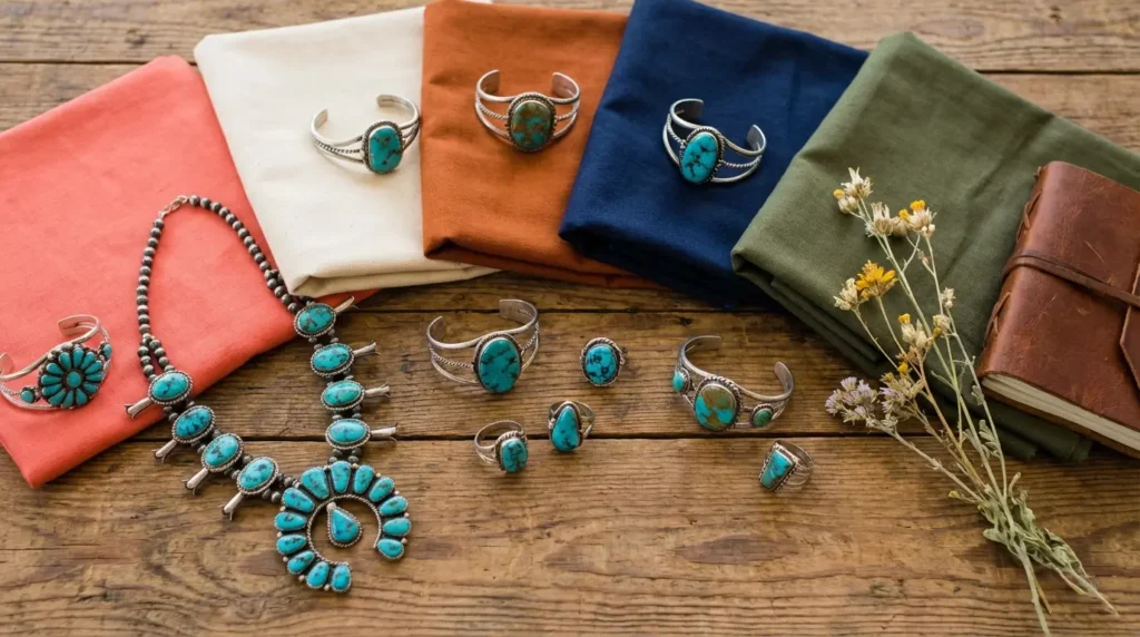
If you are currently standing in your closet in your underwear scanning this article for help, here is the gist. Contrast creates energy; harmony creates calm. You also need to look at your specific stone. Solid blue stones are chill and handle patterns well, but stones with heavy veins (the matrix) need solid block colors or you risk looking messy.
- Check the Wheel: Opposites (oranges/browns) make it pop; neighbors (blues/greens) make it blend.
- Know Your Stone: Solid blue? Go for patterns. Heavy veins? Stick to solids.
- Vibe Check: Earth tones for boho, sharp neutrals for modern, metallics for glam.
- When in Doubt: Black, white, and denim are your safety nets. They never fail.
| Goal Aesthetic | Best Color Family | Key Example |
|---|---|---|
| Modern Chic | Neutrals (High Contrast) | Crisp White or Jet Black |
| Bohemian / Western | Warm Earth Tones | Rust, Terracotta, or Camel |
| Sophisticated / Corporate | Cool Blues & Greens | Navy, Teal, or Charcoal |
| Party / Statement | Brights & Metallics | Fuchsia, Gold, or Cherry Red |
Not sure which color family works for you? Try the free Color Analysis Quiz
The 3 Rules of Styling Turquoise
Before you grab a dress, you need to get why some pairings look expensive and others look cheap. Turquoise has a big personality. When thinking about dress colors to wear with turquoise jewelry, keep these three things in mind.
The Color Wheel (Simplified)
You essentially have three options here. Complementary colors are opposite turquoise on the wheel (oranges, corals, warm browns). These create high energy and make the jewelry the main character. Analogous colors sit next to turquoise (blues, greens). These create a vibe that is calm and put-together.
Then you have Neutrals (blacks, whites, and greys), which just let the stone do its thing without fighting the fabric.

The Vibe You Want
What’s the goal? Southwestern or Boho looks need earth tones, rusts, and textures like linen or suede. Modern styles need sharp contrasts like black, white, or navy with sleek fabrics. For an Old Hollywood feel, grab the metallics. It helps to have a basic understanding of color analysis so you know which vibe actually suits your skin tone.
Discover your most flattering shades with the free Color Analysis Quiz
The Stone Itself
Look at your jewelry. Is it a “Sleeping Beauty” stone (solid, clear sky blue with no veins)? Those can handle busy patterns or bright florals because the stone is simple. Does it have a heavy matrix (black, brown, or copper veins)? If so, stick to solid block colors. The stone is the pattern. If you wear a busy print with a busy stone, it’s just visual chaos.
Match your jewelry and undertones using the free Color Analysis Quiz
| Stone Type | Characteristics | Best Fabric Choice | Why? |
|---|---|---|---|
| Sleeping Beauty | Solid, clear sky blue; no veins. | Patterns, Florals, Prints | The stone is simple enough not to clash. |
| Spiderweb / Matrix | Heavy black, brown, or copper veins. | Solid Block Colors | The stone is the pattern. Don’t overcomplicate it. |
Category A: The Essential Neutrals
Neutrals are the safest and usually the chicest way to style turquoise outfits. They let the jewelry take the stage without any competition.
Find the neutrals that flatter you most with the free Color Analysis Quiz
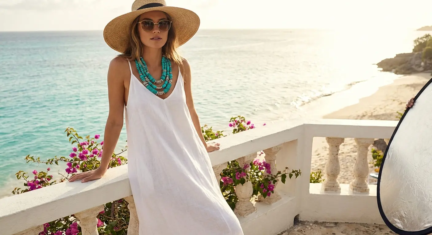
1. Crisp White
This is the ultimate summer look. The turquoise looks incredibly vibrant against white. It works for everything from casual beach weddings to upscale brunches. Try a white linen maxi or a structured white blazer dress.
2. Jet Black
Black makes that blue-green hue look electric. It takes the jewelry from “festival” to “art gallery.” A sleeveless black turtleneck midi or a classic LBD works perfectly here.
3. Charcoal Grey
Grey cools everything down. It’s less harsh than black, making it perfect for the office or city dinners. A slate grey slip dress is a great option.
Real Life Scenario: You have a business dinner right after work and want to wear your favorite turquoise studs, but a black suit feels too severe. Go for a charcoal grey sheath dress. It’s professional, but softens the vibe enough to let the jewelry shine.
4. Chocolate Brown
Brown brings out the veins in the turquoise. This pairing leans heavily into the 70s revival and Western trends. Try a rich espresso-colored knit dress.
5. Cream / Ecru
Unlike crisp white, cream softens the look. It feels vintage and romantic. A crochet or lace boho dress in off-white captures this perfectly.
6. Taupe / Greige
This allows massive statement pieces (like a squash blossom necklace) to shine without the outfit competing. It’s “quiet luxury.” A mushroom-colored silk wrap dress is the perfect vehicle for this.
Category B: Warm Earth Tones
These colors are opposite turquoise on the wheel, so they create a vibrant, high-energy look.
7. Rust / Terracotta
The orange undertones in rust make the blue in turquoise vibrate. This is the gold standard for Southwestern chic. A burnt sienna slip dress is your go-to here.

8. Mustard Yellow
This combo feels retro and sunny. It works best with green-leaning turquoise rather than pure blue. Try a golden-yellow sundress.
9. Coral
Coral and turquoise are the classic “vacation” duo. It screams playfulness and warm weather. A bright coral chiffon cocktail dress fits the bill.
10. Camel
Camel acts as a warm neutral. It elevates the jewelry and makes it look expensive. Great for fall fashion. A wool sweater dress in camel tan is a staple.
Real Life Scenario: You’re at an outdoor fall wedding. A floral dress feels too summery, but black feels too sad. A camel wool dress with a chunky turquoise necklace strikes the perfect balance—the camel matches the autumn leaves, and the turquoise keeps it from looking boring.
11. Clay Red
Less aggressive than bright red, clay red harmonizes with the copper or brown matrix found in many stones. A muted red wrap dress works beautifully.
12. Peach
It offers the contrast of orange but in a pastel, romantic volume. Excellent for spring. Try a soft peach satin midi skirt.
Category C: Cool Blues & Greens
Styling tone-on-tone creates a seamless, elongated silhouette.
13. Navy Blue
Navy anchors the turquoise. Since they are in the same color family, it looks intentional. A tailored navy jumpsuit is a power move.

14. Deep Teal
This creates a moody, monochromatic look. It’s very fashion-forward for winter weddings. A velvet dress in dark teal captures this vibe.
15. Denim Blue
Denim is the turquoise’s best friend. It creates a casual, rugged, yet stylish aesthetic. A chambray shirt dress or a denim bustier dress is iconic here.
16. Forest Green
This highlights the green undertones in the stone. It feels organic and rich. A dark green emerald cut dress is stunning.
17. Mint Green
This is a low-contrast look that feels very spring-forward. It blends the jewelry into the outfit for a subtle shimmer. A pastel mint chiffon dress works well.
18. Royal Blue
Both colors are vivid and saturated. This is a bold choice for someone who wants to turn heads. A cobalt blue bodycon dress makes a serious statement.
| Event Type | Recommended Blue/Green Shade | Why It Works |
|---|---|---|
| Formal Winter Wedding | Deep Teal or Forest Green | Rich, moody tones (like velvet) complement the weight of silver and turquoise. |
| Casual BBQ / Picnic | Denim or Chambray | The historical “Americana” pairing; rugged and effortless. |
| Spring Brunch | Mint Green | Low contrast creates a soft, airy look. |
Get personalized color guidance from the free Color Analysis Quiz
Category D: Statement Brights & Metallics
For formal events or when you want to break the rules.
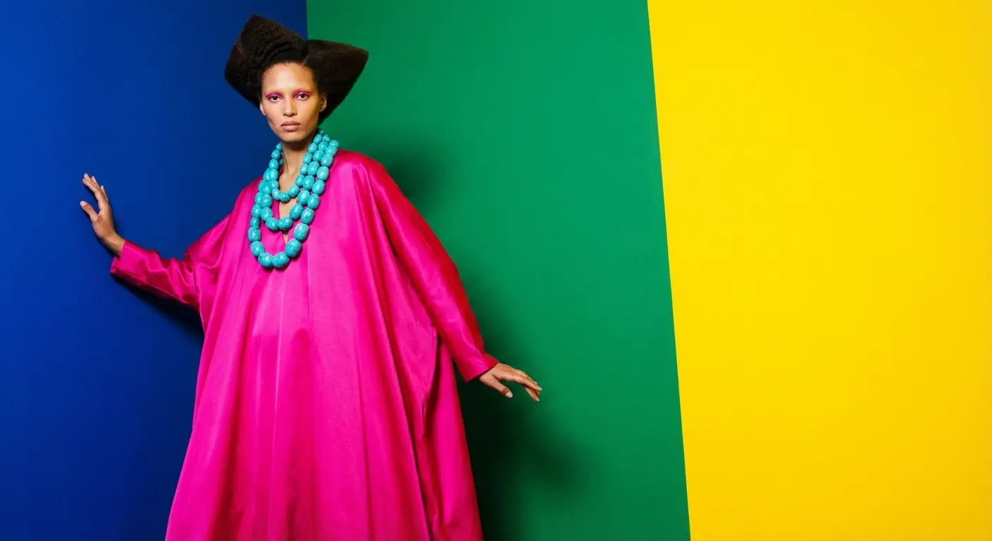
19. Fuchsia Pink
This is a “power clashing” combo that is very trendy right now. The cool blue balances the hot pink. A hot pink silk slip dress creates a dynamic effect.
20. Royal Purple
Purple and turquoise form a triad pairing on the color wheel. It feels majestic and creative. A deep plum evening gown is the right choice.
21. Silver / Gunmetal
Most turquoise is set in silver. Wearing a silver dress extends the metal of the jewelry, creating a seamless, icy look. This aligns perfectly with the principles of styling silver dresses, where keeping the metallics cohesive creates a polished finish. A sequined silver cocktail dress is ideal.

22. Champagne Gold
Even if the stone is set in silver, the warm gold fabric contrasts beautifully with the cool blue stone. It’s a similar concept to finding the best dress colors to wear with gold jewelry—mixing warm and cool tones adds depth. A satin champagne slip dress works wonders.
23. Cherry Red
This is pure Americana. It’s bold, confident, and classic pin-up style. A bold red A-line dress captures this spirit.
24. Lavender
Lavender brings out the blue in the turquoise while keeping the overall palette soft. A soft lilac tulle dress is a dreamy option.
Real Life Scenario: You’re invited to a New Year’s Eve gala and want to wear your grandmother’s turquoise squash blossom necklace, but you don’t want to look “western.” Choose a silver sequin gown. The silver connects with the jewelry’s metal setting, transforming the look from “ranch wear” to “Studio 54.”
Why This Decision is About Your Sanity
Choosing a dress color to match a stone is a micro-decision. But if you’re planning a wedding, you are currently drowning in macro-decisions.
Simplify one more decision with the free Color Analysis Quiz

If you find yourself stressing over whether your bridesmaids should wear Rust or Navy to match the turquoise jewelry you bought them, you might be focusing on the details to avoid the bigger chaos: family drama, budget blowouts, and the crushing pressure of the “perfect day.” When the pressure gets too high, you have to learn how to manage your wedding planning meltdowns before they ruin the experience.
This is where Bridesmaid for Hire steps in.
Just as you need a color guide to navigate your closet, sometimes you need a professional guide to navigate the wedding industry. Jen Glantz and her team don’t just put on a dress and walk down the aisle; they are the “fixers” of the wedding world.
- Decision Fatigue: Jen acts as an unbiased voice of reason. Whether it’s choosing turquoise outfits for the shower or mediating a fight between the Maid of Honor and the Mother of the Bride, she removes the guesswork.
- The “Professional” Bestie: Your friends want to party; your family wants to control everything. A hired bridesmaid is there strictly for you. From writing the vows to managing the run-of-show, they ensure you are stress-free.
- Crisis Management: You worry about the jewelry clashing; Jen worries about the caterer cancelling or the zipper breaking. She’s the professional problem solver who has been to over 150 weddings and seen it all.

Don’t let the stress of the details overshadow the joy of the event. Whether you need a full-service undercover bridesmaid, a maid-of-honor speech writer, or just a 1:1 venting session, Bridesmaid for Hire ensures the only thing you have to worry about is looking good in that turquoise.
Final Thoughts
Fashion is supposed to be fun, not a source of anxiety. While these rules and color pairings are helpful, they aren’t laws. If you put on a dress and feel amazing, that confidence will outshine any color theory mismatch. Trust your gut. Wear the stone with pride. And if the rest of the wedding planning feels like too much, remember that you don’t have to do it alone.
Related posts:


1-800-BRIDESMAID
The Newlywed
Card Game
something extra to love
Read the weekly newsletter from Bridesmaid for Hire, 1-800-Bridesmaid, to hear about real stories, from strangers, who need advice on love, life, friendship, and so much more.
Looking for the perfect wedding gift for someone you adore? Grab The Newlywed Card Game. It's a fun and interactive game they can play on their honeymoon or future date nights.

