


25 Stunning Winter Wedding Colors: The Complete Guide for Your Perfect Seasonal Palette
May 21, 2025

Hi, Friend! Jen Glantz here. I’m a bestselling author, the first ever bridesmaid for hire and have been hired by hundreds of brides all over the world. Let’s talk about winter wedding colors.
Winter weddings offer unique opportunities for creating magical atmospheres through thoughtful color selection. This comprehensive guide explores 25 winter wedding color palettes across five distinct categories, providing practical advice for implementation. You’ll discover how to choose colors that complement your venue, reflect your personal style, and enhance the winter season’s natural beauty—whether you’re planning a snowy December celebration or a Florida February wedding.
Quick Resources:
- Use our AI Color Analysis Tool
- Color Analysis Quiz
- Color Analysis Deep Dive
- Personal Style Color Analysis
Factors to Consider When Choosing Winter Wedding Colors
Selecting the perfect winter wedding colors involves more than just picking shades you love. Your venue’s existing features play a huge role in what will work. I’ve seen gorgeous burgundy and gold palettes clash terribly with orange-toned wood paneling!
The time of day for your celebration matters too. Morning ceremonies benefit from lighter tones that capture the crisp winter light, while evening events can embrace deeper, more dramatic colors that shine under artificial lighting.
Before finalizing your winter wedding color palette, you might want to check out our guide on how to pick bridesmaid dresses you won’t regret since your color choices will directly impact these important wardrobe decisions.
Winter lighting conditions vary significantly from other seasons. I’ve photographed summer and winter weddings in the same venue, and the difference is striking! Colors appear completely different under the low-angle sunlight and earlier sunsets typical of winter months. That perfect blush you loved in the store might read as almost beige in December’s natural light.
Your color selection impacts temperature perception too. I’ve attended winter weddings where warm-toned palettes with burgundies and golds made freezing ballrooms feel psychologically cozier, while cool tones like silvers and blues enhanced the crisp winter atmosphere in overheated spaces.
| Factor | Consideration | Impact on Color Selection |
|---|---|---|
| Venue Style | Historic, modern, rustic, etc. | Choose colors that complement existing features |
| Time of Day | Morning, afternoon, evening | Morning: lighter tones; Evening: deeper colors |
| Region | Snowy, southern, urban | Snow reflects and amplifies colors; southern venues may need cooler tones |
| Photography | Indoor/outdoor, lighting conditions | Some colors photograph better in winter light |
| Personal Style | Classic, bohemian, glamorous | Colors should reflect your personality and wedding vision |
Classic Winter Neutrals
Neutral color palettes provide timeless elegance for winter weddings while offering versatility across different venues and styles. I’ve worked with couples who initially worried neutrals would be boring, only to be amazed by the sophisticated backdrop they created for other wedding elements.
These combinations maintain a distinctly seasonal feel without screaming “winter wedding” in an obvious way. The subtle variations in tone and texture create depth that guests notice subconsciously, making the entire celebration feel cohesive.
Neutral palettes photograph exceptionally well in winter’s challenging lighting conditions. As a former wedding photographer, I can tell you this is a huge advantage! They provide consistent results across indoor and outdoor settings, even when you’re dealing with the tricky mix of natural and artificial light common in winter celebrations.
Texture becomes particularly important with neutral palettes. I always recommend incorporating velvet, faux fur, and metallics to add dimension. Without these textural elements, neutrals can appear flat, especially in photography.

Get your color analysis today >>
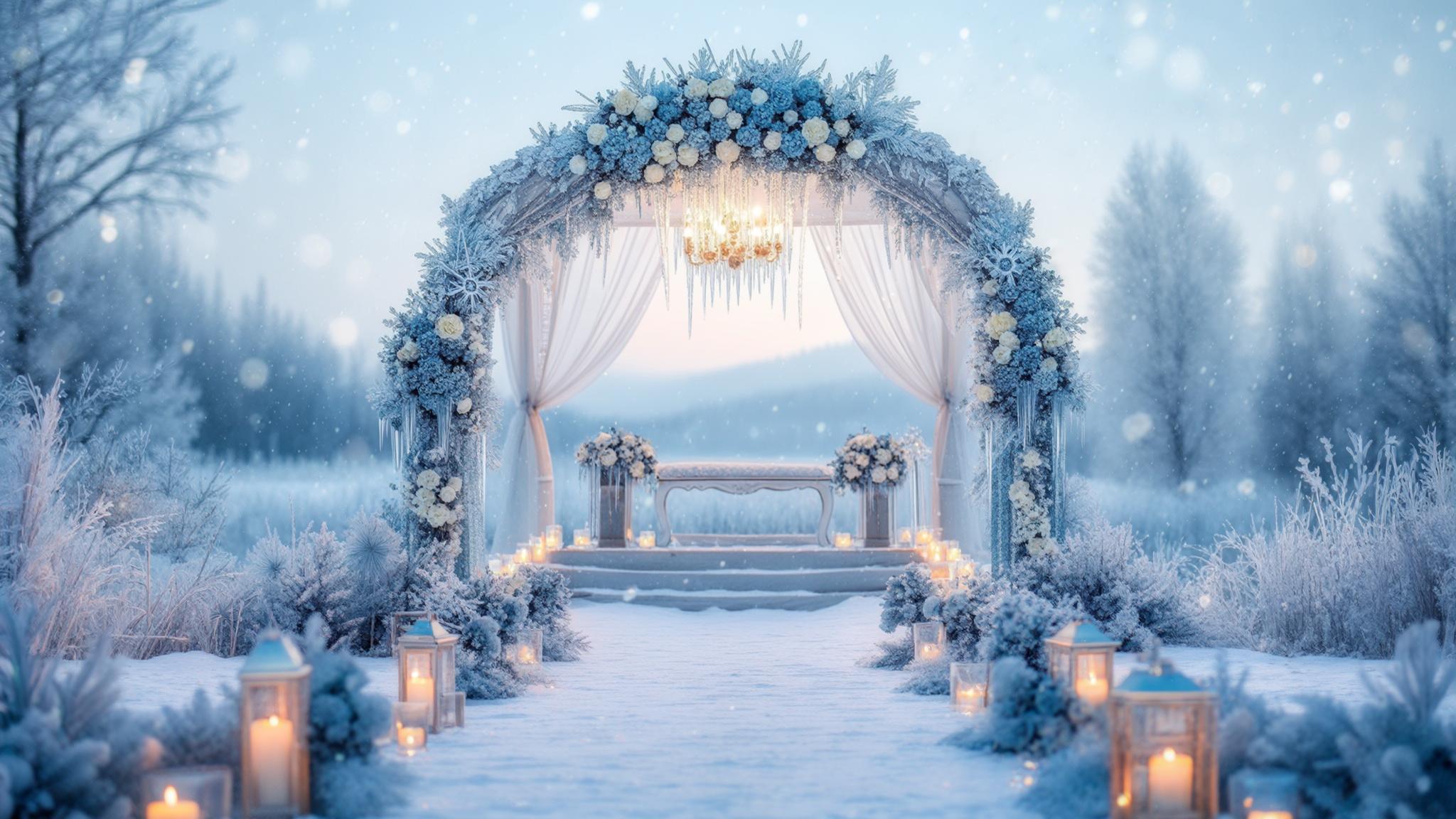
1. Winter White & Silver
This crisp, clean combination creates a pure winter wonderland effect that works beautifully in both daytime and evening celebrations. The reflective quality of silver adds sparkle that mimics ice and snow, while white provides a classic foundation that never goes out of style.
White reflects available light, brightening spaces during winter’s shorter daylight hours. I’ve seen this effect transform dark, wood-paneled venues into luminous celebrations.
Silver elements require strategic placement to prevent overwhelming glare in flash photography. I recommend using silver in smaller accents rather than large expanses, especially if you’re planning lots of formal portraits.
2. Ivory & Gold
This warmer neutral palette brings richness and luxury to winter celebrations. I love how this combination creates a soft glow that feels both elegant and inviting, perfect for creating a cozy atmosphere during the coldest months.
Ivory photographs warmer than pure white, creating a more flattering tone for skin in winter lighting. This subtle difference makes a significant impact in portraits, especially for guests with fair complexions who can look washed out against stark white.
Gold metallics require careful selection. I’ve found brushed gold creates subtle warmth while high-shine gold adds dramatic contrast. The difference between these finishes completely changes the feel of your celebration, so request samples before committing.

3. Greige & Bronze
This sophisticated combination of gray-beige with warm metallic accents creates depth and interest without overwhelming the senses. It’s particularly effective in rustic winter venues where it complements natural elements like wood and stone.
Greige (gray-beige hybrid) provides a modern neutral base that works with both cool and warm accent colors. I’ve used it as a foundation for everything from burgundy accents to sage green details, making it incredibly versatile.
Bronze metallics create warmth without the brightness of gold, making them ideal for intimate winter settings. They have a subtle glow rather than a shine, which photographs beautifully in candlelit receptions.
4. Charcoal & Platinum
This dramatic dark gray with lighter metallic accents creates sophisticated winter elegance. The combination feels urban and modern while still honoring winter’s deeper color palette.
Charcoal absorbs light, requiring strategic lighting design to prevent spaces from feeling too dark. I always recommend additional uplighting when working with this color to maintain the right ambiance.
Platinum provides a more subtle alternative to silver, creating dimension without overwhelming brightness. It has a sophisticated sheen rather than a sparkle, perfect for formal winter celebrations.
5. Winter Beige & Copper
This warm neutral palette with rustic metallic elements creates an inviting, cozy winter atmosphere. It works beautifully in venues with natural elements and complements the golden hour light of winter afternoons.
Winter beige has slightly cooler undertones than summer beige, creating seasonal appropriateness. This subtle shift makes the same color feel completely different depending on when you use it.
Copper develops a natural patina over time, making it ideal for elements guests will interact with throughout the event. I love copper chargers or candle holders that show slight variations, adding character to table settings.
Rich Jewel Tones
Jewel tones provide depth, richness, and luxury that perfectly complement winter’s dramatic atmosphere. These saturated colors create visual warmth that guests respond to immediately upon entering your celebration.
I’ve found jewel tones particularly effective for evening celebrations when their depth can be fully appreciated. Under candlelight and warm ambient lighting, these colors develop a luminous quality that feels both intimate and luxurious.
Jewel tones require careful lighting design. They absorb more light than pastels, necessitating additional illumination to prevent dark corners in your reception space. I always recommend a lighting test before committing to a heavily jewel-toned design.
Color saturation in jewel tones varies significantly between digital displays and physical samples. I’ve had clients shocked by the difference between what they saw online and the actual fabric swatches. Always request physical samples when working with these rich colors.
6. Emerald Green & Gold
Deep, rich green paired with metallic gold creates royal winter elegance that feels both seasonal and timeless. This combination brings the evergreen elements of winter indoors while adding warmth and luxury through gold accents.
Emerald green comes in various undertones. I’ve worked with blue-leaning emeralds that create cooler winter atmospheres and yellow-leaning emeralds that add warmth. The difference is subtle but impacts the overall feel of your celebration.
Gold metallics against emerald create high contrast that draws attention to focal points in both decor and photography. I recommend using this to highlight important elements like your cake table or ceremony backdrop.
7. Burgundy & Navy
This powerful combination of deep red and dark blue creates sophisticated depth perfect for formal winter celebrations. The contrast between these rich colors creates visual interest while maintaining a cohesive winter feel.
Burgundy appears differently under various lighting conditions. I’ve seen it read more purple in daylight and more brown under certain artificial lights. Always test this color in your actual venue before finalizing your palette.
Navy provides structure and depth while allowing burgundy elements to stand out as focal points. I find this balance particularly effective for creating visual hierarchy in your design.

8. Plum & Silver
Rich purple with cool metallic creates a royal winter ambiance that feels both luxurious and seasonally appropriate. This combination works particularly well for evening events where the depth of plum can be fully appreciated.
Plum contains both warm and cool undertones, making it versatile for different winter lighting conditions. I’ve used it successfully in both candlelit intimate gatherings and brighter ballroom celebrations.
Silver brightens plum without competing with its richness, creating balanced visual weight. The metallic reflection adds necessary light to this otherwise deep palette.
9. Sapphire & Gold
Deep blue paired with warm metallic creates a night sky winter effect that feels both dramatic and elegant. This combination balances cool and warm elements for a visually interesting palette.
Sapphire blue requires careful fabric selection. I’ve seen it appear significantly different in different materials—richer in velvet, brighter in satin, and almost navy in certain crepes. Always view fabric samples before ordering attire in this color.
Gold warms sapphire’s coolness, preventing the palette from feeling too cold in winter settings. This balance is particularly important for creating an inviting atmosphere.
10. Ruby Red & Forest Green
These traditional winter colors can be elevated to sophisticated elegance through careful implementation. By selecting rich, complex shades rather than bright primary versions, this combination feels seasonally appropriate without being overtly holiday-themed.
Ruby red contains blue undertones that distinguish it from brighter holiday reds, creating sophistication. This subtle difference transforms the palette from “Christmas party” to “winter wedding” in an instant.
Forest green provides depth and grounding, preventing ruby from dominating the visual field. I find this balance crucial for creating a cohesive design rather than a single-color statement.
Get your color analysis today >>
Winter Pastels
Winter pastels offer a softer approach to seasonal color palettes, creating gentle atmospheres that still feel appropriate for the season. I’ve found these lighter colors work particularly well for daytime celebrations and create beautiful contrast against snowy backgrounds.
Many couples don’t initially consider pastels for winter, but they can be incredibly effective. The key is selecting winter-appropriate versions with the right undertones.
Winter pastels differ from spring pastels through their undertones. Winter versions contain more gray or blue, giving them a sophisticated coolness that distinguishes them from their springtime counterparts. This subtle difference makes the same color feel completely different depending on the season.
Pastel palettes require texture variation to prevent appearing flat in winter’s diffused light. I always incorporate multiple materials—velvet, silk, frosted glass, brushed metals—to create necessary dimension.
11. Dusty Blue & Silver
Soft, muted blue with icy metallic creates a gentle winter palette that feels both seasonal and sophisticated. This combination works beautifully for daytime ceremonies and photographs exceptionally well against snowy backgrounds.
Dusty blue contains gray undertones that distinguish it from spring blues, creating winter appropriateness. I’ve found this subtle difference makes the color feel completely different depending on when you use it.
Silver adds necessary brightness to prevent dusty blue from appearing too flat in winter’s diffused light. The metallic reflection creates dimension that enhances the overall design.
12. Blush & Champagne
Soft pink with warm neutral creates a romantic winter glow that feels both elegant and inviting. This combination works particularly well for indoor celebrations where its warmth can be fully appreciated.
Winter blush contains more mauve undertones than summer blush, creating seasonal distinction. This subtle shift makes the same color feel appropriate for the season rather than out of place.
Champagne provides warmth without competing with blush’s delicacy, creating balanced visual weight. I find this harmony particularly effective for creating cohesive designs.
13. Lavender & Gray
Soft purple with cool neutral creates a subtle winter palette that feels unique and sophisticated. This unexpected combination provides distinction without heaviness, perfect for couples seeking something different yet seasonally appropriate.
Winter lavender contains more gray undertones than spring versions, creating seasonal appropriateness. This subtle difference transforms the color from sweet and youthful to sophisticated and seasonally relevant.
Gray stabilizes lavender’s potential sweetness, creating a more sophisticated winter palette. I’ve found this balance particularly important for maintaining adult elegance.
14. Mint & Pearl
Soft green with luminous white creates a fresh winter feel that references ice and snow while adding subtle color. This combination feels clean and crisp, perfect for modern winter celebrations.
Winter mint contains more blue undertones than spring mint, creating seasonal distinction. This subtle shift makes the color feel cool and icy rather than fresh and springlike.
Pearl adds dimension through its subtle iridescence, preventing the palette from appearing flat. The gentle luminosity creates interest without overwhelming brightness.
15. Powder Blue & Ivory
Icy blue with warm white creates a gentle winter wonderland effect that feels both seasonal and sophisticated. This combination works beautifully for daytime celebrations and creates a serene atmosphere.
Powder blue reflects winter light effectively, brightening spaces during shorter daylight hours. I’ve seen this effect transform dark venues into luminous celebrations.
Ivory warms powder blue’s coolness, preventing the palette from feeling too cold. This balance is crucial for creating an inviting atmosphere despite the cool color foundation.
Dramatic Winter Combinations
Dramatic color combinations create memorable winter atmospheres that feel both bold and seasonally appropriate. I’ve found these high-contrast palettes make strong statements that guests remember long after the celebration.
These combinations work particularly well for evening celebrations where their depth can be fully appreciated. Under candlelight and strategic uplighting, they develop a luminous quality that feels both intimate and luxurious.
Dramatic palettes require careful balance. They can easily overwhelm spaces if not properly distributed. I always recommend using the boldest colors as accents rather than primary elements to prevent visual fatigue.
Lighting design becomes crucial with dramatic palettes. They transform significantly under different light sources, sometimes appearing completely different between daylight and evening illumination. Always test your colors under the actual lighting conditions you’ll have at your celebration.

16. Black & Gold
This bold, dramatic combination creates luxurious winter sophistication perfect for formal evening celebrations. The contrast between dark and light creates visual interest while maintaining elegance.
Black absorbs light, requiring strategic lighting design to prevent spaces from feeling too dark. I always recommend additional uplighting when working with this color to maintain the right ambiance.
Gold provides necessary warmth and brightness, preventing black from feeling too somber. The metallic reflection adds dimension that enhances the overall design.
Get your color analysis today >>
17. Midnight Blue & Copper
Dark blue with warm metallic creates a winter night sky effect that feels both dramatic and cozy. This combination balances cool and warm elements for a visually interesting palette.
Midnight blue provides depth without the starkness of black, creating softer drama. I find this subtlety particularly effective for creating sophisticated atmospheres.
Copper adds unexpected warmth that distinguishes this palette from more common blue combinations. The reddish undertones create a unique contrast that feels fresh and interesting.
18. Wine & Slate
Deep red with blue-gray creates sophisticated winter depth that feels both rich and grounded. This unexpected combination provides distinction while maintaining seasonal appropriateness.
If you’re considering wine-colored bridesmaid dresses for this palette, our article on how to feel more confident in your bridesmaid dress offers great tips for your bridal party.
Wine contains complex undertones that change under different lighting conditions, creating visual interest. I’ve seen it shift from purple-leaning to brown-leaning depending on the light source.
Slate provides structure and neutrality while allowing wine elements to stand out as focal points. This balance creates necessary visual hierarchy in your design.
19. Forest Green & Black
Deep green with dramatic black creates an elegant winter forest feel that works beautifully for evening celebrations. This combination feels both natural and sophisticated.
Forest green contains enough brightness to prevent the palette from becoming too dark when paired with black. I find this balance crucial for maintaining visibility and atmosphere.
Black provides structure and depth while allowing forest green to remain the dominant color. This relationship creates visual interest without competition.
20. Plum & Champagne
Rich purple with warm neutral creates royal winter warmth that balances depth with lightness. This combination works well for both daytime and evening celebrations.
Plum provides rich color saturation while champagne prevents the palette from becoming too heavy. I’ve found this balance particularly effective for creating sophisticated designs that don’t feel overwhelming.
The contrast between cool purple and warm champagne creates visual interest and depth. This tension makes the palette more dynamic and engaging.
Unconventional Winter Palettes
Unconventional winter palettes offer fresh approaches to seasonal color schemes, creating distinctive celebrations that still honor the winter season. I’ve helped couples develop unexpected combinations that perfectly reflected their personalities while still feeling appropriate for their January or February weddings.
These unexpected combinations provide opportunities for personal expression while maintaining seasonal appropriateness. The key is incorporating winter elements through texture, lighting, and strategic color placement.
Unconventional palettes require thoughtful implementation to maintain seasonal connection. Without careful planning, they can feel disconnected from winter altogether. I always recommend incorporating at least one traditionally winter element—whether through texture, material, or a single color accent.
Supporting elements (textures, materials, lighting) become particularly important in grounding unexpected color choices in winter. Velvet, faux fur, metallic accents, and warm ambient lighting help connect otherwise non-winter colors to the season.

21. Terracotta & Sage
Warm earth tone with muted green creates a winter desert palette that feels both grounded and fresh. This unexpected combination works particularly well for southwestern or bohemian winter weddings.
Winter terracotta contains more brown undertones than summer versions, creating seasonal distinction. This subtle shift makes the color feel richer and more appropriate for colder months.
Sage provides winter-appropriate greenery without the heaviness of darker evergreen shades. Its muted quality feels sophisticated rather than springlike.
Get your color analysis today >>
22. Mauve & Taupe
Dusty purple-pink with warm neutral creates subtle winter elegance that feels sophisticated without obvious seasonal references. This combination works beautifully for couples seeking understated refinement.
Mauve contains gray undertones that distinguish it from brighter pinks, creating winter appropriateness. This complexity gives the color depth that feels seasonally relevant.
Taupe provides warmth and grounding while allowing mauve to remain the focal color. I find this relationship creates necessary balance in the palette.
23. Teal & Bronze
Rich blue-green with warm metallic creates jewel-toned winter luxury that feels both distinctive and seasonally appropriate. This unexpected combination provides visual interest while maintaining sophistication.
Teal contains both blue and green elements, creating complexity that changes under different lighting. I’ve seen it shift dramatically between daylight and candlelight, providing visual interest throughout the celebration.
Bronze warms teal’s coolness, preventing the palette from feeling too cold in winter settings. This balance creates an inviting atmosphere despite the cool color foundation.
24. Mustard & Gray
Warm yellow with cool neutral creates a balanced winter contrast that provides unexpected warmth while maintaining seasonal appropriateness. This combination works particularly well for late winter celebrations.
Winter mustard contains more amber undertones than summer versions, creating seasonal distinction. This richness makes the color feel appropriate rather than summery.
Gray provides structure and winter connection while allowing mustard to add necessary warmth. I find this balance crucial for creating cohesive designs.
25. Coral & Slate Blue
Warm orange-pink with cool blue creates a sunset-on-snow effect that works beautifully for winter weddings in warmer regions. This combination balances warmth and coolness for visual interest.
Winter coral contains more dusty undertones than summer coral, creating seasonal appropriateness. This subtle shift makes the color feel sophisticated rather than tropical.
Slate blue provides winter connection while allowing coral to add necessary warmth. The contrast between these colors creates dynamic visual interest.
Color Psychology in Winter Weddings
Colors do more than just look pretty—they actively shape how people feel during your celebration. I’ve witnessed guests’ moods shift noticeably when moving from a burgundy-draped cocktail hour to a silver-blue reception space. The emotional impact is real and worth considering.
Winter weddings benefit from thoughtful color psychology implementation. Deep blues foster intimacy perfect for winter’s introspective nature. I’ve created cozy conversation areas with navy velvet furniture that immediately encouraged guests to settle in for meaningful conversations.
Vibrant reds generate excitement and warmth. I’ve used strategic red lighting and decor elements to energize dance floors after dinner, completely transforming the atmosphere from elegant dining to celebration.
Understanding these emotional impacts helps you craft an atmosphere that matches your vision for the day. Want a high-energy celebration? Incorporate more warm, vibrant tones. Prefer an intimate, romantic feel? Lean into deeper blues and purples with metallic accents.
Winter’s unique natural light significantly alters color perception. What looks perfect in a showroom might appear completely different in your venue. I’ve had clients shocked by how different their carefully selected linens looked once installed in their winter venue compared to the rental showroom.
The contrast between indoor warmth and outdoor cold creates opportunities for psychological transition through color progression from entrance to main space. I love designing entryways with cooler tones that gradually warm as guests move deeper into the celebration, creating a subconscious feeling of comfort and welcome.

| Color | Psychological Effect | Winter Wedding Application |
|---|---|---|
| Blue | Calm, tranquility, trust | Creates serene atmosphere; pairs well with silver for winter elegance |
| Red | Passion, energy, warmth | Adds visual warmth to cold settings; best used as an accent in winter |
| Green | Nature, renewal, balance | Connects to evergreen winter elements; provides grounding in white settings |
| Purple | Luxury, creativity, wisdom | Creates rich, royal atmosphere; especially effective in evening lighting |
| White | Purity, simplicity, space | Reflects winter snow; creates bright atmosphere in limited daylight |
| Gold | Prosperity, warmth, celebration | Adds warmth to cool palettes; creates festive atmosphere without holiday clichés |
Practical Applications for Your Winter Wedding Colors
Moving from theory to practice requires attention to specific wedding elements. Your attire choices need to balance aesthetic appeal with winter comfort. I’ve helped countless bridesmaids navigate this balance—velvet bridesmaid dresses in burgundy or emerald provide both rich color and practical warmth.
Venue enhancement through strategic color placement transforms even non-winter-specific spaces into seasonal showcases. I once worked with a couple who completely transformed a bland hotel ballroom into a winter wonderland using nothing but strategic lighting and fabric draping in their ice blue and silver palette.
When selecting your winter wedding colors, consider how they’ll look in photographs. Our guide on 5 unique photos to take on your wedding day can help you plan shots that will showcase your carefully chosen palette.
Photography considerations become crucial in winter’s limited light, affecting which colors will translate well to your final images. Dark purples and greens can disappear into black in poorly lit venues, while metallics can create unwanted reflections with flash photography.
A couple planning a January wedding in New England initially selected an all-white palette, thinking it would perfectly complement the snowy landscape. During their venue walkthrough, however, they realized the white-on-white effect created a flat, dimensionless look in photographs. Their planner suggested incorporating deep forest green velvet table runners, burgundy floral arrangements, and gold candle holders. These strategic color additions created necessary depth and warmth while maintaining the winter wonderland atmosphere they desired. The photographs captured both the serene white backdrop and the rich color accents, creating visual interest that wouldn’t have existed in a monochromatic design.
Winter fabrics interact with light differently than summer materials. I’ve observed how velvet absorbs and deepens color while sequins and metallics reflect and amplify it. This difference becomes particularly important when selecting attire and linens.
The early sunset of winter months creates a “blue hour” effect that shifts all colors toward the cool end of the spectrum. Photographers must adjust white balance accordingly, and you should expect your colors to appear slightly different in outdoor photos taken near sunset.
Get your color analysis today >>
Attire Considerations
Winter wedding attire offers unique opportunities for color expression through layering and texture. I love how winter allows for more fabric variety than any other season—from velvet and brocade to sequins and faux fur.
Beyond basic color selection, fabric choice significantly impacts how colors appear and feel. I’ve seen the same burgundy look completely different in satin versus velvet. The velvet version appeared richer and more dimensional, while the satin had a brighter, more vibrant appearance.
Velvet deepens colors while adding warmth, making it ideal for winter bridesmaids. I always recommend it for winter weddings—it photographs beautifully, feels luxurious, and provides practical warmth.
Accessories like wraps, stoles, and statement coats add color dimension while providing practical warmth for outdoor photos. I love incorporating these elements as opportunities for additional color expression rather than afterthoughts.
Color fastness becomes more important in winter when precipitation might contact fabrics. I’ve witnessed some dyes bleed more readily when wet, creating disasters when snow or rain hits. Always test fabric samples with water before committing to them for outdoor winter use.
Temperature fluctuations between heated interiors and cold exteriors affect how fabric colors appear. I’ve noticed some colors shift noticeably between warm and cool environments, particularly blues and greens.

Venue Enhancement
Your venue provides the canvas for your color story. I’ve transformed completely neutral spaces into winter wonderlands through strategic color placement.
Winter venues often feature neutral backgrounds that showcase your chosen palette effectively. This blank-slate quality allows for more dramatic color implementation than heavily decorated spaces.
Architectural highlighting through colored lighting transforms ordinary spaces into winter wonderlands. I love using uplighting to wash walls in subtle color that changes the entire feel of a room without adding any physical decor.
For outdoor settings, consider how your colors will pop against snow or winter foliage. Deep jewel tones create striking contrast while pastels blend softly. I’ve created both effects successfully—the key is intentional selection based on your desired impact.
Ceiling height affects color perception. I’ve observed how taller ceilings make colors appear lighter while lower ceilings intensify color impact. This difference requires adjustment in color saturation depending on your venue’s architecture.
Surface materials in venues reflect color differently. Stone absorbs and mutes while glass and mirror amplify and reflect. I always consider these existing elements when developing color implementation strategies.
Photography Optimization
Winter’s unique lighting conditions present both challenges and opportunities for wedding photography. I’ve worked with photographers to develop color strategies that maximize these opportunities.
The early sunset affects golden hour timing, often pushing it into your ceremony or cocktail hour. This timing shift requires coordination between your color palette and photography schedule to capture colors at their best.
Certain colors photograph better in winter’s blue-tinted light. I’ve found burgundies deepen beautifully while some greens may appear too dark. This difference becomes particularly important for key photography elements like bouquets and attire.
Discuss these considerations with your photographer to ensure your colors translate well to final images. Most experienced photographers can provide guidance on which colors work best in your specific venue and timing.
Flash photography interacts differently with various colors and textures. I’ve seen metallics create unwanted hotspots while mattes photograph more consistently. This difference becomes particularly important for formal portraits.
Digital color correction capabilities vary between photographers. Some can adjust problematic colors in post-processing while others prefer to get it right in camera. Understanding your photographer’s approach helps you select colors that will work with their style.

Guest Experience Enhancement
Your color choices actively shape how guests experience your celebration. I’ve witnessed how the right palette can transform not just how a space looks, but how it feels to be in it.
Strategic color placement at entrance points sets the mood immediately upon arrival. I love creating color moments at the entrance that establish the palette and atmosphere before guests even reach the main celebration.
Warm-toned decor (amber lighting, copper accents, burgundy textiles) can actually make spaces feel physically warmer. I’ve used this psychological effect to great success in winter celebrations, creating cozy atmospheres despite cold temperatures.
Consider how your colors will progress through the event timeline, perhaps deepening as daylight fades. I often design color transitions that move from lighter, brighter tones during daytime portions to richer, deeper versions for evening celebrations.
Color perception changes throughout an event as guest eyes adapt to lighting conditions. Initial impact colors may appear different after guests have been in the space for hours. This adaptation effect means your boldest colors should be used where you want immediate impact.
Peripheral vision processes color differently than direct vision. Surrounding colors influence how central focal points are perceived. I consider this effect when designing ceremony backdrops and head table settings—the surrounding colors affect how the focal point appears.
Seasonal Adaptations for Different Winter Months
Winter isn’t a monolith—December, January, and February each present distinct characteristics that influence color selection. I’ve designed celebrations for each winter month and seen how different palettes work better at different points in the season.
December weddings might acknowledge the festive season without mimicking holiday decor. I love creating sophisticated interpretations of seasonal colors—wine instead of Christmas red, forest green instead of kelly green.
January palettes often benefit from clean, fresh approaches after holiday saturation. After weeks of red and green, guests respond positively to palettes that feel distinctly “winter” rather than “holiday.”
February celebrations can incorporate subtle hints of the coming spring while maintaining winter sophistication. I often introduce slightly warmer tones or the palest blush accents as February progresses, acknowledging the seasonal transition.
Daylight hours increase measurably from December to February, affecting when and how natural light interacts with your colors. This progression changes optimal photography timing and can influence which colors work best at different points in the season.
Cultural associations with specific winter months influence guest expectations. Your color choices can either align with or intentionally contrast these expectations. I’ve created both types of experiences successfully—the key is intentional decision-making.
December Wedding Colors
December weddings exist in proximity to holiday celebrations without needing to duplicate them. I’ve helped many couples navigate this balance, creating celebrations that feel festive without feeling like a holiday party.
Consider palettes that acknowledge the season while maintaining wedding sophistication. Burgundy and navy feel festive yet distinct from traditional holiday combinations. I love this pairing for December weddings—it has seasonal richness without holiday cliché.
The winter solstice offers unique inspiration through deep blues transitioning to lighter shades, symbolizing the return of light. I’ve created beautiful ceremonies around this concept, using lighting design to gradually brighten the space throughout the celebration.
December’s often overcast skies create diffused light that softens color contrasts. Bold color differences may appear more subtle than expected. I always recommend viewing your color samples under similar lighting conditions to understand how they’ll actually appear.
Indoor heating systems running at maximum in December can affect floral color longevity. Some blooms fade faster in dry, heated environments. I work closely with florists to select varieties that maintain their color despite these challenging conditions.
January Wedding Colors
January offers a fresh start for color exploration after December’s often-saturated palette. I love the clean slate feeling of January weddings—they allow for color approaches that would feel out of place during the holiday season.
This month welcomes clean, crisp approaches. Winter white with a single bold accent creates striking simplicity that feels refreshing after December’s complexity. I’ve created beautiful January celebrations using white with just one jewel tone as an accent.
Snow-inspired gradients using variations of the same color family add depth without complexity, perfect for this often-monochromatic month. I love creating tonal palettes that range from pale silver to deep charcoal, mimicking the variations in snow and ice.
January typically features the coldest temperatures, affecting outdoor color display duration. Some installations may require weather protection. I always have contingency plans for outdoor color elements during this particularly challenging month.
Post-holiday vendor availability often improves in January, allowing for more specialized color customization from in-demand professionals. This timing advantage means you can often secure more elaborate custom color treatments than during the busier December season.
February Wedding Colors
February weddings balance winter’s conclusion with hints of the coming spring. I love this transitional month—it allows for color exploration that wouldn’t work earlier in the season.
This month allows for color transitions. Deep plum with subtle pale green accents suggests seasonal change while remaining winter-appropriate. I’ve created beautiful February palettes that acknowledge the coming spring without abandoning winter entirely.
Valentine’s proximity offers opportunities for sophisticated interpretations of romantic colors. Wine rather than red, blush rather than pink creates elegance without cliché. I love helping couples navigate this balance, creating celebrations that feel romantic without feeling like Valentine’s Day.
February’s increasing daylight hours create longer golden hour opportunities than earlier winter months. This lighting advantage allows for more outdoor color display and photography, expanding your palette possibilities.
Temperature fluctuations become more common in February, requiring flexible color implementation strategies for outdoor elements. I always develop contingency plans for outdoor color moments during this unpredictable month.
Regional Adaptations for Winter Wedding Colors
Geographic location fundamentally shapes your winter wedding color experience. I’ve designed winter celebrations across various regions and seen firsthand how dramatically location affects color implementation.
Snowy regions offer natural white backdrops that showcase colors differently than southern settings. Deep jewel tones pop dramatically against snow in ways they simply can’t in non-snowy environments.
Florida winter weddings can embrace lighter interpretations of winter palettes while still feeling seasonally appropriate. I love creating subtle winter references through cooler undertones rather than obviously winter-specific colors for southern celebrations.
Urban celebrations might draw inspiration from city surroundings. Sleek charcoal and platinum complement metropolitan environments in ways that feel sophisticated rather than forced.
Altitude affects light quality. Higher elevations experience more intense sunlight that brightens colors, even in winter. I’ve seen the same color palette appear completely different between a mountain venue and a sea-level celebration.
Proximity to bodies of water influences ambient light reflection. Coastal winter weddings receive different light quality than inland celebrations. This difference affects how colors appear, particularly during golden hour.
| Region | Typical Winter Conditions | Recommended Color Adaptations |
|---|---|---|
| Northeast/Midwest | Snow, overcast skies, early sunset | Deep jewel tones for contrast; metallics reflect limited light effectively |
| Pacific Northwest | Rain, gray skies, diffused light | Saturated colors prevent palette from appearing washed out |
| Southern States | Mild temperatures, more daylight | Cooler tones create winter feel despite warmer weather |
| Mountain Regions | Bright sun, snow reflection, blue skies | Softer colors prevent overwhelming brightness; deeper accents for definition |
| Urban Settings | Artificial lighting, indoor venues | Sophisticated neutrals complement city architecture; strategic lighting for atmosphere |
Snow-Region Winter Weddings
Snowy settings provide natural enhancement for winter color palettes. I’ve designed celebrations where the snow became an active element in the color story rather than just a backdrop.
The reflective quality of snow amplifies colors, making them appear brighter and more vibrant. I’ve seen burgundy look almost luminous against fresh snow—a quality it simply doesn’t have in other settings.
High-contrast elements—deep forest green, rich burgundy, royal blue—pop dramatically against white landscapes. I love creating these striking contrasts for outdoor photo opportunities.
Consider this natural amplification when selecting color intensity for outdoor elements. Colors that appear appropriately saturated indoors may look overwhelming against snow. I always recommend testing samples outdoors before finalizing your palette.
Snow reflects up to 90% of available light, creating natural uplighting that brightens colors from below. This effect is unique to snowy settings and creates a luminous quality that can’t be replicated elsewhere.
Temperature fluctuations in snowy regions can cause condensation on decor items, potentially affecting color appearance as surfaces become damp. I always consider this possibility when selecting materials for outdoor installations.
Get your color analysis today >>
Florida Winter Weddings
Florida winter celebrations offer unique opportunities for seasonal color interpretation. I’ve helped many couples create winter atmospheres despite the palm trees and sunshine.
Without snow as a backdrop, colors read differently—requiring thoughtful selection to create winter atmosphere. I focus on cooler undertones and sophisticated combinations rather than obviously winter-specific colors.
Subtropical adaptations might include coral with slate blue, referencing winter without ignoring the setting. I love creating these regionally appropriate interpretations that honor both the season and the location.
Evening temperature drops create opportunities for adding deeper color accents as the celebration progresses. I often design color transitions that introduce richer tones as the sun sets and temperatures fall.
Florida’s winter sunlight contains less blue than northern regions, creating warmer ambient light that affects how cool colors appear. Blues and greens often read warmer than expected, requiring adjustment in selection.
Humidity levels influence color saturation. Florida’s often-humid winter air can make colors appear richer than in drier climates. This difference becomes particularly important when coordinating indoor and outdoor elements.
Urban Winter Weddings
City celebrations present distinct color opportunities and challenges. I’ve designed urban winter weddings that embraced the cityscape rather than fighting against it.
Urban winter weddings can draw inspiration from the cityscape itself—incorporating architectural elements into the color story. I love creating palettes that reference the surrounding buildings, streets, and city lights.
Industrial warmth through brick red accents with gray creates sophisticated coziness. This combination acknowledges both the urban setting and the winter season without feeling forced in either direction.
Consider how city light pollution might affect evening color perception, potentially requiring deeper or more saturated hues to create impact. I always test colors under actual nighttime conditions in urban settings before finalizing the palette.
A couple planning a December wedding in Chicago wanted to incorporate the city’s winter atmosphere into their color palette. Rather than fighting against the urban environment with traditional winter greens, they embraced the city’s architecture by selecting a palette of charcoal gray, brushed gold, and deep burgundy. They photographed their engagement session at sunset when the city lights began to glow against the winter sky, and incorporated those same golden tones into their reception lighting. By matching their palette to their environment rather than imposing a generic “winter” theme, they created a celebration that felt authentic to both the season and their urban setting. Their photographer noted that the burgundy elements photographed beautifully against both the city skyline and the venue’s industrial interior.
Urban light pollution creates a persistent ambient glow that reduces contrast. Colors may need more saturation to achieve the same impact as in darker settings. I often select slightly more saturated versions of colors for city celebrations to compensate for this effect.
City buildings reflect and absorb light differently than natural settings—creating micro-climates that affect outdoor color display. I consider building materials, window reflections, and architectural lighting when developing urban color strategies.
Budget-Conscious Color Implementation
Creating maximum impact with your winter wedding colors doesn’t require unlimited funds. I’ve helped couples with various budgets achieve their color visions through strategic implementation.
Strategic concentration of color in high-visibility areas creates focal points that define the space without requiring wall-to-wall implementation. I love creating color moments that draw the eye and establish the palette without unnecessary repetition.
Lighting offers particularly cost-effective transformation. Colored uplighting can completely change a venue’s atmosphere for less investment than physical decor. I’ve transformed plain white walls into rich jewel tones through nothing but strategic lighting.
The inverse square law of light means that colored lighting intensity decreases rapidly with distance. Positioning is crucial for effective coverage. I always work closely with lighting designers to ensure proper placement for maximum impact.
Color psychology research shows that humans remember dominant colors even when they occupy relatively small portions of the visual field. Strategic accent placement creates lasting impression without requiring extensive implementation.
When faced with a limited floral budget for their January wedding, a creative couple implemented a “color concentration strategy” that maximized impact while minimizing cost. Rather than trying to fill their large venue with expensive winter blooms in their burgundy and gold palette, they invested in three strategic focal points: a dramatic altar arrangement, statement pieces on the escort card table and cake table, and petite bud vase arrangements for dinner tables. The remaining decor featured budget-friendly elements like burgundy velvet table runners, gold mercury glass votives, and strategic uplighting that washed the white walls with warm amber. Guests repeatedly commented on the “rich color scheme” despite the relatively modest floral investment. The couple saved nearly 40% on their decor budget while still achieving their desired color impact through strategic placement.

How Bridesmaid for Hire Can Help
Implementing your winter wedding color vision requires both creative ideas and practical execution. I’ve seen how professional support makes this process significantly smoother.
Bridesmaid for Hire provides specialized support through their understanding of winter wedding dynamics. Their team has experienced the unique challenges of winter celebrations and can anticipate issues before they arise.
Their professionals help navigate challenges from finding perfectly-colored bridesmaid dresses to coordinating with vendors for color consistency. I’ve witnessed their ability to translate a couple’s vision to various vendors, ensuring everyone understands the desired palette.
For couples planning a winter wedding, having a dedicated professional can make all the difference. Learn about the difference between a wedding planner and professional bridesmaid to understand how our team can specifically help with your winter color implementation.
When weather changes threaten your carefully planned color display, they provide quick solutions that maintain your vision. I’ve seen them transform outdoor color moments into equally effective indoor implementations when winter weather didn’t cooperate.
Professional wedding assistants bring experience from multiple winter celebrations. They’ve seen which colors work in practice rather than just in theory. This practical knowledge prevents disappointing surprises on your wedding day.
Objective third-party perspective helps resolve color disagreements between couples and family members. Their professional input prevents emotional decision-making that might compromise the overall vision. I’ve witnessed them diplomatically navigate color preferences between couples and parents, finding solutions that satisfy everyone.
If you’re planning a winter wedding, don’t forget to check our guide on 6 things to pack if you’re a bridesmaid in a winter wedding to ensure your bridal party is prepared for the season while showcasing your beautiful color palette.
Ready to create your perfect winter wedding color story? Contact Bridesmaid for Hire today for expert assistance that ensures your vision translates beautifully from concept to celebration.

Get your color analysis today >>
Final Thoughts
Your winter wedding colors create the foundation for your celebration’s atmosphere. They’re not just decorative elements—they actively shape how your day feels and how it will be remembered.
By thoughtfully selecting and implementing a palette that honors both the season and your personal style, you’ll create a cohesive experience that feels intentional and memorable. The most successful celebrations I’ve designed have balanced seasonal appropriateness with personal significance.
Remember that winter offers unique opportunities for color expression through both traditional and unexpected combinations. Don’t feel limited to obvious winter palettes if they don’t resonate with you. The perfect palette is one that feels authentically yours while embracing the season’s special characteristics.
As you finalize your winter wedding color palette, remember that your wedding day timeline will need to accommodate the season’s shorter daylight hours. Our guide on mastering wedding day timeline can help you plan your day to showcase your colors in the best light.
The most successful winter wedding palettes balance three key elements: seasonal appropriateness, personal significance, and practical implementation. When these three factors align, the result is a celebration that feels both cohesive and authentic.
Color memory forms during emotional experiences. Your wedding colors will become associated with the day’s feelings, creating lasting impressions for both you and your guests. This emotional connection makes color selection particularly meaningful for your celebration.


1-800-BRIDESMAID
The Newlywed
Card Game
something extra to love
Read the weekly newsletter from Bridesmaid for Hire, 1-800-Bridesmaid, to hear about real stories, from strangers, who need advice on love, life, friendship, and so much more.
Looking for the perfect wedding gift for someone you adore? Grab The Newlywed Card Game. It's a fun and interactive game they can play on their honeymoon or future date nights.

