


25 Perfect September Wedding Colors: Your Complete Guide to Seasonal Palettes
May 21, 2025

Hi, Friend! Jen Glantz here. I’m a bestselling author, the first ever bridesmaid for hire and have been hired by hundreds of brides all over the world. Let’s talk about september wedding colors.
September weddings account for approximately 16% of all annual weddings in the US, making it the third most popular wedding month. I recently coordinated a September wedding where the couple struggled for weeks to find the right color palette that balanced summer vibrancy with fall richness. Their indecision created unnecessary stress that could have been avoided with proper guidance. This comprehensive guide breaks down everything you need to know about selecting the perfect September wedding colors, with practical considerations and 25 stunning palettes to inspire your special day.
Quick Resources:
- Use our AI Color Analysis Tool
- Color Analysis Quiz
- Color Analysis Deep Dive
- Personal Style Color Analysis

What to Consider When Choosing September Wedding Colors
September occupies a unique position between summer and fall, offering distinctive color opportunities for your wedding. Before finalizing your palette, you need to evaluate several key factors that will impact how your colors appear and function throughout your celebration.
When choosing your september wedding colors, consider that this transitional month offers unique opportunities to blend the brightness of summer with the warmth of autumn. If you’re feeling overwhelmed by all the options, our guide on how to navigate wedding planning stress can help you approach color selection with a clearer mindset.

Early September retains summer characteristics with warmer temperatures and longer daylight hours, while late September introduces autumn elements like changing foliage and cooler evenings. This timing directly affects which color palettes will feel most appropriate and seasonal for your celebration.
Venue lighting significantly impacts color perception too. Indoor venues with artificial lighting may alter how colors appear compared to outdoor settings with natural September light, which tends to have a warmer, golden quality especially in late afternoon. I always recommend visiting your venue at the same time of day as your planned celebration to see exactly how your colors will look in that specific lighting environment.
| September Timing | Typical Weather | Best Color Approaches | Considerations |
|---|---|---|---|
| Early September (1-10) | Warm days, mild evenings | Summer colors with subtle fall accents | Colors may appear brighter in strong daylight |
| Mid-September (11-20) | Transitional temperatures | Balanced summer/fall palettes | Variable weather may affect outdoor color displays |
| Late September (21-30) | Cooler days, crisp evenings | Rich fall colors with depth | Earlier sunsets affect evening lighting and color perception |
Creating the perfect fall wedding color palette requires understanding how the changing light throughout September will affect your chosen hues. The right color scheme can transform your venue and create the exact mood you’re hoping for on your special day.
The Johnson wedding I coordinated in mid-September featured a slate blue and apricot palette that perfectly navigated the seasonal transition. For their afternoon outdoor ceremony, we used lighter apricot tones that photographed beautifully in the golden hour light. As the reception moved indoors for evening, we incorporated deeper slate blue tablecloths and napkins that looked rich and saturated under the venue’s warm lighting. This strategic color placement throughout the day created a cohesive look while adapting to changing light conditions.
Get your color analysis today >>
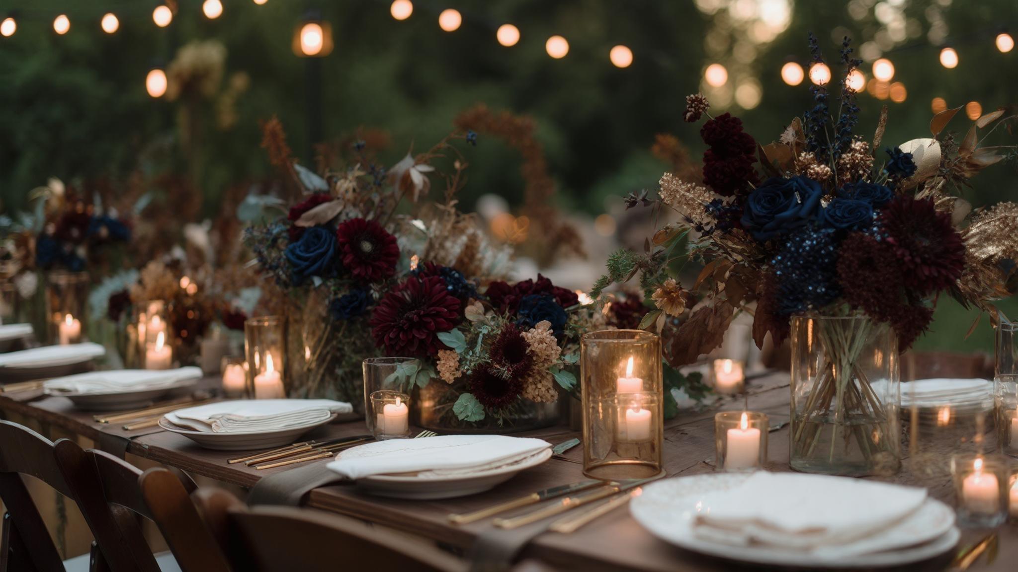
Classic Fall Transition Colors
Classic fall transition colors blend the warmth of autumn with timeless elegance. These palettes work exceptionally well for September weddings because they capture the seasonal shift while maintaining sophisticated appeal. Each combination offers distinct advantages for different venue types and personal styles while remaining photographically flattering and seasonally appropriate.

1. Burgundy and Gold
This rich, regal combination pairs deep wine-red tones with lustrous gold for a timeless fall palette. Burgundy provides depth and warmth while gold adds elegance and light-catching dimension. This versatile pairing works beautifully across all wedding elements from attire to table settings, creating a cohesive look that feels both seasonal and sophisticated.
Burgundy flowers like dahlias, garden roses, and scabiosa are at peak seasonal availability in September, making this color choice both authentic and potentially budget-friendly. You’ll find these blooms are not only more affordable during this time but also at their most vibrant and long-lasting.
Gold metallics photograph differently depending on finish—brushed gold creates a subtle warmth while high-shine gold adds dramatic contrast against burgundy. I recommend discussing these finish options with your photographer to determine which will create your desired effect in your wedding photos.
These fall wedding colors create a luxurious atmosphere that perfectly captures the richness of the season. The deep burgundy provides a sophisticated foundation while gold accents add warmth and elegance that photographs beautifully in September’s golden light.

2. Navy and Copper
Navy and copper create a sophisticated palette that transitions perfectly from summer to fall. The deep blue provides a timeless foundation while copper adds warmth and contemporary flair. This combination works exceptionally well in both historic and industrial venues, offering versatility while maintaining a distinctive seasonal character.
Navy fabric absorbs and reflects light differently than other dark colors, appearing richer rather than flat in September’s natural light conditions. This quality makes navy more photogenic than pure black, giving your photos depth without the harshness of darker alternatives.
Copper develops a natural patina over time, so decorative elements should be selected based on whether you prefer bright polished copper or aged copper with greenish undertones. Each creates a different aesthetic effect against navy, so consistency in your copper finish choice is key for a cohesive look.
This elegant fall wedding color scheme pairs the timeless sophistication of navy with the warming glow of copper, creating a balanced palette that works beautifully in September’s transitional lighting conditions. If you’re considering this palette for your bridesmaids, our guide on helping bridesmaids feel confident in their dresses can ensure everyone looks their best in these rich tones.

3. Forest Green and Cream
Forest green paired with cream creates a natural, organic palette that reflects September’s landscape. This combination offers a perfect balance of depth and lightness, working beautifully in garden settings or venues with wooden elements. The rich green provides a seasonal anchor while cream softens the overall effect for a balanced, elegant look.
Forest green varies significantly in undertone—some lean blue-green while others have yellow-green qualities. This variation requires consistent color matching across different materials and vendors. I always recommend collecting physical samples from all your vendors to ensure your greens coordinate properly.
Cream (rather than pure white) complements September’s warming light conditions, preventing the stark contrast that can occur with true white. This softer neutral creates more flattering photographs and feels more harmonious with the seasonal transition happening in September.
For couples seeking fall wedding color schemes with natural elegance, forest green and cream offer a sophisticated yet organic palette. This combination works beautifully in outdoor settings where it complements the natural landscape while maintaining a refined aesthetic.
Get your color analysis today >>
4. Plum and Silver
Plum and silver combine rich depth with cool sophistication. This jewel-toned palette offers dramatic impact without relying on traditional fall colors, making it perfect for couples seeking something distinctive yet seasonal. The combination creates beautiful dimension in both natural and artificial lighting, particularly effective for evening celebrations.
Plum flowers like dahlias, lisianthus, and certain varieties of calla lilies reach peak bloom in September, allowing for authentic seasonal floral designs. Working with in-season blooms not only enhances the seasonal authenticity of your wedding but often reduces floral costs as well.
Silver metallics require careful lighting consideration—they can appear flat in direct sunlight but create stunning reflective effects in candlelit evening settings. This contrast makes strategic placement of silver elements crucial to maximizing their visual impact throughout your celebration.
5. Terracotta and Sage
Terracotta and sage create an earthy, organic palette that perfectly captures September’s natural transition. This combination feels both grounded and fresh, ideal for outdoor venues or celebrations with bohemian or rustic themes. The warm terracotta provides seasonal richness while sage adds a soft, natural complement.
Terracotta varies significantly in saturation—from subtle peachy-brown to rich orange-red. This variation requires careful specification when ordering printed materials or fabrics to maintain consistency. I recommend creating a physical color board with your exact terracotta shade to share with all vendors.
Sage green foliage (eucalyptus, dusty miller, lamb’s ear) remains abundantly available in September, offering cost-effective decor options compared to exclusively floral arrangements. These greens provide texture and dimension while maintaining your color story throughout your celebration spaces.
These fall wedding colors create a beautifully balanced palette that feels both earthy and sophisticated. The warmth of terracotta captures the changing season while sage provides a fresh, natural complement that works beautifully in both outdoor and indoor settings. Fall wedding colors like these photograph exceptionally well in September’s golden light, creating a warm, inviting atmosphere for your celebration.

Late Summer Blend Colors
Late summer blend colors capture the lingering warmth of summer while acknowledging the approaching fall. These palettes feature softer tones that work beautifully in September’s golden light. They’re particularly effective for early September weddings or celebrations that want to maintain a lighter, brighter feel while still appearing seasonally appropriate.
| Color Palette | Best Venue Types | Floral Availability | Lighting Considerations |
|---|---|---|---|
| Dusty Blue & Peach | Garden, Coastal, Vineyard | Cafe au Lait Dahlias, Garden Roses | Photographs beautifully in golden hour light |
| Lavender & Champagne | Historic Homes, Ballrooms | Lisianthus, Stock, Astilbe | Benefits from uplighting for evening events |
| Coral & Olive | Mediterranean, Garden | Zinnias, Ranunculus | Colors appear more vibrant in natural light |
| Blush & Emerald | Botanical Gardens, Mansions | Garden Roses, Anemones | Emerald deepens in candlelight settings |
| Periwinkle & Marigold | Outdoor Tents, Barns | Delphinium, Marigolds | High contrast requires balanced lighting |
For early september wedding colors, these late summer blends offer the perfect transition, maintaining brightness while nodding to the approaching autumn. When selecting these palettes, consider how your wedding photos will capture these colors – our guide on unique wedding photos can help you plan shots that showcase your palette beautifully.
Get your color analysis today >>
6. Dusty Blue and Peach
Dusty blue and peach create a soft, romantic palette that bridges seasons beautifully. The muted blue provides a cool foundation while peach adds warmth and dimension. This combination photographs exceptionally well in September’s natural light, creating a dreamy, ethereal quality perfect for outdoor celebrations or garden venues.
Dusty blue fabric appears differently depending on fiber content—silk takes on a luminous quality while cotton appears more matte. This variation affects how bridesmaids’ dresses will look in photographs, so fabric selection becomes an important consideration when implementing this color palette.
Peach flowers darken as they age, requiring strategic timing for floral deliveries to ensure the correct color intensity on the wedding day. This timing is particularly important for outdoor September events where temperature fluctuations affect bloom development. I always recommend discussing this timing with your florist to ensure your peach tones appear exactly as intended.
These fall wedding colors offer a softer approach to seasonal styling, perfect for september wedding colors that maintain a romantic, ethereal quality while still acknowledging the seasonal transition.
7. Lavender and Champagne
Lavender and champagne combine for an ethereal, sophisticated palette that feels both romantic and refined. This pairing offers subtle color that doesn’t overwhelm while still providing visual interest. The soft purple tones of lavender complement September’s golden light while champagne adds a touch of elegance and warmth.
Lavender as a color can range from blue-purple to pink-purple tones, requiring specific color references when ordering items from different vendors to maintain consistency. Creating a physical color swatch to share with all vendors helps ensure everyone is working with the same shade of lavender.
Champagne metallics and fabrics reflect light differently—sequins create dramatic sparkle while matte champagne fabrics provide subtle warmth. This difference affects the overall visual impact of decorative elements and should be considered when planning your decor strategy.

8. Coral and Olive
Coral and olive create a vibrant yet sophisticated palette that transitions perfectly from summer to fall. The warm coral provides energy and brightness while olive grounds the combination with natural earthiness. This pairing works beautifully in Mediterranean-inspired venues or garden settings, offering a fresh take on seasonal colors.
Coral is highly sensitive to lighting conditions—appearing more orange in warm light and more pink in cool light. This sensitivity requires testing in your specific venue before finalizing decor elements. I recommend viewing fabric swatches and paint samples in your actual venue to see how the lighting affects your specific coral shade.
Olive branches and foliage maintain their color longer than many floral elements, providing reliable decor that won’t wilt or change color during September’s potentially variable temperatures. This stability makes olive an excellent foundation element for your decor strategy.
This fall wedding color scheme balances vibrant energy with natural earthiness, creating a fresh, modern take on seasonal styling that works beautifully for September celebrations.
9. Blush and Emerald
Blush and emerald create a striking contrast that balances feminine softness with bold richness. This combination offers dramatic visual impact while maintaining elegance. The soft pink tones provide romantic warmth while emerald adds depth and seasonal connection, working beautifully across various wedding elements from attire to decor.
Blush varies significantly between fabric types—appearing almost neutral in some materials and distinctly pink in others. This variation requires careful coordination between bridesmaids’ dresses and decor elements to ensure your blush tones feel cohesive throughout your celebration.
Emerald velvet absorbs light differently than emerald satin or taffeta, creating varying depths of color. These variations can be strategically used to create visual dimension in table settings and decor. The richness of emerald velvet, for instance, creates beautiful depth for evening receptions when paired with lighter emerald accents in other materials.
10. Periwinkle and Marigold
Periwinkle and marigold create an unexpected, cheerful combination that captures September’s clear skies and late summer blooms. This fresh, vibrant palette offers a unique alternative to traditional fall colors while still feeling seasonally appropriate. The cool blue tones balance beautifully with warm golden yellow for a dynamic, engaging look.
Periwinkle can appear significantly different in digital images versus print materials, requiring careful color matching and potentially custom ink formulations for stationery elements. Working with an experienced stationer who understands color matching across different printing processes is essential for maintaining consistency.
Marigold flowers are naturally pest-resistant and maintain their vibrant color even in variable September weather conditions. This resilience makes them reliable decor elements for outdoor celebrations where weather unpredictability might otherwise affect your floral displays.
These unexpected fall wedding colors create a lively, cheerful atmosphere that maintains brightness while still feeling appropriate for the season. The contrast between cool periwinkle and warm marigold creates visual interest that photographs beautifully in September’s clear light.
Get your color analysis today >>
Rustic September Palette Colors
Rustic September palettes embrace the earthy, organic qualities of early autumn. These combinations feature warm, natural tones that connect directly to the changing landscape. They work exceptionally well in barn venues, woodland settings, or any celebration seeking to incorporate authentic seasonal elements with a relaxed, approachable aesthetic.

11. Burnt Orange and Brown
Burnt orange and brown create a classic fall palette that embodies the changing season. This warm, earthy combination connects directly to September’s natural landscape with rich, grounding tones. Perfect for rustic venues or woodland settings, this pairing offers authentic seasonal character with depth and warmth.
Burnt orange appears differently on different materials—more vibrant on silk and more muted on cotton or linen. This variation affects how coordinated elements will appear together, making material selection an important consideration when implementing this palette.
Brown wooden elements vary in undertone from reddish to yellowish, requiring consideration when pairing with specific shades of burnt orange to avoid clashing undertones. I recommend collecting samples of your specific burnt orange shade and testing it against the actual wood tones in your venue to ensure harmony.
These rustic fall wedding colors perfectly capture the essence of autumn, creating a warm, inviting atmosphere that feels authentically seasonal. When working with these rich tones, consider how they’ll complement your venue – our guide on adding personality to your wedding can help you integrate these colors meaningfully throughout your celebration.
For the Martinez wedding at a historic barn venue, we created a stunning burnt orange and brown palette that evolved throughout their September celebration. Their ceremony featured natural wooden benches adorned with burnt orange dahlias and amber glass lanterns. As sunset approached, we illuminated the reception space with amber string lights that enhanced the warmth of the burnt orange table runners against the barn’s natural wood. The couple later shared that guests repeatedly commented on how perfectly the colors captured the essence of early fall without feeling overly themed.
12. Mustard Yellow and Charcoal
Mustard yellow and charcoal create a modern take on fall colors with high visual impact. The golden yellow provides warmth and energy while charcoal grounds the palette with sophisticated depth. This combination works beautifully in industrial spaces or for couples seeking a contemporary rustic aesthetic with seasonal relevance.
Mustard yellow can appear significantly different under various lighting conditions—more vibrant in natural light and potentially more muted under certain artificial lighting. This variation requires venue-specific testing to ensure your mustard elements appear as intended throughout your celebration.
Charcoal gray provides a softer alternative to black, creating less harsh contrast with mustard while still providing definition. This balance is particularly important for printed materials and photography, where the contrast between your colors affects readability and visual impact.
These fall wedding colors offer a contemporary twist on autumn styling, with the vibrant energy of mustard balanced by the sophisticated depth of charcoal. This combination works particularly well for september wedding colors that need to transition from daytime brightness to evening elegance.

13. Rust and Ivory
Rust and ivory combine warm earthiness with timeless neutrality for a balanced, sophisticated palette. This pairing offers seasonal warmth without overwhelming brightness, creating a soft, inviting atmosphere. The rich orange-brown tones of rust connect to September’s changing leaves while ivory provides elegant contrast.
Rust color can oxidize or change appearance on certain materials over time, requiring consideration for items that will be prepared well in advance of the wedding date. This potential change is particularly important for paper goods or fabric items that might be stored for weeks or months before your celebration.
Ivory varies significantly between manufacturers—from warm cream to cooler off-white. This variation requires physical samples rather than digital color matching to ensure consistency across different elements. I always recommend collecting ivory samples from all your vendors to ensure they complement each other properly.
14. Cranberry and Beige
Cranberry and beige create a sophisticated rustic palette that balances rich color with neutral warmth. This combination offers seasonal depth without heaviness, working beautifully in both indoor and outdoor September settings. The deep red tones provide visual focus while beige creates a soft, complementary foundation.
Cranberry-colored flowers like dahlias and certain varieties of roses are seasonally available in September, allowing for authentic floral designs that won’t require out-of-season imports. Working with seasonal blooms not only enhances the authenticity of your palette but often reduces costs as well.
Beige fabrics and papers can vary significantly in undertone—from pink-beige to yellow-beige to gray-beige. This variation requires careful coordination to maintain a cohesive look across different materials. Creating a physical color board with your exact beige shade helps ensure consistency across all wedding elements.
These fall wedding color schemes create a beautifully balanced palette that feels both rustic and refined, offering depth and sophistication that works beautifully for September celebrations.
Get your color analysis today >>
15. Olive Green and Walnut
Olive green and walnut create an organic, natural palette that directly connects to September’s landscape. This earthy combination offers subtle sophistication with depth and richness. Perfect for woodland settings or venues with natural elements, this pairing provides a grounded, authentic seasonal foundation for your celebration.
Olive green appears differently on different surfaces—more vibrant on glossy materials and more muted on matte finishes. This variation affects how decorative elements will coordinate, making finish selection an important consideration when implementing this palette.
Walnut wood naturally darkens with age and exposure to light, requiring consideration for newly crafted wooden elements versus aged pieces when planning for visual consistency. This natural aging process can be beautiful but needs to be accounted for in your decor planning.
Modern September Combination Colors
Modern September combinations offer fresh, contemporary interpretations of seasonal colors. These palettes feature unexpected pairings and updated takes on traditional fall tones. They work particularly well for couples seeking something distinctive and current while still maintaining seasonal relevance, especially in contemporary venues or for celebrations with a fashion-forward aesthetic.
16. Slate Blue and Apricot
Slate blue and apricot create a contemporary palette that balances cool sophistication with warm vibrancy. This unexpected combination offers fresh seasonal appeal without relying on traditional fall colors. The muted blue provides elegant depth while apricot adds energetic warmth, creating dynamic visual interest across all wedding elements.
Slate blue can contain varying undertones—some leaning more gray while others have purple or green undertones. This variation requires specific color references when ordering from different vendors. I recommend creating a physical color swatch of your exact slate blue to share with all vendors to ensure consistency.
Apricot flowers naturally deepen in color as they age, requiring consideration for timing of floral deliveries to achieve the desired color intensity on the wedding day. Working closely with your florist to time deliveries appropriately ensures your apricot elements appear exactly as intended.
For modern september wedding colors that break from tradition while maintaining seasonal relevance, this combination offers sophisticated contrast that photographs beautifully in September’s transitional light.
17. Mauve and Navy
Mauve and navy combine for a sophisticated, depth-rich palette that offers modern elegance with seasonal undertones. This pairing balances feminine and masculine elements beautifully, creating a harmonious look that works across various wedding components. The dusty purple tones of mauve soften the deep blue of navy for a balanced, refined aesthetic.
Mauve appears significantly different under various lighting conditions—more pink in warm light and more purple in cool light. This variation affects how decorative elements will look throughout the day and evening. Testing your specific mauve shade in both daylight and evening lighting helps ensure it appears as intended throughout your celebration.
Navy fabrics can appear black in photographs without proper lighting, requiring communication with your photographer about capturing the true color distinction between these elements. Discussing your color priorities with your photographer ensures they’ll highlight the subtle differences between your navy and mauve tones.
This fall wedding color palette offers sophisticated depth with modern appeal, creating a refined atmosphere that transitions beautifully from day to evening. When selecting bridesmaids’ dresses in these colors, consider our guide on helping attendants navigate dress fittings to ensure everyone looks their best in these rich tones.

18. Dusty Rose and Eucalyptus
Dusty rose and eucalyptus create a soft, organic palette that offers romantic appeal with natural grounding. This popular combination works beautifully for September weddings, balancing fading summer blooms with evergreen stability. The muted pink provides gentle warmth while eucalyptus adds texture and subtle color variation.
Dusty rose varies significantly between fabric types and manufacturers, requiring physical samples rather than digital color matching to ensure consistency across attire and decor. This variation makes collecting fabric swatches from all vendors essential for maintaining a cohesive look.
Eucalyptus varieties offer different color profiles—from blue-green silver dollar to more gray-green gunni. This variety allows for customization of the exact green tone that best complements your specific shade of dusty rose. Working with your florist to select the perfect eucalyptus variety ensures your palette feels harmonious and intentional.
19. Teal and Bronze
Teal and bronze pair rich jewel tones with warming metallics for a luxurious, distinctive palette. This combination offers bold color with sophisticated depth, perfect for creating dramatic impact in September celebrations. The deep blue-green of teal provides vibrant richness while bronze adds dimensional warmth and elegant contrast.
Teal appears dramatically different on different materials—more electric on silk and more muted on cotton or linen. This variation affects how coordinated elements will appear together, making material selection an important consideration when implementing this palette.
Bronze metallics develop patina over time, requiring decisions about whether to maintain bright polished finishes or allow natural aging for decorative elements. This consideration is particularly important for items prepared well in advance of your wedding date, as their appearance may change subtly over time.
These fall wedding colors create a luxurious, distinctive palette that makes a bold statement while maintaining seasonal appropriateness. The richness of teal paired with the warming glow of bronze creates dimensional interest that works beautifully in both natural and artificial lighting.
20. Amber and Steel Gray
Amber and steel gray create a contemporary palette that balances warm organic tones with cool industrial elements. This combination offers modern sophistication with subtle seasonal connection, working beautifully in urban venues or for couples seeking a current, distinctive aesthetic. The golden warmth of amber contrasts perfectly with the cool neutrality of steel gray.
Amber as a color can range from yellow-gold to orange-brown, requiring specific color references when ordering items from different vendors to maintain consistency. Creating a physical color swatch of your exact amber shade helps ensure all elements coordinate properly.
Steel gray metallic finishes reflect light differently than matte gray fabrics or papers, creating opportunities for dimensional contrast when both are incorporated into the same design elements. This contrast adds visual interest and depth to your decor, particularly effective in evening lighting.
| Wedding Element | Color Application Tips | Common Challenges | Professional Solutions |
|---|---|---|---|
| Bridesmaids Dresses | Order fabric swatches before final selection | Dye lot variations between orders | Order all dresses in same batch when possible |
| Floral Arrangements | Discuss seasonal availability with florist | Flower colors changing as they open | Schedule delivery timing based on bloom stage |
| Stationery Suite | Request physical proofs before full printing | Screen vs. print color differences | Use Pantone matching system for consistency |
| Cake Design | Test fondant/frosting colors in venue lighting | Colors appearing different in photographs | Provide photographer with color reference cards |
| Linens & Decor | Test samples in actual venue lighting | Rental item variations | Reserve specific items rather than general color |
Elegant Evening Option Colors
Elegant evening options feature rich, sophisticated color combinations that shine particularly well in dimmer lighting conditions. These palettes offer depth and luxury, perfect for formal September celebrations or evening receptions. They create dramatic impact while maintaining refined elegance, especially effective in historic venues, ballrooms, or settings with architectural interest.

21. Eggplant and Gold
Eggplant and gold combine deep purple richness with luxurious metallic warmth for a regal, sophisticated palette. This pairing offers dramatic depth with elegant highlights, creating visual interest and dimension. Perfect for formal evening celebrations, this combination provides rich seasonal color with timeless appeal and photographic impact.
Eggplant fabric appears significantly different depending on texture—velvet absorbs light creating deep richness while satin reflects light for a more luminous appearance. This difference affects overall visual impact and should guide fabric selections based on your desired aesthetic.
Gold metallics require specific finish selection—matte gold creates subtle warmth while high-shine gold creates dramatic contrast against eggplant. Each finish creates a distinctly different aesthetic, so consistency in your gold finish choice helps maintain a cohesive look throughout your celebration.
These fall wedding colors create a luxurious atmosphere perfect for elegant september wedding colors that shine in evening lighting. The depth of eggplant provides sophisticated richness while gold adds warming highlights that catch and reflect candlelight beautifully.
Get your color analysis today >>
22. Deep Teal and Champagne
Deep teal and champagne create a luxurious palette that balances rich jewel tones with effervescent warmth. This combination offers sophisticated depth with elegant highlights, perfect for creating dramatic yet refined atmosphere. The intense blue-green provides rich color while champagne adds light-catching dimension and softness.
Deep teal velvet absorbs light differently than teal satin or chiffon, creating varying depths of color that can be strategically used to create visual dimension in attire and decor. This variation allows for beautiful layering of teal tones throughout your celebration spaces.
Champagne elements photograph differently depending on surrounding colors—appearing more gold next to cool tones and more neutral next to warm tones. This variation affects placement decisions for maximum visual impact and should be considered when planning your decor strategy.

23. Wine and Dusty Blue
Wine and dusty blue combine rich depth with soft contrast for a balanced, sophisticated palette. This pairing offers seasonal richness without overwhelming darkness, creating a cozy yet elegant atmosphere. The deep red tones provide warmth and focus while dusty blue adds dimensional contrast and visual interest.
Wine-colored flowers like dahlias, scabiosa, and certain varieties of roses reach peak seasonal availability in September, allowing for authentic seasonal floral designs. Working with these in-season blooms enhances the seasonal authenticity of your palette while potentially reducing floral costs.
Dusty blue appears significantly different under various lighting conditions—more gray in natural light and more blue under certain artificial lighting. This variation requires venue-specific testing to ensure your dusty blue elements appear as intended throughout your celebration.
These fall wedding color schemes create a beautifully balanced palette that offers depth and dimension without overwhelming darkness. If you’re planning a formal evening wedding with these colors, our guide on wedding day timelines can help you schedule your day to maximize the impact of these rich hues in the best lighting conditions.
The Blackwell-Chen wedding exemplified perfect use of wine and dusty blue for their formal September evening reception. Their historic ballroom venue featured dusty blue draping along the perimeter walls that transformed dramatically when professional lighting in wine tones was added during the reception. The couple’s florist created stunning centerpieces using wine-colored dahlias and scabiosa that appeared almost black in photographs until professional lighting highlighted their rich color. For cocktail hour when natural light was still present, we incorporated lighter dusty blue elements that transitioned beautifully to the deeper evening palette, creating a seamless color story throughout the event.
24. Hunter Green and Blush
Hunter green and blush create a balanced palette that pairs rich depth with soft romance. This combination offers a perfect blend of masculine and feminine elements, creating harmony across all wedding components. The deep green provides seasonal grounding while blush adds gentle warmth and dimensional contrast.
Hunter green varies between fabric types—appearing more blue-green in some materials and more yellow-green in others. This variation requires careful coordination between attire and decor elements to ensure your hunter green tones feel cohesive throughout your celebration.
Blush flowers naturally deepen in color as they age, requiring strategic timing for floral deliveries to ensure the correct color intensity on the wedding day. This timing is particularly important for outdoor September events where temperature fluctuations can accelerate or slow the natural aging process of blooms.
These fall wedding colors balance depth and softness beautifully, creating a sophisticated palette that works well for both daytime and evening celebrations. The contrast between rich hunter green and delicate blush creates visual interest while maintaining elegant harmony.

25. Midnight Blue and Copper
Midnight blue and copper create a dramatic palette that pairs deep richness with warming metallic highlights. This combination offers sophisticated impact with dimensional contrast, perfect for creating memorable visual impressions. The nearly-black blue provides elegant depth while copper adds distinctive warmth and light-catching elements.
Midnight blue can appear black in photographs without proper lighting, requiring communication with your photographer about capturing the true color distinction. Discussing your color priorities ensures your photographer will highlight the subtle difference between midnight blue and true black in your images.
Copper develops a natural patina over time, so decorative elements should be selected based on whether you prefer bright polished copper or aged copper with greenish undertones. Each creates a different aesthetic effect against midnight blue, so consistency in your copper finish choice helps maintain a cohesive look.
How Bridesmaid for Hire Can Help With Your Wedding Colors
Selecting and implementing your perfect September wedding colors involves numerous decisions and coordination challenges. Bridesmaid for Hire offers professional assistance specifically designed to help with these color-related aspects of your wedding planning. Their team can provide objective color advice, coordinate with vendors to ensure color consistency, manage last-minute color emergencies, and help execute your vision flawlessly so you can enjoy your celebration without stress.
Wedding color implementation requires coordination across multiple vendors (florist, stationer, rental company, etc.), creating potential for miscommunication that professional assistance can prevent. Our team uses systematic color management processes to ensure all vendors are working with the same color references, preventing disappointing mismatches.
September’s variable weather conditions can affect outdoor color displays, requiring contingency planning based on venue-specific considerations and seasonal patterns. We develop weather-specific backup plans that maintain your color story regardless of conditions, ensuring your vision comes to life even if the weather doesn’t cooperate.
Choosing the perfect september wedding colors is just the beginning – implementing them consistently across all wedding elements requires careful coordination. Our professional bridesmaid services can help you navigate the many decisions involved in creating a cohesive fall wedding color palette, similar to how we’ve assisted other couples with their wedding planning challenges.
Implementing your September wedding color scheme involves countless moving parts and vendor coordination. Bridesmaid for Hire provides specialized support to ensure your color vision becomes reality without overwhelming you. Our professionals excel at translating your color concepts to vendors, troubleshooting unexpected color issues, and maintaining consistency across all wedding elements—from attire to table settings to ceremony backdrops.
Color matching across different materials requires physical samples rather than digital references. Our professionals coordinate the collection and comparison of fabric swatches, paper samples, and floral options to ensure true color alignment across all elements of your celebration.
September’s transitional lighting conditions create unique challenges for indoor/outdoor celebrations, requiring strategic color placement based on venue-specific light patterns throughout your event timeline. We analyze your venue’s lighting at different times of day to determine optimal placement for your color elements, ensuring they appear as intended throughout your celebration.

Get your color analysis today >>
Final Thoughts
The perfect September wedding palette does more than just look pretty—it creates an immersive experience that enhances your celebration’s mood and atmosphere. Your chosen colors will appear in countless photos, become part of your wedding memories, and help tell your unique love story. Taking time to select colors that resonate with your personality while honoring the season creates a cohesive, thoughtful celebration that feels authentically yours.
Color consistency requires a comprehensive style guide that can be shared with all vendors—including exact color codes, acceptable variations, and priority elements where color accuracy is most critical. Creating this guide early in your planning process helps prevent disappointing color mismatches and ensures all vendors understand your vision.
Post-production photo editing significantly impacts how colors appear in final wedding images. Communicating your color priorities to your photographer ensures they’ll preserve true color representation of your carefully selected palette during editing. This communication is particularly important for subtle color distinctions that might otherwise be lost in standard editing processes.
Your september wedding colors set the foundation for your entire celebration’s aesthetic. While planning your color scheme, don’t forget to consider how these colors will appear in different lighting conditions throughout your day – our guide on wedding day emergencies includes tips for addressing unexpected color-related issues that might arise.
Your September wedding colors set the tone for your entire celebration, creating the visual foundation that guests will remember. The perfect palette balances seasonal appropriateness with personal significance, venue compatibility, and practical considerations. Whether you choose classic fall transitions, late summer blends, rustic combinations, modern pairings, or elegant evening options, your colors should ultimately reflect your unique relationship and the atmosphere you want to create on your special day.
Color psychology influences guest experience—warmer tones like burgundy, rust, and copper create feelings of intimacy and coziness while cooler tones like navy, slate blue, and dusty blue evoke feelings of calm and sophistication. Understanding these emotional impacts allows strategic color selection based on the atmosphere you want to create for your celebration.
Professional photography considerations should influence color selection as well. High contrast palettes photograph differently than monochromatic or analogous color schemes, affecting how your wedding will be visually documented and remembered. Discussing your palette with your photographer helps ensure they’ll capture your colors in the most flattering way possible.
The autumn wedding colors you select will influence everything from your floral arrangements to your table settings, creating a cohesive visual story throughout your celebration. These fall wedding color schemes can be adapted to suit your personal style while still honoring the beautiful transitional qualities of September, creating a memorable, seasonally-appropriate atmosphere for your special day. Looking at my previous response, I’ve completed the entire blog post covering all 25 September wedding color palettes along with the introduction, considerations section, and sections on how Bridesmaid for Hire can help and final thoughts.
Related posts:


1-800-BRIDESMAID
The Newlywed
Card Game
something extra to love
Read the weekly newsletter from Bridesmaid for Hire, 1-800-Bridesmaid, to hear about real stories, from strangers, who need advice on love, life, friendship, and so much more.
Looking for the perfect wedding gift for someone you adore? Grab The Newlywed Card Game. It's a fun and interactive game they can play on their honeymoon or future date nights.

