


The Ultimate Makeup Color Analysis Guide: Science Behind Your Perfect Shade
May 20, 2025
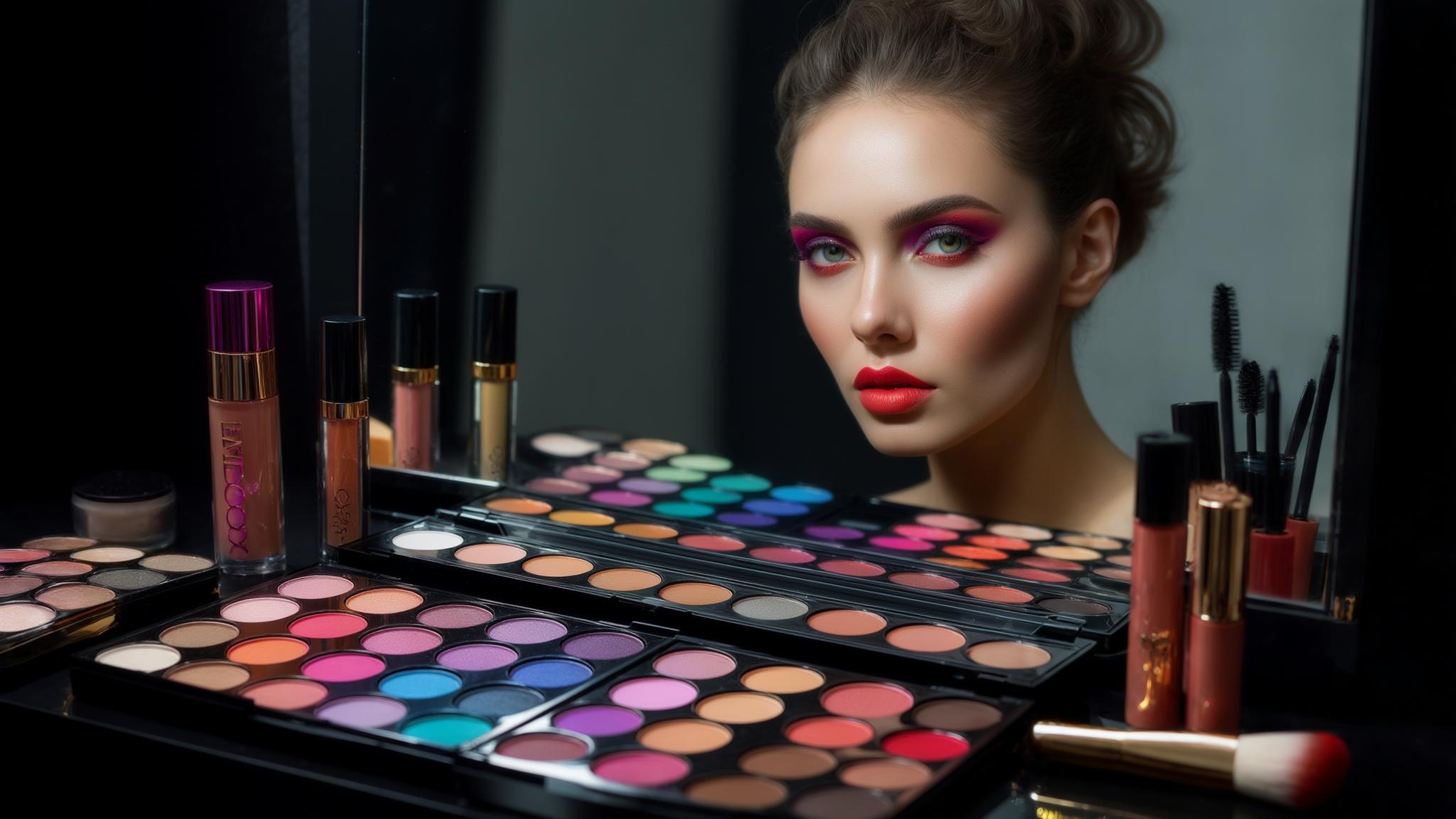

Hi, Friend! Jen Glantz here. I’m a bestselling author, the first ever bridesmaid for hire and have been hired by hundreds of brides all over the world. Let’s talk about makeup color analysis.
According to a recent study by the American Academy of Dermatology, 73% of women report using the wrong foundation shade for their skin tone. I discovered this firsthand when working with clients who struggled to find makeup that truly enhanced their features. Makeup color analysis goes far beyond picking a pretty color—it’s a scientific approach to understanding how colors interact with your unique features. This comprehensive guide breaks down the complex science of color analysis into practical knowledge you can use to transform your makeup routine.
Quick Resources:
- Use our AI Color Analysis Tool
- Color Analysis Quiz
- Color Analysis Deep Dive
- Personal Style Color Analysis

The Foundational Science of Color Analysis
Color analysis in makeup is built on scientific principles from physics, psychology, and even anthropology. Understanding how we perceive color and how it interacts with skin chemistry creates the foundation for effective makeup application. This isn’t just about matching foundation—it’s about comprehending the complex relationship between light, pigment, and your unique features to create harmonious looks that enhance your natural beauty.
When I first started studying color analysis, I was amazed by how light wavelengths interact differently with various skin tones. Deeper skin reflects more yellow and red wavelengths while fair skin reflects more blue wavelengths, which explains why cool-toned products can appear ashy on deeper complexions.
Both subtractive color mixing (physical pigments combining) and additive color mixing (how colors appear when light combines) affect final makeup appearance, especially when layering products. I’ve seen this principle in action countless times when helping clients understand why their layered products sometimes create unexpected colors.
Our perception of color is relative to surrounding colors and lighting conditions (chromatic adaptation). This explains why the same makeup can look dramatically different in various environments. I always tell my clients to check their makeup in different lighting before heading out for important events.
Get your color analysis today >>

According to a survey by MyColorAnalysis.ai, over 121,325 individuals have used AI-based color analysis tools to determine their seasonal color palette, showing the growing demand for personalized color guidance.
The Physics of Color Perception
When you apply makeup, you’re actually manipulating how light interacts with your face. The way we perceive color involves complex interactions between light sources, objects, and our visual system. Understanding these interactions helps explain why certain colors enhance your features while others might make you look tired or washed out.
I’ve found that when light hits your skin, specific wavelengths are absorbed while others are reflected back to create the colors you see. This selective reflection is why makeup appears different on various skin tones. I once worked with two friends who bought the same lipstick, only to be confused when it looked completely different on each of them!
The thickness of your skin affects color perception too. Thinner skin (like around eyes) reveals more blood vessels, creating bluish discoloration that requires specific correction techniques. This is why under-eye concealer often needs to be a different shade than what you’d use elsewhere on your face.
Light source quality dramatically impacts color appearance. Natural daylight provides the most accurate color rendering, while fluorescent lighting can cast greenish tones that alter how makeup appears. I always recommend clients do their foundation matching near a window if possible.
A recent study featured on Camille Styles noted that when people switch to their correct color palette, they immediately appear more vibrant as their natural features are enhanced rather than competed with.
Light-Skin Interactions
Your skin’s unique properties determine how it absorbs and reflects light. Different skin tones interact with light in distinct ways, which explains why makeup that looks stunning on your friend might look completely different on you. Understanding your specific light-skin interaction pattern is crucial for selecting products that enhance rather than clash with your natural coloring.
Melanin concentration affects how light interacts with skin. Higher melanin levels absorb more light across all wavelengths, requiring more pigmented products to create visible effects. I’ve noticed this when working with clients with deeper skin tones who often need more saturated colors to achieve the same visual impact as lighter-skinned clients.
Skin’s translucency varies between individuals and affects how light penetrates before being reflected. More translucent skin shows more underlying structures, creating complex color interactions. This is why some people can wear sheer products beautifully while others need more opaque formulas to achieve an even appearance.
Surface texture impacts light reflection patterns too. Smoother skin creates more uniform reflection while textured skin scatters light, affecting how color appears and requiring adjustments in application technique. I often adjust application pressure and product selection based on a client’s skin texture.
Get your color analysis today >>

I had a client with deep skin tone who was frustrated that her purple eyeshadow appeared ashy and dull despite being vibrant in the pan. After analyzing her light-skin interaction pattern, we discovered that her skin was absorbing the blue wavelengths from the purple, leaving only a grayish cast. Switching to a purple with stronger red undertones created the vibrant effect she desired because those wavelengths reflected more effectively from her skin.
Subtractive vs. Additive Color Mixing
When working with makeup, you’re dealing with two different color systems simultaneously. Physical products on your skin follow subtractive color mixing rules, while the way light interacts with these layers creates additive effects. Understanding both systems helps you predict how products will look when combined and layered on your unique skin.
Subtractive mixing occurs when physical pigments combine. Mixing yellow and blue pigments creates green because each pigment absorbs (subtracts) certain wavelengths of light. This is why mixing foundation shades doesn’t always create the perfect intermediate shade you might expect.
Additive mixing happens with light itself. When red and green light combine, you perceive yellow, which explains why layered translucent products create colors that aren’t present in any single layer. I’ve seen this happen when clients layer certain blushes over bronzers, creating unexpected but beautiful results.
The final appearance of layered makeup results from light passing through multiple semi-transparent layers, with each layer filtering specific wavelengths before the light reflects back to your eye. This is why the order of application can dramatically affect your final look.

Chromatic Adaptation and Context
Your perception of color isn’t fixed—it changes based on surrounding colors and lighting conditions. This phenomenon, called chromatic adaptation, explains why your makeup can look perfect in your bathroom but completely different outdoors. By understanding how context affects color perception, you can create looks that maintain their intended effect across different environments.
Your visual system automatically adjusts to the dominant light source. Spending time in warm lighting causes your brain to compensate by perceiving colors as cooler than they actually are. I’ve had clients panic when they step outside after applying makeup under warm bathroom lights, only to find their foundation suddenly looks orange!
Color constancy (your brain’s attempt to perceive colors consistently despite lighting changes) can be both helpful and misleading when selecting makeup shades. While it helps us recognize familiar objects under different lighting, it can trick us into thinking a foundation matches when it actually doesn’t.
The surrounding colors in your environment affect how makeup colors are perceived. Wearing a strongly colored outfit can shift how your makeup appears to others. I often recommend clients bring their outfit or at least a swatch when getting makeup done for special events.
Get your color analysis today >>

| Lighting Type | Effect on Makeup Appearance | Compensation Strategy |
|---|---|---|
| Natural Daylight | Most accurate color rendering | Best for shade matching and evaluation |
| Fluorescent | Emphasizes green/blue tones, dulls reds | Add warmer tones to counteract, increase saturation |
| LED | Varies by color temperature; can be harsh | Check Kelvin rating (4000-5000K is most neutral) |
| Incandescent | Enhances warm tones, yellows | Add cooler tones to balance, reduce orange-based products |
| Candlelight | Extremely warm, mutes all colors | Increase contrast and intensity for evening looks |
Get your color analysis today >>
The Bezold Effect in Makeup Application
The Bezold effect describes how colors appear different when placed next to different colors. This explains why the same lipstick can look dramatically different depending on your eye makeup or clothing choices. Strategic color pairing allows you to enhance or minimize certain features by controlling how colors interact visually.
Adjacent colors create simultaneous contrast effects. A neutral brown eyeshadow appears warmer when paired with blue tones and cooler when paired with orange tones. I’ve used this trick countless times to adjust how a particular shade reads without having to buy new products.
The perceived intensity of a color changes based on surrounding colors. A moderate blush appears more intense against neutral skin but more subdued when paired with bright lipstick. This is why I often recommend clients adjust their blush intensity based on how bold their other makeup elements are.
Strategic placement of contrasting colors can create depth perception effects. Placing slightly contrasting colors in adjacent areas creates dimension without harsh contour lines. This technique has revolutionized how I approach contouring for clients who want subtle definition.
Metamerism in Product Selection
Metamerism occurs when colors appear identical under one light source but different under another. This explains why foundation might match perfectly in store lighting but look mismatched in daylight. Testing products under multiple light sources helps you select options that perform consistently across different environments.
Different light sources emit different wavelength distributions. Incandescent bulbs emit more red/yellow wavelengths while fluorescent lights emit more blue/green wavelengths. I always take clients near windows or outside when matching foundation to ensure accuracy.
Metameric failure occurs when two seemingly identical colors reveal their differences under changing light conditions. This is particularly problematic with foundation matching. I’ve had clients return products that looked perfect in-store but completely wrong at home due to this phenomenon.
Digital screens emit light directly (rather than reflecting it), causing makeup colors to appear differently in selfies or video calls compared to in-person viewing. This is why makeup that looks great in person might need adjustment for important video meetings or photo sessions.
Adaptation to Artificial Enhancement
Your visual system gradually adapts to seeing enhanced features, which explains why makeup application can feel like a slippery slope of “more is better.” Understanding this adaptation mechanism helps you create makeup looks that remain impactful without requiring constant escalation in intensity.
Neural adaptation causes diminishing returns in visual impact. The first application of color creates the most significant perceptual change while subsequent additions yield smaller effects. This is why that first swipe of lipstick makes such a dramatic difference, but adding more layers doesn’t continue to increase impact proportionally.
Contrast sensitivity adaptation explains why you might feel you need more makeup after wearing it regularly. Your visual system becomes accustomed to enhanced contrast. I’ve noticed this with clients who gradually increase their makeup intensity over time without realizing it.
Periodic “reset periods” without makeup help recalibrate your visual perception, allowing you to better judge appropriate intensity levels. I recommend makeup-free days to clients who feel they’re getting caught in the cycle of needing more and more product to feel “done.”
Beyond Seasons: Multidimensional Color Analysis Frameworks
Traditional seasonal color analysis (Spring, Summer, Autumn, Winter) provides a starting point but lacks the nuance needed for diverse populations. Modern approaches incorporate multiple dimensions that account for various factors beyond just undertone. These expanded frameworks help you understand not just whether you’re “warm” or “cool,” but also how factors like contrast level, color clarity, and depth affect your optimal makeup choices.
Contemporary color analysis systems incorporate dimensions like clarity, depth, and mutedness alongside temperature to create more precise categorizations. I’ve found these additional dimensions crucial when working with clients who don’t fit neatly into traditional seasonal categories.
Facial geometry and physical features influence optimal color placement beyond just shade selection. The shape of your features affects how color should be distributed. I’ve seen dramatic improvements in clients’ appearance just by adjusting placement while keeping the same colors.
Cultural contexts and anthropological factors impact both color perception and practical application across diverse populations. What’s considered flattering or appropriate varies significantly between cultures, and modern color analysis must account for these differences.

Research from The Concept Wardrobe reveals that while traditional color analysis focuses primarily on temperature (warm vs. cool), 86% of people actually fall somewhere in the neutral spectrum rather than at either extreme, highlighting the need for more nuanced analysis.
Get your color analysis today >>
Expanded Dimensional Frameworks
Contemporary color analysis has evolved beyond the warm/cool binary to include additional dimensions that create more accurate categorization systems. Understanding where you fall on scales of clarity, depth, and mutedness helps you select colors that truly harmonize with your natural features rather than forcing yourself into limited seasonal categories.
The clarity dimension measures how well you handle clear, vibrant colors versus muted, softened shades—independent of whether those colors are warm or cool. I’ve worked with clients who were incorrectly typed as “Winters” simply because they had high contrast features, when in fact they looked much more harmonious in the softened colors of Autumn.
The depth dimension evaluates how light or dark colors appear against your natural coloring. Someone with fair skin but very dark eyes and hair might still register as having deep coloring. This dimension explains why some fair-skinned people can wear much deeper colors than traditional analysis would suggest.
The mutedness dimension describes how gray or desaturated colors appear on you. People with muted natural coloring often have neutral or olive undertones that harmonize with slightly grayed colors. I’ve found this dimension particularly helpful for clients with olive skin who struggled with traditional seasonal recommendations.

In a recent interview with Who What Wear, color consultant Lizzie Heo explained that modern color analysis considers four distinct aspects: undertone, saturation, value, and clearness—a much more comprehensive approach than traditional systems.
The Dimension of Clarity
Clarity refers to how much contrast you can harmoniously wear. High-clarity individuals (often those with distinct features and high contrast between hair, skin, and eyes) can wear clear, vibrant colors, while low-clarity individuals look more harmonious in muted, softened shades. This dimension exists independently of temperature and explains why some people can wear highly saturated colors regardless of whether they’re warm or cool.
Clarity is determined by measuring the natural contrast levels in your features. High contrast between hair, skin, and eyes typically indicates high clarity tolerance. I’ve found that clients with dramatic coloring (like porcelain skin with jet black hair) can wear much more vibrant makeup than those with more blended coloring.
Pigment distribution in your iris provides clues about clarity. Eyes with distinct color patterns rather than blended hues often indicate higher clarity. I often look at a client’s eyes first when assessing their clarity tolerance, as it’s one of the most reliable indicators.
Makeup pigment particle size affects clarity perception. Finely milled pigments create clearer color expression while larger particles create more diffused, muted effects. This is why some high-end makeup brands with finely milled pigments can appear too intense on people with naturally muted coloring.
The Dimension of Depth
Depth measures how light or dark colors appear against your natural coloring. Deep coloring requires deeper makeup shades to create balance, while light coloring needs lighter shades to avoid overwhelming natural features. When analyzing depth, consider your overall impression rather than individual features—someone with fair skin but very dark eyes and hair might still register as having deep coloring.
Depth is evaluated by assessing the overall value (lightness/darkness) of your natural coloring. Hair, skin, and eyes together create a composite depth level. I’ve worked with clients who were using makeup that was technically the right undertone but completely wrong depth, creating an unbalanced appearance.
Contrast between your features affects perceived depth. High contrast between light skin and dark hair creates a different depth profile than harmonious values across all features. This is why some fair-skinned people with dark features can wear much deeper colors than those with fair features throughout.
Lighting conditions affect depth perception. Natural depth becomes more apparent in diffused lighting while harsh direct light can flatten depth differences. I always assess clients’ depth in multiple lighting conditions to get an accurate reading.
For brides planning their wedding makeup, understanding depth is crucial. As our guide on making bridal makeup last all day explains, selecting the right depth of colors ensures your makeup photographs beautifully and withstands various lighting conditions throughout your celebration.
The Dimension of Mutedness
Mutedness describes how gray or desaturated a color appears. People with muted natural coloring (often with neutral or olive undertones) look harmonious in colors that have been slightly grayed, while those with clear coloring shine in pure, saturated hues. This dimension explains why some people look washed out in bright colors despite having the “right” undertone.
Mutedness results from complex undertone mixtures. Olive skin contains both warm and cool pigments creating a naturally muted appearance that harmonizes with similarly complex colors. I’ve found that clients with olive skin often struggle with traditional color analysis until we address this mutedness factor.
The presence of gray undertones in hair and eyes often indicates higher compatibility with muted makeup shades. Clients with ash-toned hair or hazel eyes typically look better in slightly grayed-down makeup colors than in pure, bright shades.
Saturation tolerance varies throughout the face. Many people can wear higher saturation on lips than eyes, requiring strategic saturation mapping for harmonious looks. I often create custom saturation maps for clients to help them understand where they can wear more vibrant colors and where they should stick to more muted options.
A client with muted coloring consistently gravitated toward bright coral lipsticks but felt they looked “off” despite matching her warm undertone. When we switched to a slightly grayed-down terracotta with the same warmth but lower saturation, she immediately saw the harmony with her features. The color still read as “coral” to the eye but contained subtle gray undertones that echoed her natural coloring.
Kibbe Body Types and Facial Geometry
The Kibbe system incorporates physical features, bone structure, and overall appearance to determine not just color compatibility but also textural and geometric harmony in makeup application. Understanding your Kibbe type helps you select not only flattering colors but also appropriate textures, finishes, and application techniques that enhance your natural features.
Kibbe types range from extremely yin (soft, rounded) to extremely yang (sharp, angular), affecting which makeup textures and finishes look most harmonious. I’ve found that clients with more yin features typically look better with dewy finishes and softly blended application, while yang-dominant clients can carry more structured, matte looks.
Facial geometry—the specific angles and proportions of your features—determines optimal placement for color products beyond basic face shapes. The standard blush placement advice doesn’t work for everyone; it needs to be adjusted based on your unique facial structure.
The relationship between your facial features creates a unique map for product placement that standard techniques might not address. I create custom placement maps for clients based on their specific proportions rather than following generic guidelines.
Get your color analysis today >>
Yin-Yang Balance in Makeup Textures
Kibbe types range from extremely yin (soft, rounded) to extremely yang (sharp, angular), with most people falling somewhere on the spectrum. This balance affects not just clothing recommendations but makeup texture choices as well. Yin-dominant types generally harmonize with rounded shapes, dewy finishes, and soft-focus effects, while yang-dominant types can carry sharper contours, matte finishes, and more defined lines.
Yin features (rounded, soft) harmonize with diffused application techniques, luminous finishes, and curved placement patterns. I’ve noticed that clients with predominantly yin features often look overwhelmed by sharp contours and precisely defined makeup, but glow beautifully with softly blended, luminous products.
Yang features (angular, sharp) support more precise application, matte textures, and geometric placement patterns. Clients with strong yang features can carry structured makeup looks that might look harsh or aging on more yin-dominant individuals.
Most individuals have a mixture of yin and yang features requiring balanced approaches. Pure yin or yang techniques often look unnatural or harsh. I typically assess each facial feature individually to create a balanced approach that honors both the yin and yang elements in a client’s appearance.
| Kibbe Type | Recommended Makeup Textures | Optimal Application Techniques | Best Color Intensity |
|---|---|---|---|
| Dramatic (Yang) | Matte, defined, high-contrast | Precise lines, sharp contours | Bold, clear, high-contrast |
| Natural (Yang-Neutral) | Semi-matte, textured | Blended but visible structure | Medium-high, earthy |
| Classic (Balanced) | Satin, refined | Symmetrical, moderate definition | Medium, refined |
| Romantic (Yin) | Dewy, luminous | Soft-focus, rounded shapes | Medium-soft, delicate |
| Gamine (Yin-Yang Mix) | Varied, playful contrasts | Asymmetrical, unexpected | High contrast, playful |
| Theatrical Romantic (Yin with Yang) | Luminous with defined accents | Soft with precise details | Medium-high with focus points |
| Flamboyant Natural (Yang with Yin) | Natural with polish | Blended with structure | Medium-bold, natural |
| Soft Classic (Balanced with Yin) | Satin with softness | Symmetrical with gentle edges | Medium-soft, harmonious |
Accommodating Facial Geometry
Beyond basic face shapes, comprehensive analysis considers the specific geometries of your features—the angle of your cheekbones, the shape of your eye sockets, the proportions of your facial thirds. This precise mapping creates more harmonious enhancement than standardized placement techniques that don’t account for your unique structure.
Facial thirds proportions affect optimal placement of horizontal elements like blush and contour. Balanced thirds require different placement than elongated or compressed proportions. I’ve completely transformed clients’ appearances simply by adjusting blush placement to honor their unique facial proportions.
Eye socket geometry determines ideal eyeshadow placement. Deep-set eyes, protruding eyes, and hooded eyes each require different application patterns. The standard crease placement advice simply doesn’t work for many eye shapes, which is why customized mapping is so important.
Facial plane angles affect how light interacts with makeup. The angle of your cheekbones, forehead, and jaw influence how products should be placed to work with natural light fall. I often use a small flashlight during consultations to observe exactly how light moves across a client’s face before determining optimal product placement.
Cultural and Anthropological Considerations
Color analysis must acknowledge cultural contexts and anthropological factors that influence both the perception of beauty and the practical application of makeup across diverse populations. Understanding these factors helps you navigate color choices that respect cultural meanings while enhancing your natural features.
Colors carry different symbolic meanings across cultures. Red signifies luck in Chinese culture but can connote different meanings in Western contexts. I’ve worked with brides from various cultural backgrounds who had specific color requirements based on traditional meanings rather than just aesthetic preferences.
Research suggests some color preferences may be somewhat universal (blue is widely favored across cultures) while others are culturally specific. This balance of universal and cultural-specific preferences creates fascinating patterns in makeup preferences worldwide.
Cultural contexts influence which makeup colors are considered “neutral” or “statement” in different settings. What’s considered a bold lip color in one culture might be an everyday shade in another. I always consider cultural context when making recommendations to clients.
Cultural Color Symbolism
Colors carry different symbolic meanings across cultures, which can unconsciously affect how makeup looks are perceived. Red signifies luck and prosperity in Chinese culture but can connote different meanings in Western contexts. Understanding these symbolic associations helps you create looks that convey your intended messages across cultural boundaries.
Color symbolism affects psychological responses to makeup. Colors with positive associations in your cultural context create more favorable impressions. I’ve noticed that clients often have strong emotional reactions to certain colors based on cultural associations they may not even consciously recognize.
Historical context influences color perception. Colors associated with specific historical periods or movements carry subtle connotations. Certain makeup colors can evoke specific eras or movements, which can be used strategically or avoided depending on the desired effect.
Professional and social contexts have unwritten color codes that signal belonging. Understanding these codes helps you navigate different environments effectively. I often help clients develop different makeup palettes for various contexts in their lives, from professional to social to special occasions.
Anthropological Patterns in Color Preference
Research suggests some color preferences may be somewhat universal (blue is widely favored across cultures) while others are culturally specific. These patterns influence which makeup colors are considered “neutral” or “statement” in different contexts. Recognizing these patterns helps you create looks that register appropriately within their intended cultural framework.
Cross-cultural studies show certain color preferences appear consistently across populations. Blues and greens are widely appreciated while yellow-green combinations often receive negative responses. I’ve found these patterns helpful when working with clients from diverse backgrounds, as they provide common ground to start from.
Color preference patterns shift with age. Younger populations typically tolerate higher saturation while preference for subtlety often increases with age. This isn’t just about “appropriate” colors for different age groups but about genuine shifts in perception and preference over time.
Geographic location affects color preference through environmental exposure. People from regions with vibrant natural colors often prefer higher saturation in makeup. I’ve noticed distinct regional preferences even within the same country, often correlating with the local natural environment.
Advanced Application Techniques for Color Analysis
Translating color analysis knowledge into practical application requires specialized techniques beyond basic color matching. These advanced methods allow for nuanced manipulation of color to enhance features, correct imbalances, and create optical illusions that harmonize with your unique characteristics. Mastering these techniques gives you unprecedented control over how color works with your features.
Precision color correction uses color theory principles to neutralize unwanted tones and enhance desired ones, creating an optimal canvas. I’ve transformed clients’ makeup experiences by teaching them targeted correction techniques rather than full-face coverage that masks their natural beauty.
Dimensional color application creates depth through strategic placement of related hues rather than relying on a single shade. This approach mimics natural coloration much more effectively than flat application of single colors, creating lifelike dimension and movement.
Environmental adaptation strategies help create looks that perform well across different lighting conditions and settings. I’ve developed techniques that ensure clients look their best whether they’re in office lighting, natural daylight, or evening venues.

A comprehensive survey by Colorwise.me found that 68% of women report significant improvement in makeup satisfaction when using color analysis to guide product selection, with foundation match being the most dramatically improved category.
Get your color analysis today >>
Precision Color Correction
Advanced color correction uses the principles of color theory to neutralize unwanted tones and enhance desired ones, creating an optimal canvas for makeup application. Rather than applying the same correction techniques to everyone, precision correction addresses your specific color challenges with targeted solutions.
Color wheel relationships guide correction choices. Complementary colors neutralize each other while adjacent colors create subtle shifts. I’ve found that understanding these relationships transforms color correction from guesswork to precision.
Different facial zones often require different correction approaches. The T-zone typically has different undertones than the perimeter of the face. I map clients’ faces into correction zones rather than applying the same techniques everywhere, creating much more natural results.
Layering translucent color correctors creates more natural results than opaque coverage, preserving skin’s dimensional appearance. I prefer building thin layers of correction rather than using heavy, opaque products that can look mask-like.
When preparing for special events like weddings, precision color correction becomes even more important. As noted in our guide on beauty tips to tackle during your wedding month, starting color correction treatments early ensures your skin tone is balanced and ready for flawless makeup application on your big day.
Strategic Underpainting
Underpainting involves applying color correctors beneath foundation to address specific concerns. Unlike traditional color correction that relies on complementary colors (green for redness, etc.), advanced underpainting uses adjacent color wheel hues to create subtle shifts in tone. For example, using slightly yellow-peach correctors rather than stark green produces more natural-looking correction for redness in olive skin tones.
Adjacent color wheel hues create more natural correction than direct complementary colors. Slightly yellow-peach tones often correct redness more naturally than pure green. I’ve completely changed my approach to correcting redness after discovering how much more natural adjacent color correction looks compared to traditional complementary correction.
Layering thin corrective products creates optical color mixing that appears more skin-like than thick, opaque correction. This technique preserves the natural dimension and translucency of skin while still addressing discoloration.
The depth (value) of correctors should match the depth of the discoloration. Using too light or dark a corrector creates unnatural dimension. I always match corrector depth to the discoloration depth, regardless of the client’s overall skin tone.
Zonal Color Neutralization
Different areas of your face may require different correction approaches. The T-zone often has different undertones than the perimeter of your face, and areas with thinner skin (under eyes, around nose) reveal more blood vessels, creating bluish or purplish discoloration. Mapping your face into correction zones creates more balanced results than applying the same correction technique everywhere.
Facial blood vessel distribution creates predictable discoloration patterns. Nasolabial area, under-eyes, and chin often show more vascular influence. I create custom correction maps for clients based on their specific vascular patterns, which are often visible under good lighting.
Skin thickness varies across the face. Thinner areas require different correction approaches than thicker areas. I adjust both product selection and application technique based on the skin thickness in different facial zones.
Hormonal influences create specific discoloration patterns. Melasma and hormonal pigmentation follow predictable distribution patterns requiring targeted correction. Understanding these patterns helps me create more effective correction strategies for clients dealing with hormonal skin changes.
Optical Mixing for Discoloration
Rather than fully covering discoloration with opaque products, optical mixing uses sheer layers of corrective colors that visually blend with your skin’s natural color. This technique preserves skin’s natural dimension while neutralizing unwanted tones. It requires precise color analysis to determine exactly which corrective shades will create the desired optical effect when combined with your skin’s natural color.
Optical mixing relies on the visual system’s tendency to blend adjacent colors. Strategically placed sheer color creates the impression of even tone without full coverage. I’ve helped clients with severe discoloration achieve natural-looking correction using this technique when heavy coverage made them look mask-like.
Particle size affects optical mixing effectiveness. Finely milled pigments create more effective optical mixing than larger particles. This is why high-quality color correctors often perform better despite having less pigment—their fine particle size creates more effective optical effects.
Light-scattering ingredients enhance optical mixing effects. Silica, mica, and other light-manipulating ingredients improve correction without heavy coverage. I look for these ingredients in corrective products for clients who want natural-looking results.

Dimensional Color Application
Creating dimension through strategic color placement enhances your natural features and creates depth that flat application cannot achieve. Rather than applying single shades of products, dimensional application uses related color families to create realistic, multidimensional effects that mimic natural coloration.
Natural coloration is never flat. Even natural blush involves multiple related hues that create dimensional effects. I always remind clients that their natural flush isn’t a single flat color but a complex blend of related tones.
Strategic placement of related colors creates more realistic effects than single-color application. I’ve transformed clients’ makeup by introducing dimensional application techniques that create lifelike depth and movement.
Transitional blending between color zones prevents harsh lines while maintaining color integrity. Proper blending technique is crucial for dimensional application—it’s about creating smooth transitions without muddying the distinct colors.
Get your color analysis today >>
Tonal Graduation Techniques
Rather than using a single blush or bronzer shade, tonal graduation applies multiple related hues to create natural-looking dimension. For example, applying a deeper rose tone at the hollow of your cheek, a brighter pink at the apple, and a soft peach-pink as a highlighter creates a complex, dimensional flush that mimics natural coloration more effectively than a single shade.
Natural facial coloration follows predictable patterns. Blood vessels create deeper color in recessed areas while raised areas show brighter tones. I study clients’ natural flush patterns to create customized tonal graduation maps that enhance their natural coloration.
Related color families (colors sharing undertone but varying in brightness or saturation) create the most natural graduation effects. I help clients identify their ideal color families based on their color analysis results.
Application pressure affects color intensity. Varying pressure with the same product creates natural graduation without requiring multiple products. This technique is especially helpful for clients who want to minimize their product collection while maximizing effects.
A makeup artist working on a film set struggled to create realistic-looking blush for HD cameras, which revealed the artificial nature of single-color application. By implementing tonal graduation—using three shades from the same color family but with slightly different depths and saturations—the result appeared completely natural even under 4K magnification. The technique involved placing the deepest shade in the hollow, the brightest at the apple’s peak, and a translucent highlight shade on the highest points, mimicking how blood naturally flows through facial tissue.
Transitional Blending Zones
Creating seamless transitions between color zones requires understanding how colors interact at their borders. Establishing intentional transitional zones where colors gradually blend into each other prevents harsh lines while maintaining color integrity. These zones should be mapped according to your facial structure rather than applied uniformly.
Transitional zones require specific blending techniques. Circular motions diffuse edges while back-and-forth motions can create muddy results. I teach clients specific blending patterns based on their facial structure and the products they’re using.
The width of transitional zones affects perceived softness. Wider transitions create softer effects while narrower transitions create more defined structure. I adjust transition width based on the client’s Kibbe type and desired effect.
Product formulation affects transition quality. Certain formulas blend more effectively than others regardless of application technique. I help clients select products that work well together to create seamless transitions.
Environmental Adaptation Strategies
Makeup that looks perfect in one setting may appear drastically different in another due to lighting variations. Advanced color analysis includes strategies for creating looks that adapt well to changing environments, ensuring your makeup performs consistently throughout your day regardless of where you go.
Different lighting environments affect how colors appear. Daylight, office lighting, and evening venues each create different color effects. I’ve developed techniques to help clients create looks that maintain their intended effect across various lighting conditions.
Some pigments change appearance dramatically under different light sources while others remain stable. Understanding which pigments are most affected by lighting changes helps create more consistent looks.
Strategic product selection and application techniques can create looks that maintain consistent appearance across environments. I help clients develop adaptable makeup wardrobes that perform well in their specific daily environments.
Light-Reactive Pigment Selection
Some pigments change appearance dramatically under different light sources. Certain red pigments appear vibrant in daylight but muddy under fluorescent lights, while some blue-based pigments practically disappear in warm incandescent lighting. Selecting pigments that maintain consistent appearance across lighting conditions—or strategically using changing pigments for specific effects—requires understanding the chemical properties of different colorants.
Fluorescent lighting emphasizes green undertones while minimizing red. Products with balanced undertones perform better across lighting conditions. I’ve helped clients who work in offices with fluorescent lighting select products that maintain their intended appearance despite challenging lighting.
Photochromic pigments change appearance based on light intensity. Some appear more vibrant outdoors than indoors. Understanding these properties helps predict how makeup will perform in different environments.
Interference pigments (like those in duochrome products) show dramatically different effects under different lighting angles and sources. These can be used strategically for special events where lighting conditions are known in advance.

Environmental Color Mapping
For special events, analyzing the actual environment where your makeup will be worn allows for strategic color selection. Consider the dominant colors in the venue, the lighting temperature, and even the colors guests are likely to wear. This environmental color mapping helps create looks that photograph well and remain harmonious throughout the event.
Venue color schemes affect how makeup appears. Complementary venue colors enhance makeup while clashing colors can create unflattering effects. I’ve helped brides select makeup that harmonizes with their venue colors to create cohesive wedding photos.
Lighting temperature (measured in Kelvins) dramatically affects color appearance. Higher temperatures (bluer light) enhance cool tones while lower temperatures (yellower light) enhance warm tones. Understanding the specific lighting at an event venue helps create more effective makeup plans.
Photography considerations require specific adjustments. Flash photography washes out certain colors while enhancing others. I always ask clients about photography plans when creating special event makeup to ensure they look great both in person and in photos.
When preparing for wedding photos, environmental color mapping becomes essential. Our article on unique photos to take on your wedding day highlights how coordinating makeup colors with your venue and photography style ensures stunning images that capture your best features in every shot.
Time-Based Color Evolution
How makeup interacts with your skin changes over time as products warm, oils emerge, and pigments oxidize. Advanced application accounts for these changes by selecting products that evolve favorably and applying techniques that anticipate how the look will develop throughout wear time. This might include slightly under-applying certain products or selecting formulations that interact positively with your natural oils.
Oxidation affects certain pigments more than others. Many foundations darken over time while some powder products lighten as they blend with skin oils. I help clients test how their products evolve over time to avoid unpleasant surprises.
Body temperature affects how products develop. Higher skin temperature accelerates color development and breakdown. This is particularly important for clients who will be in warm environments or engaging in physical activity.
Strategic powder placement can control how cream products evolve. Selective setting extends wear while allowing controlled dimensional development in strategic areas. I teach clients targeted setting techniques rather than all-over powdering to create more dimensional, long-lasting looks.
Personalized Analysis Systems and Technology Integration
The future of makeup color analysis lies in personalized systems that combine traditional color theory with modern technology. These approaches move beyond one-size-fits-all categorizations to create truly individualized color recommendations that account for the full complexity of your unique coloration and preferences. Technology now allows for unprecedented precision in analyzing and matching colors to your specific needs.
Digital color analysis tools provide objective measurements that eliminate guesswork from traditional visual assessment methods. I’ve incorporated several of these tools into my practice with remarkable results.
Biological factors beyond visual characteristics influence how colors interact with skin and how they’re perceived. Understanding these factors helps create truly personalized recommendations rather than generic advice.
Psychological aspects of color preference and perception play crucial roles in successful makeup application. The most technically “correct” colors won’t work if they don’t align with your personal preferences and comfort.
Digital Color Analysis Tools
Technological advancements have created new possibilities for precise color matching and analysis that were previously impossible with visual assessment alone. From professional spectrophotometers to consumer smartphone apps, these tools provide objective data about your unique coloration that can guide more accurate product selection and application techniques.
Spectrophotometric analysis measures exact wavelengths reflected by skin, providing objective data about undertones. I’ve used these devices with clients who struggled with traditional analysis methods, often revealing undertones that weren’t visible to the naked eye.
AI systems trained on diverse datasets can generate personalized color recommendations based on individual characteristics. These systems can process multiple variables simultaneously, creating more nuanced recommendations than traditional methods.
Augmented reality applications allow virtual testing of countless color combinations without applying actual products. This technology has revolutionized how I work with clients, allowing us to experiment with colors they might never have considered otherwise.
Spectrophotometric Skin Analysis
Professional-grade spectrophotometers can measure the exact wavelengths of light reflected by your skin, providing objective data about undertones that eliminate the guesswork of visual assessment. These devices can detect subtle undertone variations that might be imperceptible to the human eye, allowing for unprecedented precision in product matching.
Spectrophotometers measure specific wavelength reflection patterns, quantifying exactly how much red, yellow, or blue your skin reflects. This objective data has helped me resolve disagreements between makeup artists about clients’ undertones, providing clear evidence of their actual skin properties.
Melanin distribution patterns affect spectrophotometric readings. Measuring multiple facial points creates more accurate overall assessment. I typically take readings from at least five facial locations to create a comprehensive undertone map.
Subsurface scattering affects color readings. Advanced devices account for how light penetrates skin before being reflected back. This technology has been particularly helpful for clients with translucent skin, where traditional visual assessment is especially challenging.
Artificial Intelligence Color Recommendation
AI systems trained on thousands of examples can analyze your facial features, existing coloration, and even style preferences to generate personalized color recommendations. Unlike traditional systems that place people in predefined categories, these algorithms can create unique color palettes tailored to your individual characteristics and preferences.
Machine learning algorithms identify patterns in successful color combinations across diverse individuals, creating recommendations based on people with similar characteristics. This approach has helped me work more effectively with clients who don’t fit neatly into traditional categories.
Neural networks can process multiple variables simultaneously, considering undertone, contrast level, feature prominence, and other factors together rather than sequentially. This holistic approach creates more nuanced recommendations than traditional methods.
Feedback mechanisms allow AI systems to refine recommendations based on your responses, creating increasingly accurate suggestions over time. I’ve found that these learning systems become remarkably accurate after just a few feedback cycles.
If you’re interested in exploring how color analysis can enhance your wedding day look, our guide on what is a color analysis and why it matters provides valuable insights on how this science can help you select the perfect makeup palette for your special day photos and celebrations.
Augmented Reality Color Testing
AR applications allow virtual testing of countless color combinations without applying actual products. Advanced systems account for skin texture, lighting conditions, and even how products interact with existing makeup, providing realistic previews of how colors will actually appear when applied. This technology enables experimentation with colors outside your comfort zone without commitment.
Facial mapping technology creates precise virtual placement. Products appear exactly where they would be applied in real life. The accuracy of these systems has improved dramatically in recent years, creating truly realistic previews.
Texture simulation replicates how different formulations (matte, cream, gloss) interact with your skin texture. This feature helps clients understand not just color but finish effects before purchasing products.
Light modeling simulates how products will appear under different lighting conditions, allowing you to preview day-to-night transitions. I use this feature to help clients create versatile looks that perform well across their daily environments.

Bioindividual Factors in Color Response
Beyond visual characteristics, biological factors influence how colors interact with your skin and how they’re perceived by others. Understanding your unique biological responses to different pigments and formulations helps you select products that work harmoniously with your body chemistry rather than fighting against it.
Skin pH affects how pigments develop once applied. More acidic or alkaline skin can alter how colors appear. I’ve seen identical products look completely different on clients with different skin pH levels.
Body temperature, circulation, and hormonal fluctuations affect how colors appear throughout the day or month. These factors explain why the same product can look different on you at different times.
Individual skin chemistry can cause certain pigments to break down differently, creating unpredictable color shifts in some people. Understanding these reactions helps avoid products with problematic ingredients for your specific chemistry.
Get your color analysis today >>
Skin Barrier and pH Considerations
Your skin’s pH affects how pigments develop and appear once applied. Acidic skin (lower pH) can cause certain pigments to appear warmer, while alkaline skin can cool down some shades. Understanding your individual skin chemistry helps predict how colors will actually develop on your skin rather than just how they appear in the package.
Skin pH typically ranges from 4.5-5.5 but varies between individuals, affecting how certain pigments develop. I’ve helped clients understand why the same lipstick looks different on them than on friends by explaining these pH interactions.
Barrier function influences pigment interaction. Compromised barriers allow deeper pigment penetration, potentially altering color appearance. This is particularly relevant for clients with sensitized skin or those using active skincare ingredients.
Skincare ingredients affect subsequent makeup performance. Acids, retinoids, and other active ingredients can alter skin pH and pigment development. I help clients coordinate their skincare and makeup routines to ensure compatible interactions.
Metabolic Color Shifts
Your body temperature, circulation, and even hormonal fluctuations can affect how colors appear throughout the day or month. Some individuals experience significant shifts in their optimal color palette during different phases of their menstrual cycle or in different seasons due to these metabolic factors. Tracking these patterns allows for adaptation of color choices to your biological rhythms.
Circulation changes affect underlying skin tone. Increased blood flow during exercise or in warm environments brings more red/pink undertones to the surface. I’ve helped clients develop different makeup strategies for different activity levels based on how their circulation affects their coloring.
Hormonal fluctuations during menstrual cycles can alter oil production and skin clarity, affecting how products adhere and appear. Some clients benefit from slightly different product selections during different phases of their cycle.
Seasonal metabolic adjustments change how your body processes certain pigments, creating subtle shifts in optimal color palettes throughout the year. I’ve observed that many clients naturally gravitate toward slightly different colors in different seasons, often aligning with these metabolic shifts.
Psychological Color Harmony
The psychological aspects of color preference and perception play a crucial role in successful makeup application, regardless of what might be theoretically “correct” according to traditional analysis. Understanding your emotional responses to different colors helps you create looks that not only flatter your physical features but also support your psychological well-being.
Personal associations with colors significantly impact how comfortable you feel wearing certain shades. I always discuss color associations with clients to understand their emotional responses to different options.
The confidence with which you wear a color dramatically affects how others perceive it on you. A technically “perfect” color worn with discomfort often looks worse than a slightly less optimal color worn with confidence.
Different color choices serve different purposes. Some enhance natural features while others create specific impressions or moods. Understanding your goals for different situations helps select appropriate colors beyond just what’s theoretically flattering.
Cognitive Color Associations
Your personal associations with colors—whether from past experiences, cultural background, or individual preference—significantly impact how comfortable you feel wearing certain shades. These psychological factors sometimes override theoretical color harmony principles and should be incorporated into your analysis rather than dismissed.
Early life experiences create lasting color associations. Colors present during significant emotional events often retain those emotional qualities. I’ve worked with clients who had strong negative reactions to technically “perfect” colors due to negative associations from past experiences.
Cultural immersion affects color perception. Extended exposure to specific cultural color palettes shapes preferences and associations. This explains why people who have lived in different cultural environments often develop different color preferences.
Color-emotion links vary between individuals. The same color can evoke confidence in one person and discomfort in another regardless of how “flattering” it might be. I always prioritize clients’ emotional responses to colors over theoretical perfection.
Color Confidence Calibration
The confidence with which you wear a color dramatically affects how others perceive it on you. Creating a “confidence calibration” process helps you gradually expand your color comfort zone while maintaining psychological ease. This might involve introducing new colors in small doses or in less prominent placements before incorporating them more boldly.
Psychological comfort with colors affects physical appearance. Tension or discomfort when wearing unfamiliar colors can alter facial expressions and posture. I’ve seen clients physically transform when switching from colors that made them uncomfortable to ones that gave them confidence.
Gradual exposure techniques build color confidence. Starting with small accessories or less noticeable placements before moving to focal points helps expand comfort zones without overwhelming. I often recommend clients start with new colors in eyeliner or nail polish before trying them in more prominent placements.
Positive reinforcement strengthens color comfort. Documenting positive responses to new colors builds confidence for future experimentation. I encourage clients to keep notes about compliments received when wearing new colors to build positive associations.
Intention-Based Color Selection
Different color choices serve different purposes—some enhance your natural features, others create specific impressions or moods. Clarifying your intention behind makeup application helps determine which color analysis principles to prioritize in a given situation. A professional setting might prioritize credibility and harmony, while a creative context might emphasize expression and impact.
Context-specific color strategies serve different purposes. Professional environments typically benefit from colors that enhance credibility while social contexts might prioritize memorability. I help clients develop different color strategies for different areas of their lives.
Emotional state influences optimal color choices. Colors that energize when you’re feeling low or calm when you’re feeling anxious can support psychological well-being. I sometimes recommend clients create mood-based color palettes to support different emotional needs.
Intention setting creates more satisfying results. Consciously choosing colors to achieve specific effects rather than defaulting to “flattering” creates more purposeful self-expression. I always start client consultations by discussing their intentions and goals for their makeup.
Practical Implementation for Special Circumstances
Applying color analysis principles to challenging real-world situations requires adapting theoretical frameworks to accommodate unique circumstances that standard approaches might not address. Whether dealing with medical conditions, preparing for photography, or adapting to changing environments, these specialized techniques help you maintain color harmony despite challenging conditions.
Medical conditions that affect skin appearance require specialized approaches to color analysis. I’ve developed specific techniques for clients with conditions like rosacea, melasma, and post-inflammatory hyperpigmentation that standard color analysis doesn’t address.
Photography and digital representation create unique challenges for color consistency across platforms. Understanding how different cameras and screens affect color perception helps create looks that translate well across media.
Changing environmental conditions require adaptive techniques to maintain consistent appearance. From humidity to unusual lighting, these factors can dramatically affect how makeup performs and appears.

Medical Considerations in Color Analysis
Medical conditions that affect skin appearance require specialized approaches to color analysis that standard systems don’t typically address. From hyperpigmentation to rosacea, these conditions create unique color challenges that require targeted solutions rather than one-size-fits-all approaches.
Conditions like melasma, post-inflammatory hyperpigmentation, and sun damage create irregular pigmentation patterns requiring zonal approaches. I map affected areas separately from surrounding skin to create more effective correction strategies.
Vascular conditions like rosacea create persistent redness that traditional color theory would suggest neutralizing with green correctors—often creating an ashy appearance. I’ve developed alternative correction techniques that create more natural results for clients with these conditions.
Medication side effects can alter skin coloration, requiring temporary adjustments to color strategies during treatment periods. I help clients develop flexible makeup approaches that can adapt to these temporary changes.
For brides with chronic health conditions, specialized color analysis becomes particularly important. Our article on surviving your big day with chronic illness provides valuable insights on how proper makeup color selection can help minimize visible symptoms while creating a radiant look that lasts throughout your celebration.
Get your color analysis today >>
Addressing Hyperpigmentation Patterns
Conditions like melasma, post-inflammatory hyperpigmentation, and sun damage create irregular pigmentation patterns that complicate color analysis. Rather than treating your entire face as having a single undertone, mapping specific zones allows for targeted color correction without creating an unnatural masked effect. This zonal approach might involve using different foundation mixtures for different facial regions while maintaining a cohesive overall appearance.
Hyperpigmentation often contains different undertones than surrounding skin, requiring specific color correction rather than coverage alone. I analyze the specific undertones in hyperpigmented areas to create targeted correction strategies.
Strategic product layering creates more natural correction. Building coverage only in affected areas preserves skin’s natural dimension. I teach clients precise application techniques that focus correction exactly where needed without creating obvious makeup boundaries.
Color-adjusting primers targeted to specific areas create a more uniform base without heavy foundation application. This approach has been particularly effective for clients who want natural-looking correction without full-coverage foundation.
Vascular Condition Adaptations
Conditions like rosacea, telangiectasia, and other vascular issues create persistent redness that traditional color theory would suggest neutralizing with green correctors. However, this approach often creates an ashy appearance. Advanced techniques instead focus on selective correction and strategic color placement that draws attention away from affected areas without attempting to completely neutralize your natural coloration.
Yellow-based neutralizers often work better than green for rosacea, creating more natural correction without the gray cast green can produce. I’ve helped many clients switch from green-based products to yellow-based ones with dramatically improved results.
Strategic use of yellow-toned setting powders helps control redness throughout the day without additional product layers. This technique provides ongoing color correction without building up product.
Emphasizing other facial features draws attention away from redness. Creating focal points with eye or lip color reduces perceived redness without complete neutralization. I often create “distraction strategies” that highlight clients’ best features while minimizing focus on areas affected by vascular conditions.
Get your color analysis today >>
Photography and Digital Optimization
With social media documentation becoming increasingly important, understanding how makeup colors translate in digital formats requires specialized knowledge beyond what looks good in person. Different cameras, lighting conditions, and screens all affect how your makeup appears in digital formats, requiring strategic adjustments to ensure your look translates effectively.
Different camera sensors reproduce colors with varying accuracy, requiring adjustments based on which devices will capture your image. I’ve developed specific techniques for clients who frequently appear on different media platforms.
Screen calibration affects how colors appear digitally. The same makeup can look dramatically different on various devices. Understanding these variations helps create looks that translate well across platforms.
Strategic application techniques can create looks that photograph well without appearing overdone in person. I’ve helped many clients develop “camera-ready” looks that work both in person and on screen.
Camera Sensor Compensation
Different camera sensors reproduce colors with varying accuracy. iPhone cameras typically boost saturation and contrast, while some professional cameras capture a more neutral image. Understanding these tendencies allows for preemptive adjustments to your makeup application that will photograph as intended rather than requiring extensive post-processing. This might involve slightly desaturating colors that tend to become exaggerated or emphasizing ones that typically get muted.
Smartphone cameras typically enhance contrast and saturation, requiring slightly more subdued application for natural-looking photos. I often recommend clients apply makeup about 20% less intensely than they think they need for smartphone photography.
Flash photography reflects off certain pigments (particularly titanium dioxide in foundations), creating unwanted white cast in photos. I help clients select photo-friendly foundations that don’t contain these problematic ingredients for important photo occasions.
Camera color temperature settings affect how makeup appears. Warmer settings enhance orange/red tones while cooler settings enhance blues/purples. Understanding the typical settings used in different contexts helps predict how makeup will photograph.
Screen-to-Reality Calibration
Colors appear differently on various screens and under different lighting conditions. Developing a calibration system that accounts for these variations ensures that makeup tutorials, virtual consultations, and digital color recommendations translate accurately to physical application. This calibration might involve creating standardized reference charts that allow for consistent interpretation across devices.
Most consumer screens oversaturate colors. Digital makeup often appears more vibrant online than in reality. I help clients develop a mental adjustment factor for interpreting online makeup content.
Screen brightness settings dramatically affect perceived color. The same digital image can appear dramatically different at different brightness levels. This explains why online makeup recommendations sometimes don’t translate well to real life.
Creating personal reference images of products both digitally and in real life helps build an intuitive understanding of how your specific device translates colors. I recommend clients create a digital-to-reality reference chart with their most-used products to develop this skill.

Adaptive Techniques for Changing Conditions
Certain situations create unique challenges for color stability and perception, requiring specialized approaches to maintain consistent appearance. From high humidity environments to unusual lighting conditions, these adaptive techniques help your makeup perform consistently despite challenging circumstances.
Environmental factors like humidity, temperature, and air quality affect how products perform and appear. I’ve developed specific techniques for clients who travel between different climates or work in challenging environments.
Different artificial light sources dramatically alter color perception, requiring specific compensation strategies. Understanding the lighting in your most frequent environments helps create looks that perform well where you spend most of your time.
Time-based factors like product oxidation and skin oil production change how makeup appears throughout wear time. Anticipating these changes helps create looks that evolve favorably rather than deteriorating throughout the day.
High-Humidity Environment Strategies
Humid environments affect how pigments adhere to your skin and how light reflects off your face. Colors that look subtle in dry conditions can intensify dramatically as humidity rises. Techniques like strategic powder placement, waterproof formulation selection, and undertone adjustment can create looks that maintain their intended appearance despite environmental moisture. This might involve selecting slightly cooler tones than would be ideal in dry conditions to counteract the warming effect of humidity.
Humidity accelerates oxidation in many products, causing foundations to appear darker and warmer than intended. I recommend clients select slightly lighter and cooler foundation shades for humid environments to compensate for this shift.
Water-resistant formulations maintain color integrity better in humid conditions but require different application techniques than traditional products. I teach clients specific application methods for these more challenging formulas.
Strategic use of silicone-based primers creates humidity barriers in specific areas, preventing color shift in crucial zones while allowing natural dewiness elsewhere. This targeted approach creates more natural results than all-over mattifying products.
Artificial Light Compensation
Different artificial light sources dramatically affect color perception. Fluorescent lighting casts greenish tones that can make warm-toned makeup appear muddy, while sodium vapor lighting (common in outdoor settings) virtually eliminates blue wavelengths, dramatically altering how cool tones appear. Developing compensation strategies for specific lighting environments ensures consistent appearance regardless of setting.
Fluorescent lighting emphasizes green and minimizes red, requiring slightly warmer product selection to maintain natural appearance. I’ve helped office workers develop specific makeup palettes that counteract the unflattering effects of office lighting.
LED lighting varies dramatically in color rendering. High-quality LEDs provide more accurate color representation than economy options. Understanding the specific quality of LED lighting in your environment helps create more effective makeup strategies.
Venue lighting can be assessed in advance. Testing makeup under similar lighting conditions before events ensures appropriate compensation. I recommend clients visit important venues before events to test how their planned makeup will perform in that specific lighting.
How Bridesmaid for Hire Can Help With Your Wedding Makeup Planning
Planning wedding makeup involves coordinating looks for diverse individuals while maintaining a cohesive aesthetic. This becomes particularly challenging when bridesmaids have different coloring and features. Bridesmaid for Hire professionals understand these challenges and provide specialized support to ensure everyone looks their best while maintaining the wedding’s visual harmony.
Bridesmaid for Hire professionals can help select wedding color schemes that complement both the bride’s coloring and that of key attendants. We understand how to create cohesive looks that honor individual coloring while maintaining a harmonious overall aesthetic.
We provide guidance on adapting a single color palette to flatter different bridesmaids through strategic shade selection and placement. Rather than forcing everyone into identical colors, we create coordinated looks that enhance each person’s natural beauty.
Our emergency color correction expertise prevents last-minute disasters when dresses or accessories don’t work as expected. We come prepared with solutions for unexpected color clashes or makeup emergencies.

Looking your best on your wedding day starts with understanding your unique coloring. Our comprehensive guide on bridal beauty tips for the morning of the wedding provides practical advice on how to ensure your makeup enhances your natural features and photographs beautifully throughout your special day.
Final Thoughts
Makeup color analysis combines science, art, and psychology to create looks that enhance your unique features. By understanding the physics of color perception, the multidimensional frameworks for analysis, and advanced application techniques, you gain unprecedented control over how color works with your natural features. Remember that while science provides guidelines, your personal preferences and comfort ultimately determine what works best for you. The most successful makeup looks balance objective color harmony with subjective self-expression.
Color analysis isn’t about rigid rules but about understanding principles that you can apply flexibly to your unique features and preferences. I’ve seen clients transform their relationship with makeup by understanding these principles rather than following strict rules.
Regular reassessment of your color palette is valuable as natural coloring changes with age, season, and health status. What worked perfectly five years ago might need adjustment as your coloring naturally evolves.
The ultimate goal of color analysis is enhancing confidence through informed choices. Technical knowledge serves personal expression rather than restricting it. When you understand why certain colors work for you, you gain the freedom to make intentional choices rather than random ones.
For those interested in exploring how color analysis can enhance their wedding makeup, our mastering color analysis makeup guide offers expert insights on how to create a cohesive look that flatters everyone in your bridal party while maintaining individual beauty.
Need help navigating your wedding party’s makeup color challenges? Contact Bridesmaid for Hire today to schedule a consultation with our color analysis experts who can help ensure everyone looks their best on your special day.
Related posts:


1-800-BRIDESMAID
The Newlywed
Card Game
something extra to love
Read the weekly newsletter from Bridesmaid for Hire, 1-800-Bridesmaid, to hear about real stories, from strangers, who need advice on love, life, friendship, and so much more.
Looking for the perfect wedding gift for someone you adore? Grab The Newlywed Card Game. It's a fun and interactive game they can play on their honeymoon or future date nights.

