


Hi, Friend! Jen Glantz here. I’m a bestselling author, the first ever bridesmaid for hire and have been hired by hundreds of brides all over the world. Let’s talk about october wedding colors.
October weddings give you a unique chance to embrace the rich, warm palette of fall while creating a memorable atmosphere for your special day. Choosing the right color scheme means thinking about seasonal elements, venue characteristics, and your personal style. I’ve put together this guide to walk you through 25 stunning October wedding color combinations across five distinct categories, with practical examples and considerations for each palette.
Quick Resources:
- Use our AI Color Analysis Tool
- Color Analysis Quiz
- Color Analysis Deep Dive
- Personal Style Color Analysis

Factors to Consider When Choosing October Wedding Colors
Picking the perfect october wedding colors involves multiple considerations that will impact how your celebration looks and feels. From natural surroundings to practical aspects like lighting and flower availability, these factors will help you narrow down your options and create a look that truly represents your vision.
Seasonal lighting in October creates a golden hour effect earlier in the day. This natural phenomenon enhances warm tones like burgundy and amber while potentially washing out cooler pastels in outdoor settings. I’ve seen countless couples surprised by how different their colors looked in photos compared to their swatches because they didn’t account for this lighting shift.
Regional climate variations significantly impact color selection too. If you’re getting married in a northern venue, you’ll benefit from rich, warm palettes that complement the stunning fall foliage. Southern venues might work better with transitional colors that acknowledge the season without requiring heavy, dark elements that could feel out of place in warmer climates.
| Factor | Impact on Color Selection | Considerations |
|---|---|---|
| Geographic Location | Determines natural backdrop and weather | Northern regions: Rich, warm colors to complement foliage Southern regions: Lighter transitional palettes |
| Venue Type | Sets baseline aesthetic and existing colors | Historic: Work with existing architecture Modern: More flexibility for bold choices Outdoor: Complement natural surroundings |
| Time of Day | Affects how colors appear in person and photos | Morning: Softer light enhances pastels Afternoon: Golden hour enhances warm tones Evening: Darker colors gain depth under artificial lighting |
| Personal Style | Should reflect couple’s personality | Traditional: Classic fall combinations Contemporary: Unexpected pairings Romantic: Softer interpretations of fall hues |
1. Seasonal Atmosphere
October sits firmly in autumn, offering a natural backdrop of changing leaves and harvest elements. Your fall wedding colors can either complement or contrast with these seasonal characteristics, depending on whether you want to embrace the fall feeling or create something unexpected.
The peak foliage season varies by geographic location, with northern regions experiencing color changes in early October and southern regions later in the month. This timing difference affects the natural backdrop of your event and should influence your color choices. I’ve worked with couples who scheduled their weddings specifically to align with peak foliage in their area, building their entire color scheme around nature’s display.
October’s natural color progression includes not just the traditional oranges and reds but also purples, yellows, and browns in varying intensities. This diverse natural palette gives you plenty of inspiration to draw from for your fall wedding colors. Have you considered taking a walk through a local park to gather color inspiration directly from nature?
When planning your October celebration, consider reviewing our guide on how to add personality into your engagement photo shoot to ensure your pre-wedding photos complement your chosen fall wedding colors.
Get your color analysis today >>
2. Venue Compatibility
Your venue plays a crucial role in determining which fall wedding color palette will work best. Historic buildings with existing color schemes, outdoor settings with natural elements, and modern blank-slate venues each present different opportunities and limitations for your color palette.
Architectural elements like exposed brick, wood beams, or stone walls contribute undertones that should be factored into your color selection to prevent clashing. I once worked with a couple who chose a bright orange and navy palette, only to discover their venue’s reddish brick walls made the orange look muddy and off. We had to adjust to a deeper burnt orange that harmonized better with the space.
Lighting systems in different venues produce varying color temperatures that can significantly alter how your chosen colors appear. Traditional ballrooms often have warmer lighting while industrial spaces may have cooler tones. This difference of just a few thousand Kelvins can make your carefully selected burgundy look either richly vibrant or oddly purple.
3. Lighting Conditions
October days are shorter with distinct lighting characteristics. The golden afternoon light can enhance certain colors while diminishing others. Evening receptions may require colors that maintain their vibrancy under artificial lighting.
October’s average sunset times occur approximately 1-2 hours earlier than summer months, requiring careful planning for outdoor photography sessions. I always advise my October couples to schedule their photo sessions earlier than they might think necessary to capture true color representation before losing natural light.
Color temperature changes throughout the day affect perception dramatically. Midday light has a blue cast while late afternoon light has a golden-orange cast that naturally enhances warm color palettes. This is why so many fall weddings look magical during that “golden hour” – the colors are literally being enhanced by nature.
4. Personal Style
Your wedding colors should ultimately reflect who you are as a couple. Whether you’re drawn to bold, dramatic statements or subtle, understated elegance, your personal preferences should guide your final decision regardless of seasonal trends for your fall wedding color scheme.
Color psychology research indicates that personal color preferences often connect to emotional associations and past experiences. This makes your selection more meaningful when tied to significant memories. I’ve worked with couples who incorporated specific shades of green because they met hiking in the mountains, or particular blues that reminded them of their first vacation together.
Cultural backgrounds and traditions may influence color preferences and meanings, with certain colors holding specific significance that can be intentionally incorporated into your palette. Don’t be afraid to break from Western wedding traditions if other cultural color meanings resonate more deeply with you.

5. Weather Considerations
October weather varies dramatically by region. In cooler climates, warmer fall wedding colors create a cozy atmosphere, while in warmer regions, you might incorporate more refreshing tones. Your color choices can help set the mood regardless of temperature.
Fabric selections for attire and decor should account for temperature variations. Velvet and heavier materials in rich fall wedding colors work well in cooler regions, while lighter fabrics in similar hues maintain the seasonal feel in warmer climates. I’ve seen southern brides struggle with heavy velvet bridesmaid dresses that looked perfect on Pinterest but were impractical for their 80-degree October wedding day.
Microclimates within venues can create temperature differences of 10-15 degrees, affecting both comfort and how colors are perceived in different spaces. A sunny courtyard might make colors appear brighter and more vibrant than the same palette used in a shaded reception hall. This is particularly important if you’re planning to move between indoor and outdoor spaces throughout your celebration.
For outdoor celebrations, consider reviewing our article on 8 ways to prepare a rain day wedding back up plan to ensure your fall wedding colors look stunning regardless of weather conditions.
6. Flower Availability
Seasonal flower availability impacts both your budget and color options. October offers specific blooms that naturally align with fall palettes, though greenhouse varieties can expand your choices at varying price points.
October-specific flowers include dahlias, chrysanthemums, marigolds, and certain varieties of roses, which naturally come in fall-appropriate hues. These seasonal options typically cost 20-30% less than out-of-season blooms, making them both beautiful and budget-friendly choices for your fall wedding colors.
Flower preservation techniques have advanced significantly in recent years, allowing for treatment of blooms with glycerin or silica gel to maintain color integrity for months. This technology enables early purchase of certain flowers to lock in seasonal colors, which can be helpful if you’re worried about availability closer to your date.

Get your color analysis today >>
7. Versatility
Your chosen fall wedding color palette should work cohesively across all wedding elements—from attire and decor to stationery and cake design. Colors that can be used in varying intensities offer greater flexibility throughout your planning process.
Professional printers use the Pantone Matching System (PMS) to ensure color consistency across different materials and production methods. This makes it valuable to identify specific color codes for your palette rather than just saying “burgundy” or “navy,” which can be interpreted differently by each vendor. I always recommend getting physical color swatches from your stationer to share with other vendors.
Digital color representation varies across devices and screens, making physical color swatches essential for accurate planning. What appears as burgundy online may print as purple or brown without proper color calibration. This discrepancy has led to more wedding day disappointments than I can count!
8. Timelessness
Consider whether you want colors that feel distinctly seasonal or ones that will look timeless in your photos years from now. Some couples prefer a clearly autumnal fall wedding color scheme, while others opt for more neutral schemes with seasonal accents.
Photography editing styles significantly impact how colors appear in final images. Light and airy editing techniques can wash out deep fall colors, while dark and moody editing enhances their richness. Have you discussed editing styles with your photographer to ensure they’ll complement your chosen palette?
The archival quality of wedding photos depends partly on color selection, as certain pigments and dyes show aging effects more quickly than others when displayed in homes over decades. This might seem like a minor consideration now, but it matters when you’re looking at your wedding photos on your 25th anniversary.
Classic Fall Wedding Color Palettes
These time-tested fall wedding color combinations capture the essence of autumn while maintaining a traditional wedding feel. These palettes work beautifully across various venue types and create a distinctly seasonal atmosphere without feeling trendy or dated.
Classic fall palettes typically incorporate at least one color with a low value (darkness level) to create depth and richness characteristic of the season. This depth is what distinguishes fall palettes from the brighter, lighter combinations popular in spring and summer.
Traditional fall wedding colors have historical roots in harvest celebrations and natural dyeing processes, with many pigments originally derived from plants harvested in autumn. There’s something deeply satisfying about connecting your modern celebration to these historical traditions through color.

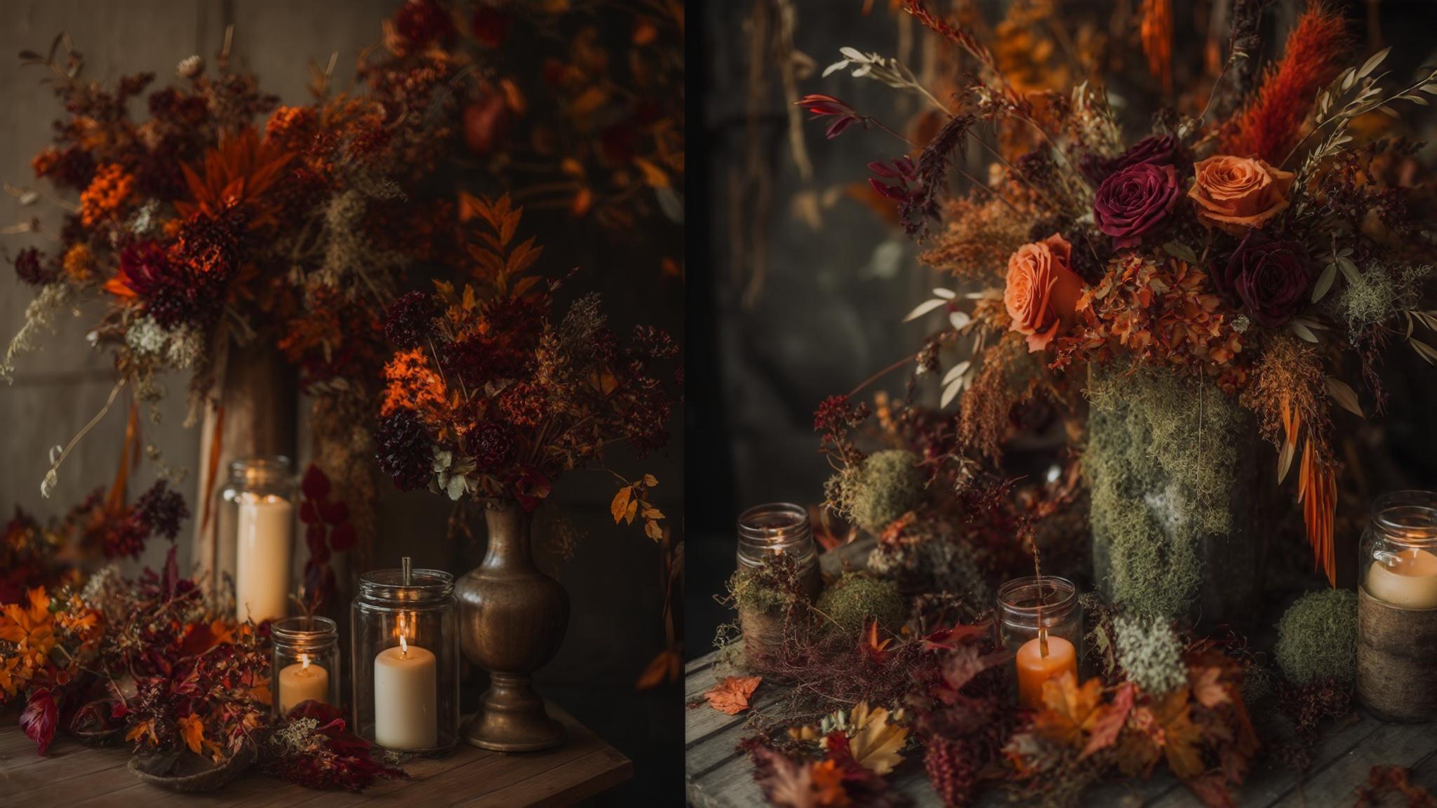
1. Burgundy & Gold
This rich, luxurious combination pairs the depth of burgundy with the warmth of gold for a truly regal autumn palette. The contrast creates visual interest while maintaining a cohesive fall feeling that photographs beautifully in both natural and artificial light.
Burgundy (a cool-toned deep red) contains blue undertones that complement the warm yellow undertones in gold, creating a balanced color harmony based on temperature contrast. This balance is why this combination has remained popular for fall weddings for decades – it simply works on a fundamental color theory level.
Gold metallics come in various undertones from rose gold to champagne to yellow gold, with each variation creating a slightly different effect when paired with burgundy. Champagne gold creates a softer look while yellow gold provides maximum contrast. I’ve found that rose gold with burgundy creates a particularly romantic variation on this classic fall wedding colors pairing.
A recent October wedding at a historic estate featured burgundy bridesmaid dresses in velvet with gold leaf accents in the bouquets. The reception tables showcased burgundy table runners with gold-rimmed chargers and candlesticks, while the wedding cake incorporated both colors with burgundy sugar flowers cascading over ivory fondant with gold painted details. The rich colors photographed beautifully against the venue’s stone walls and created a luxurious atmosphere that felt seasonally appropriate without being overtly “fall themed.”
2. Burnt Orange & Navy
This sophisticated pairing balances the warmth of burnt orange with the depth of navy blue. The contrast creates a striking visual impact while the navy grounds the brightness of the orange, resulting in a palette that feels both seasonal and timeless for autumn wedding colors.
This combination follows color theory principles of complementary colors, as orange and blue sit opposite on the color wheel. This opposition creates maximum visual impact while maintaining harmony. The muted quality of burnt orange (as opposed to bright orange) makes this combination sophisticated rather than sporty.
Navy fabric dyes and paints often contain undertones that can appear purple or green in certain lighting conditions, requiring careful selection to ensure true navy representation throughout your decor. I always recommend viewing fabric samples under various lighting conditions before making final decisions.
3. Forest Green & Copper
This earthy yet elegant combination evokes the feeling of woodland settings while incorporating a metallic element for sophistication. The deep green provides a natural backdrop while copper accents add warmth and visual interest.
Copper naturally develops a patina over time, changing from bright penny-like tones to deeper, more complex hues. This aging process can be accelerated or prevented depending on the finish desired for decor elements. Some couples embrace the changing nature of copper, seeing it as a beautiful metaphor for how relationships develop and deepen over time.
Forest green contains varying amounts of blue undertones, with some versions leaning toward emerald and others toward olive. These variations significantly affect how it pairs with copper’s orange-brown tones. The more blue in your forest green, the more contrast you’ll create with copper’s warmth.
If you’re interested in this earthy palette, you might want to explore 5 unique wedding photos to take on your wedding day that can beautifully showcase these natural tones in forest or outdoor settings.
4. Plum & Silver
This cooler-toned fall palette offers a sophisticated alternative to traditional autumn colors. The rich depth of plum creates a seasonal feel while silver adds brightness and elegance, making it particularly effective for evening ceremonies.
Plum contains both red and blue pigments in varying ratios, creating a complex fall wedding colors option that can appear more reddish or more bluish depending on lighting conditions and surrounding colors. This complexity makes it an interesting choice that can shift and change throughout your wedding day as lighting conditions evolve.
Silver metallics range from bright chrome-like finishes to antiqued pewter tones, with each variation creating a different effect. Brighter silvers create more contrast while antiqued finishes blend more harmoniously with plum. For October weddings, I often recommend a slightly antiqued silver that feels more seasonal than bright sterling.
5. Amber & Chocolate Brown
This warm, intimate combination captures the essence of falling leaves and creates a cozy atmosphere perfect for rustic venues. The amber provides a golden glow while chocolate brown grounds the palette with rich depth.
Amber is technically a translucent fossilized tree resin with a distinctive golden-orange color, but in design contexts refers to a range of yellow-orange hues that mimic this natural material. The warmth of amber fall wedding colors makes them particularly flattering in candlelight, creating a golden glow that enhances skin tones.
Chocolate brown contains varying amounts of red undertones, which can create either harmony or discord with amber depending on whether the amber leans more yellow or more orange. This subtle relationship means you need to be particularly careful when selecting specific shades to ensure they complement rather than clash.
Get your color analysis today >>
Modern & Unexpected Color Combinations
These contemporary pairings offer fresh takes on fall wedding colors by combining traditional autumn hues with unexpected partners. These palettes feel current and distinctive while still acknowledging the seasonal setting of an October wedding.
Modern color combinations often employ the 60-30-10 rule from interior design, where 60% is the dominant color, 30% is the secondary color, and 10% is an accent color that creates visual interest. This distribution creates balance while allowing for creative expression.
Contemporary fall wedding color palette choices frequently incorporate color psychology principles, using specific hues to evoke particular emotional responses from guests. For example, including touches of blue can create a sense of calm and tranquility, while yellow accents add energy and joy.
| Modern Color Combination | Best Venue Types | Seasonal Elements | Complementary Accent Color |
|---|---|---|---|
| Terracotta & Dusty Blue | Industrial, modern, outdoor | Dried grasses, succulents, copper details | Cream or sage green |
| Mustard Yellow & Charcoal Gray | Urban lofts, art galleries | Yellow dahlias, gray berries, wheat stalks | Ivory or navy blue |
| Cranberry & Sage | Garden venues, vineyards | Berries, eucalyptus, apples | Gold or cream |
| Pumpkin & Slate Blue | Converted barns, mountain lodges | Mini pumpkins, blue thistle, oak leaves | Copper or navy |
| Marigold & Eggplant | Ballrooms, tented receptions | Marigold flowers, dark grapes, plums | Gold or forest green |
6. Terracotta & Dusty Blue
This balanced combination pairs the warmth of terracotta with the coolness of dusty blue for a unique palette that feels both seasonal and fresh. The earthy quality of terracotta grounds the ethereal dusty blue, creating a harmonious balance that photographs beautifully.
Terracotta literally means “baked earth” and refers to the natural clay color that contains iron oxide, giving it its characteristic reddish-brown hue with orange undertones. This connection to earth makes it a perfect choice for fall wedding color schemes that want to reference the season subtly.
Dusty blue contains gray undertones that mute its intensity, creating a sophisticated color that changes dramatically under different lighting conditions—appearing more gray in shadow and more blue in direct light. This chameleon-like quality makes it particularly interesting for weddings that transition from day to evening.

7. Mustard Yellow & Charcoal Gray
This modern, sophisticated pairing combines the seasonal warmth of mustard yellow with the contemporary elegance of charcoal gray. The contrast creates visual interest while maintaining a cohesive look that works well across various wedding elements.
Mustard yellow derives its name from the spice and contains significant amounts of brown and orange undertones that distinguish it from brighter yellows, giving it depth and complexity. This depth makes it a sophisticated fall wedding colors choice that feels grown-up rather than childish or overly bright.
Charcoal gray sits between medium gray and black on the value scale, containing subtle blue undertones that create a cool counterpoint to mustard’s warmth. This temperature contrast is what makes this combination so visually interesting – they balance each other perfectly.
8. Cranberry & Sage
This softer alternative to traditional red and green creates a natural, garden-inspired look with seasonal appeal. The muted quality of both colors results in a harmonious palette that feels sophisticated rather than overly bright or festive.
Cranberry red contains blue undertones that distinguish it from warmer reds, creating a cooler, more sophisticated fall wedding colors option that pairs naturally with sage’s gray-green tones. The cooler temperature of cranberry makes it feel distinctly different from Christmas red, avoiding any holiday associations.
Sage green contains significant gray components that mute its intensity, with variations ranging from more gray to more green depending on the specific shade selected. This variability allows you to customize the exact feel of your palette – leaning more earthy or more garden-inspired depending on your preference.

9. Pumpkin & Slate Blue
This unexpected pairing combines distinctly autumnal pumpkin orange with cool slate blue for a contemporary twist on colors for a fall wedding. The slate blue tempers the brightness of the orange while maintaining a seasonal feel through the pumpkin tone.
Pumpkin orange contains more yellow undertones than other orange variations, creating a brighter, more vibrant hue that directly references the iconic fall gourd. This clear seasonal connection makes it perfect for couples who want to embrace autumn without being subtle about it.
Slate blue derives its name from the natural stone and contains significant gray components, creating a complex color that appears differently under various lighting conditions. This complexity adds sophistication to the brightness of pumpkin, creating a balanced palette that feels both fun and elegant.
10. Marigold & Eggplant
This bold, dramatic combination creates significant visual impact through the contrast between bright marigold yellow and deep eggplant purple. The intensity of both fall wedding colors makes this palette particularly effective for couples seeking a memorable, distinctive look.
Marigold yellow derives its name from the flower and contains orange undertones that distinguish it from cooler yellows, creating a warm, rich color that naturally complements fall settings. The vibrancy of marigold makes it particularly effective in smaller doses – perhaps in bouquets or table accents rather than large expanses.
Eggplant purple contains significant amounts of black, creating a deep, complex color that appears almost black in low light conditions while revealing its purple undertones in brighter settings. This depth makes it an excellent anchor color that can ground the brightness of marigold.
Get your color analysis today >>
Rustic Fall Wedding Colors
These earthy, natural palettes perfectly complement barn venues, outdoor settings, and celebrations with organic, handcrafted elements. These combinations evoke the natural world of autumn while maintaining a cohesive wedding aesthetic.
Rustic color palettes typically incorporate colors with lower saturation levels (more muted) that mimic naturally occurring pigments found in plant materials and earth. This connection to nature makes them feel authentic and grounded rather than trendy or artificial.
Natural dye processes historically used in rural communities relied on plant materials harvested in autumn, creating a traditional connection between these fall wedding colors and harvest celebrations. There’s something deeply satisfying about incorporating these historical color relationships into your modern celebration.

11. Rust & Cream
This soft, rustic combination creates a warm, inviting atmosphere perfect for barn or outdoor venues. The rich depth of rust provides seasonal color while cream softens the fall wedding color palette for a romantic, approachable feel.
Rust color derives its name from iron oxide and contains complex undertones of orange, brown, and red that create depth and variation even within a single shade. This complexity makes it more interesting than flat orange or brown, with subtle variations that catch the light differently throughout your celebration.
Cream contains yellow undertones that distinguish it from pure white, creating a softer, warmer neutral that complements rust’s warmth while providing necessary contrast. The softness of cream prevents the palette from feeling heavy or overwhelming, which can happen with darker neutrals like beige or tan.
12. Olive Green & Wheat
This natural, understated palette evokes harvest themes with its combination of olive green and wheat beige. The earthy quality of both fall wedding colors creates a cohesive look perfect for farm or vineyard weddings with organic elements.
Olive green contains significant yellow undertones that distinguish it from cooler greens, creating a natural connection to ripening fruits and vegetation in autumn. This yellow quality makes olive particularly harmonious with golden hour lighting, which enhances its warmth and depth.
Wheat color accurately mimics the natural beige-yellow of harvested grain, with variations ranging from more golden to more tan depending on the specific shade selected. This range allows you to customize the warmth of your palette while maintaining its natural, harvest-inspired feel.

13. Cinnamon & Beige
This warm, spice-inspired palette creates a subtle, sophisticated atmosphere with its combination of rich cinnamon and neutral beige. The warmth of both colors works beautifully with wooden elements and natural materials.
Cinnamon color derives from the spice and contains complex red-brown undertones that create depth and richness even in small quantities. This complexity makes it more interesting than flat brown, with subtle variations that add visual texture to your wedding elements.
Beige contains varying amounts of yellow, pink, or gray undertones that significantly affect how it pairs with cinnamon. Yellow-beige creates harmony while gray-beige creates more contrast. This subtle relationship allows you to fine-tune your fall wedding color schemes to achieve exactly the mood you’re seeking.
For couples considering this warm palette, our guide on 6 things to know before saying I do to a backyard wedding offers valuable insights on how to showcase these rustic fall wedding colors in an outdoor setting.
14. Hunter Green & Burnt Sienna
This rich, woodland-inspired combination creates depth and warmth through the pairing of deep hunter green with earthy burnt sienna. The natural quality of both colors makes this fall color scheme perfect for forest or mountain venues.
Hunter green contains significant amounts of blue undertones that create a deep, cool green distinct from more yellow-based forest greens. This coolness creates an interesting contrast with the warmth of burnt sienna, resulting in a balanced palette that feels sophisticated rather than simplistic.
Burnt sienna derives its name from the earth pigment used in traditional art and contains complex red-brown tones that create natural harmony with green through their complementary relationship. This traditional color pairing has roots in classical painting, giving it a timeless quality.
For their mountain lodge wedding last October, one couple embraced the hunter green and burnt sienna palette throughout their celebration. The groom and groomsmen wore hunter green velvet jackets with burnt sienna ties, while bridesmaids chose burnt sienna dresses with greenery-focused bouquets. Table settings featured hunter green napkins on wooden chargers with copper accents, and centerpieces incorporated pine branches, cinnamon sticks, and amber-colored glass vessels. The natural palette perfectly complemented the surrounding forest views visible through the venue’s large windows, creating a seamless transition between indoor and outdoor spaces.
15. Caramel & Cream
This soft, inviting combination creates a cozy atmosphere through the warmth of caramel paired with the lightness of cream. The subtle contrast works beautifully with wooden and natural elements for a refined rustic aesthetic.
Caramel color mimics the sugar-based confection and contains complex amber and brown tones that create depth and richness even in flat applications. This depth makes it more interesting than simple tan or brown, with a warmth that feels particularly appropriate for fall celebrations.
The warm undertones in both caramel and fall wedding colors create a harmonious palette based on temperature similarity rather than contrast, resulting in a subtle, sophisticated combination. This harmony makes it particularly easy to work with across various wedding elements, from attire to decor.
Elegant & Sophisticated Palettes
These luxurious color combinations elevate October weddings with rich, refined hues that create a sense of opulence. These fall wedding color palette options work particularly well for formal venues and evening celebrations where creating a distinctive atmosphere is paramount.
Sophisticated color palettes often incorporate jewel tones which historically signified luxury due to the expensive natural dyes required to produce them. This historical connection to wealth and status gives these colors an inherent formality that works beautifully for upscale celebrations.
Elegant combinations frequently employ color theory principles of analogous colors (those adjacent on the color wheel) or split complementary schemes for refined visual interest. These relationships create subtle harmony rather than stark contrast, resulting in sophisticated palettes that feel intentional rather than random.

Get your color analysis today >>
16. Merlot & Champagne
This luxurious, refined combination pairs the rich depth of merlot with the subtle shimmer of champagne for a romantic atmosphere. The contrast creates visual interest while maintaining an upscale, sophisticated feel perfect for formal venues.
Merlot derives its name from the wine grape and contains complex purple undertones that distinguish it from brighter reds, creating a sophisticated depth. This complexity makes it particularly beautiful in velvet or other textured fabrics that can showcase its rich variations. Have you considered how different fabrics might enhance your wedding colors november celebration?
Champagne contains subtle pink or gold undertones that create different effects. Pink-champagne creates a romantic feel while gold-champagne adds more luxury and warmth. This subtle variation allows you to customize the exact mood of your palette while maintaining its elegant character.
17. Emerald & Gold
This rich, opulent combination creates jewel-toned elegance through the pairing of deep emerald green with lustrous gold. The contrast creates a luxurious atmosphere perfect for ballroom or estate venues with formal elements.
Emerald green contains blue undertones that create its characteristic cool, jewel-like quality, distinguishing it from warmer forest or olive greens. This coolness gives it a regal quality that feels particularly appropriate for formal fall wedding colors.
Gold metallics can range from bright yellow-gold to deeper antique gold, with each variation creating a different effect. Brighter golds create more contrast while antique golds blend more harmoniously. For October weddings, I often recommend a slightly antiqued gold that feels seasonal while maintaining its luxurious character.
18. Aubergine & Blush
This sophisticated combination pairs deep aubergine purple with soft blush pink for a palette that balances depth and delicacy. The contrast creates visual interest while the muted quality of both colors maintains elegance and refinement.
Aubergine derives its name from the eggplant vegetable and contains complex blue-red undertones that create depth and sophistication. This complexity makes it a more interesting choice than simple purple, with subtle variations that add richness to november wedding colors.
Blush pink contains varying amounts of beige or peach undertones that significantly affect how it pairs with aubergine. Beige-blush creates a more neutral look while peach-blush adds warmth. This relationship allows you to fine-tune the temperature of your palette while maintaining its elegant character.
19. Midnight Blue & Bronze
This dramatic, elegant combination creates a starry night atmosphere through the pairing of deep midnight blue with warm bronze. The contrast creates visual interest while maintaining a sophisticated, formal feel perfect for evening ceremonies.
Midnight blue contains black undertones that create its characteristic depth, appearing almost black in low light while revealing its blue quality in brighter settings. This chameleon-like quality makes it particularly effective for evening celebrations that transition from twilight to full darkness.
Bronze metallics contain copper and tin components that create a warmer, more complex finish than pure copper or gold, with variations ranging from reddish to more golden depending on the specific alloy. This complexity adds sophistication to your fall wedding color scheme, creating depth that flat colors can’t achieve.
If you’re drawn to this elegant palette, you might find inspiration in our article on wedding etiquette tips to ensure your formal celebration maintains the same level of sophistication as your color scheme.
20. Garnet & Antique Gold
This vintage-inspired combination pairs rich garnet red with warm antique gold for a timeless, elegant palette. The depth of both colors creates a luxurious atmosphere while their warm undertones maintain cohesion and harmony.
Garnet derives its name from the gemstone and contains complex undertones that can lean more toward ruby-red or more toward burgundy depending on the specific shade. This range allows you to customize the exact character of your september wedding colors while maintaining their jewel-toned quality.
Antique gold contains brown undertones that distinguish it from brighter yellow-gold, creating a more subtle, sophisticated metallic that pairs harmoniously with garnet’s depth. This aged quality gives the palette a timeless feel that won’t look dated in photos years from now.
Soft & Romantic October Palettes
These gentle, ethereal combinations offer alternatives to traditional bold fall colors. These fall wedding color palette options create a romantic, dreamy atmosphere while still acknowledging the seasonal setting through subtle warmth or depth in selected hues.
Romantic color palettes typically employ high value (lighter) colors with low saturation (more muted) to create an ethereal, dreamy quality. This approach creates a softer interpretation of fall that feels seasonal without being overly bold or dramatic.
Soft combinations often utilize the color theory principle of monochromatic or analogous schemes with minimal contrast to create harmony and cohesion. This subtle approach creates sophisticated palettes that feel intentional and refined rather than random or haphazard.
| Soft Palette | Seasonal Connection | Best Floral Options | Lighting Considerations |
|---|---|---|---|
| Dusty Rose & Taupe | Muted version of fall red | Garden roses, astilbe, scabiosa | Enhances warmth under sunset/candlelight |
| Lavender & Warm Gray | Unexpected fall twist | Lavender, dusty miller, silver brunia | Photographs beautifully in afternoon light |
| Peach & Ivory | Softer version of orange | Ranunculus, garden roses, dahlias | May appear more yellow under warm lighting |
| Periwinkle & Camel | Cool/warm balance | Delphinium, thistle, wheat | Maintains distinction in both natural and artificial light |
| Blush & Mahogany | Soft contrast with depth | Quicksand roses, chocolate cosmos | Depth varies dramatically between day and evening lighting |
21. Dusty Rose & Taupe
This soft, romantic combination creates an elegant, feminine atmosphere through the pairing of muted dusty rose with neutral taupe. The subtle contrast maintains sophistication while the muted quality of both fall wedding colors creates a refined, timeless feel.
Dusty rose contains gray undertones that mute its intensity, creating a sophisticated color that bridges the gap between pink and mauve. This complexity makes it more interesting than simple pink, with a depth that feels appropriate for fall while maintaining its romantic character.
Taupe contains complex undertones that can lean more gray, more brown, or more purple, significantly affecting how it pairs with dusty rose. Gray-taupe creates more contrast while brown-taupe creates more harmony. This relationship allows you to fine-tune the exact mood of your palette while maintaining its soft, sophisticated character.

Get your color analysis today >>
22. Lavender & Warm Gray
This unexpected combination for fall creates a soft, sophisticated atmosphere through the pairing of gentle lavender with neutral warm gray. The subtle contrast maintains elegance while creating a distinctive palette that works beautifully for transitional weather.
Lavender contains varying amounts of blue or pink undertones that significantly affect its character. Blue-lavender creates a cooler feel while pink-lavender adds warmth. This variation allows you to customize the exact mood of your fall wedding colors while maintaining their soft, romantic quality.
Warm gray contains beige or taupe undertones that distinguish it from cooler grays, creating a neutral that harmonizes with lavender’s softness while adding sophistication. This warmth prevents the palette from feeling too cool or wintery, maintaining a connection to fall despite its unconventional color choice.
23. Peach & Ivory
This soft, romantic combination creates a gentle warmth through the pairing of subtle peach with creamy ivory. The lightness of both colors creates an airy, delicate feel while the warmth of peach maintains a connection to the fall season.
Peach contains varying amounts of pink or orange undertones that significantly affect its character. Pink-peach creates a more romantic feel while orange-peach adds more warmth and seasonal connection. This range allows you to customize the exact mood of your palette while maintaining its soft, delicate quality.
Ivory contains yellow undertones that distinguish it from pure white, creating a softer, warmer neutral that complements peach’s warmth while providing necessary contrast. This warmth prevents the palette from feeling too stark or summery, maintaining a subtle connection to fall’s golden quality.

24. Periwinkle & Camel
This unique, sophisticated combination balances cool periwinkle blue with warm camel tan for a distinctive palette that feels both fresh and seasonal. The contrast creates visual interest while maintaining an elegant, refined quality.
Periwinkle contains both blue and purple pigments in varying ratios, creating a complex color that bridges the gap between these two color families. This complexity makes it more interesting than simple blue, with subtle variations that add depth to your fall wedding colors.
Camel derives its name from the animal’s coat and contains yellow undertones that create its characteristic warm tan color, distinct from cooler browns or more orange-toned tans. This warmth grounds the coolness of periwinkle, creating a balanced palette that acknowledges the season while maintaining a fresh, unexpected quality.
25. Blush & Mahogany
This combination pairs soft blush pink with rich mahogany brown for a palette that balances delicacy with depth. The contrast creates visual interest while the warmth of mahogany grounds the lightness of blush for a seasonally appropriate feel.
Blush contains varying amounts of beige undertones that mute its intensity, creating a sophisticated pink that appears differently under various lighting conditions. This subtlety makes it more versatile than brighter pinks, with a refined quality that works beautifully for formal fall wedding colors.
Mahogany derives its name from the wood and contains red undertones that distinguish it from cooler browns, creating a warm, rich neutral that complements blush’s softness while adding seasonal depth. This warmth creates a connection to fall without relying on obvious autumn colors.
A recent October wedding at a historic mansion utilized the blush and mahogany palette to create a sophisticated atmosphere that balanced romantic softness with seasonal depth. The bride carried a bouquet of blush garden roses, quicksand roses, and cafe au lait dahlias with mahogany-toned foliage and ribbon. Bridesmaids wore blush dresses while groomsmen incorporated mahogany ties with subtle blush pocket squares. Reception tables featured mahogany chargers with blush napkins and centerpieces that transitioned from lighter to darker tones. The wedding cake presented as predominantly blush with mahogany accents in the form of chocolate drips and fresh figs. This palette created a romantic atmosphere that felt seasonally appropriate without relying on traditional fall colors.
How Bridesmaid for Hire Can Help With Your Color Selection
Choosing the perfect October wedding colors involves numerous decisions and considerations that can quickly become overwhelming. Bridesmaid for Hire offers professional support throughout this process, providing expert guidance on color selection based on your venue, style preferences, and practical considerations that friends and family might overlook.
Professional wedding assistants have experience with seasonal color trends across multiple years, providing perspective on which combinations maintain timeless appeal versus those that may appear dated in photos. This historical perspective is invaluable when making decisions that will be preserved in your wedding album for decades to come.
Color consultation services include physical swatch coordination across vendors to ensure consistent interpretation of your fall wedding color palette, preventing mismatches between digital and printed materials. I’ve seen too many couples disappointed when their “burgundy” appears as purple in their flowers but brown in their linens because they didn’t have professional help coordinating across vendors.

Expert Color Consultation
Bridesmaid for Hire professionals bring extensive experience with seasonal wedding colors and can provide unbiased advice on which palettes will work best for your specific venue, time of day, and personal style. This objective perspective helps you navigate the overwhelming number of options to find the perfect combination.
Professional color consultants understand color theory principles including complementary, analogous, and triadic relationships that create different visual effects and emotional responses. This technical knowledge helps create intentional palettes that achieve specific moods rather than random combinations that might clash or feel disjointed.
Expert color selection includes consideration of how colors will photograph under various lighting conditions specific to your venue and time of day, preventing unexpected results in final images. We’ve all seen wedding photos where colors look completely different than intended – professional guidance helps avoid these disappointing surprises.
Our team has helped countless couples select their perfect fall color palette. Learn more about what makes our service unique in the difference between a wedding planner and professional bridesmaid to understand how we can support your color selection process.
Get your color analysis today >>
Vendor Coordination
Ensuring your color palette is consistently implemented across all wedding elements requires careful coordination with multiple vendors. Bridesmaid for Hire can attend consultations, share accurate color information, and verify samples to maintain a cohesive look throughout your celebration.
Professional coordinators maintain organized systems for tracking exact color specifications across vendors, including Pantone codes, RGB values, and physical swatches to ensure consistency. This systematic approach prevents the “telephone game” effect where your original color concept gradually shifts as it passes from vendor to vendor.
Vendor management includes timeline coordination for color-critical elements like floral selections that depend on seasonal availability and may require advance booking for specific fall wedding colors. This foresight prevents last-minute disappointments when your heart is set on specific blooms that might be unavailable without proper planning.

Final Thoughts
Your October wedding colors set the tone for your entire celebration, creating a visual foundation that ties together all elements of your special day. Whether you choose rich jewel tones that embrace the depth of fall or unexpected combinations that create a unique atmosphere, selecting colors that resonate with your personal style while acknowledging the season will create a cohesive, memorable experience for you and your guests. Remember that while trends come and go, the colors that make you feel most connected to your vision are always the right choice.
Color psychology research indicates that guests retain stronger emotional memories of events when color schemes create cohesive sensory experiences that align with the event’s emotional tone. This means your carefully selected fall wedding colors actually contribute to how vividly your guests will remember your celebration years later.
Professional photography studies show that carefully selected color palettes can increase satisfaction with wedding photos by up to 40% when colors are chosen with consideration for how they’ll appear in different lighting conditions. This significant impact makes color selection one of the most important decisions in your wedding planning process.
Practical Implementation
Bringing your October wedding colors to life requires thoughtful application across various elements of your celebration. From attire and decor to stationery and floral arrangements, consistent implementation creates a cohesive experience while allowing for creative expression in each area.
Color distribution typically follows the 60-30-10 rule in wedding design, with primary colors covering approximately 60% of visible elements, secondary colors 30%, and accent colors providing the remaining 10% for visual interest. This balanced approach prevents any single color from overwhelming your design while ensuring visual cohesion.
Material textures significantly impact color perception—the same hue appears differently on velvet versus satin versus paper, requiring adjustments in shade selection for consistent visual effect. I always recommend viewing color samples on materials similar to their final application rather than just looking at paint chips or digital swatches.
For more inspiration on implementing your color scheme throughout your wedding, check out our article on ways to personalize your wedding with meaningful details that reflect your chosen fall wedding colors.
Budget Considerations
Your color palette can significantly impact your wedding budget. Certain hues require specialty dyes or out-of-season flowers that increase costs, while others naturally align with October availability. Strategic color selection helps maximize visual impact while maintaining financial boundaries.
Specialty colored items often carry price premiums of 15-30% over standard options, particularly in linens, specialty papers, and custom-dyed fabrics. Being aware of these potential upcharges helps you allocate your budget more effectively, perhaps splurging on key elements while choosing standard options for less visible items.
Seasonal availability creates price fluctuations—October-blooming flowers in seasonal colors typically cost 20-40% less than imported or greenhouse varieties in non-seasonal hues. This significant difference makes seasonally appropriate fall wedding colors not just aesthetically pleasing but financially savvy as well.
How Bridesmaid for Hire Can Support Your October Wedding Vision
Planning an October wedding involves countless decisions beyond just selecting colors. Bridesmaid for Hire provides comprehensive support throughout your planning journey, offering professional assistance with everything from vendor coordination to day-of management, ensuring your autumn celebration unfolds exactly as you’ve envisioned.
Professional wedding assistants provide approximately 80-120 hours of support for the average wedding, handling tasks that would otherwise fall to friends, family, or the couple themselves. This significant time investment allows you to enjoy your engagement period rather than drowning in logistics and details.
Wedding day coordination prevents approximately 90% of common ceremony and reception issues through proactive planning and on-site management. This preventative approach means you and your loved ones can fully immerse yourselves in the celebration rather than troubleshooting problems.
Stress Reduction Through Professional Support
Wedding planning stress can diminish your enjoyment of this special time. Bridesmaid for Hire professionals take on the logistical burden, handling details and coordination so you can focus on the meaningful aspects of your celebration while still achieving your perfect October wedding vision.
Studies indicate wedding planning ranks among the top five life stressors, with 71% of couples reporting significant stress during the process. This statistic isn’t surprising given the emotional, financial, and logistical complexity involved in planning a major celebration while maintaining your normal life responsibilities.
Professional support reduces reported stress levels by approximately 60% by providing clear timelines, managing vendor communications, and preventing last-minute complications. This dramatic reduction allows you to actually enjoy your engagement period rather than just surviving it.
Ready to Create Your Perfect October Wedding?
Your autumn celebration deserves thoughtful planning and expert support. Bridesmaid for Hire offers customized packages designed specifically for October weddings, with services ranging from color consultation to comprehensive planning. Contact us today to discuss how we can help bring your fall wedding vision to life.
Initial consultations include a comprehensive assessment of 15-20 key planning areas to identify specific support needs based on your unique wedding vision. This personalized approach ensures you receive exactly the help you need rather than a one-size-fits-all package.
Service packages can be customized to provide targeted assistance with specific aspects of planning or comprehensive support throughout the entire process. This flexibility allows you to supplement your own planning efforts with professional expertise exactly where you need it most.
Related posts:


1-800-BRIDESMAID
The Newlywed
Card Game
something extra to love
Read the weekly newsletter from Bridesmaid for Hire, 1-800-Bridesmaid, to hear about real stories, from strangers, who need advice on love, life, friendship, and so much more.
Looking for the perfect wedding gift for someone you adore? Grab The Newlywed Card Game. It's a fun and interactive game they can play on their honeymoon or future date nights.

