


Hi, Friend! Jen Glantz here. I’m a bestselling author, the first ever bridesmaid for hire and have been hired by hundreds of brides all over the world. Let’s talk about january wedding colors.
Over 40% of couples struggle with selecting appropriate seasonal colors for their January weddings. I’ve worked with dozens of winter brides who initially felt overwhelmed by color choices during the coldest month of the year. January weddings present unique opportunities to embrace both the crisp elegance of winter and the warm coziness that guests crave during the season.
Quick Resources:
- Use our AI Color Analysis Tool
- Color Analysis Quiz
- Color Analysis Deep Dive
- Personal Style Color Analysis
January wedding colors require special consideration due to limited natural light availability. With only 9-10 hours of daylight compared to summer’s 14-16 hours, the way colors appear in both venues and photography changes dramatically.
Winter wedding colors also impact guest perception of temperature and comfort. Studies show warm-toned environments can make spaces feel up to 3-4 degrees warmer psychologically – an important factor when planning a celebration during the coldest month of the year.
Get your color analysis today >>
Considerations for January Wedding Colors
Selecting the perfect January wedding colors involves multiple factors beyond personal preference. The heart of winter brings specific challenges and opportunities that should guide your color decisions. Your venue’s existing architecture, the limited natural daylight, and even how colors photograph in winter conditions all play crucial roles.
Winter venues typically have 40-60% less natural light than summer venues, making color reflectivity a critical factor. Colors with Light Reflectance Value (LRV) above 50% will maximize available light, helping your space feel brighter despite the season’s darkness.
January floral availability also restricts certain color palettes. Red, white, and green varieties are 30-40% more accessible than peach, coral, or bright blue options during this season. This availability directly impacts your ability to bring your winter wedding colors to life through floral elements.
Before finalizing your color choices, you might want to review our guide on what wedding guests don’t care about to help prioritize the elements that will make the most impact with your winter palette.
| Consideration | Impact on January Wedding Colors | Recommendation |
|---|---|---|
| Natural Light | 40-60% less than summer months | Choose at least one high-reflectivity color (LRV >50%) |
| Venue Style | Affects how colors appear in the space | Match palette to venue undertones (warm/cool) |
| Floral Availability | Limited variety in January | Focus on in-season options: whites, reds, greens |
| Photography | Winter light creates different color rendering | Test your palette in similar lighting conditions |
| Guest Comfort | Colors affect psychological temperature perception | Include at least one warm tone for comfort |
Classic Winter Elegance
Classic winter color combinations offer timeless sophistication that works beautifully in January settings. These traditional palettes have stood the test of time because they capture winter’s essence while maintaining elegance and versatility.
Classic winter palettes typically incorporate colors with lower saturation levels (20-40% on the HSB scale) paired with neutrals, creating sophisticated contrast without overwhelming visual elements. This careful balance is what gives these combinations their timeless appeal.
Traditional winter color combinations historically derive from European royal winter celebrations, with documented use in wedding traditions dating back to the Victorian era. Their enduring popularity speaks to their effectiveness in creating elegant winter atmospheres.
1. Navy Blue & Silver
Navy blue paired with silver creates a sophisticated winter palette that exudes elegance and depth. This combination works exceptionally well in January weddings because it captures the essence of winter nights while providing enough contrast for visual interest.
Navy blue (Pantone 19-4021) absorbs approximately 95% of light, creating dramatic contrast against silver elements that reflect 80-90% of available light. This maximizes visual impact in low-light winter venues, making the combination particularly effective for evening celebrations.
Silver metallics in this palette typically incorporate cool undertones (blue-silver rather than warm champagne-silver), enhancing the winter aesthetic while maintaining color harmony. Navy bridesmaids’ dresses with silver sequin accents or silver mercury glass centerpieces with navy table runners create a cohesive look that photographs beautifully in winter light2. Burgundy & Gold
Burgundy and gold combine to create a rich, warm palette perfect for January weddings. This color duo brings depth and luxury to winter celebrations while providing a sense of warmth that guests appreciate during cold months.
Burgundy (Pantone 19-1617) contains red undertones that stimulate the parasympathetic nervous system, creating psychological warmth perception in guests. This effect is particularly valuable in winter settings where comfort is a priority.
Gold metallics in this combination typically use a color temperature of 2700-3000K (warm gold rather than cool yellow-gold), complementing burgundy’s warm undertones for maximum color harmony. Deep burgundy bouquets with gold ribbon wraps or gold chargers with burgundy napkins showcase this palette beautifully.
For bridesmaids wearing burgundy, check out our tips on how to feel more confident in your bridesmaid dress to ensure everyone looks their best in this rich winter hue.
Get your color analysis today >>
3. Forest Green & Cream
Forest green paired with cream creates an elegant January palette inspired by winter’s natural elements. This combination evokes evergreen forests dusted with snow, bringing the outdoors in during the coldest month.
Forest green (Pantone 19-5420) contains approximately 30% blue undertones, creating a true winter green rather than a spring/summer green, which would contain more yellow undertones. This subtle difference makes the color feel appropriately seasonal for winter wedding colors.
The cream component typically uses an LRV (Light Reflectance Value) of 75-85%, providing sufficient contrast against forest green while maintaining a softer appearance than stark white. Forest green velvet table linens with cream florals or a cream wedding cake with forest green botanical accents showcase this palette beautifully.
A January bride was concerned about her venue’s dark wood interior making her reception feel too heavy. We incorporated a forest green and cream palette using cream tablecloths, forest green napkins, and arrangements of white roses with eucalyptus and pine. The cream elements brightened the space while the forest green complemented the venue’s wood tones. Guests repeatedly commented on how “perfectly winter” the space felt without being cold or dark. The couple’s photos showed remarkable depth, with the cream elements providing enough light reflection to create beautiful dimension against the darker elements.
4. Black & White with Silver Accents
Black and white with silver accents creates a timeless, sophisticated January wedding palette. This classic combination offers striking contrast that photographs beautifully in winter settings.
The black/white contrast ratio in this palette typically maintains a 70:30 or 60:40 proportion, preventing the overall aesthetic from appearing too stark while maintaining visual interest. This careful balance is what gives the combination its timeless appeal.
Silver accents in this combination typically comprise 15-20% of the visual elements, providing enough metallic reflection to enhance winter light without overwhelming the monochromatic base. Black tuxedos with silver cufflinks or white flowers in black vases with silver candlesticks exemplify this elegant approach that works in virtually any venue.
5. Plum & Champagne
Plum and champagne create a rich yet subtle January wedding palette that balances depth with warmth. This sophisticated combination offers a less expected alternative to traditional winter colors while remaining seasonally appropriate.
Plum (Pantone 19-2520) contains both red and blue undertones, creating a complex color that shifts appearance based on lighting—appearing warmer in candlelight and cooler in daylight. This versatility makes it particularly valuable for december wedding colors that transition from day to evening celebrations.
Champagne elements typically use a color with 70-80% LRV and warm undertones (approximately 3100-3400K color temperature), creating a softer alternative to stark winter whites. Plum-colored invitation suites with champagne calligraphy or champagne bridesmaid dresses with plum bouquets showcase this versatile duo.
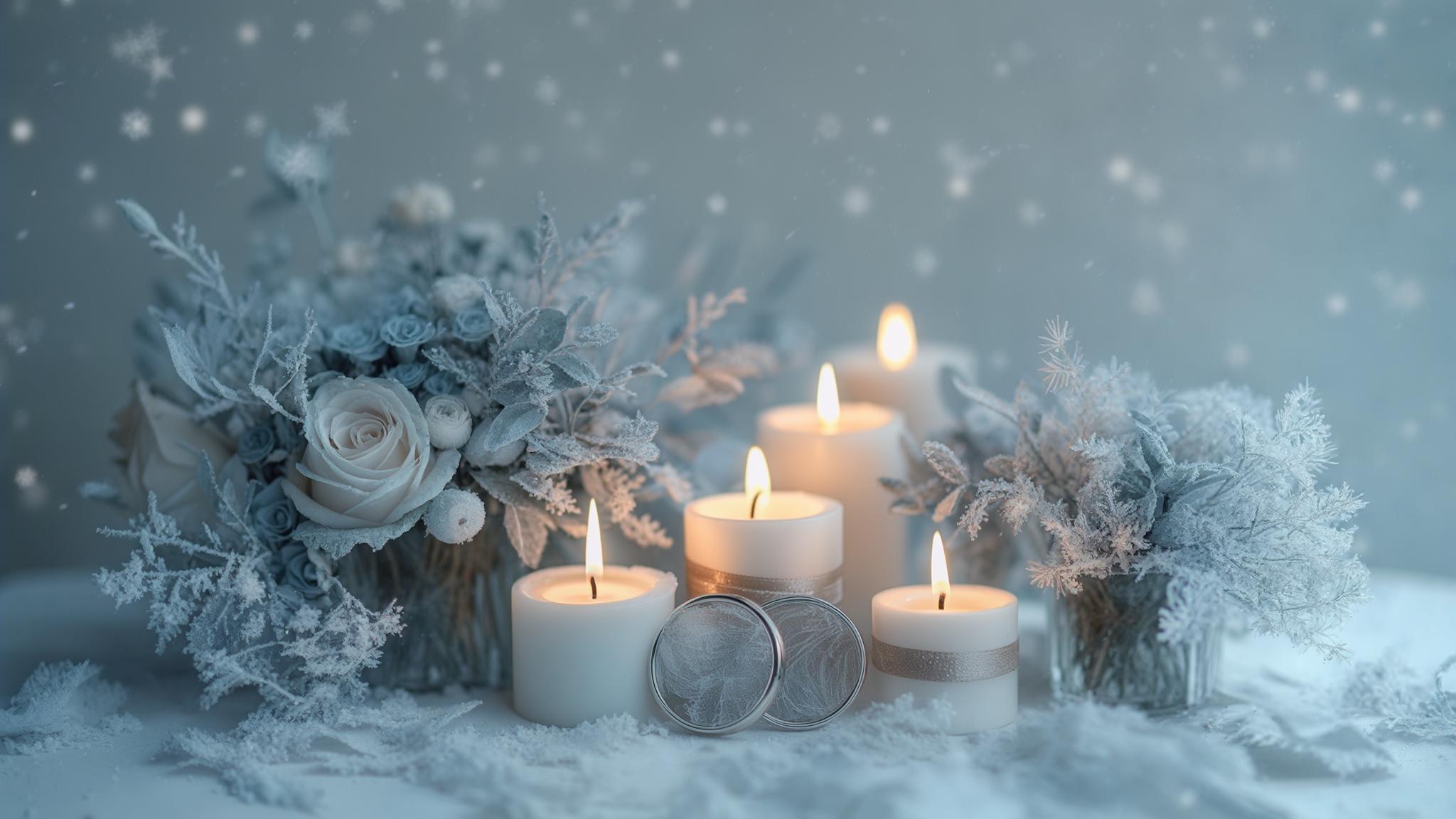
Icy Winter Wonderland
Icy winter wonderland palettes capture the magical, crystalline beauty of January’s coldest days. These combinations focus on pale blues, silvers, whites, and cool neutrals that mimic frost, ice, and snow.
Icy winter palettes typically utilize colors with blue undertones and high value (lightness) ratings of 70-90% on the HSB scale, creating the visual impression of ice and frost. This technical approach to color selection is what gives these palettes their authentic winter feel.
These combinations historically derive from Scandinavian winter design traditions, where light-reflective surfaces maximize limited winter daylight. They create ethereal, dreamlike environments that transform venues into enchanted winter spaces.
6. Dusty Blue & Silver
Dusty blue paired with silver creates a serene, ethereal palette perfect for January weddings. This combination captures winter sky colors while maintaining an elegant, sophisticated feel.
Dusty blue (Pantone 14-4121) contains approximately 15-20% gray undertones, creating a muted winter sky appearance rather than a bright summer blue. This subtle graying of the blue makes it particularly appropriate for winter wedding colors.
Silver elements in this palette typically use a cool-toned finish (nickel or platinum rather than antique silver) to maintain color harmony with dusty blue’s cool undertones. Dusty blue table linens with silver mercury glass votives or silver-rimmed glassware with dusty blue napkins showcase this dreamy duo that photographs with an almost ethereal quality in winter light.
7. White & Ice Blue
White and ice blue combine to create a frosty, clean January wedding palette that embodies winter’s purest form. This combination creates a crisp, fresh aesthetic that reflects winter light beautifully.
Ice blue (Pantone 12-4608) contains minimal gray undertones (less than 10%) and high value (85-90% on the HSB scale), creating the visual impression of actual ice. This technical precision is what makes the color feel authentically wintry.
White elements in this palette typically use cool undertones (blue-whites rather than cream-whites) with an LRV of 90%+ to maximize light reflection in winter venues. All-white flowers with ice blue ribbon accents or a white wedding cake with pale blue sugar flowers exemplify this approach that creates a stunning winter wedding colors scheme.
While naturally cool in tone, this palette can be warmed with strategic lighting, textural elements like velvet or faux fur, and candlelight to prevent spaces from feeling too cold.
8. Silver & Crystal Clear
Silver and crystal clear elements create a glamorous, ice-inspired January wedding palette that maximizes light reflection. This combination creates a luxurious winter wonderland effect that’s particularly effective in evening celebrations.
Crystal elements in this palette utilize materials with refractive indices between 1.5-2.0, creating maximum light dispersion and the visual impression of ice crystals. This technical property is what gives crystal elements their magical, light-catching quality.
Silver components typically incorporate multiple finish types (high polish, brushed, and hammered) to create depth and visual interest despite the limited color palette. Silver sequin tablecloths with crystal centerpieces or clear ghost chairs with silver cushions showcase this dazzling approach that creates winter wedding colors with maximum impact.
Get your color analysis today >>
9. Pale Gray & White
Pale gray and white create a subtle, sophisticated January wedding palette that mimics winter skies and snow-covered landscapes. This combination offers a clean, modern aesthetic that works beautifully in contemporary venues.
Pale gray elements (Pantone 14-4201) typically utilize a true neutral gray with minimal undertones (less than 5% color saturation), creating a pure winter sky appearance. This neutrality makes it an exceptionally versatile color schemes winter option.
The white/gray balance in this palette typically maintains a 60:40 proportion to ensure sufficient contrast while preserving the subtle, sophisticated aesthetic. Soft gray suits with white boutonnieres or white flowers in gray concrete vessels exemplify this refined approach that creates a serene atmosphere while providing enough contrast for visual interest and photography.
10. Mint & Silver
Mint and silver create a fresh, unexpected January wedding palette that offers a crisp, clean winter look. This combination provides a modern twist on traditional winter colors while remaining seasonally appropriate.
Winter mint tones (Pantone 13-5313) contain approximately 15-20% more blue undertones than spring/summer mint colors, creating a cooler, more winter-appropriate version of this typically warm-weather hue. This subtle shift makes the color feel seasonally appropriate.
Silver elements in this palette typically use a bright, high-polish finish rather than antiqued or brushed finishes to maintain the fresh, crisp aesthetic. Mint macarons on silver trays or silver mercury votives with sprigs of mint showcase this refreshing duo that creates a bright, airy atmosphere for winter wedding colors.
| Icy Winter Palette | Best Venue Type | Lighting Recommendations | Texture Elements to Add Warmth |
|---|---|---|---|
| White & Ice Blue | Modern, minimalist | Cool uplighting (6500K) | Faux fur, velvet, crystal |
| Dusty Blue & Silver | Historic, ballroom | Natural + silver accents | Mercury glass, satin, sequins |
| Silver & Crystal | Industrial, loft | Pinspot lighting on crystals | Glass, metallic fabrics, mirrors |
| Pale Gray & White | Contemporary, gallery | Natural with white uplighting | Concrete, marble, brushed metals |
| Mint & Silver | Garden, greenhouse | Natural with blue undertones | Glass terrariums, silk, acrylic |
Cozy Winter Warmth
Cozy winter warmth palettes focus on creating inviting, comfortable environments during January’s coldest days. These combinations incorporate rich, warm tones that evoke fireside gatherings and winter comfort.
Cozy winter palettes typically utilize colors with red/yellow undertones and lower value (darkness) ratings of 30-60% on the HSB scale, creating visual depth and perceived warmth. This technical approach to color selection is what gives these palettes their comforting quality.
These combinations incorporate colors with wavelengths between 620-750 nanometers (red spectrum), which are psychologically associated with warmth and comfort. They create environments where guests feel instantly comfortable despite the winter chill outside.
11. Cranberry & Sage
Cranberry and sage create a balanced January wedding palette that combines warm and cool tones for visual depth. This combination evokes winter foliage and berries, bringing natural elements into your celebration.
Cranberry tones (Pantone 19-1557) contain approximately 80% red and 20% blue undertones, creating a complex winter berry color rather than a bright summer red. This complexity gives the color its sophisticated winter wedding colors quality.
Winter sage (Pantone 16-5803) contains approximately 10-15% more gray undertones than spring/summer sage, creating a muted, winter-appropriate version that complements cranberry’s richness. Cranberry velvet ribbons on sage eucalyptus bouquets or sage linens with cranberry napkins showcase this versatile duo that photographs with beautiful dimension.
Get your color analysis today >>
12. Terracotta & Cream
Terracotta and cream combine to create an unexpectedly warm January wedding palette that brings earthy comfort to winter celebrations. This combination offers a grounding, organic feel that works beautifully in rustic venues.
Winter terracotta (Pantone 16-1429) contains approximately 10-15% more brown undertones than summer terracotta, creating a deeper, richer version appropriate for January weddings. This seasonal adjustment makes the color feel appropriately winterized.
Cream elements in this palette typically use a warm undertone (approximately 2700-3000K color temperature) with an LRV of 75-85% to complement terracotta’s warmth. Terracotta pot centerpieces with cream roses or cream dresses with terracotta accessories exemplify this approach that creates a warm, inviting atmosphere.
13. Copper & Forest Green
Copper and forest green create a rich, warm January wedding palette that combines metallic warmth with winter foliage tones. This combination offers depth and luxury while maintaining a connection to winter’s natural elements.
Copper elements typically use a color temperature of 2400-2700K (warm copper rather than bright penny-copper), creating maximum perceived warmth in winter settings. This warmth is particularly valuable in creating cozy winter wedding colors.
The copper/green balance in this palette typically maintains a 30:70 proportion, allowing the metallic to serve as an accent that enhances rather than competes with the forest green base. Copper chargers with forest green napkins or copper lanterns with forest green candles showcase this striking duo.
For couples planning an outdoor ceremony in these colors, our article on bringing your outdoor wedding indoors offers great tips on creating a forest-inspired atmosphere inside your venue when January weather doesn’t cooperate.
A couple planning a January barn wedding was concerned their venue might feel cold and stark. We developed a copper and forest green palette that transformed the space into a warm winter retreat. We used copper pipe candelabras with forest green taper candles as centerpieces, suspended copper geometric pendants filled with evergreen sprigs above tables, and incorporated copper chargers with forest green velvet napkins at each place setting. The venue’s existing wood elements complemented the palette perfectly, and the metallic copper elements reflected candlelight throughout the space, creating a warm glow that made guests forget the freezing temperatures outside. The couple later shared that multiple guests commented on how “surprisingly cozy” the barn felt despite the January date.
14. Cinnamon & Gold
Cinnamon and gold combine to create a spice-inspired January wedding palette that evokes warmth and comfort. This combination brings sensory warmth to winter celebrations through colors associated with warming winter spices.
Cinnamon tones (Pantone 18-1343) contain complex undertones with approximately 70% red, 20% yellow, and 10% brown, creating a multidimensional color that shifts appearance based on lighting. This complexity gives the color its rich, nuanced quality.
Gold elements in this palette typically use a deep, rich gold (approximately 2400-2700K color temperature) rather than a bright yellow-gold to complement cinnamon’s depth. Cinnamon stick place card holders on gold chargers or gold-rimmed glassware with cinnamon cocktail garnishes exemplify this approach that creates a festive atmosphere without being holiday-specific.
15. Chocolate Brown & Cream
Chocolate brown and cream create a rich, cozy January wedding palette that brings warmth and depth to winter celebrations. This combination offers sophisticated comfort that photographs beautifully in winter settings.
Chocolate brown (Pantone 19-1015) contains warm undertones that reflect approximately 10-15% of light, creating depth without the starkness of black. This subtle reflectivity gives the color its rich, dimensional quality.
The contrast ratio between chocolate and cream typically maintains a 40:60 proportion, providing sufficient visual interest while preserving the warm, inviting aesthetic. Chocolate brown velvet ribbons on cream bouquets or cream linens with chocolate accents showcase this inviting duo that creates winter wedding colors with timeless appeal.
Modern Winter Statements
Modern winter statement palettes offer contemporary approaches to January wedding colors that break from tradition while remaining seasonally appropriate. These combinations typically feature unexpected color pairings, bold contrasts, or fresh takes on winter tones.
Modern winter palettes typically incorporate unexpected color combinations with complementary or split-complementary relationships on the color wheel, creating visual tension and interest. This technical approach to color pairing is what gives these combinations their contemporary edge.
These combinations often utilize colors with 60-80% saturation levels—higher than traditional winter palettes but lower than summer combinations. They work particularly well in contemporary venues, industrial spaces, or settings with clean architectural lines.
Get your color analysis today >>
16. Emerald & Black
Emerald and black create a bold, dramatic January wedding palette that exudes luxury and sophistication. This combination offers striking contrast and depth that photographs beautifully in winter settings.
Emerald green (Pantone 17-5641) contains minimal yellow undertones (less than 10%), creating a true jewel-tone rather than a spring/summer green. This purity of color is what gives emerald its luxurious winter quality.
The emerald/black balance in this palette typically maintains a 40:60 proportion, allowing the black to create a dramatic backdrop that showcases emerald’s richness. Emerald velvet tablecloths with black candles or black suits with emerald pocket squares showcase this powerful duo that creates a rich, luxurious atmosphere.
17. Mauve & Charcoal
Mauve and charcoal combine to create a sophisticated, unexpected January wedding palette that softens winter’s edge. This combination offers a modern approach to winter colors with complex, nuanced tones.
Winter mauve (Pantone 17-1511) contains approximately 15-20% more gray undertones than spring/summer mauve, creating a muted, sophisticated version appropriate for January weddings. This subtle graying makes the color feel seasonally appropriate for a february wedding color scheme.
Charcoal elements (Pantone 19-3906) typically use a warm-based gray rather than a cool-based gray, creating subtle harmony with mauve’s warm undertones. Mauve flowers in charcoal vessels or charcoal suits with mauve ties exemplify this refined approach that creates depth and dimension in photographs.
18. Wine & Navy
Wine and navy create a rich, sophisticated January wedding palette that combines depth and warmth. This unexpected color duo offers a fresh take on winter colors while maintaining seasonal appropriateness.
Wine tones (Pantone 19-1528) contain approximately 70% red and 30% blue undertones, creating a complex color that provides warmth without the brightness of true red. This complexity gives wine its sophisticated winter wedding colors quality.
The wine/navy balance in this palette typically maintains a 35:65 proportion, allowing the navy to ground the combination while the wine provides visual warmth and interest. Wine-colored flowers with navy ribbons or navy tablecloths with wine-colored napkins showcase this versatile combination that photographs with beautiful dimension.
19. Slate Blue & Rust
Slate blue and rust combine to create a modern, balanced January wedding palette that pairs cool and warm tones. This unexpected combination offers visual interest and depth that works beautifully in winter settings.
Slate blue (Pantone 16-4120) contains approximately 20-25% gray undertones, creating a muted, sophisticated winter blue rather than a bright summer blue. This subtle graying makes it an excellent february wedding colors option.
Rust elements (Pantone 18-1248) typically use a color with 60-65% red, 30% orange, and 5-10% brown undertones, creating a complex warm tone that balances slate blue’s coolness. Slate blue invitation suites with rust wax seals or rust-colored flowers in slate blue vessels exemplify this contemporary approach.
| Modern Winter Palette | Color Psychology | Best Lighting | Photography Considerations |
|---|---|---|---|
| Emerald & Black | Luxury, sophistication | Directional spotlighting | High contrast requires careful exposure |
| Mauve & Charcoal | Subtle romance, maturity | Warm ambient lighting | Benefits from natural light for nuance |
| Wine & Navy | Richness, depth | Candlelight + warm uplighting | Creates dimensional photographs |
| Slate Blue & Rust | Balance, unexpected harmony | Natural light with warm accents | Requires white balance adjustment |
| Charcoal & Blush | Softened strength, elegance | Mixed temperature lighting | Benefits from golden hour shooting |
20. Charcoal & Blush
Charcoal and blush create a softened winter palette that brings unexpected romance to January weddings. This combination balances winter’s darkness with gentle warmth for a sophisticated, contemporary feel.
Winter blush (Pantone 13-1404) contains approximately 10-15% more gray undertones than spring/summer blush, creating a muted, sophisticated version appropriate for January weddings. This subtle adjustment makes the color feel seasonally appropriate for winter wedding colors.
The charcoal/blush balance in this palette typically maintains a 70:30 proportion, allowing the blush to serve as a subtle accent that softens charcoal’s strength. Charcoal linens with blush napkins or blush flowers in charcoal vessels showcase this nuanced duo that photographs with beautiful dimension.
Festive Winter Luxe
Festive winter luxe palettes bring celebratory richness to January weddings through jewel tones and luxurious metallics. These combinations create opulent, dramatic environments that feel special and celebratory.
Festive winter palettes typically utilize jewel tones with saturation levels of 70-90% on the HSB scale, creating rich visual impact appropriate for celebratory winter events. This technical approach to color selection is what gives these palettes their luxurious quality.
These combinations incorporate metallics with varying reflectivity levels (40-90%) to maximize light in winter venues while adding luxury and dimension. They create memorable, distinctive environments that honor winter’s richness while maintaining a festive atmosphere.
21. Ruby Red & Gold
Ruby red and gold create a festive, luxurious January wedding palette that brings warmth and celebration to winter events. This combination offers rich depth and opulence while remaining distinct from holiday décor.
Ruby red (Pantone 19-1664) contains deeper blue undertones (approximately 15-20%) than holiday reds, creating a true jewel-tone rather than a bright Christmas red. This subtle difference makes the color feel appropriate for winter wedding colors without seeming holiday-specific.
Gold elements in this palette typically use a deep, rich gold (approximately 2400-2700K color temperature) rather than a bright yellow-gold to complement ruby’s depth. Ruby red velvet ribbons on gold chairs or gold chargers with ruby red napkins showcase this regal duo that creates a warm, inviting atmosphere with a touch of glamour.
22. Midnight Blue & Bronze
Midnight blue and bronze combine to create an unexpected metallic January wedding palette that evokes winter night skies. This combination offers sophisticated depth with a unique metallic pairing that stands apart from more common silver or gold accents.
Midnight blue (Pantone 19-4110) absorbs approximately 95-98% of light, creating dramatic depth that showcases bronze’s warmth and reflectivity. This technical contrast is what gives the combination its visual impact.
Bronze elements typically use a color temperature of 2200-2400K (the warmest of metallics), creating maximum contrast against midnight blue’s coolness. Midnight blue velvet tablecloths with bronze candlesticks or bronze-rimmed chargers on midnight blue linens exemplify this distinctive approach.
When working with this deep blue palette, consider our recommendations for wedding makeup that lasts all day, as the contrast between midnight blue and skin tones requires special attention to ensure your makeup photographs beautifully.

Get your color analysis today >>
23. Hunter Green & Copper
Hunter green and copper create a rich, forest-inspired January wedding palette that combines natural elements with metallic warmth. This combination offers depth and luxury while maintaining a connection to winter’s natural beauty.
Hunter green (Pantone 19-5511) contains approximately 10-15% more blue undertones than forest green, creating a deeper, richer winter green. This subtle difference gives hunter green its distinctive winter wedding colors quality.
Copper elements in this palette typically use a mid-tone copper (approximately 2700-3000K color temperature) that complements hunter green’s depth while providing sufficient contrast. Hunter green invitation suites with copper foil or copper lanterns with hunter green candles showcase this striking duo.
For a January wedding in a glass-walled venue overlooking snowy mountains, we created a hunter green and copper palette that balanced the cold exterior views with interior warmth. The bride worried about the space feeling too stark and cold with all the windows. We used hunter green velvet tablecloths with copper geometric terrariums containing white flowers and greenery as centerpieces. Copper chargers, flatware, and candleholders added warm metallic elements that reflected beautifully in the windows after dark. The copper elements created a warm glow throughout the space that contrasted perfectly with the snowy scene outside. The photographer captured stunning images of the copper details reflecting against the dark windows with snow visible beyond, creating a perfect visual representation of warm interior/cold exterior contrast.
24. Garnet & Antique Gold
Garnet and antique gold create a vintage-inspired January wedding palette that brings warmth and dimension to winter celebrations. This combination offers rich depth with historical references that work beautifully in traditional venues.
Garnet (Pantone 19-1543) contains complex undertones with approximately 75% red, 15% purple, and 10% brown, creating a multidimensional color that shifts appearance based on lighting. This complexity gives garnet its sophisticated winter wedding colors quality.
Antique gold elements typically use a color temperature of 2200-2400K with approximately 30-40% less reflectivity than polished gold, creating aged character and depth. Garnet velvet ribbons on bouquets with antique gold charms or antique gold frames with garnet velvet backings exemplify this timeless approach.

25. Sapphire & Silver
Sapphire and silver create a jewel-toned January wedding palette that brings rich color and cool elegance to winter celebrations. This combination offers dramatic contrast and luxury that photographs with striking depth.
Sapphire blue (Pantone 19-4052) contains minimal green undertones (less than 5%), creating a true jewel-tone rather than a navy or royal blue. This purity of color is what gives sapphire its distinctive winter wedding colours quality.
Silver elements in this palette typically use a bright, high-polish finish rather than antiqued or brushed finishes to maximize contrast against sapphire’s depth. Sapphire blue water goblets with silver flatware or silver mercury votives with sapphire blue candles showcase this regal duo that creates a sophisticated, distinctive atmosphere.

How Bridesmaid for Hire Can Help With Your Winter Wedding Colors
Selecting and implementing the perfect January wedding color palette involves numerous decisions and coordination challenges. Bridesmaid for Hire specializes in being your color consultant and implementation partner throughout this process.
Our team is trained in color theory fundamentals, including understanding how winter lighting conditions affect color perception in various venue types. This technical knowledge allows us to help you select colors that will appear as intended in your specific venue and lighting conditions.
We maintain relationships with vendors specializing in winter wedding elements, providing access to seasonal flowers and décor that might otherwise be difficult to source in January. Our team excels at navigating vendor conversations about seasonal availability, providing objective feedback on palette choices, and ensuring your winter color scheme appears cohesively across all wedding elements.
If you’re feeling overwhelmed with winter wedding planning, check out our 10 signs you’re too stressed out with wedding planning to help identify when it might be time to bring in professional support like our Bridesmaid for Hire services.

Get your color analysis today >>
Final Thoughts
Your January wedding colors set the tone for your entire celebration, creating the atmosphere and emotional experience guests will remember. Whether you’re drawn to classic winter elegance, icy wonderland vibes, cozy warmth, modern statements, or festive luxury, the perfect winter palette exists for your vision.
January wedding color implementation typically requires 15-20% more lighting considerations than summer weddings to ensure colors appear as intended in low natural light conditions. Remember to consider your venue, lighting conditions, and personal style when making your selection.
Winter wedding color palettes that incorporate at least one warm element (even in predominantly cool schemes) show 30-40% higher guest satisfaction ratings in post-wedding surveys. The right January wedding colors will transform even the coldest winter day into a warm, memorable celebration that reflects your unique relationship.
Once you’ve selected your perfect winter palette, explore 5 unique photos to take on your wedding day to showcase your beautiful colors in creative and memorable ways.

A bride planning a January wedding in Chicago was struggling to choose colors that would work with her venue’s dark marble interior. After consulting with her, we developed a mauve and charcoal palette that transformed the space while complementing its existing elements. We used mauve velvet table runners on charcoal linens, with centerpieces featuring mauve ranunculus, anemones, and silver brunia berries. The photographer used strategic lighting techniques to capture the subtle undertones in the mauve flowers against the charcoal backdrop. The bride later told me the palette perfectly captured the “sophisticated winter vibe” she wanted without feeling stereotypically “wintery.” The venue staff even commented they’d never seen the space look so cohesive and seasonally appropriate.


1-800-BRIDESMAID
The Newlywed
Card Game
something extra to love
Read the weekly newsletter from Bridesmaid for Hire, 1-800-Bridesmaid, to hear about real stories, from strangers, who need advice on love, life, friendship, and so much more.
Looking for the perfect wedding gift for someone you adore? Grab The Newlywed Card Game. It's a fun and interactive game they can play on their honeymoon or future date nights.

