


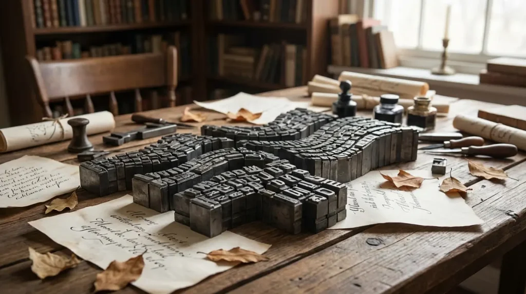

Hi, Friend! Jen Glantz here. I’m a bestselling author, the first ever bridesmaid for hire and have been hired by hundreds of brides all over the world. Let’s talk about typography poem examples.
According to Fiveable’s American Literature resource, typographic poetry is all about the visual arrangement—using fonts, spacing, and layout to actually be part of the poem’s meaning. I distinctly remember the first time I stumbled across this art form back in college. It was a total “aha!” moment for me. I realized that words didn’t just have to sit there in straight lines; they could dance, spiral, and flow just as powerfully as spoken words. It completely flipped how I thought about the relationship between what we say and how it looks.
In this guide, we’re going to look at how you can take simple text and turn it into an immersive experience. We’ll chat about how to pick the right style and walk through 25 specific typography poem examples—from romantic wedding vows to trippy digital art.
Quick Resources
-
Write vow text worth turning into art with the Wedding Vow Generator
-
Explore the full planning suite in All Wedding Tools
TL;DR
In a rush? No worries. Here is the spark-notes version on how to nail shape poem examples. The main thing to remember: you have to find the sweet spot between “looks cool” and “can actually be read.”
- Balance is key: If the shape is cool but nobody can read the poem, you’ve lost the plot. The visual should boost the meaning, not hide it.
- Context matters: A complex swirl works great on a wall poster but looks like a smudge on a phone screen. Design for where it’s going to live.
- Feelings first: Bold, jagged shapes create tension; flowing scripts feel calm. Use the font to set the mood.
- The future is moving: By 2026, digital trends are all about kinetic typography—think GIFs and interactive clouds, not just static ink.
- Get help with the words: If you’re doing this for a wedding, pro speech writers can help you get the sentiment right before you start messing with fonts.
Start with meaningful words using the Wedding Vow Generator
| Design Element | The Goal | Please Don’t Do This |
|---|---|---|
| Font Selection | Set the vibe (e.g., Script for love, Sans-serif for modern). | Using crazy decorative fonts that turn into alien hieroglyphs when resized. |
| Shape Density | Make a clear silhouette using spacing. | Cramming in so much text it looks like a black blob instead of a shape. |
| Line Breaks | Control the rhythm and how fast people read. | Chopping lines randomly just to fit the shape, which ruins the poem’s flow. |
| Color Contrast | Make it pop or define the edges. | Light gray on white (aka the “I want my readers to squint” look). |
Critical Considerations Before You Open Photoshop
Before you pick a typography poem style, take a second to think about the tug-of-war between design and content. Are you trying to get info across, or are you making art? Similarly, visual poetry examples rely on the layout to tell the story, sometimes more than the words themselves. You also need to think about the “vibe” of the font. Sharp, jagged fonts feel anxious, while circles feel endless and safe.
Nail the sentiment before design with the Wedding Vow Generator
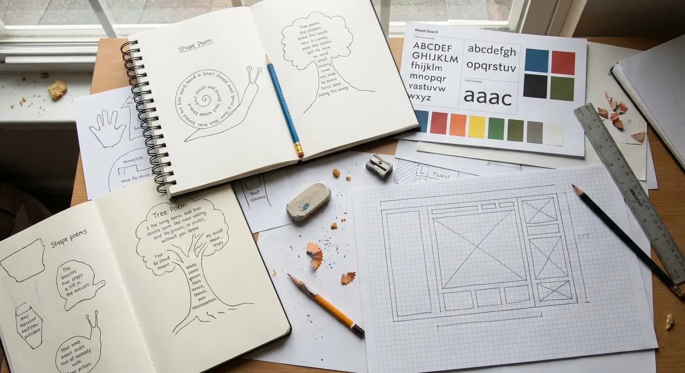
The “Can I Read This?” Test
If you’re designing a wedding invite, prioritize Readability. Guests need to know the “Who, When, and Where” without solving a puzzle. But, if you’re making a framed anniversary gift, you can lean into Visual Abstraction. For example, the couple’s vows forming a fingerprint. In that case, the texture and the look matter more than being able to read every single word from across the room.
The Top 25 Typography Poem Examples
Here is a hand-picked list of 25 typography poem examples broken down into five categories. These show how to handle legibility, shape, and emotion, whether you’re planning a wedding, a hiking trip, or a TikTok post.
The Wedding & Romantic Suite
These are the tear-jerkers. They are designed for vows, speeches, and gifts. The focus here is connection and “forever,” so expect lots of soft curves and intertwining lines.
Create vow text designed for visual layouts with the Wedding Vow Generator
To make it really special, try using text from modern wedding vows that actually sound like you, rather than generic Hallmark card stuff.
| Occasion | Shape Idea | The Vibe |
|---|---|---|
| Vow Exchange | Infinity Loop or Intertwined Rings | Serious, Romantic, “Forever” |
| Reception Menu | Champagne Flute or Cake | Party time, Fun, Useful |
| First Dance | Heart Shape or Musical Note | Sweet, Rythmic, Soft |
| Anniversary Gift | Fingerprint or Silhouette | Intimate, Deep, Personal |
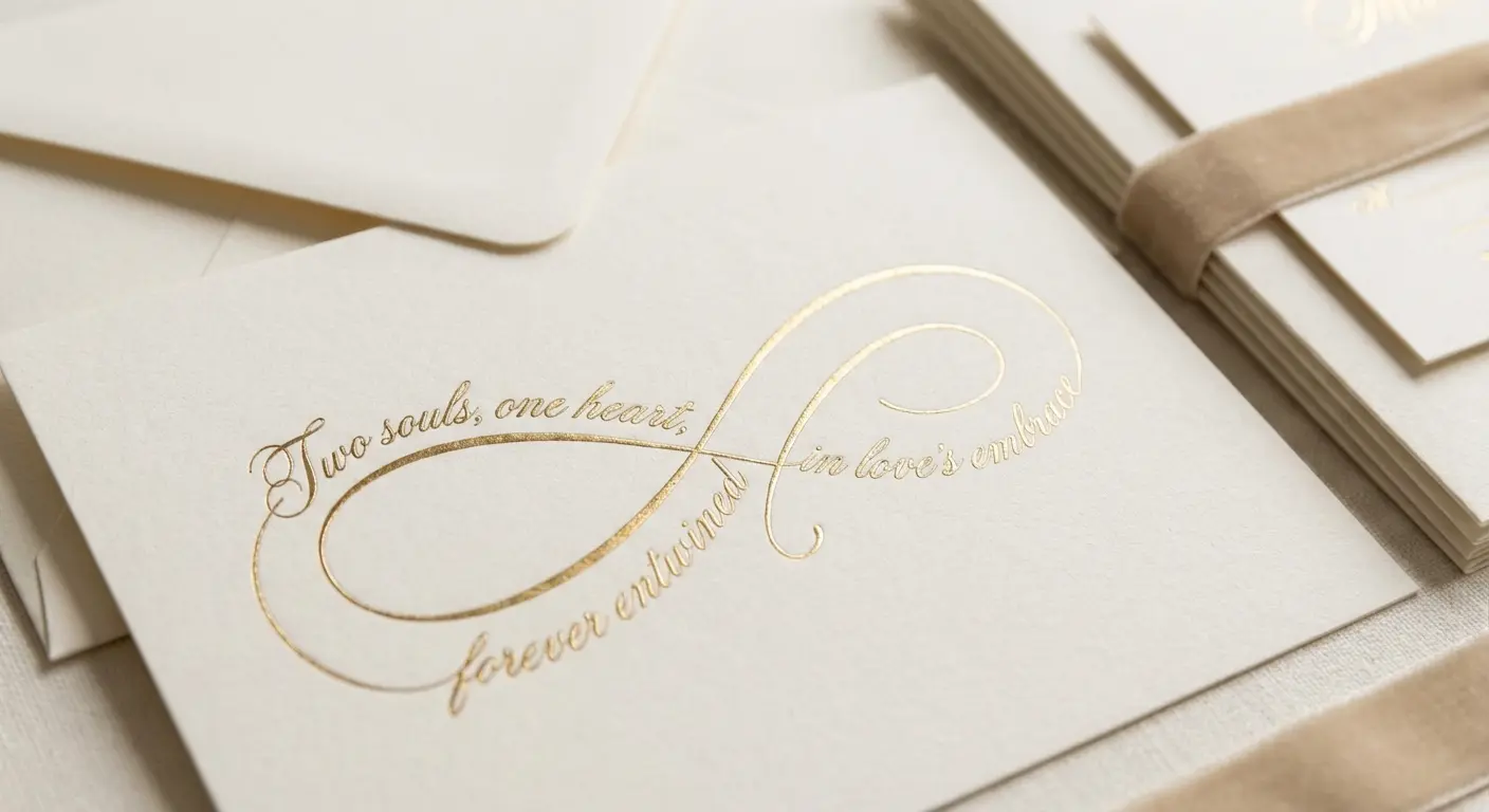
1. The Infinity Loop Vow
Imagine two streams of text weaving over and under each other in a figure-eight. It represents two lives becoming one. Just be careful where the lines cross—you don’t want the words to become a jumbled mess.
2. The Fingerprint Identity Poem
This is super cool for art pieces. The poem is written in tiny print that swirls around to match the ridges of a thumbprint. It’s more about the texture than reading it quickly. It forces the viewer to get up close and personal.
3. The Champagne Flute Toast
The text creates the shape of a tall glass, and punctuation marks (like periods or asterisks) float up like bubbles. It’s instantly recognizable and perfect for bachelorette invites or menus where you want people to get the point fast.
4. The Heart-Shaped Lyric
Classic, right? The text fills a heart shape. To keep it from looking like a Valentine’s card from 1995, try a modern twist for 2026: use negative space (white text) on a colored heart background.
5. The Wedding Ring Circle
A single sentence written in a perfect circle. No beginning, no end. It symbolizes eternity. If you use a clean font, it’s actually pretty easy to read. Great for the inside of cards.
Generate short, circular-ready vows with the Wedding Vow Generator
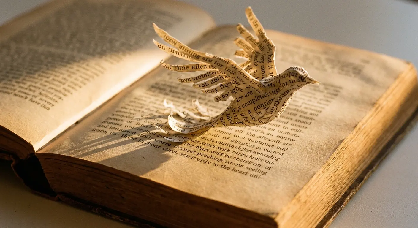
The Classics (Calligrams)
This is where it all started. These are the historical heavy hitters of calligram poetry. They show how playing with font size and direction has been used for decades to guide your eye.
While these are old school, modern designers still look at them to see how it’s done. You can see the influence in modern concrete poems, which tend to be a bit sharper and more rigid.
6. “The Mouse’s Tale” (Lewis Carroll)
From Alice in Wonderland. The text gets smaller and winds back and forth, looking exactly like a mouse’s tail. It’s a masterclass in using font size to pull the reader down the page.
Try This: The “Fading Echo” Technique
Want to recreate that vibe? Imagine writing a poem about a fading echo. Start with a big 24pt Bold font. On the next line, drop to 20pt Regular. Keep shrinking it line by line until the last word is a tiny, whisper-quiet 6pt Light. It physically forces the reader to squint to “hear” the end.
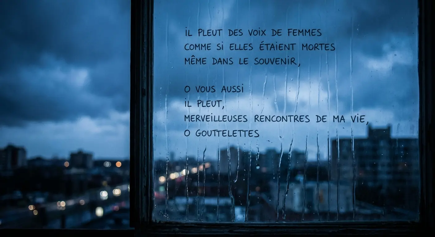
7. “Il Pleut” (Guillaume Apollinaire)
French for “It Rains.” The words trickle down the page in slanted lines. It looks exactly like rain falling. It shows that typography can mimic motion.
8. “Easter Wings” (George Herbert)
This one is ancient (1600s!). The stanzas are shaped to look like wings turned sideways. It’s a great lesson in how centering your text can create symmetry and balance.
9. The Vortex (Ezra Pound style)
The text spirals inward toward the center, getting smaller and tighter. It creates intensity. It gets harder to read near the center, which mimics the feeling of being overwhelmed or sucked in.
10. The Silenced Box
You’ve probably seen this—a page of text where most of it is blacked out with a marker, leaving just a few words visible to form a new poem. It’s edgy and uses “destruction” to create something new.
Nature & Environment
These examples bridge the gap between words and the physical world. They often mimic organic shapes, sometimes sacrificing a bit of readability to capture the chaos of nature.
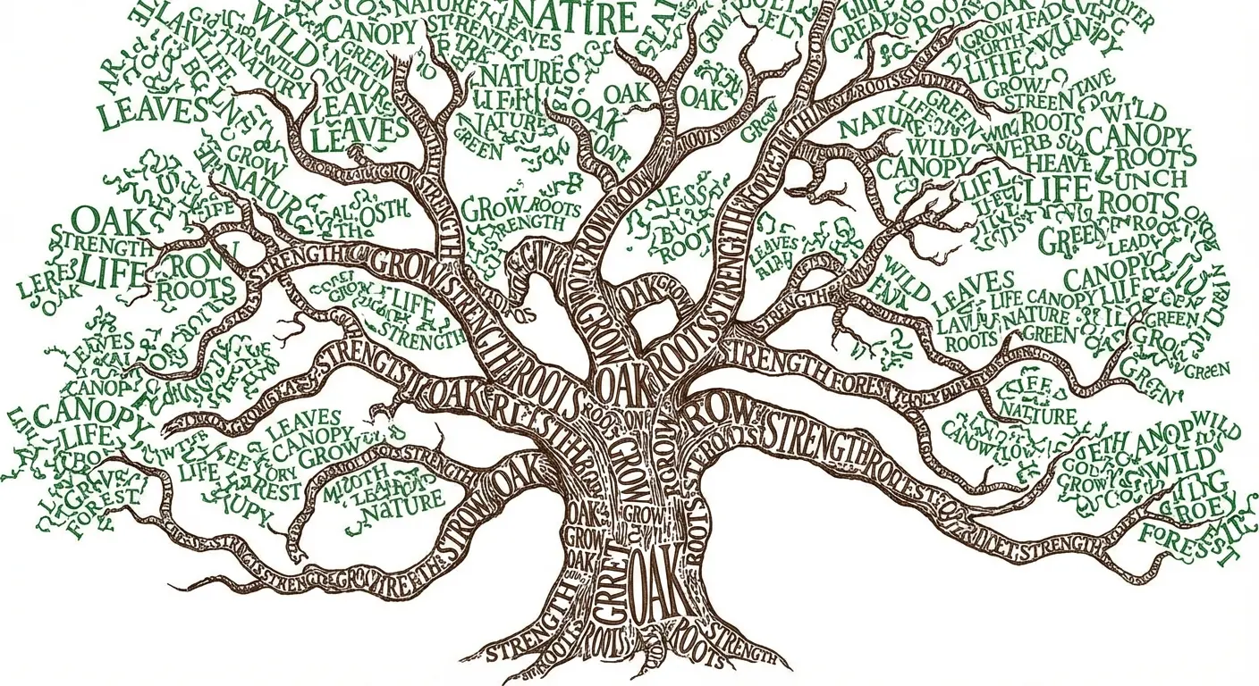
11. The Rooted Tree
Title at the top (canopy), verses in the middle (trunk), footnotes sprawling out at the bottom (roots). It follows the natural way we read (top to bottom), so it works perfectly for poems about family trees or growth.
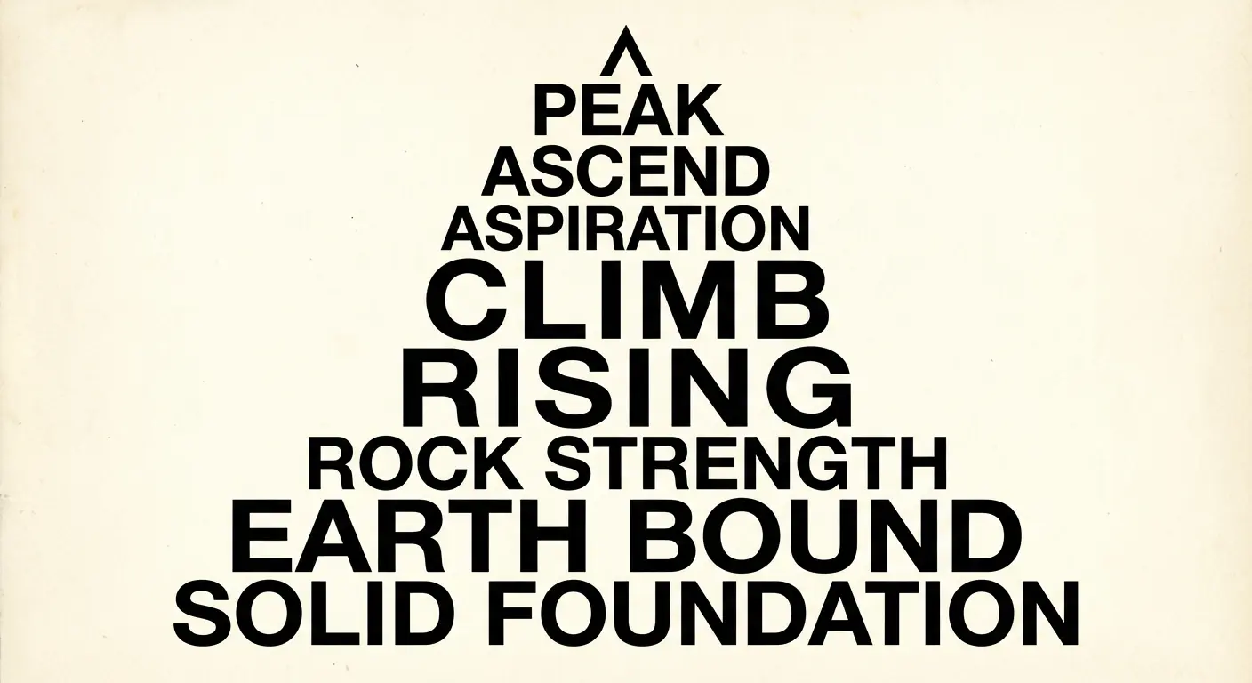
12. The Mountain Peak
The text starts wide at the bottom and tapers up to a single word at the peak. It’s a great visual payoff. That final word at the top gets all the attention, representing the goal or the summit.
13. The Undulating Wave
Lines of text curve up and down like the ocean surface. It has a calming rhythm. Just be careful with your line spacing so the letters don’t crash into each other.
14. The Raindrop Explosion
A tight cluster of words at the top that scatters into individual letters as it goes down. It visualizes chaos or things falling apart. You lose readability at the bottom, but the visual impact is awesome.
15. The Sunrise Radial
Sentences shoot outward from a central semi-circle like sun rays. It’s interactive because the reader usually has to turn the page (or their head) to read it. Great for short, positive affirmations.
Digital & Kinetic (2026 Trends)
Paper is cool, but screens are the future. These examples use tech to move and interact. We’re talking animation, metadata, and the stuff you see on social media.
| Feature | Old School (Print) | New School (Digital) |
|---|---|---|
| Legibility | Static; you read at your own pace. | Temporal; the animation controls the speed. |
| Interaction | Tactile; holding the paper. | Active; clicking, hovering, waiting for the loop. |
| Context | Margins and ink. | Screen resolution and hashtags. |
| Best For | Keepsakes, gallery walls. | TikTok, Instagram, projected art. |
16. The GIF Poem
Text that morphs into the shape it describes. This is where things are headed for 2026. You have to actually watch the animation to read the text.
17. The Hashtag Cloud
A poem built entirely out of hashtags, clustered together. The bigger the font, the more “emotional weight” that tag has. It speaks the language of the internet.
18. ASCII Art Redux
Using keyboard characters to build a picture that holds the poem inside. It’s a total retro-tech aesthetic. It hits the nostalgia button hard but needs a monospaced font (like Courier) to line up right.
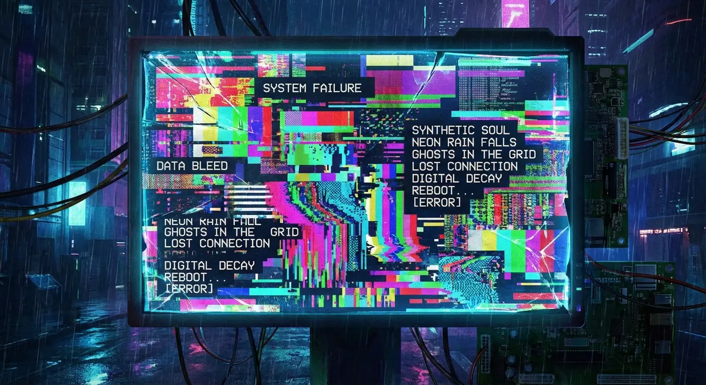
19. The Glitch Text Block
A normal block of poetry, but the letters are corrupted or shifted to look like a digital error or a bad signal. It reflects modern digital anxiety. It looks cool, even if it’s a pain to read.
20. Emoji-Integrated Stanzas
Replacing key nouns with emojis. It’s casual, accessible, and bridges the gap between “high art” and how we actually text our friends.
Celebration & Party
These are the fun ones. Designed for events, invites, and thank-you cards. They use shapes that scream “Party!”
If you want more ideas on how shapes can spice up your event stationery, check out these shape poem examples that are perfect for festive designs.
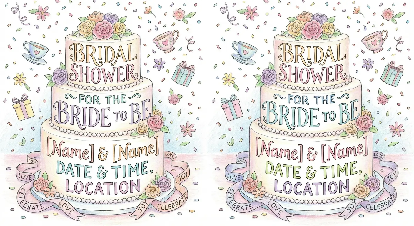
21. The Tiered Cake
Stanzas stacked in rectangles that get narrower as they go up, looking like a wedding cake. It’s a classic for bridal showers—part poem, part decoration.
22. The Balloon Bunch
Words inside circles with strings of text connecting them to a hand at the bottom. It’s playful and non-linear—you can read the balloons in any order you want.
Try This: The “Birthday Bunch”
Making a card? Pick five words describing the birthday person (e.g., “Radiant,” “Wild,” “Loyal”). Put each in a circle (balloon). Then, use a cursive font for the “strings” trailing down, spelling out “Happy 30th Birthday” where they all meet at the bottom.
23. The Gift Box
Text arranged in a square block with a “bow” made of cursive text on top. The shape implies the message is a gift. Perfect for thank-you notes.
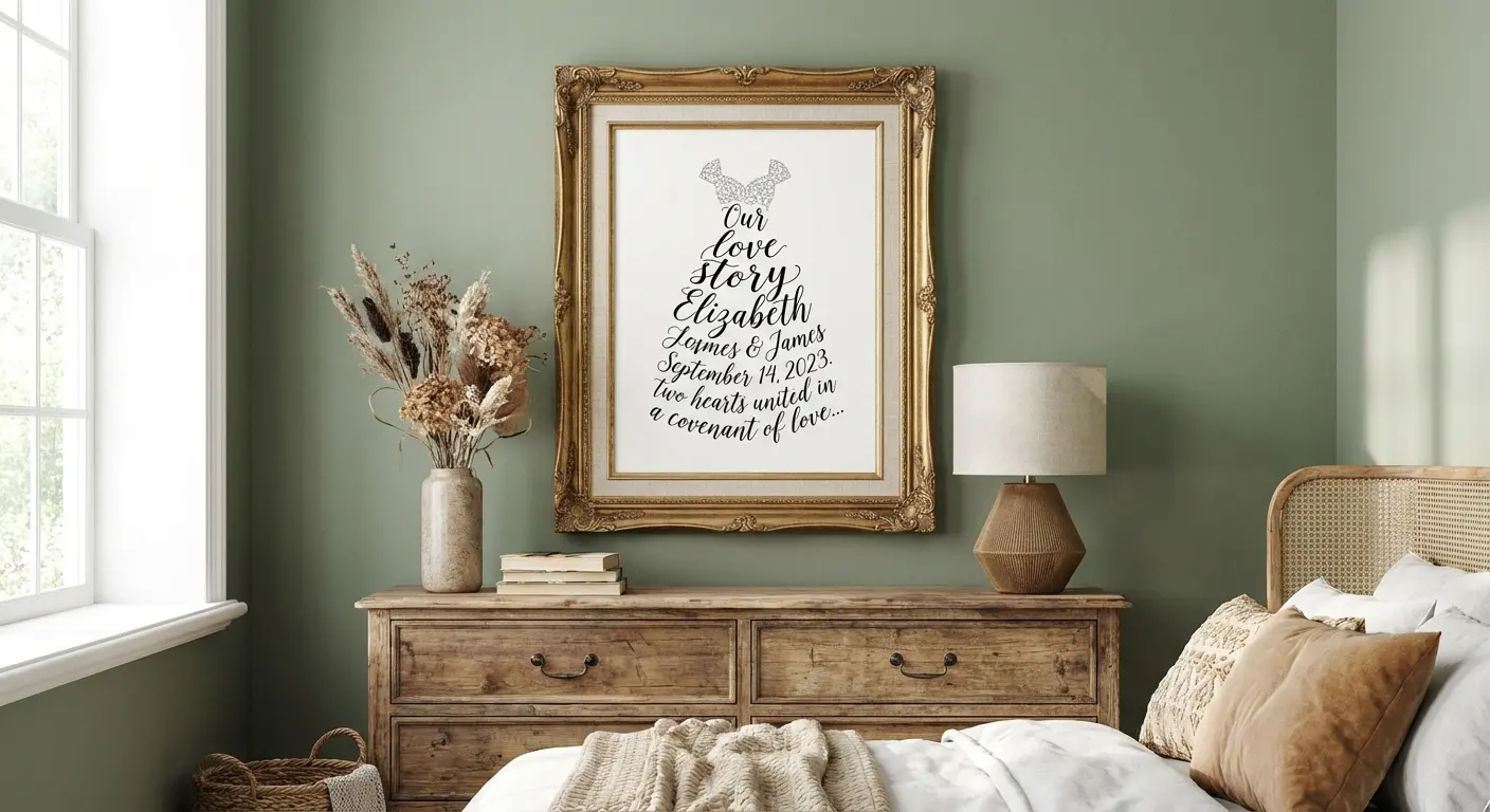
24. The Dress Silhouette
Words contouring the shape of a bridal gown. This is a huge hit for Maid of Honor speeches printed as keepsakes. It’s instantly associated with the bride.
25. The Open Door
Text in two columns with a gap in the middle. It symbolizes walking into a new life or a new chapter. The empty space is the focal point.
Making the Words Sound As Good As They Look
Here’s the thing: a typography poem is a beautiful way to present a speech or vow, but the content itself is what brings the tears (the good kind). You want the art to look amazing, but if the words fall flat, the font can’t save you. This is where getting some pro help can make a huge difference.
Turn your final draft into something unforgettable using the Wedding Vow Generator
Check out some creative wedding vow ideas to make sure your text is worthy of the artistic effort you’re putting in.
How Bridesmaid for Hire Can Help
Bridesmaid for Hire is all about taking the stress out of the big day. Jen Glantz provides tools to help you write personalized Maid of Honor speeches and wedding vows in minutes—so you have something great to format into that keepsake poem.
Beyond the writing, the brand acts as a support system to handle the family drama and wedding chaos, so you can focus on the fun details (like picking fonts).
Final Thoughts
Look, in 2026, the pressure to be visually and verbally perfect is real, but don’t let it ruin the party. By understanding how design and words work together, you can create something that looks cool and hits people right in the feels.
Whether you go with a classic shape or a flashy GIF, just make sure the style matches the message. And hey, don’t be afraid to ask for help with the speeches—nobody has to do it all alone.


1-800-BRIDESMAID
The Newlywed
Card Game
something extra to love
Read the weekly newsletter from Bridesmaid for Hire, 1-800-Bridesmaid, to hear about real stories, from strangers, who need advice on love, life, friendship, and so much more.
Looking for the perfect wedding gift for someone you adore? Grab The Newlywed Card Game. It's a fun and interactive game they can play on their honeymoon or future date nights.

