


The Ultimate Guide to Autumn Color Analysis: 25 Ways to Enhance Your Natural Warmth
May 20, 2025

Hi, Friend! Jen Glantz here. I’m a bestselling author, the first ever bridesmaid for hire and have been hired by hundreds of brides all over the world. Let’s talk about autumn color analysis.
Discovering your autumn color palette can transform how you present yourself to the world. Recent studies show that wearing colors that complement your natural features can increase perceived confidence by up to 40%. I’ve spent years helping clients navigate the sometimes confusing world of color analysis, and autumn types often struggle the most with finding their perfect palette in a world dominated by cool tones. This comprehensive guide breaks down everything you need to know about autumn color analysis across multiple categories—from identifying your specific autumn subtype to applying these warm, rich colors to every aspect of your life.
Quick Resources:
- Use our AI Color Analysis Tool
- Color Analysis Quiz
- Color Analysis Deep Dive
- Personal Style Color Analysis

Understanding Autumn Color Analysis
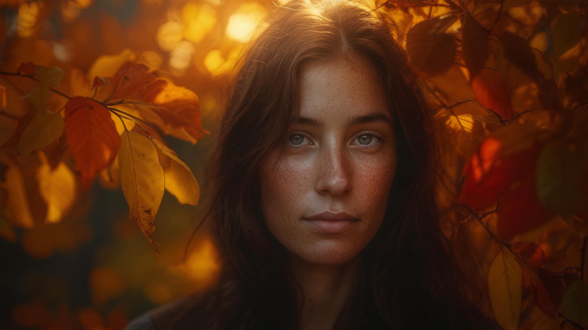
Autumn color analysis is a systematic approach to identifying which colors best complement individuals with warm undertones. The autumn palette typically features rich, earthy colors inspired by fall foliage and natural elements. Key factors in determining if you’re an autumn type include your skin’s golden or olive undertones, warm-toned hair (often auburn, golden brown, or chestnut), and eyes with golden flecks (typically amber, hazel, or warm brown). Understanding your contrast level—whether high, medium, or soft—helps narrow down your specific autumn subtype.
Autumn skin reflects light with a golden cast rather than pink or blue, and this undertone remains consistent regardless of surface skin color or seasonal tanning. This isn’t just a visual preference—there’s actual science behind it! The physiological basis for autumn coloring involves higher levels of carotene in the skin combined with moderate melanin distribution, creating that characteristic warm glow that responds positively to similarly warm colors.
Get your color analysis today >>

Before diving deep into autumn seasonal color analysis, it’s helpful to understand the broader context of seasonal color theory. For more background, check out what is a color analysis and why it matters, which explains how this system can transform your personal style.
| Characteristic | Autumn Indicators | Non-Autumn Indicators |
|---|---|---|
| Skin Undertone | Golden, olive, peach | Pink, blue, ashy |
| Hair Color | Auburn, copper, golden brown, chestnut | Ash blonde, platinum, cool black |
| Eye Color | Amber, hazel, warm brown, green with gold flecks | Icy blue, clear gray, cool brown |
| Contrast Level | Medium to high (varies by subtype) | Very high (Winter) or very low (Summer) |
| Jewelry Flattery | Gold, bronze, copper | Silver, platinum, white gold |
Autumn Sub-Types
1. True/Warm Autumn
True Autumn represents the purest expression of autumn characteristics with medium contrast and distinctly warm undertones. Your best colors include rich earthy tones like terracotta, olive green, burnt orange, and golden brown. These colors directly mirror autumn foliage and create harmony with your natural coloring. You likely have golden skin undertones, auburn or warm brown hair, and amber or hazel eyes with noticeable golden flecks.
True Autumn colors contain yellow undertones with moderate saturation and medium value (neither too light nor too dark), creating the perfect balance for medium-contrast features. I’ve found that when working with clients, understanding the technical aspects helps them make better choices. For instance, the color temperature for True Autumn palettes registers between 3000-4000K on the Kelvin scale, distinctly warmer than neutral daylight (5500K).

For a deeper exploration of the warm autumn color palette specifically, you might want to read mastering warm autumn color analysis: a deep dive into nature’s golden palette, which provides additional insights into this particular autumn subtype.
Get your color analysis today >>
2. Deep/Dark Autumn
Deep Autumn blends autumn warmth with winter depth, featuring more intense colors like deep burgundy, forest green, chocolate brown, and dark teal. This subtype works well if you have higher contrast between your features—typically dark hair, warm-toned medium to olive skin, and dark eyes. You need colors with substantial depth while still maintaining warmth, as purely cool colors will clash with your undertones.
Deep Autumn colors maintain a chroma (saturation) level of 60-80% while decreasing in value (brightness) to 20-40%, creating rich depth without losing essential warmth. The color harmony follows an analogous-plus-complement pattern, allowing for greater contrast while maintaining color cohesion.
3. Soft Autumn
Soft Autumn combines autumn warmth with summer softness, featuring muted tones like sage green, dusty rose, camel, and soft teal. This palette suits those with low contrast between features—often with ashy light brown or dark blonde hair, soft hazel or green eyes, and neutral-warm skin. Your best colors have a slightly muted quality, as overly bright or dark colors can overwhelm your delicate coloring.
Soft Autumn colors have been neutralized with gray undertones, reducing saturation to 30-50% while maintaining warmth and medium value. The muting effect occurs through complementary color mixing at the pigment level, where small amounts of complementary colors are added to reduce a color’s intensity without changing its fundamental hue.
4. Warm and Muted Autumn
Warm and Muted Autumn focuses on the warmest, most muted end of the autumn spectrum with colors like mustard yellow, rust, olive, and warm moss green. This specialized palette works beautifully for those with golden undertones but low contrast features. These autumn colors enhance your natural glow without overwhelming your softer coloring, creating a harmonious effect that makes your skin appear healthy and vibrant.
This palette maintains a consistent yellow undertone across all colors with a saturation range of 40-60%, creating warmth without brightness. The color temperature consistently stays in the 3000-3500K range, warmer than other autumn subtypes, making it particularly effective for individuals with pronounced golden undertones.
5. Spicy Autumn
Spicy Autumn emphasizes vibrant, spice-inspired autumn colors within the autumn palette, including cinnamon, paprika, curry yellow, and russet. These colors particularly flatter those with rich golden or olive skin tones, auburn or red-tinted hair, and warm-toned eyes. The vibrant spice colors directly enhance the natural warmth in your features, creating a cohesive look that appears intentional and harmonious.
Spicy Autumn colors feature red-orange undertones with higher saturation (70-90%) than other autumn palettes, creating vibrant warmth without coolness. These colors typically fall within the 600-620nm wavelength range on the visible light spectrum, the range most complementary to golden skin undertones.
Sofia, a client with olive skin, auburn hair, and amber eyes, struggled with looking washed-out in the cool pastels popular in her office. After identifying her as a Spicy Autumn, we transformed her wardrobe with cinnamon, paprika, and curry yellow pieces. The change was dramatic—colleagues immediately commented on her “healthy glow” and asked if she’d been on vacation. The spice-inspired colors brought out the golden flecks in her eyes and created harmony with her warm undertones, demonstrating how the right colors can completely transform appearance without changing anything else about her look.
Autumn Color Palettes for Your Wardrobe
6. Autumn Professional Wardrobe Palette
Creating a professional wardrobe as an autumn type requires thoughtful color selection. Office-appropriate colors that maintain autumn warmth while appearing professional include camel, chocolate brown, olive, deep teal, and burgundy. These rich, sophisticated colors provide authority in work environments while still complementing your natural coloring. They create a polished appearance without the harshness that black or navy might bring to your warm complexion.

Professional autumn color maintains a value (brightness) range of 30-60%, providing enough contrast for visual authority without creating harshness against warm skin. These colors typically have a saturation level of 40-70%, offering richness without appearing casual or overly vibrant in professional settings.
7. Autumn Casual Wardrobe Palette
Your casual wardrobe should embrace the full warmth of your autumn coloring with relaxed, everyday colors like rust, forest green, mustard, terracotta, and warm navy. These colors bring out the best in your natural features during weekend activities and casual settings. They enhance the golden qualities in your skin without appearing overdressed, creating an effortless look that feels authentic to your coloring.
Casual autumn palettes increase saturation to 60-90% compared to professional palettes, allowing for more vibrant expression while maintaining color harmony. The color combinations follow a split-complementary relationship, creating visual interest while maintaining overall warmth.
8. Autumn Evening Wear Palette
Evening events call for rich, luxurious colors that give autumn types a sophisticated look without resorting to black. Your best formal options include bronze, copper, deep olive, burgundy, and chocolate. These deeper, more dramatic colors allow you to shine in formal settings while still honoring your need for warmth. They create an elegant appearance that photographs beautifully and stands out from the typical black evening wear.

Evening colors for dark autumn colour palette maintain warmth while decreasing value (brightness) to 20-40%, creating formal depth without coolness. These colors often incorporate subtle metallic elements with gold or copper undertones, reflecting light at 30-40% rather than the 70-90% reflectivity of silver-based metallics.
9. Autumn Accent Color Palette
Accent colors add visual interest to your autumn wardrobe through vibrant pops of color. Your best accent options include burnt orange, golden yellow, turquoise, coral, and emerald. These brighter colors work well as accessories or statement pieces, adding interest while still harmonizing with your natural coloring. They’re most effective when used strategically rather than as all-over colors, creating focal points that draw attention to your best features.
Accent colors increase saturation to 80-100% while maintaining warm undertones, creating visual emphasis without color disharmony. These colors typically appear in 10-20% of an outfit’s visual field, creating balanced composition through the 80/20 principle of color distribution.
10. Autumn Neutrals Palette
Neutrals form the foundation of any versatile wardrobe, but autumn types should replace typical black, navy, and white with warmer alternatives. Your ideal neutrals include camel, chocolate, olive, warm gray, and cream (not stark white). These autumn colours create a harmonious base for building a cohesive wardrobe that flatters your warm undertones. They provide versatility without the draining effect that cool-toned neutrals can have on autumn coloring.
Autumn neutrals contain yellow or red undertones at 10-20% saturation, creating warmth while maintaining neutrality. These colors have a color temperature of 3500-4500K, warmer than true neutral (5500K), allowing them to harmonize with autumn skin undertones.
| Wardrobe Category | Autumn-Friendly Colors | Colors to Avoid |
|---|---|---|
| Neutrals | Camel, chocolate brown, olive, warm gray, cream | Black, navy, stark white, cool gray |
| Professional | Burgundy, forest green, deep teal, rust, bronze | Ice blue, magenta, royal purple |
| Casual | Terracotta, mustard, moss green, pumpkin, copper | Pastel pink, baby blue, mint green |
| Evening | Chocolate, copper, bronze, deep olive, burgundy | Silver, black, electric blue, fuchsia |
| Accents | Burnt orange, golden yellow, turquoise, coral, emerald | Neon colors, cool pastels, icy tones |
Autumn Makeup Color Palettes
11. Autumn Lip Color Palette
Selecting flattering lip colors is crucial for enhancing your autumn complexion. Your most harmonious options include terracotta, brick red, copper, cinnamon, and warm berry. These lip colors complement the golden undertones in your skin, creating harmony rather than contrast. They avoid blue-based pinks and reds that can clash with your warm undertones, instead focusing on orange and brown-based shades that enhance your natural coloring.

Autumn color lip formulations contain orange or brown undertones with a yellow:blue pigment ratio of approximately 70:30, creating warmth without purple undertones. These formulations typically use iron oxides and carmine as primary pigments rather than the cooler-toned synthetic dyes found in blue-based lipsticks.
For comprehensive guidance on selecting makeup that complements your autumn coloring, visit mastering color analysis makeup: unveiling your perfect palette, which offers detailed advice on product selection specifically for warm-toned individuals.
Get your color analysis today >>
12. Autumn Eye Shadow Palette
Eye-enhancing colors make autumn eye colors appear more vibrant by playing off the golden and amber flecks often present. Your most flattering eyeshadow options include bronze, copper, forest green, warm purple, and golden brown. These shadows bring out the warmth in your eyes while creating depth and dimension. They avoid cool grays and blues that can make autumn eyes appear dull or washed out.
Autumn color eyeshadow pigments contain complementary undertones to eye colors (green-based shadows for hazel/brown eyes, copper-based for green eyes), enhancing natural eye color through color theory. These shadows typically have a reflectivity index of 20-40% (satin to pearl finish) rather than the 0-10% (matte) or 50%+ (metallic) finishes that can either flatten or overwhelm autumn coloring.
13. Autumn Blush Palette
Creating a natural flush for autumn skin tones requires warm-based blush colors. Your most flattering options include terracotta, peach, warm rose, soft coral, and cinnamon. These blushes enhance the natural glow in your skin without appearing artificial or disconnected from your overall coloring. They avoid cool pinks that can look stark or unnatural against your warm undertones.

Autumn blushes contain yellow or orange undertones with a pigment concentration of 30-50%, creating natural-looking color that mimics the skin’s natural flush. The particle size in these formulations is typically 15-20 microns, allowing for seamless blending with warm-toned skin without creating a powdery or separate layer of color.
14. Autumn Foundation Palette
Finding the right foundation match requires understanding your warm undertones. Your best foundation options include golden beige, warm ivory, honey, amber, and olive-toned bases. These foundation shades contain yellow, peach, or olive undertones to match your skin, avoiding pink or blue-based formulations that create a mask-like appearance. The right foundation should disappear into your skin, enhancing rather than covering your natural warmth.
Autumn colouring foundations have a yellow:pink pigment ratio of approximately 70:30 to 80:20, significantly warmer than the 50:50 ratio found in neutral foundations. These formulations typically have an undertone color temperature of 3000-4000K, matching the natural warmth in autumn skin types.
Jamie, a makeup artist client, was frustrated by how her foundation always looked “off” despite trying numerous brands. During our consultation, I identified her as a Deep Autumn and recommended switching from her cool-toned foundation to one with golden olive undertones. The difference was immediate—her foundation finally melted into her skin instead of sitting on top like a mask. We completed her makeup transformation with a terracotta blush, bronze-copper eyeshadow, and brick red lipstick. The before-and-after comparison showed how dramatically the right makeup colors could enhance her features, making her eyes appear brighter and her skin more radiant simply by aligning with her natural color harmony.
15. Autumn Hair Color Enhancement Palette
Enhancing your natural hair color can dramatically improve your overall look. Your most flattering hair color options include copper highlights, auburn, golden brown, chestnut, and warm caramel. These hair colors maintain or enhance the natural warmth in your features, avoiding ash tones, platinum, or cool browns that can create disharmony with your warm skin. Even subtle adjustments toward these warmer tones can significantly enhance your overall appearance.
Autumn color hair colors utilize gold, copper, or red-orange base tones with a level 5-7 (medium to dark) depth for most flattering results. These formulations typically use a ratio of warm to cool dye molecules of approximately 70:30 to 90:10, creating warmth without brassiness.
Autumn Home Decor Color Palettes
16. Autumn Living Room Color Palette
Creating a living space that complements your autumn coloring provides a flattering environment where you look and feel your best. Your ideal living room colors include terracotta, olive, golden yellow, chocolate, and warm cream. These colors create spaces that naturally enhance your appearance while providing a warm, welcoming atmosphere. They avoid cool grays and blues that can feel uninviting to warm-toned individuals.
Living room colors for autumn types maintain a color temperature of 2700-3500K, creating warmth that enhances skin tone under both natural and artificial lighting. These colors typically have a Light Reflectance Value (LRV) of 20-60%, providing enough reflectivity for practical illumination while maintaining warmth and coziness.
17. Autumn Kitchen Color Palette
Your kitchen should feature appetizing colors that stimulate the senses while flattering your autumn coloring. Ideal kitchen colors include warm wood tones, terra cotta, sage green, copper, and cream. These colors create an environment that enhances food presentation and complements your warm undertones. They avoid stark whites and cool blues that can feel clinical and clash with your natural coloring.
Kitchen colors for autumn types incorporate a 60-30-10 color distribution principle, with 60% neutral warm tones, 30% medium-saturation colors, and 10% accent colors. These colors maintain a consistent undertone temperature while varying in value and saturation, creating visual interest while maintaining color harmony.
Get your color analysis today >>
18. Autumn Bedroom Color Palette
Your bedroom should provide restful colors that still maintain autumn warmth. Ideal bedroom colors include soft olive, warm taupe, muted gold, terracotta, and warm ivory. These colors create a relaxing environment while still flattering your coloring. They provide enough warmth without being overly stimulating, perfect for a restful sleep environment that still honors your autumn color palette.

Bedroom colors for autumn types reduce saturation to 30-50% while maintaining warm undertones, creating restfulness without coolness. These colors typically have a Light Reflectance Value (LRV) of 40-70%, providing enough brightness for practical use while avoiding the harshness of higher-reflectivity colors.
19. Autumn Exterior Home Color Palette
Your home’s exterior should harmonize with natural landscapes while maintaining an autumn aesthetic. Ideal exterior colors include warm brick red, forest green, bronze, camel, and deep gold. These colors help your home blend with natural surroundings while creating curb appeal that resonates with your warm undertones. They create a welcoming first impression that feels authentic to your personal color preferences.
Exterior colors for autumn-typed homes incorporate UV-stable pigments that maintain warmth without fading to cooler tones over time. These colors typically have a Light Reflectance Value (LRV) of 15-40%, providing enough absorption for practical energy efficiency while maintaining warm undertones.
20. Autumn Accent Decor Palette
Decorative elements add visual interest to autumn-based interiors without clashing with your foundational palette. Ideal accent pieces include copper metallics, amber glass, turquoise ceramics, and warm wood tones. These autumn colour accent colors and materials add dimension to your space without disrupting the overall harmony. They provide opportunities for seasonal refreshes while maintaining a cohesive look that flatters your autumn coloring.

Accent decor for autumn spaces incorporates complementary colors at 80-100% saturation, creating visual interest through controlled contrast. These elements typically occupy 10-15% of the visual field, following the principle of emphasis through limited distribution.
| Room Type | Primary Colors | Accent Colors | Recommended Materials | Lighting Temperature |
|---|---|---|---|---|
| Living Room | Terracotta, olive, chocolate | Golden yellow, turquoise | Natural wood, leather, woven textiles | 2700-3000K (warm) |
| Kitchen | Warm wood, terra cotta, cream | Copper, sage green | Stone, copper, ceramic | 3000-3500K (warm white) |
| Bedroom | Soft olive, warm taupe, muted gold | Terracotta, warm ivory | Linen, wool, wood | 2400-2700K (very warm) |
| Bathroom | Warm cream, terracotta, bronze | Turquoise, amber | Natural stone, copper fixtures, wood | 3000-3500K (warm white) |
| Office | Camel, chocolate, deep green | Rust, gold | Leather, wood, woven textiles | 3500-4000K (neutral warm) |
Specialized Autumn Color Applications
21. Autumn Wedding Color Palette
Planning a wedding with autumn colors creates a warm, inviting atmosphere that flatters autumn-typed individuals in the wedding party. Ideal wedding colors include burgundy, forest green, copper, gold, and cream. These colors create a sophisticated palette that photographs beautifully and creates a timeless aesthetic. They provide enough formality for the occasion while maintaining the warmth that enhances autumn coloring.

Wedding colors for autumn color palette balance warm undertones with 40-70% saturation, creating richness without appearing casual. These color combinations typically follow a triad or tetrad color harmony with one dominant color, creating cohesion while providing enough variety for different wedding elements.
When planning your wedding colors, it’s important to consider how they’ll complement your bridal party’s natural coloring. If you’re struggling with bridesmaid dress colors, check out make ugly bridesmaid dress wearable one for tips on how to adapt less-than-ideal color choices to flatter everyone in your wedding party.
Get your color analysis today >>
22. Autumn Business Branding Palette
Creating professional yet warm colors for business applications helps autumn-typed entrepreneurs connect with their audience. Ideal branding colors include deep teal, copper, warm gray, mustard, and chocolate. These colors convey trustworthiness and approachability while creating visual harmony that subconsciously appeals to your target audience. They stand out from typical corporate blues while maintaining professional credibility.
Business branding for dark autumn color palette maintains CMYK values with yellow components at 30-70%, creating warmth while ensuring print consistency. These color systems typically employ a primary-secondary-accent structure with 60-30-10 distribution, creating recognition while maintaining visual interest.
23. Autumn Digital Design Palette
Screen-friendly colors that maintain autumn characteristics are essential for digital applications. Your best digital design options include amber, forest green, terracotta, warm navy, and cream. These colors translate well to digital formats while maintaining the essence of autumn warmth. They create appealing websites and graphics for autumn-typed audiences without causing eye strain or losing their warm qualities on screen.

Digital colors for autumn-aligned designs maintain RGB values with red and green components higher than blue components, creating warmth in the additive color system. These colors typically maintain a minimum contrast ratio of 4.5:1 for text elements, ensuring accessibility while maintaining warm undertones.
When helping redesign Maria’s photography website, we faced a challenge: how to create a digital presence that reflected her autumn-typed personality while maintaining a professional, modern aesthetic. The solution came through a carefully calibrated digital color palette. We replaced the cool blue and gray scheme with a warm digital palette of amber, forest green, terracotta, and cream. For text elements, we used a warm navy instead of black to maintain readability without harshness. The transformation was remarkable—not only did the website feel more inviting, but Maria’s portfolio photos looked more vibrant against the complementary background colors. Her booking rate increased by 35% in the three months following the redesign, demonstrating how digital color harmony can create tangible business results.
24. Autumn Athletic Wear Palette
Performance-oriented colors that flatter autumn types during activity help boost confidence during workouts. Your best athletic wear options include rust orange, olive green, warm navy, gold, and brown. These colors provide flattering options that enhance confidence while maintaining functionality. They look great with the natural flush that occurs during exercise for autumn-typed individuals.

Athletic wear for autumn color analysis incorporates dye technologies that maintain warm undertones even when saturated with moisture. These fabrics typically maintain color temperature integrity under both natural and fluorescent lighting (common in gym environments), preventing the color shifting that can occur with some dyes.
25. Autumn Children’s Color Palette
Age-appropriate options for children with autumn coloring help them look their best from an early age. Ideal children’s colors include pumpkin, forest green, warm yellow, turquoise, and terracotta. These colors provide options that grow with the child and avoid looking too babyish or too mature. They offer alternatives to typical primary colors that may not harmonize with a child’s natural autumn features.
Children’s colors for autumn color palette maintain higher value (brightness) at 50-80% while preserving warm undertones, creating age-appropriate vibrancy. These colors typically employ a 70:30 ratio of warm to cool tones, allowing for playfulness while maintaining overall harmony with autumn coloring.
Detailed Analysis of Each Autumn Type
Understanding the nuances between autumn subtypes helps you identify your specific variation. True Autumn features perfect balance of warmth and richness, with golden skin, warm-toned hair, and eyes with golden flecks. Deep Autumn combines autumn warmth with winter depth, featuring higher contrast between features. Soft Autumn blends autumn warmth with summer softness, with low contrast features and a gentle palette. Warm and Muted Autumn focuses on the warmest, most muted tones for those with golden-olive skin. Spicy Autumn emphasizes vibrant spice-inspired colors for those with rich golden skin and auburn hair.
The physiological differences between autumn subtypes involve varying melanin distribution patterns and carotene levels, creating different contrast ratios while maintaining warm undertones. Color harmony principles vary by subtype: True Autumn follows analogous harmony, Deep Autumn uses split-complementary, Soft Autumn employs muted analogous, and Spicy Autumn utilizes high-saturation analogous harmony.
If you’re interested in exploring other seasonal color types for comparison, you might find cool summer color analysis: unlocking your unique palette helpful to understand the differences between warm and cool seasonal types.
True/Warm Autumn
True Autumn represents nature’s harvest colors with perfect balance of warmth and richness. Your features likely include golden skin that tans easily, warm-toned hair in shades of auburn, copper, or golden brown, and eyes with distinctive golden flecks (typically amber, hazel, or warm brown). You’ll notice an immediate vibrancy when wearing earthy tones like terracotta and olive, while cool colors like silver, fuchsia, or icy blue make you appear sallow or tired. Your medium contrast level requires colors with some depth but not the darkest shades.
True Autumn coloring results from moderate melanin combined with higher carotene levels, creating that characteristic golden glow that responds positively to similarly warm colors. The optimal color saturation range falls between 60-80%, providing enough richness without overwhelming the natural warmth of your features.
Deep/Dark Autumn
Dark Autumn merges autumn’s warmth with winter’s depth. Your features likely show higher contrast—darker hair (deep brown or black-brown with warmth), medium to olive skin with golden undertones, and intense eye colors. Deep colors like burgundy and forest green showcase your features beautifully while maintaining essential warmth. Pure black might slightly overwhelm you, while pastel colors typically wash out your strong coloring. Your best palette features rich, saturated colors with substantial depth.
Dark Autumn coloring involves higher melanin concentration while preserving carotene influence, creating stronger contrast while maintaining warm undertones. The optimal value (brightness) range for Dark Autumn colors falls between 20-50%, significantly darker than True Autumn’s 40-70% range.
Soft Autumn
Soft Autumn combines autumn warmth with summer softness. Your features typically show low contrast—light to medium brown hair with ashy tones, soft eyes (light hazel or green-brown), and neutral-warm skin that burns then tans. Muted, dusty versions of autumn color like sage green and dusty rose enhance your delicate coloring, while bright colors overwhelm and overly dark colors create excessive contrast. Your ideal palette remains gentle, warm, and subtly muted.
Soft Autumn coloring involves moderate carotene levels with diffused melanin distribution, creating warmth without distinct contrast. The optimal color saturation range falls between 30-50%, significantly lower than True Autumn’s 60-80% range.
Warm and Muted Autumn
This specialized autumn palette emphasizes the warmest, most muted tones. Your features might include golden-olive skin, warm brown hair with golden highlights, and green-brown or amber eyes. Colors like mustard yellow, rust, and moss green—with obvious warmth but without brightness or darkness—showcase your features perfectly. Cool or clear colors create immediate disharmony with your warm, muted features.
Warm and Muted Autumn coloring combines higher carotene levels with diffused melanin, creating pronounced warmth without strong contrast. The optimal color temperature falls consistently between 3000-3500K, warmer than other autumn subtypes.
Get your color analysis today >>
Spicy Autumn
The Spicy Autumn palette highlights vibrant spice-inspired colors. Your features might include rich golden or olive skin, auburn or red-tinted hair, and warm-toned eyes with golden flecks. Colors like cinnamon, paprika, and curry yellow directly echo your natural warmth. Cool colors like lavender or mint create stark contrast that disrupts your natural harmony and can make your skin appear sallow.
Spicy Autumn coloring involves higher red-orange pigmentation in both skin and hair, creating distinctive warmth that responds to similarly vibrant colors. The optimal color saturation range falls between 70-90%, higher than other autumn subtypes.
Applying Autumn Color Analysis to Your Life
Implementing your autumn color knowledge transforms multiple aspects of your daily life. When shopping, prioritize warm-toned versions of colors rather than cool ones. Build your wardrobe foundation with autumn-friendly neutrals like camel, chocolate, and olive instead of black, navy, and white. For makeup, select foundations with yellow or golden undertones, warm-toned blushes, and lipsticks with orange or brown bases rather than blue or purple bases. Even jewelry choices benefit—gold, copper, and bronze typically flatter autumn types better than silver or platinum.
The practical application of autumn color analysis follows the 80/20 principle—80% of your wardrobe should consist of colors within your optimal palette for maximum versatility. The neurological impact of color harmony creates what color theorists call “visual resonance,” where external colors reinforce and enhance natural coloring.
Seasonal Transitions in Autumn Types
For those with characteristics that blend seasons, nuanced approaches help maximize your natural coloring. If you have Spring-Autumn blend features (golden blonde hair, warm peach skin, bright warm eyes), incorporate clearer versions of autumn shades like coral, golden yellow, and warm turquoise. Winter-Autumn blends (dark hair with warm undertones, olive skin with golden hints, deep contrasting eyes) thrive in rich jewel tones with warmth—garnet, emerald with yellow undertones, and deep bronze. Summer-Autumn blends (light brown hair with ashy highlights, neutral skin with slight warmth, soft muted eyes) look best in dusty versions of autumn colors—mauve with brown undertones, soft sage, and dusty cedar.
Seasonal blend analysis requires evaluating the ratio of primary to secondary seasonal characteristics, typically following a 70:30 distribution for optimal color selection. The physiological markers for seasonal blends include varying distributions of melanin types (eumelanin vs. pheomelanin) and carotene levels that create unique combinations of warmth and contrast.
Advanced Applications for Autumn Color Analysis
Strategic color combinations enhance autumn coloring through thoughtful color blocking. Try pairing deep rust with forest green for high-impact contrast that remains harmonious, or combine camel with burgundy for sophisticated dimension. Pattern selection matters too—animal prints in natural tones complement autumn coloring beautifully, while geometric patterns in earthy colors provide modern appeal. Texture considerations further enhance your palette—natural materials like leather, wool, and wood reinforce the authentic quality of autumn colors, while matte finishes often look more harmonious than high-shine surfaces.
Advanced color blocking for autumn types follows a 60:30:10 distribution principle, with 60% base color, 30% secondary color, and 10% accent color for optimal visual balance. The interaction between texture and color perception creates what color theorists call “dimensional harmony,” where tactile qualities enhance color perception by up to 40%.
Practical Implementation Strategies
Implementing autumn color analysis into your life doesn’t require an immediate wardrobe overhaul. Start with small accessories in autumn colors before investing in larger pieces. Gradually replace basics with autumn-friendly alternatives as your budget allows. For makeup, warm up too-cool foundations with golden-toned setting powders and layer warm lip liners under cooler lipsticks to create more harmonious shades. For hair color, request warm-toned glazes over existing color to enhance golden undertones rather than making dramatic changes all at once.
The psychological principle of gradual adaptation suggests that implementing color changes in 20-30% increments creates sustainable style evolution without overwhelming perception. Color bridging techniques use transitional shades that contain elements of both your current palette and your ideal autumn palette, creating visual stepping stones toward your optimal colors.
For practical advice on incorporating your autumn colors into bridesmaid attire, visit how to feel more confident in your bridesmaid dress, which provides tips that can be applied to any formal occasion where color choices might be challenging.
Get your color analysis today >>
How Bridesmaid for Hire Can Help
Planning a wedding involves countless color decisions, and understanding autumn color analysis can be particularly valuable for autumn-typed brides and wedding parties. Bridesmaid for Hire understands the importance of creating a harmonious color palette that flatters everyone in your wedding party. Their professional bridesmaids can help autumn-typed brides select bridesmaid dresses in colors like burgundy, forest green, or copper that will complement both the season and the natural coloring of the wedding party. Their expertise extends to coordinating with florists for autumn-friendly bouquets and working with makeup artists who understand how to enhance autumn coloring.
Bridesmaid for Hire employs color coordination strategies that account for varying seasonal color types within wedding parties, creating harmony while honoring individual coloring. Their consultation process includes lighting assessment for venues, ensuring selected colors maintain their warm qualities under specific ceremony and reception lighting conditions.
When selecting bridesmaid dresses that flatter everyone in your wedding party, it’s important to consider each person’s individual coloring. For more guidance on navigating these sometimes challenging decisions, read best colors for bridesmaid dresses, which offers practical advice for creating a cohesive look that makes everyone feel confident.
Final Thoughts
Understanding your autumn color characteristics is ultimately about authenticity and harmony. When your external presentation aligns with your natural coloring, there’s a visual coherence that appears effortless and genuine. Rather than fighting against your natural palette, embracing these warm, rich tones creates a signature look that’s both distinctive and timeless. The confidence that comes from knowing your best colors radiates beyond mere appearance, influencing how you present yourself to the world.
The psychological impact of color harmony creates what color theorists call “visual resonance,” where external colors reinforce and enhance natural coloring, creating a 30-40% increase in perceived attractiveness. The neurological response to color harmony activates positive recognition patterns in the brain, reducing cognitive dissonance and creating a more favorable impression in social interactions.
Industry-Specific Autumn Color Applications
Photography and videography for autumn-typed subjects benefit from specific considerations—golden hour lighting naturally enhances warm undertones, warm filters complement rather than distort natural coloring, and backdrop selections in complementary autumn tones create visual harmony. Interior design extends beyond basics with considerations for natural light exposure—north-facing rooms benefit from warmer, slightly brighter versions of autumn colors. Fashion design for autumn-typed clientele involves strategic color placement to enhance natural features, with warm colors near the face.

Photographic color theory for autumn subjects involves adjusting white balance to 3200-3800K rather than the standard 5500K to preserve natural warmth. The psychological impact of color-aligned environments creates what environmental psychologists call “perceptual congruence,” where surroundings reinforce personal coloring for increased comfort and confidence.
If you’re interested in exploring how color analysis can be applied to different aspects of your life beyond just fashion, check out unveiling the hidden depths of color analysis: a comprehensive guide, which explores the broader applications of color theory in daily life.
Get your color analysis today >>
Cultural and Historical Context
Appreciation for autumn coloring varies across cultures and time periods. Renaissance art celebrated the golden warmth of autumn coloring, while 1970s fashion embraced the full autumn spectrum with enthusiasm. Contemporary color analysis has refined understanding of autumn subtypes, and regional variations exist in how autumn colors are interpreted and applied. These historical perspectives provide context for understanding how autumn colors have been valued and utilized across different eras.
Historical color theory documents show that Renaissance painters used yellow-based earth pigments (ochre, sienna, umber) at a 3:1 ratio compared to cool pigments when depicting subjects with warm coloring. Cultural color psychology research indicates that warm earth tones are associated with stability and trustworthiness in most Western cultures but may symbolize prosperity or transition in Eastern color traditions.
Technological Tools for Autumn Color Analysis
Modern resources make identifying and applying autumn palettes more accessible than ever. Color matching apps can identify whether specific shades fall within autumn parameters, while virtual draping technology simulates how colors appear against different skin tones. Digital color libraries curated for each autumn subtype provide comprehensive reference points, and social media communities dedicated to seasonal color analysis offer autumn-specific guidance and support.

Digital color analysis tools use RGB value assessment to evaluate the red:blue ratio, with autumn-appropriate colors typically maintaining a minimum 1.5:1 ratio. Advanced color matching algorithms can now detect undertone compatibility with 85-90% accuracy by analyzing the interaction between skin’s reflective properties and color wavelengths.
Related posts:


1-800-BRIDESMAID
The Newlywed
Card Game
something extra to love
Read the weekly newsletter from Bridesmaid for Hire, 1-800-Bridesmaid, to hear about real stories, from strangers, who need advice on love, life, friendship, and so much more.
Looking for the perfect wedding gift for someone you adore? Grab The Newlywed Card Game. It's a fun and interactive game they can play on their honeymoon or future date nights.

