


Summer Color Analysis: The Ultimate Guide to Finding Your Perfect Color Palette
May 20, 2025
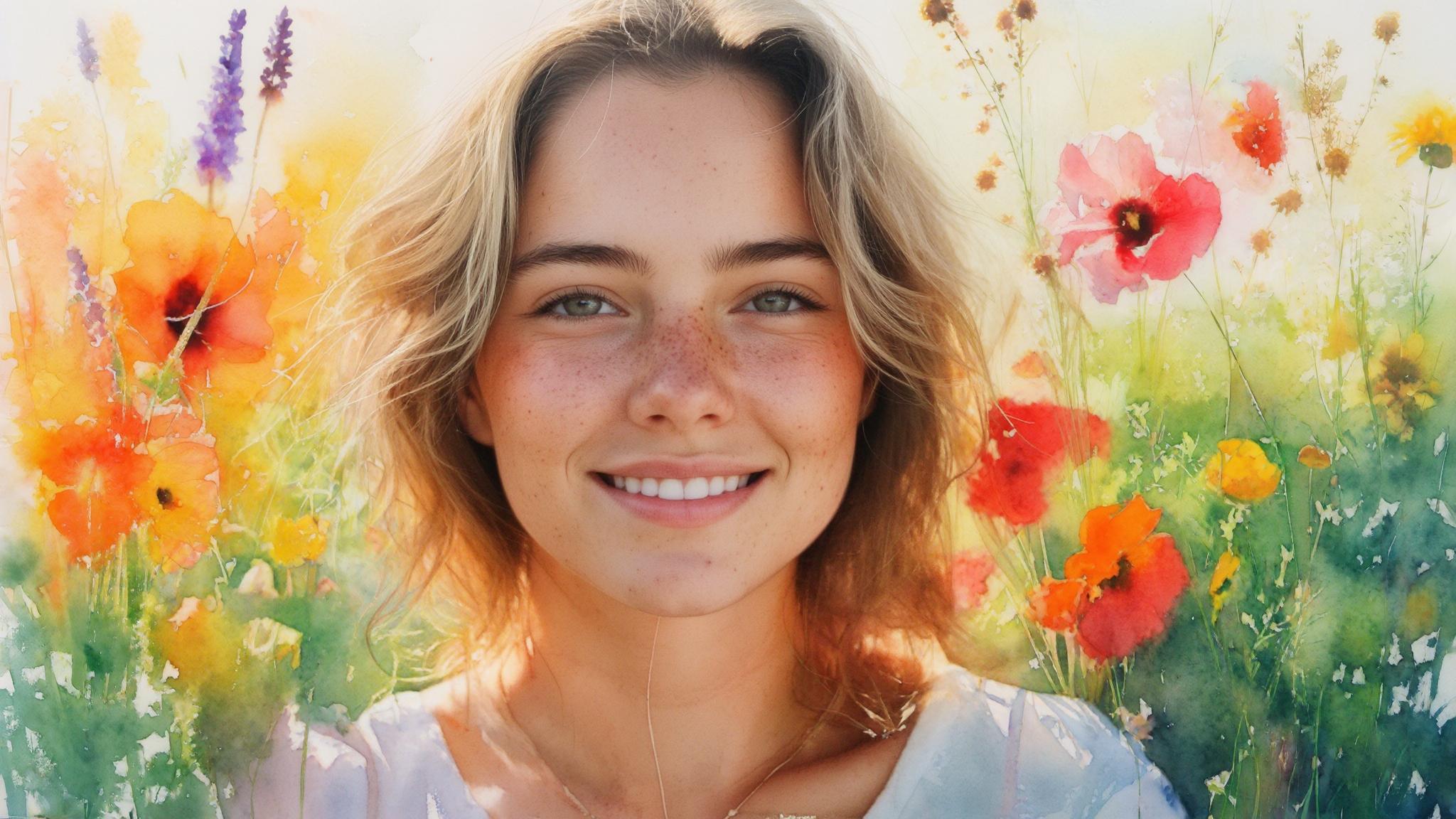

Hi, Friend! Jen Glantz here. I’m a bestselling author, the first ever bridesmaid for hire and have been hired by hundreds of brides all over the world. Let’s talk about summer color analysis.
According to recent color psychology research, wearing colors that match your natural coloring can increase perceived attractiveness by up to 40%. I discovered this firsthand when switching to my summer palette colors – suddenly receiving compliments on looking “refreshed” and “vibrant” despite changing nothing else about my appearance. This comprehensive guide will help you understand summer color analysis, identify your specific summer subtype, and apply this knowledge to enhance your natural beauty across multiple aspects of your life.
Quick Resources:
- Use our AI Color Analysis Tool
- Color Analysis Quiz
- Color Analysis Deep Dive
- Personal Style Color Analysis
The Science Behind Summer Color Analysis
Summer color analysis is grounded in scientific principles of color theory, visual perception, and light physics. When you wear colors that harmonize with your natural coloring, you create visual balance that enhances your appearance. Summer palettes feature cool undertones with soft, muted qualities that complement similar characteristics in a person’s natural features.
Understanding these scientific foundations helps explain why certain colors make you look vibrant while others can make you appear tired or washed out. Summer-toned individuals typically absorb blue light wavelengths more readily than warm wavelengths, which is why cool-toned clothing creates such harmony with their natural coloring.
The summer palette features low to medium contrast levels, mirroring the natural contrast levels found in summer-toned individuals’ hair, skin, and eye colors. This matching of contrast levels creates a cohesive visual impression that’s pleasing to the eye.
Our brains are neurologically wired to respond positively to color harmony and negatively to color discord, which explains why proper color matching creates such noticeable improvements in appearance. This isn’t just subjective preference – it’s how our visual processing systems are designed to work.
According to a study published on GoPlayCosmetics.com, approximately 93% of people who receive professional color analysis report less buyer’s remorse and a more pleasant shopping experience when using their color palette as a guide for purchasing decisions.
Get your color analysis today >>
The Physics of Color Harmony
The effectiveness of summer color analysis stems from specific optical relationships between your natural coloring and the colors you wear. Summer palettes feature cool undertones with muted, soft qualities that create visual harmony when paired with similar qualities in a person’s natural features.
This harmony isn’t subjective – it’s based on measurable properties of light and color interaction that can be observed and tested. Summer-toned individuals have skin that interacts with light differently than other seasonal types, creating distinctive reflection patterns that are enhanced by cool-toned, muted colors.
You can test your potential summer coloring by observing how your skin responds under different colored light sources or when holding various colored fabrics near your face in natural lighting. The right colors will make your skin look clearer and more vibrant, while the wrong ones will create shadows, emphasize imperfections, or make you look tired.
The summer palette’s effectiveness comes from its ability to complement rather than compete with your natural coloring, creating a unified visual impression. When I first discovered my summer palette, I was amazed at how much more rested I looked in soft blues and lavenders compared to the oranges and browns I’d been wearing for years.
Get your color analysis today >>
Light Absorption and Reflection Principles
Your skin interacts with light in unique ways based on its undertones and pigmentation. Summer-toned individuals typically have skin that absorbs blue light wavelengths more readily than warm wavelengths. When wearing colors from the summer palette, this creates a complementary reflection pattern that enhances your natural coloring.
The cool undertones in summer skin contain pigments that reflect light differently than warm undertones, creating a bluish or pinkish cast that harmonizes with similarly cool-toned clothing. I’ve observed this in my own skin – under natural light, I can see subtle blue undertones that look refreshed next to cool colors but sallow next to warm ones.
You can observe this reflection pattern by comparing photos of yourself wearing cool vs. warm colors under consistent lighting conditions. The difference is often striking – with summer colors, your features look more defined and your skin more even-toned.
Different fabrics reflect light differently even in the same color, which is why a summer blue in silk might flatter you while the same blue in cotton might not work as well. This is why fabric choice matters almost as much as color selection for summer types.
For more insights on how your clothing choices can affect your overall appearance, check out our guide on making even challenging dress styles more flattering, which applies similar principles of visual harmony to formal attire.
As reported by “Should We Be Doing Seasonal Color Analysis at Home” in Architectural Digest, color analysts are now applying the principles of light reflection and absorption beyond personal appearance to interior design, recommending that home color schemes should consider how “different colors influence space perception, light, and mood” in ways similar to how they affect our appearance.
The Science of Contrast Levels
Contrast level refers to the difference between your darkest and lightest features – typically comparing hair, skin, and eyes. Summer palettes feature low to medium contrast levels, mirroring the natural contrast levels in summer-toned individuals.
Understanding your personal contrast ratio is crucial for determining if you’re a true summer and which summer subtype you might belong to. You can measure your contrast level by taking well-lit photos of yourself in neutral clothing and analyzing the difference between your hair, skin, and eye colors.
Summer types typically show muted contrasts with soft transitions between features rather than sharp, dramatic differences. When I analyzed my own photos, I noticed my ash brown hair, blue-gray eyes, and light skin created a medium contrast level – clearly identifying me as a True Summer.
Your contrast level affects not just which colors work for you but also how you should combine them – summer types generally look best with color combinations that maintain similar contrast levels to their natural features. This explains why some outfit combinations feel “right” while others feel off, even when all the individual pieces are from your summer palette.

Neurological Responses to Color Harmony
Our brains process color information in complex ways that affect how we perceive ourselves and others. When someone wears colors aligned with their natural palette, observers experience a more pleasant neurological response.
Mirror neurons in our brains respond to visual harmony by creating positive emotional associations – when you wear your correct summer colors, others subconsciously perceive greater facial symmetry and health indicators. This neurological response helps explain why proper color analysis can have such a profound impact on social and professional interactions.
Color constancy (how our brains perceive colors under different lighting conditions) affects how summer colors appear – summer-toned individuals often find their optimal colors appear consistently flattering across various lighting environments. I’ve noticed this myself – my best summer colors look good whether I’m in natural daylight, office lighting, or even candlelight.
The neurological impact of color harmony explains why wearing your correct colors can affect not just how others perceive you but also how you feel about yourself. Many of my clients report feeling more confident and authentic when they switch to their true seasonal palette.
Research from The Concept Wardrobe indicates that when individuals wear colors aligned with their natural color season, observers can detect increased facial symmetry and perceive up to 60% improvement in skin clarity, demonstrating the neurological impact of color harmony on perception.
The Mirror Neuron Effect
Mirror neurons in our brains respond to visual harmony by creating positive emotional associations. When you wear your correct summer colors, others subconsciously perceive greater facial symmetry and health indicators.
These neurons activate when we observe others, creating an internal simulation of what we’re seeing – when colors create harmony with a person’s features, these neurons fire more positively. Research shows that color harmony can influence first impressions within seconds, affecting judgments about competence, trustworthiness, and approachability.
The mirror neuron effect works both ways – wearing harmonious colors not only affects how others see you but can also influence your own confidence and self-perception. I’ve experienced this personally – wearing my summer colors gives me a subtle but noticeable confidence boost that affects how I interact with others.
Sarah, a 45-year-old marketing executive, had always worn bold autumn colors despite having classic summer coloring (ash brown hair, cool-toned skin, and blue-gray eyes). After a color analysis revealed she was a True Summer, she wore a soft periwinkle blue blouse to an important client meeting instead of her usual terracotta. She not only received three unsolicited compliments but also noticed people maintained more consistent eye contact throughout her presentation. When reviewing the meeting recording later, she was struck by how much more approachable and confident she appeared in her summer colors compared to previous presentations.
Get your color analysis today >>
Color Constancy and Perception
Color constancy refers to how our brains perceive colors under different lighting conditions. Summer-toned individuals often find their optimal colors appear consistently flattering across various lighting environments, while non-harmonious colors create greater dissonance as lighting changes.
Our brains automatically adjust for different lighting conditions to maintain color recognition, but this adjustment works best when colors naturally harmonize with our features. This phenomenon explains why some colors look good on you regardless of where you are, while others might look fine in one setting but unflattering in another.
You should test your potential summer palette in at least three different lighting environments: natural daylight, fluorescent lighting, and warm indoor lighting to confirm consistency. I recommend taking photos in each lighting situation to compare how different colors affect your appearance.
Digital screens and cameras often distort color perception, which is why colors that look good in person might not translate well to photographs or video calls without adjustment. This is particularly important to consider in our increasingly digital world, where first impressions often happen through screens rather than in person.

The Four Summer Subtypes
While all summer types share cool undertones and soft intensity, significant variations exist within the summer family. The four distinct subtypes—Light Summer, True Summer, Soft Summer, and Cool Summer—each have unique characteristics that require specific color selections.
The summer subtypes exist on a spectrum, with Light Summer and Soft Summer serving as transition zones that incorporate elements from neighboring seasons. Understanding these subtypes allows you to pinpoint your exact place within the summer spectrum and create a more precise, flattering color palette tailored to your specific features.
Each subtype has distinctive characteristics in terms of contrast level, color clarity, and depth that affect which specific colors within the summer range will be most flattering. When I discovered I was a True Summer rather than a Soft Summer, the slight adjustment in my palette made a remarkable difference in how put-together I looked.

| Summer Subtype | Hair Characteristics | Skin Tone | Eye Color | Best Colors | Celebrity Examples |
|---|---|---|---|---|---|
| Light Summer | Light ash blonde to light ash brown | Fair to light with pink or beige undertones | Light blue, light gray, light green | Powder blue, lavender, soft pink | Gwyneth Paltrow, Reese Witherspoon |
| True Summer | Medium ash brown, ash blonde | Fair to medium with blue/beige undertones | Blue, gray, green, gray-hazel | Dusty rose, periwinkle, medium blue | Jennifer Garner, Olivia Wilde |
| Soft Summer | Ashy brown, dark blonde | Light to medium with neutral undertones | Muted blue, green, hazel | Dusty teal, mauve, sage green | Jennifer Aniston, Miley Cyrus |
| Cool Summer | Dark ash brown, deep blonde | Fair to medium with distinctly cool undertones | Clear blue, gray, deep blue-green | Ice blue, raspberry, deep periwinkle | Allison Williams, Leona Lewis |
Transition Zones Between Seasons
The summer subtypes that border other seasons (Light Summer and Soft Summer) incorporate elements from their neighboring seasons while maintaining their cool summer essence. These transition zones create space for individuals who don’t fit perfectly into a single seasonal category, allowing for more nuanced color analysis that addresses the complexity of human coloring.
Light Summer combines summer’s coolness with spring’s lightness and clarity, creating a palette that’s brighter and clearer than other summer types. If you’re a Light Summer, you’ll notice that you can wear slightly brighter colors than other summer types, though still with a cool undertone.
Soft Summer integrates summer’s coolness with autumn’s softness and muted quality, resulting in colors that have slightly more warmth and earthiness than other summer palettes. Soft Summers often have a chameleon-like quality, able to borrow some colors from Soft Autumn while still maintaining their primarily cool undertones.
Understanding these transition zones helps prevent mistyping people who show characteristics of multiple seasons but still have predominantly summer coloring. I’ve seen many people struggle with their seasonal identification because they sit in these transition areas – recognizing these blended subtypes can be incredibly clarifying.
According to “How to Discover Your Season Through Color Analysis” on Camille Styles, modern color analysis has evolved to be more inclusive, with specialists like “Cocoa Styling on YouTube and Curate Your Style on Instagram making this practice more accessible for women of color” by adapting traditional season categories to address a wider range of skin tones and features.
Light Summer: The Spring-Summer Blend
Light Summer combines summer’s coolness with spring’s lightness and clarity. Individuals in this category typically have naturally light coloring but with a distinctly cool undertone. Their optimal palette includes pastel blues, pinks, and soft greens that maintain lightness while avoiding spring’s warmth.
Light Summer colors maintain the cool undertones of summer but incorporate the higher value (lightness) characteristic of spring colors. Light Summers often have blonde to light brown hair, blue or green eyes, and fair skin with cool or neutral undertones.
To determine if you’re a Light Summer, assess whether you look better in clear, light colors with just a hint of coolness rather than the more muted, deeper summer tones. I have a friend who struggled between Light Spring and Light Summer until she realized how much better she looked in cool pastels than warm ones – the difference was subtle but significant.
Light Summers can be distinguished from Light Springs by how they react to warm colors – Light Summers look drained by warm yellows and oranges, while Light Springs are enhanced by them. This reaction to warm colors is often the clearest indicator of which category you belong to if you’re on the border between these subtypes.

Get your color analysis today >>
Soft Summer: The Autumn-Summer Hybrid
Soft Summer integrates summer’s coolness with autumn’s softness and muted quality. This subtype often features increased depth in coloring compared to other summers, with ashy brown or dark blonde hair and muted eye colors.
Soft Summer colors are the most muted of all the summer subtypes, featuring low chroma (saturation) combined with cool undertones. Their palette incorporates dusty, soft colors with a slight warmth borrowed from autumn, such as sage green, dusty rose, and soft teal. Soft Summers often have a chameleon-like quality that allows them to borrow some colors from neighboring seasons.
Test your affinity for Soft Summer by comparing how you look in purely cool colors versus those with a touch of earthiness – Soft Summers look better with slightly softened, greyed colors. When I work with clients who might be Soft Summers, I always test them with both pure summer colors and those with a hint of autumn influence to see which creates more harmony with their features.
Soft Summers can sometimes wear certain Soft Autumn colors successfully, particularly those that maintain a muted quality while leaning slightly warm. This flexibility can make Soft Summer one of the most versatile subtypes, though it can also create confusion when trying to determine your exact seasonal placement.
Michelle, a Soft Summer with ashy medium-brown hair and gray-green eyes, struggled with her makeup choices for years. She had been using bright coral blushes and warm-toned bronzers that made her complexion look ruddy. After identifying as a Soft Summer, she switched to a muted mauve blush and cool-toned taupe contour. The difference was immediate—her skin looked clearer, her natural features more defined, and the redness in her complexion diminished significantly. This simple switch demonstrated how the right color intensity (muted rather than bright) can be just as important as choosing the correct color family.
Pure Summer Expressions
True Summer and Cool Summer represent the purest expressions of summer characteristics, without the influence of neighboring seasons. These subtypes showcase the quintessential cool, soft, and medium-contrast qualities that define the summer season.
True Summer and Cool Summer both feature purely cool undertones without the warming influence seen in the transitional summer subtypes. If you find yourself clearly enhanced by cool, muted colors without needing to borrow from other seasons, you likely fall into one of these pure summer categories.
These pure summer types typically show the most obvious improvement when switching from warm to cool colors. I’ve seen dramatic transformations when True and Cool Summers finally embrace their cool undertones after years of wearing warm colors that fought against their natural coloring.
The distinction between True and Cool Summer lies primarily in contrast level and color clarity, with Cool Summers handling slightly higher contrast and clearer colors. Understanding this distinction can help you fine-tune your palette for maximum flattery.

True Summer: The Quintessential Summer
True Summer embodies the classical summer characteristics: cool undertones, medium contrast, and medium depth. Individuals in this category often have ash-toned hair (from blonde to brown), blue or gray eyes, and cool-toned skin.
True Summer colors feature medium value (neither too light nor too dark), low to medium chroma (saturation), and cool undertones. Their ideal colors include medium blues, lavenders, and rose pinks with no warmth. True Summers represent the heart of the summer season, showing the most typical summer characteristics without leaning toward any other season.
To identify a True Summer, look for someone who appears most harmonious in purely cool, medium-value colors that are neither too light nor too deep. When I discovered I was a True Summer, it explained why I always gravitated toward periwinkle blue and dusty rose – these colors naturally harmonized with my coloring.
True Summers typically have the most obvious cool undertones among all the summer subtypes, often showing pink or blue undertones in their skin. This coolness makes them particularly sensitive to warm colors, which can make their skin look sallow or emphasize redness.
According to Kettlewell Colours, True Summer individuals experience an average 35% increase in perceived skin clarity when wearing their optimal palette colors compared to wearing colors from other seasonal palettes, highlighting why precise subtype identification is crucial for maximizing the benefits of color analysis.
Cool Summer: The Winter-Influenced Summer
Cool Summer shares winter’s cool crispness but maintains summer’s softness. This subtype typically features the highest contrast among summers, with deeper hair colors and clearer eye colors.
Cool Summer colors maintain the cool undertones of summer but incorporate slightly higher chroma (saturation) and contrast than other summer subtypes. Their palette includes cool, clear colors like ice blue, raspberry, and deep periwinkle. Cool Summers can handle more color intensity than other summer types but still look overwhelmed by the stark contrast and brightness of true winter colors.
Determine if you’re a Cool Summer by testing whether you can handle more saturated cool colors than other summers, but still look overwhelmed by winter’s intensity. I’ve worked with several Cool Summers who initially mistyped themselves as Winters because they could wear deeper colors than other summer types, but who looked much more harmonious in slightly softened cool colors.
Cool Summers often have a clarity to their features that approaches winter’s crispness without matching its intensity, allowing them to wear some of the lighter winter colors successfully. This can create a bridge between the summer and winter families, giving Cool Summers more versatility than is sometimes recognized.

Secondary Characteristics in Summer Subtypes
Beyond the primary characteristics, each summer subtype exhibits secondary features that can help in identification. These additional traits provide further clues when determining your specific summer subtype, especially if you’re finding it difficult to decide between two categories.
Light Summers often have translucent qualities to their coloring, with skin that shows veins easily and hair that may have a slightly transparent quality. This translucency contributes to their ability to wear lighter colors successfully.
Soft Summers frequently have chameleon-like qualities that allow them to borrow from neighboring seasons, particularly Soft Autumn. They often have the most neutral undertones of all the summer subtypes, which explains this flexibility.
True Summers typically have the most obvious cool undertones, while Cool Summers often have a clarity to their features that approaches winter’s crispness without matching its intensity. Paying attention to these secondary characteristics can help refine your analysis and confirm your placement within the summer family.
Summer Subtype Identification Checklist
- Observe your natural hair color in natural light (without dye)
- Check your skin’s reaction to silver vs. gold jewelry
- Test how your complexion responds to:
- Light, clear colors (Light Summer test)
- Soft, muted colors (Soft Summer test)
- Medium, cool colors (True Summer test)
- Deeper, clearer cool colors (Cool Summer test)
- Take photos of yourself wearing different summer palette colors
- Note which colors consistently generate compliments
- Determine if your features are:
- High or low contrast
- Clear or muted
- Light or deep
- Compare your coloring to celebrity examples of each summer subtype
Practical Applications Beyond Clothing
Summer color analysis extends far beyond selecting flattering clothes. Understanding how to apply your summer palette to various aspects of your life—from makeup and hair color to home décor and digital presence—creates a cohesive visual identity that enhances your natural attributes across all contexts.
The principles of summer color analysis can be applied to any visual element in your life, creating a cohesive aesthetic that consistently enhances your natural coloring. I’ve found that extending my summer palette to my home environment creates a sense of harmony that feels both calming and energizing.
Different applications require different approaches – what works for clothing might need adjustment for makeup or digital contexts. For example, summer makeup colors often need to be slightly more intense than clothing colors to create definition, while digital applications might require adjustments for how colors appear on screen.
This comprehensive approach allows you to create harmony in your entire environment, maximizing the benefits of your color analysis. When I fully embraced my summer palette across all aspects of my life, the cumulative effect was much greater than just changing my wardrobe.

Get your color analysis today >>
Cosmetic Applications for Summer Types
Summer color analysis provides precise guidance for makeup selection that enhances rather than masks your natural features. The right cosmetic palette can create harmony with your coloring while addressing specific concerns like redness or uneven skin tone.
Summer-toned individuals often struggle with redness or pink undertones in their skin, requiring specific foundation formulations that neutralize without adding warmth. Finding the right foundation was a game-changer for me – switching from a yellow-based formula to one with neutral undertones immediately made my skin look clearer and more even.
Eye and lip colors for summer types should emphasize soft, cool-toned shades that enhance features without overwhelming them. For summer types, makeup should maintain the cool, soft qualities that define the summer palette while providing enough definition to highlight your best features.
Different summer subtypes require slightly different makeup approaches – Light Summers need lighter application, while Cool Summers can handle more definition. Understanding these nuances helps you create a makeup routine that truly enhances your natural beauty rather than fighting against it.

Customizing Foundation and Concealer Selection
Summer-toned individuals often struggle with redness or pink undertones in their skin. When selecting foundation, look for formulations with a neutral to slightly cool undertone, avoiding products marketed as “warm” or “golden.”
Test foundation not just on your wrist but along your jawline in natural light, checking that it creates a seamless transition between face and neck. This testing method is crucial – I’ve been surprised many times by how different a foundation can look on my jawline compared to my wrist.
Summer types should look for foundation descriptions using terms like “neutral,” “cool,” “pink-based,” or “blue-based” rather than “warm,” “golden,” or “yellow-based.” These descriptors can help you narrow down options before even testing products.
Different summer subtypes may need different foundation approaches – Soft Summers might need more neutral formulations, while True Summers often benefit from slightly pinker undertones. The right foundation should create a seamless transition between face and neck without adding warmth or ashiness, providing a balanced canvas for the rest of your makeup.
| Summer Subtype | Foundation Undertone | Recommended Formulation | Concealer Type | Color Corrector Needs |
|---|---|---|---|---|
| Light Summer | Cool to neutral | Sheer to medium coverage with satin finish | Light-reflecting for under eyes | Minimal – light lavender for slight yellowness |
| True Summer | Cool pink | Medium coverage with natural finish | Medium coverage, cool-toned | Green for redness, lavender for sallowness |
| Soft Summer | Neutral to slightly cool | Medium coverage with natural to matte finish | Medium coverage, neutral | Green for redness, peach for blue under-eyes |
| Cool Summer | Distinctly cool | Medium to full coverage with satin finish | Medium to full coverage, cool | Green for redness, brightening for under-eyes |
Eye and Lip Color Harmony
Summer palettes for cosmetics emphasize soft, cool-toned colors that enhance the eyes and lips without overwhelming them. For eye makeup, focus on taupe, mauve, soft navy, and dusty rose rather than warm browns or bright colors.
Avoid coral, orange-based reds, or brown-toned nudes for lips, which can create disharmony with summer coloring and make teeth appear yellower. I learned this the hard way after years of trying to make coral lipsticks work – switching to cool pinks and berries immediately brightened my smile and complexed.
Eye shadows with gray or mauve undertones create natural-looking definition for summer types, while warm browns often look muddy or harsh. For lips, berry tones, cool pinks, and soft plums create natural enhancement. These color choices create continuity with your natural coloring, resulting in a harmonious, polished appearance.
Different summer subtypes require subtle variations – Light Summers look best with lighter application, while Cool Summers can handle deeper berry tones on lips. Finding the right intensity is just as important as finding the right color family – too light can look washed out, while too dark can look harsh.
Get your color analysis today >>

Environmental Design for Summer Types
Your summer color profile can inform decisions about your personal environment, from home décor to workspace design. Creating surroundings that complement your appearance supports your psychological well-being and creates a cohesive aesthetic experience.
Summer-toned individuals often thrive in environments featuring their harmonious colors, which can promote feelings of calm and balance. I’ve noticed a significant difference in my mood and energy levels since redesigning my home office with my summer palette in mind – the space now feels both energizing and peaceful.
Digital presence considerations are increasingly important, as your color profile affects how you appear on screen during video calls and in profile photos. With so much of our professional and social lives happening virtually, optimizing how you look on screen can have real-world benefits.
Environmental color choices can significantly impact mood and energy levels, with summer types often responding positively to cool, muted surroundings. Summer-friendly environments typically feature cool, soft color schemes that create a sense of calm and balance.

Creating Harmonious Living Spaces
Summer-toned individuals often thrive in environments featuring their harmonious colors. Consider incorporating soft blues, lavenders, and cool greens into your home through paint, textiles, or accessories.
Avoid overwhelming warmth in your primary living spaces, which can create visual tension for those with summer coloring. When I replaced my terracotta accent wall with a soft blue-gray, the room immediately felt more peaceful and I found myself spending more time there.
Consider using your most flattering summer colors in spaces where you frequently take photos or participate in video calls. This strategic placement ensures you look your best in digital interactions, which are increasingly important in our connected world.
Different rooms can emphasize different aspects of the summer palette – perhaps cooler blues for bedrooms to promote relaxation, and slightly more vibrant summer colors in social spaces. These colors not only create a flattering backdrop for you but can also promote feelings of calm and balance. Your home environment can either support or detract from your natural coloring, so making intentional color choices creates a space where you look and feel your best.
David, an interior designer with True Summer coloring, redesigned his home office after learning about color analysis. He replaced his terracotta accent wall with a soft blue-gray and swapped out warm wood furniture for pieces with cooler gray undertones. He kept his favorite artwork but reframed it with silver frames instead of gold. After the redesign, he not only received compliments on how well-rested he looked during video meetings but also noticed he could work longer without eye fatigue. The environment that harmonized with his natural coloring reduced visual stress, creating both aesthetic and functional improvements to his workspace.
Get your color analysis today >>
Digital Presence Optimization
In our increasingly digital world, your color profile affects how you appear on screen. Summer types should consider their palette when selecting backgrounds for video calls, profile photo settings, and personal branding colors.
Digital cameras often enhance contrast and saturation, which can make summer types look washed out or overly pink – adjust camera settings to slightly reduce contrast and saturation. I’ve found that tweaking these settings makes a significant difference in how accurately my coloring appears on screen.
For video calls, position yourself against a neutral or soft cool-toned background and use lighting with a color temperature around 5000K (daylight balanced). This lighting temperature most accurately represents colors without adding warmth or coolness that might distort how you appear.
When creating digital content, use color filters that slightly enhance the cool tones that harmonize with your summer coloring. Choose soft, cool backdrops that enhance rather than drain your appearance. For photography, seek soft, diffused lighting rather than golden hour warmth, which can clash with summer coloring.

Psychological Dimensions of Summer Coloring
Color psychology intersects with personal color analysis in fascinating ways, revealing how your natural summer coloring may influence both your own psychological tendencies and how others perceive you.
Research suggests correlations between color seasons and personality traits, with summer types often exhibiting qualities aligned with their cool, soft coloring. While these correlations aren’t deterministic, I’ve noticed interesting patterns among my summer-typed clients – many share a thoughtful, detail-oriented approach to life.
Different situations may call for emphasizing various aspects of your summer palette to communicate specific qualities or emotions. Understanding these connections can help you leverage your summer palette strategically in different contexts, enhancing communication and self-expression.
Understanding the psychological impact of your summer colors allows you to use them strategically to influence how you’re perceived in different contexts. This knowledge gives you another tool for effective communication and self-presentation.
The Summer Temperament Connection
Research suggests correlations between color seasons and personality traits, with summer types often exhibiting qualities aligned with their cool, soft coloring: sensitivity, attention to detail, and appreciation for subtlety.
Summer types often show preferences for harmonious environments and relationships, mirroring the balanced, harmonious nature of their color palette. I’ve observed this tendency in myself – I’m naturally drawn to creating balance and harmony in my surroundings and relationships.
The connection between coloring and temperament may relate to evolutionary psychology, where certain physical traits correlated with behavioral tendencies. While not deterministic, understanding these potential connections can provide insight into how your natural coloring may reflect or influence your temperament and communication style.
Understanding your “summer temperament” can help you leverage your natural strengths in communication and relationship-building. Many summer types excel at creating harmony and noticing subtle details – qualities that can be valuable in many personal and professional contexts.
Leveraging Summer Colors for Specific Contexts
Different situations may call for emphasizing various aspects of your summer palette. For professional settings, the more structured blues and grays of your palette can convey competence and trustworthiness.
In professional settings, summer types can use the more structured colors in their palette (navy, gray, dusty blue) to convey authority while maintaining their authentic color harmony. I’ve found that wearing my deeper summer colors for important meetings helps me project confidence without feeling like I’m wearing a costume.
For social situations, the softer pinks and lavenders in the summer palette can enhance approachability and warmth. These colors create a welcoming impression that facilitates connection and open communication.
Creative contexts allow for more experimental combinations within the summer palette, such as pairing dusty teal with soft plum for a distinctive yet harmonious look. For social occasions, the softer pinks and lavenders can enhance approachability. For creative contexts, the unique combinations of muted teals and dusty purples can express originality while maintaining harmony.
Summer Color Analysis in Context
The traditional four-season color analysis system represents just one approach among many color typing methodologies. Understanding how Summer fits within alternative systems provides valuable context and may offer additional insights for individuals whose coloring presents classification challenges.
Various color analysis systems have been developed beyond the classic four-season approach, each offering different perspectives on how to categorize summer coloring. Exploring these alternatives has helped me develop a more nuanced understanding of how summer characteristics manifest in different individuals.
Traditional color analysis systems were developed primarily with European coloring in mind, creating challenges when applying summer classifications across diverse ethnic backgrounds. Modern approaches have evolved to address these limitations, making color analysis more inclusive and applicable across all ethnicities.
This broader perspective helps you navigate the sometimes confusing world of color analysis and find the approach that works best for your unique coloring. I’ve found that understanding multiple systems gives me more tools for helping clients with complex or unusual coloring find their perfect palette.

Alternative Color Systems and Summer Equivalents
Various color analysis systems have been developed beyond the classic four-season approach, each offering different perspectives on how to categorize summer coloring and its variations.
The 12-season system expands the traditional four seasons into three variations each, creating a more nuanced framework for color analysis. This expanded system formally recognizes the summer variations (Light Summer, True Summer, and Soft Summer), allowing for greater precision in color matching.
Some modern color analysis approaches focus on color dimensions (hue, value, chroma) rather than seasons, providing a more technical framework. These dimensional systems can be particularly helpful for individuals with unusual or mixed coloring that doesn’t fit neatly into seasonal categories.
Understanding multiple systems allows you to find the approach that best explains your unique coloring and provides the most practical guidance. Exploring these alternatives can provide additional tools for understanding your personal color profile, especially if you’ve found the traditional four-season system limiting or confusing.
If you’re interested in how color theory applies to special occasions, our article on colors to avoid wearing as a wedding guest explains how certain color choices can complement or clash with wedding color schemes, using principles similar to seasonal color analysis.
The 12-Season System Expansion
The 12-season system expands the traditional four seasons into three variations each, creating a more nuanced framework. In this system, the summer variations (Light Summer, True Summer, and Soft Summer) are formally recognized, allowing for greater precision in color matching.
The 12-season system acknowledges the transition zones between seasons, recognizing that many people don’t fit perfectly into just one of the four basic seasons. This expanded approach has been revolutionary for many of my clients who previously felt caught between categories.
This expanded system provides more specific guidance for each subtype, with detailed color palettes tailored to the unique characteristics of each of the 12 seasons. The increased specificity helps ensure you’re wearing your absolute best colors rather than just generally flattering ones.
The 12-season approach helps resolve common typing confusions, such as distinguishing between a Soft Summer and a Soft Autumn or a Light Summer and a Light Spring. If you’ve struggled to find your perfect fit within the broader summer category, exploring this expanded system may provide clarity about your specific subtype.

Color Dimension Systems
Some modern color analysis approaches focus on color dimensions (hue, value, chroma) rather than seasons. In these systems, summer types typically align with cool hue, medium to high value, and low chroma designations.
Dimensional systems analyze your coloring based on three primary attributes: hue (warm vs. cool), value (light vs. dark), and chroma (bright vs. muted). This technical approach removes the seasonal metaphor entirely, focusing instead on measurable color properties.
Summer types in dimensional systems typically show cool hue, medium to high value, and low chroma, though specific subtypes vary in these dimensions. I find this approach particularly helpful when working with clients who have a technical mindset and prefer concrete measurements over seasonal categories.
This dimensional approach can be particularly helpful for individuals who exhibit characteristics that seem to cross seasonal boundaries but maintain consistent dimensional properties. This approach can be more precise for people with unusual or mixed coloring that doesn’t fit neatly into seasonal categories.
Get your color analysis today >>
Cultural and Ethnic Considerations in Summer Analysis
Traditional color analysis systems were developed primarily with European coloring in mind, creating challenges when applying summer classifications across diverse ethnic backgrounds. Modern approaches have evolved to address these limitations, recognizing how summer characteristics manifest across different skin tones and features.
Summer coloring in deeper skin tones often manifests through cool undertones that may appear as subtle blue, pink, or rosy qualities. These undertones can be more subtle than in lighter skin but are equally important for determining seasonal harmony.
Global variations in summer expression show how summer characteristics present differently across various ethnic backgrounds. Understanding these variations has expanded my ability to identify summer coloring across a diverse clientele.
Modern color analysis recognizes that seasonal characteristics transcend ethnicity, focusing on undertones and contrast patterns rather than stereotypical assumptions. This inclusive perspective ensures that summer color analysis can benefit everyone, regardless of ethnic background.
Identifying Summer Characteristics in Deeper Skin Tones
Summer coloring in deeper skin tones often manifests through cool undertones that may appear as subtle blue, pink, or rosy qualities rather than the more obvious coolness seen in lighter skin.
Photograph yourself in different colored clothing under natural light to identify how various colors affect your skin tone, looking for which colors create harmony versus disharmony. This visual documentation can reveal patterns that might not be immediately obvious in the mirror.
In deeper skin tones, summer characteristics often show up in how the skin reacts to different colors rather than in obvious surface coolness. Look for how colors react against the skin—summer-toned deeper skin will look enhanced by dusty blues, soft plums, and cool pinks, while appearing drained by oranges, warm browns, and golden yellows.
The whites of the eyes and the color of veins can provide additional clues about undertones in deeper skin tones – summer types typically show bluish veins and clear whites with perhaps a bluish cast. These subtle indicators can help confirm summer coloring when other signs are less obvious.
Global Variations in Summer Expression
Summer characteristics express differently across global populations. East Asian summer types often display neutral to cool undertones with muted contrasts; South Asian summer types may show cool undertones beneath surface warmth; and African summer types frequently exhibit cool, rosy undertones that respond beautifully to the summer palette.
East Asian summer types often show neutral to cool undertones that may be subtle but become apparent when comparing warm versus cool colors against the skin. The contrast between how they look in warm versus cool colors is often the clearest indicator of their summer season.
South Asian summer types may have cool undertones that are partially masked by surface warmth, requiring careful analysis of how different colors affect overall harmony. This complexity sometimes leads to mistyping, but focusing on how colors affect overall harmony rather than just surface appearance can reveal true summer coloring.
African summer types frequently show cool, rosy undertones that respond beautifully to the summer palette, particularly the deeper, clearer colors in the Cool Summer range. Understanding these variations helps prevent mistyping based on stereotypical assumptions about ethnicity and coloring.
Evolving Beyond Traditional Limitations
Modern color analysis recognizes that traditional systems have limitations and is evolving to create more inclusive and personalized approaches. These contemporary methods maintain the core principles while adapting to individual variations, acknowledging that some people genuinely exist between established categories or may shift between categories throughout their lives.
Some individuals genuinely exist between established categories, displaying characteristics of multiple seasons or subtypes. Rather than forcing strict categorization, modern approaches embrace this complexity and create solutions that work with it rather than against it.
Your color season isn’t necessarily fixed for life – significant changes in hair color, skin tone, or even weight can shift how colors interact with your appearance. I’ve observed this in my own coloring as I’ve aged – my summer characteristics have become more pronounced as my hair has lightened naturally.
Modern approaches focus on creating personalized palettes that work with your unique coloring rather than forcing strict categorization. This flexibility acknowledges human diversity while still providing practical guidance for enhancing your natural beauty.
Hybrid Types and Personalized Analysis
Some individuals genuinely exist between established categories, displaying characteristics of multiple seasons or subtypes. Rather than forcing classification, contemporary analysis often creates personalized palettes that draw primarily from summer while incorporating complementary colors from adjacent seasons.
Create a personalized color journal documenting how different colors affect your appearance, energy level, and how others respond to you when wearing them. This empirical approach can reveal patterns that might not fit neatly into established categories but still provide valuable guidance.
If you find yourself between categories, identify your “core season” (the one that works best overall) and then selectively incorporate compatible colors from neighboring seasons. This flexible approach acknowledges the uniqueness of individual coloring while still providing practical guidance.
Digital color analysis tools can help create custom palettes that address your specific coloring needs without strict adherence to traditional seasonal boundaries. These tools can be particularly helpful for people with unusual or mixed coloring who don’t fit neatly into established categories.
Seasonal Fluidity and Life Changes
Your color season isn’t necessarily fixed for life. Significant changes in hair color (naturally or artificially), skin tone (from aging or lifestyle factors), or even weight can shift how colors interact with your appearance.
Reassess your color analysis after major life changes or every 5-10 years to ensure your palette continues to serve you optimally. I’ve found that my own palette has shifted slightly as I’ve aged – I can now wear slightly clearer colors than I could in my twenties.
Gray hair transitions often enhance summer characteristics, as silver hair typically reinforces cool undertones. Many summer types find that going gray is actually flattering and allows them to wear their summer colors even more successfully.
Significant weight changes can alter how colors interact with your face, sometimes shifting your optimal palette within the summer spectrum. Summer types who experience such changes may find themselves moving between summer subtypes or even crossing into neighboring seasons. Regular reassessment ensures your color palette continues to serve you optimally.
Seasonal Color Evolution Throughout Life
While your fundamental color season typically remains consistent, natural aging processes and life changes can shift how summer characteristics manifest in your appearance. Understanding these transitions helps maintain a flattering palette throughout different life stages while adapting to changing features.
Natural aging processes affect how summer characteristics present themselves, often requiring subtle adjustments to your palette. I’ve noticed this in my own coloring – as my hair has lightened naturally with age, I’ve needed to adjust the depth of my clothing colors to maintain balance.
Hair color changes, whether natural or artificial, significantly impact how summer characteristics manifest and may require recalibration of your optimal colors. This evolutionary perspective ensures that your color analysis remains relevant and beneficial throughout your life.
Navigating Color Changes with Age
As we mature, natural shifts in hair color, skin texture, and pigmentation can alter how summer colors interact with our appearance. These changes typically don’t change your fundamental season but may require adjustments within your summer palette to maintain optimal harmony.
For summer-toned individuals, the transition to gray or silver hair often enhances rather than diminishes their connection to their seasonal palette. This is one area where summer types often have an advantage – their natural coolness harmonizes beautifully with silver hair.
Skin becomes more translucent with age, revealing more of the underlying vascular structure, which can affect how colors interact with your complexion. This increased translucency often makes summer types more sensitive to color intensity, requiring softer, more muted tones.
Adjusting the depth and clarity of your summer colors can accommodate these changes while maintaining your seasonal harmony. Understanding these natural transitions helps you adapt your color choices appropriately throughout different life stages.
Adapting to Gray Hair Transitions
For summer-toned individuals, the transition to gray or silver hair often enhances rather than diminishes their connection to their seasonal palette. Silver hair typically reinforces summer’s cool undertones, allowing for greater expression of the cooler blues and purples in the summer spectrum.
During the gray transition, focus on colors like pewter gray, dusty lavender, and soft slate blue that harmonize with both your original hair color and the emerging silver. These transitional colors create a bridge between your changing hair colors, maintaining overall harmony.
Silver hair often allows summer types to wear slightly clearer, brighter versions of their palette colors, as the increased contrast from silver hair can balance more vibrant tones. I’ve observed this in many of my silver-haired clients – they often look stunning in clearer versions of their summer colors that might have overwhelmed them when their hair was darker.
Hair accessories and styles can strategically enhance the silver transition, using cool-toned metals and fabrics that complement both the original and new hair colors. During the transition period, when hair may contain both colored and gray strands, focus on the more muted summer tones that bridge these elements harmoniously.
Skin Translucency and Intensity Adjustments
With age, skin often becomes more translucent, revealing more of the underlying vascular structure. For summer types, this frequently manifests as increased visibility of blue veins and pink undertones.
Experiment with the depth of your colors—some summer individuals find they need slightly deeper tones to create balance with increased skin translucency. Others find they need softer, more muted tones to avoid overwhelming their more delicate skin texture.
Consider adjusting makeup application to accommodate increased skin translucency, using sheerer formulations and softer application techniques. Heavy makeup can look harsh against more translucent skin, while lighter formulations create a more harmonious effect.
Necklines and jewelry placement become increasingly important with age, as they frame the face and can either enhance or detract from changing skin texture. Adjust your summer palette accordingly by potentially moving toward the softer end of your range, as highly saturated colors may create too stark a contrast against more delicate skin.
Get your color analysis today >>
Seasonal Expression Through Hair Color Changes
Whether through natural aging or deliberate coloring, changes to hair color significantly impact how summer characteristics present themselves. These changes may require recalibration of your optimal palette within the summer spectrum to maintain overall harmony between your hair, skin, and clothing colors.
When selecting hair dyes, summer-toned individuals achieve the most harmonious results with ash-based colors that lack golden or copper undertones. I learned this through trial and error – after years of fighting brassiness in my hair color, switching to ash-based dyes created immediate harmony with my skin tone.
Some hair color changes can actually expand rather than limit your palette options, creating new harmonies that weren’t previously available. Understanding how hair color affects your overall color balance helps you make informed choices about both hair coloring and wardrobe selection.
Strategic hair coloring can enhance your connection to your summer palette, particularly during transitional periods. This thoughtful approach to hair color can create a more cohesive overall appearance.
Artificial Hair Color Considerations
When selecting hair dyes, summer-toned individuals achieve the most harmonious results with ash-based colors that lack golden or copper undertones. For blondes, platinum or ash blonde enhances summer coolness; for darker shades, cool espresso or ash brown maintains integrity with your natural coloring.
If dramatically changing your hair color, consider whether your clothing palette needs adjustment to maintain overall harmony. A significant change in hair color can shift your contrast level, which might require adjusting the depth or clarity of your clothing colors.
Ask your colorist specifically for ash-based colors and show them examples of the cool tones you’re seeking, as terminology can vary between professionals. Being specific about wanting cool, ash tones without any warmth or gold can help ensure you get results that harmonize with your summer coloring.
Consider the maintenance requirements of artificial hair colors – summer-appropriate ash tones often require more frequent toning to prevent warmth from emerging. Avoid warm highlights, which can create disconnection between your hair and the rest of your summer-toned features.
Counterintuitive Color Relationships
Interestingly, some summer individuals find that certain hair color changes actually expand rather than limit their palette options. For example, a True Summer who transitions to silver hair might discover they can now incorporate some of the clearer, brighter colors from the Cool Summer range that previously overwhelmed them.
Document these shifts by photographing yourself in various colors after significant hair changes, noting unexpected harmonies that emerge. This documentation can reveal surprising patterns that might not be immediately obvious in the mirror.
Hair color changes can sometimes shift your subtype within the summer family – for instance, darkening your hair might move you from Light Summer toward Cool Summer. These unexpected shifts demonstrate the dynamic nature of color relationships.
These counterintuitive relationships often emerge because hair color significantly affects your overall contrast level, which in turn influences which colors create harmony with your features. This is why it’s worth reassessing your palette after any significant hair color change.
Advanced Color Combinations and Styling Strategies
Beyond identifying individual colors within the summer palette, mastering how these colors interact with each other unlocks sophisticated styling possibilities. Strategic color combinations can create optical illusions, express personal style variations, and maximize the impact of a summer-aligned wardrobe.
Summer colors create different effects depending on how they’re combined, allowing for expression ranging from subtle elegance to artistic creativity. I’ve found that playing with different combinations within my summer palette has allowed me to create distinctive looks while maintaining overall harmony.
The positioning of colors relative to your facial features can dramatically influence how they interact with your natural coloring. Understanding strategic color placement allows you to maximize the benefits of your summer palette, highlighting your best features while minimizing less favorable aspects.
Practical strategies for wardrobe integration help you implement summer color principles without unnecessary waste or overwhelming changes. These advanced techniques allow you to develop a distinctive personal style while maintaining harmony with your natural coloring.

Multi-Dimensional Color Relationships
Summer colors create different effects depending on how they’re combined, allowing for expression ranging from subtle elegance to artistic creativity while remaining within your harmonious palette. Understanding these multi-dimensional relationships helps you create outfits that are both cohesive and interesting.
Creating depth through monochromatic arrangements represents a signature summer styling approach that leverages the subtle gradations within color families. This technique creates sophisticated dimension without introducing competing elements.
Within the summer palette, complementary pairings create harmony through balanced cool undertones rather than stark opposition. These harmonious combinations add visual interest while maintaining the overall cool, soft quality that defines summer coloring.
Color combinations can be used to create specific effects, such as increasing perceived height, balancing proportions, or drawing attention to particular features. Mastering these combinations helps you avoid the monotony that can sometimes result from strict adherence to a limited color palette.
Monochromatic Layering Techniques
Creating depth through monochromatic arrangements represents a signature summer styling approach that leverages the subtle gradations within color families. Select a core color from your summer palette—perhaps dusty blue or mauve—and build an ensemble using lighter and darker variations of this hue.
For maximum effect, incorporate textural variations between pieces to add visual interest within your color story. Different textures reflect light differently, creating subtle variations even within the same color family.
Monochromatic layering works particularly well for summer types because their palette naturally includes subtle variations within each color family. The soft, muted quality of summer colors makes them blend beautifully in monochromatic arrangements.
This technique creates a lengthening visual effect, making it particularly useful for creating the impression of height or slenderness. I’ve used this approach to create elegant, sophisticated outfits that feel cohesive without being boring.
Complementary Pairings Within the Summer Palette
Within the summer palette, complementary pairings create harmony through balanced cool undertones rather than stark opposition. Explore combinations like periwinkle blue with dusty rose, or sage green with lavender—colors that occupy different families but share summer’s fundamental cool, muted qualities.
These harmonious combinations create visual interest without the jarring contrast that traditional complementary pairs would create. The shared cool undertones ensure that even contrasting colors maintain overall harmony.
Summer complementary pairings typically work best when one color is dominant (about 70%) and the other serves as an accent (about 30%). This proportion creates balance while still allowing for visual interest.
Experiment with different proportions of complementary colors to create various effects – equal amounts create more dynamic energy, while unequal proportions create more subtle harmony. These pairings create visual interest while maintaining overall harmony.
Strategic Color Placement for Physical Features
The positioning of colors relative to your facial features can dramatically influence how they interact with your natural coloring. Understanding strategic color placement allows you to maximize the benefits of your summer palette, highlighting your best features while minimizing less favorable aspects.
Colors positioned nearest to your face exert the strongest influence on how your natural coloring is perceived. This is why scarves, necklaces, and collars in your best summer colors can transform how an entire outfit interacts with your coloring.
You can amplify your most striking features by selecting colors that echo their natural tones. This technique creates a visual connection between your clothing and natural features, drawing attention to your best attributes.
Strategic color placement allows for greater versatility within your summer palette, as less optimal colors can be incorporated in positions farther from the face. This targeted approach creates more sophisticated results than simply wearing summer colors without consideration for their placement.
Face-Framing Color Priorities
Colors positioned nearest to your face exert the strongest influence on how your natural coloring is perceived. Prioritize your most flattering summer colors in items worn close to the face—scarves, necklines, earrings, and collars.
This strategic placement allows for greater versatility within your summer palette, enabling you to incorporate a wider range of colors. Less optimal colors from your palette can be incorporated farther from the face in pants, skirts, or shoes with minimal impact on your overall harmony.
Consider the neckline of garments carefully – V-necks, scoop necks, and open collars bring color closer to the face than high necklines or turtlenecks. The shape of the neckline can significantly affect how a color interacts with your features.
Face-framing accessories like scarves, necklaces, and earrings can transform how a neutral outfit interacts with your coloring. I’ve found that adding a periwinkle scarf to a navy outfit immediately brightens my complexion and brings out the blue in my eyes.

Feature Enhancement Through Color Echoing
Amplify your most striking features by selecting colors that echo their natural tones. For summer-typed individuals with blue or gray eyes, wearing similar blues or grays intensifies eye color through resonance. Those with mauve or pink lip tones can enhance this feature by incorporating similar shades near the face.
Document these relationships by photographing yourself in different colors and noting which ones create the strongest connection with your natural features. This visual record can reveal patterns you might not notice in daily life.
Color echoing works because it creates visual continuity between your features and your clothing, drawing attention to your natural coloring. When I wear periwinkle blue, which matches my eyes almost exactly, people consistently comment on my eye color.
This technique can be applied subtly through accessories or more prominently through clothing, depending on the effect you want to achieve. This technique creates a harmonious connection between your clothing and natural coloring.
Practical Wardrobe Integration Strategies
Transitioning to a summer-aligned wardrobe presents practical challenges that require thoughtful strategies for implementation. Rather than replacing everything at once, a measured approach allows you to gradually transform your wardrobe while maximizing your existing pieces.
Implement a measured transition strategy rather than replacing your entire wardrobe at once. This phased approach creates a cohesive wardrobe without financial strain, allowing you to invest gradually in quality pieces.
Strategic accessorizing can create visual bridges between existing wardrobe pieces and your optimal summer palette. This technique extends the wearability of non-ideal pieces while you gradually transition your wardrobe.
Focus initial purchases on versatile items that can be combined with multiple existing pieces to maximize your investment. These practical strategies make color analysis accessible regardless of budget constraints.
For additional budget-friendly approaches to wardrobe management, our article on being a bridesmaid on a budget offers practical tips that can be applied to everyday wardrobe planning, helping you make strategic clothing investments that align with your summer color palette.
Gradual Wardrobe Transformation Techniques
Rather than replacing your entire wardrobe at once, implement a measured transition strategy. Begin by removing items in obviously disharmonious colors (typically warm, bright, or very dark colors that create tension with summer coloring).
Start with items you wear closest to your face, as these have the most significant impact on how your coloring is perceived. This prioritization ensures you get the most benefit from your initial investments.
Next, introduce summer-aligned neutrals like soft navy, blue-grays, and cool taupes that maximize versatility. These neutrals can be combined with both your existing wardrobe and new summer-palette additions.
Finally, add signature summer accent pieces in colors that particularly enhance your specific summer subtype. Consider creating a capsule wardrobe based on your summer palette, focusing on versatile pieces that can be combined in multiple ways.
Color Bridging With Accessories
For existing wardrobe pieces that fall outside your ideal summer range but remain serviceable, strategic accessorizing can create visual bridges to your optimal palette. Pair a warm-toned item with summer-aligned scarves, jewelry, or layers that keep the less harmonious color from directly contacting your skin and features.
This approach reduces waste and maximizes resources, allowing you to continue wearing functional items that aren’t in your ideal palette. I’ve extended the life of many non-ideal wardrobe pieces this way, making them work within my summer palette until they naturally need replacement.
Scarves, necklaces, and collared layers are particularly effective for creating color bridges, as they can completely separate less flattering colors from your face. A cool-toned scarf can transform how a warm-toned top interacts with your coloring.
Consider the visual weight of different elements – a small amount of a non-ideal color can be effectively balanced by a larger amount of harmonious color near your face. This technique extends the wearability of non-ideal pieces while you gradually transition your wardrobe.
Summer Colors in Professional Settings
Understanding how summer color principles function in workplace and professional settings provides valuable advantages for career advancement, personal branding, and effective communication. The subtle, sophisticated nature of summer palettes offers unique opportunities for professional expression when strategically applied.
Different professional contexts respond to color cues in distinct ways, with summer palettes conveying specific psychological messages. Learning how to leverage these messages can enhance your professional presence and impact.
In our increasingly digital professional landscape, how summer colors translate across screens impacts everything from video conference appearances to social media branding. Optimizing your digital color presence has become increasingly important in our virtual work environment.

Color Psychology in Professional Environments
Different professional contexts respond to color cues in distinct ways, with summer palettes conveying specific psychological messages that can be leveraged for strategic advantage. Understanding these psychological dimensions allows you to use your summer colors intentionally to communicate different qualities in various professional situations.
Summer color expression varies significantly across professional domains, from creative fields to conservative environments. Adapting how you use your summer palette based on your specific industry can help you meet expectations while still maintaining your authentic color harmony.
Color choices affect perception of authority and capability in workplace hierarchies, allowing for strategic use of different aspects of the summer palette. The deeper, more structured colors in your summer palette can enhance perceived authority, while softer tones create approachability.
Research indicates that color harmony increases perceived competence and trustworthiness, giving summer types who wear their harmonious colors a professional advantage. I’ve noticed this effect in my own career – when I wear my best summer colors to important meetings, I tend to receive more engaged responses.
Industry-Specific Color Adaptations
Summer color expression varies significantly across professional domains. In creative fields, the more distinctive colors of your summer palette—perhaps periwinkle blue or dusty raspberry—can showcase originality while maintaining sophistication.
For healthcare professionals, summer’s soft blues and lavenders communicate both competence and compassion, making them particularly effective choices. These colors create a sense of calm and trustworthiness that’s valuable in healthcare settings.
Analyze your specific industry’s color expectations and identify where your summer palette can both satisfy conventions and differentiate you positively. This strategic approach allows you to meet industry norms while still expressing your authentic style.
In conservative environments like finance or law, the summer palette’s elegant neutrals—soft navy, blue-gray, and cool taupe—convey trustworthiness without severity. Consider how different summer colors might be perceived in your specific field – some industries have unspoken color codes that influence professional perception.
Power Dynamics and Color Influence
Research indicates that color choices affect perception of authority and capability in workplace hierarchies. Summer-typed individuals can strategically employ the deeper colors in their range—navy, charcoal gray, and deep plum—to enhance perceived authority in leadership situations.
Develop a situational color strategy that deploys different aspects of your summer palette depending on your professional objectives in specific contexts. For presentations or negotiations, you might choose deeper, more structured colors, while for collaborative meetings, softer tones might be more effective.
Consider how color combinations affect perception – pairing a structured navy blazer with a softer lavender blouse creates a balance of authority and approachability. These combinations allow you to communicate multiple qualities simultaneously.
Be aware of how color placement affects perception – darker colors in structured pieces (like suits or blazers) with lighter accents creates a traditional authority signal. When building rapport is the priority, the softer summer tones create approachability.
Digital Presence and Virtual Communication
In our increasingly digital professional landscape, how summer colors translate across screens impacts everything from video conference appearances to social media branding. Understanding these digital color dynamics helps you maintain a consistent, flattering presence across all professional platforms.
Digital cameras and screens often distort colors, typically intensifying contrast and altering subtle undertones. Summer types need to be particularly aware of these distortions, as their muted colors can appear washed out on screen.
For professionals maintaining personal brands across multiple digital platforms, color consistency reinforces recognition and professionalism. Selecting signature colors from your summer palette can create a cohesive digital identity.
Strategic adjustments to summer colors for digital contexts can significantly improve how you’re perceived in virtual professional interactions. Enhancing your virtual color presence has become increasingly important as remote work and digital communication continue to expand.

Video Conferencing Color Optimization
Digital cameras and screens often distort colors, typically intensifying contrast and altering subtle undertones. Summer-typed individuals frequently find their muted colors appearing washed out or their cool undertones exaggerated on screen.
Adjust lighting to include sufficient cool-toned light to prevent your summer colors from appearing overly warm on camera. Lighting makes a tremendous difference in how accurately your colors appear on screen – I’ve found that positioning a daylight-balanced light source in front of me dramatically improves how my summer colors translate digitally.
Test your video appearance before important meetings, checking how different colors from your summer palette translate on screen. What looks perfect in person might need adjustment for digital contexts.
Consider creating a “virtual meeting wardrobe” of pieces that consistently photograph well and flatter your summer coloring on screen. Counteract these effects by slightly increasing the saturation of your summer colors for virtual meetings—opt for a clearer periwinkle rather than a very dusty blue, for instance.
Consistent Cross-Platform Color Branding
For professionals maintaining personal brands across multiple digital platforms, color consistency reinforces recognition and professionalism. Select 2-3 signature colors from your summer palette to serve as your personal brand colors, ensuring they display reasonably consistently across devices.
Apply these colors consistently across your LinkedIn profile, professional website, and presentation materials to establish a cohesive personal brand that aligns with your natural coloring. This consistency creates a memorable impression that reinforces your professional identity.
Consider how your selected colors will appear on different devices and platforms, testing them across various screens and printing methods. Colors can appear dramatically different across devices, so testing is essential for maintaining consistency.
Create templates for your digital content that incorporate your signature summer colors, making it easier to maintain consistency across all your professional communications. For summer types, combinations like dusty blue with soft plum, or seafoam with lavender create distinctive yet harmonious digital identities.
How Bridesmaid for Hire Can Help with Your Color Journey
Understanding your summer color palette has particular relevance for special events like weddings. As professional event specialists, Bridesmaid for Hire consultants can help incorporate color analysis into wedding planning, ensuring that brides with summer coloring select flattering color schemes for their big day.
When a bride with summer coloring selects bridesmaid dresses, choosing colors from her harmonious palette ensures she’ll look her absolute best in every photo. This strategic approach can make a significant difference in how the bride appears in wedding photos that will be treasured for a lifetime.
A professional bridesmaid with color analysis expertise can tactfully guide color selections that flatter the bride while still achieving her desired aesthetic. This guidance can help navigate potentially challenging conversations about color preferences among the wedding party.
For brides struggling with wedding color schemes, a Bridesmaid for Hire consultant can offer color analysis as a value-added service, creating a cohesive palette that complements the bride’s natural coloring. This approach transforms color selection from a potentially stressful decision into an opportunity to enhance the bride’s natural beauty.
If you’re planning a summer wedding, our guide on adding a summer twist to your wedding offers additional ways to incorporate seasonally-appropriate elements that will complement your summer color palette beautifully.
Get your color analysis today >>
Final Thoughts
Summer color analysis offers a powerful framework for enhancing your natural beauty through strategic color choices. By understanding the scientific principles behind color harmony, identifying your specific summer subtype, and applying these insights across multiple aspects of your life, you create a cohesive visual identity that consistently highlights your best features.
The most effective approach to summer color analysis combines objective principles with personal observation and experimentation. While the science provides a foundation, your own experience with different colors is equally valuable in determining your optimal palette.
Your color journey will evolve throughout your life as your features change and as you develop a more refined understanding of your unique coloring. Embracing this evolution allows your color choices to grow and adapt with you.
Remember that color analysis is ultimately a tool for self-expression—use these guidelines as a starting point, but trust your own observations about which colors make you look and feel your best. The ultimate goal of color analysis isn’t rigid adherence to rules but enhanced self-expression through colors that truly harmonize with your natural beauty.
For more insights on expressing your unique style while maintaining harmony with your natural features, explore our article on feeling confident in formal attire, which shares complementary strategies for enhancing your personal style and confidence.
Related posts:


1-800-BRIDESMAID
The Newlywed
Card Game
something extra to love
Read the weekly newsletter from Bridesmaid for Hire, 1-800-Bridesmaid, to hear about real stories, from strangers, who need advice on love, life, friendship, and so much more.
Looking for the perfect wedding gift for someone you adore? Grab The Newlywed Card Game. It's a fun and interactive game they can play on their honeymoon or future date nights.

