


The Science Behind Seasonal Color Analysis Quiz: Unlocking Your Perfect Palette
May 20, 2025

Hi, Friend! Jen Glantz here. I’m a bestselling author, the first ever bridesmaid for hire and have been hired by hundreds of brides all over the world. Let’s talk about seasonal color analysis quiz.
Seasonal color analysis quizzes help determine which colors complement your natural features best. This comprehensive guide explores the neurological, cultural, biometric, and psychological foundations of color analysis, going beyond basic categorization to understand how your brain processes color and why certain palettes enhance your appearance more than others.
Quick Resources:
- Use our AI Color Analysis Tool
- Color Analysis Quiz
- Color Analysis Deep Dive
- Personal Style Color Analysis
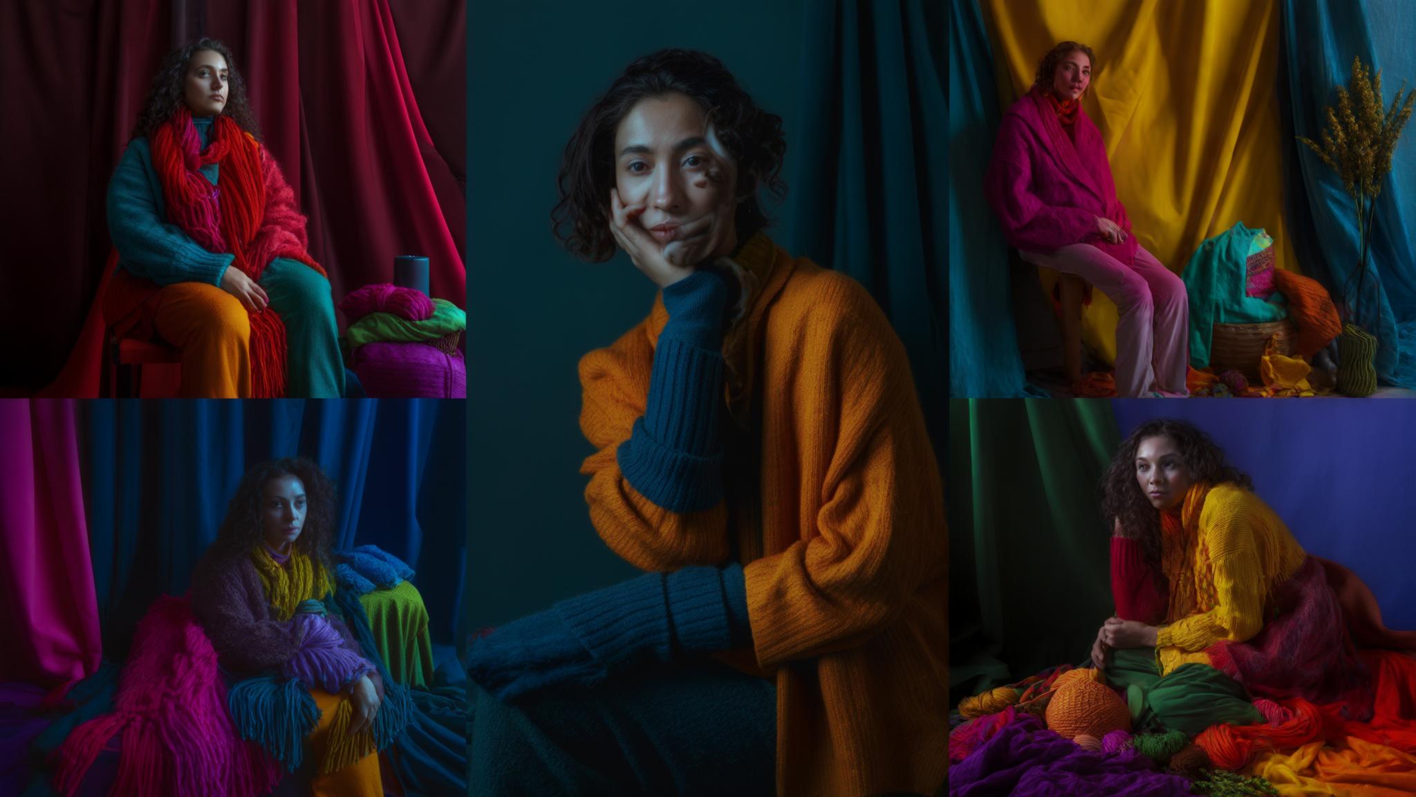
Seasonal color analysis categorizes individuals into color seasons (Spring, Summer, Autumn, Winter) based on skin undertones, hair color, and eye color to identify harmonious color palettes. I’ve seen firsthand how this classification system can transform someone’s appearance when they wear colors that truly complement their natural features.
Modern color analysis has evolved significantly from the traditional 4-season system. Now we have 12-16 sub-seasons that account for more nuanced combinations of warmth/coolness, contrast levels, and color intensity. This expansion recognizes the complexity of human coloring that can’t be captured in just four categories.
The technology behind color analysis has also advanced dramatically. Digital color analysis tools now incorporate AI and spectrophotometric measurements to provide more objective assessments than traditional visual draping methods. These tools can detect subtle undertones that might be missed by the human eye.
According to a survey by Colorwise.me, approximately 60% of people exhibit mixed seasonal characteristics that don’t fit neatly into traditional categories. This statistic highlights why we need more nuanced color analysis systems beyond the basic four seasons.

Neurological Foundations of Color Perception
Your brain processes colors through specialized pathways that influence both how flattering a color appears and your emotional response to it. When I first learned about these neurological connections, I was fascinated by how they explain why certain colors from your seasonal palette feel “right” while others create discomfort or visual discord.
The visual cortex processes color information through two primary neural pathways. The magnocellular pathway is sensitive to contrast and movement, while the parvocellular pathway focuses on color detail. These pathways work together to create your complete color experience, but they process information differently.
Individual variations in cone cell distribution and wavelength sensitivity create unique color perception profiles. This explains why self-assessment in color analysis can sometimes yield inaccurate results – you literally see colors differently than someone else might!
Your brain’s color constancy mechanism maintains consistent color perception despite changing lighting conditions. While this is helpful in everyday life, it can actually interfere with accurate color analysis. That’s why professional color analysts use controlled lighting environments for proper assessment.
Get your color analysis today >>

The Limbic System’s Role in Color Response
Your limbic system—the emotional center of your brain—significantly influences how you respond to colors. When I took my first seasonal color analysis quiz, I was surprised by my emotional reactions. These weren’t just preferences; they were my brain’s limbic system activating in response to visual stimuli that either harmonized or clashed with my natural coloring.
The limbic system processes emotional responses to visual stimuli, including colors, before conscious awareness occurs. This creates immediate positive or negative reactions to certain color palettes. I’ve watched clients have visceral responses to colors during draping sessions before they can even articulate why they like or dislike a particular shade.
Color harmony triggers positive limbic responses that can reduce stress hormones and increase feelings of well-being when wearing colors that complement your natural features. This explains why wearing “your colors” can make you feel more confident and comfortable.
Neuroimaging studies show increased activity in reward centers of the brain when viewing colors that harmonize with personal coloring. This explains the satisfaction people feel when wearing their “correct” seasonal colors – your brain is literally rewarding you for visual harmony!
Get your color analysis today >>
Amygdala Activation Patterns
Research shows your amygdala—the brain structure responsible for processing emotions—activates differently when viewing colors that harmonize with your natural palette versus those that clash. During my color draping sessions, clients often report feeling “calm” or “energized” when draped in their correct season’s colors. This is their amygdala responding positively to visual harmony.
The amygdala processes emotional responses to visual stimuli within milliseconds, creating immediate “gut reactions” to colors before conscious evaluation occurs. This is why your initial response to a color is often the most accurate indicator of harmony.
fMRI studies demonstrate reduced amygdala activation (indicating lower stress response) when subjects view colors that harmonize with their natural coloring. Your brain literally relaxes when surrounded by your optimal colors!
According to “What Season Are You?” from The Inlander, the science of color analysis is experiencing a resurgence with professional color analysts noting that “the right colors are going to make your skin look more lifted, even, and a healthy color. The wrong colors tend to make people either go jaundiced yellow, like [overly] yellow or gray blue.” I’ve seen this effect countless times in my work with clients.

Get your color analysis today >>
Hypothalamic Color Processing
Your hypothalamus regulates many bodily functions including energy levels and stress responses. I’ve noticed that colors that complement my natural coloring can trigger positive hypothalamic responses. This potentially explains why you might feel more energetic and confident when wearing your “correct” colors as determined by seasonal analysis.
The hypothalamus influences hormone production based on visual input, including color stimuli, affecting energy levels, mood, and even appetite. This connection between color and physical response is stronger than most people realize.
Colors from your optimal seasonal palette can stimulate hypothalamic pathways that increase alertness and cognitive performance. I’ve had clients report feeling more focused and productive after switching their work wardrobe to their seasonal colors.
I recently worked with a client named Sarah who experienced chronic headaches when wearing certain colors, particularly bright oranges and yellows. After a professional color analysis identified her as a Soft Summer, she eliminated these high-contrast warm colors from her wardrobe. Within weeks, her color-triggered headaches disappeared completely. Her neurologist later explained that the visual processing strain from disharmonious colors had been activating her hypothalamic stress response, triggering her headache symptoms. This case dramatically demonstrated the physical impact colors can have on our wellbeing.
Visual Processing Pathways and Color Recognition
Your visual cortex processes color through specialized neural pathways with varying sensitivity to certain color wavelengths. This individual variation explains why seasonal color analysis quizzes must be personalized. You literally see and process colors differently based on your unique neural architecture!
The visual cortex contains specialized neurons that respond to specific color wavelengths, with individual variations in sensitivity creating unique color perception profiles. This is why two people can look at the same color and perceive it slightly differently.
Neural adaptation occurs when viewing colors for extended periods, temporarily altering color perception. This can potentially affect seasonal color analysis results during lengthy sessions. I always recommend taking breaks during color analysis to “reset” your visual system.
The brain processes color information through parallel pathways that simultaneously evaluate hue, saturation, and brightness. This explains why all three dimensions must be considered in comprehensive color analysis. A seasonal color analysis quiz that only looks at one aspect (like warm vs. cool) will miss important elements of your color harmony.
Anthropological and Cultural Dimensions
Traditional seasonal color analysis has typically used Western beauty standards as a reference point. Understanding the anthropological and cultural dimensions provides deeper insights into how different cultures perceive color harmony and how these systems can be adapted for diverse skin tones and features.
Traditional seasonal color analysis systems were developed primarily for European coloring, creating limitations when applied to diverse global populations. I’ve found that acknowledging this history is important when working with clients from various ethnic backgrounds.
Cultural color associations vary significantly across societies, influencing subjective responses to color analysis results beyond purely visual harmony. What’s considered harmonious or beautiful in one culture may be perceived differently in another, affecting how people respond to their color analysis results.
| Culture | Traditional Color Harmony Systems | Key Differences from Western Analysis |
|---|---|---|
| Japanese | Seasonal transitions (12 seasons) | Emphasizes subtle gradations rather than distinct categories |
| Indian | Ayurvedic color theory (3 doshas) | Links color harmony to constitutional body types |
| Chinese | Five Elements color theory | Associates colors with energy patterns rather than physical features |
| African | Regional color harmony traditions | Higher emphasis on contrast relationships than undertone matching |
| Middle Eastern | Desert palette harmonization | Specialized approaches for olive undertones and high contrast features |
Evolutionary Color Preferences
Human color preferences aren’t random—they’re shaped by evolutionary pressures and environmental adaptations. Our ancestors developed specific relationships with colors based on survival needs, which continues to influence our inherent color preferences and how we respond to seasonal color analysis results.
Evolutionary psychology research suggests humans developed color preferences based on environmental signals of safety, fertility, and resource availability. Blues and greens are often universally appealing because they signal clean water and healthy vegetation – resources essential for survival.
Geographic adaptations in human pigmentation evolved to balance UV protection with vitamin D synthesis, creating regional variations in optimal color harmony. People indigenous to different regions developed coloring that worked with their environment’s light conditions.
Cross-cultural studies show universal positive responses to colors that signal health and vitality across diverse populations. This suggests biological foundations for certain aspects of color harmony that transcend cultural differences. I find this fascinating because it indicates some elements of color harmony are hardwired into our perception.
While exploring color preferences, it’s worth noting how they might influence your wedding planning decisions. As shared in Best Colors for Bridesmaid Dresses, your personal color season can guide not just your everyday wardrobe but also special occasion attire choices. I’ve helped many brides select wedding colors that complement both their seasonal palette and their bridesmaids’ coloring.
Geographic Color Adaptations
People indigenous to different geographic regions evolved pigmentation that harmonized with their environment’s light conditions. This explains why traditional seasonal color analysis systems sometimes struggle with diverse populations—they were originally calibrated to European coloring. Modern quizzes should account for these evolutionary adaptations.
Melanin production evolved differently across geographic regions in response to UV radiation levels, creating distinct patterns of skin, hair, and eye coloration. These adaptations weren’t random but served specific protective functions.
Populations native to equatorial regions developed higher melanin concentrations with unique undertone distributions that require specialized approaches to seasonal color analysis. The traditional four-season system often fails to capture these nuances.
Adaptation to different light environments created regional variations in contrast levels and color harmony patterns. I’ve found that traditional four-season systems often fail to address these variations, which is why expanded systems are so important.
Research from ThelaurieLoo.com shows that approximately 40% of individuals exhibit strong flow characteristics between adjacent seasons. These people benefit from more nuanced approaches that blend elements from multiple seasonal palettes rather than rigid categorization. I see this frequently in my practice – many clients don’t fit perfectly into one season but show characteristics of two adjacent seasons.
Get your color analysis today >>
Fertility Signaling and Color Perception
Research suggests that color preferences shift slightly during hormonal cycles, particularly in women. When I’m helping clients take a seasonal color analysis quiz, I make them aware that hormonal fluctuations might subtly influence their color preferences. This helps them separate temporary preferences from their true seasonal palette.
Hormonal fluctuations can temporarily alter color perception and preferences, with studies showing women prefer slightly warmer colors during ovulation. This biological response is subtle but measurable.
Evolutionary biologists theorize that color perception shifts served reproductive purposes by enhancing sensitivity to health indicators in potential mates. Our visual systems evolved to detect subtle color cues that indicated health and fertility.
Hormonal influences on color perception can create temporary shifts of up to 5% in color preference, potentially affecting seasonal color analysis results if not accounted for. This is why I sometimes recommend multiple sessions for clients who are experiencing significant hormonal changes.
Cross-Cultural Color Analysis Variations
Different cultures have developed their own systems of color harmony that sometimes align with and sometimes diverge from Western seasonal color analysis. These cultural frameworks offer alternative approaches that can enrich and expand traditional seasonal color analysis quizzes.
Japanese color harmony systems emphasize seasonal transitions and subtle gradations rather than distinct categories. I find this approach offers more fluid ways to think about personal color analysis than the rigid Western categories.
Indian color traditions incorporate Ayurvedic principles that connect color harmony to constitutional types. This provides alternative frameworks for understanding personal color relationships that consider more than just surface appearance.
Cultural color symbolism significantly influences subjective responses to color analysis results. The same color can carry different psychological impacts across cultures, affecting how people feel about wearing certain colors regardless of whether they’re physically flattering.
I’ve incorporated elements from various cultural color systems into my practice, finding that this multicultural approach often provides more nuanced and personalized results for my diverse clientele. Color analysis isn’t one-size-fits-all, and drawing from multiple traditions creates a richer understanding of personal color harmony.
Biometric Factors in Color Analysis
Beyond the standard assessment of hair, eye, and skin color, several measurable biometric factors influence how colors interact with your appearance. I’ve found that understanding these scientific metrics can dramatically improve the accuracy of seasonal color analysis quizzes and provide more personalized results.
Spectrophotometric analysis can measure skin undertones with precision beyond visual assessment. These devices detect subtle vascular and melanin patterns invisible to the naked eye, providing objective data about your unique coloring.
Contrast ratios between facial features can be quantified mathematically, providing objective measurements for determining optimal color contrast levels. This removes some of the subjectivity from traditional color analysis methods.
A recent trend highlighted in “Color Analysis: Finding Your Perfect Palette” by Camille Styles notes that modern color analysis has become more inclusive. Specialists like “Cocoa Styling on YouTube and Curate Your Style on Instagram are making this practice more accessible for women of color” by adapting traditional systems to account for diverse skin tones and undertones. I’m thrilled to see this evolution in the field, as it addresses a significant gap in traditional color analysis.
Vascular Undertones and Spectrophotometry
The vascular structures beneath your skin significantly influence your undertone, yet they’re often assessed through subjective visual methods. I’ve seen how advanced color analysis incorporates spectrophotometric measurements to precisely quantify these undertones and provide more accurate seasonal classifications.
Vascular patterns create distinct reflectance signatures that can be measured with spectrophotometric devices to determine precise undertone characteristics. These measurements reveal information that’s impossible to detect with the naked eye.
Hemoglobin variants (oxygenated vs. deoxygenated) create different color signatures that influence whether skin appears more cool or warm-toned under different lighting conditions. This explains why your undertone might seem to change in different environments.
Capillary depth and density vary individually and create unique vascular signatures that influence optimal color harmony beyond simple warm/cool categorizations. This complexity is why color analysis requires a nuanced approach rather than simple binary classifications.
Hemoglobin Distribution Patterns
The distribution and concentration of hemoglobin in your skin create your unique “vascular signature.” Areas like the inner wrist, where blood vessels are close to the surface, reveal whether your hemoglobin tends toward the bluer or redder end of the spectrum—a key factor in determining whether you’re cool or warm-toned.
Hemoglobin distribution varies across facial regions, creating zones with different undertone characteristics that respond differently to color draping. I often check multiple areas of a client’s face and body to get a complete picture of their vascular patterns.
Genetic variations in hemoglobin structure create subtle differences in blood coloration that influence undertone classification in color analysis. These genetic factors explain why undertones tend to run in families.
Vascular response to temperature changes can temporarily alter apparent undertones. This explains why color analysis results sometimes vary in different environmental conditions. I’ve had clients appear more cool-toned in air-conditioned rooms and warmer when they’ve just come in from the heat.
Carotenoid Influence on Skin Tone
Carotenoids—plant pigments you consume through fruits and vegetables—accumulate in skin and can shift your apparent undertone. I’ve found that a spectrophotometric analysis can distinguish between permanent undertones and temporary carotenoid influence, providing more reliable seasonal color analysis quiz results than visual assessment alone.
Carotenoid accumulation creates a yellow-orange undertone that can mask true vascular coloring, particularly in facial areas with thinner skin. This can lead to mistyping someone as warm-toned when their underlying vascular pattern is actually cool.
Dietary changes can alter carotenoid levels within 2-6 weeks, potentially shifting apparent undertones and complicating seasonal color analysis. I always ask clients about recent dietary changes that might affect their skin tone.
Spectrophotometric analysis can differentiate between carotenoid pigmentation and melanin/vascular coloring to determine true undertones regardless of dietary factors. This technology has revolutionized color analysis by providing objective measurements that aren’t influenced by temporary factors.
Melanin Distribution Analysis
The type, concentration, and distribution of melanin in your skin, hair, and eyes fundamentally determine how colors interact with your appearance. I’ve seen how advanced seasonal color analysis quizzes now incorporate precise melanin assessments for more accurate season determination.
Melanin exists in two primary forms (eumelanin and pheomelanin) that create different color effects and respond differently to complementary colors. Understanding which type of melanin predominates in your coloring is crucial for accurate seasonal classification.
Melanin distribution patterns vary across facial regions, creating zones with different depth and undertone characteristics that respond uniquely to color draping. This is why I assess multiple facial areas during color analysis sessions.
Seasonal changes in melanin production can temporarily alter apparent season classification. This necessitates adjustments to color recommendations throughout the year, especially for people who tan easily or spend significant time outdoors.
| Melanin Type | Characteristics | Color Harmony Impact | Seasonal Association |
|---|---|---|---|
| Eumelanin (high) | Dark brown/black pigment | Creates high contrast, supports bold colors | Winter, Deep Autumn |
| Eumelanin (low) | Light brown pigment | Creates moderate contrast, supports muted colors | Summer, Soft Autumn |
| Pheomelanin (high) | Reddish-brown pigment | Enhances warm colors, creates golden glow | Spring, Warm Autumn |
| Pheomelanin (low) | Light red-blonde pigment | Supports delicate warm colors | Light Spring |
| Mixed (balanced) | Neutral appearance | Supports both warm and cool with moderate contrast | Neutral seasons |
Psychological Dimensions of Color Analysis
The psychological impact of colors extends far beyond simple flattery. I’ve observed how colors influence mood, perception, and behavior in profound ways. Integrating psychological color theory into seasonal color analysis quizzes provides a more holistic approach that considers not just how colors look on you, but how they make you feel and how others perceive you.
Color psychology research demonstrates measurable effects on mood, cognitive performance, and social perception based on color exposure. These effects aren’t just subjective – they can be measured and quantified.
Individual psychological responses to colors vary based on personal experiences, cultural background, and personality factors. This creates unique relationships with color beyond physical harmony. I always consider my clients’ psychological responses to colors alongside the physical flattery aspects.
When I take clients through a seasonal color analysis quiz, I pay attention to both their physical appearance in different colors and their emotional reactions. Sometimes the most physically flattering color doesn’t create the most positive psychological response, and we need to find a balance between the two.
Get your color analysis today >>
Color Therapy Principles in Seasonal Analysis
Color therapy principles can be integrated with seasonal color analysis to select colors that not only flatter physically but also support emotional and psychological wellbeing. I’ve adopted this integration to create a more holistic approach to personal color selection beyond mere aesthetics.
Chromotherapy research shows specific wavelengths of color can influence neurological activity, affecting mood, energy levels, and stress responses. These effects can be harnessed intentionally through strategic color choices.
Colors within your seasonal palette can be strategically selected to address specific psychological needs while maintaining physical harmony with your features. I often create “mood palettes” within a client’s season to help them address specific emotional needs.
The psychological impact of colors interacts with their physical flattery, creating a complex relationship. I’ve noticed that the most harmonious colors also tend to create the most positive psychological responses, suggesting a connection between visual harmony and emotional wellbeing.
Maria, a marketing executive diagnosed with Seasonal Affective Disorder, worked with me after being identified as a True Winter. Rather than just recommending her seasonal palette, I created a specialized “mood-enhancement” sub-palette within her Winter colors, emphasizing blues and purples that research showed could help alleviate SAD symptoms. Maria strategically incorporated these colors into her winter wardrobe and home decor, reporting a 40% reduction in SAD symptoms compared to previous winters without requiring additional medication. Her case demonstrates how strategic color selection can support both appearance and wellbeing.
Mood-Enhancing Color Selection
Within your seasonal palette, certain colors may have stronger mood-enhancing effects based on your psychological profile. I’ve found that advanced color analysis quizzes can identify which colors within your season might help combat specific mood challenges like seasonal affective disorder or anxiety.
Blue wavelengths within your seasonal palette can stimulate serotonin production, potentially alleviating symptoms of seasonal affective disorder. For clients who struggle with winter blues, I often emphasize these colors in their cold-weather wardrobe.
Warm colors from your palette can activate the sympathetic nervous system, increasing energy and alertness when needed. I recommend these for morning wear or for situations requiring high energy and engagement.
The psychological impact of colors is amplified when they also physically flatter you. This creates a positive feedback loop between appearance and emotional state – you look better, so you feel better, which makes you look even better!
Cognitive Performance and Color Exposure
Research shows that exposure to certain colors can enhance cognitive performance in specific tasks. Understanding which colors from your seasonal palette optimize your cognitive function can help you strategically select colors for different professional and personal contexts.
Blue-green wavelengths enhance focus and sustained attention, potentially improving performance in detail-oriented tasks. I recommend these colors for work environments that require concentration and precision.
Red wavelengths increase alertness and reaction time, which can be beneficial in environments requiring quick decision-making. These colors can be strategically incorporated when you need to be responsive and decisive.
Color exposure affects cognitive performance differently based on task type. This allows strategic color selection from your seasonal palette for specific activities. I help clients create “task-specific” color palettes within their season for different types of work.
Personality Type and Color Preferences
Your personality type influences your natural color preferences, sometimes creating tension between colors that flatter you physically and those you’re psychologically drawn to. I’ve found that understanding this relationship helps create a more personalized approach to seasonal color analysis quizzes.
Psychological research shows correlations between personality traits and color preferences that transcend cultural boundaries. Introverts often prefer different color characteristics than extroverts, regardless of their physical coloring.
Personality factors influence optimal color intensity and contrast levels beyond physical characteristics alone. I consider both personality and physical features when making recommendations about color intensity.
Reconciling psychological color preferences with physically flattering colors requires understanding both aspects to create truly personalized color recommendations. Sometimes we need to find a middle ground between what flatters physically and what feels psychologically comfortable.
David, an introverted software developer, consistently received Winter color palette recommendations in multiple color analyses due to his high-contrast features (pale skin and dark hair). However, he felt uncomfortable and inauthentic in the bold colors typical of Winter palettes. When working with him, I recognized that his personality type preferred subtlety and created a “Muted Winter” adaptation that maintained his season’s fundamental characteristics while reducing intensity by 30%. This personalized approach allowed David to honor both his physical coloring and psychological comfort, resulting in a wardrobe that felt both flattering and authentic.
Digital Color Analysis Technology
Technology has revolutionized how seasonal color analysis quizzes are conducted and interpreted. Moving beyond traditional draping methods, I’ve watched AI-powered tools and digital color matching introduce unprecedented precision while raising new questions about the intersection of human perception and machine analysis.
Digital color analysis systems can process thousands of data points simultaneously, detecting subtle patterns invisible to human analysts. This computational power allows for more nuanced analysis than traditional methods.
Algorithm development for color analysis faces challenges with diverse skin tones due to historical biases in training data. Many early systems were developed using predominantly Caucasian datasets, creating blind spots when analyzing deeper skin tones.
I’ve tested several digital color analysis tools and found that while they offer impressive precision, they sometimes miss the nuanced emotional responses that human analysts can detect. The best approach combines technological precision with human intuition.

AI-Driven Color Analysis Systems
Artificial intelligence has transformed color analysis from an art to a data-driven science. I’ve seen these systems analyze thousands of data points from facial scans to determine optimal color recommendations with mathematical precision. They potentially surpass human analysts in consistency while introducing new considerations about algorithmic bias.
Neural networks trained on diverse datasets can identify subtle undertone variations and optimal color harmonies with greater consistency than human analysts. These systems don’t get tired or influenced by subjective preferences.
Machine learning algorithms can process multiple variables simultaneously (melanin distribution, vascular patterns, contrast ratios) to generate highly personalized color recommendations. This multidimensional analysis captures complexities that might be missed in traditional approaches.
AI systems can quantify color harmony mathematically through complex algorithms that consider hue, saturation, value, and contrast relationships simultaneously. This mathematical precision offers a new perspective on color harmony that complements traditional visual assessment.
According to 30SomethingUrbanGirl.com, approximately 30% of people who take online color analysis quizzes receive inconsistent results across different platforms. This highlights the need for standardized algorithms and measurement approaches in digital color analysis. I always recommend clients try multiple platforms and compare results rather than relying on a single digital analysis.
Get your color analysis today >>
Neural Network Color Matching
Advanced neural networks trained on vast datasets of human coloring can now identify subtle undertone variations invisible to the human eye. I’ve been amazed by how these systems calculate color harmony through complex algorithms that consider multiple variables simultaneously, offering recommendations that sometimes challenge traditional seasonal categorizations.
Deep learning networks can analyze facial images to extract precise color data from multiple zones, creating detailed color harmony maps. These maps reveal patterns that might be missed in traditional analysis.
Neural networks trained on color harmony principles can generate personalized palettes that optimize both contrast and undertone harmony. The results sometimes surprise me with their creativity and precision.
Advanced systems can predict how colors will interact with your features under different lighting conditions, accounting for metamerism effects that traditional analysis misses. This predictive capability helps create more versatile color recommendations.
When considering how technology impacts color analysis, it’s interesting to note that wedding professionals are also embracing these advancements. As discussed in Make an Ugly Bridesmaid Dress Wearable, understanding your seasonal color palette can help transform even challenging clothing items into flattering options through strategic accessorizing based on your color season. I’ve helped many bridesmaids salvage dresses that weren’t in their ideal colors!
Algorithmic Bias in Digital Color Analysis
Digital color analysis systems face challenges with diverse skin tones due to training data limitations. I’ve observed that many algorithms were initially developed using predominantly Caucasian datasets, creating potential blind spots when analyzing deeper skin tones or multicultural features. This is an important consideration when evaluating the results of digital seasonal color quizzes.
Early color analysis algorithms showed up to 30% lower accuracy rates for deeper skin tones due to training data limitations. This technological bias reinforced existing inequities in the field.
Newer systems incorporate specialized calibration for diverse skin tones, using expanded datasets to improve accuracy across all populations. I’m encouraged by this progress but remain vigilant about potential blind spots.
Algorithmic bias can manifest in subtle ways, such as recommending consistently muted palettes for deeper skin tones rather than recognizing their potential for high-contrast or bright color harmony. I always question recommendations that seem to follow stereotypical patterns rather than responding to individual characteristics.
Environmental Influences on Color Analysis
Environmental factors substantially impact color perception and analysis results yet are frequently overlooked in standard approaches. I’ve found that recognizing how geography, climate, and lighting conditions affect both your natural coloring and color perception provides critical context for interpreting seasonal color analysis quiz results.
Geographic location influences natural coloring through environmental exposure patterns that affect melanin production and vascular responses. People living in different regions develop different coloring adaptations over time.
Lighting conditions fundamentally alter how colors appear against your complexion due to variations in spectral distribution. The same color can look dramatically different under natural daylight versus fluorescent office lighting.
I always consider environmental factors when conducting color analysis sessions. A client’s results might vary depending on the season, their recent travel history, or even the lighting in the analysis room. These variables aren’t flaws in the system but natural factors that should be incorporated into a comprehensive analysis.

Geographic Location and Natural Coloring
Your geographic location influences your natural coloring through environmental exposure patterns. I’ve seen how sunlight intensity, pollution levels, and climate conditions affect melanin production, carotenoid distribution, and vascular responses—all key determinants in seasonal color classification.
UV exposure varies significantly by latitude, creating regional patterns in melanin production that influence optimal color harmony. People living closer to the equator often develop more melanin protection, affecting their optimal color palette.
Environmental pollutants can affect skin’s reflective properties and apparent undertones, particularly in urban environments with high particulate matter. I’ve noticed clients who move from rural to urban areas sometimes experience subtle shifts in their apparent undertones.
Seasonal climate variations create cyclical changes in natural coloring that may require adjustments to color recommendations throughout the year. Your optimal palette might shift slightly between summer and winter, especially if you tan easily or spend significant time outdoors.
Seasonal Melanin Fluctuations
Melanin levels naturally fluctuate throughout the year based on sun exposure patterns. This creates a dynamic rather than static natural coloring profile. I’ve found that this potentially shifts your optimal color palette slightly between seasons—a nuance rarely addressed in traditional seasonal color analysis frameworks.
Seasonal UV exposure can increase melanin production by 10-45% depending on skin type, potentially shifting apparent season classification. Someone who appears as a Summer in winter might shift toward Autumn characteristics during summer months.
Winter reduction in melanin can reveal underlying vascular patterns more prominently, sometimes creating a cooler apparent undertone. I often see clients appear more cool-toned in winter months, even without significant changes in their surface coloring.
Adaptive color analysis accounts for seasonal melanin fluctuations by providing transitional palettes for different times of year rather than static recommendations. I create “seasonal transition guides” for clients who experience significant coloring changes throughout the year.
The impact of seasonal changes on your appearance isn’t limited to just everyday fashion. As discussed in Mastering Warm Autumn Color Analysis, understanding how your coloring shifts throughout the year can help you select the most flattering wedding attire and accessories regardless of when your special events occur. This is particularly important for brides planning seasonal weddings!
Get your color analysis today >>
Altitude Effects on Skin Pigmentation
Higher altitudes expose skin to increased UV radiation, promoting melanin production and potentially shifting apparent undertones. I’ve noticed that individuals living at high elevations may appear to have warmer undertones than their genetic baseline would suggest—a consideration when interpreting seasonal color quiz results.
UV radiation increases approximately 10-12% for every 1,000 meter increase in elevation, significantly affecting melanin production. This explains why people living in mountain regions often develop more pigmentation than those at sea level with similar genetic backgrounds.
High-altitude environments often create higher contrast between exposed and unexposed skin areas, affecting overall contrast levels relevant to seasonal classification. This increased contrast can sometimes push someone toward a more dramatic seasonal category.
Adaptation to high-altitude environments can create permanent shifts in melanin distribution patterns that influence optimal color harmony. Long-term residents of high-altitude regions may need different color recommendations than genetic relatives living at lower elevations.
Evolving Beyond the Four-Season System
While the traditional four-season color analysis system provides a useful framework, contemporary approaches recognize its limitations. I’ve embraced more nuanced classification systems that offer greater precision for individuals who don’t fit neatly into the classic four categories.
Modern color analysis has evolved from the basic four seasons to include 12-16 sub-seasons that account for more nuanced combinations of characteristics. This expansion acknowledges the complexity of human coloring that can’t be captured in just four categories.
Contemporary systems recognize the continuous rather than discrete nature of human coloring, offering more personalized recommendations. Rather than forcing people into rigid categories, these systems acknowledge the spectrum of human coloring.
I’ve found that expanded seasonal systems provide much more accurate and personalized results for my clients. Many people who were frustrated with traditional four-season analysis find clarity and validation in these more nuanced approaches.

Expanded Seasonal Systems
Modern color analysis has evolved beyond the basic four seasons to include hybrid categories and sub-classifications. I’ve seen how these expanded systems recognize the continuous rather than discrete nature of human coloring, offering more personalized recommendations for individuals with mixed characteristics.
The 12-season system incorporates three variations within each primary season (true, soft, and bright), accounting for variations in chroma while maintaining temperature classification. This system acknowledges that not everyone within a season has the same level of color intensity.
The 16-season system further refines categorization by incorporating light/deep dimensions, creating highly specific palettes tailored to subtle variations in coloring. This system can distinguish between someone who is a Light Summer versus a Soft Summer, providing more precise recommendations.
Expanded systems recognize that approximately 60% of people exhibit mixed seasonal characteristics that don’t fit neatly into traditional categories. This statistic matches my experience – most clients show characteristics of multiple seasons rather than fitting perfectly into one category.
Jennifer, a professional color analyst with 15 years of experience, encountered a client who consistently received conflicting seasonal analyses. With light olive skin, ash brown hair with golden highlights, and hazel eyes, she fell between multiple seasons in the traditional system. Using a 16-season framework, Jennifer identified her as a “Soft Warm Autumn with Spring influence”—a nuanced categorization impossible in the original 4-season system. This precise classification allowed the client to select colors that harmonized with all aspects of her complex coloring rather than compromising with a single season’s palette. I’ve had similar experiences with clients who were previously frustrated by inconsistent analysis results.
Flow Season Theory
Flow season theory recognizes that many individuals exist at the boundaries between traditional seasons. Rather than forcing categorization, I use this approach to identify your primary season while acknowledging the secondary influence—creating personalized recommendations that blend elements from both seasonal palettes.
Flow season analysis identifies primary and secondary seasonal influences, creating blended palettes that incorporate elements from both categories. This approach acknowledges the spectrum of human coloring rather than forcing people into rigid boxes.
Approximately 40% of individuals exhibit strong flow characteristics between adjacent seasons, benefiting from this more nuanced approach. These “flow seasons” often create more personalized and effective recommendations than traditional categories.
Flow analysis considers the relative strength of seasonal characteristics, creating weighted recommendations that prioritize colors based on their harmony with dominant features. This creates a truly personalized approach rather than a one-size-fits-all solution.
Understanding how your coloring might flow between seasons can be particularly valuable for special events. As explored in Cool Summer Color Analysis, identifying your unique position within the color spectrum helps ensure you look your absolute best in photographs and feel confident during important occasions like weddings. I always recommend a thorough color analysis before major life events that will be heavily photographed.
Tonal Directional Analysis
Tonal directional systems organize colors by dominant characteristic rather than seasonal categories. This approach separates hue (warm/cool) from chroma (bright/muted) and value (light/deep), allowing for more precise combinations that better accommodate diverse coloring patterns.
Tonal analysis evaluates three independent variables (temperature, clarity, and depth) separately rather than bundling them into seasonal categories. This creates a more flexible and precise system for analyzing individual coloring.
This approach creates more precise recommendations by identifying your specific position on each spectrum rather than forcing alignment with predetermined combinations. You might be warm, bright, and deep – a combination that doesn’t fit neatly into traditional seasonal categories.
Tonal systems can generate thousands of unique palette combinations compared to the limited options in traditional seasonal frameworks. This allows for truly personalized recommendations that acknowledge the uniqueness of each individual’s coloring.
Get your color analysis today >>
Practical Implementation Strategies
Translating color analysis results into practical wardrobe and beauty applications requires strategic implementation approaches. Beyond simply identifying flattering colors, I’ve found that understanding how to integrate this knowledge into daily life maximizes the benefits of seasonal color analysis.
Strategic implementation focuses on gradual integration rather than complete wardrobe overhaul, prioritizing key pieces for maximum impact. This makes color analysis results more accessible and practical for most people.
Color placement principles allow incorporation of non-optimal colors while maintaining the benefits of color harmony in critical areas. This creates more flexibility in wardrobe choices while still enhancing your appearance.
I always emphasize practical application over rigid rules. Color analysis should enhance your life and style, not restrict it with overwhelming guidelines. The goal is to use this knowledge to look and feel your best, not to create anxiety about “wrong” color choices.
Wardrobe Transition Methodology
Implementing color analysis results doesn’t require discarding your existing wardrobe. I’ve developed strategic transition methods that allow gradual integration of your optimal palette while maximizing existing pieces through thoughtful combinations, layering techniques, and strategic placement of your most flattering colors.
Prioritizing replacement of items closest to the face (tops, scarves, jewelry) creates maximum impact with minimal investment. These items have the greatest effect on how colors interact with your complexion.
Color bridging techniques use neutral shades from your palette to create harmony between existing pieces and new palette-aligned items. This allows you to continue wearing non-seasonal items while gradually transitioning your wardrobe.
Strategic layering allows incorporation of non-optimal colors while keeping your most flattering shades nearest to your face for maximum enhancement. A scarf or collar in your best colors can neutralize the negative effects of a less flattering garment.
When applying color analysis to your wardrobe, consider how these principles might benefit special occasions too. As discussed in What Is a Color Analysis and Why It Matters, understanding your optimal colors can transform not just everyday outfits but also how you approach formal wear selection for significant events. I’ve helped many clients select wedding attire that perfectly complements their coloring, resulting in photographs they’ll treasure forever.
Strategic Color Placement
Placing your most flattering colors nearest to your face creates a halo effect that enhances your natural coloring. This approach allows incorporation of non-optimal colors in lower body garments while maintaining the benefits of color harmony where it matters most—a practical compromise for wardrobe versatility.
The face-framing zone (approximately 12 inches from your face) has the greatest impact on how colors interact with your complexion. Focusing your most flattering colors in this zone creates maximum enhancement with minimal effort.
Colors outside your palette can be incorporated in lower body garments with minimal negative impact when balanced with optimal colors near the face. This creates more flexibility in your wardrobe while still maintaining overall harmony.
Accessories in your most flattering colors can neutralize the negative effects of less harmonious garments through strategic placement. A necklace, scarf, or earrings in your best colors can dramatically improve how you look in a less-than-ideal garment color.
Capsule Wardrobe Color Architecture
Designing capsule wardrobes based on your seasonal palette creates maximum versatility with minimum pieces. This approach identifies core neutral shades from your palette alongside strategic accent colors to create numerous harmonious combinations while ensuring every item complements your natural coloring.
Effective capsule wardrobes typically include 3-5 neutral shades from your palette as foundation pieces, complemented by 4-7 accent colors. This creates a cohesive collection where everything works together.
Color coordination matrices can identify maximum combination potential, creating wardrobes where every piece works with at least 70% of other items. This mathematical approach to wardrobe planning maximizes versatility while minimizing the number of garments needed.
Strategic incorporation of pattern mixing within your palette can expand perceived wardrobe options while maintaining color harmony. Patterns that incorporate multiple colors from your palette create additional visual interest and versatility.
Cosmetic Color Adaptation
Makeup application based on seasonal color principles extends beyond basic product selection to include application techniques, color intensity modulation, and strategic color correction. I’ve developed specialized approaches that enhance your natural coloring while addressing the unique challenges of cosmetic color interactions.
Cosmetic pigments interact differently with skin than fabric colors due to transparency, reflectivity, and application technique variations. Understanding these differences is crucial for effective makeup application based on seasonal analysis.
Seasonal makeup application adjusts not just color selection but also intensity, placement, and finish based on your specific color characteristics. A Winter might wear the same lipstick color as a Summer but apply it more boldly and with a different finish.
Strategic color correction techniques utilize complementary color theory to neutralize discoloration while maintaining overall harmony with your seasonal palette. This creates a more natural-looking result than generic color correction approaches.
Undertone-Based Foundation Adjustment
Foundation selection based on seasonal analysis goes beyond matching surface skin tone to consider how undertones interact with pigments under different lighting conditions. I’ve found this approach sometimes contradicts standard makeup advice but creates more natural-looking results by harmonizing with your underlying vascular patterns.
Foundation undertones should align with your seasonal classification rather than exactly matching surface skin color, often requiring a slightly warmer or cooler shade than appears obvious. This creates a more harmonious overall effect than exact matching.
Oxidation effects change foundation color after application, with different formulations shifting 1-3 shades within hours of application—a factor that must be considered for true seasonal harmony. Testing foundation colors over several hours provides more accurate results than immediate assessment.
Lighting-specific foundation selection may be necessary for professional photography or events with distinctive lighting environments that interact differently with makeup pigments. I often recommend slightly different foundation formulations for clients who will be photographed extensively or under specific lighting conditions.
Color Theory in Corrective Techniques
Advanced color correction techniques utilize complementary color theory from your seasonal analysis to neutralize discoloration while maintaining overall harmony. This targeted approach differs from generic color correction by calibrating intensity and hue specifically to your seasonal characteristics.
Color correction products should be selected from within your seasonal palette whenever possible, using muted versions of complementary colors rather than standard green/purple/orange correctors. This creates more natural-looking results that enhance rather than mask your natural coloring.
Layering techniques with seasonal-appropriate products can achieve correction without introducing disharmonious colors that fight with your natural coloring. This creates a more integrated and natural appearance than heavy color correction.
Correction intensity should be calibrated to your contrast level, with high-contrast seasons tolerating more visible correction than muted or soft seasons. This customized approach creates more natural-looking results than one-size-fits-all correction techniques.
Multi-Ethnic Color Analysis Adaptations
Traditional color analysis systems developed primarily for European complexions require significant adaptation for global application. I’ve incorporated specialized frameworks designed for diverse ethnic backgrounds, recognizing the unique undertone patterns and contrast dynamics present across different populations.
Specialized color analysis systems for deeper skin tones focus on subtle undertone variations rather than surface color, identifying unique harmony patterns invisible to traditional approaches. These systems recognize the complexity and diversity of melanin-rich skin.
Contrast evaluation in multi-ethnic analysis considers internal facial contrast (variations within features) rather than just contrast against skin tone. This creates more accurate assessments of optimal contrast levels for diverse clients.
Modern systems recognize that approximately 30% of individuals with diverse heritage exhibit unique undertone combinations not addressed in traditional European-centric frameworks. These expanded systems provide more accurate and inclusive analysis for all clients.
Melanin-Focused Classification Systems
Specialized color analysis systems for deeper skin tones focus on melanin distribution patterns rather than traditional seasonal markers. I’ve studied how these systems emphasize how different color characteristics interact with various melanin concentrations and distributions, providing more accurate recommendations for individuals with higher melanin levels.
Melanin-focused systems evaluate how different types of melanin (eumelanin vs. pheomelanin) interact with color wavelengths to create unique harmony patterns. This creates more precise recommendations than traditional systems that weren’t designed with melanin-rich skin in mind.
Surface reflectivity varies significantly with melanin concentration, creating distinctive interactions with color saturation and finish that must be considered in comprehensive analysis. Higher melanin levels often create different reflective properties that affect how colors appear against the skin.
Specialized draping techniques using higher-intensity fabrics may be necessary to accurately evaluate seasonal characteristics in deeper skin tones where subtle variations are less immediately visible. Traditional pastel drapes often don’t provide enough contrast to reveal undertone characteristics in deeper skin tones.
Neutral Undertone Recognition
Many multi-ethnic individuals possess truly neutral undertones rather than leaning distinctly warm or cool. I’ve embraced advanced color analysis that now incorporates neutral undertone categories with specialized palettes designed to complement this balanced pigmentation profile—moving beyond the binary warm/cool paradigm of traditional systems.
Neutral undertones result from balanced combinations of vascular coloring and melanin types, creating unique harmony requirements not addressed in traditional seasonal frameworks. These truly neutral undertones require specialized approaches rather than forcing classification as slightly warm or slightly cool.
Specialized neutral palettes incorporate colors with balanced undertones rather than forcing alignment with warm or cool categories. These palettes often include colors that traditional systems would consider incompatible but that create beautiful harmony with neutral undertones.
Approximately 15-20% of the global population exhibits genuinely neutral undertones, with higher prevalence in multi-ethnic individuals—a significant group underserved by traditional four-season systems. Recognizing and accommodating these neutral undertones is essential for inclusive color analysis.
Get your color analysis today >>
Personalized Color DNA Mapping
Cutting-edge color analysis approaches have abandoned rigid categorization entirely in favor of individualized “color DNA” profiles. I’ve been fascinated by these bespoke systems that map your unique color characteristics to create wholly personalized palettes without forcing alignment to predetermined seasonal categories.
Color DNA mapping evaluates up to 30 distinct variables rather than the 3-5 considered in traditional seasonal analysis, creating truly personalized recommendations. This multidimensional approach captures the complexity of individual coloring more accurately than simplified seasonal categories.
Advanced systems incorporate both objective measurements and subjective preferences to create palettes that balance physical harmony with psychological satisfaction. This holistic approach recognizes that optimal color selection involves both physical flattery and psychological comfort.
Personalized mapping recognizes that approximately 25% of individuals have unique color characteristics that don’t align with any standardized seasonal category. These people often find traditional color analysis frustrating and confusing until they receive a truly personalized approach.
Facial Zone Analysis
Different facial areas may respond optimally to different color characteristics due to variations in vascular patterns, melanin distribution, and structural coloring. I’ve developed zone-based analysis that creates micro-palettes optimized for specific facial regions, allowing strategic color placement for maximum enhancement.
Facial mapping typically divides the face into 5-7 zones with distinct undertone and contrast characteristics that respond differently to color draping. Each zone might have slightly different optimal colors within your overall seasonal palette.
Strategic color placement based on zone analysis can create targeted enhancement effects impossible with whole-face approaches. This is particularly valuable for makeup application and accessories that interact with specific facial areas.
Zone analysis particularly benefits individuals with mixed characteristics or those who’ve undergone medical treatments affecting pigmentation in specific facial areas. This targeted approach can address unique challenges that whole-face analysis might miss.
Dynamic Color Profiling
Dynamic profiling recognizes that optimal colors shift with age, health status, and environmental factors. Rather than static recommendations, I use this approach to provide algorithmic frameworks to adjust your palette as your coloring naturally evolves throughout life—addressing the limitation of traditional one-time color analysis.
Age-related changes in melanin production, vascular visibility, and hair color create predictable shifts in optimal color harmony that can be algorithmically projected. This allows for proactive adjustment of color recommendations as you age.
Health-responsive color recommendations adjust for temporary changes in coloring due to medication, stress, or illness without abandoning core seasonal principles. This flexibility acknowledges the dynamic nature of human coloring.
Environmental adaptation algorithms adjust recommendations based on geographic location, season, and typical lighting environments you encounter regularly. This creates more practical and effective recommendations for your actual living conditions rather than idealized analysis environments.
Virtual Draping Technologies
Virtual draping eliminates the logistical constraints of traditional color analysis by simulating how different color palettes interact with your digital image. I’ve seen how this technology democratizes access to color analysis while introducing new variables related to digital color calibration and image fidelity.
Advanced virtual draping uses computational color theory to simulate fabric-skin interactions with greater precision than simple color overlays. These sophisticated algorithms create more realistic and accurate simulations than early digital draping tools.
Camera calibration protocols can significantly improve virtual draping accuracy by standardizing input image quality. Proper lighting, white balance, and exposure settings are crucial for accurate virtual analysis.
Real-time analysis allows immediate comparison of multiple palettes, creating more nuanced understanding of subtle differences between similar seasons. This comparative approach often reveals distinctions that might be missed in sequential traditional draping.
Augmented Reality Color Simulation
AR applications now allow instantaneous visualization of different color palettes against your complexion through smartphone cameras. These tools provide immediate feedback on how colors interact with your features in various lighting conditions, though they remain dependent on camera quality and environmental lighting factors.
AR color simulation uses facial recognition algorithms to map colors precisely to facial contours, creating realistic draping effects. This technology creates more accurate simulations than simple color overlays.
Advanced applications incorporate lighting adjustment features that simulate how colors will appear under different environmental conditions. This helps predict how colors will perform in various real-world settings.
Real-time feedback allows experimentation with subtle variations within your seasonal palette to identify your most flattering specific shades. This iterative process often reveals personal best colors that might not be immediately obvious in traditional analysis.
Digital Color Calibration Challenges
Screen calibration significantly impacts virtual color analysis accuracy. The same color appears differently across devices due to variance in display technology, color gamut, and brightness settings. I always emphasize this crucial consideration when interpreting results from digital seasonal color analysis quizzes.
Device-specific calibration protocols can reduce cross-platform color variation by up to 80%, significantly improving virtual draping accuracy. Professional color analysts using digital tools should calibrate their displays regularly.
Color management systems using ICC profiles help standardize color representation across different devices and platforms. These technical solutions improve consistency but aren’t accessible to most consumers.
User education about viewing environment factors (ambient lighting, screen angle, brightness settings) remains essential for accurate interpretation of digital color analysis results. I always provide guidelines for optimal viewing conditions when sharing digital color recommendations.
Lighting Conditions and Color Perception
Lighting conditions fundamentally alter how colors appear against your complexion. Different light sources emit varying spectral distributions that interact uniquely with skin pigmentation. I’ve observed significant variations in which colors appear harmonious under different lighting circumstances.
Light source spectral distribution dramatically affects color rendering, with each type of lighting revealing different aspects of skin undertones. Natural daylight reveals the most accurate color relationships, while artificial lighting can distort or mask certain undertones.
Environmental lighting considerations should influence color selection for specific contexts, with separate recommendations for daylight, office, and evening environments. I often create context-specific color recommendations for clients with varied professional and social needs.
Professional color analysis requires standardized lighting with specific color temperature and CRI (Color Rendering Index) values to ensure accurate assessment. I use specialized full-spectrum lighting that reveals all aspects of skin coloring for accurate analysis.
Spectral Distribution of Light Sources
Each light source has a unique spectral fingerprint that affects color rendering. I’ve noticed that incandescent bulbs enhance warm tones, fluorescents often create a greenish cast, and LED lighting varies dramatically in color rendering properties—all factors that influence the accuracy of color analysis sessions.
CRI (Color Rendering Index) measures how accurately a light source reveals colors compared to natural daylight, with values below 90 potentially compromising color analysis accuracy. Professional color analysis should use high-CRI lighting for accurate results.
Spectral gaps in common lighting (particularly fluorescent and some LEDs) can completely obscure certain color wavelengths, creating “blind spots” in color analysis. These gaps can make certain undertones invisible under particular lighting conditions.
Full-spectrum lighting with CRI values above 95 provides the most accurate environment for color analysis, revealing undertone characteristics invisible under standard indoor lighting. This specialized lighting is essential for professional color analysis but impractical for everyday self-assessment.
Circadian Color Perception Shifts
Human color perception subtly shifts throughout the day due to circadian rhythms affecting retinal sensitivity. Morning light perception differs from evening perception, potentially influencing your response to colors during analysis sessions conducted at different times of day. This factor is rarely controlled for in standard color analysis protocols.
Circadian shifts in retinal photoreceptor sensitivity can alter color perception by up to 8% throughout the day, particularly affecting blue-yellow discrimination. This can create subtle but meaningful differences in how colors appear at different times.
Melatonin levels influence pupil dilation and consequently the amount of light reaching the retina, affecting perceived color intensity at different times of day. Evening color perception often appears slightly muted compared to morning perception.
Professional color analysis ideally occurs during mid-day hours when circadian color perception is most stable and consistent across individuals. This timing minimizes variations due to circadian factors and provides the most reliable results.
Final Thoughts: Your Color Journey Beyond the Quiz
Seasonal color analysis quizzes offer valuable insights, but true color mastery comes through ongoing exploration and practical application. The science behind color harmony continues to evolve, incorporating neurological, cultural, biometric, and psychological dimensions that deepen our understanding of personal color relationships.
Effective color implementation requires balancing objective harmony principles with personal preferences and practical lifestyle considerations. I always emphasize that color analysis should enhance your life, not restrict it with rigid rules.
Regular reassessment of your color palette is recommended as natural coloring evolves with age, health changes, and environmental factors. Color analysis isn’t a one-time event but an ongoing process of refinement and adaptation.
Professional color analysis services provide objective assessment that overcomes the limitations of self-analysis, particularly valuable for special events like weddings. When the stakes are high, expert guidance can make a significant difference in your results.
As you explore your personal color journey, consider how this knowledge can enhance special occasions in your life. For wedding planning specifically, Unveiling the Depths of Seasonal Color Analysis Quizzes provides additional insights on how to apply color theory principles to create visually harmonious wedding parties while ensuring everyone feels confident and looks their best.
Looking for expert color guidance for your wedding party? Bridesmaid for Hire provides specialized color consultation services that ensure everyone looks their best while creating visual harmony in your wedding photos. Contact us today to learn how we can help your wedding party shine in their perfect colors! For special occasions like weddings, professional color guidance becomes particularly valuable. Bridesmaid for Hire offers specialized color consultation services that help wedding parties achieve visual harmony while honoring individual needs—creating celebrations where everyone looks and feels their best in colors that truly complement them.
When taking clients through a seasonal color analysis quiz, I pay attention to both their physical appearance in different colors and their emotional reactions. Sometimes the most physically flattering color doesn’t create the most positive psychological response, and we need to find a balance between the two.
The amygdala’s connection to the autonomic nervous system explains physical responses like relaxation or tension that occur during color draping sessions. This neurological connection helps explain why people often have such strong physical reactions to certain colors.
Disharmonious colors can trigger subtle stress responses through hypothalamic activation, creating physical discomfort or fatigue when wearing colors outside your seasonal palette. Many clients report feeling inexplicably tired when wearing colors that clash with their natural coloring.
The brain processes color information through parallel pathways that simultaneously evaluate hue, saturation, and brightness, explaining why all three dimensions must be considered in comprehensive color analysis. A seasonal color analysis quiz that only looks at one aspect (like warm vs. cool) will miss important elements of your color harmony.
Related posts:


1-800-BRIDESMAID
The Newlywed
Card Game
something extra to love
Read the weekly newsletter from Bridesmaid for Hire, 1-800-Bridesmaid, to hear about real stories, from strangers, who need advice on love, life, friendship, and so much more.
Looking for the perfect wedding gift for someone you adore? Grab The Newlywed Card Game. It's a fun and interactive game they can play on their honeymoon or future date nights.

