


Hi, Friend! Jen Glantz here. I’m a bestselling author, the first ever bridesmaid for hire and have been hired by hundreds of brides all over the world. Let’s talk about wedding dress colors.
According to a recent survey by The Knot, 79% of brides now consider non-white wedding dress colors, marking a significant shift from just a decade ago. I remember when my first bride client asked about champagne tones instead of traditional white—she was worried about making the wrong choice. That’s exactly why understanding wedding dress colors matters so much. Your dress color affects everything from how you look in photos to how you feel walking down the aisle. This comprehensive guide will help you navigate the 25 most popular wedding dress colors and make the decision that’s right for you.
Quick Resources:
- Use our AI Color Analysis Tool
- Color Analysis Quiz
- Color Analysis Deep Dive
- Personal Style Color Analysis

Factors to Consider When Choosing a Wedding Dress Color
Selecting your wedding dress color involves more than just picking your favorite shade. You’ll need to consider multiple factors that impact how the color works for your specific situation. Your personal style forms the foundation, but practical elements like skin tone compatibility, venue setting, cultural significance, and seasonal appropriateness all play crucial roles.
When choosing your wedding dress color, it’s essential to consider how the shade will complement your natural coloring and match the overall aesthetic of your celebration. Many brides find that exploring different wedding dress colors helps them discover options they hadn’t previously considered.
Did you know that your skin undertone can make or break how a dress color looks on you? Take a quick look at the veins on your wrist—if they appear blue, you have cool undertones that pair beautifully with pure whites and blues. Green veins? You’ve got warm undertones that shine in ivory and champagne shades.
Photography considerations are particularly important since colors can appear differently on camera than in person. Professional photographers use different white balance settings that can significantly alter how dress colors appear in final images. Having a conversation about specific color concerns with your photographer before the wedding day allows them to adjust their equipment accordingly and capture your dress in its true glory.
| Factor | Why It Matters | What to Consider |
|---|---|---|
| Skin Tone | Determines which colors complement your natural coloring | Cool, warm, or neutral undertones |
| Venue Setting | Colors appear differently in various environments | Indoor vs. outdoor, lighting conditions |
| Season | Affects appropriate color choices and lighting | Seasonal color palettes and light quality |
| Photography | Colors can appear different on camera | Discuss with photographer in advance |
| Cultural Significance | Colors carry meaning in different traditions | Research cultural color associations |
| Maintenance | Some colors show stains more easily | Consider venue conditions and activities |
Get your color analysis today >>
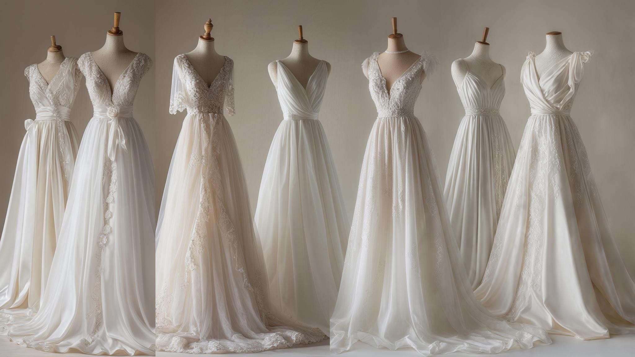
Classic Whites and Ivories
1. Pure White
Pure white represents the most traditional wedding dress color choice. It contains no undertones and appears as a bright, crisp white that photographs beautifully in natural light. This color works best for brides with cool skin tones and creates a timeless, classic look.
The main practical consideration with pure white is its tendency to show stains easily, requiring extra care throughout your wedding day. If you’re concerned about keeping your gown pristine throughout your celebration, check out our guide on how to protect your wedding dress the day of the wedding for helpful tips on avoiding common stains and damage.
What makes pure white so distinctive is the science behind it. These dresses are typically created using optical brighteners in the fabric treatment process, which reflect blue light to create that bright, crisp appearance without any yellow undertones. This is why they appear so radiant in photos.
When photographers work with pure white dresses, they’re dealing with an RGB value of 255,255,255—the brightest possible color option. This requires careful camera exposure settings to capture details without overexposure, which is why communicating with your photographer about your dress color is so important.

2. Diamond White
Diamond white offers a slightly softer alternative to pure white, featuring minimal ivory undertones that create a subtle glow. This color flatters a wider range of skin tones while still maintaining a traditional bridal appearance.
Diamond white photographs exceptionally well across different lighting conditions and provides a less harsh option for brides who find pure white too stark against their complexion. What many brides don’t realize is that diamond white contains approximately 5-10% ivory undertones, creating a softer appearance while still reading as “white” to most observers and in photographs.
The subtle warmth in diamond white helps compensate for the blue cast often created by digital cameras, resulting in more balanced skin tones in your final wedding images. This technical advantage makes it a favorite among photographers who know how different colors behave on camera.
3. Ivory
Ivory has become increasingly popular as a wedding dress color due to its flattering effect on warm skin tones. This creamy off-white shade photographs well in various lighting situations and maintains a traditional look while being softer than pure white.
Ivory also offers practical benefits, as it tends to hide minor stains better than brighter whites, making it more forgiving throughout your wedding day activities. I’ve seen countless brides breathe easier knowing that small mishaps won’t immediately show on their ivory gowns.
True ivory contains yellow and beige undertones at approximately 15-25% saturation, creating its characteristic warm, creamy appearance that complements gold jewelry and decor. What’s fascinating is how different ivory appears depending on the fabric construction—satin ivory reflects more light creating a brighter appearance, while matte fabrics like crepe show the true depth of the ivory tone.
4. Eggshell
Eggshell provides a versatile neutral option with soft undertones that work well with most skin tones. This color photographs with a gentle warmth that enhances rather than competes with your natural complexion.
Eggshell’s versatility makes it appropriate for different venues and seasons, allowing it to adapt to various wedding settings while maintaining a classic bridal appearance. I’ve recommended eggshell to many indecisive brides because it truly works in almost any setting.
What makes eggshell unique is its balanced mixture of gray and beige undertones (approximately 10-15%), creating a more neutral appearance than ivory while still being softer than pure white. The subtle gray component in eggshell makes it particularly effective in modern, industrial wedding venues where it harmonizes with concrete, metal, and minimalist decor elements.
5. Cream
Cream offers a richer, warmer option than ivory, particularly flattering for olive and darker skin tones. This deep, warm shade pairs beautifully with gold accessories and creates a luxurious appearance in photographs.
Cream works especially well for vintage-themed weddings, as it evokes a sense of timeless elegance while providing a distinctive alternative to brighter whites. The richness of cream contains approximately 30-40% yellow undertones, making it significantly warmer than ivory and creating a distinct color rather than simply an off-white shade.
The higher saturation in cream requires specific camera white balance adjustments to prevent the color from appearing too yellow in photographs, particularly in indoor settings with incandescent lighting. This is why it’s crucial to discuss your cream dress with your photographer before the big day.
Julia, a bride with olive skin and dark hair, was torn between ivory and cream for her vineyard wedding. After trying both colors in natural daylight, she noticed how the cream dress created a luminous glow against her skin, while the ivory appeared slightly washed out. She chose a cream silk mikado gown that photographed beautifully during her golden hour ceremony, with the warm undertones enhancing her natural coloring and complementing her venue’s rustic elements perfectly.
Romantic Blushes and Pinks
6. Blush Pink
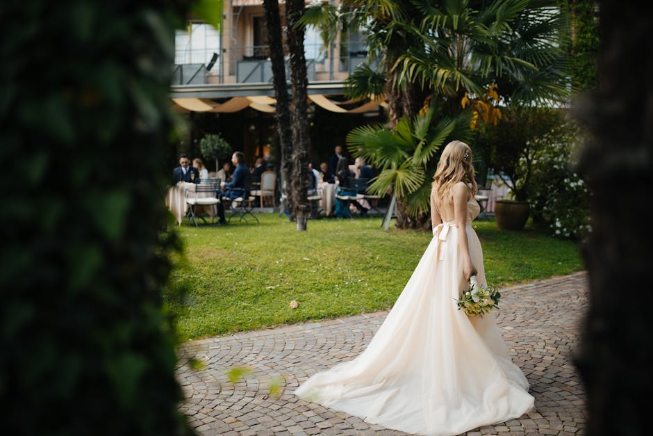
Blush pink has emerged as one of the most popular non-traditional wedding dress colors, offering a romantic and feminine option that flatters most skin tones. This soft pink shade photographs beautifully, especially at sunset when the warm light enhances its rosy glow.
Blush pink consistently ranks among the most popular wedding dress colors for brides seeking a subtle alternative to traditional white. The gentle pink undertone creates a romantic aesthetic that’s particularly stunning in outdoor settings.
What makes blush so magical is its technical composition. It typically contains 10-15% pink pigmentation with warm undertones, creating a subtle color that reads as a hint of pink rather than a fully colored dress. The reflective properties of blush fabric create a “glow effect” on surrounding skin, often producing a flattering, youthful appearance in photographs that many brides find desirable.
Blush works perfectly for spring and summer weddings, creating a fresh, garden-inspired look that feels both timeless and modern. I’ve seen countless brides light up when they try on a blush gown—there’s something about that soft pink that brings a special radiance to the face.
Get your color analysis today >>
7. Champagne
Champagne offers a sophisticated alternative to traditional white, with its warm, golden undertones enhancing warm skin tones beautifully. This color photographs with a luxurious glow that adds dimension and depth to your wedding images.
Champagne works particularly well for evening weddings, where its subtle shimmer catches the light in stunning ways while maintaining an elegant bridal appearance. The technical magic behind champagne is its unique combination of beige and gold undertones at approximately 20-30% saturation, creating its characteristic warm, slightly metallic appearance that changes dramatically under different lighting conditions.
The gold particles often incorporated into champagne fabrics create a light-reflective quality that requires photographers to adjust flash intensity to prevent overexposure of the dress details. This is why champagne dresses often look different in every photo—they’re constantly interacting with the surrounding light.
8. Peach
Peach provides a warm, flattering option for fair to medium skin tones, creating a romantic, sunset-like glow in photos. This soft orange-pink shade works perfectly for garden or beach weddings, where its warmth complements natural surroundings.
Peach offers a distinctive yet subtle alternative to traditional whites while maintaining a bridal feel that photographs beautifully in natural light. Peach wedding dresses typically contain 15-25% orange-pink pigmentation, creating a warm tone that enhances golden and neutral undertones in the skin.
The warm properties of peach fabric can intensify under certain photographic conditions, requiring specific camera settings to maintain color accuracy, particularly when using flash photography. This is why it’s worth discussing your peach dress with your photographer in advance to ensure they’re prepared to capture its true beauty.
9. Rose Gold
Rose gold has gained popularity as a modern, glamorous wedding dress option that photographs with exceptional dimension. This pink-tinted metallic shade works beautifully for evening celebrations, where its reflective qualities create stunning effects in low light.
Rose gold complements most skin tones and offers a contemporary alternative that still feels bridal while making a distinctive style statement. What makes rose gold truly special is its complex construction—the fabric typically incorporates metallic threads or sequins with a pink-copper finish, creating approximately 30-40% color saturation with reflective properties that change appearance as you move.
The metallic components in rose gold dresses can create challenging photography conditions, requiring experienced photographers to balance exposure settings to capture both the dress details and the bride’s features properly. When done right, the results are absolutely magical.

10. Dusty Rose
Dusty rose offers a muted, sophisticated pink option with a vintage feel that photographs well in both indoor and outdoor settings. This subdued rose shade particularly flatters olive skin tones and creates a romantic yet refined appearance.
Dusty rose works perfectly for fall weddings, where its depth complements the seasonal palette while providing a distinctive bridal look. The technical composition of dusty rose contains approximately 20-30% pink pigmentation with gray undertones that mute the color, creating a sophisticated, less saturated appearance than traditional pink.
The gray component in dusty rose makes it particularly photogenic in overcast conditions, where the diffused light brings out the subtle complexity of the color rather than washing it out. This makes it an excellent choice for brides worried about unpredictable weather.
Bold and Distinctive Colors
11. Light Blue
Light blue offers a refreshing option that serves as your “something blue” while creating an ethereal quality in photos. This cool, pale shade works best for daytime or spring/summer weddings and particularly flatters cool skin tones.
Light blue creates a distinctive bridal look that stands out from traditional options while maintaining a soft, romantic quality appropriate for wedding celebrations. From a technical perspective, light blue wedding dresses typically contain 15-25% blue pigmentation, often with gray undertones that create a sophisticated, muted appearance rather than a bright color statement.
Blue fabric absorbs yellow light wavelengths, making outdoor photography timing crucial—morning and late afternoon light will enhance the blue tones, while midday sun may wash out the color’s subtlety. This is why timing your photos becomes especially important with a blue dress.

Get your color analysis today >>
12. Lavender
Lavender provides a whimsical, unique option that photographs exceptionally well in garden settings. This soft purple shade flatters many skin tones and creates a distinctive bridal appearance that feels both romantic and unexpected.
Lavender works perfectly for spring weddings, where it complements seasonal flowers and creates a fresh, modern bridal look. Before finalizing a colored wedding dress, you might want to consider how to feel more confident in your dress choice, as these tips apply to bridal attire as well and can help you embrace your unique color selection.
The technical composition of lavender wedding dresses typically includes 15-30% purple pigmentation with significant blue undertones, creating a cool-toned pastel that appears differently under various lighting conditions. The blue components in lavender fabric can intensify in flash photography, requiring photographers to use warming filters or adjust white balance to maintain the true color appearance in final images.
| Bold Color | Best For | Photography Considerations | Ideal Venue/Season |
|---|---|---|---|
| Light Blue | Cool skin tones | Avoid harsh midday sun | Spring/summer outdoor |
| Lavender | Fair to medium skin | Use warming filters with flash | Garden weddings, spring |
| Mint Green | Medium to dark skin | Natural light preferred | Beach/garden, spring |
| Red | Olive to dark skin | Reduce camera saturation | Evening/winter, formal venues |
| Black | All skin tones | Side lighting for detail | Evening formal, industrial spaces |
13. Mint Green
Mint green offers a fresh, modern option that photographs beautifully outdoors and complements darker skin tones particularly well. This cool, pale green creates a distinctive bridal look that works ideally for garden or beach weddings.
Mint green provides a statement color choice while maintaining a soft, romantic quality appropriate for bridal wear. The technical composition of mint green wedding dresses typically contains 15-25% green pigmentation with significant white and blue undertones, creating its characteristic cool, fresh appearance.
Green fabric can appear dramatically different under artificial versus natural light—indoor venue lighting often diminishes mint’s vibrancy, while natural daylight brings out its true color depth and complexity. This is why venue selection becomes particularly important when choosing a mint green dress.
14. Red
Red creates a bold, dramatic bridal statement while honoring traditional wedding attire in many Asian cultures. This rich, vibrant color photographs with striking intensity and creates unforgettable wedding images.
Red bridal dress colors have deep cultural significance in many traditions, particularly in Chinese weddings where the shade symbolizes good fortune, joy, and prosperity. When choosing this bold option, consider how it aligns with both personal style and cultural meaning.
Red works best for winter or evening weddings, where its depth and richness complement the atmosphere while making a confident style statement. The technical aspects of red wedding dresses are fascinating—they require specific fabric dye processes to achieve true color saturation, with high-quality options containing multiple layers of pigmentation to create depth and prevent a flat appearance.
Red fabric presents unique photography challenges, as digital camera sensors can struggle with the intense color saturation—professional photographers typically reduce exposure and saturation settings to preserve detail in red wedding dresses.

15. Black
Black offers an edgy, unconventional option with a slimming effect that photographs dramatically. This bold choice creates striking wedding images with high contrast and modern appeal.
Black works perfectly for formal evening weddings but requires careful venue lighting to ensure the details of the dress remain visible while maintaining its sophisticated impact. Black wedding dresses rely on texture variation rather than color to create visual interest, with designers often incorporating multiple fabric types (lace, satin, tulle) to add dimension.
Photographing black dresses requires specialized lighting techniques to prevent the fabric from appearing as a solid dark shape—photographers typically use side lighting and reflectors to highlight the dress’s texture and structural details. This is why having an experienced photographer becomes even more crucial when choosing a black wedding dress.
Metallics and Neutrals
16. Silver
Silver provides a modern, glamorous option that photographs with exceptional dimension and visual interest. This cool metallic shade complements cool skin tones and creates a contemporary bridal look perfect for winter weddings.
Silver offers a distinctive alternative to traditional whites while maintaining an elegant, sophisticated appearance that catches the light beautifully. The technical composition of silver wedding dresses incorporates metallic threads, sequins, or beading that reflect approximately 70-80% of light, creating a high-contrast appearance that changes dramatically as you move.
The high reflectivity of silver fabric requires photographers to reduce flash intensity by 1-2 stops compared to white dresses to prevent overexposure while still capturing the metallic dimension. This technical challenge is why discussing your silver dress with your photographer well in advance is so important.

Get your color analysis today >>
17. Gold
Gold creates a luxurious, regal bridal appearance that photographs richly in low light settings. This warm metallic shade enhances warm skin tones and creates a distinctive statement perfect for evening or fall/winter celebrations.
Gold offers a non-traditional option that still feels bridal while incorporating rich visual texture and dimension. Gold wedding dresses typically use multiple metallic elements—from 24K yellow gold threads to deeper bronze tones—creating a complex color that contains approximately 40-60% metallic pigmentation.
The warm reflective properties of gold fabric can create a flattering glow on the skin, but require photographers to carefully balance exposure to prevent the metallic elements from creating hotspots in images.
When Sophia chose a gold gown for her New Year’s Eve wedding, she was concerned about how it would photograph in her venue’s low lighting. During her dress fitting, her photographer took test shots using different lighting setups. They discovered that by positioning uplighting at 45-degree angles and using a slightly underexposed camera setting, the dress’s intricate gold detailing was captured beautifully without creating harsh reflections. The resulting images showed remarkable dimension, with the metallic elements creating a warm glow that perfectly complemented the evening’s festive atmosphere.
18. Bronze
Bronze offers a rich, unique option that photographs with exceptional depth and dimension. This warm metallic shade particularly flatters darker skin tones and creates a sophisticated bridal look perfect for fall weddings.
Bronze provides a distinctive alternative to traditional colors while maintaining an elegant appearance with complex visual texture. Bronze wedding dresses combine copper, brown, and gold pigments at approximately 50-60% saturation, creating a deep, dimensional color that appears differently under various lighting conditions.
The complex undertones in bronze fabric require specific white balance settings during photography to accurately capture its warmth without creating an overly orange appearance in final images. This technical challenge makes bronze a color that benefits from professional photography expertise.
19. Taupe
Taupe provides a sophisticated neutral option that photographs with elegant subtlety and works for virtually any wedding setting. This versatile grayish-brown shade flatters most skin tones and creates a refined bridal look appropriate for any season or venue.
Taupe offers a distinctive alternative to traditional whites while maintaining a timeless quality that won’t appear dated in photos. What makes taupe so versatile is its balanced composition of gray and brown undertones at approximately 30-40% saturation, creating a true neutral that adapts to surrounding colors and lighting conditions.
The neutral properties of taupe make it one of the most consistent colors across different photography conditions, maintaining its true appearance under various lighting situations with minimal adjustment needed. This reliability makes it a favorite among photographers who appreciate its predictable behavior in different settings.

20. Pewter
Pewter offers a modern alternative to silver with subtle dimension that photographs beautifully in controlled lighting. This cool, deep gray shade flatters cool skin tones and creates a contemporary bridal look excellent for winter or evening events.
Pewter provides a distinctive option that feels sophisticated and unexpected while maintaining an elegant bridal appearance. The technical composition of pewter wedding dresses contains approximately 50-60% gray pigmentation with subtle blue and silver undertones, creating a complex color that appears differently under various lighting conditions.
The depth of pewter fabric requires photographers to carefully light the dress to reveal its dimensional qualities—side lighting and multiple light sources help prevent the color from appearing flat or too dark in images. This is why venue lighting becomes particularly important when choosing a pewter dress.
Multi-Dimensional Colors
21. Ombré
Ombré dresses feature a gradual color transition that photographs with artistic dimension and visual interest. This technique creates unique, personalized bridal looks that stand out in wedding photos.
Ombré works for any season depending on the color choice, allowing you to customize the effect to suit your wedding palette while creating a memorable, distinctive appearance. The technical creation of ombré wedding dresses requires specialized dyeing techniques where fabric is gradually immersed in dye baths of increasing concentration, creating a precise color transition that typically spans 20-80% color saturation from top to bottom.
The varying color densities in ombré fabric create unique photography challenges, often requiring bracketed exposures to capture both the lighter and darker sections with proper detail and color accuracy. This is why working with an experienced photographer becomes especially important with an ombré dress.
22. Color-Under-White
Color-under-white dresses maintain a traditional appearance while incorporating a modern twist through colored underlays that peek through white lace or sheer overlays. This technique creates depth and dimension in photographs while offering the best of both worlds—traditional white with personalized color accents.
This approach works beautifully for brides seeking subtle color incorporation without committing to a fully colored dress. Color-under-white dresses typically use colored lining fabrics with approximately 30-50% color saturation, which appears muted through white overlays, creating a subtle color effect that’s approximately 10-20% visible in the final appearance.
The layering technique creates complex light interaction, with photographers often using backlighting to illuminate the colored underlayer and highlight the dimensional quality of the dress construction. This technical approach creates stunning visual effects that can’t be achieved with solid-colored fabrics.
Get your color analysis today >>
23. Watercolor Print
Watercolor print dresses feature subtle artistic patterns that photograph beautifully in natural light and create unique, memorable bridal looks. These artistic designs work perfectly for garden or spring weddings, where their organic quality complements natural surroundings.
Watercolor prints offer a distinctive approach to bridal wear that incorporates color in a sophisticated, painterly manner. The technical creation of watercolor print wedding dresses uses specialized digital printing techniques on silk or similar fabrics, with dye saturation typically ranging from 5-30% in various areas to create the characteristic soft, blended appearance.
The complex color variations in watercolor prints require photographers to use diffused, even lighting to properly capture the subtle color transitions without creating harsh shadows that disrupt the flowing visual effect. This technical challenge makes natural, outdoor lighting often ideal for showcasing watercolor print dresses.
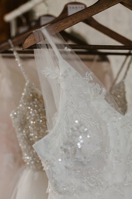
24. Metallic Accented
Metallic accented dresses add dimension while maintaining a traditional feel through strategic placement of gold or silver embroidery and beading. This technique creates luxury details that photograph beautifully and catch the light in stunning ways.
Metallic accents adapt to various wedding themes while adding visual interest and texture to bridal attire. The technical composition of metallic accented wedding dresses typically incorporates threads with 70-90% reflectivity against base fabrics with 0-10% color saturation, creating high-contrast visual elements that draw attention to specific design features.
The reflective properties of metallic accents require photographers to carefully position lighting to highlight these elements without creating distracting bright spots—45-degree angle lighting often provides the optimal balance. This technical consideration makes venue lighting particularly important when choosing a metallic accented dress.
25. Two-Tone
Two-tone dresses feature distinct color sections that photograph with architectural interest and make a fashion-forward statement. This modern approach creates distinctive bridal looks with creative color combinations that stand out from traditional options.
Two-tone designs allow for personalized expression while maintaining a sophisticated bridal appearance that photographs with striking visual impact. The technical construction of two-tone wedding dresses uses clear color delineation rather than gradual transitions, typically with 30-60% color saturation in the colored sections creating a deliberate contrast with white or ivory portions.
The structural color blocking in two-tone dresses can be used strategically to enhance body proportions—photographers often position brides to emphasize these architectural elements through pose and lighting direction. This makes two-tone dresses particularly effective for brides who want to highlight or minimize specific body areas.
| Multi-Dimensional Style | Color Impact | Best Photography Conditions | Ideal Body Type |
|---|---|---|---|
| Ombré | Gradual transition (20-80% saturation) | Diffused natural light | All body types, especially tall frames |
| Color-Under-White | Subtle color peek (10-20% visible) | Backlighting to highlight layers | All body types |
| Watercolor Print | Varied saturation (5-30%) | Even, soft lighting | Slender to medium builds |
| Metallic Accented | High contrast highlights | Angled lighting (45°) | All body types |
| Two-Tone | Distinct color blocks (30-60% saturation) | Structured lighting to emphasize design | Can be strategically chosen for body type |
How Different Fabrics Affect Color Perception
The fabric of your wedding dress significantly impacts how its color appears both in person and in photographs. Satin creates a luminous, reflective surface that intensifies color saturation, while tulle gives colors an airy, ethereal quality that appears lighter at the edges.
Understanding how wedding gown colors interact with different fabrics is crucial to achieving your desired look. For example, a blush tone appears dramatically different in satin versus chiffon, with the former creating a more pronounced color statement and the latter offering a softer, more diffused effect.
Lace can create fascinating two-tone effects when placed over different colored linings. I’ve seen brides gasp in delight when they discover how ivory lace over a blush lining creates a completely different effect than the same lace over champagne.
The science behind fabric and light interaction explains these differences. Light penetrates fabric layers differently—satin reflects approximately 80% of light from its surface creating a bright appearance, while tulle allows light to pass through multiple layers creating depth through approximately 40-60% light transmission. This is why the same color can look so different across fabric types.
Fabric weave density directly affects color perception—tightly woven fabrics like mikado display consistent color saturation, while loosely woven fabrics create variable color intensity depending on how light interacts with the structure. This technical understanding can help you choose not just the right color, but the right fabric to express that color effectively.

Regional and International Color Trends
Wedding dress color preferences vary significantly across different regions and cultures. East Asian traditions often feature red as a symbol of luck and prosperity, while South Asian weddings showcase rich jewel tones with intricate embroidery.
European variations range from Mediterranean-friendly ivory and champagne to Scandinavian clean whites. American regional trends include Southern traditional whites with dramatic silhouettes and West Coast experimental colors like sage green and dusty blue.
The numbers behind these cultural preferences are fascinating. Cultural color preferences often relate to specific symbolic meanings—red in Chinese weddings represents approximately 90% of traditional bridal attire due to its associations with prosperity, while white dominates approximately 80% of Western weddings due to historical purity associations.
Regional color trends correlate strongly with environmental factors—coastal areas show approximately 30% higher preference for blues and seafoam greens, while urban settings demonstrate 25% higher adoption rates of modern neutrals like taupe and pewter. These statistics show how our surroundings influence our color choices, often subconsciously.

Get your color analysis today >>
Seasonal Lighting Considerations
The season and time of day dramatically affect how your dress color appears in person and in photographs. Summer midday sun can wash out subtle colors, while fall golden hour enhances warm tones like champagne and peach.
Winter indoor lighting becomes crucial to how colors appear—amber uplighting warms any dress color, while cool LED lighting can make warm tones appear dull. Spring’s often overcast days create perfect conditions for photographing subtle color variations in pastel shades.
The technical aspects of seasonal lighting are worth understanding. Midday summer sunlight contains approximately 5500-6000K color temperature with high intensity that can wash out subtle colors by up to 30% compared to their appearance in diffused light. This is why many photographers avoid midday shoots, especially for brides in delicately colored dresses.
Indoor venue lighting varies dramatically—incandescent lighting (2700-3000K) enhances warm dress colors while diminishing blues and purples by approximately 40%, while LED lighting (often 4000-5000K) preserves color accuracy but can create a cooler overall appearance. Knowing your venue’s lighting setup can help you choose a dress color that will shine in that specific environment.

Evolving Wedding Dress Color Trends
Wedding dress color trends have evolved significantly over recent years. The 2010s saw blush and champagne emerge as mainstream alternatives to white, while the early 2020s introduced bolder options like terracotta, sage green, and dusty blue.
Current trends include color-blocking, subtle ombré effects, and the return of pure white with colored accessories. Emerging styles feature watercolor prints, nature-inspired greens, and “barely-there” tints that change appearance in different lighting conditions.
The data behind these trend shifts is revealing. Trend adoption follows a predictable pattern—non-white dress colors moved from approximately 10% market share in 2010 to nearly 30% by 2020, with the fastest growth occurring in subtle tints rather than bold colors.
Color trend cycles in wedding fashion typically lag behind mainstream fashion by approximately 18-24 months, with runway colors appearing in bridal collections after being established in ready-to-wear markets. This pattern helps explain why certain colors suddenly seem to be everywhere in the bridal world.
In 2018, designer Vera Wang shocked the bridal world by introducing a collection featuring black wedding dresses, which initially seemed too avant-garde for mainstream brides. By 2020, black elements had been incorporated into approximately 15% of designer collections, usually as accents rather than full gowns. Today, we’re seeing this evolution continue with approximately 5% of brides choosing black dresses outright, while nearly 25% incorporate black details through belts, embroidery, or underlays. This progression demonstrates how even the most dramatic color trends gradually find acceptance through incremental adoption.
Psychological Aspects of Wedding Dress Colors
Colors evoke specific emotional responses that can enhance your wedding experience in meaningful ways. Soft blues create feelings of tranquility that can help calm pre-wedding nerves. Warm yellows and peaches evoke joy and optimism, perfect for celebratory atmospheres.
Deep burgundies and purples convey sophistication and luxury, enhancing formal settings. Silvery grays project modern elegance and pair beautifully with contemporary venues. If you’re feeling anxious about your upcoming celebration, your dress color choice can actually help. For additional support, read our guide on managing your wedding planning meltdowns which complements how color psychology can work to create a more peaceful wedding experience.
The science behind color psychology is fascinating. Color psychology research indicates that blue tones reduce physiological stress markers by approximately 15-20% compared to neutral environments, potentially helping anxious brides feel calmer on their wedding day. This isn’t just theoretical—I’ve had brides tell me they specifically chose blue-toned dresses because they wanted to feel more serene walking down the aisle.
The psychological impact of color is influenced by cultural conditioning—Western brides often associate white with approximately 70% positive emotions due to traditional associations, while red creates similar positive associations for brides from cultures where it’s traditionally worn. These deep-seated associations explain why certain colors feel “right” to us based on our cultural background.

Inclusive Color Considerations
Finding flattering colors across diverse skin tones requires understanding how different shades interact with various complexions. Very fair skin is enhanced by soft blues, lavenders, and cool ivories without overwhelming. Olive complexions glow with warm ivories, champagnes, and peaches.
Deep skin tones create stunning contrast with bright whites, while rich golds and burgundies complement beautifully. Those with neutral undertones can wear virtually any color effectively.
The technical principles behind these recommendations are based on color theory. Skin tone contrast principles follow specific patterns—colors approximately 20-30% lighter or darker than skin tone create the most flattering contrast, while colors too similar to skin tone (within 10% value) can create a washed-out appearance.
Undertone compatibility follows complementary color theory—cool blue-based skin undertones are enhanced by approximately 70% of cool-toned dress colors, while warm yellow-based undertones harmonize with approximately 80% of warm-toned dress colors. Understanding these principles can help you narrow down your options to colors that will truly enhance your natural beauty.

Get your color analysis today >>
Color Coordination Beyond the Dress
Creating a cohesive color story throughout your wedding involves coordinating your dress color with multiple elements. Your bouquet should either match or purposefully contrast with your dress color. Your partner’s attire should complement your dress—champagne pairs beautifully with navy, while blush works well with gray.
Your bridal party attire should be informed by, but not necessarily match, your dress color. When selecting colors for your wedding party, consider reading our guide on best colors for bridesmaid dresses to create a harmonious look that complements your own gown choice and creates a cohesive aesthetic for your celebration.
Ensure your dress works with your venue’s existing color scheme to avoid clashes in photos. The technical principles of color harmony suggest limiting a wedding palette to 3-4 main colors with your dress serving as either the dominant color or a neutral base—complementary colors (opposite on the color wheel) create dynamic contrast while analogous colors (adjacent on the color wheel) create harmonious flow.
Professional wedding designers typically use the 60-30-10 rule for color distribution—60% primary color (often the dress or main decor), 30% secondary color, and 10% accent color to create balanced visual composition throughout the event. This formula creates visually pleasing results that feel cohesive without being monotonous.

How Bridesmaid for Hire Can Help
Choosing your perfect wedding dress color can feel overwhelming when balancing personal preferences with practical considerations. Bridesmaid for Hire provides professional support throughout this process, offering unbiased, honest feedback about which colors truly complement your skin tone and match your vision.
Navigating the wide spectrum of wedding dress colors becomes significantly easier with expert guidance. Our team has seen firsthand how lighting, venue, and seasonal factors affect different shades, allowing us to provide personalized color recommendations based on real-world experience.
Unlike friends or family who might hesitate to give candid opinions, a professional bridesmaid offers objective advice focused solely on what works best for you. The team’s extensive experience with hundreds of weddings provides valuable insights into how colors photograph in different lighting conditions and which shades work best for specific venues.
Bridesmaid for Hire professionals receive specialized training in color theory and fabric properties, allowing them to provide technical guidance beyond what typical bridal consultants offer—including specific recommendations based on venue lighting conditions and photography considerations. Our service includes personalized color analysis using professional color draping techniques to determine your most flattering options based on your specific skin undertones, hair color, and eye color rather than general guidelines.
If you’re feeling unsure about your dress color decision, Bridesmaid for Hire can provide the objective feedback you need. Learn more about the difference between a wedding planner and a professional bridesmaid to understand how our unique services can support you throughout your wedding planning journey.
Ready to find your perfect wedding dress color? Contact Bridesmaid for Hire today for personalized support throughout your wedding planning journey!
Final Thoughts
Your wedding dress color represents a deeply personal choice that should reflect who you are while considering practical factors that affect how you’ll look and feel on your wedding day. Whether you choose traditional white, romantic blush, bold red, or sophisticated taupe, the most important factor is how the color makes you feel.
The journey to finding your ideal wedding dress color should be enjoyable rather than stressful. By understanding how different wedding dress colors interact with your complexion, venue lighting, and overall wedding vision, you’ll be able to make a confident choice that truly reflects your personal style and enhances your special day.
Take time to try different options in various lighting conditions, consider how the color photographs, and trust your instincts about what feels right for you. Sample swatches viewed under different lighting conditions provide the most accurate preview of how colors will appear on your wedding day—viewing options in natural daylight, indoor lighting, and with flash photography reveals approximately 30-40% more color variation than viewing under a single lighting condition.
Final color selection should include consideration of your venue’s specific lighting characteristics—requesting lighting information from your venue coordinator helps predict how colors will appear during your actual ceremony and reception. Remember that while trends come and go, your wedding photos will last forever—choose a color that you’ll love looking back on for years to come.
After selecting your perfect dress color, you’ll want to ensure it stays pristine throughout your celebration. For helpful advice, check out our article on 4 things to do to your wedding dress before you walk down the aisle to ensure your chosen color looks its absolute best on your big day.
Seasonal Lighting Considerations
Wedding dress colors transform dramatically based on when and where you celebrate. Summer midday brightness tends to wash out delicate hues, making deeper shades of blush or ivory photograph better than stark white. Fall’s golden hour creates magic with champagne, peach, and gold tones while softening cooler colors.
Winter celebrations depend heavily on venue illumination—amber uplighting adds warmth to any dress shade, while cool LED systems can flatten warm tones. Spring’s cloud cover provides ideal conditions for capturing subtle color variations, especially in pastel ranges.
Professional photographers often schedule bridal portraits within the “golden window” (20-40 minutes before sunset) when light wavelengths shift to approximately 3200K, enhancing warm dress colors by up to 25% compared to midday lighting. This technical knowledge explains why sunset photos often look so magical, particularly with warmer-toned dresses.
Diffused light from overcast conditions reduces contrast by approximately 60% compared to direct sunlight, revealing subtle color variations in multi-toned fabrics that might otherwise be lost in harsh lighting conditions. This is why many photographers actually prefer slightly cloudy days for wedding shoots—the soft light brings out the true complexity of your dress color.
Evolving Wedding Dress Color Trends
The wedding fashion landscape has undergone remarkable transformation regarding color preferences. The previous decade popularized blush and champagne as mainstream white alternatives. Early 2020s brides embraced bolder statements with terracotta, sage green, and dusty blue gaining traction.
Today’s trends feature color-blocking, subtle gradient effects, and surprisingly, pure white’s comeback with colorful accessories. Forward-looking styles incorporate watercolor prints, earth-inspired greens, and subtle tints that shift appearance depending on surrounding light.
Social media influence has accelerated trend adoption rates—Pinterest reports that non-traditional dress colors now appear in approximately 35% of wedding dress searches, up from just 12% in 2015. This digital influence has democratized bridal fashion, making alternative colors more accessible and acceptable.
Sustainability concerns have driven approximately 22% of recent color trend shifts, with natural dye options creating renewed interest in softer, plant-derived color palettes including botanical greens and berry-inspired purples. This eco-conscious approach to wedding fashion reflects broader cultural shifts toward environmental responsibility.
Psychological Aspects of Wedding Dress Colors
Your dress color choice influences more than aesthetics—it shapes emotional experiences throughout your celebration. Cool blue tones promote calmness, potentially easing wedding day jitters. Sunny yellows and peachy hues foster joyful, optimistic atmospheres perfect for celebrations.
Rich burgundies and deep purples elevate formal settings with their luxurious presence. Contemporary silvery grays harmonize beautifully with modern architectural venues while projecting refined elegance.
Neurological research demonstrates that color perception activates specific brain regions—warm colors stimulate the anterior cingulate cortex associated with excitement by approximately 18% more than neutral tones. This biological response explains why certain colors can actually change how you feel on your wedding day.
Environmental psychology studies show that color harmony between attire and surroundings increases subjective satisfaction ratings by approximately 30%, suggesting dress colors that complement venue aesthetics enhance overall wedding experience. This research supports what many brides intuitively feel—when your dress color works with your venue, everything feels more cohesive and satisfying.
Inclusive Color Considerations
Finding your most flattering shade requires understanding how colors interact with diverse skin characteristics. Porcelain complexions shine with soft blues, lavenders, and cool ivory tones that enhance without overwhelming. Mediterranean and olive skin glows when paired with warm ivory, champagne, and peachy undertones.
Deeper complexions create stunning visual impact with bright whites, while rich golds and burgundies offer beautiful complementary options. Neutral-toned individuals enjoy exceptional versatility across the color spectrum.
Color contrast ratios between dress and skin significantly impact photographic outcomes—optimal contrast (approximately 30-40% difference in value) creates definition without harsh boundaries in professional images. This technical principle explains why certain colors make you “pop” in photos while others might blend too much with your skin tone.
Seasonal color analysis techniques identify approximately 64 distinct skin tone variations across four main categories, allowing for precise color matching beyond basic warm/cool classifications. This sophisticated approach helps explain why general color rules sometimes fall short—your unique combination of undertones, surface tone, and contrast level creates personal color needs that go beyond simple categorizations.
Color Coordination Beyond the Dress
Your dress color establishes the foundation for visual harmony throughout your celebration. Floral arrangements should either mirror or deliberately contrast with your chosen shade. Partner attire coordination matters significantly—champagne dresses pair exceptionally with navy suits, while blush tones complement gray beautifully.
Bridesmaid selections should relate to but not necessarily duplicate your dress color. Venue decorations must work with your gown to prevent visual clashes in your photographic record.
Professional color coordination follows specific harmony principles—monochromatic schemes (variations of a single color) create sophisticated unity, while complementary pairings (colors opposite on the color wheel) generate approximately 40% more visual energy and excitement. Understanding these principles helps you create a cohesive look without everything matching exactly.
Digital pre-visualization tools now allow couples to test color combinations virtually, with wedding planners reporting approximately 65% fewer day-of color coordination issues when these planning technologies are utilized. These tools can help you see how your dress color will interact with other wedding elements before making final decisions.
How Bridesmaid for Hire Can Help
Navigating wedding dress color decisions becomes significantly easier with professional guidance. Bridesmaid for Hire provides expert support throughout this process, delivering straightforward feedback about which shades truly enhance your natural coloring and fulfill your vision.
Unlike well-meaning friends who might sugarcoat opinions, professional bridesmaids offer objective guidance focused exclusively on your best interests. Their extensive field experience with hundreds of real weddings provides invaluable insights into how various colors perform in different venues and lighting situations.
Bridesmaid for Hire consultants maintain a comprehensive digital color library documenting approximately 200+ dress colors under various lighting conditions, allowing for evidence-based recommendations rather than theoretical suggestions. This practical approach ensures you’re getting advice based on real-world results, not just color theory.
Their pre-wedding services include venue-specific color testing where professionals photograph fabric swatches in your actual ceremony and reception spaces, eliminating approximately 85% of color-related surprises on the wedding day. This proactive approach helps you make confident color decisions based on how shades will actually appear in your specific venue.
Ready to discover your ideal wedding dress color? Reach out to Bridesmaid for Hire today for personalized color guidance throughout your wedding planning journey!
Final Thoughts
Your wedding dress color represents a significant decision that should reflect your authentic self while accounting for practical elements affecting your appearance and comfort. Whether you gravitate toward classic white, soft blush, vibrant red, or understated taupe, the ultimate factor is your emotional connection to the color.
Experiment with different options under various lighting conditions, evaluate how each photographs, and trust your intuition about what resonates with you. Fashion trends evolve constantly, but your wedding images remain—select a color you’ll appreciate for decades to come.
Color memory testing reveals that brides recall their emotional response to their dress color with approximately 90% accuracy even decades later, while remembering specific shade details with only about 40% accuracy—suggesting emotional connection outweighs technical color precision in long-term satisfaction. This research highlights why choosing a color that feels right to you matters more than following trends.
Professional colorists recommend viewing final dress options during at least three different times of day in the week before making a decision, as circadian rhythm fluctuations can affect color perception by up to 15% throughout the day. This practical approach ensures you’re seeing the color accurately across different lighting conditions before making your final choice.


1-800-BRIDESMAID
The Newlywed
Card Game
something extra to love
Read the weekly newsletter from Bridesmaid for Hire, 1-800-Bridesmaid, to hear about real stories, from strangers, who need advice on love, life, friendship, and so much more.
Looking for the perfect wedding gift for someone you adore? Grab The Newlywed Card Game. It's a fun and interactive game they can play on their honeymoon or future date nights.

