


21 Winter Wedding Guest Colors That Will Make You The Best Dressed in the Room
January 16, 2026

Hi, Friend! Jen Glantz here. I’m a bestselling author, the first ever bridesmaid for hire and have been hired by hundreds of brides all over the world. Let’s talk about winter wedding guest colors.
Let’s be honest: winter weddings are tricky. Summer events are easy—you grab a floral dress, throw on some sandals, and you’re out the door. But when you stare at your closet in January, you realize that most of what you own just doesn’t work for the temperature or the vibe.
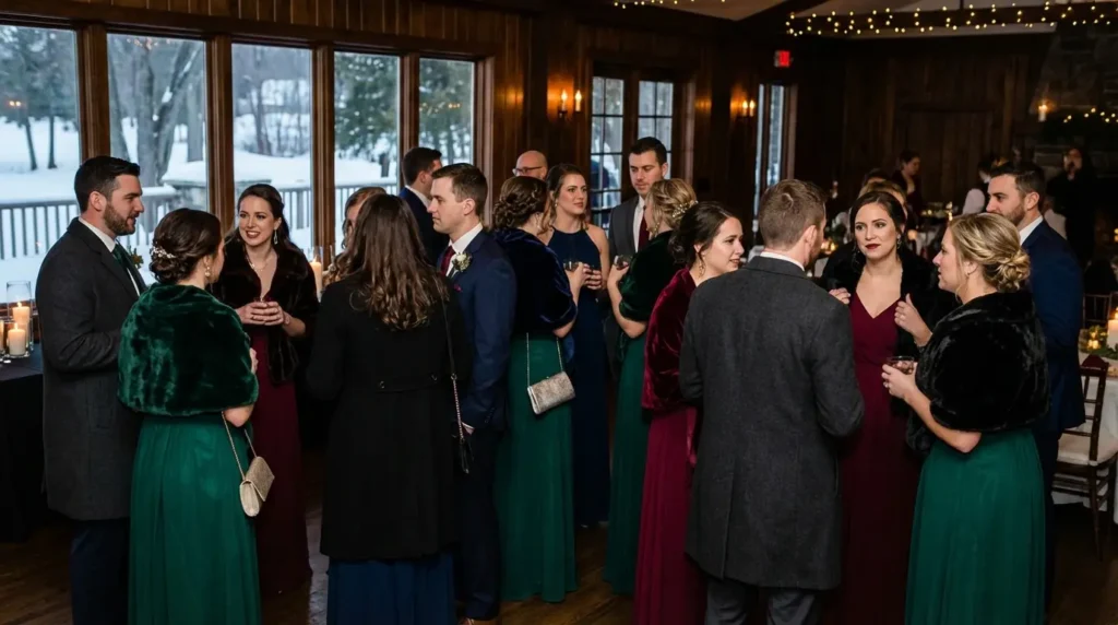
As the team at Wedding Shoppe Inc points out, the cold months call for a totally different palette—think jewel tones like ruby red and emerald green, or cool colors with blue undertones. These shades pop in photos and actually make sense with the season.
Quick Resources:
-
Find your most flattering winter shades with the free Color Analysis Quiz
-
Explore styling and planning support with All Wedding Tools
Trust me, I learned this the hard way. I once showed up to a December ceremony in a pale yellow chiffon number. I didn’t look festive; I looked frozen. You need a strategy that prioritizes warmth and lighting just as much as style. The right color choice can take your look from “out of place” to outstanding.

The “Skim Read” Version (TL;DR)
If you’re currently standing in a dressing room or frantically scrolling online, here are the bullet points you need to know before you buy.
- Lighting is Everything: Winter events rely on artificial light and flash photography. Pick saturated colors that won’t look washed out.
- Fabric First: Your color needs to make sense with heavy fabrics. Velvet, wool, and heavy satin are your friends.
- Beware of “Almost White”: Pale colors need to be clearly defined (like a distinct blue or gray). If it’s too pale, a bright camera flash will make you look like you’re wearing a wedding dress.
- Visual Warmth: Even if the venue is heated, dress for the season. Save the neons and tropical prints for July.
- Top Picks: You can never go wrong with Emerald Green, Espresso Brown, or Midnight Navy.
Not sure which winter shade actually flatters you? Take the free Color Analysis Quiz
The Rules of Winter Engagement
You can’t just pick a pretty color and hope for the best. Winter weddings operate under a different set of rules regarding light and atmosphere. Before you commit to a shade, you have to think about the environment.
Lighting and Photography
The sun sets early in the winter. That means the ceremony and photos are likely happening under artificial indoor lights or during that blue twilight hour. You need colors that hold their own in low light. Pastels often disappear or turn gray in these conditions, while rich, deep tones look expensive and vibrant in flash photography.
Knowing what to wear also means knowing what not to wear. It’s worth a quick look at the 4 colors you should avoid wearing as a guest just to make sure you don’t accidentally clash with the lighting—or the couple.

Fabric Compatibility
Winter outfits need some weight to them. You’ll probably be wearing velvet, heavy satin, wool blends, or sequins. The thing is, some colors look luxurious in these textures, while others look cheap. Emerald green looks incredible in velvet, but a light cotton green just looks wrong. Make sure your color choice makes sense with the heavier textile.
| Fabric Type | Best Color Match | Worst Color Match | The Vibe |
|---|---|---|---|
| Velvet | Emerald, Burgundy, Navy | Pale Pink, Light Yellow | Velvet makes dark colors look deeper, but makes light colors look messy. |
| Heavy Satin | Champagne, Silver, Espresso | Neon Green, Hot Pink | The sheen reflects light, making neutrals look like liquid metal. |
| Wool/Tweed | Charcoal, Olive, Camel | Bright Turquoise, Coral | Matte textures absorb light, favoring earthy and moody tones. |
| Sequins | Gold, Bronze, Midnight Blue | Matte Pastels | Sparkle needs a dark or rich base to contrast with the reflection. |
Match your fabric and shade to your skin tone with the free Color Analysis Quiz
The “Read” of the Color
The line between “bridal white” and “pale pastel” is razor-thin. If you opt for a lighter shade, like icy gray or champagne, it has to clearly read as a color. Flash photography at indoor venues tends to blow out highlights. The last thing you want is to be the guest who accidentally looks like the bride in the background of the cake-cutting photo.
The “Champagne” Mistake:
Imagine you buy a stunning floor-length dress in “Pale Bisque.” In the dressing room, it looks like a soft beige. But once you’re at the venue with dim lighting and a photographer using a high-intensity flash, that beige reflects the light and appears stark white in every photo. To the bride scrolling through Instagram the next day, it looks like you wore a wedding dress. Always test pale colors with your phone’s flash in a dark room before buying.
Avoid flash disasters by choosing your best tones using the free Color Analysis Quiz
Venue Temperature vs. Visual Warmth
Even if the venue is heated, the aesthetic should still feel warm and cozy. Cool tones like ice blue can work, but they need intentional styling. Without the right accessories or fabric weight, a cool-toned dress can look like you’re dressed for a spring garden party. You want to mirror the enclosed, intimate atmosphere of the event.
Also, if you’re traveling, check out this list of things to pack for a winter wedding. It’s geared toward bridesmaids, but honestly, having the right layers to stay warm between the hotel and the Uber is vital for everyone.

The 21 Best Shades for Cold Weather Nuptials
Here are the top trending colors for 2026, categorized by the “vibe” they give off. Before diving in, it might help to understand color analysis so you can pick the hue that actually compliments your skin tone.
Figure out which winter colors love you back with the free Color Analysis Quiz
The Jewel Tones (Rich & Regal)
These are the gold standard. They offer depth and saturation, making them the most reliable options for winter. If you’re stuck, start here.

1. Emerald Green
This deep, vivid green is a stunner, especially in velvet. It suits almost every skin tone and photographs beautifully in low light.
2. Sapphire Blue
A bright, saturated blue that sits right between navy and royal blue. It works perfectly for semi-formal to black-tie events and looks great with silver accessories.
3. Deep Amethyst
This is a rich, warm purple with red undertones. It bridges the gap between fun party wear and serious formal wear.
4. Ruby Red
Red is having a major moment in 2026. This classic deep red reads as romantic and festive. Just make sure the fabric is high quality (like silk or satin) so it looks elegant rather than “Santa costume.”

5. Golden Topaz
Think antique gold or mustard. It’s a dark, brownish-yellow that is an excellent choice for boho-chic or rustic weddings.
The “New” Neutrals (Earthy & Moody)
Sophisticated neutrals for 2026 are moving away from standard beige and embracing darker, moodier tones. These are great if you want a subtle look but want to stay on trend.
6. Espresso Brown
Brown is the breakout color of the year. This very dark, cool-toned shade is softer than black but just as slimming and formal. It looks incredible in satin slip dresses.

7. Charcoal Grey
A dark grey without blue undertones offers a sophisticated alternative to black. It handles artificial lighting well, absorbing light without disappearing into the background.
8. Taupe
Just make sure this dark, grey-brown beige is dark enough not to look white. When executed correctly with beading or sequins, it looks expensive and timeless.
9. Olive Drab
This muted, dark green with brown undertones fits daytime or less formal weddings perfectly. It pairs well with gold jewelry and matches the organic aesthetic of barn or lodge venues.
10. Midnight Navy
Probably the most versatile color on the list. It fits strict black-tie codes and casual cocktail hours alike.
Berry & Wine (Romantic & Warm)
These shades mimic the colors of winter fruits and wine, making them inherently perfect for the season. They give you a pop of color without feeling summery.
| Berry Shade | Undertone | Best Jewelry Pairing | The Vibe |
|---|---|---|---|
| Burgundy | Warm/Brown | Gold or Bronze | Classic, traditional, and cozy. |
| Plum | Cool/Blue | Silver or Pewter | Sophisticated, modern, and sharp. |
| Mulberry | Neutral/Pink | Rose Gold | Playful, energetic, and party-ready. |
| Mauvewood | Muted/Grey | Pearls or White Gold | Soft, romantic, and vintage-inspired. |
Choose the right berry tone for your undertone with the free Color Analysis Quiz
11. Burgundy / Oxblood
A staple of winter attire. This dark red with brown/purple undertones is universally flattering and hides wrinkles in fabrics well.
12. Plum
This dusty, dark purple leans cooler than Amethyst. It offers a sophisticated, mature look that works particularly well in crepe fabrics.
13. Mulberry
A vibrant berry shade that sits between raspberry and purple. It’s energetic and fun—a strong choice for New Year’s Eve weddings.

14. Mauvewood
For guests who love pink but want to avoid pastels, this darker, dustier version works well. It brings a touch of femininity while remaining grounded enough for winter.
Metallics (Festive & Glamorous)
Winter is the only season where full metallic outfits are a standard, acceptable option for guests. It lets you bring the party atmosphere with you.
How to Style Metallics:
If you choose a Liquid Gold dress, the key to avoiding “costume” territory is in the accessories. Do not match your shoes and bag to the dress. Instead of gold heels, opt for a matte nude or black suede pump. Keep hair sleek and makeup neutral. Let the dress be the only source of shine.
15. Liquid Gold
This true yellow-gold metallic is best for evening or black-tie weddings. (Just double-check the bride isn’t wearing gold!)
16. Pewter / Gunmetal
Dark silver resembling graphite is much more wearable than bright silver. It looks edgy and modern, perfect for a city or downtown hotel wedding.

17. Bronze
Warmer than gold and less flashy, bronze compliments every skin tone. It captures candlelight beautifully during dinner service.
18. Rose Gold
This pink-tinted metal shade keeps the look soft. It bridges the gap between metallic glamour and feminine softness.
The Icy Pastels (Crisp & Cool)
If you really want to avoid dark colors, these specific pastels work when worn with care. They can be tricky, so stick to these exact tones.
19. Ice Blue
This very pale, crisp blue must be clearly blue, not white-adjacent. When done in a satin gown, it looks like a winter wonderland, but it is a high-risk choice.

20. Sage Green
This dusty, grey-green works well for morning or early afternoon weddings. It connects to the evergreen nature of winter without being dark.
21. Dusty Lavender
A cool-toned, grey-purple serves as a lovely alternative to grey. It feels frosty and appropriate for January or February weddings.
| Pastel Choice | How to “Winterize” It | Avoid This |
|---|---|---|
| Ice Blue | Pair with silver heels and a dark navy coat. | Pairing with white accessories (looks too bridal). |
| Sage Green | Wear in velvet or heavy crepe; add gold jewelry. | Wearing in linen or cotton (looks like summer). |
| Dusty Lavender | Add a faux fur stole in grey or black. | Floral prints or straw accessories. |
See if icy pastels actually work for you using the free Color Analysis Quiz
The Accessory You Can’t Wear (But Might Need)
You can spend weeks agonizing over whether to wear Espresso Brown or Deep Amethyst, and browsing through wedding guest dresses to find the perfect fit—but even the perfect velvet fit cannot fix the stress in the room.
Whether you’re a guest navigating a rogue bridal party, a Maid of Honor drowning in to-do lists, or a bride realizing the logistics are a nightmare, the color of the dress matters less than your peace of mind.
That’s where Bridesmaid for Hire comes in. Jen Glantz and her team operate as the fixers behind the scenes. They handle the family drama, write the speeches, and ensure the vibe stays fun so you don’t have to. Stop wishing for a stress-free wedding and start working with Bridesmaid for Hire.
The Stress Scenario:
You are wearing the perfect Emerald Green velvet gown, but the bride is hyperventilating in the bathroom because the caterer is late, and her aunt is arguing with the DJ. Instead of enjoying your cocktail, you are tasked with damage control. This is where a professional buffer changes the game. With a pro handling the crisis, you stay in the reception hall looking fabulous, while the problem gets solved behind closed doors.

Final Thoughts
Selecting the right color for a winter wedding is really just about balancing style with the reality of the season. You want to feel warm, look great in flash photography, and respect the formality of the event. Stick to these shades, choose a fabric that keeps you cozy, and you’ll be good to go. Grab a glass of champagne and enjoy the celebration!
Related posts:


1-800-BRIDESMAID
The Newlywed
Card Game
something extra to love
Read the weekly newsletter from Bridesmaid for Hire, 1-800-Bridesmaid, to hear about real stories, from strangers, who need advice on love, life, friendship, and so much more.
Looking for the perfect wedding gift for someone you adore? Grab The Newlywed Card Game. It's a fun and interactive game they can play on their honeymoon or future date nights.

