


25 Stunning July Wedding Colors for 2025: The Ultimate Summer Palette Guide
May 28, 2025

Hi, Friend! Jen Glantz here. I’m a bestselling author, the first ever bridesmaid for hire and have been hired by hundreds of brides all over the world. Let’s talk about july wedding colors.
According to recent wedding industry data, 68% of couples struggle to choose their wedding colors, with summer weddings presenting unique challenges due to heat considerations and seasonal trends. I’ve helped countless couples navigate this decision, and July weddings in particular require thoughtful color selection that balances seasonal appropriateness with personal style.
Quick Resources:
- Use our AI Color Analysis Tool
- Color Analysis Quiz
- Color Analysis Deep Dive
- Personal Style Color Analysis
What to Consider When Choosing July Wedding Colors
Selecting colors for your July 2025 wedding involves multiple practical considerations beyond just personal preference. Your decision should account for the summer season’s characteristics, your venue type, and the time of day of your celebration. Temperature plays a crucial role, as certain colors can visually affect how warm or cool a space feels. Additionally, you’ll want to consider how your chosen palette photographs in bright summer sunlight and the seasonal availability of flowers and décor elements that match your vision.
July’s position at summer’s peak means colors that reflect seasonal vibrancy (bright yellows, corals, blues) typically work better than darker, heavier tones that absorb heat and feel visually warming. This isn’t just about aesthetics – it’s about creating a comfortable environment for your guests during what can be the hottest month of the year.
The difference between indoor and outdoor venues significantly impacts color performance too. Outdoor settings with natural greenery may require less decorative color, while indoor venues might need more vibrant hues to create atmosphere. I’ve seen couples save thousands on décor by choosing colors that complement their natural surroundings rather than compete with them.
Before finalizing your palette, consider reviewing our guide on wedding etiquette tips to ensure your color choices align with the formality level of your celebration.
| Color Category | Visual Temperature | Best For | Considerations for July |
|---|---|---|---|
| Blues/Greens | Cooling | Outdoor daytime ceremonies | Provides visual refreshment in heat |
| Reds/Oranges | Warming | Evening receptions, cooler venues | Use sparingly to avoid visual warmth |
| Neutrals | Balanced | Versatile for any setting | Provides foundation for seasonal accents |
| Metallics | Varies by tone | Adding dimension without color | Silver/chrome cool; gold/copper warm |
Classic Summer Wedding Color Palettes
1. Coral and Turquoise
This timeless summer combination captures beachy vibes while offering visual balance. The warmth of coral paired with cooling turquoise creates a refreshing palette ideal for July celebrations. This combination works exceptionally well for beach weddings, garden ceremonies, and destination events where you want to evoke a sense of summer joy without overwhelming the space.

Coral contains warm orange undertones that photograph beautifully in natural light, creating a glow effect on skin tones when used in bridesmaid dresses. I’ve noticed this is particularly flattering in outdoor photos taken during golden hour.
Turquoise acts as a temperature-balancing element in this palette, providing visual cooling that’s particularly effective for outdoor July celebrations where heat is a concern. When I worked with a couple planning a Florida beach wedding last July, we incorporated turquoise linens in the reception tent, and guests commented on how refreshing the space felt despite the 90-degree weather.
Get your color analysis today >>
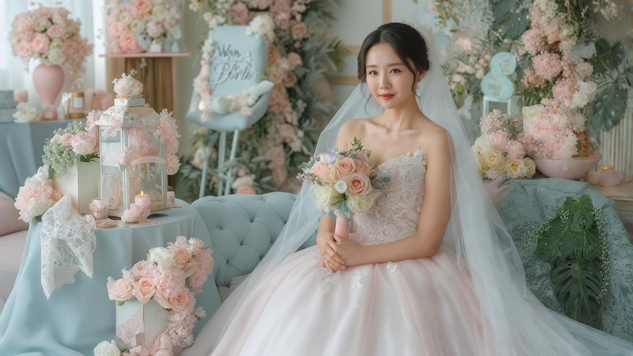
2. Navy and Blush
This sophisticated yet seasonally appropriate combination offers timeless elegance with a summer twist. Navy provides a grounding element while blush adds softness and warmth. The contrast between these colors creates visual interest without feeling overwhelming, making it perfect for yacht club venues, evening receptions, and semi-formal celebrations.
Navy absorbs heat but visually reads as cool, making it an excellent choice for groomsmen attire in hot weather while still maintaining formality. I’ve found that navy suits photograph much better than black ones in bright summer sunlight, maintaining definition rather than appearing as a dark blob.
The specific undertone of blush matters significantly – peachier blushes feel more summery, while cooler pink-based blushes create a more formal atmosphere. When helping couples select their palette, I always bring multiple blush fabric swatches to demonstrate this subtle but important difference.
3. Sunflower Yellow and Navy
This cheerful combination captures quintessential summer energy with the bold brightness of sunflower yellow balanced by sophisticated navy. The high contrast creates visual impact perfect for rustic barn venues, garden parties, and country club settings. This palette photographs exceptionally well, creating vibrant, cheerful imagery that captures the joy of a summer celebration.
Yellow reflects the most light of any color in the spectrum, making it particularly vibrant in outdoor July settings but potentially overwhelming in smaller indoor spaces. I recommend using yellow strategically in larger outdoor areas but more sparingly in intimate indoor settings.
The specific shade of navy matters – lighter navy blues prevent the palette from feeling too heavy for summer, while darker navies create more formal contrast. For a July wedding I coordinated last year, we chose a medium navy that maintained formality while still feeling seasonally appropriate.
4. Periwinkle and Silver
This soft but impactful combination with cool undertones creates a dreamy, sophisticated atmosphere. Periwinkle evokes summer sky feelings while silver adds elegance and light-reflecting properties. This palette works beautifully for evening garden receptions and sophisticated outdoor venues where you want to create a sense of refined summer elegance.
Periwinkle contains both blue and purple undertones, making it exceptionally versatile for coordinating with various flower types available in July. This flexibility can be a budget-saver when working with seasonal blooms.
Silver elements reflect light rather than absorb it, creating a cooling visual effect particularly valuable for hot July celebrations. I’ve used silver mercury glass containers for centerpieces at summer weddings specifically for this light-reflecting quality.
5. Sage Green and Peach
This natural, organic palette combines the freshness of sage green with the warmth of peach for a balanced summer feeling. The combination feels simultaneously fresh and warm, making it perfect for vineyard weddings, botanical gardens, and rustic-elegant venues. This palette photographs beautifully in natural light, creating a soft, romantic atmosphere.

Sage green coordinates exceptionally well with natural outdoor settings, requiring less additional greenery in floral arrangements and reducing decoration costs. I’ve helped couples save up to 30% on their floral budget by choosing this naturally complementary color.
The specific undertone of peach significantly impacts the palette’s feeling – yellower peaches feel more summery while pinker peaches create a more romantic atmosphere. When working with florists, I always specify the exact peach tone we’re targeting to ensure consistency.
For more inspiration on bridesmaid dresses that complement these color palettes, check out our guide on 50 bridesmaid dresses under $150 that work beautifully with summer wedding colors.
Trending 2025 Wedding Color Schemes
The Johnsons chose terracotta and cream for their July 2025 desert wedding in Arizona. They incorporated terracotta in their invitation suite, ceremony programs, and table runners, while using cream for floral arrangements, chair covers, and the wedding cake. To prevent the venue from feeling too warm, they added potted succulents with blue-green tones and scheduled their ceremony for sunset when the terracotta elements would take on a beautiful golden glow. The photographer captured stunning images of the couple against red rock formations, where their color palette perfectly complemented the natural landscape.
Get your color analysis today >>
6. Terracotta and Cream
This earthy combination with a modern twist brings warmth and sophistication to July weddings. The rich terracotta grounds the palette while cream softens and lightens the overall effect. This combination works particularly well for desert-inspired venues, bohemian celebrations, and southwestern themes where you want to embrace natural elements with contemporary style.
Terracotta’s earthy red-brown undertones create a warming effect that works best when balanced with cooling elements in the venue or used primarily in decorative accents rather than large surface areas. I’ve found that limiting terracotta to about 30% of the visual space creates the perfect balance.
Cream rather than pure white prevents harsh contrast in bright July sunlight, creating a more cohesive and photographically pleasing palette. This subtle difference makes a huge impact in outdoor photography, preventing the blown-out highlights that often occur with stark white.
7. Lavender and Mint
This soft pastel combination with a contemporary edge creates a fresh, garden-inspired feeling perfect for summer celebrations. Both colors feel cool and refreshing, making them ideal for hot July weddings. This palette works beautifully for garden parties, afternoon tea-inspired receptions, and herb garden venues where you want to create a sense of natural elegance.
Lavender and mint both contain cool undertones that create a psychologically cooling effect, particularly valuable for daytime July celebrations. I’ve used this palette for several mid-day garden weddings with great success – guests consistently comment on how refreshing the space feels.
These colors correspond with flowers and herbs naturally available in July, reducing the need for out-of-season blooms and potentially lowering floral costs. Working with what’s seasonally available can save couples 20-40% on their floral budget.
8. Dusty Blue and Copper
This modern combination pairs cooling blue with warming metallic accents for a balanced, sophisticated palette. The dusty blue provides a cool base while copper adds warmth and visual interest. This combination works exceptionally well for industrial chic venues, modern minimalist settings, and evening celebrations where you want contemporary elegance with depth.

Dusty blue contains gray undertones that prevent it from feeling too bright or primary, creating a more sophisticated atmosphere than clearer blues. This subtlety makes it appropriate for formal celebrations while still feeling seasonally relevant.
Copper elements reflect warm light, creating a glowing effect particularly beautiful during golden hour photography sessions. I recommend scheduling at least some couple portraits during this time to capture the magical interaction between copper décor and sunset lighting.
9. Marigold and Olive
This rich garden-inspired palette combines the vibrant warmth of marigold with the grounding natural tone of olive green. The combination feels simultaneously vibrant and sophisticated, perfect for Tuscan-inspired settings, orchard weddings, and sophisticated outdoor venues where you want to embrace natural summer abundance.
Marigold’s orange-yellow tone corresponds with flowers naturally blooming in July, creating seasonal authenticity in floral arrangements. This color is particularly abundant in summer blooms, making it both seasonally appropriate and budget-friendly.
Olive green contains both warm and cool undertones, making it exceptionally versatile for coordinating with venue elements and preventing the palette from feeling too warm. I’ve found this color works beautifully in venues with existing wooden elements, creating natural harmony.
Get your color analysis today >>
10. Champagne and Charcoal
This elegant neutral combination offers sophisticated versatility perfect for upscale July weddings. The warmth of champagne balances the depth of charcoal for a timeless effect that works year-round but feels particularly elegant for summer evenings. This palette works beautifully for upscale hotel ballrooms, evening rooftop celebrations, and formal affairs where you want timeless elegance.
Champagne reflects light while charcoal absorbs it, creating natural visual contrast that photographs exceptionally well in various lighting conditions. This balance makes the palette work from daylight through evening, maintaining its sophistication as lighting changes.
The temperature balance between these colors makes them practical for July weddings where managing heat perception is important. I’ve used this combination for several high-end summer weddings where the sophisticated neutrals created an air-conditioned feeling even in outdoor spaces.
When selecting your wedding color scheme, remember that these colors will influence your overall wedding style. For more on creating a cohesive wedding experience, explore our guide on ways to personalize your wedding with your chosen palette.
Bold Statement Wedding Palettes
11. Magenta and Gold
This vibrant and luxurious combination creates dramatic visual impact perfect for couples wanting to make a bold statement. The rich magenta provides vibrant energy while gold adds luxury and warmth. This palette works exceptionally well for luxury hotel venues, glamorous evening celebrations, and ballroom receptions where you want to create a sense of opulence and celebration.

Magenta contains both red and purple undertones, making it more sophisticated and less primary than pure pink while still maintaining vibrant energy. This complexity gives it staying power beyond trendy hot pinks that might feel dated in photos years later.
Gold metallics reflect light differently depending on finish (polished vs. brushed), allowing for textural variety within the same color family. I recommend mixing gold finishes for added dimension – perhaps brushed gold flatware with polished gold chargers and matte gold votive holders.
12. Electric Blue and Tangerine
This high-energy summer combination creates vibrant visual impact perfect for contemporary celebrations. The cool electric blue balances the warm tangerine for a dynamic, energetic effect. This palette works particularly well for modern art gallery venues, contemporary celebrations, and vibrant outdoor parties where you want to create a sense of fun and energy.
Electric blue contains more intensity than navy or royal blue, requiring careful balance to prevent overwhelming the space, particularly in smaller venues. I typically recommend using this color strategically rather than extensively – perhaps for statement pieces like the cake or signature cocktails.
Tangerine’s yellow-orange undertones feel more sophisticated than pure orange while maintaining summer energy and vibrancy. This color photographs beautifully in summer light, creating a warm glow in images that captures the season’s essence.
13. Emerald and Raspberry
This rich jewel-toned combination with summer flair creates dramatic depth and visual interest. The cool emerald balances the warm raspberry for a sophisticated, vibrant effect. This palette works beautifully for garden venues with lush greenery, evening celebrations, and dramatic settings where you want to create a sense of luxury with seasonal appropriateness.
Emerald green coordinates naturally with outdoor greenery, creating cohesion between decorative elements and natural surroundings. This harmony can significantly reduce the need for additional décor in garden settings.
Raspberry provides a more sophisticated alternative to primary red, containing purple undertones that feel more appropriate for summer than true red. I’ve found this color particularly flattering for bridesmaid dresses across various skin tones.
14. Cobalt and Coral
This strong contrast combination with summer sensibility creates vibrant visual impact without feeling overwhelming. The cool depth of cobalt balances the warm brightness of coral for a dynamic, energetic effect. This palette works particularly well for seaside celebrations, Mediterranean-inspired venues, and bold contemporary spaces where you want to create a sense of vibrant elegance.
Cobalt blue contains more depth than royal blue but less darkness than navy, creating a vibrant yet sophisticated base color. This intensity makes it particularly effective for creating focal points in your décor.
The specific undertone of coral significantly impacts the palette’s feeling – yellower corals feel more energetic while pinker corals create a softer effect. I always recommend testing several coral shades in your actual venue before making final decisions.
Get your color analysis today >>
15. Plum and Mint
This unexpected pairing creates unique visual interest with a sophisticated summer twist. The rich depth of plum contrasts beautifully with the fresh lightness of mint for a balanced, interesting effect. This palette works well for vineyard settings, evening garden parties, and transitional summer-to-fall celebrations where you want something distinctive yet seasonally appropriate.
Plum contains both red and blue undertones, making it more complex and sophisticated than primary purple while maintaining richness. This depth allows it to transition beautifully from daytime to evening events.
The contrast between these colors creates natural focal points in decorative elements, drawing the eye to important details. I’ve used this combination to highlight key areas like the cake table or sweetheart table, creating natural photo opportunities.
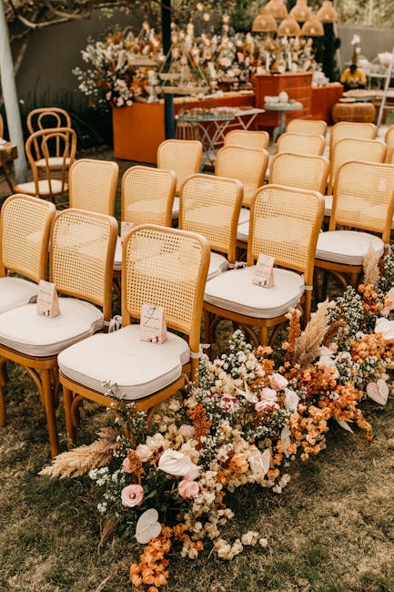
Nature-Inspired Wedding Color Combinations
| Nature Element | Color Palette | Seasonal Flowers | Best Venue Type |
|---|---|---|---|
| Ocean/Beach | Ocean Blues + Sandy Beige | Delphinium, White Roses | Coastal, Waterfront |
| Summer Sunset | Orange + Sky Blue | Zinnias, Cornflower | Rooftop, Open-air |
| Woodland | Forest Green + Purple | Hydrangea, Lavender | Garden, Forest |
| Summer Fields | Wheat Gold + Cornflower Blue | Wheat Stalks, Bachelor Buttons | Farm, Countryside |
| Stone Garden | Moss Green + Gray Stone | Succulents, White Blooms | Historic, Garden |
16. Ocean Blue and Sandy Beige
This beach-inspired palette creates serene elegance perfect for coastal celebrations. The cool ocean blue evokes water while sandy beige grounds the palette with natural warmth. This combination works beautifully for beach weddings, coastal venues, and nautical-themed celebrations where you want to create a sense of seaside sophistication.

Ocean blue varies significantly in depth and intensity, allowing for tonal variation within the same color family for visual interest. I recommend incorporating at least three different blue tones – perhaps a light aqua for linens, medium blue for bridesmaid dresses, and deeper navy for accents.
Sandy beige contains subtle warm undertones that photograph beautifully in natural light, creating a soft glow effect. This warmth makes it particularly flattering for outdoor ceremonies where harsh sunlight might otherwise create unflattering shadows.
17. Sunset Orange and Sky Blue
This dramatic combination inspired by summer evening skies creates visual impact with natural inspiration. The warm sunset orange contrasts beautifully with cool sky blue for a balanced, vibrant effect. This palette works particularly well for rooftop venues, oceanfront celebrations, and venues with spectacular views where you want to complement natural beauty.
The specific shade of orange significantly impacts the palette’s sophistication – burnt orange feels more elegant than bright orange while maintaining warmth. I’ve found that oranges with slightly brown undertones photograph more elegantly than pure citrus tones.
Sky blue contains more gray than primary blue, creating a softer effect that coordinates better with natural environments. This subtlety allows the orange to shine as the star color while the blue creates a sophisticated foundation.
18. Forest Green and Wildflower Purple
This woodland-inspired combination creates rich natural beauty with summer vibrancy. The deep forest green provides a natural base while wildflower purple adds unexpected color and visual interest. This palette works beautifully for woodland venues, botanical gardens, and nature-centered celebrations where you want to embrace natural elements with distinctive style.

Forest green contains more depth than sage or mint, creating a richer effect that works particularly well for evening celebrations or venues with dense natural greenery. This depth creates a sense of luxury while still feeling connected to nature.
Wildflower purple varies naturally in tone, allowing for a range of purple shades within the same palette for authentic natural feeling. I recommend embracing this variation rather than trying to match exact purple tones – the natural diversity creates authentic woodland charm.
19. Wheat Gold and Cornflower Blue
This combination inspired by summer fields creates nostalgic beauty with natural elegance. The warm wheat gold provides a natural base while cornflower blue adds fresh color and visual interest. This palette works particularly well for farm venues, country celebrations, and rustic outdoor settings where you want to embrace natural summer abundance.
Wheat gold contains yellow undertones that coordinate beautifully with natural elements like wood and dried grasses, creating cohesion with rustic venues. This harmony reduces the need for extensive décor in already-beautiful natural settings.
Cornflower blue contains more gray than primary blue, creating a softer effect that feels more natural and less synthetic. This subtlety makes it appropriate for country settings where overly bright colors might feel out of place.
20. Moss and Stone
This organic, earthy neutral combination creates natural sophistication with subtle depth. Both colors feel cool and grounding, making them perfect for creating a sense of natural elegance. This palette works beautifully for garden venues, historic stone buildings, and natural settings where you want to complement rather than compete with natural beauty.
Moss green contains more gray than sage or mint, creating a more sophisticated, subtle effect that coordinates exceptionally well with natural environments. This understated quality makes it perfect for venues with existing character.
Stone gray varies significantly in undertone (warm vs. cool), allowing you to select the specific shade that best complements your venue’s natural stone elements. I always recommend bringing stone samples from your venue when selecting exact gray tones to ensure perfect harmony.
Sophisticated Neutral Wedding Colors with Pops
A Manhattan couple chose charcoal, white, and sunshine yellow for their rooftop July wedding. They used charcoal for table linens and groom’s attire, white for florals and the bride’s gown, and strategic pops of sunshine yellow in cocktail napkins, the wedding cake’s sugar flowers, and small floral accents. Their photographer captured stunning images during golden hour, when the yellow elements seemed to glow against the city skyline. The couple received numerous compliments on how the bright yellow accents created a joyful atmosphere without overwhelming the sophisticated urban venue. The color combination photographed beautifully in both bright daylight and evening lighting.
21. Ivory, Taupe, and Blush
This subtle, elegant combination creates sophisticated warmth with timeless appeal. The neutral base of ivory and taupe provides versatility while blush adds soft color and visual interest. This palette works beautifully for upscale venues, elegant garden settings, and sophisticated celebrations where you want timeless elegance with subtle warmth.
Ivory contains more warmth than pure white, creating a softer effect that photographs more flatteringly in bright July sunlight. This subtle warmth prevents the harsh shadows that can occur with bright white in outdoor settings.
The specific undertone of taupe (gray-brown) significantly impacts how it coordinates with venue elements – warmer taupe works better with wooden elements while cooler taupe coordinates better with stone. I always recommend testing taupe samples in your actual venue before finalizing your selection.
22. Charcoal, White, and Sunshine Yellow
This classic neutral combination with a vibrant pop creates contemporary sophistication with summer energy. The neutral base of charcoal and white provides timeless elegance while sunshine yellow adds vibrant color and visual interest. This palette works particularly well for modern venues, contemporary celebrations, and industrial chic settings where you want sophisticated impact.
Charcoal contains more depth and sophistication than pure black, creating a softer effect more appropriate for summer celebrations. This subtlety prevents the heaviness that can make black feel too formal or winter-appropriate.
The specific shade of yellow significantly impacts the palette’s feeling – butter yellow feels more sophisticated while brighter yellows create more energy. For formal venues, I typically recommend a slightly muted yellow, while casual celebrations can handle brighter tones.
23. Greige, Cream, and Dusty Rose
This modern neutral combination with a romantic touch creates sophisticated warmth with contemporary appeal. The neutral base of greige and cream provides versatility while dusty rose adds soft color and visual interest. This palette works beautifully for converted warehouse venues, modern farmhouse settings, and sophisticated outdoor celebrations where you want contemporary elegance.

Greige (gray-beige) contains both warm and cool undertones, making it exceptionally versatile for coordinating with various venue elements. This chameleon-like quality makes it perfect for venues with mixed materials like wood, concrete, and metal.
Dusty rose contains gray undertones that create a more sophisticated effect than clearer pinks, feeling appropriate for adult celebrations rather than youthful events. This subtlety makes it perfect for couples wanting romantic color without sweetness or girlishness.
Get your color analysis today >>
24. Slate, Ivory, and Sage
This cool-toned sophisticated combination creates elegant natural beauty with contemporary appeal. The slate and ivory provide a sophisticated neutral base while sage adds natural color and visual interest. This palette works particularly well for mountain venues, lakeside celebrations, and elegant outdoor settings where you want to create a sense of refined natural beauty.
Slate blue contains more sophistication than primary blue, creating an elegant effect that coordinates beautifully with natural stone elements. This subtle color creates depth without heaviness, perfect for summer celebrations.
Sage green contains gray undertones that create a more sophisticated effect than clearer greens, feeling appropriate for elegant celebrations. I’ve found this color particularly effective for creating a sense of natural luxury in outdoor settings.
25. Espresso, Champagne, and Teal
This rich combination with dramatic depth creates luxurious impact with unexpected interest. The espresso and champagne provide a sophisticated neutral base while teal adds vibrant color and visual surprise. This palette works beautifully for rustic-luxe venues, evening celebrations, and dramatic settings where you want to create memorable visual impact.

Espresso brown provides more sophistication and depth than medium brown, creating a luxurious foundation for the palette. This richness feels particularly appropriate for evening celebrations or venues with architectural character.
Teal contains both blue and green undertones, making it more complex and sophisticated than primary colors while maintaining vibrancy. This complexity allows it to transition beautifully from daytime to evening lighting, maintaining its impact throughout your celebration.
If you’re planning a more intimate celebration with your chosen color scheme, check out our guide on how to become your own wedding planner for tips on implementing your palette without professional help.
Practical Implementation Tips for Your Color Palette
Successfully implementing your chosen July wedding colors requires practical consideration beyond just selecting the palette. You’ll need to research seasonal flower availability to ensure your vision can be realized without excessive costs. Consider how materials like candles, paper products, and chocolate will perform in July temperatures. Strategic placement of cooler tones in gathering areas can create a psychological cooling effect, while understanding how colors transform between daylight and evening lighting ensures your palette works throughout your celebration.

July’s specific growing season affects flower availability and pricing – peonies typically finish blooming by July while dahlias are just beginning, impacting which flowers can realistically achieve your color vision. I always recommend consulting with your florist about seasonal availability before finalizing your palette to avoid disappointment or budget surprises.
Color temperature perception varies significantly between natural daylight (which contains more blue) and evening lighting (which contains more yellow), requiring testing under specific lighting conditions. I’ve seen beautiful blush tones turn muddy under evening lighting and vibrant blues fade to gray – always test your colors in the actual venue at the same time of day as your event.
| Wedding Element | Color Implementation Tips | July-Specific Considerations |
|---|---|---|
| Attire | Consider fabric weight and breathability | Darker colors show sweat; lighter colors show transparency |
| Flowers | Research seasonal availability | Heat-resistant varieties for outdoor displays |
| Stationery | Test ink colors in various lighting | Avoid heat-sensitive papers and adhesives |
| Cake | Consider heat impact on frosting types | Fondant more heat-stable than buttercream |
| Décor | Test candle performance in heat | Avoid meltable elements in outdoor settings |
How Bridesmaid for Hire Can Help With Your Color Selection
Sarah and Michael were torn between two completely different color directions for their July vineyard wedding. Sarah loved vibrant jewel tones while Michael preferred earthy neutrals. Their Bridesmaid for Hire consultant organized a venue visit during their actual wedding timeframe, bringing fabric swatches and floral samples in both palettes. Seeing how the colors actually appeared in the space at the correct time of day helped the couple discover a compromise: a sophisticated palette of forest green and deep plum that satisfied Sarah’s desire for richness while incorporating the earthy quality Michael preferred. The consultant then created a detailed implementation guide for all vendors, ensuring color consistency across every wedding element.
Choosing wedding colors often becomes overwhelming, especially when managing family opinions and vendor coordination. Bridesmaid for Hire professionals provide objective guidance tailored to your specific venue and vision. They help navigate endless color options, provide feedback on what photographs best in your setting, coordinate with vendors for color consistency, manage family expectations, source decorations and attire, and provide day-of coordination to ensure your color vision comes to life perfectly.

Professional color consultants follow a structured process: selecting foundation colors, identifying complements, determining accents, incorporating neutrals, and planning color proportions. This methodical approach prevents the overwhelm that often happens when couples try to tackle color selection alone.
Bridesmaid for Hire professionals bring practical experience with how colors perform in real wedding settings – knowledge that goes beyond theoretical color theory to address practical implementation challenges. I’ve seen countless Pinterest-perfect palettes fail in real-world settings due to lighting issues, seasonal flower availability, or venue constraints – problems our consultants can help you avoid.
When choosing your July wedding colors, our team can help you navigate family expectations and opinions. Learn more about how to handle unruly wedding party members and family members who may have strong opinions about your color choices.
Ready to find your perfect July wedding colors? Contact Bridesmaid for Hire today for personalized color consultation that takes the stress out of creating your dream wedding palette!
Get your color analysis today >>
Final Thoughts
Your July 2025 wedding colors do more than just decorate your venue – they create the emotional atmosphere of your celebration and will live forever in your photographs. While trends come and go, the most successful wedding palettes reflect your personal style while respecting seasonal considerations. Whether you choose bold and vibrant or soft and subtle, your colors should feel authentically you while creating a comfortable, beautiful environment for your summer celebration. With thoughtful planning and perhaps some professional guidance, your color palette will set the perfect tone for your unforgettable July wedding day.
The psychological impact of color significantly affects guest experience – cooler tones create calm while warmer tones energize, allowing you to strategically design the emotional journey of your celebration. I’ve seen this play out beautifully at weddings where ceremony spaces used calming blues and greens to create a serene atmosphere, while reception spaces incorporated energizing corals or yellows to encourage celebration.
Color memory forms a powerful association with your wedding day – the specific palette you choose becomes part of your celebration’s identity in guests’ memories and your own recollection of the day. Years later, seeing your wedding colors in other contexts will instantly transport you back to your celebration – a powerful emotional souvenir that costs nothing.
For more inspiration on creating meaningful color experiences at your wedding, explore our guide on 5 unique photos to take on your wedding day that can showcase your chosen color palette in creative ways.
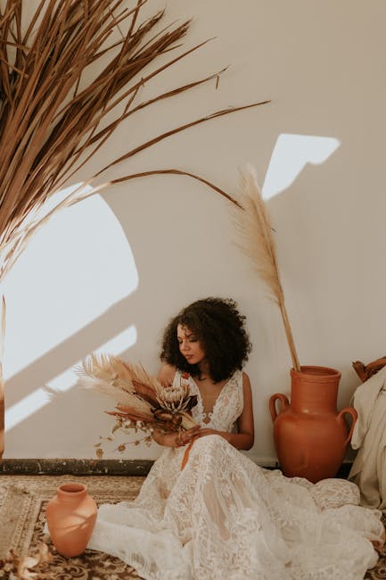
Emerging Color Trends for 2025
Wedding color trends for 2025 show a shift toward meaningful, personalized palettes rather than simply following fashion. Four distinct directions are emerging: sustainable earth tones reflecting environmental consciousness, unexpected digital-inspired combinations breaking traditional rules, heritage color stories incorporating personal history, and sophisticated monochromatic schemes using texture for depth. These trends offer fresh approaches for couples wanting something distinctive yet timeless for their July celebrations.
Sustainable earth tones typically incorporate clay, moss, and stone – colors that coordinate naturally with eco-friendly materials like recycled paper, organic fabrics, and locally-sourced flowers. I’ve noticed these palettes gaining tremendous popularity among environmentally-conscious couples who want their values reflected in every aspect of their celebration.
Digital aesthetics influence unexpected color pairings by breaking traditional color wheel rules, creating visually striking combinations that feel fresh and contemporary. This approach works particularly well for couples with backgrounds in creative fields who want their wedding to reflect their artistic sensibilities.
Regional Climate Considerations for July Weddings
July weather varies dramatically across regions, directly impacting which color palettes work best. East Coast humidity differs significantly from Southwest desert heat or Pacific Northwest mild temperatures. Your location should influence color choices – cooler tones often work better in hotter regions by creating visual refreshment, while warmer palettes can enhance cooler climates. Understanding your specific regional conditions helps create a comfortable, appropriate atmosphere for guests.

High-humidity regions benefit from colors that don’t show moisture marks – medium-toned blues, greens, and purples typically perform better than light pastels or dark shades. Working with a Florida beach wedding last July, we specifically avoided pale gray bridesmaid dresses after discovering how quickly they showed perspiration marks during outdoor photos.
Desert locations with intense sunlight require colors that won’t fade visually in bright conditions – saturated midtones typically maintain their impact better than very light or very dark shades. For an Arizona wedding I coordinated, we selected a rich terracotta rather than a lighter peach specifically because it maintained its vibrancy even in harsh midday sun.
Cultural Significance in Wedding Colors
Wedding colors carry different meanings across cultures, offering opportunities to incorporate heritage into your celebration. From red symbolizing luck and prosperity in Chinese traditions to blue representing fidelity in Western customs, cultural color associations add depth to your palette. Many couples now blend cultural traditions, creating unique combinations that honor multiple heritages while creating a cohesive visual identity for their celebration.
Cultural color traditions often specify exact shades – Chinese red traditionally contains more orange undertones than Western red, while Indian wedding reds typically contain deeper crimson tones. These subtle differences matter tremendously when honoring specific cultural traditions.
Successfully blending cultural color traditions typically works best when finding a common element – such as gold accents that complement both Chinese red and Indian purple. I worked with a couple who beautifully merged her Chinese heritage and his Indian background by using gold as the unifying element throughout their celebration, creating harmony between their distinct cultural color traditions.
Creating a Color Story That Evolves
The most memorable wedding palettes tell a visual story that unfolds throughout your celebration. Consider creating a journey palette that transitions from ceremony to reception, perhaps beginning with softer tones and evolving to more dramatic hues as the day progresses. Alternatively, incorporate colors from significant places in your relationship or develop a palette inspired by sensory experiences you’ve shared, creating deeper meaning beyond just visual appeal.
Journey palettes require careful planning for transitional spaces – areas guests move through between ceremony and reception should incorporate elements from both color schemes to create visual flow. For a recent wedding, we designed a hallway with floral installations that gradually shifted from ceremony colors to reception colors, creating a beautiful visual transition.
Memory-anchored colors benefit from physical representation in your wedding – incorporating actual items from significant locations rather than just their colors creates multi-dimensional meaning. One couple I worked with collected sand from beaches where they’d traveled together, displaying these colorful layers in custom vessels throughout their reception.
Guest Experience and Color Psychology
Your color choices significantly impact how guests experience your celebration. Beyond aesthetics, colors affect mood and comfort – soothing blues and greens create calm while vibrant yellows and oranges energize the atmosphere. Strategic color placement can guide guest behavior, highlighting important areas like the guest book or gift table. Consider how your palette will influence the overall feeling of your day and what emotional experience you want to create for those sharing your celebration.
Color saturation directly impacts energy levels – fully saturated colors create more stimulation while muted tones with gray undertones create a more relaxed atmosphere. For evening receptions where you want to encourage dancing and celebration, brighter colors work wonderfully in the main party space.
Strategic color blocking can direct guest attention and movement through your venue – brighter colors naturally draw the eye and can highlight important elements. I often recommend using bolder colors to mark key areas like the cake table or bar, helping guests naturally navigate the space.
Fabric and Material Interactions with Color
Colors appear dramatically different across various materials, a crucial consideration when coordinating attire and décor. Silk reflects light differently than cotton or linen, affecting how your palette translates across different elements. Velvet deepens colors while sequins and metallics transform them entirely. When selecting your palette, test colors on actual materials you’ll use rather than relying solely on paint chips or digital swatches to ensure cohesive implementation.
Fabric weave significantly impacts color perception – tight weaves like satin appear more vibrant while loose weaves like linen absorb more light and appear more muted. This difference can create unintentional disconnects between different wedding elements if not carefully considered.
Lighting interaction with different materials creates varying effects – shiny surfaces reflect colored lighting while matte surfaces absorb it, potentially creating unintended color variations. Testing materials under your actual venue lighting prevents day-of surprises when elements suddenly appear different than expected.
Get your color analysis today >>
Photography Considerations for Color Longevity
While trends come and go, your wedding photos remain. Some trendy colors may date your wedding photos quickly, so balance contemporary elements with timeless foundations. Consider how your palette photographs in different lighting conditions – colors that look beautiful to the naked eye sometimes photograph poorly. Professional photographers recommend testing your palette in conditions matching your venue and timing to ensure your colors translate beautifully to images you’ll treasure for decades.

Camera sensors capture color differently than the human eye – particularly struggling with very bright yellows and certain purples, which may appear different in photos than in person. Working with your photographer to test how your specific colors photograph prevents disappointment when you receive your wedding images.
Digital post-processing significantly impacts how colors appear in final images – discussing your palette with your photographer allows them to adjust their editing approach to accurately capture your chosen colors. Some editing styles naturally enhance certain colors while muting others, so ensuring your photographer’s style complements your palette is essential.
Budget-Friendly Color Implementation Strategies
Implementing your dream color palette doesn’t require unlimited funds. Strategic color placement often creates more impact than saturating every element. Consider concentrating your colors in high-impact areas like the head table and ceremony backdrop while using more neutral elements elsewhere. Seasonal flowers naturally available in July typically cost less than out-of-season blooms, so building your palette around what’s naturally available can significantly reduce floral costs while maintaining visual impact.
The 60-30-10 rule provides cost-effective color distribution – using your primary color for 60% of elements (typically less expensive basics), secondary color for 30% (mid-range items), and accent color for just 10% (can include higher-cost specialty items). This approach creates visual cohesion while allowing you to splurge selectively on statement pieces.
Lighting offers the most cost-effective way to transform a space with color – strategic colored uplighting can completely change neutral-colored spaces without requiring extensive decorative elements. A few well-placed lights can transform a white-walled venue into a colorful environment for a fraction of the cost of physical décor.
For more budget-friendly wedding ideas, check out our guide on free wedding planning tools you should know about to help implement your color scheme without breaking the bank.
Bridesmaid for Hire: Your Color Confidence Partner
Finding yourself overwhelmed by Pinterest boards and conflicting color advice? This is exactly when professional support becomes invaluable. Bridesmaid for Hire professionals excel at cutting through the noise to identify what truly matters for your specific celebration. They bring practical experience with how colors actually perform in real wedding settings – knowledge that goes beyond theoretical color theory to address implementation challenges.
Professional color consultants evaluate venues for existing elements that must be incorporated into your palette – from permanent fixtures to architectural features that can’t be changed. This practical assessment prevents the common mistake of selecting colors that clash with immovable venue elements.
Bridesmaid for Hire professionals can conduct color testing in your actual venue under various lighting conditions, providing evidence-based recommendations rather than theoretical suggestions. This hands-on approach eliminates guesswork and ensures your colors will look beautiful throughout your celebration.
When family members push for traditional choices while you’re drawn to something more contemporary, your hired bridesmaid becomes an objective advocate for your preferences. They diplomatically navigate color conversations with opinionated relatives while keeping your vision intact.
Ready to find your perfect July wedding colors? Contact Bridesmaid for Hire today for personalized color consultation that takes the stress out of creating your dream wedding palette!
Wedding Shower Versus Bridal Shower: What’s the Difference?
When planning pre-wedding celebrations, many couples wonder about the distinction between wedding showers and bridal showers. While bridal showers traditionally focus solely on the bride with female guests, wedding showers are more inclusive events celebrating both partners. Your color palette can extend to these pre-wedding events, creating visual continuity throughout your celebration journey. Consider using lighter versions of your wedding colors for these daytime gatherings, particularly for summer events where a fresher, brighter approach works beautifully.
Not sure which type of pre-wedding celebration is right for you? Learn more about the differences and planning considerations in our comprehensive bridal shower guide that can help you align these events with your wedding color scheme.
Spring to Summer Color Transitions
For couples planning weddings at the transition from spring to summer, color selection requires special consideration. Spring wedding colors typically feature softer pastels and floral-inspired hues, while July demands more heat-appropriate choices. Creating a palette that bridges these seasons allows you to incorporate spring’s romantic softness with summer’s vibrant energy. Consider starting with spring wedding colors like blush pink or lavender as your base, then adding more saturated summer accents like coral or cornflower blue to create a perfect seasonal transition that honors both times of year.
Spring floral availability differs significantly from July options – transitional palettes should account for which flowers will still be available as the seasons change. Working with your florist to identify blooms that bridge both seasons ensures your vision can be realized without excessive costs.
Color temperature perception shifts as daylight hours increase – colors that read as vibrant in spring’s softer light may appear overwhelming in July’s intense sunshine. Testing your palette under summer lighting conditions prevents surprises when your spring-selected colors suddenly feel too intense in July’s brightness.


1-800-BRIDESMAID
The Newlywed
Card Game
something extra to love
Read the weekly newsletter from Bridesmaid for Hire, 1-800-Bridesmaid, to hear about real stories, from strangers, who need advice on love, life, friendship, and so much more.
Looking for the perfect wedding gift for someone you adore? Grab The Newlywed Card Game. It's a fun and interactive game they can play on their honeymoon or future date nights.

