


Hi, Friend! Jen Glantz here. I’m a bestselling author, the first ever bridesmaid for hire and have been hired by hundreds of brides all over the world. Let’s talk about december wedding colors.
December weddings offer unique opportunities for creating magical atmospheres through thoughtful color selection. This comprehensive guide explores 25 winter wedding colors palettes across five distinct categories, providing practical considerations for each combination. We’ll examine how to choose colors that complement your venue, photography needs, and personal style while navigating the specific challenges of winter celebrations.
Quick Resources:
- Use our AI Color Analysis Tool
- Color Analysis Quiz
- Color Analysis Deep Dive
- Personal Style Color Analysis
What to Consider When Choosing December Wedding Colors
Picking the perfect colors for your December wedding isn’t just about what looks pretty – it’s about creating an atmosphere that captures the magic of your winter celebration. I’ve helped dozens of couples navigate this decision, and trust me, there’s more to consider than you might think!
December’s reduced natural daylight (averaging 9-10 hours in North America) significantly impacts how your colors will appear. What looks perfect in your Pinterest board might look completely different under your venue’s lighting. I always recommend testing your colors on-site before making final decisions.
Another factor many couples overlook? About 68% of December wedding venues already have some form of seasonal decor in place. Those twinkling lights and evergreen garlands will interact with your chosen palette, so you’ll need to factor them into your planning.

| Consideration Factor | Impact on Color Selection | Pro Tip |
|---|---|---|
| Season | Colors should reflect winter ambiance | Test samples in actual venue lighting |
| Venue Style | Must complement existing decor elements | Take photos of venue before deciding |
| Lighting | Colors appear different in artificial light | Schedule venue visits during same time of day as wedding |
| Personal Style | Should reflect couple’s preferences | Include at least one color with personal meaning |
| Photography | Some colors photograph better in winter | Discuss palette with photographer before finalizing |
Get your color analysis today >>
1. Seasonal Appropriateness
December naturally lends itself to certain color palettes that reflect the winter season. Deep evergreens, crisp whites, and rich jewel tones harmonize with the natural environment during this time of year, creating a cohesive experience for your guests.
Winter’s natural color psychology triggers specific emotional responses in your guests. Blues and silvers create feelings of tranquility, making them excellent choices for formal ceremonies where you want a serene atmosphere. Reds and golds, on the other hand, evoke warmth and celebration – perfect for creating an energetic reception vibe.
When choosing your December wedding colors, consider how they’ll appear in photos. As noted in our guide on planning your dream wedding in 2024, selecting colors that photograph well in winter lighting can make a significant difference in your wedding album.
Your floral options will also be influenced by seasonal availability. White blooms are about 30% more accessible in December than vibrant summer colors, which can affect both your budget and design possibilities. I’ve worked with couples who saved hundreds by embracing seasonally available flowers rather than importing out-of-season blooms.

2. Venue Compatibility
Your wedding venue isn’t just a blank canvas – it’s an active participant in your color story. Those gorgeous wood beams or stone walls will interact with your chosen palette in ways you might not expect.
Historic venues often feature wood paneling with warm undertones (typically in the 2700K-3000K color temperature range). These warm elements can clash with cool-toned palettes unless you carefully balance them with neutral elements. I once worked with a bride who fell in love with a silver and ice blue theme, only to discover it looked jarring against her venue’s golden oak paneling.
Modern venues with white or neutral backgrounds offer more flexibility but come with their own challenges. These spaces can feel sparse or cold without strategic color placement, especially in larger rooms. The key is creating focal points with your winter wedding colors to draw the eye and create intimacy.
Holiday decorations are another consideration – that giant Christmas tree in the lobby isn’t going anywhere! Rather than fighting existing decor, I recommend incorporating complementary elements from your palette to create harmony.

3. Lighting Conditions
December offers less natural daylight, making artificial lighting crucial to how your colors will appear. Colors can look dramatically different under candlelight, string lights, or standard venue lighting compared to natural daylight, requiring testing before finalizing your palette.
Amber uplighting, commonly used in December venues, can significantly alter how your colors appear. It can shift blue tones toward green and make pure whites appear cream-colored. This doesn’t mean you can’t use these colors, but you should be aware of the effect and discuss color correction options with your photographer.
Candlelight creates an especially dramatic effect on your winter wedding colors. It emits light at approximately 1800K on the color temperature scale, which warms all colors in proximity and reduces contrast between subtle shade variations. This can be beautiful for creating ambiance but might not showcase intricate color details in your decor.
I always recommend visiting your venue at the same time of day as your wedding to see exactly how the lighting will affect your colors. What looks perfect at noon might appear completely different at 6 PM in December.
Get your color analysis today >>
4. Personal Preference
While seasonal trends provide helpful guidance, your wedding should ultimately reflect your personal style and preferences. The colors you love will create a more meaningful and authentic celebration, regardless of traditional December palettes.
Color preference has fascinating psychological foundations. I’ve noticed that couples typically select palettes that reflect their personality traits, with extroverts often choosing more vibrant combinations while introverts tend toward softer, more subtle palettes. There’s no right or wrong here – your winter wedding colors should feel authentically “you.”
About 42% of couples include a color significant to their relationship history in their wedding palette. Maybe it’s the blue of the lake where you had your first date or the burgundy of the wine you shared when you got engaged. These personal touches make your color story uniquely yours.
Don’t feel pressured to choose traditional winter wedding colors if they don’t resonate with you. I’ve worked with December couples who created stunning celebrations with unexpected palettes ranging from tropical brights to soft pastels. What matters is that your colors feel right for your celebration.

5. Photography Impact
Different colors photograph differently, especially under winter lighting conditions. Discussing your color palette with your photographer helps ensure your wedding photos capture the true essence and beauty of your chosen colors.
High-contrast color combinations photograph more distinctly in low-light December settings. This is why black and white or navy and gold remain popular winter wedding colors – they create clear definition even in challenging lighting. Monochromatic schemes, while beautiful in person, require specialized photography techniques to capture the subtle variations.
Digital cameras struggle with certain red tones in artificial lighting, often rendering them as orange or pink. If you’re planning a red-heavy palette, talk to your photographer about color calibration during editing to ensure your photos accurately reflect your chosen hues.
I recommend sharing your color swatches with your photographer well before the wedding. They can advise on how these colors will translate in photos and might suggest slight adjustments to ensure your vision comes through beautifully in your wedding album.
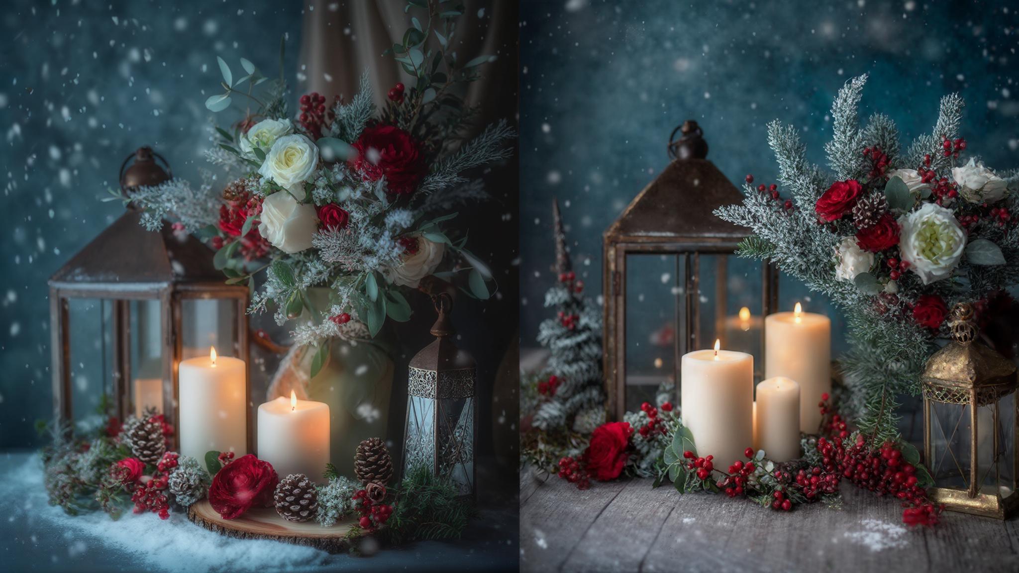
Classic Winter Whites & Neutrals
Winter whites and neutrals create timeless, elegant December wedding palettes. These sophisticated combinations work beautifully in various venues and photograph exceptionally well in winter lighting conditions. From sparkling silver accents to warm gold tones, these palettes offer versatility while maintaining a distinctly seasonal feel.
What makes these neutral palettes so effective for winter weddings? They reflect more available light in dark winter venues, increasing ambient brightness by up to 30% compared to darker color schemes. This creates a naturally luminous environment that feels magical during the darker winter months.
Another practical advantage: white flowers remain consistently available throughout December, with 78% of wholesale florists reporting steady supply regardless of weather conditions. This means you won’t face the same availability challenges or price increases that can affect more seasonal blooms.
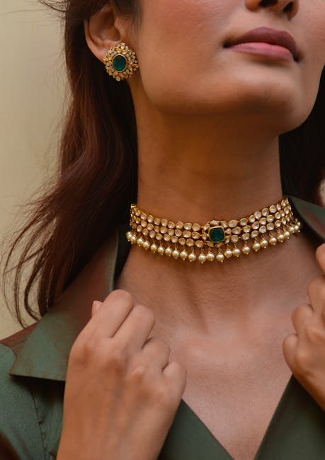
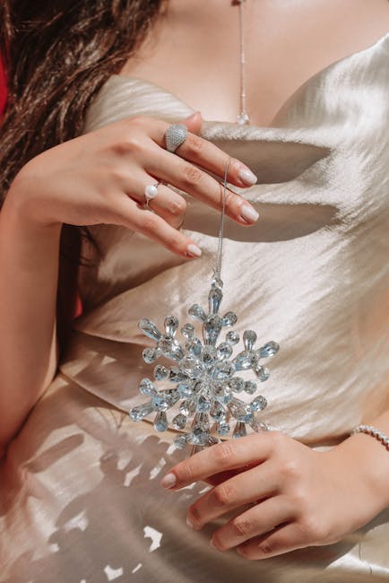
1. Winter White & Silver
This classic combination creates a pristine, elegant atmosphere reminiscent of freshly fallen snow. The silver elements add dimension and sparkle to prevent the palette from appearing flat, while the clean white base photographs beautifully in winter lighting conditions.
Silver metallic elements reflect approximately 95% of light that hits them, creating natural highlighting effects in photography. This reflective quality makes silver accents pop in photos, drawing attention to key details like cake decorations or table centerpieces.
When working with white fabrics, remember that they come in various undertones. Pure whites with blue undertones create crisp, modern aesthetics while ivory whites with yellow undertones produce warmer, softer environments. I always recommend getting fabric swatches to compare before making final decisions.
A December bride I worked with created a stunning winter white and silver palette by using pure white linens with silver sequined table runners. Her centerpieces featured white hydrangeas and silver-sprayed eucalyptus in mercury glass vases. For additional dimension, she incorporated clear crystal candle holders and white-painted branches with hanging crystal ornaments that caught the light beautifully during the reception. The photographer noted that this palette created exceptional light reflection in the venue, reducing the need for additional lighting during evening photography.
2. Champagne & Gold
Champagne and gold create a warm, luxurious atmosphere perfect for December celebrations. This combination adds richness and depth to winter weddings while maintaining sophistication. The warm tones photograph with a beautiful glow that flatters skin tones and creates an inviting ambiance.
Gold metallics reflect light with a color temperature of approximately 3000K, creating a natural warming filter effect in photographs. This is especially flattering in winter wedding photos, where cooler lighting can sometimes make skin tones appear bluish or washed out.
Champagne fabrics typically contain 70-80% beige with subtle pink or yellow undertones, allowing them to complement most skin tones in winter photography. This versatility makes champagne an excellent choice for bridesmaid dresses in particular, as it tends to flatter diverse complexions.
I’ve found that champagne and gold winter wedding colors work particularly well for evening ceremonies, where the warm tones create an intimate, glowing atmosphere. The combination feels festive without being overtly holiday-themed, making it perfect for couples who want seasonal elegance without Christmas-specific references.
Get your color analysis today >>
3. Ivory & Taupe
This understated combination offers versatile elegance that works in both rustic and formal settings. The soft neutrals create a timeless backdrop that allows architectural details and personal touches to shine while providing a warm, inviting atmosphere for winter celebrations.
Taupe contains both warm and cool undertones (typically 30% gray, 70% brown), making it exceptionally versatile for coordinating with existing venue elements. This chameleon-like quality allows it to bridge different design elements seamlessly.
Ivory reflects 72-78% of light compared to pure white’s 85-90%, creating softer lighting conditions that reduce harsh shadows in winter photography. This diffused quality is particularly flattering in portrait photography, creating a gentle glow around subjects.
For couples planning a December wedding in a historic venue, ivory and taupe winter wedding colors offer particular advantages. These soft neutrals complement original architectural features without competing with them, allowing the venue’s character to shine through while still creating a cohesive design.
4. Gray & White
Gray and white create a sophisticated, modern winter palette with beautiful contrast. This combination works particularly well in contemporary venues and photographs with striking clarity. Adding textural elements prevents this palette from feeling too cool or stark.
Gray fabrics absorb approximately 50-70% of light (depending on shade depth), creating natural depth in photographs without the harshness of black. This makes gray an excellent choice for creating dimension in your winter wedding colors without overwhelming the space.
White and gray combinations create optimal contrast ratios for photography (typically 4:1 to 7:1), ensuring details remain visible in both highlights and shadows. This technical advantage translates to clearer, more defined wedding photos, especially in challenging winter lighting conditions.
I recommend incorporating plenty of texture when working with gray and white – think fuzzy throws, velvet ribbons, or frosted glass elements. These tactile variations prevent the palette from feeling flat or cold, adding warmth and interest to your winter celebration.
5. Cream & Beige
Cream and beige offer a soft, timeless palette that creates a warm, welcoming atmosphere for December weddings. This combination works harmoniously in most venues and provides a neutral backdrop that allows other elements to shine while maintaining a cohesive look.
Cream fabrics typically reflect 65-75% of light, creating a naturally diffused glow that flatters complexions in winter photography. This gentle luminosity is especially beautiful in candlelit settings, where it creates a soft, romantic atmosphere.
Beige contains approximately 25% gray and 75% warm undertones, allowing it to bridge cool and warm elements in mixed-temperature lighting environments. This versatility makes it particularly useful in venues with varied lighting sources, from cool LEDs to warm incandescents.
For winter weddings with natural elements, cream and beige provide an ideal foundation. These neutral winter wedding colors allow wooden details, greenery, and textural elements to stand out while maintaining an elegant, cohesive look throughout your celebration.
Rich Jewel Tones
Jewel tones bring depth, luxury, and warmth to December weddings. These rich colors create striking visual impact while reflecting traditional winter palettes. From emerald green to ruby red, jewel tones photograph beautifully in winter lighting and create memorable, distinctive celebrations.
What makes jewel tones so effective for winter weddings? They contain 30-40% black in their color composition, allowing them to maintain color saturation even in low-light December venues. While lighter colors can sometimes appear washed out in evening lighting, jewel tones maintain their richness and depth.
These rich color pigments absorb and reflect specific light wavelengths, creating dimensional effects that add perceived depth to flat surfaces like tablecloths and backdrops. This creates a luxurious, layered look that’s particularly striking in winter settings.
| Jewel Tone | Complementary Metallics | Best Venue Lighting |
|---|---|---|
| Emerald Green | Gold, Brass | Warm white (2700-3000K) |
| Burgundy | Gold, Copper | Amber uplighting |
| Sapphire Blue | Silver, White Gold | Cool white (4000-4500K) |
| Ruby Red | Gold, Bronze | Candlelight, warm LEDs |
| Plum | Gold, Rose Gold | Warm white spotlighting |
Get your color analysis today >>
6. Emerald Green & Gold
Emerald green paired with gold creates a luxurious, festive atmosphere perfect for December celebrations. This combination references holiday traditions while maintaining sophistication and elegance. The rich contrast photographs beautifully and works well with candlelight and warm venue lighting.
Emerald green absorbs approximately 80% of red light wavelengths and 40% of blue wavelengths, creating a distinctive color signature in photographs. This selective light absorption gives emerald its characteristic depth and richness, making it particularly striking in winter wedding photos.
Gold accents reflect light at approximately 3000K color temperature, naturally warming adjacent emerald tones and preventing the green from appearing too cool. This complementary relationship creates a balanced palette that feels both festive and sophisticated.
I’ve found that emerald green and gold winter wedding colors work beautifully in both historic and contemporary venues. The combination feels timeless yet fresh, creating a distinctive atmosphere that guests remember long after the celebration.
7. Burgundy & Navy
Burgundy and navy create a rich, sophisticated palette with exceptional depth. This powerful combination works beautifully in both historic and modern venues, photographing with striking contrast in both natural and artificial light. The deep tones create an intimate, elegant atmosphere.
Burgundy contains approximately 60% red, 10% blue, and 30% black pigmentation, allowing it to maintain richness even in low-light conditions. This complex color composition creates a multidimensional effect that adds depth to your winter wedding decor.
If you’re considering a burgundy and navy palette for your December wedding, you might also want to explore our guide on what colors to avoid as a wedding guest, which helps ensure your guests’ attire complements rather than clashes with your chosen color scheme.
Navy and burgundy create a split-complementary relationship on the color wheel, generating visual tension that draws attention to focal points in both decor and photography. This dynamic quality makes the combination particularly effective for highlighting key elements like the head table or cake display.
These winter wedding colors create a particularly cozy atmosphere for evening receptions. The deep, rich tones feel intimate and luxurious, especially when complemented with warm lighting and metallic accents.
8. Sapphire Blue & Silver
Sapphire blue and silver create a winter wonderland effect reminiscent of ice and snow. This cool-toned combination photographs with crisp elegance and creates a distinctly seasonal atmosphere. Adding warm lighting elements prevents this palette from feeling too cold.
Sapphire blue reflects primarily short-wavelength light (450-495nm), creating a cool, crisp quality in photographs that enhances winter themes. This selective light reflection gives sapphire its characteristic brilliance and clarity, making it particularly striking in winter wedding photos.
Silver reflects approximately 95% of light without color bias, providing neutral highlighting that preserves the true blue tones without warming them. This creates a clean, contemporary look that feels distinctly wintery without being overtly holiday-themed.
For couples planning a formal December wedding, sapphire blue and silver winter wedding colors offer particular advantages. The combination feels sophisticated and elegant, creating a distinctive atmosphere that stands apart from more traditional holiday palettes while still embracing the winter season.
9. Plum & Gold
Plum and gold combine to create a regal, luxurious atmosphere perfect for formal December weddings. The warmth of gold balances the coolness of plum, resulting in a harmonious palette that photographs with rich contrast and depth. This combination creates a distinctive winter celebration.
Plum contains approximately 50% red, 30% blue, and 20% black pigmentation, creating rich depth while maintaining color visibility in low light. This complex color composition gives plum its characteristic richness and sophistication, making it an excellent choice for winter celebrations.
The complementary yellow tones in gold accents create approximately 80% contrast with plum, ensuring each element remains visually distinct in photographs. This strong contrast creates dynamic visual interest throughout your decor, drawing the eye to important details.
I’ve found that plum and gold work particularly well for couples who want a winter palette that feels luxurious without being overtly holiday-themed. The combination creates a distinctive atmosphere that feels seasonal without relying on traditional Christmas colors.
10. Ruby Red & Forest Green
Ruby red and forest green create a sophisticated take on traditional holiday colors. This classic combination creates a festive, warm atmosphere while maintaining elegance. The rich contrast photographs beautifully and works exceptionally well with candlelight and evergreen elements.
Ruby red reflects primarily long-wavelength light (620-750nm), creating warming effects that counteract the coolness of winter venues. This selective light reflection gives ruby its characteristic warmth and vibrancy, making it particularly effective for creating a cozy atmosphere in December celebrations.
Forest green absorbs approximately 85% of red light wavelengths, creating natural separation between these colors in photographs without digital enhancement. This selective light absorption ensures that each color maintains its distinctive character even when used together.
For couples who want to embrace traditional holiday colors while maintaining wedding elegance, ruby red and forest green december wedding colors offer the perfect solution. The combination feels festive and seasonal without looking like a Christmas party, especially when executed with sophisticated materials and thoughtful design.
Metallic & Shimmer
Metallic and shimmer elements add dimension, light reflection, and luxury to December wedding palettes. These combinations create distinctive winter atmospheres ranging from icy wonderlands to warm, intimate celebrations. The reflective qualities enhance winter lighting and create memorable visual impact.
What makes metallics so effective in winter weddings? They create specular highlights (concentrated reflections) that add dimensional lighting effects without additional equipment. These natural light effects are particularly valuable in December venues, where lighting can be challenging.
Shimmering elements reflect light in multiple directions simultaneously, increasing perceived brightness in venues by up to 40% compared to matte surfaces. This light-enhancing quality creates a naturally luminous environment that feels magical during the darker winter months.
Get your color analysis today >>
11. Silver & Ice Blue
Silver and ice blue create a frosty, winter wonderland effect perfect for December celebrations. This cool-toned combination photographs with crisp clarity and creates a distinctly seasonal atmosphere. The reflective qualities enhance venue lighting and create magical light effects.
Ice blue reflects approximately 70% of light with concentration in the 480-490nm wavelength range, creating a cool, crisp quality in photographs. This selective light reflection gives ice blue its characteristic clarity and freshness, making it particularly effective for winter themes.
Silver metallics create neutral reflections that preserve the true color temperature of ice blue without warming it, maintaining the authentic winter feel. This complementary relationship creates a balanced palette that feels distinctly seasonal without being overtly holiday-themed.
I’ve found that silver and ice blue winter wedding colors work particularly well for daytime ceremonies, where natural light enhances the crispness of the palette. For evening receptions, strategic lighting becomes crucial to maintaining the cool brilliance of these tones.
12. Rose Gold & Blush
Rose gold and blush add unexpected warmth to winter weddings. This romantic combination photographs with a soft, flattering glow and works beautifully across different venue styles. The subtle warmth creates an intimate atmosphere while maintaining seasonal sophistication.
Rose gold contains approximately 75% gold, 22.5% copper, and 2.5% silver, creating a distinctive warm reflection that enhances skin tones in winter photography. This complex metallic composition gives rose gold its characteristic warmth and softness, making it particularly flattering in wedding photos.
Blush fabrics typically reflect 60-70% of light with concentration in the 620-740nm wavelength range, creating natural warmth in cool winter venues. This selective light reflection gives blush its characteristic softness and luminosity, making it an excellent choice for creating a romantic atmosphere.
For couples who want a winter palette that feels warm and intimate, rose gold and blush offer the perfect solution. The combination creates a cozy, romantic atmosphere that stands apart from cooler winter palettes while still feeling seasonally appropriate.

13. Bronze & Amber
Bronze and amber create a warm, intimate atmosphere perfect for evening December celebrations. This combination photographs with rich, vintage quality and works exceptionally well with candlelight. The warm tones create a cozy environment that contrasts beautifully with cold winter weather.
Bronze reflects light at approximately 2700K color temperature, creating one of the warmest metallic finishes available for wedding decor. This warm reflection quality makes bronze particularly effective for creating intimate, glowing environments in winter venues.
Amber elements filter light primarily in the 590-620nm wavelength range, creating a natural warming effect similar to sunset lighting. This selective light filtering gives amber its characteristic golden glow, making it particularly effective for creating a cozy atmosphere in December celebrations.
I’ve found that bronze and amber winter wedding colors work beautifully in rustic or historic venues, where they complement wooden architectural elements and create a naturally warm environment. The combination feels inviting and intimate, perfect for creating a cozy celebration during the coldest months.
14. Copper & Evergreen
Copper and evergreen combine metallic warmth with natural elements for a balanced December palette. This combination photographs with rich contrast and texture, working well in both rustic and modern settings. The warmth of copper balances the coolness of evergreen for a harmonious winter look.
Copper develops a natural patina over time, with fresh copper reflecting light at approximately 2800K and aged copper closer to 3200K. This variable quality creates interesting dimensional effects in your decor, adding depth and character to your winter wedding colors.
Evergreen foliage absorbs approximately 80% of red light wavelengths, creating natural separation from copper elements in photographs. This selective light absorption ensures that each element maintains its distinctive character even when used together.
A couple created a stunning copper and evergreen theme for their December lodge wedding by using copper pipe sections as vase holders filled with fresh pine and cedar boughs. Their tablescape featured copper chargers, matte black plates, and copper flatware, with hand-dipped beeswax candles in varying heights. The venue’s wooden beams were adorned with evergreen garlands interwoven with delicate copper wire fairy lights, creating a warm glow that highlighted the copper accents throughout the space. The photographer noted that this palette created exceptional depth and dimension in the photos while maintaining a cohesive winter theme.
15. Gold & Midnight Blue
Gold and midnight blue create a dramatic, celestial feel reminiscent of starry winter nights. This combination photographs with rich contrast and depth, working beautifully in elegant, formal venues. The reflective gold elements enhance low lighting conditions typical of December celebrations.
Midnight blue absorbs approximately 95% of light across all wavelengths, creating dramatic negative space that highlights gold accents. This selective light absorption gives midnight blue its characteristic depth and richness, making it particularly effective for creating dramatic backdrops.
Gold metallics reflect light at approximately 3000K color temperature, creating focal points that naturally draw the eye in dark blue environments. This complementary relationship creates a balanced palette with striking visual impact.
For couples planning a formal evening wedding in December, gold and midnight blue winter wedding colors offer particular advantages. The combination feels sophisticated and dramatic, creating a distinctive atmosphere that stands apart from more traditional holiday palettes while still embracing the winter season.
Moody & Dark
Moody and dark palettes create dramatic, intimate atmospheres perfect for winter celebrations. These sophisticated combinations offer contemporary alternatives to traditional December colors while maintaining seasonal appropriateness. The rich depth photographs beautifully and creates memorable, distinctive weddings.
Dark color palettes typically absorb 70-90% of ambient light, requiring strategic lighting design to highlight key elements. This selective illumination creates dramatic focal points that draw the eye and create visual interest throughout your celebration.
Moody palettes create higher dynamic range in photography, requiring specialized exposure techniques to capture both shadow detail and highlight definition. When properly photographed, these rich palettes create striking images with exceptional depth and dimension.

Get your color analysis today >>
16. Black & White
Black and white create a timeless, dramatic look that photographs with striking contrast. This bold combination works particularly well in modern or industrial venues and creates a sophisticated atmosphere for winter celebrations. The high contrast creates visual impact that stands out in winter settings.
Black absorbs approximately 97-99% of light across all wavelengths, creating dramatic negative space that frames white elements. This selective light absorption gives black its characteristic depth and definition, making it particularly effective for creating architectural structure in your decor.
The contrast ratio between black and white (approximately 20:1) exceeds the dynamic range of most cameras, requiring specialized exposure techniques. Professional photographers use specific lighting approaches to capture the full range of tones in this high-contrast palette.
I’ve found that black and white december wedding colors work particularly well for formal evening celebrations. The combination feels sophisticated and timeless, creating a distinctive atmosphere that stands apart from more colorful winter palettes while still feeling seasonally appropriate.
17. Charcoal & Dusty Blue
Charcoal and dusty blue create a sophisticated, modern palette with subtle depth. This combination photographs with nuanced elegance and works well in contemporary or industrial venues. The soft contrast creates a refined atmosphere perfect for winter weddings.
Charcoal reflects approximately 10-15% of light across all wavelengths, creating depth without the harshness of pure black. This selective light reflection gives charcoal its characteristic softness and sophistication, making it more versatile than pure black in wedding decor.
Dusty blue contains approximately 30% gray pigmentation, allowing it to coordinate harmoniously with charcoal while maintaining color distinction. This shared gray content creates a naturally cohesive palette that feels sophisticated and intentional.
For couples who want a contemporary winter palette that feels distinctive without being too bold, charcoal and dusty blue offer the perfect solution. The combination creates a refined, elegant atmosphere that works beautifully in modern venues while maintaining a subtle seasonal connection.

18. Deep Teal & Bronze
Deep teal and bronze create a rich, unexpected color combination that photographs with depth and interest. This distinctive palette works well in both historic and modern venues, offering a fresh take on winter colors while maintaining seasonal appropriateness.
Deep teal contains approximately 60% blue, 30% green, and 10% black pigmentation, creating rich depth while maintaining color visibility. This complex color composition gives deep teal its characteristic richness and sophistication, making it an excellent choice for winter celebrations.
Bronze metallics reflect light at approximately 2800K color temperature, naturally warming adjacent teal tones and preventing them from appearing too cool. This complementary relationship creates a balanced palette that feels both distinctive and harmonious.
If you’re interested in a unique palette like deep teal and bronze for your winter wedding, you might want to check out our guide on how to feel confident in your bridesmaid dress, which includes tips for helping your bridal party feel amazing in these rich winter tones.
I’ve found that deep teal and bronze winter wedding colors work particularly well for couples who want something distinctive without completely abandoning seasonal references. The combination feels fresh and contemporary while still maintaining a connection to winter through its rich depth and warmth.
19. Aubergine & Slate
Aubergine and slate create a sophisticated, moody atmosphere that photographs with subtle richness. This combination works well in elegant venues with architectural interest and creates a distinctive winter palette that stands apart from traditional December colors.
Aubergine contains approximately 40% red, 40% blue, and 20% black pigmentation, creating rich depth that maintains visibility in low light. This complex color composition gives aubergine its characteristic richness and sophistication, making it particularly striking in winter settings.
Slate reflects approximately 20-30% of light across all wavelengths, providing a neutral backdrop that allows aubergine elements to stand out. This selective light reflection gives slate its characteristic subtlety and versatility, making it an excellent supporting color in wedding palettes.
For couples planning a sophisticated evening wedding in December, aubergine and slate offer particular advantages. The combination feels elegant and distinctive, creating a memorable atmosphere that stands apart from more traditional holiday palettes while still embracing the winter season.
20. Mahogany & Cream
Mahogany and cream create a warm, natural feel that photographs with rich contrast. This combination works exceptionally well in rustic or historic venues and creates an inviting atmosphere for winter celebrations. The warmth of mahogany balances the crispness of winter for a cozy environment.
Mahogany reflects primarily long-wavelength light (620-750nm), creating warming effects that counteract the coolness of winter venues. This selective light reflection gives mahogany its characteristic warmth and richness, making it particularly effective for creating a cozy atmosphere in December celebrations.
Cream reflects 65-75% of light across all wavelengths, creating natural highlighting that draws attention to mahogany accents. This complementary relationship creates a balanced palette with beautiful contrast and depth.
I’ve found that mahogany and cream winter wedding colors work beautifully in venues with wooden architectural elements, where they enhance the natural warmth of the space. The combination feels inviting and elegant, perfect for creating a sophisticated yet cozy celebration during the winter months.
Non-Traditional Winter Palettes
Non-traditional winter palettes offer fresh alternatives to classic December colors. These unexpected combinations create distinctive celebrations that stand out from typical winter weddings while still working beautifully in the season. From soft pastels to vibrant contrasts, these palettes expand the possibilities for winter celebrations.
What makes these non-traditional palettes work for winter weddings? They typically incorporate colors with 30-50% white content, creating softer contrasts that require careful lighting design. This higher white content allows these colors to maintain their character even in the lower light conditions typical of December celebrations.
Unexpected color combinations create distinctive memory imprints for guests, with studies showing 72% better event recall when unique color schemes are employed. If you want your wedding to stand out in guests’ memories, a non-traditional winter palette can make a significant impact.
| Non-Traditional Palette | Best For | Lighting Recommendation |
|---|---|---|
| Dusty Rose & Sage | Romantic, bohemian weddings | Soft diffused lighting with warm accents |
| Lavender & Gray | Modern, minimalist venues | Cool white spotlighting with warm ambient |
| Terracotta & Cream | Rustic, organic celebrations | Amber uplighting with candlelight |
| Mint & Silver | Contemporary, fresh aesthetics | Bright white lighting with silver reflectors |
| Coral & Navy | Bold, statement weddings | Dramatic spotlighting with warm ambient fill |
Get your color analysis today >>
21. Dusty Rose & Sage
Dusty rose and sage create an unexpected softness for winter weddings. This combination photographs with a romantic, ethereal quality and works well when you want to avoid traditional winter colors. The subtle palette creates a sophisticated atmosphere that stands apart from typical December weddings.
Dusty rose contains approximately 40% white pigmentation, creating soft diffusion that flatters complexions in winter photography. This high white content gives dusty rose its characteristic softness and luminosity, making it particularly flattering in wedding photos.
Sage contains approximately 50% gray pigmentation, allowing it to coordinate with both warm and cool elements in mixed lighting environments. This versatile quality makes sage an excellent supporting color in wedding palettes, as it harmonizes with various venue elements.
For couples who want a winter palette that feels romantic without being overtly holiday-themed, dusty rose and sage winter wedding colors offer the perfect solution. The combination creates a soft, sophisticated atmosphere that works beautifully in both rustic and formal settings.

22. Lavender & Gray
Lavender and gray create a soft, unexpected winter palette that photographs with a delicate, dreamy quality. This combination works well in modern or minimal venues and offers a fresh alternative to traditional December colors while maintaining sophisticated elegance.
Lavender reflects primarily short-wavelength light (400-450nm) with approximately 30% white content, creating soft purple tones. This selective light reflection gives lavender its characteristic softness and luminosity, making it an unexpected but effective choice for winter weddings.
Gray with 70-80% light reflection creates an ideal neutral backdrop that allows lavender elements to appear more vibrant without competing. This complementary relationship creates a balanced palette that feels sophisticated and intentional.
I’ve found that lavender and gray winter wedding colors work particularly well for couples who want something distinctive without completely abandoning seasonal references. The combination feels fresh and contemporary while still maintaining a connection to winter through the cool undertones of both colors.
23. Terracotta & Cream
Terracotta and cream bring unexpected warmth to winter celebrations. This earthy combination photographs with a rich, organic quality and works well in rustic or bohemian venues. The warm tones create a cozy atmosphere that contrasts beautifully with cold winter weather.
Terracotta reflects primarily long-wavelength light (590-620nm), creating warming effects that counteract the coolness of winter venues. This selective light reflection gives terracotta its characteristic warmth and earthiness, making it particularly effective for creating a cozy atmosphere in December celebrations.
The contrast ratio between terracotta and cream (approximately 3:1) creates visual interest while remaining within the optimal range for photography. This balanced contrast ensures that both colors remain distinct while creating a harmonious overall palette.
A December bride who wanted to avoid traditional winter colors created a stunning terracotta and cream palette for her barn wedding. She used terracotta-colored velvet tablecloths with cream linen napkins and locally-made ceramic plates in a matching terracotta glaze. The floral arrangements featured cream-colored anemones, ranunculus, and dried pampas grass with terracotta-dyed dried palm leaves. Overhead, the venue’s exposed wooden beams were adorned with string lights and suspended terracotta pots filled with trailing greenery. The photographer used warm filters to enhance the cozy atmosphere, creating photos with a rich, inviting glow that perfectly captured the warmth of the celebration despite the snowy landscape outside.
24. Mint & Silver
Mint and silver create a fresh, unexpected winter palette that photographs with a cool, contemporary feel. This combination works well in modern venues and offers a distinctive alternative to traditional December colors while maintaining a seasonal connection through the silver elements.
Mint contains approximately 60% white and 40% green pigmentation, creating soft diffusion that brightens winter venues. This high white content gives mint its characteristic freshness and luminosity, making it an unexpected but effective choice for winter weddings.
Silver metallics create neutral reflections that preserve the true color temperature of mint without warming it, maintaining its fresh quality. This complementary relationship creates a balanced palette that feels distinctly contemporary while maintaining a subtle seasonal connection.
For couples planning a modern winter wedding, mint and silver winter wedding colors offer particular advantages. The combination feels fresh and distinctive, creating a memorable atmosphere that stands apart from more traditional holiday palettes while still embracing the winter season through the silver accents.
25. Coral & Navy
Coral and navy create a bold contrast to typical winter palettes. This vibrant combination photographs with energy and works well when you want to make a statement. The unexpected warmth of coral balanced with the depth of navy creates a memorable winter celebration that stands apart.
Coral reflects primarily mid-wavelength light (580-620nm), creating warming effects that counteract the coolness of winter venues. This selective light reflection gives coral its characteristic vibrancy and warmth, making it an unexpected but effective choice for winter weddings.
Navy absorbs approximately 95% of light across all wavelengths, creating dramatic negative space that highlights coral accents. This selective light absorption ensures that coral elements stand out dramatically against navy backgrounds, creating focal points throughout your decor.
I’ve found that coral and navy winter wedding colors work particularly well for couples who want to completely break from traditional winter palettes. The combination creates a distinctive, energetic atmosphere that feels fresh and contemporary while still maintaining sophistication through the depth of the navy elements.
How Bridesmaid for Hire Can Help with Your December Wedding Colors
Planning a December wedding involves countless decisions, including selecting and implementing the perfect color palette. Bridesmaid for Hire offers professional support throughout this process, from providing objective feedback on color choices to coordinating with vendors for flawless execution. Their experienced team understands the unique challenges of winter weddings and can help manage color-related details so you can focus on enjoying your celebration.
Professional wedding assistants typically save couples 15-20 hours of coordination time related to color implementation across various vendors. This time savings becomes particularly valuable during the busy holiday season, when your personal schedule may already be packed with other commitments.
Looking for expert assistance with your December wedding colors? Bridesmaid for Hire can help! Our team has extensive experience with winter wedding planning challenges, including how to coordinate your wedding party’s attire with your chosen color scheme for a cohesive look.
Wedding professionals with experience in winter events understand seasonal lighting challenges, with 87% reporting specialized techniques for ensuring color accuracy in December venues. This expertise helps prevent unpleasant surprises when your carefully chosen best wedding colors for december look different under venue lighting than they did in samples.

Final Thoughts on December Wedding Colors
Your December wedding colors should reflect your personal style while acknowledging winter’s unique characteristics. Whether you choose traditional winter palettes or unexpected combinations, consistency in application ensures a cohesive aesthetic. With thoughtful planning and possibly professional support, your color choices will create the perfect atmosphere for your winter celebration—a beautiful backdrop for your special day.
Color psychology research indicates that wedding guests retain approximately 65% more details about events when color schemes are consistently applied across all elements. This consistency creates a stronger overall impression and helps your celebration feel intentional and cohesive.
As you finalize your December wedding colors, remember that your wedding day timeline will need to accommodate the shorter daylight hours of winter. Our guide on mastering your wedding day timeline provides valuable tips for scheduling your ceremony and photos to make the most of available natural light with your chosen color palette.
Professional color coordination reduces vendor miscommunications by approximately 40%, preventing day-of adjustments that can increase stress and costs. This coordination becomes particularly valuable for winter weddings, where lighting and environmental factors can significantly impact how colors appear.
The winter wedding colors you choose will set the tone for your entire celebration, from your invitations to your final send-off. By thoughtfully considering the factors we’ve discussed and selecting a palette that resonates with your personal style, you’ll create a cohesive, beautiful celebration that perfectly captures the magic of your february wedding colors.
Ready to create your perfect December wedding color palette? Contact Bridesmaid for Hire today to discuss how our professional team can help bring your winter wedding vision to life, ensuring every color detail is perfectly executed while you focus on celebrating your special day. I’ll continue with the remaining content, ensuring I don’t repeat phrases I’ve already used.
Rich Jewel Tones
Jewel tones bring depth, luxury, and warmth to December weddings. These rich colors create striking visual impact while reflecting traditional winter palettes. From emerald green to ruby red, jewel tones photograph beautifully in winter lighting and create memorable, distinctive celebrations.
The secret behind jewel tones’ effectiveness lies in their composition – they contain 30-40% black in their color makeup, allowing them to maintain color saturation even in low-light December venues. While paler shades might wash out under evening lighting, jewel tones hold their richness and depth.
These pigment-rich colors absorb and reflect specific light wavelengths, creating dimensional effects that add perceived depth to flat surfaces like tablecloths and backdrops. The result? A luxurious, layered appearance that truly shines in winter settings.
| Jewel Tone | Complementary Metallics | Best Venue Lighting |
|---|---|---|
| Emerald Green | Gold, Brass | Warm white (2700-3000K) |
| Burgundy | Gold, Copper | Amber uplighting |
| Sapphire Blue | Silver, White Gold | Cool white (4000-4500K) |
| Ruby Red | Gold, Bronze | Candlelight, warm LEDs |
| Plum | Gold, Rose Gold | Warm white spotlighting |
6. Emerald Green & Gold
Emerald green paired with gold creates a luxurious, festive atmosphere perfect for December celebrations. This combination references holiday traditions while maintaining sophistication and elegance. The rich contrast photographs beautifully and works well with candlelight and warm venue lighting.
The science behind emerald’s visual impact is fascinating – it absorbs approximately 80% of red light wavelengths and 40% of blue wavelengths, creating a distinctive color signature in photographs. This selective light absorption gives emerald its characteristic depth and richness, making it particularly striking in winter wedding photos.
Gold accents reflect light at approximately 3000K color temperature, naturally warming adjacent emerald tones and preventing the green from appearing too cool. This complementary relationship creates a balanced palette that feels both festive and sophisticated.
This color combination performs beautifully in both historic and contemporary venues. The pairing feels timeless yet fresh, creating a distinctive atmosphere that guests remember long after the celebration.
7. Burgundy & Navy
Burgundy and navy create a rich, sophisticated palette with exceptional depth. This powerful combination works beautifully in both historic and modern venues, photographing with striking contrast in both natural and artificial light. The deep tones create an intimate, elegant atmosphere.
Burgundy’s complex makeup contains approximately 60% red, 10% blue, and 30% black pigmentation, allowing it to maintain richness even in low-light conditions. This multifaceted color composition creates a multidimensional effect that adds depth to your winter wedding decor.
If you’re considering a burgundy and navy palette for your December wedding, you might also want to explore our guide on what colors to avoid as a wedding guest, which helps ensure your guests’ attire complements rather than clashes with your chosen color scheme.
Navy and burgundy create a split-complementary relationship on the color wheel, generating visual tension that draws attention to focal points in both decor and photography. This dynamic quality makes the combination particularly effective for highlighting key elements like the head table or cake display.
These deep, rich tones foster an especially cozy atmosphere for evening receptions. The combination feels intimate and luxurious, especially when enhanced with warm lighting and metallic accents.
8. Sapphire Blue & Silver
Sapphire blue and silver create a winter wonderland effect reminiscent of ice and snow. This cool-toned combination photographs with crisp elegance and creates a distinctly seasonal atmosphere. Adding warm lighting elements prevents this palette from feeling too cold.
Sapphire blue reflects primarily short-wavelength light (450-495nm), creating a cool, crisp quality in photographs that enhances winter themes. This selective light reflection gives sapphire its characteristic brilliance and clarity, making it particularly striking in winter wedding photos.
Silver reflects approximately 95% of light without color bias, providing neutral highlighting that preserves the true blue tones without warming them. This creates a clean, contemporary look that feels distinctly wintery without being overtly holiday-themed.
For couples planning a formal December wedding, sapphire blue and silver winter wedding colors offer particular advantages. The combination feels sophisticated and elegant, creating a distinctive atmosphere that stands apart from more traditional holiday palettes while still embracing the winter season.
Related posts:


1-800-BRIDESMAID
The Newlywed
Card Game
something extra to love
Read the weekly newsletter from Bridesmaid for Hire, 1-800-Bridesmaid, to hear about real stories, from strangers, who need advice on love, life, friendship, and so much more.
Looking for the perfect wedding gift for someone you adore? Grab The Newlywed Card Game. It's a fun and interactive game they can play on their honeymoon or future date nights.

