


Let’s be real: buying bold clothing is the easy part. Wearing it is where the panic sets in. You buy the item because it looked like a power move on the mannequin, but now it’s just sitting in your closet, judging you. I know the feeling. I once impulse-bought a pair of fire-engine red trousers, convinced they were going to be my new signature look. Then I actually tried to get dressed.
Most style experts will tell you that red and black is the best possible combination. It makes sense—they both fight for attention but somehow balance each other out. I wish I’d read that advice before I committed a fashion crime. I stood in front of the mirror holding up a neon yellow top and looked exactly like a fast-food mascot. It wasn’t a look. While we’re focusing on trousers here, mastering the reverse is just as key; knowing pants colors to wear with red shirts helps build a closet that actually makes sense.
Quick Resources:
-
Find shirt colors that actually flatter you with the free Color Analysis Quiz
-
Explore the full planning and style toolkit in All Wedding Tools
Figuring out the right shirt colors red pants need isn’t about luck. It’s about strategy. I eventually ditched that neon top for a black tee, and the difference was instant.
Unsure which colors work best on you? Start with the free Color Analysis Quiz.

That moment grounded the look and taught me the rules of “refined maximalism.” You can wear the loud pants without looking like a costume if you just understand the logic behind the pairing.
TL;DR
In a rush and need to get dressed in five minutes? Here is the cheat sheet. These points cover the essentials without the deep dive.
-
Context is King: High contrast (white/black) looks formal; earth tones look casual.
-
Texture Matters: If the pants are shiny, the shirt should be matte. Balance the visual weight.
-
Warm vs. Cool: Decide if you want to lean into the heat (gold/brown) or cool it down (blue/grey).
-
The Safest Bet: If you’re nervous, just grab a crisp white or navy blue shirt. You can’t mess that up.
-
The 2026 Trend: “Refined Maximalism” is huge right now—think bold monochromatic looks, like burgundy on red.
The Vibe Check: How to Choose
You can’t just grab any shirt and hope for the best. Before I get dressed, I run through a quick mental checklist. First, look at the Shade. Darker reds act like neutrals, while bright reds need a shirt that calms them down.
Second, consider the Occasion. Are you heading to a boardroom or a dive bar? Third, look at Fabric and Texture. A silk pant needs a matte cotton shirt so you don’t look slippery. When you’re wondering what colors go with red pants, the fabric usually answers the question before the color wheel does.
|
Pant Fabric |
Best Shirt Pairing |
Why It Works |
|---|---|---|
|
Red Denim / Chino |
Cotton, Chambray, or Flannel |
Rugged textures match the sturdy weight of denim. |
|
Red Wool / Trouser |
Silk, Fine Knit, or Crisp Poplin |
Smoother fabrics make the wool look sharper for the office. |
|
Red Silk / Satin |
Matte Cotton or Cashmere |
Matte tops keep you from looking like you’re wearing fancy pajamas. |
|
Red Linen |
Linen blend or Lightweight Cotton |
Matches the breezy, relaxed vibe of the pants. |
Finally, check the Color Temperature. Understanding color analysis is huge here. You have to decide whether to turn up the heat or cut through it with cool tones.
Identify whether warm or cool tones suit you with the Color Analysis Quiz.
Quick Tip: If you aren’t sure about color temperature, check your veins. Blue veins usually mean cool undertones—so go for a “cool” red pant (cherry/berry) with white or charcoal. Green veins mean warm undertones—opt for a brick red pant with cream, gold, or olive.
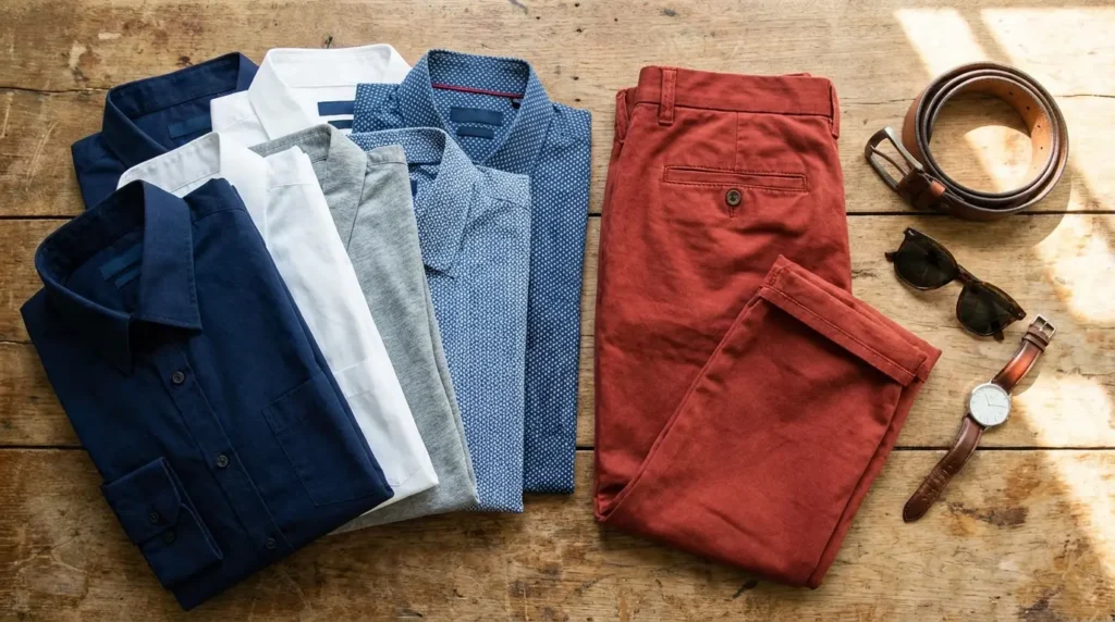
Category A: The Essential Neutrals
These are your safety nets. They let the pants be the main character without clashing. If you are stuck deciding what color shirt goes with red pants, start here.
Confirm which neutrals flatter your undertones using the free Color Analysis Quiz.
1. Crisp White
The gold standard. A white Oxford or stiff cotton button-down creates a super clean aesthetic. It’s fresh and uncomplicated.

2. Jet Black
Slimming and modern. I love a black fitted tee or turtleneck here. It gives off a “downtown chic” vibe that’s perfect for the evening.

3. Heather Grey
Soft and casual. A heather grey t-shirt tones down the aggression of bright red pants. It makes the whole outfit look effortless.
4. Charcoal
A darker grey gives you the formality of black but isn’t quite as harsh. This is ideal for office settings, especially with burgundy trousers.
5. Cream / Off-White
Warmer than crisp white. Cream softens the look and pairs amazingly well with rust or brick-red pants for a vintage feel.
Category B: The Blues (Complementary Classics)
Blue sits opposite red on the color wheel, which means they naturally look good together. These shades feel grounded but still colorful.
Learn your most flattering contrast colors with the Color Analysis Quiz.
6. Navy Blue
The nautical classic. Navy grounds the outfit just like black does, but it feels a little more harmonious. It just works.
Style Shift: A navy blazer with red chinos is the ultimate “Yacht Club” look—very preppy. But swap that blazer for a fitted navy t-shirt and sneakers, and suddenly it’s a cool, urban weekend fit.
7. Chambray / Denim
Texture is everything here. A light or medium wash denim shirt adds a rugged feel to red chinos. It’s an easy weekend go-to.

8. Powder Blue
A corporate staple. A light powder blue dress shirt creates a sophisticated contrast against darker red pants. It says you mean business but you’re not boring.
9. Slate Blue
A grey-infused blue. This muted tone is excellent for fall fashion. It pairs beautifully with deep red wool pants.
10. Midnight Blue
Almost black, but with blue undertones. This adds depth and richness. It is perfect for formal holiday events where you want to look sharp.
Category C: Earth Tones & Grounding Hues
Organic colors neutralize the brightness of red. Browns, greens, and beiges create a sophisticated, expensive look by leaning into the warmth of the pants. Add these to your list of what colors go with red pants for a more subtle approach.
Build a wearable earth-tone palette using the free Color Analysis Quiz.
11. Camel
Luxurious and warm. A camel cashmere sweater looks expensive when paired with deep red. It’s a rich combination.

12. Beige / Khaki
The “Safari” reverse. Instead of khaki pants and a red shirt, flip it. A beige linen shirt keeps red pants breezy for summer.
13. Chocolate Brown
A major trend right now. Deep brown paired with deep red creates a moody look. It feels very high-fashion and intentional.
14. Army Green / Olive
Olive is muddy enough to look cool and utilitarian, not festive. It avoids the “Christmas” trap while still using complementary colors.

15. Taupe
A mix of grey and brown. It effectively bridges the gap between the pants and your skin tone for a neutral transition.
Category D: Prints and Patterns
Prints add dimension and break up color blocks. Classic patterns like stripes and gingham add visual texture that solids just can’t achieve.
16. Breton Stripe (Navy/White)
The classic French sailor look. A horizontal striped boat-neck shirt is arguably the most iconic pairing for red trousers.

17. Black and White Gingham
This adds visual texture without introducing a crazy new color. It leans preppy—perfect for spring picnics or casual Fridays.
18. Tartan / Plaid (with Red accents)
A flannel that incorporates the shade of the pants within the pattern ties the whole look together seamlessly.
Pattern Matching Rule: If you’re wearing plaid with red pants, make sure the red inside the shirt matches the pants (or is darker, like burgundy). If the shirt is orange-red and the pants are blue-red, the clash will look accidental, not stylish.
19. Leopard Print
For the bold. Leopard acts as a neutral in the fashion world. The warm browns and blacks in the print coordinate perfectly with warm reds.
20. Polka Dot (White on Navy)
Playful and retro. It breaks up the solid blocks of color and adds a sense of fun to the outfit.
Category E: Monochromatic & Analogous (The Bold Choice)
Staying within the red, pink, or orange family is a fashion-forward move. Executing “clashing” colors intentionally creates a modern, trendy aesthetic.
21. Blush Pink
Pink is really just light red. Pairing blush with bold red creates a soft, romantic aesthetic. It feels very current.
22. Burgundy (Tone-on-Tone)
Wearing a burgundy shirt with bright red pants creates a cool gradient effect. It elongates the body and looks incredibly chic.

23. Rust / Terracotta
An earthy orange-red. This works best in autumn. Layer different textures of “burnt” colors for a cozy vibe.
24. Metallic Silver
Party time. Silver acts as a cool-toned neutral that cuts through the heat of the red. It gives a futuristic look.
25. Mustard / Goldenrod
The “Ketchup and Mustard” risk. To do this right, choose a deep, rich Goldenrod to pair with a dark maroon pant. Avoid bright yellow unless you want to look like a condiment.
|
Combination |
Boldness Score (1-10) |
The Vibe |
|---|---|---|
|
Monochromatic (Red on Red) |
10/10 |
Runway Ready. Requires absolute confidence. |
|
Pink on Red |
8/10 |
Playful, romantic, and fashion-forward. |
|
Mustard on Maroon |
7/10 |
Retro academic. Quirky but stylish. |
|
Rust on Brick |
5/10 |
Subtle and earthy. High style, low volume. |
Once you nail the shirt, don’t forget the footwear. Check out our guide on shoes to pair with red pants to complete the outfit.
Where to Wear What
Knowing what color shirt goes with red pants is only half the battle; knowing where to wear it is the other half. Here’s how I score these colors based on where you’re actually going.
-
Professional Settings: Stick to Crisp White, Charcoal, or Navy Blue. These temper the loudness of the pants. They score high on safety.
-
Casual / Weekend: Go for Heather Grey, Chambray, or Breton Stripe. Relaxed fabrics, relaxed vibes.
-
Evening / Date Night: Jet Black, Chocolate Brown, and Silk Camel are winners. These deeper tones create intimacy. For more event inspo, look at 2025 wedding guest outfit trends to see how bold colors are playing a role.
-
Fashion-Forward: Blush Pink or Burgundy Tone-on-Tone. These defy traditional matching rules and show you know what you’re doing.
The occasion dictates the shirt choice just as much as your personal taste does.
|
Occasion |
Recommended Shirt Color |
Avoid |
|---|---|---|
|
Job Interview (Creative Field) |
Navy Blue, Charcoal, or crisp White |
Neon colors or loud prints (too distracting). |
|
First Date |
Black, Camel, or Dark Denim |
Bright Yellow (unless you want to look like McDonald’s). |
|
Holiday Party |
Midnight Blue, Metallic Silver, or Green |
Matching the decor too closely (unless it’s on purpose). |
|
Summer BBQ |
Breton Stripe, White Linen, or Gingham |
Heavy black wool or turtlenecks. |
Solving Decision Fatigue with Bridesmaid for Hire
Staring at your closet trying to decide between Slate Blue and Navy creates a specific kind of exhaustion. You worry about the photos. You worry about the vibe. You worry about making a mistake. That same paralysis happens when you are planning a wedding or trying to survive one as a Maid of Honor.

You have endless options for vendors, speeches, and timelines. Sometimes your friends are too biased or too busy to give you the objective help you need. Bridesmaid for Hire steps in as that professional support system.
We aren’t just there to stand in a line. We act as the unbiased voice of reason you need when things get complicated. Whether you are drowning in spreadsheets or struggling to manage wedding planning meltdowns, we handle the dirty work. We offer a “best friend” experience that is paid to care, support, and solve problems. You don’t have to do it alone.
Final Thoughts
Red pants are a statement. They signal confidence. Now that you have the toolkit to style them, stop overthinking it. Whether you choose a safe crisp white or a bold leopard print, the most important thing you wear is your attitude.
Understanding what colors go with red pants gives you the freedom to experiment. Own the look.
Take the guesswork out of bold outfits with the Color Analysis Quiz.


1-800-BRIDESMAID
The Newlywed
Card Game
something extra to love
Read the weekly newsletter from Bridesmaid for Hire, 1-800-Bridesmaid, to hear about real stories, from strangers, who need advice on love, life, friendship, and so much more.
Looking for the perfect wedding gift for someone you adore? Grab The Newlywed Card Game. It's a fun and interactive game they can play on their honeymoon or future date nights.

