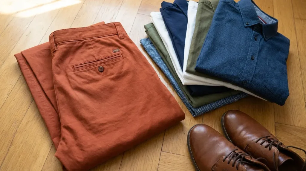
Hi, Friend! Jen Glantz here. I’m a bestselling author, the first ever bridesmaid for hire and have been hired by hundreds of brides all over the world. Let’s talk about what color shirt goes with orange pants.
I’ve noticed that many people shy away from orange pants, but they’re actually super versatile when you know how to style them! The key is understanding a few basics that’ll make your orange pants outfit pop in all the right ways.
First off, the specific shade of orange you’re working with makes a huge difference. Bright tangerine creates a totally different vibe than a muted rust tone. Your skin tone matters too – I’ve found that people with warmer complexions can rock pretty much any orange shade, while cooler skin tones might want to be a bit more selective.
When I’m putting together an outfit with orange pants, I always consider the occasion and season. Those bright tangerine pants that look amazing at a summer beach party might feel a bit out of place at a winter business meeting. And don’t forget about basic color theory – it’s not just for art class! The relationships between colors on the color wheel directly impact how your outfit comes together.
Got patterned orange pants? I usually pair them with solid shirts to avoid visual overload. With solid orange pants, you’ve got more freedom to play with patterns and textures in your shirt choice. Remember that orange pants naturally draw attention, so your shirt can either tone things down or amp up the boldness factor.
If you’re planning to wear orange pants to a wedding as a guest, consider checking out our guide on 4 colors you should avoid wearing as a guest at a wedding to ensure your orange pants outfit is appropriate for the occasion.
Orange Shade | Characteristics | Best Shirt Pairings | Occasions |
---|---|---|---|
Bright Tangerine | Vibrant, high-energy | Navy, white, black, cobalt blue | Casual outings, creative events |
Burnt Orange | Muted, earthy | Cream, olive, burgundy, forest green | Fall/winter events, smart casual |
Rust/Terracotta | Subdued, sophisticated | Beige, chambray, chocolate brown | Year-round professional settings |
Coral Orange | Soft, approachable | Sky blue, white, dusty pink | Spring/summer social events |
Did you know that color wheel relationships are fundamental when pairing with orange? Complementary colors (opposite on the wheel like blue) create high contrast while analogous colors (adjacent on the wheel like yellow or red) create harmony and cohesion.
The intensity of orange pigmentation affects light reflection against different skin undertones too. I’ve noticed that cooler skin tones (pink/blue undertones) typically pair better with more muted oranges while warmer skin tones (yellow/golden undertones) can handle brighter orange hues.
Get your color analysis today >>
I can’t think of a more foolproof combo than a crisp white shirt with orange pants! This pairing is my go-to when I want something that works every single time. White creates the ultimate clean contrast with any shade of orange pants, from the brightest neon to the deepest rust.
What I love most about this combination is how versatile it is. I’ve worn it to casual weekend brunches and dressed it up for semi-formal events just by changing my accessories. The white shirt balances the boldness of orange pants while flattering literally every skin tone. My favorite look is a tailored white button-down with orange chino pants and brown loafers – it’s polished but not trying too hard.
When you wear white with orange, you’re maximizing color contrast through the complete absence of competing hues. This allows the orange to maintain its true color value without being influenced by neighboring pigments. Plus, the neutral pH of white fabric dyes prevents chemical interaction with orange pigments when garments make contact, maintaining color integrity throughout wear. That’s why your white shirt stays looking crisp against those orange pants all day long!
Looking for something a bit softer than stark white? Light beige shirts create a sophisticated pairing with orange pants that feels elegant and understated. I find this combination works especially well with brighter orange shades, creating minimal contrast that lets both pieces shine.
This pairing is particularly flattering if you have a warmer skin tone, and it’s perfect for casual to smart-casual settings during spring and summer. When I want a seasonal appropriate outfit, I’ll pair a lightweight beige linen shirt with bright orange shorts and white sneakers for a refined warm-weather look that’s comfortable but still put-together.
Beige contains subtle yellow undertones that create a harmonious relationship with orange through shared color components. This results in a visually cohesive palette that’s pleasing to the eye. The low saturation level of beige (approximately 10-15% color saturation) allows it to function as a neutral while still maintaining enough warmth to complement orange’s high saturation (typically 80-100%). This balance is what makes the combination feel so natural and effortless in your orange pants outfit.
Charcoal gray shirts provide depth without competing with orange pants, creating a particularly effective combination with deeper orange tones like rust, terracotta, and burnt orange. I’ve found this pairing works well across different skin tones and fits perfectly in business casual to smart casual settings.
What I appreciate about charcoal gray is how it grounds the outfit while allowing orange to be the focal point. This makes it ideal for fall and winter looks when you want something sophisticated but not somber. My go-to outfit for cooler weather is a soft charcoal henley with burnt orange corduroy pants and black chelsea boots – it feels put-together without being stuffy.
Charcoal gray contains black pigmentation mixed with white, creating a neutral that absorbs rather than reflects light. This allows the orange pants to visually advance while the gray recedes, creating a flattering silhouette. The color temperature difference between cool-toned charcoal and warm-toned orange creates visual tension that registers as sophisticated contrast in human color perception.
When creating a balanced orange pants outfit with a charcoal shirt, you might also be interested in learning how to feel more confident in your outfit, applying the same confidence-building techniques to your everyday style.
Navy blue shirts complement all orange shades, particularly vibrant ones, creating a classic, timeless contrast that’s never too loud. I’ve worn this combination everywhere from business casual environments to weekend outings throughout the year.
What makes navy and orange so special is how they create balanced contrast without competition. Navy lets the orange shine without fighting for attention. For a polished casual look, I’ll often grab a structured navy polo with tangerine slim-fit pants and white sneakers – it’s versatile enough for almost any casual setting.
Navy blue sits opposite orange on the color wheel (approximately 180 degrees), creating a complementary color relationship that maximizes visual impact while maintaining color harmony. The low luminance value of navy (typically 15-20% on the brightness scale) creates strong value contrast with orange (typically 60-80% luminance), enhancing the definition between garments. This is why navy is such a reliable answer when wondering what color shirt with orange pants will create a balanced look.
Get your color analysis today >>
Black shirts create a bold, striking look with orange pants that demands attention. I’ve found this combination works best with brighter orange shades for maximum contrast. It can appear a bit harsh against very fair skin, so I usually reserve it for evening events, creative workplaces, or fashion-forward settings.
While this pairing works year-round, it can feel a bit heavy during summer months. For a contemporary outfit that turns heads, I’ll wear a fitted black t-shirt with bright orange wide-leg trousers and black loafers – it’s high-contrast and attention-grabbing in all the right ways.
Urban Professional Look: Alex, a graphic designer at a creative agency, pairs a fitted black turtleneck with bright tangerine slim-fit trousers for client presentations. The sleek black top balances the statement orange pants while maintaining a professional edge. He completes the look with black leather Chelsea boots and a minimal silver watch, creating a contemporary outfit that works perfectly in his creative professional environment while still appearing intentional and put-together.
Black’s complete absence of color (0% saturation, 0% brightness) creates maximum contrast with orange’s high saturation and brightness values. This results in the strongest possible visual boundary between garments. The stark value contrast between black and orange creates a figure-ground relationship that draws the eye directly to the transition points between colors, emphasizing silhouette and garment structure.
Powder blue shirts pair exceptionally well with deeper oranges like rust and terracotta. I’ve discovered this creates a fresh, unexpected contrast that feels modern without trying too hard. This combination flatters most skin tones and works perfectly for daytime events and casual office settings.
I especially love this pairing during spring and summer when the light, refreshing quality of powder blue feels just right. For a versatile outfit that transitions well from office to evening, I combine a light powder blue oxford shirt with rust-orange chinos and tan desert boots. The balance between the colors creates a look that’s interesting but not overwhelming.
Powder blue contains approximately 85-90% white mixed with blue pigment, creating a high-value (bright) complementary contrast to orange that’s softer than pure blue. The high luminance of powder blue reflects significant light, creating a visual lifting effect when paired with the medium luminance of most orange pants. This is why the combination feels so fresh and approachable when considering what color shirt goes with orange pants.
Teal shirts offer a rich complementary pairing with orange pants that’s grounded in color theory principles. I’ve found this combination works best with muted oranges and rust tones, creating a sophisticated palette that flatters most skin tones.
This pairing is perfect for creative professional settings and social events where you want to show some personality without going overboard. The vibrant but balanced color story works year-round but feels especially rich for fall and winter. My go-to cool-weather look is a teal knit sweater with burnt orange pants and brown leather sneakers – sophisticated without being stuffy.
Teal combines blue (orange’s complement) with green, creating a blue-green hybrid that sits approximately 150-170 degrees from orange on the color wheel. This is close enough to maintain complementary contrast while adding complexity. The balanced saturation levels between teal and orange (both typically 70-90% saturation) create equivalent color strength, allowing neither to visually dominate.
Chambray blue shirts work with all orange shades, adding texture while maintaining a relaxed vibe. I love how this universally flattering combination feels perfect for casual settings, especially during spring and summer when you want something effortless but still put-together.
The textural quality of chambray adds visual interest without competing with the orange, creating dimension in your outfit. For a weekend-ready look, I’ll pair a textured chambray shirt (untucked) with bright orange shorts and canvas slip-ons – it’s effortlessly stylish for warm-weather adventures.
Chambray’s woven structure creates visual texture through alternating blue and white threads, reducing the perceived intensity of the blue-orange complementary contrast. The washed, slightly faded appearance of most chambray shirts reduces color saturation to approximately 40-60%, creating a more harmonious relationship with bright orange’s high saturation.
For those interested in creating a chambray and orange pants outfit for a special occasion, you might want to explore our tips for wedding guest attire to ensure your stylish combination is appropriate for the celebration.
Get your color analysis today >>
Cobalt blue shirts create a vibrant contrast with bright orange pants for a bold color-blocking effect that’s impossible to ignore. I’ve noticed this high-impact combination can be intense on very fair skin, so it works best for creative or social settings where making a statement is welcome.
This pairing creates an attention-grabbing, fashion-forward statement that works year-round. When I want a contemporary outfit that showcases my color confidence, I’ll wear a vibrant cobalt blue fitted t-shirt with tangerine trousers and white sneakers – it’s bold in all the right ways.
Cobalt blue sits almost exactly opposite orange on the color wheel (approximately 175-185 degrees), creating the strongest possible complementary relationship with maximum visual vibration. The similar saturation and brightness values between cobalt blue and bright orange (both typically 80-100% saturation) create equivalent visual weight, resulting in a balanced but high-energy color relationship.
Sky blue shirts pair beautifully with coral-tinted oranges, creating a cheerful, approachable look that feels fresh and inviting. This combination flatters most skin tones and is perfect for casual, outdoor events during spring and summer.
I particularly love this pairing for vacation settings – it evokes that perfect seasonal feel that works especially well for resort wear or beach weddings. For a summer-ready outfit, I’ll wear a light sky blue linen shirt with coral-orange pants and espadrilles – it’s breezy, comfortable, and perfectly appropriate for warm-weather special occasions.
Sky blue contains approximately 70-80% white mixed with blue pigment, creating a high-value complementary contrast to orange that’s softer and more atmospheric than deeper blues. The high luminance value of sky blue (typically 75-85% brightness) paired with the medium-high luminance of orange creates an overall bright palette that reflects significant light, ideal for daytime settings. This makes styling orange pants with sky blue particularly effective for outdoor events.
Earth Tone Shirt | Best Orange Pairing | Seasonal Suitability | Event Appropriateness |
---|---|---|---|
Olive Green | Rust, Terracotta | Year-round (best in Fall) | Casual, Outdoor, Smart Casual |
Camel | Burnt Orange | Fall, Winter | Business Casual, Smart Casual |
Chocolate Brown | Terracotta, Rust | Fall, Winter | Smart Casual, Evening Events |
Forest Green | All Orange Shades | Year-round (best in Fall) | Casual to Smart Casual |
Burgundy | Rust, Burnt Orange | Fall, Winter | Smart Casual, Evening Events |
Olive green shirts create a natural, earthy combination with orange pants that feels grounded and organic. I’ve found this pairing works best with rust and terracotta shades, creating a rich palette that complements warm skin tones especially well.
This combination excels in casual and outdoor settings, creating an aesthetic that’s perfect for fall but works year-round if you style it right. For a versatile outfit that transitions well between seasons, I’ll wear an olive green utility shirt with rust-orange pants and brown boots – it’s outdoorsy yet stylish without trying too hard.
Olive green contains yellow undertones that share a color component with orange, creating a partial analogous relationship while the green component adds enough contrast to prevent visual blending. The muted saturation of olive green (typically 30-50%) balances the higher saturation of orange, creating a sophisticated color relationship with natural earthen undertones. This balance is key when figuring out how to wear orange pants in a way that feels intentional rather than overwhelming.
Camel shirts create a sophisticated tonal pairing with burnt orange pants that exudes luxury and refinement. I’ve noticed this combination is most flattering on medium to deeper skin tones and works beautifully for professional settings during fall and winter.
The rich, warm palette creates an elevated, refined look that feels intentional and polished. My favorite cold-weather ensemble combines a camel cashmere sweater with burnt orange woolen trousers and brown brogues – it’s upscale without being stuffy and perfect for important meetings or dinner dates.
Camel and burnt orange share similar color components (both contain red and yellow pigments), creating a harmonious analogous relationship with approximately 30-40 degrees of separation on the color wheel. The similar color temperature between camel and burnt orange (both warm-toned) creates a cohesive palette while their different saturation levels (camel at 30-40%, burnt orange at 60-70%) provide enough contrast for visual distinction.
Get your color analysis today >>
Chocolate brown shirts work beautifully with terracotta and rust orange pants, creating a rich, earthy combination that feels sophisticated and grounded. This pairing is most flattering on warm skin tones and works well for sophisticated casual to smart settings during fall and winter.
I love how this combination creates depth and warmth in an outfit without feeling heavy or overwhelming. For a refined cold-weather look, I’ll wear a chocolate brown turtleneck with terracotta wide-leg pants and cognac loafers – it’s elegant, comfortable, and perfect for everything from office days to weekend gatherings.
Chocolate brown contains red undertones that connect chromatically with the red component in orange, creating a harmonious relationship while maintaining distinct color identities. The low luminance value of chocolate brown (typically 20-30% brightness) creates strong value contrast with the medium brightness of most orange pants (50-70%), enhancing garment definition and creating visual interest in your orange pants outfit.
Forest green shirts create a natural, balanced contrast with both bright and muted orange pants. I’ve found this combination flatters across skin tones and works for casual to smart casual settings year-round, though it feels particularly appropriate during fall.
The pairing offers a rich contrast without appearing too stark, creating a balanced look that’s interesting without being overwhelming. For a versatile outfit that works for multiple occasions, I’ll wear a dark forest green button-up with bright orange pants and black boots – it’s bold yet sophisticated in all the right ways.
Forest green sits approximately 90-110 degrees from orange on the color wheel, creating a near-complementary relationship that provides strong contrast without the maximum vibration of true complementary colors. The low luminance of forest green (typically 25-35% brightness) against the medium-high brightness of orange creates a value contrast that enhances the visual impact of both colors, making each appear more vibrant.
Burgundy shirts create a rich autumnal palette with deeper orange pants, particularly rust tones. This combination flatters most skin tones and works well for smart casual settings during fall and winter when you want something sophisticated and seasonal.
I love the depth and richness this pairing creates – it feels intentional and thoughtfully put together. For an elevated cold-weather look with creative flair, I’ll wear a burgundy knit polo with rust-orange corduroy pants and dark brown chelsea boots – it’s perfect for everything from creative office environments to dinner with friends.
Burgundy and rust orange share red undertones, creating a partial analogous relationship while their different secondary color components (blue in burgundy, yellow in orange) provide enough contrast for visual interest. The similar saturation levels between burgundy and rust orange (both typically 50-70%) create a balanced color relationship with equivalent visual weight, making this orange pants outfit feel cohesive and intentional.
Lavender shirts create an unexpected yet harmonious contrast with bright orange pants, resulting in a modern, fashion-forward look that feels fresh and contemporary. I’ve found this combination is particularly flattering on cool skin tones and works well for creative settings and social events during spring and summer.
The pairing offers a fresh, contemporary aesthetic that stands out from traditional color combinations without looking like you’re trying too hard. For a stylish warm-weather outfit, I’ll wear a soft lavender shirt with bright orange chinos and white sneakers – it’s unexpected but still feels intentional and put-together.
Fashion Week Standout: During Milan Fashion Week, style influencer Maya created a street-style sensation with her lavender silk button-down paired with vibrant tangerine wide-leg trousers. She kept accessories minimal with clear acrylic heels and a small white structured handbag. The unexpected color combination photographed beautifully against urban backdrops, demonstrating how unconventional color pairings can create memorable, fashion-forward impressions while still appearing intentional and sophisticated.
Lavender contains both red and blue pigments, creating a complex relationship with orange – the red component provides harmony while the blue component creates contrast. The typically low saturation of lavender (30-50%) balances the high saturation of bright orange (80-100%), preventing visual competition while maintaining distinct color identities.
Get your color analysis today >>
Mustard yellow shirts create a bold, analogous color combination with burnt orange pants, making an artistic statement that feels intentional and confident. This pairing can be challenging on very fair skin with yellow undertones but works beautifully for creative casual settings, especially during fall.
I love how this combination creates a warm, rich palette with visual cohesion that feels artistic without being over-the-top. For a sophisticated autumnal look, I’ll wear a mustard yellow sweater with burnt orange pants and brown suede shoes – it’s perfect for gallery openings, creative workspaces, or weekend coffee dates.
Mustard yellow and burnt orange sit approximately 30-40 degrees apart on the color wheel, creating an analogous relationship that shares yellow as a primary component. The similar saturation levels (both typically 60-80%) and similar color temperature (both warm) create a cohesive palette while their different red content provides enough distinction to prevent visual blending. This makes it a surprisingly effective answer to the question of what to wear with orange pants when you want something unexpected.
Dusty pink shirts provide a soft, modern contrast with terracotta and muted orange pants. I’ve found this combination flatters across skin tones and works well for social and creative settings during spring and summer when you want something sophisticated but not severe.
The pairing creates a sophisticated, contemporary aesthetic with subtle contrast that feels fresh and unexpected. For a refined warm-weather look, I’ll wear a dusty pink knit shirt with terracotta trousers and gray suede loafers – it’s perfect for summer dinner parties, creative office environments, or upscale casual events.
Dusty pink contains red pigments that connect chromatically with the red component in orange, creating partial harmony while the different secondary components create enough contrast for visual interest. The low saturation of dusty pink (typically 20-40%) balances the medium saturation of terracotta orange (40-60%), creating a sophisticated, muted palette that feels intentional and refined.
For those interested in incorporating dusty pink and orange into a wedding guest outfit, check out our guide on what to wear as a wedding guest to ensure your color combination works for the specific dress code.
Emerald green shirts make a vibrant, eye-catching statement with bright orange pants. This high-impact combination flatters across skin tones and works well for evening events and creative settings year-round when you want to make a bold impression.
I love how this pairing creates a bold, confident aesthetic that demands attention without looking costumey. For a statement-making outfit that works for cocktail parties or creative celebrations, I’ll wear an emerald green silk shirt with bright orange wide-leg pants and metallic sandals – it’s dramatic in all the right ways.
Emerald green sits approximately 100-110 degrees from orange on the color wheel, creating a near-complementary relationship that provides strong contrast without the maximum vibration of true complementary colors. The high saturation levels of both emerald green and bright orange (both typically 80-100%) create equivalent visual weight, resulting in a balanced but high-energy color relationship that makes for a memorable orange pants outfit.
Plum purple shirts create depth and richness when paired with deeper orange pants like rust tones. This combination flatters across skin tones and works well for evening and creative settings during fall and winter when you want something sophisticated with a creative edge.
The pairing offers a rich, sophisticated palette with visual depth that feels luxurious without being stuffy. For an elevated cold-weather look with creative flair, I’ll wear a deep plum henley with rust-orange pants and black boots – it’s perfect for everything from dinner dates to creative industry events.
Plum purple contains both red and blue pigments, creating a complex relationship with orange – the red component provides harmony while the blue component creates contrast. The low luminance value of plum purple (typically 20-30% brightness) paired with the medium luminance of rust orange creates a rich value contrast that enhances the visual depth of both colors, making the combination feel sophisticated and intentional.
Pattern Type | Best Orange Pairing | Pattern Scale | Color Considerations |
---|---|---|---|
Stripes | Medium to bright orange | Medium to narrow | Navy/white stripes most versatile |
Florals | Orange that matches floral accents | Small to medium | Base color should complement orange |
Geometric | All orange shades | Small to large | Should include colors that work with orange |
Micro-Check | Both bright and deep orange | Very small | Blues and whites most versatile |
Color-Block | Exact match to orange in design | Large blocks | Other colors should create intentional contrast |
Navy and white striped shirts add visual interest while maintaining harmony with orange pants. I’ve found this works particularly well with medium to bright orange tones, creating a classic combination that never goes out of style.
This universally flattering pairing is perfect for casual weekend outings and seaside events, especially during spring and summer when you want something with a bit of nautical flair. The pattern adds dimension without competing with the orange, creating a balanced look that feels effortless. For a classic casual look, I’ll wear a navy and white striped tee with bright orange chinos and white sneakers – it’s timeless but still interesting.
The alternating navy and white stripes create an averaged visual color that appears as a medium blue from a distance, maintaining the complementary relationship with orange. The linear pattern of stripes creates visual rhythm that contrasts with the solid expanse of orange pants, adding dimensional interest without competing for attention. This makes striped shirts a reliable answer when wondering what to wear with orange pants for a casual but put-together look.
Get your color analysis today >>
Subtle floral print shirts with orange accents create cohesion when paired with orange pants. I’ve found this works best when the orange in the print matches the pants, creating a thoughtful, coordinated look that feels intentional rather than random.
The effectiveness with different skin tones depends on the base color of the print, so I always consider that when putting together this combination. This pairing excels at social and creative events during spring and summer when floral patterns feel most appropriate. For a coordinated warm-weather look, I’ll wear a navy background floral shirt with orange accents paired with rust-orange pants – it’s cohesive without being matchy-matchy.
The inclusion of orange elements within the floral pattern creates color echoing between the shirt and pants, establishing visual connectivity across the outfit. The varied scale of color within a floral pattern (typically featuring 3-5 colors) reduces the visual dominance of any single hue, allowing the solid orange pants to remain the focal point while still creating a cohesive orange pants outfit.
Geometric pattern shirts create a sophisticated, intentional look with orange pants when the pattern includes colors that complement orange. I’ve found the effectiveness with different skin tones depends on the pattern colors, so I always consider that when putting together this combination.
This pairing works well for creative settings and fashion-forward events year-round with appropriate colors. For a contemporary outfit that works for a creative workplace or artistic event, I’ll wear a blue and green geometric print shirt with bright orange pants – it’s interesting and modern without being overwhelming.
Geometric patterns featuring angular shapes create structural contrast with the flowing, organic nature of how fabric drapes on the body, adding visual complexity. The mathematical precision of geometric patterns provides a counterpoint to the emotional warmth of orange, creating intellectual balance in the overall aesthetic that feels sophisticated and intentional.
Micro-check pattern shirts add subtle texture and complementary colors when paired with orange pants. I’ve found this works well with both bright and deeper orange tones, creating a refined look that’s interesting without being loud.
This universally flattering combination (in most color combinations) is appropriate for business casual to smart casual settings year-round. For a versatile outfit that works for business casual or weekend brunches, I’ll wear a blue and white micro-check shirt with burnt orange chinos and navy loafers – it’s polished but not boring.
The small scale of micro-check patterns creates a visual texture that registers as a blended color from normal viewing distances, functioning similarly to a solid while adding depth. The typically restrained color palette of micro-checks (usually two colors) maintains visual simplicity while the pattern itself adds textural complexity.
When wearing micro-check patterns with orange pants to a wedding, you may want to review our article on wedding etiquette tips to ensure your patterned combination is appropriate for the formality of the event.
Color-block design shirts create a bold, intentional fashion statement with orange pants. I’ve found this works best when the orange in the shirt matches the pants exactly, creating a cohesive look that feels deliberate and fashion-forward.
The effectiveness with different skin tones depends on the other colors in the design, so I always consider that when putting together this combination. This pairing excels at fashion-forward events and creative industry gatherings year-round with appropriate colors. For a contemporary statement that shows serious style confidence, I’ll wear a color-block shirt featuring navy, white, and orange sections with solid orange pants in the exact same shade – it’s bold but still sophisticated.
Runway to Real Life: Designer Marcos Alonso featured a striking menswear look in his Spring/Summer collection that quickly translated to street style. The outfit paired rust-orange wide-leg trousers with a color-block shirt featuring cream, navy, and a precise match to the pants’ orange tone in vertical panels. Fashion editors noted how the exact color matching created a cohesive look while the blocking provided visual structure. Celebrities and style influencers adapted this runway look for red carpet events by maintaining the color harmony while adjusting proportions to suit their personal style.
Color-blocking creates deliberate visual segmentation that draws attention to the structural elements of the garment and body proportions. The exact matching of orange tones between shirt and pants creates color continuity that can visually elongate the silhouette when the blocks are strategically positioned, making this a sophisticated approach to styling orange pants.
Get your color analysis today >>
While we at Bridesmaid for Hire specialize in wedding day support rather than personal styling, our team brings the same level of attention to detail and problem-solving skills to every situation. We understand that looking your best for special occasions requires careful preparation and confidence.
Whether you’re wearing orange pants to a wedding as a guest or need to look polished for any celebration, our experience with high-pressure situations can help you approach your outfit planning with the same thoughtful consideration we bring to our wedding services. We excel at providing creative solutions to unexpected challenges, helping you feel confident and ready for your special event.
Our professional event specialists are trained in quick-response problem solving, applying the same methodical approach to wardrobe emergencies as we do to wedding day challenges. We maintain an extensive network of vendor relationships that can be leveraged for last-minute styling needs, from emergency alterations to accessory procurement.
If you’re planning to wear orange pants to a wedding or special event, you might find our 5 tips from a professional bridesmaid helpful for navigating the event with confidence and style.
Orange pants represent a confident fashion choice that opens up numerous styling possibilities. Throughout this guide, I’ve explored 25 distinct shirt options across various color families and patterns to help you create intentional, balanced outfits that work for different occasions and seasons.
The key to success lies in understanding the specific properties of your orange pants – their exact shade, texture, and cut – and selecting shirts that either complement or purposefully contrast with these elements. I always consider my personal coloring, the event context, and seasonal appropriateness when making my selection.
With these principles in mind, orange pants can transform from an intimidating statement piece into a versatile wardrobe staple that showcases your personal style and color confidence. Have you tried any of these combinations? Which one is your favorite for how to wear orange pants?
The visual impact of orange pants varies significantly based on fabric texture – matte fabrics like cotton twill diffuse light and appear more subdued, while satin or glossy finishes reflect light and intensify the orange hue. Strategic shirt selection creates intentional focal points within an outfit through controlled contrast ratios – high-contrast pairings direct attention to the transition between garments while harmonious pairings create a more unified visual flow.
Read the weekly newsletter from Bridesmaid for Hire, 1-800-Bridesmaid, to hear about real stories, from strangers, who need advice on love, life, friendship, and so much more.
Looking for the perfect wedding gift for someone you adore? Grab The Newlywed Card Game. It's a fun and interactive game they can play on their honeymoon or future date nights.