


25 Shirt Colors That Pair Perfectly With Royal Blue Pants (And How to Style Them)
January 16, 2026

Hi, Friend! Jen Glantz here. I’m a bestselling author, the first ever bridesmaid for hire and have been hired by hundreds of brides all over the world. Let’s talk about what color shirt goes with royal blue pants.
I recently bought a pair of electric royal blue trousers for a rehearsal dinner. At the store, I thought I was being bold. A trendsetter. Then I got home, stared at my closet, and realized I had absolutely no idea what to wear with them without looking like a sports mascot or a walking Pepsi can. Turns out, I’m not alone in this panic.
If you Google this, most fashion “experts” will give you a generic list: white, pink, grey, black, beige, and light blue shirts. Sure, those technically work, but that doesn’t really help you figure out the specific vibe you’re going for. This guide cuts through the fluff to give you the actual pairings that look good in 2026.
Quick Resources:
-
Find the shirt shades that flatter you most with the free Color Analysis Quiz
-
Explore styling, planning, and outfit tools in All Wedding Tools
TL;DR
In a rush? Here’s the cheat sheet. If you don’t have time for the deep dive, just follow these rules so you can grab a shirt and leave with confidence.
-
Contrast is King: High contrast (white) looks formal and preppy. Low contrast (black/navy) looks sleek and better for the evening.
-
Check the Fabric: Texture matters. Matte cotton looks casual. Silk or satin makes you look ready for a gala.
-
Cool vs. Warm: Royal blue is a cool color. Pair it with other cool tones (grey, silver) to blend in, or warm tones (cream, brown) to stand out.
-
Read the Room: Stick to neutrals for someone else’s wedding. Save the funky colors (like mustard or coral) for parties where you’re the main character.
|
Goal Aesthetic |
Contrast Level |
Best Shirt Options |
Ideal Occasion |
|---|---|---|---|
|
Formal / Business |
High |
Crisp White, Light Grey |
Office, Weddings, Interviews |
|
Sleek / Nightlife |
Low |
Black, Charcoal, Navy |
Cocktail Parties, Dinners |
|
Casual / Summer |
Medium |
Pink, Mint, Linen Beige |
Garden Parties, Day Dates |
|
Trend / Fashion |
Dynamic |
Chocolate Brown, Mustard |
Art Events, Creative Work |
Use this table to quickly decide what goes with royal blue pants based on where you’re actually going.
The Four Pillars of Styling Royal Blue
Royal blue isn’t a background color. It’s high-energy and dominant. It sits right between navy and electric blue, meaning you can’t just throw on whatever is clean and hope for the best. To get this right, you have to think about four things: color theory, the event, the fabric, and the undertones.
To understand why some shirts look amazing and others look weird, it helps to know a little about color analysis and why it matters regarding your skin tone. Knowing your own palette ensures the shirt colors pair royal blue pants in a way that makes you look good, not just the trousers.
Identify your undertones and best shirt colors with the free Color Analysis Quiz
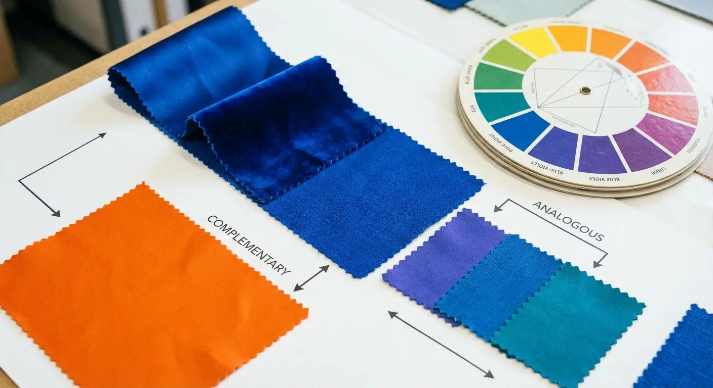
Color Theory & Contrast
Think of the color wheel as your volume knob. High-contrast pairings (like white) are sharp and crisp. Low-contrast options (like navy) are moody and subtle. Complementary colors (opposites on the wheel, like orange/yellow) are the loudest statement you can make.
The Occasion (Formality Scale)
Context is everything. Royal blue is inherently a “party” color, but you need to dial it back with neutrals for formal weddings or business settings. On the flip side, casual settings let you experiment with earth tones and louder prints without looking crazy.
Fabric & Texture
Texture is huge for 2026 styling. The finish of your shirt changes how the color reads. A matte cotton shirt absorbs light and looks relaxed. A shiny silk or linen shirt reflects light, making the outfit feel dressier and more expensive.
Undertones
Royal blue is cool. You can create a smooth look by pairing it with other cool tones like greys and silvers. If you want a bit of tension and visual interest, swap those out for warm tones like creams, browns, and reds.
Confirm whether cool or warm shades suit you best using the free Color Analysis Quiz
If you find yourself gravitating toward silver and grey pairings, you might be a “Winter.” You should explore winter color analysis types to find your perfect cool-toned palette for the rest of your wardrobe.
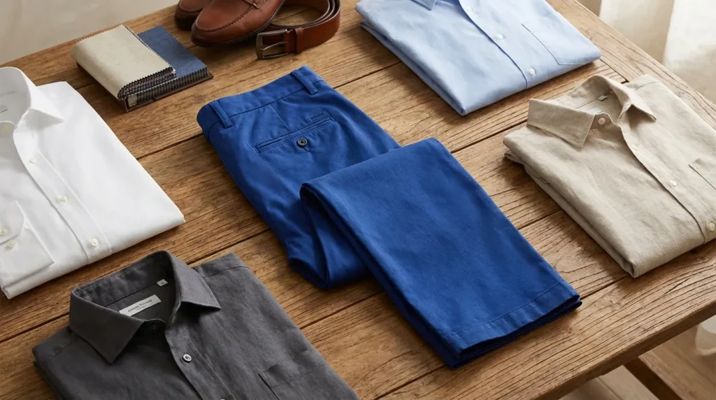
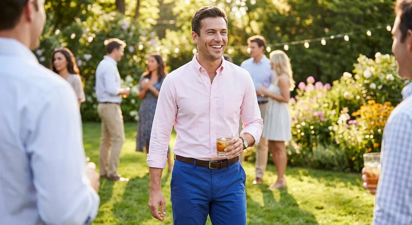
Category A: The Crisp Classics (Formal & Professional)
These are your “don’t mess this up” options. Perfect for the office, job interviews, or traditional weddings. When you need to look put-together without taking a massive fashion risk, start here.
Choose the most flattering formal shirt color for your skin tone with the free Color Analysis Quiz
Real-World Scenario: The Conservative Wedding
You’re at a country club wedding with a “Cocktail Attire” code. You want to wear the blue pants, but you don’t want to look like you’re trying to upstage the groom.
The Fix: Go with Option #1 (Crisp White). Add a dark brown leather belt and matching loafers. The white shirt calms the blue down, making it look intentional and respectful rather than loud.
If you’re unsure about the specific dress code rules, check out our guide on wedding guest dresses and outfits. The formality rules apply to guys, too. This will help you decide what goes with royal blue pants for specific venues.
1. Crisp White
The ultimate high-contrast pairing. A high-quality button-down anchors the brightness of the royal blue. It’s business professional, groomsman-appropriate, and just looks sharp.

2. Light Grey (Heather)
A fitted oxford in heather grey isn’t as harsh as stark white. It offers a softer, more modern professional look that works exceptionally well for the office.
3. Ivory / Off-White
Warmer than crisp white, a textured linen or silk-blend shirt in creamy ivory softens the royal blue. This is ideal for outdoor or beach weddings where a bright white shirt might feel too blinding in the sun.
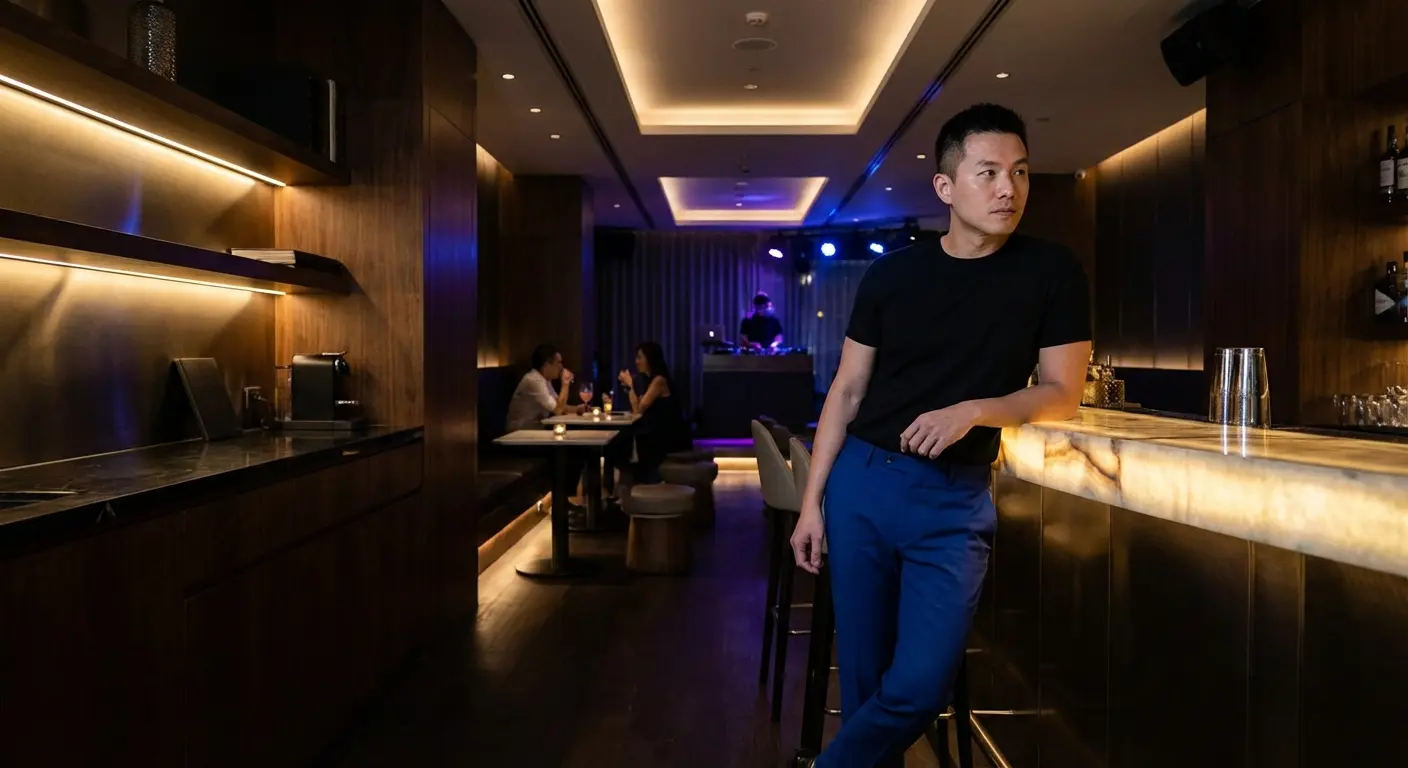
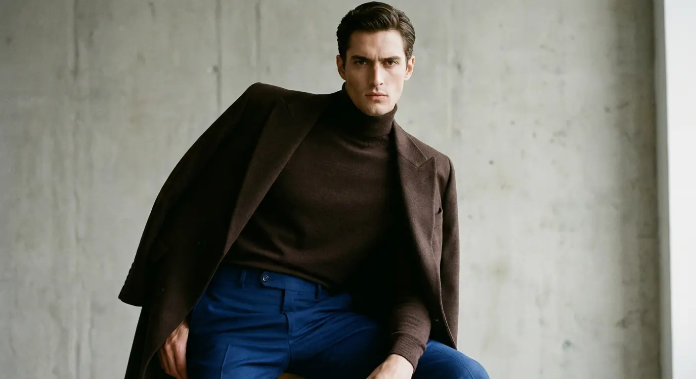
4. Black
For high drama and a sleek vibe, go with a fitted black tee or satin dress shirt. This kills the “preppiness” of the blue and leans heavily into a nightlife look.
5. Charcoal Grey
A matte charcoal shirt is a moody alternative to black. It pairs well with the cool undertones of royal blue but provides enough distinction so you don’t look like you’re wearing a mismatched suit.
Category B: The Soft Pastels (Spring/Summer & Weddings)
Perfect for daytime events, garden parties, and “Smart Casual” codes. These colors play into the fun energy of royal blue. They’re approachable and great for warmer weather.
See which pastels actually work on you by taking the free Color Analysis Quiz
6. Pale Pink
A classic oxford in blush or baby pink is a staple of “Preppy” style. Pink and blue are a classic combo that signals you’re here to have a good time.
7. Mint Green
A light cotton shirt in a washed-out mint plays on the cool tones of the blue but adds a fresh twist. It’s an unexpected choice that works best for spring.
8. Lavender
Purple sits right next to blue on the color wheel. A structured dress shirt in light purple creates a sophisticated look that feels very European.
9. Butter Yellow
Yellow is the opposite of blue, which means they look great together. A soft polo in pale butter yellow gives you that contrast without slapping you in the face. Great for summer.
10. Sky Blue
Monochromatic styling requires care. A chambray or light blue dress shirt works, but make sure the shirt is significantly lighter than the pants so you don’t look like you’re wearing a uniform.
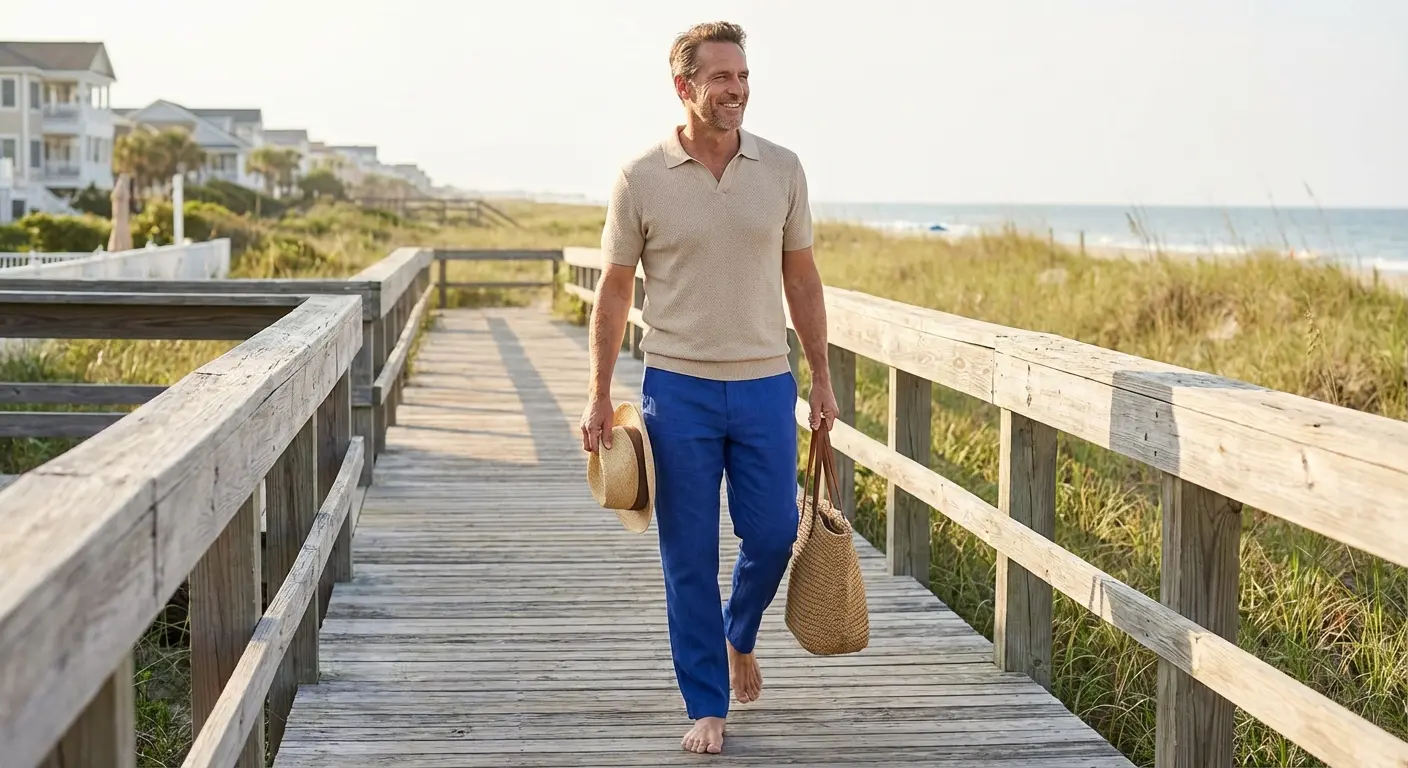
Category C: Earth Tones & Neutrals (The 2026 Trend)
Fashion in 2026 is all about grounding bright colors with natural, earthy hues. These combinations make royal blue feel more mature, organic, and less “sporty.” This shift mirrors the current 2025 groom and groomsmen style trends, which favor organic textures over shiny synthetics.
If you want to know what goes with royal blue pants to look current, check this out:
|
Traditional Pairing |
The 2026 Trend Update |
Why It Works Now |
|---|---|---|
|
Light Blue |
Sage Green |
Sage adds an organic, earthy feel that kills the “corporate” look of blue-on-blue. |
|
Crisp White |
Oatmeal / Beige |
Replaces stark contrast with warm, textured softness. Gives off “Old Money” energy. |
|
Black |
Chocolate Brown |
Brown is warmer and richer than black, creating a vintage-inspired, sophisticated clash. |
Find your best earth tones and neutrals with the free Color Analysis Quiz
11. Beige / Tan
A knitted polo or linen button-down in sandy beige grounds the electric nature of the pants. Excellent for upscale resort wear.
12. Taupe
Taupe is that sophisticated middle ground between grey and brown. A silk-blend shirt in this shade makes royal blue pants feel more mature—perfect for dinner dates.
13. Sage Green
A matte cotton shirt in dusty sage offers an earthy contrast. Sage suppresses the brightness of the blue, making the outfit feel organic and modern rather than flashy.
14. Cream
Similar to ivory but with more yellow undertones. A heavy-weight cotton t-shirt or sweater in rich cream adds warmth. Perfect for the Fall.
15. Chocolate Brown
Pairing deep earth tones with bright primaries is a bold 2026 trend. A fine-gauge turtleneck or knit polo in deep chocolate brown creates a rich look that feels very current.
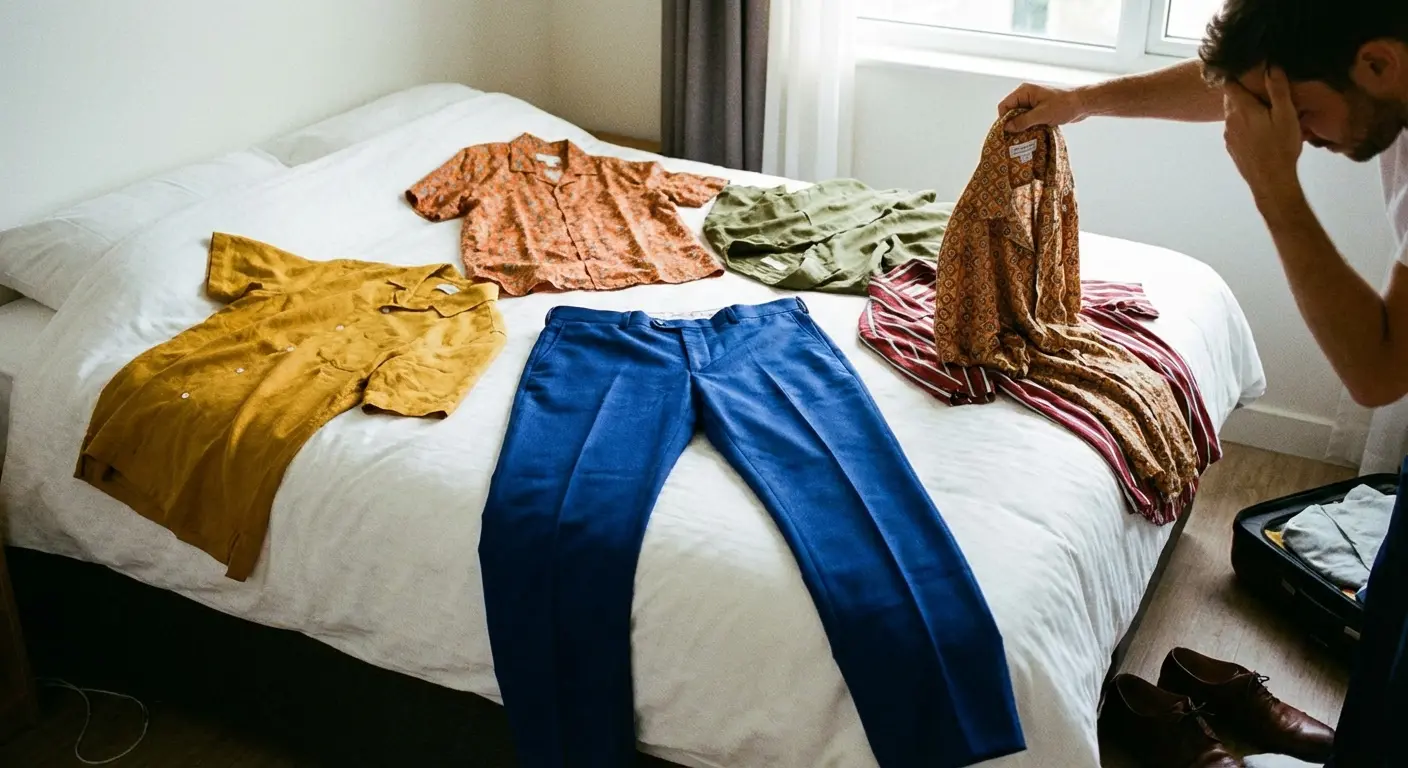
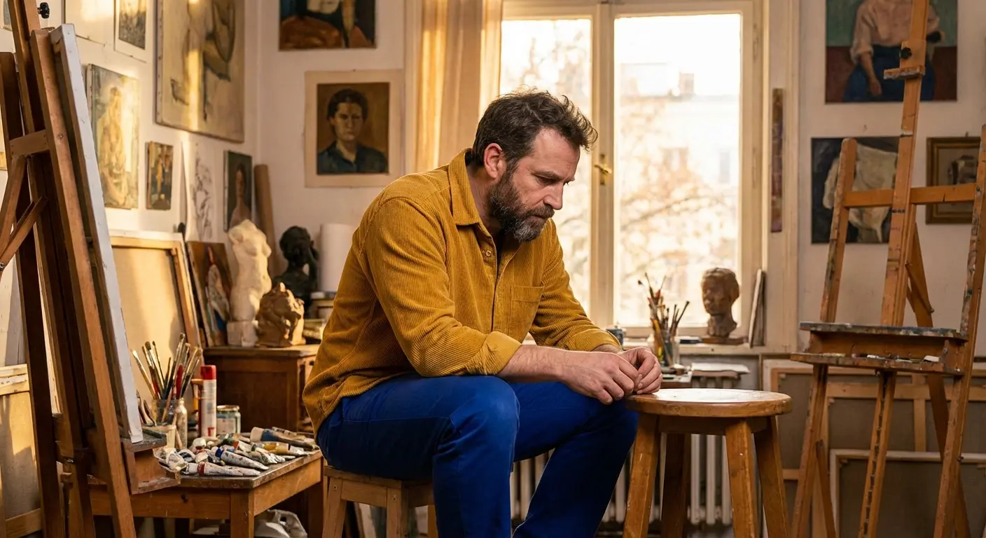
Category D: Bold Statements (Fashion Forward & Creative)
These options are for the guest who wants to stand out, or for guys working in creative industries. These pairings embrace the clash.
Real-World Scenario: The Gallery Opening
You’re invited to an art show or a creative mixer. A standard white shirt feels boring, but a neon shirt is too much.
The Fix: Go with Option #16 (Mustard Yellow). The complementary colors vibrate against each other. It shows you know what you’re doing. Keep accessories minimal to let the colors talk.
16. Mustard Yellow
A flannel or corduroy shirt in deep mustard embraces color theory fully. It is artistic, bold, and best reserved for places where you want to be noticed.
17. Burgundy / Wine
This is a “Jewel Tone” clash. Since both colors are rich and saturated, a burgundy button-down signifies confidence. Great for holiday parties.
18. Coral
Coral pops aggressively against royal blue. A linen shirt in vibrant coral is a summer power move. Wear this on vacation.
19. Teal
A dark teal silk shirt creates a “cool ocean” palette. It’s distinct enough to be interesting without looking messy. Requires some confidence to pull off.
20. Rust / Terracotta
A camp-collar shirt in rust orange offers a masculine, rugged pairing. The orange undertone complements the blue, while the earthy finish keeps the outfit grounded.
Category E: Patterns & Textures (Complex Options)
Sometimes the “color” is defined by the pattern or the material. These options add visual texture and break up the solid blocks of color.
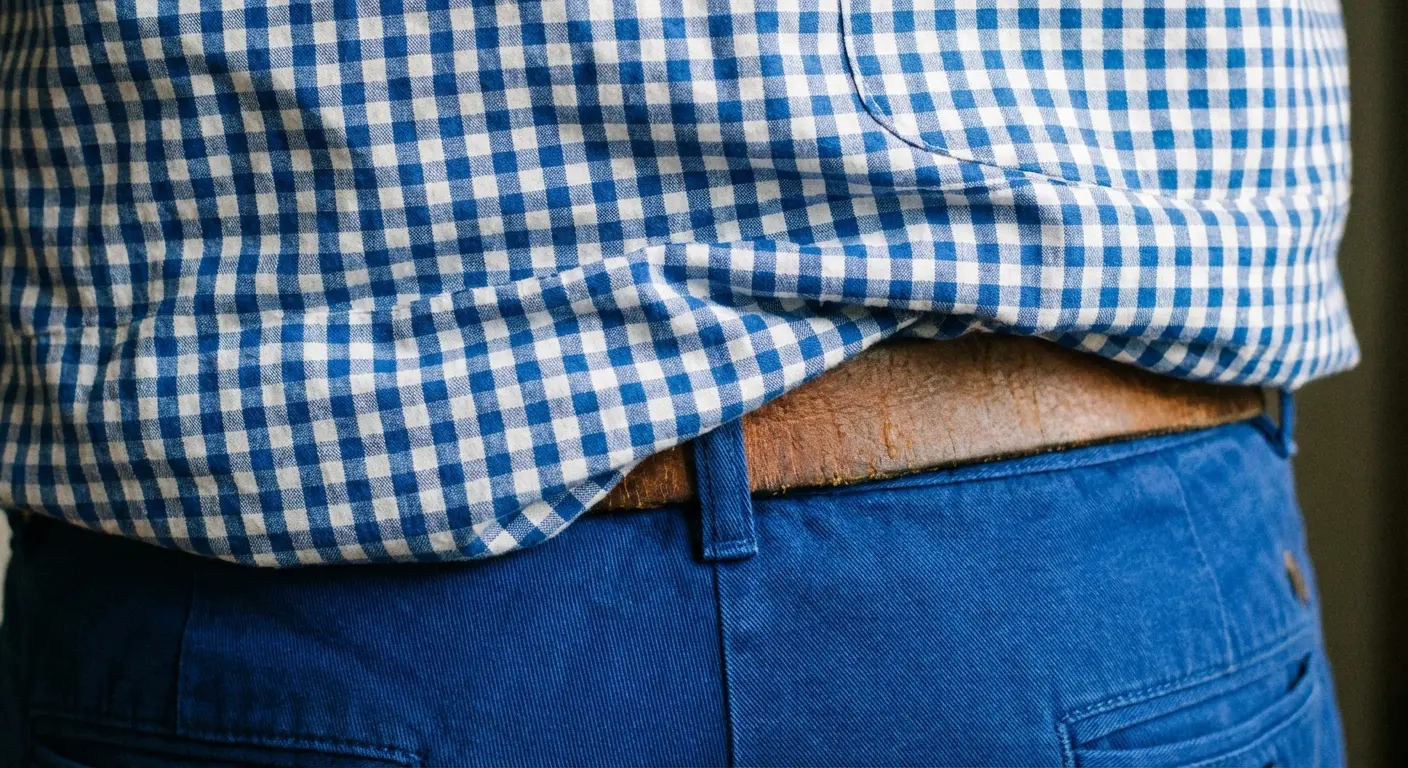
21. Blue & White Gingham
A micro-check gingham shirt adds visual texture. From a distance, it reads as light blue, but up close, the pattern adds depth.
22. White with Navy Stripes
A vertical Bengal stripe dress shirt is a classic. The navy stripes tie in perfectly with the royal blue pants, while the white background keeps it clean.
23. Floral with Navy Base
A dark floral print shirt with a navy background connects to the royal blue pants, while the colorful flowers add personality. Ideal for wedding guests who want to look festive.
24. Silver / Metallic Grey
For New Year’s Eve or parties, a shirt with a slight sheen or metallic thread works wonders. It amplifies the “electric” feel of the royal blue.
25. Champagne
A satin finish shirt in champagne is a luxurious alternative to beige. The slight shine makes it appropriate for evening weddings or galas where you need to look elevated.
|
Pattern Type |
Pairing Difficulty |
Styling Rule of Thumb |
|---|---|---|
|
Gingham / Checks |
Easy |
Keep the check size small (micro-check) to avoid looking like a picnic tablecloth. |
|
Vertical Stripes |
Easy |
Ensure the stripe color (Navy) matches the pants to tie the look together. |
|
Florals |
Medium |
The background color of the shirt should be dark (Navy/Black) to ground the bright pants. |
|
Metallics |
Hard |
Keep shoes and belt matte black to avoid looking like a disco ball. |
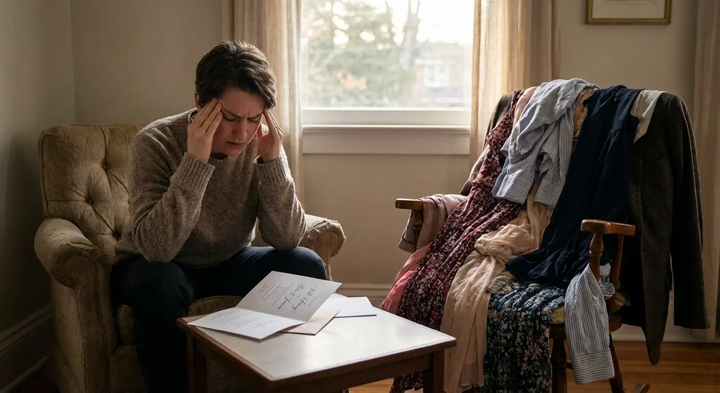
Why This Decision Feels Harder Than It Should
If you’re reading this list, you’re likely prepping for a wedding, a rehearsal dinner, or a major event where eyes will be on you. You want to look good without looking like you tried too hard. That feeling of wanting to get the details right—but feeling overwhelmed by the options—is exactly why Bridesmaid for Hire exists.
Take the guesswork out of outfit decisions with the free Color Analysis Quiz
This struggle is similar to the general stress of finding the right wedding outfits guide. Balancing personal style with etiquette can feel like a full-time job.
Real-World Scenario: The Overwhelmed Groom
You picked royal blue suits for your groomsmen. Now your fiancée is asking about tie colors, pocket squares, and shirt fabrics. You have 15 tabs open and zero decisions made.
The Fix: This is classic decision fatigue. Instead of guessing, this is where professional wedding support steps in. We curate options so you just have to point and say “that one.”
Decision Fatigue is Real
Just as choosing between “Mustard” and “Pale Pink” can be annoying, planning a bachelorette party or writing a Maid of Honor speech is exhausting. We know weddings are stressful, not just for the couple, but for everyone involved. Whether you’re a groom styling groomsmen or a guest trying to fit a dress code, the pressure is real.
The “Professional Bestie” You Need
Sometimes you need an honest opinion on whether that Coral shirt looks good, or advice on how to handle a difficult bride. Bridesmaid for Hire offers tools and services to handle that for you. We curate the chaos of the wedding experience so you don’t have to do it alone.
Final Thoughts
Styling royal blue pants doesn’t have to be a headache. Whether you choose a safe Crisp White or a trendy Sage Green, the key is matching the shirt to the occasion and your personal vibe. Put on the pants, pick your shirt, and if the rest of the wedding planning feels like a mess, you know who to call. Now you know exactly what goes with royal blue pants.


1-800-BRIDESMAID
The Newlywed
Card Game
something extra to love
Read the weekly newsletter from Bridesmaid for Hire, 1-800-Bridesmaid, to hear about real stories, from strangers, who need advice on love, life, friendship, and so much more.
Looking for the perfect wedding gift for someone you adore? Grab The Newlywed Card Game. It's a fun and interactive game they can play on their honeymoon or future date nights.

