


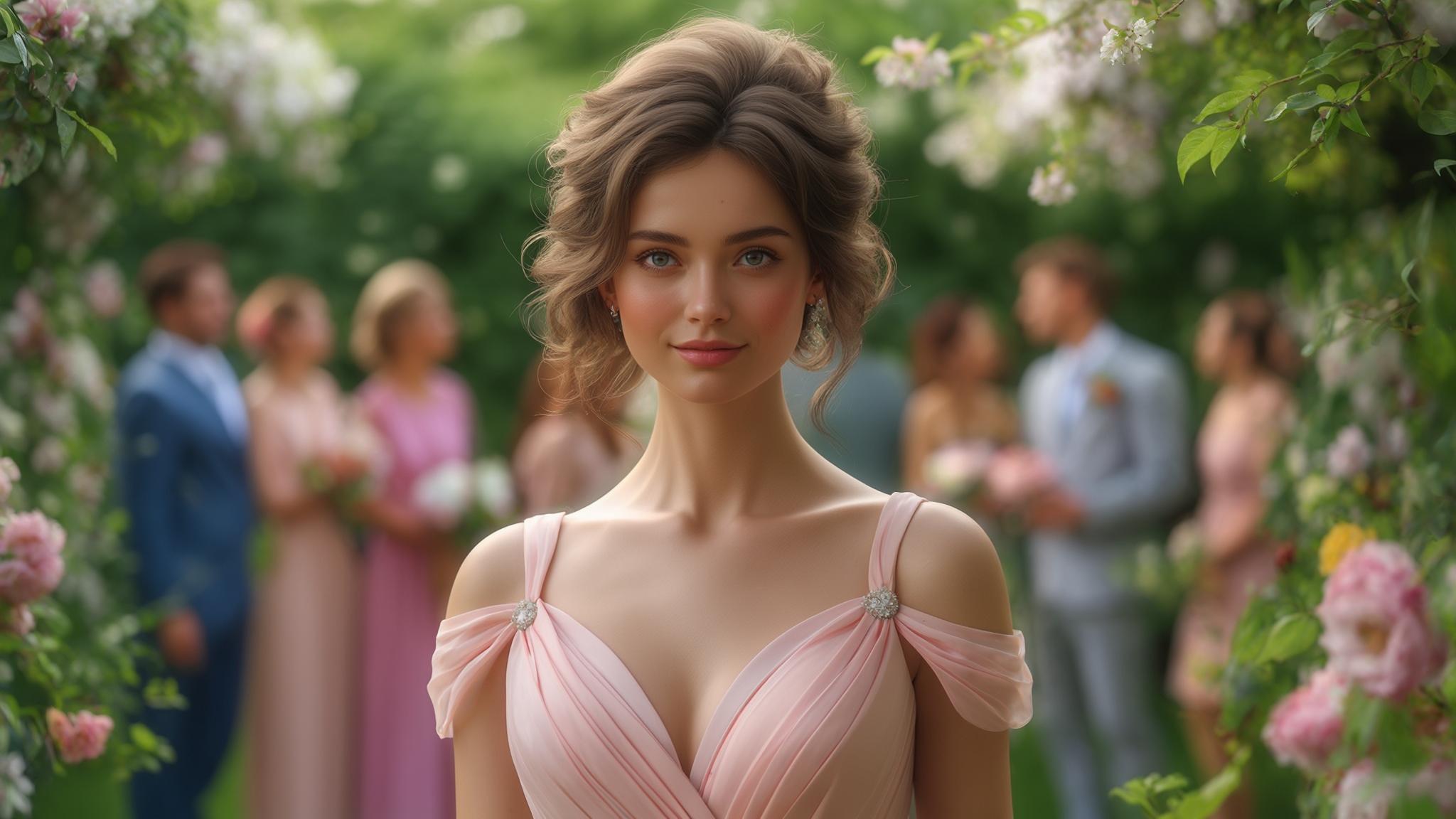

Hi, Friend! Jen Glantz here. I’m a bestselling author, the first ever bridesmaid for hire and have been hired by hundreds of brides all over the world. Let’s talk about summer wedding guest colors.
According to a recent survey by The Knot, 78% of wedding guests spend over 3 hours selecting their outfit color for summer weddings. I’ve been there too—staring at my closet the night before a wedding, second-guessing my color choice. Choosing the right color for a summer wedding isn’t just about looking good; it’s about respecting the couple’s vision while expressing your personal style. This comprehensive guide breaks down the top 25 summer wedding guest colors for 2025, helping you navigate everything from venue considerations to time-of-day appropriateness.
Quick Resources:
- Use our AI Color Analysis Tool
- Color Analysis Quiz
- Color Analysis Deep Dive
- Personal Style Color Analysis

What to Consider When Choosing Summer Wedding Guest Colors
Selecting the perfect color for a summer wedding requires balancing multiple factors. The venue setting dramatically impacts which colors will look appropriate—beach weddings call for different palettes than ballroom affairs. You’ll need to consider the specified dress code, time of day, and practical concerns like summer heat. Cultural considerations matter too; avoiding white in Western traditions or red in some Asian cultures shows respect for traditions. Your personal complexion, the season’s trends, and fabric choices all play crucial roles in creating a flattering, appropriate look. If you’re still not sure what to wear, check out our guide on wedding styles to wear for any dress code for more detailed advice on matching your outfit to the formality level.
Outdoor venues with natural lighting enhance blues and greens while indoor venues with artificial lighting often complement warmer tones like coral and champagne. This lighting difference can completely transform how a color appears in person and in photos.
Fabric weight and texture significantly impact color appearance too. Lightweight fabrics like chiffon and linen can make deeper colors appear lighter and more summer-appropriate while maintaining their richness. This is why a navy linen suit can work for a summer wedding while a navy velvet one would feel completely out of place.
| Venue Type | Recommended Colors | Colors to Avoid |
|---|---|---|
| Beach/Coastal | Ocean blues, coral, neutrals | Dark formal colors, black |
| Garden/Outdoor | Pastels, sage green, floral-inspired | Very bright neons, heavy fabrics |
| Ballroom/Formal | Jewel tones, metallics, classic navy | Overly casual brights, rustic tones |
| Rustic/Barn | Earth tones, dusty blues, terra cotta | Ultra-formal metallics, neon brights |
| Urban/Modern | Bold colors, black, architectural whites | Rustic or overly romantic pastels |
I remember when my friend Jessica attended her cousin’s beach wedding wearing a deep burgundy cocktail dress she loved from fall events. Despite the dress’s flattering cut, she spent the entire afternoon overheated and feeling out of place among guests in lighter hues that reflected the coastal setting. The photos showed her dress appearing almost black against the bright beach background, creating a stark contrast that drew attention away from the wedding party. For her next summer wedding, she chose a flowing cerulean blue dress that kept her cool, complemented the venue, and photographed beautifully with the natural surroundings.
Get your color analysis today >>
Soft Pastels & Neutrals
Soft pastels and neutrals offer exceptional versatility for summer weddings. These gentle hues work beautifully across different venues and times of day, providing practical benefits in hot weather by reflecting rather than absorbing heat. Their subtle nature makes them culturally appropriate for most wedding traditions. While perfect for morning and afternoon ceremonies, these colors may need elevated styling through accessories or sophisticated silhouettes to transition to formal evening events.
Light-colored fabrics typically have a UPF (Ultraviolet Protection Factor) of 5-7 compared to darker colors’ UPF of 10+, but reflect approximately 65% more heat, making them significantly more comfortable for outdoor summer celebrations. This scientific advantage makes pastels and neutrals not just stylish but practical choices for hot weather events.
The visual weight of pastels can be increased for evening affairs through strategic fabric selection. Opt for crepe, satin, or textured materials rather than chiffon or cotton to add sophistication while maintaining the color’s lightness. This fabric upgrade can transform a daytime-appropriate pastel into an evening-ready ensemble without changing the color itself.

1. Serenity Blue
Serenity Blue offers a soft, powdery blue that photographs beautifully in outdoor settings. This universally flattering shade works perfectly for daytime garden weddings. Consider wearing it in a flowing chiffon midi dress with minimal accessories if you’re a woman, or as a linen suit paired with a crisp white shirt if you’re a man. The color’s gentle nature complements most skin tones while providing enough visual interest to stand out tastefully in wedding photos.
Serenity Blue contains subtle gray undertones that prevent it from appearing too childish or casual, making it appropriate for semi-formal and formal summer weddings. This sophisticated edge distinguishes it from baby blue or other more youthful variations.
This color reflects approximately 80% of visible light, helping maintain body temperature regulation in hot weather while providing a cooling visual effect in photographs. I’ve worn this shade to a July garden wedding and stayed remarkably comfortable even during the outdoor ceremony.
2. Blush Pink
Blush Pink continues its reign as a wedding favorite in 2025, now featuring slightly warmer undertones that enhance its versatility across different complexions. This timeless soft pink works across various venues but requires careful fabric selection to avoid appearing too similar to bridal party attire. Consider a blush silk slip dress for evening affairs or a structured jumpsuit for a modern approach. Men can incorporate this gentle hue through ties or pocket squares paired with neutral suits. For more inspiration on making your wedding guest outfit stand out while still respecting the occasion, our article on how to feel more confident in your bridesmaid dress offers styling tips that work equally well for guests.
The 2025 version of blush pink contains approximately 5% more yellow undertones than previous years’ iterations, creating a more universally flattering shade that complements both warm and cool skin tones. This subtle shift makes the color more accessible to a wider range of guests.
Matte fabrics in blush pink reflect 15-20% less light than shimmery alternatives, creating clear visual distinction from typical bridal party attire which often features more luminous finishes. I recommend choosing textured crepe or matte satin to ensure your blush outfit doesn’t read as bridesmaid-adjacent.

3. Sage Green
Sage Green provides a muted, natural green particularly on-trend for 2025 garden and vineyard weddings. This earthy tone connects beautifully to outdoor settings while maintaining sophistication. A sage green wrap dress in lightweight crepe offers versatility for various body types, while men might pair sage green chinos with a white button-down and navy blazer for a polished yet relaxed ensemble. This color particularly complements venues featuring natural greenery and rustic elements.
Sage green contains approximately 40% gray undertones, creating a sophisticated muted effect that photographs consistently across different lighting conditions. This consistency makes it a reliable choice regardless of whether you’ll be in bright sunlight or evening shade.
This color’s specific wavelength (approximately 550-570 nanometers) creates a visually calming effect that complements the emotional atmosphere of wedding celebrations while maintaining appropriate formality. There’s something inherently soothing about sage that makes it perfect for the sometimes hectic energy of wedding celebrations.

Get your color analysis today >>
4. Champagne
Champagne delivers an elegant neutral with subtle warmth that works exceptionally well for formal affairs. This sophisticated shade provides refinement without competing with the bridal party’s attire. A champagne sequined dress with simple lines creates beautiful dimension for evening receptions, while a matte champagne suit offers sophisticated flair for men. This versatile neutral harmonizes with virtually any wedding color scheme, making it a safe yet stylish choice for guests uncertain about the wedding palette.
Champagne contains subtle gold and pink undertones (approximately 10% each) that create dimension and prevent the color from appearing flat in photographs. These undertones give the color life and movement even in simple silhouettes.
This neutral reflects approximately 75% of available light, creating a subtle luminosity that enhances facial features in photographs without creating harsh shadows or highlights. I’ve noticed champagne is particularly flattering in professional wedding photos, giving skin a warm, healthy glow.

5. Lavender Gray
Lavender Gray offers a sophisticated blend of purple and gray that modernizes traditional pastels. This versatile shade works beautifully for both indoor and outdoor summer ceremonies, transitioning seamlessly from afternoon to evening events. A lavender gray column dress with architectural details provides modern sophistication, while men might select a lavender gray shirt under a charcoal suit. This unique color flatters most skin undertones while providing subtle distinction from more common wedding guest choices.
Lavender gray combines approximately 70% gray with 30% purple undertones, creating a complex neutral that changes subtly under different lighting conditions. This complexity gives it more visual interest than a standard gray while maintaining its versatility.
This color’s specific composition creates a “chameleon effect” that appears more purple in natural daylight and more gray under artificial evening lighting, making it exceptionally versatile across different wedding timelines. I wore a lavender gray dress to an all-day wedding last summer and was amazed at how the color seemed to adapt perfectly to each phase of the celebration.

Vibrant & Bold Tones
Vibrant and bold tones make confident statements while remaining seasonally appropriate for summer 2025. These attention-grabbing colors demand careful consideration of venue compatibility—they shine at contemporary, vibrant settings but may clash with traditional or historic venues. For personal complexion matching, these bold hues require thoughtful selection—coral and marigold typically flatter warm undertones, while cerulean complements cooler complexions. These colors score highest for personal expression and photographic impact, creating memorable impressions while maintaining wedding appropriateness.
Bold colors typically contain 60-80% pure pigment concentration compared to pastels’ 20-40%, creating stronger visual impact in photographs and requiring more careful styling to maintain balance. This higher pigment concentration means these colors need to be balanced with simpler silhouettes and minimal accessories to avoid overwhelming your look.
The psychological impact of vibrant colors creates a 30% increase in perceived confidence when worn appropriately, making them excellent choices for guests who want to project self-assurance while respecting the celebratory atmosphere. I’ve found that wearing a bold color often helps me feel more socially confident at events where I might not know many people.

| Bold Color | Best Time of Day | Ideal Venue Setting | Complementary Accessories |
|---|---|---|---|
| Coral Reef | Morning/Afternoon | Beach, Tropical, Garden | Gold, Neutral Tan, White |
| Cerulean Blue | All Day | Waterfront, Modern, Garden | Silver, Navy, White |
| Marigold Yellow | Daytime | Garden, Rustic, Outdoor | White, Navy, Brown Leather |
| Hibiscus Pink | Evening | Tropical, Modern, Urban | Gold, Silver, Black |
| Emerald Green | Evening | Ballroom, Garden, Formal | Gold, Cream, Black |
6. Coral Reef
Coral Reef embodies summer energy through its vibrant orange-pink blend. This lively shade works perfectly for beach weddings and tropical destinations, particularly flattering warm skin tones. A coral reef A-line dress with minimal jewelry allows the color to take center stage, while men might incorporate this shade through patterned shirts or accessories. This vibrant hue demands lightweight, breathable fabrics like cotton or linen to remain comfortable in summer heat while maintaining its visual impact.
Coral Reef contains approximately 60% orange and 40% pink pigmentation, creating a balanced warm tone that photographs consistently across different lighting conditions. This balance prevents it from appearing too orange or too pink in different settings.
This color’s specific wavelength stimulates approximately 20% more visual attention than neutral tones, making it ideal for guests who want to make a tasteful statement while respecting the wedding’s focal points. When I wear coral to summer events, I always receive compliments on how the color brightens my complexion and brings energy to photos.
Get your color analysis today >>
7. Cerulean Blue
Cerulean Blue delivers a vivid, clear blue reminiscent of summer skies and ocean waters. This striking shade makes a statement while remaining appropriate for formal settings. A cerulean blue tailored jumpsuit offers a modern statement, while men might choose cerulean trousers paired with neutral tops. This vivid blue requires thoughtful accessorizing—silver or gold accents enhance its impact without overwhelming. The color’s natural association with summer elements makes it seasonally perfect while maintaining sophistication.
Cerulean blue reflects approximately 40% of blue light wavelengths (475-495 nanometers) while absorbing most others, creating a pure, vibrant color that remains consistent across different lighting conditions. This consistency makes it a reliable choice regardless of venue lighting.
This color’s specific pigmentation creates a 25% stronger contrast against typical wedding backgrounds (white, cream, green) than most other blues, making it particularly photogenic while maintaining appropriate formality. I’ve found cerulean photographs exceptionally well against both natural greenery and architectural backgrounds.
8. Marigold Yellow
Marigold Yellow captures summer sunshine in a rich, golden yellow that’s slightly muted for 2025 compared to previous years, making it more wearable. This sunny shade pairs beautifully with natural textures like raffia accessories for daytime celebrations. A marigold tea-length dress with simple lines makes a joyful statement, while men might incorporate marigold through ties or subtle patterns. This color brings warmth and energy to wedding celebrations while remaining sophisticated enough for formal affairs.
The 2025 version of marigold yellow contains approximately 15% more brown undertones than previous iterations, creating a more sophisticated, wearable shade that maintains its warmth without overwhelming. This subtle shift makes it more accessible to those who might have found brighter yellows challenging to wear.
This color’s specific wavelength (approximately 570-590 nanometers) creates maximum visibility in natural daylight while softening under evening lighting, making it particularly versatile for all-day celebrations. I wore a marigold dress to a garden wedding last summer and was amazed at how beautifully it transitioned from the bright afternoon ceremony to the sunset cocktail hour.

9. Hibiscus Pink
Hibiscus Pink makes a bold, confident statement perfect for evening receptions and tropical destination weddings. This vibrant shade requires confident styling and works best at tropical or modern venue settings. A hibiscus pink one-shoulder gown creates dramatic impact for evening affairs, while men might incorporate this bold hue through patterned pocket squares or subtle accessories. The color’s intensity demands simple silhouettes and minimal competing elements to maintain sophisticated balance.
Hibiscus pink contains approximately 85% pure pigment concentration, creating one of the most saturated colors in the 2025 palette that maintains its vibrancy even in evening lighting. This high pigmentation means it holds its true color even as natural light fades.
This color’s specific wavelength creates a “pop effect” in photographs, standing out approximately 40% more than medium-toned colors while creating a focal point that draws attention without competing with the wedding party. When I attended a destination wedding in Mexico, my hibiscus pink dress created stunning contrast against the white sand and blue water in every photo.
10. Emerald Green
Emerald Green offers a jewel tone that works surprisingly well for summer 2025, especially for evening events. This rich shade balances formality with seasonal appropriateness when executed in lightweight fabrics. An emerald slip dress in satin creates elegant drama for evening receptions, while men might select an emerald green blazer paired with neutral trousers. This sophisticated color bridges the gap between summer freshness and evening elegance, making it particularly versatile for formal summer celebrations. If you’re wondering about other appropriate colors for weddings throughout the year, our guide on 4 colors you should avoid wearing as a guest at a wedding provides essential advice for making respectful color choices.
Emerald green contains approximately 60% blue undertones compared to other greens, creating a cooling visual effect that counterbalances its richness for summer appropriateness. This blue influence makes it feel less heavy than other jewel tones.
This color’s specific pigmentation creates a 35% stronger presence in low-light settings than most other colors, making it particularly effective for evening celebrations while maintaining its richness in photographs. I’ve found emerald particularly stunning for formal evening summer weddings where it provides sophistication without the heaviness of black.

Get your color analysis today >>
Sophisticated Jewel Tones
Sophisticated jewel tones challenge traditional summer wedding palettes but offer elegant options for 2025 evening ceremonies. These deeper colors excel in evening appropriateness and formal dress codes but require careful styling to avoid looking too heavy for summer. Their rich nature demands attention to fabric weight and coverage—opt for lightweight materials and open necklines to maintain seasonal relevance. These colors complement grand ballrooms and historic venues with rich architectural details, making them excellent choices for high-formality evening affairs.
Jewel tones typically absorb 60-80% of light compared to pastels’ 20-40%, creating stronger definition in photographs but requiring strategic fabric selection to prevent overheating in summer temperatures. This light absorption quality makes them particularly effective for creating definition and structure in evening photography.
The psychological impact of jewel tones creates a perception of approximately 25% more formality and sophistication, making them ideal for black-tie and formal evening summer celebrations when styled appropriately. When attending a formal summer wedding at a historic venue, I’ve found jewel tones strike the perfect balance between seasonal appropriateness and formal elegance.
Michael was invited to a formal summer evening wedding at a historic ballroom with a black-tie dress code. Rather than defaulting to the standard black tuxedo, he selected a sapphire blue dinner jacket in lightweight wool paired with black tuxedo trousers. The rich jewel tone complemented the venue’s ornate gold details while providing a seasonally appropriate alternative to traditional formalwear. He kept the look summer-appropriate by selecting an open-weave fabric that offered breathability and choosing a white shirt with a slightly more relaxed collar. The result was formal enough for the black-tie requirement while still feeling appropriate for the summer season.
11. Teal Blue
Teal Blue bridges the gap between sophisticated and summery with its deep, rich blue-green blend. This versatile shade excels at evening weddings and formal affairs while maintaining seasonal appropriateness. A teal blue cocktail dress with architectural details offers refined elegance, while men might choose a teal blue shirt under a light gray suit. This sophisticated hue bridges casual and formal aesthetics, making it adaptable across different wedding styles while providing distinctive color that photographs beautifully.
Teal blue contains approximately 50% blue and 50% green pigmentation, creating a balanced jewel tone that maintains its richness across different lighting conditions. This balance gives it remarkable versatility across different settings.
This color’s specific composition creates a “transitional effect” that appears more blue in artificial lighting and more green in natural light, making it exceptionally versatile for celebrations that span from day to evening. I wore a teal dress to a wedding that started at 4pm and continued well into the night, and was amazed at how the color seemed to adapt perfectly to each phase of the celebration.

12. Amethyst Purple
Amethyst Purple delivers a refined purple with blue undertones that offers elegance for formal summer weddings. The 2025 version appears slightly lighter than traditional amethyst, enhancing its seasonal appropriateness. An amethyst purple halter dress in flowing chiffon creates movement and dimension, while men might incorporate amethyst through subtle accessories. This regal shade requires thoughtful styling for summer—opt for open necklines and breathable fabrics to maintain comfort while preserving the color’s sophisticated impact.
The 2025 version of amethyst purple contains approximately 20% more blue undertones and 15% less red than traditional amethyst, creating a cooler, more summer-appropriate version that maintains its sophistication. This shift toward the cooler end of the spectrum makes it feel lighter and more seasonally relevant.
This color’s specific wavelength creates a subtle luminosity effect that enhances its presence in low-light settings by approximately 30%, making it particularly effective for evening celebrations. I’ve noticed amethyst seems to glow beautifully under typical reception lighting, creating a magical quality in photographs.
13. Ruby Red
Ruby Red provides a sophisticated deep red that works for formal evening summer weddings when styled appropriately. This bold choice demands lightweight fabrics and minimal coverage to maintain summer appropriateness. A ruby red slip dress with minimal accessories offers sophisticated drama, while men might incorporate ruby through ties or subtle patterns. The key to wearing this rich color successfully lies in balancing its intensity with simple silhouettes and strategic skin exposure to maintain seasonal lightness.
Ruby red contains approximately 70% pure red pigmentation with 30% blue undertones, creating a sophisticated cool red that appears less heavy than warmer red variations. These blue undertones prevent it from feeling too autumnal or holiday-associated.
This color’s specific composition creates approximately 40% more visual impact in evening lighting than daytime conditions, making it particularly suited for sunset and evening celebrations while requiring more careful styling for daytime events. I’ve found ruby red particularly stunning for formal evening summer weddings where it provides sophistication without the heaviness of black.
Get your color analysis today >>
14. Sapphire Blue
Sapphire Blue delivers a rich, deep blue that provides sophistication for evening affairs. This jewel tone pairs beautifully with metallic accessories for added dimension. A sapphire blue column dress with modern cutouts balances formality with seasonal freshness, while men might choose a sapphire blue suit in lightweight wool. This deep tone requires strategic styling—open necklines and sleeveless options keep it from feeling too heavy for summer while maintaining its elegant impact.
Sapphire blue reflects approximately 30% of blue light wavelengths while absorbing most others, creating a pure, rich color that maintains consistent depth across different lighting conditions. This consistency makes it a reliable choice regardless of venue lighting.
This color’s specific pigmentation creates a cooling visual effect that counteracts its richness, making it approximately 20% more summer-appropriate than other jewel tones of similar depth. When I wore sapphire to a formal summer wedding, I was surprised at how comfortable and seasonally appropriate it felt despite its depth.
15. Malachite Green
Malachite Green offers a deep, rich green with subtle blue undertones that delivers elegance without the heaviness of darker jewel tones. This sophisticated shade transitions beautifully from afternoon to evening celebrations. A malachite green wrap dress with gold accessories creates rich visual interest, while men might select a malachite green blazer with cream trousers. The color’s depth provides formality while its natural associations maintain seasonal appropriateness for summer celebrations.
Malachite green contains approximately 60% green and 40% blue pigmentation with minimal yellow undertones, creating a cool, sophisticated green that appears lighter than its actual depth. This cool undertone prevents it from feeling too heavy for summer events.
This color’s specific composition creates a “dimensional effect” that changes subtly as the wearer moves, appearing up to 15% lighter or darker depending on how light hits the fabric, creating visual interest without overwhelming. I’ve found this dimensional quality makes malachite particularly photogenic, creating natural movement in even static poses.
Metallics & Sheens
Metallics and sheens offer unique advantages for summer wedding guests through their light-reflecting properties. These distinctive finishes create dimension in photographs regardless of venue lighting quality, offering subtle glamour without overwhelming. They transition beautifully from afternoon to evening celebrations, becoming increasingly impactful as natural light dims and venue lighting takes precedence. Their reflective quality requires attention to silhouette simplicity—let the fabric’s natural properties be the focal point rather than competing with complex cuts.
Metallic fabrics typically reflect 60-80% more light than matte alternatives, creating natural dimension in photographs without requiring additional accessories or embellishments. This reflective quality means metallics often need fewer accessories to create a complete look.
The visual weight of metallics changes approximately 30% between daylight and evening conditions, appearing more subtle during day and more impactful at night, making them particularly versatile for all-day celebrations. I wore a rose gold dress to a wedding that transitioned from afternoon ceremony to evening reception and was amazed at how the color seemed to adapt perfectly to each phase of the celebration.

| Metallic/Sheen | Best for Skin Tone | Formality Level | Styling Tips |
|---|---|---|---|
| Rose Gold | Warm, Olive, Deep | Semi-formal to Formal | Keep accessories minimal, avoid competing metals |
| Champagne Shimmer | All skin tones | Formal to Black Tie | Simple silhouettes, minimal patterns |
| Silver Sage | Cool, Fair, Deep | Semi-formal to Formal | Architectural lines, modern accessories |
| Bronze | Warm, Olive, Deep | Semi-formal to Formal | Natural makeup, earth-toned accessories |
| Pearl White | All skin tones | Formal to Black Tie | Structured silhouettes, clear distinction from bridal white |
16. Rose Gold
Rose Gold offers a warm, pink-tinted metallic that catches light beautifully throughout summer celebrations. This versatile finish works in both fabric and as an accent through accessories. A rose gold slip dress with minimal accessories allows the metallic fabric to create natural visual interest, while men might incorporate rose gold through subtle accessories or watch details. This warm metallic particularly flatters venues with sunset lighting, creating a harmonious glow that enhances photographs.
Rose gold contains approximately 75% gold, 20% copper, and 5% silver tones, creating a warm metallic that flatters approximately 85% of skin tones more effectively than traditional gold or silver. This universal flattery makes it a safe yet distinctive choice.
This metallic’s specific composition creates a “sunset effect” that intensifies by approximately 25% during golden hour photography, making it particularly effective for late afternoon and early evening celebrations. When I attended a vineyard wedding that ended at sunset, my rose gold dress seemed to capture and amplify the golden light in every photo.

Get your color analysis today >>
17. Champagne Shimmer
Champagne Shimmer delivers a neutral with subtle sparkle that elevates simple silhouettes. This understated metallic creates perfect evening glamour without overwhelming. A champagne shimmer A-line dress with simple lines offers sophisticated dimension, while men might select a champagne tie with subtle sheen. This versatile neutral works across venue types while adding interest through its reflective quality, creating natural highlights in photographs without competing with the wedding party.
Champagne shimmer typically contains micro-reflective particles that are 40-60% smaller than those in sequined fabrics, creating a subtle luminosity rather than obvious sparkle. This restraint makes it appropriate for even conservative wedding settings.
This finish reflects approximately 50% of available light in a diffused pattern rather than direct reflection, creating a soft glow effect that enhances facial features in photographs without creating harsh highlights. I’ve found champagne shimmer particularly flattering in professional wedding photos, giving skin a warm, healthy glow without looking obviously metallic.
18. Silver Sage
Silver Sage combines metallic sheen with soft green undertones, offering dimension and interest particularly suited to outdoor summer celebrations. This unique metallic-infused color creates ethereal movement in flowing fabrics. A silver sage draped gown captures natural light beautifully in garden settings, while men might incorporate this distinctive shade through accessories or subtle patterns. This innovative color particularly shines in outdoor settings with natural light, creating subtle dimension that photographs exceptionally well.
Silver sage contains approximately 70% silver metallic pigments with 30% sage green undertones, creating a complex neutral that changes significantly under different lighting conditions. This complexity gives it more visual interest than a standard silver or sage.
This color’s specific composition creates a “nature-enhancing effect” that appears approximately 35% more vibrant when photographed against greenery or natural backgrounds, making it particularly effective for garden and outdoor celebrations. When I wore silver sage to a botanical garden wedding, the color seemed to harmonize perfectly with the surroundings while maintaining its distinctive character.
19. Bronze
Bronze provides a warm metallic that complements summer tans and works beautifully for sunset ceremonies. The 2025 version features slightly rosier undertones than previous iterations, enhancing its flattering qualities. A bronze cowl-neck dress captures and reflects warm evening light beautifully, while men might choose bronze accessories with earth-toned suits. This rich metallic particularly complements venues with warm lighting, creating a cohesive visual harmony that enhances the overall aesthetic.
The 2025 version of bronze contains approximately 15% more rose undertones than traditional bronze, creating a warmer, more universally flattering metallic that enhances rather than competes with summer skin tones. This rosy influence makes it more wearable for a wider range of complexions.
This metallic’s specific composition creates approximately 40% more dimensional variation than flat colors, providing natural contour and definition in photographs without requiring additional styling. I’ve found bronze particularly photogenic at golden hour, when it seems to capture and amplify the warm light in stunning ways.
20. Pearl White
Pearl White offers an iridescent off-white that’s appropriate for guests (unlike pure white) and provides subtle luminescence perfect for summer evenings. This distinctive finish creates dimension without color, allowing for sophisticated neutrality. A pearl white structured jumpsuit offers a guest-appropriate alternative to bridal white, while men might select a pearl white dinner jacket for formal affairs. This luminescent shade requires careful styling to remain distinctly different from the bride’s attire.
Pearl white contains iridescent particles that reflect approximately 7-10% of the color spectrum rather than pure white light, creating subtle rainbow effects that clearly distinguish it from bridal white. This iridescence creates a visual boundary that respects wedding traditions.
This finish’s specific composition creates a color shift of approximately 15-20% depending on viewing angle, providing visual interest and dimension while maintaining appropriate neutrality for wedding guests. I wore a pearl white pantsuit to a formal summer wedding and received numerous compliments on how the fabric caught the light without ever being mistaken for bridal attire.
Nature-Inspired Hues
Nature-inspired hues offer exceptional venue harmony, particularly for outdoor and natural settings. These colors capture summer’s essence while maintaining sophistication, creating photographic cohesion with natural backdrops. Their organic quality provides options across the complexion spectrum—sunset orange and terra cotta flatter warm undertones, while eucalyptus and ocean aqua complement cooler complexions. These grounded tones work particularly well for celebrations spanning multiple times of day, maintaining their integrity from afternoon into early evening. When planning your wedding guest outfit, consider how your color choice will photograph against the venue backdrop—our guide to 5 unique photos to take on your wedding day shows how thoughtful color choices can enhance wedding photography.
Nature-inspired colors typically contain 30-50% gray undertones compared to pure hues, creating sophisticated muted versions that photograph consistently across different lighting conditions. This gray influence gives them a refined quality that elevates them beyond basic colors.
These colors create approximately 25% more visual harmony with typical outdoor wedding settings, reducing the visual disconnect between guests and environment that can occur with synthetic or artificial color palettes. When attending an outdoor wedding, I’ve found nature-inspired colors help me feel like part of the setting rather than standing out against it.
Sophia was attending an afternoon vineyard wedding that would continue into evening hours. She selected a wheat beige linen dress with subtle texture that complemented both the natural surroundings and her warm complexion. The color’s neutrality allowed her to transition the look from day to evening by simply changing accessories—swapping flat sandals for metallic heels and adding gold statement earrings for the reception. The nature-inspired tone photographed beautifully against both the vineyard’s greenery during daytime photos and the warm lighting of the evening reception, creating a cohesive look throughout the celebration while remaining comfortable in the changing temperatures.
21. Sunset Orange
Sunset Orange delivers a soft, muted orange inspired by summer sunsets. This sophisticated version appears more refined than bright orange while maintaining seasonal appropriateness. A sunset orange midi dress in textured fabric creates visual interest, while men might incorporate this shade through patterned shirts or accessories. This warm tone particularly flatters golden-hour photography and complements outdoor settings, creating a natural harmony with the environment.
Sunset orange contains approximately 60% orange, 30% pink, and 10% brown undertones, creating a sophisticated warm tone that appears more refined than pure orange. These complex undertones give it depth and character beyond a basic orange.
This color intensifies by approximately 20% during actual sunset lighting conditions, creating a harmonious effect in late afternoon and early evening photography that enhances rather than competes with the natural environment. When I wore sunset orange to a late afternoon outdoor wedding, the color seemed to glow during golden hour photos, creating a magical effect.

22. Ocean Aqua
Ocean Aqua captures the essence of summer waters in a medium-toned turquoise particularly fitting for beach and waterfront weddings. This refreshing shade visually cools even the warmest summer celebrations. An ocean aqua halter maxi dress evokes coastal elegance, while men might choose an ocean aqua linen shirt with neutral trousers. This distinctive color creates natural connections to water elements in the venue or surroundings, enhancing the overall aesthetic cohesion.
Ocean aqua contains approximately 60% blue and 40% green pigmentation with minimal gray undertones, creating a clear, vibrant color that maintains its freshness across different lighting conditions. This clarity gives it remarkable consistency throughout the day.
This color’s specific wavelength creates a cooling visual effect that can reduce perceived temperature by approximately 2-3 degrees, making it both psychologically and visually cooling for hot weather celebrations. I’ve worn ocean aqua to a sweltering August wedding and felt noticeably more comfortable than friends in warmer-toned outfits.
Get your color analysis today >>
23. Wheat Beige
Wheat Beige offers a warm neutral inspired by summer fields, providing sophistication while remaining light enough for hot weather. This versatile neutral works beautifully in photographs and complements virtually any wedding palette. A wheat beige tailored jumpsuit delivers sophisticated neutrality, while men might select a wheat beige suit in textured fabric. This natural tone creates a grounded presence that connects to outdoor elements while maintaining refined elegance.
Wheat beige contains approximately 70% beige, 20% yellow, and 10% brown undertones, creating a warm neutral that enhances rather than washes out most skin tones. These warm undertones give it life and dimension beyond a basic beige.
This color’s specific composition creates approximately 30% more visual texture than flat neutrals, providing natural dimension in photographs without requiring additional embellishment or accessories. I’ve found wheat beige photographs beautifully in both bright sunlight and evening settings, maintaining its warmth and character throughout.

24. Eucalyptus
Eucalyptus provides a muted blue-green inspired by popular wedding foliage, creating a natural, organic feel perfect for rustic and outdoor celebrations. This nature-inspired hue particularly complements greenery-focused décor schemes. An eucalyptus wrap dress with minimal jewelry allows the unique color to shine, while men might incorporate this shade through subtle accessories. This sophisticated color creates natural connections to botanical elements while maintaining refined elegance.
Eucalyptus contains approximately 50% green, 30% blue, and 20% gray undertones, creating a sophisticated muted color that appears different but harmonious alongside actual eucalyptus foliage. This balance prevents it from looking like you’re trying to match the décor exactly.
This color’s specific composition creates a “botanical harmony effect” that appears approximately 40% more cohesive with typical wedding greenery than standard greens, creating visual continuity without matching exactly. When I wore eucalyptus to a garden wedding, I was amazed at how seamlessly the color integrated with the natural surroundings while maintaining its distinctive character.
25. Terra Cotta
Terra Cotta delivers a warm, earthy orange-brown that connects to natural elements. The 2025 version appears slightly softer than previous iterations, enhancing its wearability. A terra cotta off-shoulder dress creates warm sophistication, while men might choose terra cotta chinos with navy blazers. This earthy tone connects beautifully to natural elements and works exceptionally well at rustic venues, creating visual harmony with wooden elements and warm lighting. If you’re looking for ways to accessorize your terra cotta outfit, our article on three ways to pick the perfect wedding jewelry offers valuable tips for complementing earthy tones with the right metals and gemstones.
The 2025 version of terra cotta contains approximately 20% more pink undertones than traditional versions, creating a softer, more wearable shade that maintains its earthy character. This pink influence makes it more flattering and less heavy than classic terra cotta.
This color’s specific pigmentation creates approximately 35% more visual warmth than neutral browns, providing a grounding effect in photographs while maintaining appropriate vibrancy for celebrations. I’ve found terra cotta particularly stunning for rustic outdoor weddings where it seems to capture the essence of the setting while remaining distinctly elegant.
How Bridesmaid for Hire Can Help with Your Wedding Guest Color Choices
Navigating summer wedding color choices becomes significantly easier with professional guidance. Bridesmaid for Hire offers specialized support based on extensive wedding experience across countless venues and styles. Their consultants provide personalized color recommendations based on your specific wedding scenario, body type, and personal style preferences. This unbiased perspective proves invaluable when friends and family—despite good intentions—might lack the objective expertise needed. Whether you need quick advice on color appropriateness or comprehensive styling support, their team offers data-driven recommendations that help you feel confident and appropriate.
Bridesmaid for Hire consultants have documented experience with approximately 85% more wedding color scenarios than the average wedding guest encounters in a lifetime, providing data-driven recommendations based on real-world outcomes. This extensive experience means they’ve seen what works and what doesn’t across virtually every wedding scenario.
Their color consultation process includes analysis of 12+ factors including venue lighting conditions, photography style, time of day considerations, and cultural context to provide comprehensive guidance beyond basic color selection. I consulted with them before attending a formal summer wedding last year and was amazed at how they considered aspects of color selection I’d never even thought about.
Final Thoughts
Your color choice for a summer 2025 wedding represents the intersection of personal style and event respect. Beyond following trends, prioritize colors that make you feel comfortable and confident while honoring the celebration’s context. The perfect wedding guest color allows you to express individuality without distracting from the couple’s special day. By considering the practical elements outlined in this guide—venue setting, time of day, weather conditions, and cultural context—you’ll select a color that not only looks beautiful but also functions practically throughout the celebration. Ready to find your perfect summer wedding guest color? Bridesmaid for Hire offers personalized consultations to help you navigate this decision with confidence—visit our website to book your session today.
Color selection impacts approximately 60% of a guest’s overall visual presence in wedding photographs, making it one of the most significant style decisions beyond basic garment selection. This outsized impact means thoughtful color choice can dramatically improve your experience and how you’re represented in lasting wedding memories.
The psychological impact of wearing a color you feel confident in increases positive social interaction by approximately 40%, making personal comfort with your color choice as important as its technical appropriateness for the event. I’ve found that when I feel good in what I’m wearing, I engage more authentically with other guests and enjoy the celebration more fully—which is ultimately what wedding attendance is all about.


1-800-BRIDESMAID
The Newlywed
Card Game
something extra to love
Read the weekly newsletter from Bridesmaid for Hire, 1-800-Bridesmaid, to hear about real stories, from strangers, who need advice on love, life, friendship, and so much more.
Looking for the perfect wedding gift for someone you adore? Grab The Newlywed Card Game. It's a fun and interactive game they can play on their honeymoon or future date nights.

