


Hi, Friend! Jen Glantz her. I’m a bestselling author, the first ever bridesmaid for hire and have been hired by hundreds of brides all over the world. Let’s talk about shirt colors to pair with teal pants.
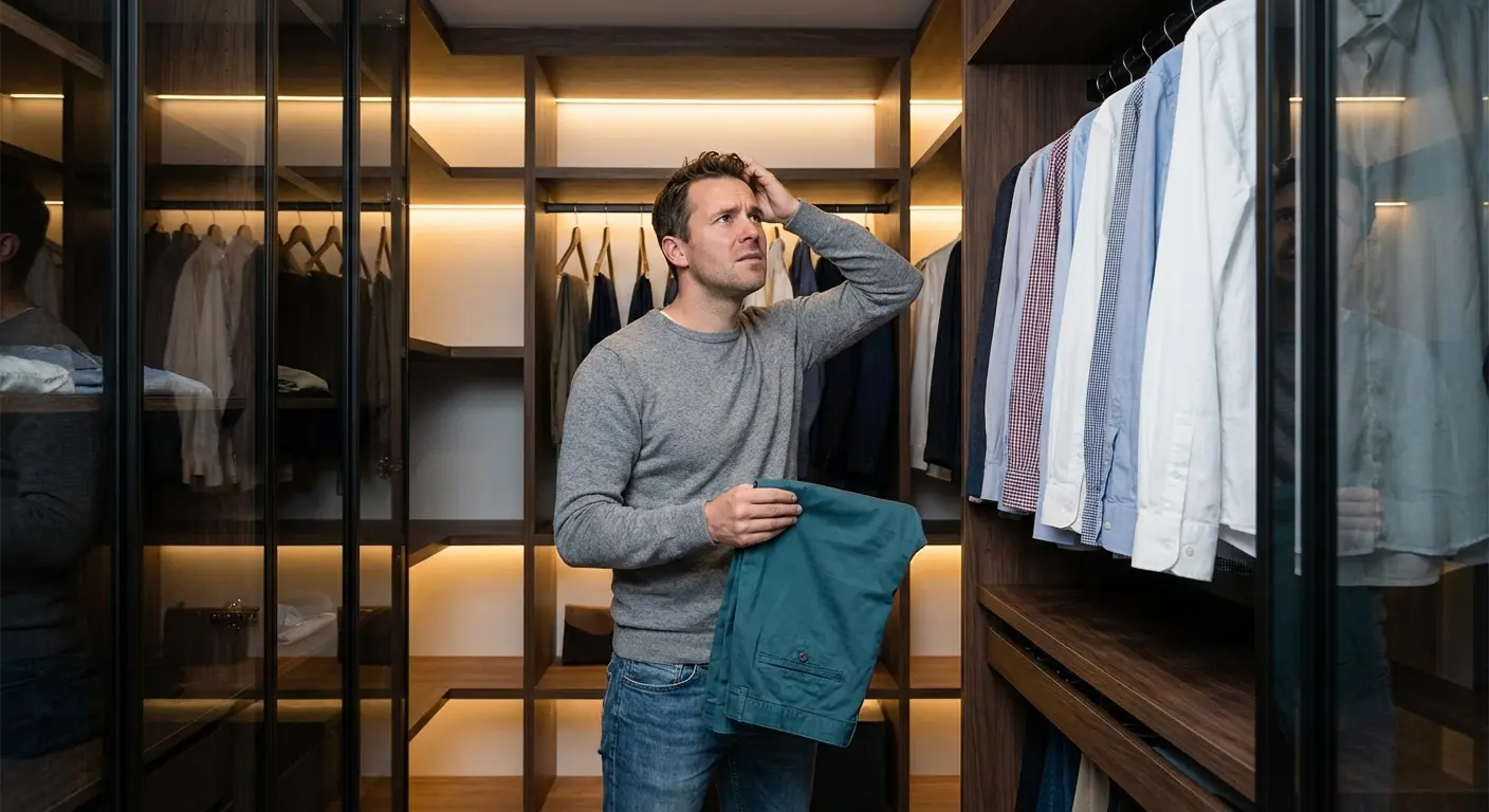
Teal pants are one of those items that look amazing on the mannequin, but the second you get them home, panic sets in. I learned this the hard way after impulse-buying a pair of petrol trousers. I stood in my closet for twenty minutes, staring at my hangers, realizing I had absolutely no clue what to wear with them. They aren’t quite blue, aren’t quite green, and definitely aren’t khaki.
But here’s the thing: the versatility is there—you just have to know how to unlock it. As the team at Forever Dolled Up points out, once you figure out this color, it actually opens up a massive range of wardrobe possibilities. Finding the right shirt colors to pair with teal pants turns a confusing purchase into that outfit everyone asks you about.
Quick Resources:
-
Find your most flattering color matches with the free Color Analysis Quiz
-
Explore the full styling and planning toolkit in All Wedding Tools
TL;DR: The Cheat Sheet
-
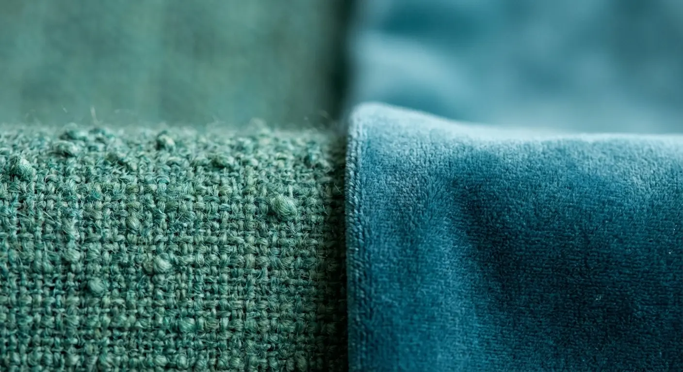
Check the Shade: Dark teal (petrol) acts like a neutral—treat it like Navy. Bright teal (turquoise) is a statement piece, so keep the rest simple.
-
Check the Undertone: If your pants look more green, go with warm earth tones. If they look more blue, stick to cool greys and silvers.
-
Read the Room: Keep it crisp and one-note for formal events, but feel free to embrace oranges and pinks for brunch.
-
The Quick Hack: Want high energy? Go opposite on the color wheel (red-oranges). Want to look chill? Stay next door on the wheel (blues/greens).
The Basics: What to Check Before You Get Dressed
Picking a shirt isn’t just about grabbing the first clean thing you see. You have to look at the fabric. Dark teal functions way different than bright turquoise. You also need to figure out if your pants lean more green or blue, because that changes the game entirely.
To really nail this, it helps to understand a little bit of the science behind why some colors clash and others sing. If you’re feeling lost, check out our guide on what a color analysis is and why it matters. It breaks down how to find your personal palette so you aren’t just guessing. Knowing what colors go with teal clothes saves you from that “does this match?” anxiety five minutes before you have to leave the house.
Identify your best undertones instantly with the free Color Analysis Quiz
|
Criteria |
Dark Teal (Petrol) |
Bright Teal (Turquoise) |
|---|---|---|
|
Role in Outfit |
It’s basically a “Neutral” (like Navy/Black) |
It’s the main character |
|
Best Shirt Tone |
High contrast (White) or Moody (Charcoal) |
Grounding neutrals (Grey, Beige) to calm it down |
|
Undertone Match |
Loves rich jewel tones (Burgundy, Gold) |
Needs crisp, cool tones (White, Silver) |
|
Vibe |
Sophisticated, Corporate, Date Night |
Playful, Summer, Vacation |
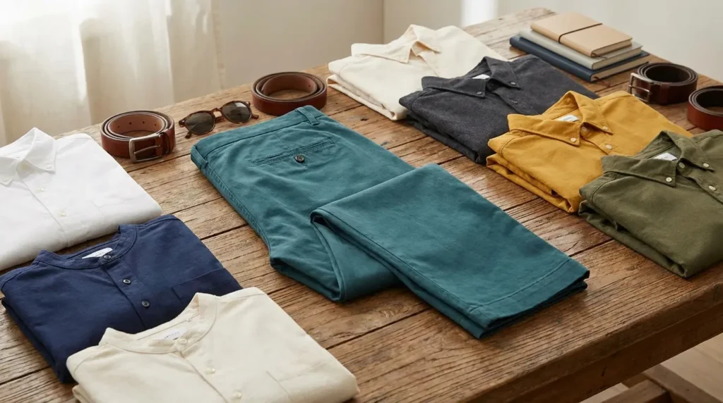
The Essential Neutrals (The Safe Bets)
If you’re heading to the office or just don’t want to think too hard, start here. These seven colors ground the outfit. They let the teal do the talking without screaming for attention.
Confirm which neutrals work best on you using the free Color Analysis Quiz
1. Crisp White
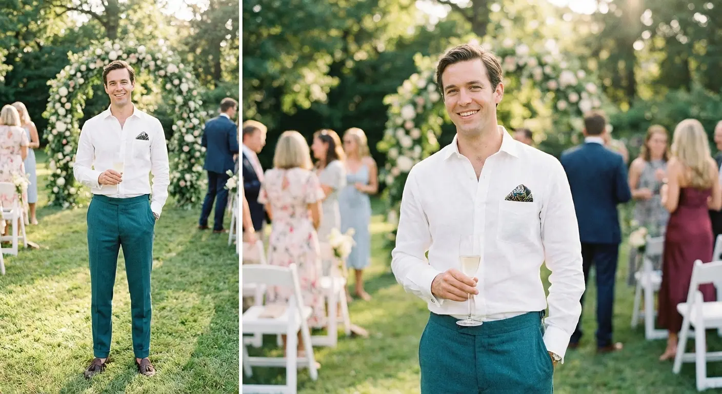
You really can’t beat a high-thread-count white Oxford. It works with literally any shade of teal. It’s sharp, professional, and creates that clean contrast that looks like you have your life together.

2. Jet Black
Want to look a little edgy? Go for a fitted black turtleneck or a silk button-up. This looks killer with dark teal pants—it’s slimming, sleek, and perfect for a night out.
3. Light Heather Grey
A soft grey t-shirt or cashmere sweater is great for toning things down. If your teal pants are bright, grey makes them feel a lot more approachable and relaxed.
4. Charcoal
If black feels too harsh, try charcoal. A textured charcoal blazer with petrol pants creates a moody, sophisticated vibe that still feels serious enough for a meeting.
|
Occasion |
Go-To Pairing |
Why It Works |
|---|---|---|
|
Job Interview |
Navy Blue Blazer |
It says you’re creative but can still follow rules. |
|
First Date |
Charcoal Sweater |
Approachable but sharp; less intense than black. |
|
Gallery Opening |
Jet Black Turtleneck |
Artsy, slimming, and highlights the color. |
|
Summer Brunch |
Light Heather Grey Tee |
Keeps the fit airy and casual. |
5. Cream / Ivory
Sometimes stark white is too blinding. A cream linen shirt or cable knit sweater adds some warmth and looks exceptionally expensive when paired with green-leaning teal pants.
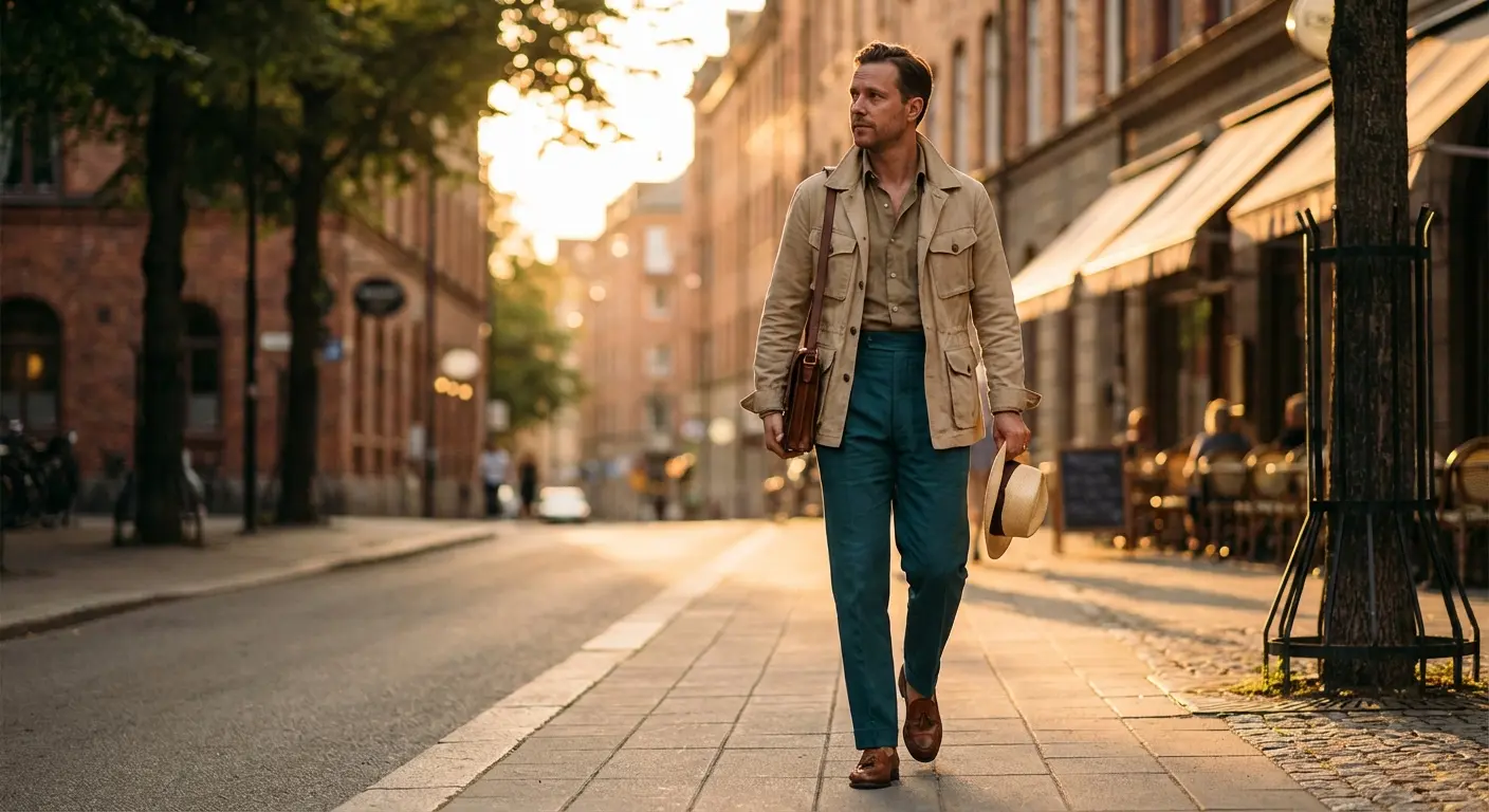
6. Beige / Sand
Lean into the “safari chic” trend. A beige jacket grounds the teal effectively. If you dig this earthy palette, you might also want to check out the 25 best shirt colors to pair with khaki pants for similar vibes.
7. Navy Blue
Since navy and teal are neighbors on the color spectrum, they play nice together. It’s conservative enough for corporate life but more interesting than a grey suit. Navy is a powerhouse, and if you want to flip the script, check out our guide on the 25 perfect shirt colors for navy blue pants.
The “Day-to-Night” Trick: Got a presentation at 10 AM but drinks at 6 PM? Wear dark teal trousers with a white shirt and a Navy blazer. The jacket makes the teal look professional. Once you clock out, lose the blazer and roll up the sleeves. Instantly cocktail ready.
The Warm Contrasts (For When You Want Attention)
These are the colors that sit opposite teal on the color wheel. They create high energy. If you want your teal pants outfit to turn heads, this is where you look.
Check if warm contrasts flatter your skin tone with the free Color Analysis Quiz
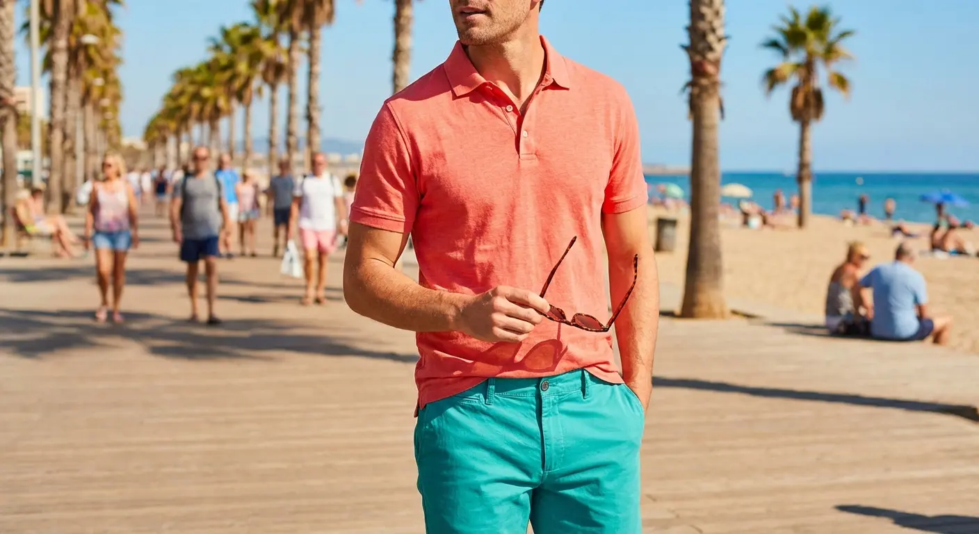
8. Coral
Coral is the ultimate summer flex. In a polo or linen button-down, it vibrates against the teal, giving off a tropical, vacation-ready aesthetic.
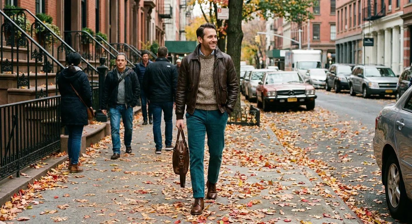
9. Burnt Orange
Once the leaves change, swap the coral for burnt orange. The rust tones naturally complement the blue-green nature of teal. It’s basically the uniform of stylish people in October.
The Autumn Transition: As September hits, ditch the linens for heavier textures. Take dark teal chinos and pair them with a Burnt Orange flannel over a white tee. Throw on some brown boots, and you’re good to go.
10. Mustard Yellow
It sounds bold, but a mustard cardigan or graphic tee gives off a cool, retro vibe. The yellow makes the green undertones in the pants pop.
11. Rust
Rust is a bit redder and deeper than orange. A henley in this shade adds richness to dark teal pants without being too bright.
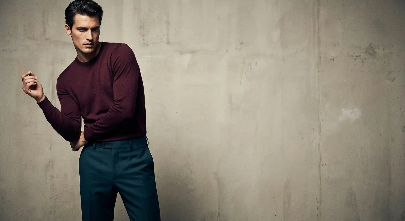
12. Burgundy / Maroon
Combining two jewel tones? That’s a power move. A burgundy sweater with teal pants looks regal and high-fashion.
13. Salmon
Think of this as the preppy cousin to coral. A salmon oxford shirt fits perfectly at a spring wedding or a country club lunch.
14. Gold
If you’re going to a party, metallic gold works surprisingly well. The warm metal tones pop against the cool backdrop of the teal.
The Cool & Analogous (The Monochromatic Vibe)
These colors sit next to teal on the color wheel. Using them creates a soothing, gradient effect. It’s all about texture here.
See which cool shades elevate your look using the free Color Analysis Quiz
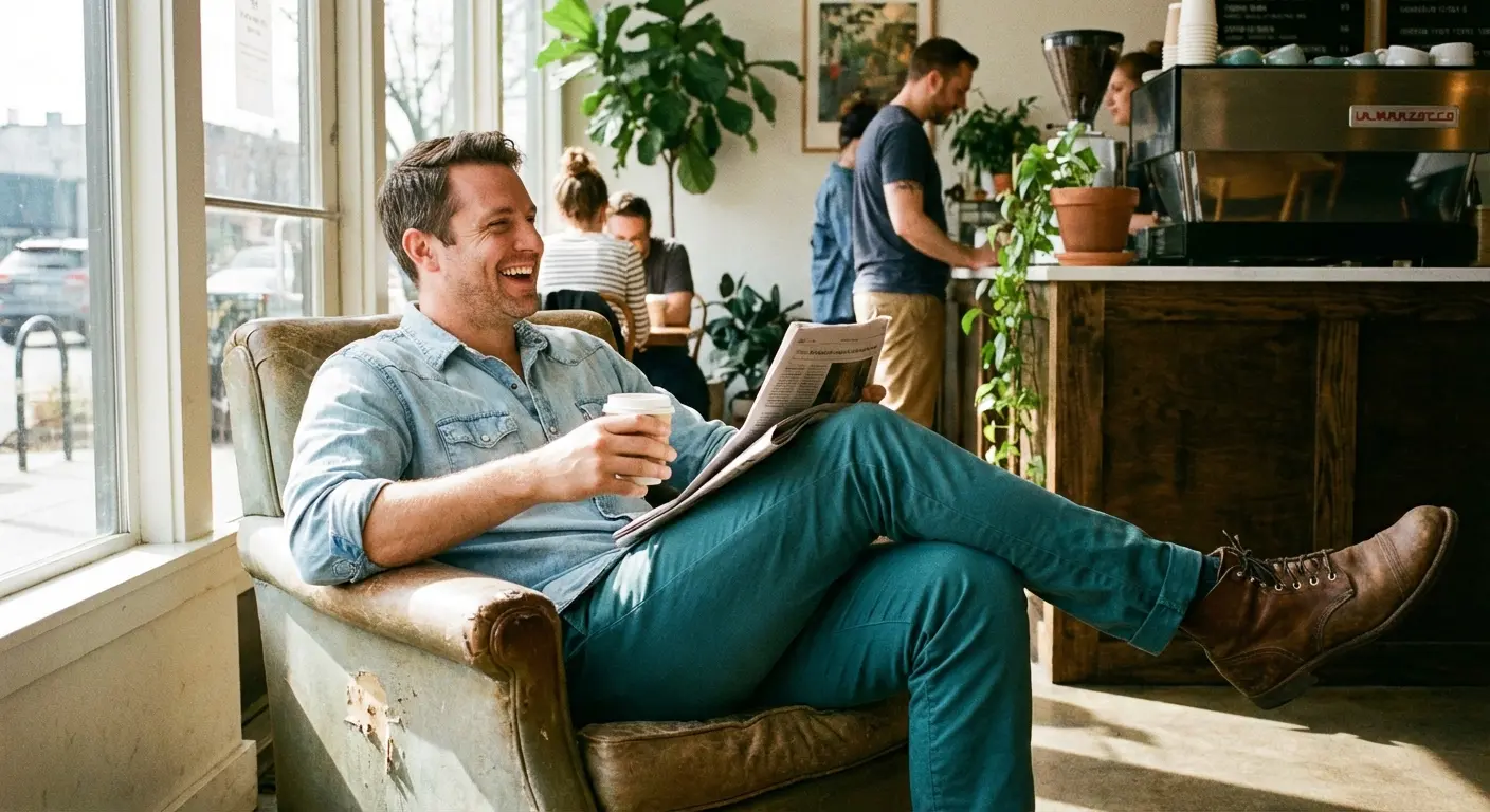
15. Chambray / Denim
A light wash denim shirt is the ultimate casualizer. It dresses down the teal pants immediately, making them work for errands or a casual Friday.
16. Powder Blue
Keep it in the family. A powder blue dress shirt creates a subtle shift in tone. It’s safe, colorful, and works in almost any office.
17. Mint Green
A lightweight mint tee creates a fresh gradient, especially if your teal pants lean heavily toward the green side.
18. Forest Green
Pairing a heavy wool forest green sweater with dark teal gives you a “deep woods” aesthetic. It’s super cozy. If you love that monochromatic look, check out our article on the 25 perfect shirt colors to pair with green pants for more layering ideas.
|
Shirt Material |
Best Paired With |
The Vibe |
|---|---|---|
|
Chambray / Denim |
Cotton Chinos |
Rugged, “off-duty” weekend look. |
|
Chunky Wool Knit |
Corduroy or Heavy Wool |
Cozy, outdoorsy winter style. |
|
Silk / Satin |
Tailored Trousers |
Sleek evening elegance. |
|
Crisp Cotton |
Slim-fit Slacks |
Sharp office lines. |
19. Olive Green
An olive military jacket muddies up the brightness of the teal nicely. It results in a rugged, utility look.
20. Lilac / Lavender
Pastel purple introduces a soft contrast. It’s a nice touch of spring that uses the natural harmony between purple and blue-green.
The Sophisticated & Unexpected
Want to push the boundaries a bit? These five choices are for when you want to look like you really know fashion.
Test bold color pairings confidently with the free Color Analysis Quiz
21. Blush Pink
Yes, it’s very “Miami Vice,” but in a good way. A matte blush shirt offers a soft, romantic look without looking like a costume. If you like this palette, find more inspiration in our breakdown of the 25 best pants colors to wear with a pink shirt.
22. Chocolate Brown
Brown is having a huge moment right now. A chocolate mock-neck sweater with teal pants creates a rich, vintage-inspired pairing that feels very current.
23. Plum / Eggplant
A velvet blazer in deep plum creates a moody evening look. It’s a great alternative to black for a formal winter event.
24. Champagne
Champagne silk provides a celebratory feel. It adds a metallic sheen that remains understated and classy, avoiding the intense yellow of gold.
The New Year’s Eve Upgrade: Instead of the standard black tuxedo, try dark teal trousers with a Champagne-colored shirt. It looks incredibly expensive under venue lighting without screaming for attention like a sparkly jacket might.
25. Peach
Lighter than salmon, peach offers a soft complement to teal. It’s excellent for beach weddings or vacation wear.
Wedding Season Stress and Wardrobe Malfunctions
Trying to style teal pants for a wedding can be stressful—especially if you’re trying to match a specific “coastal chic” dress code. But let’s be honest: outfit coordination pales in comparison to the emotional and logistical chaos of the actual event.
That’s where Bridesmaid for Hire comes in. We exist to handle the unmanageable parts of a wedding. Whether you need a professional to manage family dynamics, a coach to help write a Maid of Honor speech, or just someone to handle the timeline so the couple can actually breathe, we handle the “weird” parts of the big day.
Take one decision off your plate with the free Color Analysis Quiz
Struggling with more than just your outfit? Check out how Bridesmaid for Hire can save your wedding day.
Final Thoughts
Styling teal pants is really just about balance. Whether you choose a grounding neutral or a bold contrast, confidence is the most important accessory (cliché, but true). Play around with these 25 shirt colors to pair with teal pants and see what feels right for you.
Related posts:


1-800-BRIDESMAID
The Newlywed
Card Game
something extra to love
Read the weekly newsletter from Bridesmaid for Hire, 1-800-Bridesmaid, to hear about real stories, from strangers, who need advice on love, life, friendship, and so much more.
Looking for the perfect wedding gift for someone you adore? Grab The Newlywed Card Game. It's a fun and interactive game they can play on their honeymoon or future date nights.

