


Get confidence in your color choices with the Color Analysis Quiz

Hi, Friend! Jen Glantz here. I’m a bestselling author and the first ever bridesmaid for hire. I’m excited for 2026 because there are so many new and exciting wedding trends. As we venture into 2026 wedding planning, an exciting spectrum of color trends is emerging that perfectly balances timeless elegance with contemporary flair. From the vibrant Verona Sunset that’s been named the official Wedding Color of the Year to sophisticated seasonal palettes, couples have more inspiring options than ever to express their unique style through color. In this comprehensive guide, we’ll explore not only the broader trends but dive deep into the top 10 colors that are set to define weddings in 2026.Welcome to a guide on 2026 wedding trends. Let’s dive in!
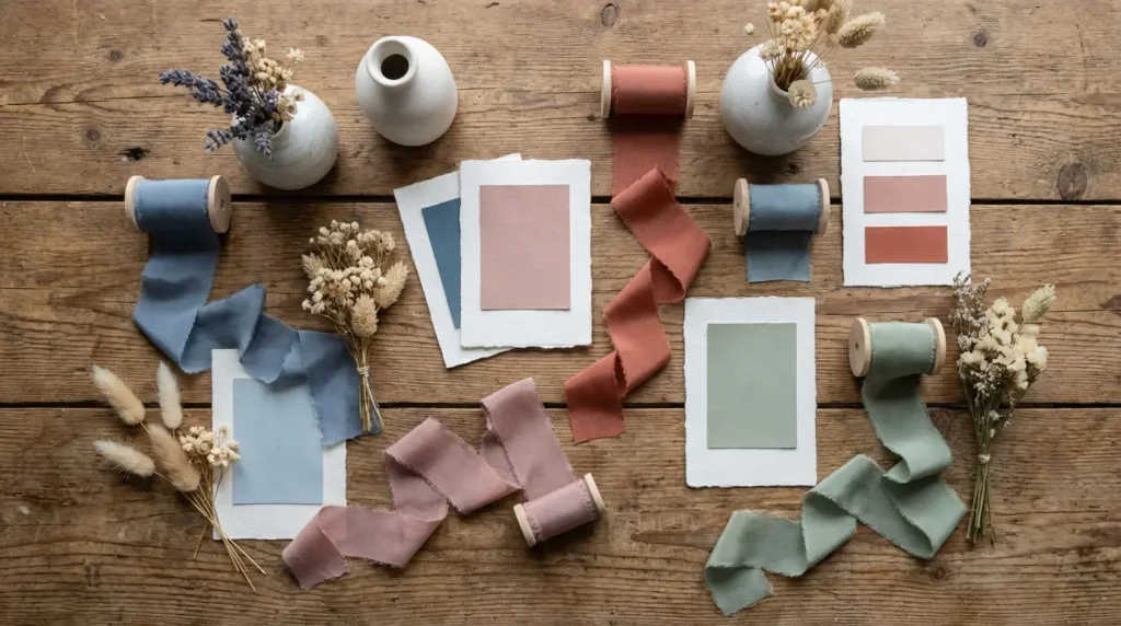
I recently attended a wedding where literally everything was beige. The dresses, the flowers, the cake, the napkins. It was undeniably elegant, like stepping into a really expensive latte, but honestly? By the time I left, everything had blended together so much that I couldn’t recall a single specific detail. That’s why I was relieved to see that for the upcoming season, we are finally seeing a shift. As Sarah Blessinger of Kindred Weddings and Events puts it, couples are getting comfortable with color again. We’re moving away from playing it safe and stepping into an era of actual personality.
This guide breaks down the specific palettes taking over right now, how to actually pull them off, and—crucially—the boring logistical stuff you need to think about before you sign a contract for 200 napkins. If you want to see where the industry is heading big picture, check out our report on 2025 wedding color trends. But for now, let’s talk about prioritizing “vibe” over tradition.
Quick Resources:
-
Use our Color Analysis Quiz to find wedding colors that flatter skin tones
-
Browse all wedding tools in one place
TL;DR: The Quick Strategy Guide
If you’re just skimming for the highlights, here is the cheat sheet on the current aesthetic shift. Things are moving fast, and Pinterest can get overwhelming. Here is the reality of the current landscape:
-
Boldness is Back: We are ditching the “safe” neutrals for high-contrast “anchor colors” that actually define the room.
-
Context is King: Your venue’s ugly carpet and the sunset time matter way more than your mood board.
-
Texture counts as a Color: If you love neutrals, you have to lean into heavy textures (velvet, dried florals) so it doesn’t look flat.
-
Green is Growing Up: Bright eucalyptus is out; deep, moody moss and emerald shades are in.
-
Chaos is Okay: The “rules” are loose. Mismatched bridesmaid dresses and clashing prints are having a huge moment.
Find colors that actually flatter skin tones with the Color Analysis Quiz
To help you visualize where things are going versus where they’ve been, take a look at this. It explains why some weddings feel fresh while others feel like 2018.
|
Old Trend (Out) |
New Trend (In) |
Why It Works |
|---|---|---|
|
Safety Beige |
High-Contrast Anchors |
Prevents the “washout” effect in photos; adds visual depth. |
|
Uniform Bridesmaids |
Mismatched Palettes |
Let’s your friends pick what fits their bodies and skin tones. |
|
Bright Eucalyptus |
Deep Moss & Emerald |
Creates a moodier, more expensive, and grounded atmosphere. |
|
Smooth Satins |
Heavy Textures (Velvet) |
Adds tactile interest that photographs better than flat fabrics. |
The 4 Pillars of Picking a Palette
Here is the hard truth: You can’t pick colors in a vacuum. Before you fall in love with a swatch, you have to look at the physical reality of your wedding day. I always tell couples to look at the “unspoken” colors of their venue—the carpet, the curtains, the walls. Those elements will fight your palette if you ignore them. You also need to think about the lighting at 9:00 PM (party time), not just noon.
Also, consider your photographer’s editing style. A “dark and moody” editor will turn pastels into mud, while a “light and airy” photographer might blow out your deep jewel tones. And obviously, think about yourself! Check out our guide to color palettes for skin tones to make sure you don’t look washed out in your own photos.
Avoid washed-out wedding photos by taking the Color Analysis Quiz
The “Carpet Clash” Scenario: Imagine falling in love with a “Terracotta and Rust” palette. You buy the linens, the dresses, the whole nine yards. Then you walk into your hotel ballroom and realize the carpet is a swirling nightmare of maroon and gold. If you put rust orange against a maroon carpet, the room is going to look cluttered and vibrating. The Fix: If you can’t hide the carpet, pick a neutral anchor color (like charcoal or cream) for the floor-length linens to create a visual buffer.
Not sure which neutrals work best? Try the Color Analysis Quiz
Category A: Neo-Nature (The Evolution of Rustic)
Rustic weddings are finally growing up. We are leaving behind the burlap and mason jars for a sophisticated, earth-toned approach that feels organic but expensive. This works best for outdoor or tented events. If you’re struggling to mix these earth tones, check our list of perfect wedding color combinations.
1. Sage Green, Mushroom, & Ivory
Think of this as the barn wedding update. Use sage velvet tablecloths and mushroom-colored taper candles to ground airy ivory florals. It’s incredibly safe for almost any venue but looks particularly stunning in natural light.
2. Terracotta, Rust, & Teal
This combo screams bohemian desert chic. Terracotta pots for centerpieces, teal napkins for a cool-toned contrast against warm rust dresses—it just works. It thrives in industrial lofts but be careful; it often clashes with the red carpets found in traditional ballrooms.
3. Moss Green, Fern, & Creme
Foliage takes center stage here, which is a nice win for your budget since greenery often costs less than premium blooms. Focus on heavy greenery installations and fern accents, using creme linens to keep it from feeling too dark.
4. Wildflower Blue, Butter Yellow, & Grass
The definitive spring palette. Mix cornflower blue table runners with yellow billy balls and fresh grass accents. Just a heads up: this requires high-quality glassware and linens to avoid looking like a child’s birthday party.
5. Sand, Driftwood, & Sea Glass
We’re doing coastal without the nautical clichés. Skip the navy stripes and anchors. Go for matte beige suits, driftwood centerpieces, and frosted pale green glass. It gives you that waterfront vibe without feeling like a yacht club theme.
Category B: Electric Love (Bold & High Energy)
High-contrast colors create a party atmosphere instantly. These palettes are for couples who want the reception to feel like a nightlife experience. They require modern venues—think galleries or warehouses—to really pop.
6. Cyber Lime & Pitch Black
High fashion and unapologetically modern. Pair black tablecloths with neon lime floral runners and signage. It demands a blank canvas venue; try this in a country club and it will look bizarre.
7. Electric Blue, Silver, & White
A futuristic, crisp look perfect for winter weddings when you want to avoid the typical red-and-green holiday vibe. White florals, dyed electric blue accents, and silver disco balls bring high energy to the dance floor.
8. Raspberry, Tangerine, & Hot Pink
The evolution of Barbiecore. Imagine ombré flower walls fading from orange to pink and bridesmaids in bright, mismatched gowns. It photographs beautifully in the summer sun but requires some confidence to pull off.
9. Gen Z Purple (Digital Lavender) & Chrome
This appeals to couples wanting a digital-age aesthetic. Soft lavender uplighting, chrome chairs, holographic menu accents. It looks best in the evening.
10. Sunshine Yellow, Slate Grey, & White
Yellow is cheerful but risky for photos (it reflects color onto skin). Ground it with slate grey suits and crisp white table settings. Use the yellow strictly for decor and keep the attire neutral so everyone looks their best.
Category C: The New Romantics (Soft & Ethereal)
These palettes evoke intimacy. They are timeless, safe, and generally universally flattering. If you want a “fairytale” vibe, look here. For those planning specifically for the blooming season, our guide to stunning spring wedding colors offers even more options.
Make sure soft palettes suit everyone with the Color Analysis Quiz
Here is a quick breakdown by season and venue:
|
Palette |
Best Season |
Ideal Venue |
|---|---|---|
|
Dusty Blue & Gold |
All Seasons |
Ballrooms, Historic Estates |
|
Lilac & Lemon |
Spring |
Gardens, Conservatories |
|
Peach Fuzz & Cream |
Summer |
Tent Receptions, Vineyards |
|
Rose Gold & Burgundy |
Late Summer/Fall |
Wineries, upscale Barns |
|
Periwinkle & Silver |
Winter/Spring |
Coastal Hotels, Art Galleries |
11. Dusty Blue, Champagne, & Gold
This channels that Bridgerton-era elegance. Gold-rimmed glasses, dusty blue napkins, and champagne shimmer on the cake. It works in ballrooms and estates and remains the most timeless option on this list.
12. Lilac, Lemon, & Mint
A pastel explosion that works strictly for spring. Think macaron towers and mixed pastel bouquets. It needs abundant natural light to look fresh; in a dark room, these colors can look a bit dingy.
13. Peach Fuzz, Apricot, & Cream
Warm tones are inviting and flattering on most skin tones. Peach garden roses and apricot-colored cocktails against cream drapery fit perfectly for brunch weddings or sunset ceremonies.
14. Rose Gold, Burgundy, & Blush
Bridging the gap between summer and fall. Mix deep burgundy dahlias with rose gold cutlery and blush chiffon runners. It brings drama without making the space feel too dark.
15. Periwinkle, White, & Silver
A fresh, airy take on purple. Periwinkle hydration stations, silver candelabras, and white hydrangeas. It feels cool and crisp, making it ideal for coastal or garden settings.
Category D: Moody & Dramatic (Edgy & Sophisticated)
Darker colors create a cozy, sophisticated atmosphere. These work best for evening weddings or winter dates where you want to embrace the lack of natural light.
16. Deep Emerald, Gold, & Black
Uses that Art Deco energy. Black tuxedos, emerald velvet furniture rentals, and gold geometric centerpieces. Warning: You must have professional lighting design. Without it, the room will feel like a cave.
The “Black Hole” Effect: We saw a couple choose Emerald and Black for a dimly lit wine cellar. Without extra lighting, the dark linens absorbed everything. Photos looked grainy and guests were sleepy by 8:00 PM. The Fix: If you go dark with linens, go bright with accents. Use plenty of candlelight and pin-spots on the centerpieces to break up the shadows.
17. Midnight Blue, Copper, & Rust
A sophisticated alternative to black. Midnight blue tablecloths with copper chargers and rust-colored dried florals. The copper warms up the cool blue, making the space feel cozy.
18. Plum, Charcoal, & Blackberry
Screams gothic romance. Incorporate dark fruits like grapes and figs into the centerpieces and use plum uplighting. Make sure your photographer is skilled in low-light situations to capture these details.
19. Stark Black & White (Tuxedo Style)
Remove color entirely to focus on architecture and fashion. White flowers, black linens, and a strict black-tie dress code. It’s timeless, but can feel cold if you don’t add warmth through candlelight.
20. Forest Green, Chocolate Brown, & Cream
Channels an “Old Money” lodge aesthetic. Leather accents, wood textures, and forest green drapes. It feels masculine and grounded, perfect for historic libraries.
Category E: Modern Minimalist (Texture over Color)
Minimalism is shifting from “empty” to “textured.” These palettes rely on materials—stone, velvet, dried grass—to create interest rather than bright hues.
21. All-White with Heavy Texture
Distinguish the layers here through texture: baby’s breath clouds, bleached ruscus, and white linens. It’s high maintenance regarding stains (red wine is your enemy here) but makes small spaces feel significantly larger.
22. Monochromatic Beige & Tan
This trendy look utilizes dried pampas grass, beige roses, and nude bridesmaid dresses. Just be careful that the bridal party doesn’t look washed out against the similar background tones.
23. Greige, Olive, & Black
Industrial chic at its finest. Concrete planters for the greige element, olive branches, and black flatware. It feels organic yet urban, perfect for city weddings.
24. Slate Blue, Dove Grey, & Thistle
A masculine take on pastels. Thistle in boutonnieres, slate blue runners, and grey taper candles. Very calming and serene.
25. Metallic Chrome, Acrylic, & White
An ultra-modern look that reflects light beautifully. Clear ghost chairs, chrome vases, and mirrored tabletops. It feels expensive, though keeping fingerprints off the acrylic requires some serious effort.
How to Stop the Color Panic
Reading through 25 different options can honestly induce decision fatigue. You might love “Cyber Lime,” but your mother-in-law is insisting on “Classic Blush,” and your Maid of Honor is worried she will look washed out in “Beige.” This is where Bridesmaid for Hire steps in. We aren’t just there to hold the bouquet; we’re a support system designed to eliminate the drama.
Take the guesswork out of color stress with the Color Analysis Quiz
If your main stressor is how your friends will look, read our analysis on the best colors for bridesmaid dresses to find a shade that flatters everyone.
|
If You Want… |
But Are Worried About… |
Try This Compromise |
|---|---|---|
|
Neon Brights |
It looking “tacky” |
Keep linens neutral (black/white) and use brights only in florals. |
|
All Black |
It feeling like a funeral |
Add metallic accents (gold/copper) and warm candlelight. |
|
Pastels |
It looking “juvenile” |
Add a deep contrast color (e.g., Lilac + Charcoal Grey). |
|
Neutrals |
It looking “boring” |
Focus heavily on texture (velvet, stone, dried florals). |
We offer an unbiased, professional perspective that your friends and family sometimes just can’t give you. If you are torn between a moody winter vibe and a summer palette, we can tell you frankly if a scheme will clash with your venue. We also act as a buffer for the “Peanut Gallery,” helping you navigate family dynamics and advocating for your vision without ruining relationships.
The Mediation Moment: We recently worked with a bride who wanted “Gothic Plum,” while her mother insisted on “Springtime Pink.” The arguments were getting heated. We stepped in as a neutral third party and suggested a “Berry & Blush” transition palette—using deep plum for the reception (the bride’s wish) but keeping the ceremony florals light and airy (the mother’s wish). Having a professional validate the compromise saved the relationship and the design.
Final Thoughts
Trends are great for inspiration, but they should never dictate your happiness. As Amos Gott of AmosEvents notes, “The goal is not to chase what’s popular, but to choose what feels like you.” Whether you choose a trending palette or something completely unique, the best color scheme is the one that makes you excited to walk into the room.
Don’t let the algorithm bully you. The trends of today might be gone tomorrow, but your wedding photos are forever. Focus on what resonates with your personal style rather than just what is viral. Even if you choose something unconventional, confidence sells the look. Ultimately, the best colors are the ones that tell your story.


1-800-BRIDESMAID
The Newlywed
Card Game
something extra to love
Read the weekly newsletter from Bridesmaid for Hire, 1-800-Bridesmaid, to hear about real stories, from strangers, who need advice on love, life, friendship, and so much more.
Looking for the perfect wedding gift for someone you adore? Grab The Newlywed Card Game. It's a fun and interactive game they can play on their honeymoon or future date nights.

