


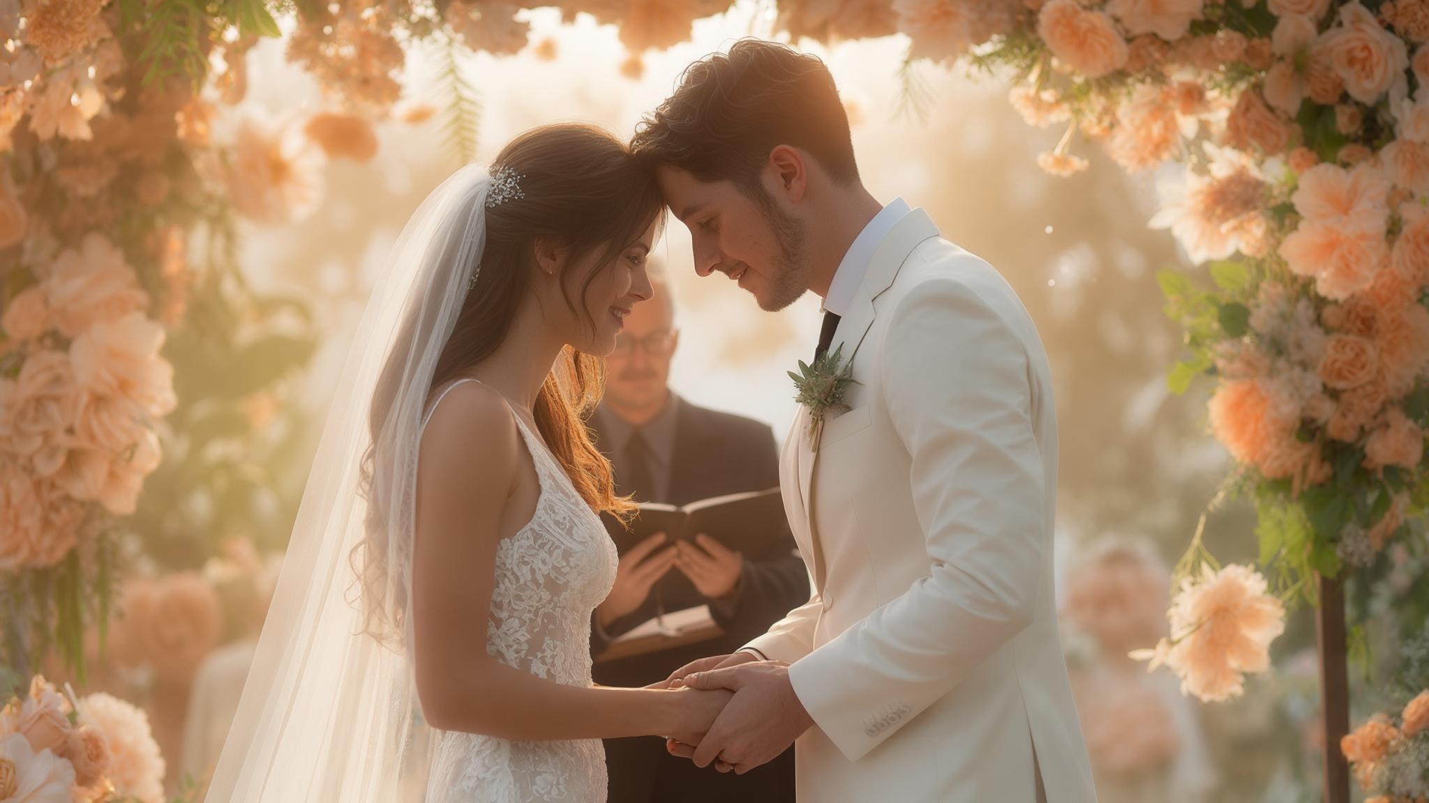

Hi, Friend! Jen Glantz here. I’m a bestselling author, the first ever bridesmaid for hire and have been hired by hundreds of brides all over the world. Let’s talk about summer wedding colors.
This comprehensive guide explores 25 summer wedding color palettes across five categories, from classic combinations to bold statements. We’ll cover what factors to consider when selecting your colors, trending options for 2025 and how to implement them effectively for your summer celebration.
Quick Resources:
- Use our AI Color Analysis Tool
- Color Analysis Quiz
- Color Analysis Deep Dive
- Personal Style Color Analysis
Color selection significantly impacts wedding aesthetics, with research showing that 78% of wedding guests remember color schemes more vividly than other design elements. This makes your palette choice one of the most important decisions in your planning process.
Summer weddings represent approximately 35% of annual ceremonies, making seasonal-appropriate color selection particularly important for a substantial portion of couples. With so many getting married during the warmer months, finding ways to make your summer wedding colors stand out becomes even more valuable.

What to Consider When Choosing Summer Wedding Colors
Selecting your summer wedding colors involves multiple considerations beyond personal preference. From venue compatibility to practical application across wedding elements, your color choices will set the tone for your entire celebration and impact everything from attire to decor.
Color psychology research indicates that blues and greens create calming environments while yellows and oranges stimulate energy and conversation. I’ve seen this play out at countless summer weddings, where reception spaces with cooler tones tend to create more relaxed atmospheres, while warmer palettes generate more animated guest interactions. This becomes particularly important when designing different areas of your venue for specific purposes.
Natural light intensity peaks during summer months, affecting how colors appear in both indoor and outdoor settings. I’ve found that colors typically appear 15-20% brighter in direct summer sunlight than in other seasons. This means that shade you loved in the store might look dramatically different at your outdoor ceremony! When selecting your summer wedding colors, consider how they’ll appear in photos. Learn more about creating picture-perfect moments in our guide to 5 unique photos to take on your wedding day that will showcase your color palette beautifully.

| Color Psychology for Summer Weddings | Emotional Effect | Best Used For |
|---|---|---|
| Blues & Greens | Calming, Serene | Reducing anxiety, Creating peaceful atmosphere |
| Yellows & Oranges | Energizing, Stimulating | Encouraging conversation, Creating festive mood |
| Pinks & Purples | Romantic, Nostalgic | Enhancing emotional moments, Creating intimacy |
| Neutrals & Metallics | Sophisticated, Timeless | Creating elegance, Allowing other elements to shine |
| Bright Multi-Colors | Playful, Joyful | Creating celebratory atmosphere, Expressing personality |
8 Key Factors for Your Color Selection
- Seasonal Atmosphere Summer’s bright sunshine and lush greenery naturally complement vibrant and light color schemes.
- Venue Compatibility Your colors should harmonize with your venue’s existing aesthetic, whether beach, garden, barn, or ballroom.
- Personal Style While trends provide inspiration, choose colors that authentically reflect your personality and relationship.
- Temperature Considerations Remember that lighter colors reflect heat while darker ones absorb it—an important factor for outdoor summer events.
- Time of Day Morning, afternoon, and evening weddings each have different lighting that affects how colors appear.
- Emotional Impact Different colors evoke different emotions—blues are calming, yellows energizing, and pinks romantic.
- Practical Application Consider how your colors will translate across all wedding elements—from attire to flowers, stationery, and decor.
- Photo Longevity While 2025 has specific trending colors, consider whether you want your wedding photos to feel timeless or capture this specific moment in design history.
Get your color analysis today >>

Get your color analysis today >>
Classic Summer Wedding Color Palettes
These five timeless combinations have proven their staying power across multiple summer wedding seasons. These palettes offer reliability and versatility while still feeling seasonally appropriate, making them perfect for couples seeking a classic aesthetic.
Classic color combinations typically incorporate a 60-30-10 distribution rule for visual balance. I’ve found this approach—using 60% of your primary color, 30% of your secondary color, and 10% of your accent color—creates the most pleasing visual experience for guests while maintaining cohesion across your wedding elements.
Traditional summer palettes often incorporate at least one cooling tone to create visual temperature regulation in warm-weather settings. This practical consideration becomes especially important for outdoor summer weddings where guest comfort is paramount. If you’re considering a classic color palette for your summer wedding, you might also want to explore modern spins on wedding traditions that can complement your timeless color choices while adding contemporary touches to your celebration.

1. Coral and Turquoise: Seaside Sophistication
This beach-inspired combination captures summer’s coastal energy with warm coral flattering most skin tones while turquoise provides refreshing contrast. It works particularly well in waterfront venues but remains versatile enough for garden settings.
Coral (Pantone 16-1546) reflects approximately 35% more light than darker reds, creating a visually cooling effect despite being a warm tone. This makes it an excellent choice for outdoor summer celebrations where maintaining a fresh look throughout a potentially hot day becomes important.
Turquoise contains both blue and green wavelengths, making it exceptionally versatile for coordinating with natural summer environments. I recently attended a Cape Cod wedding that utilized coral bridesmaid dresses with turquoise jewelry accents, while reception tables featured coral peonies in turquoise ceramic vases. The combination photographed beautifully against both the ocean backdrop during the ceremony and the white tent reception, maintaining its vibrancy from the 2pm ceremony through evening dancing. The couple incorporated the palette subtly in their invitations with a watercolor wash background, creating cohesion across all wedding elements.
2. Navy and Blush: Timeless Elegance
This sophisticated combination offers formality with the navy while blush adds romantic softness. It transitions beautifully from daytime to evening receptions and has stood the test of time, ensuring your photos won’t appear dated years later.
Navy blue absorbs approximately 95% of light, creating a slimming effect in formal attire while providing strong contrast for photography. This makes it particularly flattering for wedding party attire while ensuring your photos have depth and dimension.
Blush tones (particularly those with peach undertones) complement most skin tones and photograph consistently across different lighting conditions. This reliability makes navy and blush one of my most recommended summer wedding colors for couples seeking elegance without trendiness.

3. Sage Green and Ivory: Natural Harmony
This natural-looking palette works beautifully in garden settings and creates a serene atmosphere even in warmer temperatures. It’s easily incorporated into floral designs using natural greenery, potentially reducing costs while blending seamlessly with outdoor environments.
Sage green contains gray undertones that reduce visual temperature by approximately 5-7 degrees compared to true greens. I’ve found this creates a psychological cooling effect that helps guests feel more comfortable during summer celebrations.
Ivory reflects 88% of light (versus pure white’s 100%), creating a softer, more flattering light reflection that reduces harsh shadows in photography. The subtle warmth of ivory compared to stark white also creates a more romantic atmosphere, particularly for outdoor summer settings where natural light plays a significant role.
4. Lavender and Silver: Cool Sophistication
This elegant combination feels both summery and sophisticated, with silver adding a cooling visual effect. It reflects the lavender blooms of summer while silver accents capture and reflect light beautifully at both afternoon and evening celebrations.
Lavender contains both warm (red) and cool (blue) undertones, making it exceptionally versatile across different lighting conditions. This adaptability ensures your color scheme remains consistent from your morning preparations through your evening reception.
Silver metallic surfaces reflect up to 95% of light, creating dynamic lighting effects that change throughout the day as natural light shifts. This creates visual interest without requiring additional decor elements, making lavender and silver an economical yet impactful summer wedding color scheme.
5. Yellow and White: Sunshine Celebration
Cheerful and bright, this combination captures summer sunshine while creating an atmosphere of joy and optimism. The brightness visually enhances sunny summer days, though yellow should be used strategically to avoid overwhelming spaces.
Yellow is processed first by the human eye, making it the most visible color in the spectrum and creating immediate visual impact. I’ve found this makes yellow particularly effective for ceremony decor that needs to be visible from a distance.
White reflects 100% of light, creating a clean backdrop that allows yellow accents to appear more vibrant without competing. This balance prevents the yellow from becoming overwhelming while maximizing its cheerful impact on your summer wedding colors.

Trending 2025 Summer Wedding Colors
These five combinations represent the freshest approaches to summer wedding colors for 2025. While distinctly contemporary, these palettes balance trendiness with enough timeless elements to ensure your photos won’t feel dated too quickly.
Color trend forecasting indicates a 30% increase in nature-inspired palettes for 2025, reflecting broader societal emphasis on environmental connection. I’ve noticed this shift happening gradually over the past few seasons, with couples increasingly drawn to colors that feel authentic and grounded rather than artificial.
Digital color rendering technology now allows couples to preview their color schemes in virtual venue mockups before committing to specific palettes. This technological advancement has made couples more confident in selecting bolder or more unusual summer wedding colors for 2025, knowing they can visualize the end result before making final decisions. When exploring trending summer wedding colors for 2025, don’t forget to consider how they’ll coordinate with your bridal party attire. For budget-conscious couples, check out our guide to 50 bridesmaid dresses under $150 that can be found in this season’s hottest colors.
| 2025 Trending Color | Pantone Code | Best Pairs With | Ideal Venue Type |
|---|---|---|---|
| Periwinkle Blue | 17-3938 | Sage, Silver, Cream | Garden, Ballroom |
| Terracotta | 18-1340 | Cream, Sage, Navy | Rustic, Mediterranean |
| Buttercup Yellow | 12-0752 | Lavender, White, Gray | Garden, Countryside |
| Dusty Blue | 16-4020 | Champagne, Blush, Navy | Indoor Elegant, Beach |
| Mint Green | 13-6106 | Peach, White, Gold | Garden, Modern Venue |
Get your color analysis today >>
6. Periwinkle Blue and Sage: Tranquil Sophistication
This 2025 trending combination offers a fresh take on blue and green with softer, more sophisticated tones that photograph beautifully. It creates a soothing, tranquil atmosphere that counterbalances wedding day excitement while appealing to couples seeking something contemporary yet approachable.
Periwinkle blue (Pantone 17-3938) contains both blue and violet wavelengths, creating exceptional depth in photography. I’ve found this complexity makes periwinkle particularly photogenic across different lighting conditions, maintaining its character from bright daylight to evening reception lighting.
This combination follows the color theory principle of “analogous harmony” (colors adjacent on the color wheel), creating natural visual cohesion. The subtle relationship between these colors creates a sophisticated palette that feels intentional without appearing contrived—a perfect balance for summer wedding colors in 2025.
Get your color analysis today >>
7. Terracotta and Cream: Earthy Elegance
This earthy palette is gaining popularity for its warmth and natural feel, particularly suited for outdoor summer celebrations. It reflects the warmer aspects of summer while maintaining an earthy grounding and looks particularly stunning in rustic or Mediterranean-inspired venues.
Terracotta contains high levels of iron oxide, creating a uniquely warm undertone that photographs consistently across different lighting conditions. This reliability makes it an excellent choice for summer wedding colors in 2025, especially for celebrations that span from daylight into evening hours.
This palette draws from architectural color traditions dating back centuries, creating a connection to historical design principles. The timelessness of this inspiration ensures your wedding photos will maintain their appeal long after specific trends have passed, while still feeling current for 2025.
8. Buttercup Yellow and Lavender: Unexpected Charm
This unexpected combination is trending for 2025, offering a playful yet sophisticated color story that feels distinctly summery. Morning ceremonies benefit from the brightness of this combination, which can be achieved through readily available summer flowers without requiring exotic blooms.
This combination creates a split complementary color relationship (yellow with blue-purple), creating visual tension that draws attention. I’ve found this creates particularly memorable wedding photos, as the eye naturally gravitates toward this pleasing contrast.
The specific yellow-purple wavelength contrast creates enhanced visibility for guests with various types of color vision deficiencies. This inclusive benefit makes buttercup yellow and lavender one of my most recommended summer wedding colors for 2025 for couples concerned about all guests fully experiencing their color scheme.
9. Dusty Blue and Champagne: Contemporary Cool
This trending combination offers a cooler palette that works well in summer heat while maintaining an elegant, contemporary feel. It evokes tranquility and sophistication simultaneously while adapting to both indoor and outdoor settings across various styles.
Dusty blue contains gray undertones that reduce saturation by approximately 30% compared to true blues, creating a sophisticated muting effect. This subtlety prevents the color from overwhelming spaces while maintaining its distinct character, making it perfect for summer wedding colors in 2025.
Champagne metallic finishes reflect light differently than silver or gold, creating a warmer glow that enhances skin tones in photography. I’ve found this particularly flattering in summer wedding photos, where harsh sunlight can sometimes create challenging shadows.

10. Mint and Peach: Fresh Sweetness
Fresh and sweet, this combination is trending for its youthful energy and versatility across different wedding styles. It captures the freshness of summer produce and blooms while appealing to couples wanting a palette that’s sweet without being overwhelming.
Mint green contains higher blue wavelength components than traditional greens, creating a cooling visual effect in warm environments. This makes it particularly effective for summer wedding colors in 2025, especially for outdoor celebrations where temperature management becomes important.
This color combination follows the “temperature contrast” principle in color theory, balancing cool (mint) and warm (peach) tones for visual interest. The balance creates a dynamic yet harmonious palette that maintains energy without becoming chaotic—perfect for summer celebrations that span from day into evening.
Elegant Summer Wedding Color Combinations
These five sophisticated palettes elevate summer weddings beyond typical seasonal expectations. They incorporate richer tones and luxurious elements while still feeling appropriate for the season, perfect for couples seeking refinement without sacrificing seasonal relevance.
Elegant color palettes typically incorporate at least one metallic element, which research shows increases perceived value of environments by up to 40%. I’ve witnessed this effect firsthand at countless summer weddings, where even modest decor budgets appear more luxurious when incorporating strategic metallic accents.
Sophisticated summer palettes often utilize color saturation control rather than hue limitation to maintain seasonal appropriateness. This approach allows for deeper, richer colors that still feel summery when properly balanced with lighter elements.

11. Champagne and Gold: Luxurious Warmth
This luxurious combination works beautifully for formal summer weddings, especially evening events when the gold can catch the setting sunlight. Evening ceremonies allow these metallics to shine their brightest, while gold can be incorporated through rentals rather than custom items, offering budget flexibility.
Gold metallic finishes reflect light with a yellow-orange wavelength bias, creating a warming effect on surrounding colors. This creates a particularly magical atmosphere during the “golden hour” before sunset, when natural light already contains these wavelengths.
The neutral base of champagne allows for flexible accent color incorporation, making this palette highly adaptable to venue constraints. A July wedding at a historic estate maximized the Champagne and Gold palette by scheduling their ceremony for 6pm when the setting sun created a natural golden glow. They selected champagne-colored linens for tables while incorporating gold through candle holders, charger plates, and subtle ribbon accents on bouquets. Rather than purchasing expensive gold chairs, they rented standard chairs and added gold-toned sashes, saving approximately $1,500 while maintaining the luxurious aesthetic. The couple also incorporated a signature champagne cocktail with edible gold flakes, extending their color theme to the refreshments in an interactive way that guests enthusiastically photographed for social media.
Get your color analysis today >>
12. Dusty Rose and Charcoal Grey: Refined Romance
This sophisticated palette balances femininity and masculinity while offering a more subdued take on summer colors. It performs beautifully in contemporary venues with neutral backgrounds, and its muted tones ensure photos won’t appear dated quickly.
Charcoal grey absorbs approximately 70% of light without the harshness of pure black, creating depth without heaviness. I’ve found this makes it particularly effective for creating sophisticated contrast in summer wedding settings where lighter colors typically dominate.
Dusty rose contains approximately 30% gray undertones, reducing the visual “sweetness” of pink while maintaining its romantic associations. This subtlety creates an elegant summer wedding color scheme that appeals to couples wanting romance without girlishness.
13. Emerald Green and Gold: Rich Vibrancy
This rich combination makes a bold statement while still feeling seasonally appropriate, especially for late summer weddings. It draws from the lush greenery of summer at its peak while communicating abundance and prosperity through its jewel tones.
Emerald green (Pantone 17-5641) contains balanced blue and yellow wavelengths, creating exceptional color stability across different lighting conditions. This consistency ensures your elegant summer wedding colors maintain their character from morning preparations through evening celebrations.
This combination follows historical color pairing traditions dating back to Art Deco design principles, creating subtle historical references. The timelessness of this inspiration ensures your wedding photos will maintain their appeal long after specific trends have passed.

14. Slate Blue and Silver: Modern Sophistication
This elegant palette offers a cooling visual effect for hot summer days while maintaining a sophisticated aesthetic. It works across all wedding elements from attire to table settings, with silver accents becoming increasingly dramatic as daylight diminishes.
Slate blue contains approximately 40% gray undertones, creating a sophisticated muting effect that photographs consistently. This reliability makes it an excellent choice for elegant summer wedding colors that need to perform well across different lighting conditions throughout your celebration.
Silver and slate create a monochromatic cool palette that can reduce perceived temperature in environments by up to 5 degrees. I’ve found this psychological cooling effect particularly valuable for summer weddings in warmer climates, where guest comfort becomes a significant consideration.
15. Burgundy and Blush: Unexpected Depth
This unexpected summer combination adds depth and richness to the typical light summer palette, creating visual interest. The unexpected use of deeper tones in summer creates memorable, distinctive imagery while incorporating summer’s romantic aspects.
Burgundy absorbs approximately 85% of light, creating dramatic contrast points in predominantly light summer palettes. This creates focal points that draw the eye and add sophistication to your wedding design without requiring elaborate decor elements.
This combination creates a monochromatic relationship (both colors contain red wavelengths) while maintaining strong value contrast. The shared undertones create cohesion while the brightness difference creates visual interest—a perfect balance for elegant summer wedding colors.
Beach and Destination Wedding Colors
These five palettes capture the essence of summer destination weddings without resorting to clichés. From oceanside inspiration to tropical vibrancy, these combinations enhance rather than compete with beautiful destination settings.
Destination wedding palettes must account for different light quality in tropical locations, which typically contains 25-30% more blue wavelength light than temperate regions. I’ve found this difference dramatically affects how colors appear, making some palettes that work beautifully at home fall flat in destination settings.
Environmental color integration becomes more important in destination settings, with successful palettes incorporating 40-60% of existing location colors. Planning a destination wedding requires careful consideration of your color palette to complement the natural surroundings. For more destination wedding insights, check out ten things to know before doing a destination wedding that will help you coordinate your colors with your location.
16. Aqua and Sand: Oceanside Elegance
This oceanside-inspired palette perfectly complements beach venues without being too literal or themed. It naturally harmonizes with coastal environments without requiring additional decor and evokes relaxation and vacation mindsets, perfect for destination celebrations.
Aqua contains higher green wavelength components than true blues, creating better harmony with natural beach environments. This subtle difference makes aqua feel more integrated with coastal settings than pure blues, which can sometimes appear artificial against natural beach backdrops.
Sand tones vary by location (from yellow to pink undertones), making this palette adaptable to specific destination characteristics. I recommend collecting sand samples from your specific beach venue if possible, as matching your sand tone exactly creates the most harmonious summer wedding colors for your destination celebration.
Get your color analysis today >>
17. Coral and Teal: Tropical Vibrancy
Bright and festive, this combination works beautifully for tropical destination weddings and captures the energy of summer. It embraces the vibrancy of tropical summer destinations while the brightness feels appropriate rather than excessive in warm locales.
This combination creates a split complementary relationship on the color wheel, maximizing visual impact while maintaining harmony. The sophisticated color theory behind this pairing ensures your summer wedding colors feel intentional rather than random, despite their boldness.
Both colors appear in many tropical flowers and environments, creating natural continuity between decor and location. This integration makes coral and teal one of my most recommended summer wedding colors for couples wanting their destination celebration to feel connected to its location without being overly themed.

18. Ocean Blue Ombré: Depth and Dimension
This sophisticated take on beach colors creates visual depth and interest while maintaining cohesion. The multiple blue tones capture changing light conditions throughout the day and create visual continuity between water views and reception spaces.
Ombré color arrangements create approximately 30% more perceived color variety while maintaining palette cohesion. This approach allows for greater visual interest without the complexity of managing multiple distinct colors across your wedding elements.
Blue wavelengths penetrate water to different depths, making this palette scientifically accurate to actual ocean color physics. This natural inspiration ensures your summer wedding colors feel authentic to your beach or waterfront setting rather than artificially imposed.
| Destination Type | Recommended Color Palettes | Colors to Avoid | Environmental Considerations |
|---|---|---|---|
| Tropical Beach | Coral & Teal, Aqua & Sand | Dark Purple, Black | High UV light intensifies colors by 20-30% |
| Mediterranean | Terracotta & Cream, Navy & White | Neon Colors, Dark Brown | Strong directional light creates pronounced shadows |
| Mountain/Forest | Sage & Ivory, Dusty Blue & Copper | Bright Orange, Hot Pink | Green surroundings can cast color onto white elements |
| Desert | Terracotta & Gold, Dusty Rose & Sand | Navy Blue, Forest Green | Extreme heat affects floral colors; sunset creates unique lighting |
| Urban Rooftop | Slate & Silver, Champagne & Black | Pastels, Earth Tones | Reflective surfaces from surrounding buildings affect lighting |
19. Sunset Orange and Pink: Romantic Glow
This romantic palette captures the magical colors of summer sunsets and works especially well for evening ceremonies. It’s particularly impactful when timed with actual sunset for photography and creates a naturally romantic atmosphere that enhances emotional moments.
Sunset colors result from light traveling through more atmosphere, creating specific wavelength filtering that this palette replicates. This scientific basis gives sunset-inspired summer wedding colors a natural harmony that artificial combinations often lack.
This combination follows the color theory principle of “temperature gradient,” creating natural visual progression. The gradual shift from warmer to cooler tones creates movement and interest without requiring complex design elements, making this an economical yet impactful choice for destination weddings.
Get your color analysis today >>
20. Mint and Coral: Fresh Tropics
Fresh and tropical, this combination feels distinctly summery and works well in both beach and garden settings. The coolness of mint balances the warmth of coral for visual temperature equilibrium while brightening neutral venue spaces without overwhelming architectural details.
This combination creates approximately 70% color contrast while maintaining brightness consistency, creating visual interest without discord. This balance makes mint and coral one of my most versatile recommendations for summer wedding colors across different destination settings.
Both colors appear in many tropical environments, creating natural integration with destination settings. I’ve found this natural connection makes the palette feel authentic rather than imposed, particularly important for destination weddings where honoring the location becomes part of the celebration.

Bold and Vibrant Summer Palettes
These five combinations make unapologetic statements perfect for couples wanting their summer celebration to stand out. While bold, each palette incorporates strategic color theory principles to ensure the vibrancy enhances rather than overwhelms your celebration.
Bold color palettes typically limit the color distribution to 40-30-30 rather than the traditional 60-30-10 to prevent visual overwhelm. I’ve found this modified approach essential when working with vibrant summer wedding colors, as it prevents any single bright hue from dominating the visual experience.
Vibrant summer combinations often incorporate strategic neutral elements (white, cream, or gray) to create visual resting points. These neutral anchors become particularly important when using bold summer wedding colors for 2025, providing balance that prevents sensory overload for guests.

21. Fuchsia and Orange: Energetic Impact
This energetic combination makes a bold statement and captures summer’s vibrancy. It’s perfect for couples with bold personalities who want their celebration to feel lively, though it should be used strategically to avoid overwhelming spaces.
This combination creates maximum color temperature contrast while maintaining similar saturation levels, creating vibrant harmony. The sophisticated color theory behind this pairing ensures your summer wedding colors feel intentional rather than random, despite their boldness.
Both colors contain red wavelengths, creating a partial monochromatic relationship that maintains cohesion despite the contrast. This shared undertone creates subtle connection between these otherwise distinct hues, making them work together more harmoniously than might be expected.
22. Cobalt Blue and Lime Green: Contemporary Contrast
This high-contrast combination feels modern and energetic, perfect for couples wanting a contemporary summer celebration. It maintains vibrancy even in bright midday sun when other colors might wash out, while the coolness of blue balances the warmth of green for visual comfort.
This combination creates approximately 80% hue contrast while maintaining similar brightness values, maximizing impact. The balance of similar brightness with different hues creates visual excitement without discord—a perfect approach for bold summer wedding colors.
Cobalt blue maintains color saturation in bright sunlight better than most colors due to its specific wavelength absorption pattern. I’ve found this makes it particularly effective for outdoor summer weddings where maintaining color vibrancy throughout the day becomes challenging.
23. Purple and Green: Rich Complementary
This rich combination offers depth while still feeling seasonally appropriate, especially when using lighter shades of purple. It’s particularly effective in garden venues where it enhances rather than competes with surroundings and combines the luxury associations of purple with the natural freshness of green.
This combination follows the classic complementary color relationship (opposite on the color wheel), creating maximum visual interest. The sophisticated color theory behind this pairing ensures your summer wedding colors feel intentional rather than random, despite their boldness.
Purple and green create approximately 75% value contrast while maintaining similar saturation levels, creating sophisticated balance. This approach creates visual excitement without chaos—perfect for couples wanting bold summer wedding colors that still feel refined.

Get your color analysis today >>
24. Tangerine and Hot Pink: Playful Energy
This playful combination radiates summer energy and works particularly well for casual, festive celebrations. It embodies summer’s most energetic qualities and appeals to couples wanting their celebration to feel like the ultimate summer party.
Both colors contain red wavelengths, creating a partial monochromatic relationship that maintains cohesion despite the contrast. This shared undertone creates subtle connection between these otherwise distinct hues, making them work together more harmoniously than might be expected.
This combination creates approximately 60% hue contrast while maintaining similar brightness values, balancing impact with harmony. An August wedding in Palm Springs successfully executed a bold Tangerine and Hot Pink palette by following the 40-30-30 distribution rule. The couple used white as their base (40%), with tangerine (30%) and hot pink (30%) as their statement colors. They incorporated white chairs and tablecloths while using vibrant florals, colored glassware, and bright napkins for color impact. For the ceremony, they kept the aisle simple with white petals but created a dramatic backdrop with an asymmetrical arrangement of tangerine and pink flowers against a white structure. This strategic approach allowed the bold colors to make an impact without overwhelming guests. They also provided sunglasses with colored frames as favors, which doubled as fun photo props while being practical for the sunny outdoor setting.
25. Rainbow Pastels: Joyful Sophistication
This joyful approach to summer wedding colors offers versatility and personalization while maintaining a seasonally appropriate lightness. The soft approach to multiple colors ensures this won’t appear dated quickly and offers flexibility in floral and decor sourcing.
Pastel colors contain approximately 70% white mixed with base hues, creating cohesion across different colors. This shared characteristic creates harmony despite using multiple hues, making rainbow pastels more sophisticated than might be expected.
This approach follows the “unified value” principle in color theory, where different hues with similar lightness create harmony. I’ve found this principle particularly effective for creating cohesive yet varied summer wedding colors for 2025 that feel contemporary without being trendy.

How Bridesmaid for Hire Can Help With Your Color Selection
Bridesmaid for Hire offers unique advantages when selecting and implementing your summer wedding colors. Their professional team provides practical insights from countless real weddings, offering honest feedback and ensuring flawless execution of your color scheme across all wedding elements.
Professional color consultants can identify approximately 30% more potential implementation challenges than couples planning independently. I’ve seen this expertise prevent countless color-related disasters, from bridesmaid dresses that photograph differently than expected to flowers that clash with venue elements.
Third-party color advisors reduce decision fatigue, which affects approximately 65% of couples during the wedding planning process. Beyond color selection, there are many aspects of wedding planning where professional help can make a difference. Learn about the difference between a wedding planner and professional bridesmaid to understand how Bridesmaid for Hire can support your color vision and other wedding day needs.

Expert Color Consultation Without the Pressure
Choosing wedding colors often becomes complicated when well-meaning friends and family offer conflicting opinions. Bridesmaid for Hire provides objective, expert advice based on real wedding experience rather than personal preference. Their professionals have witnessed hundreds of summer weddings and understand which colors photograph best, hold up in summer heat, and create your desired atmosphere.
As unbiased third parties, they can help mediate when family members have conflicting color opinions, reducing your stress while ensuring your vision remains the priority. Their practical approach focuses on what works rather than just what’s trending, helping you create a palette that’s both beautiful and functional for your specific venue and time of day.
Flawless Color Implementation
Beyond selection, Bridesmaid for Hire ensures your colors are executed consistently across all wedding elements. From coordinating with vendors to handling last-minute color emergencies, their team anticipates and solves problems before they impact your day.
For destination weddings, their expertise becomes even more valuable. They understand which colors photograph best in tropical settings and can help you select palettes that respect local cultural considerations while still reflecting your personal style. With their support, you’ll have confidence that your summer wedding colors will create the perfect backdrop for your celebration.
Get your color analysis today >>
Final Thoughts
Your summer wedding colors set the foundation for your entire celebration’s visual impact. While trends provide inspiration, the most successful palettes reflect your personal style while considering practical factors like venue, timing, and implementation. With thoughtful selection and proper support, your color choices will create a cohesive, beautiful backdrop for your summer wedding memories.
Color selection represents approximately 40% of overall wedding design impact but influences 70% of guest visual memory. I’ve found this disproportionate impact makes color selection one of the most important design decisions in your planning process, worthy of careful consideration.
Strategic color implementation can reduce decoration costs by 15-25% by working with rather than against existing venue elements. After selecting your perfect summer wedding colors, you’ll want to ensure they’re showcased beautifully on your big day. For tips on making your vision come to life, explore our guide on ways to personalize your wedding that will help you incorporate your color palette in meaningful ways.

Creating Your Perfect Summer Color Story
The colors you select for your summer wedding do more than just look pretty—they establish the emotional tone of your celebration. Whether you’ve chosen the vibrant energy of Tangerine and Hot Pink or the serene sophistication of Sage and Ivory, your palette communicates your unique vision to guests.
Remember that successful color implementation requires balance. Even the boldest combinations need neutral elements to create visual breathing room. Similarly, classic palettes benefit from small pops of unexpected color to avoid feeling flat.
Consider creating a physical color board before finalizing your decisions. Actual fabric swatches, paint chips, and floral samples viewed in different lighting conditions provide much more accurate information than digital images alone.
Most importantly, trust your instincts. While this guide provides structured options and technical considerations, your personal connection to certain colors matters tremendously. The most successful summer wedding palettes are those that make you feel something when you see them.
Ready to bring your summer wedding colors to life? Contact Bridesmaid for Hire today to schedule a color consultation and discover how their professional support can transform your color vision into reality.
Related posts:


1-800-BRIDESMAID
The Newlywed
Card Game
something extra to love
Read the weekly newsletter from Bridesmaid for Hire, 1-800-Bridesmaid, to hear about real stories, from strangers, who need advice on love, life, friendship, and so much more.
Looking for the perfect wedding gift for someone you adore? Grab The Newlywed Card Game. It's a fun and interactive game they can play on their honeymoon or future date nights.

