


Hi, Friend! Jen Glantz here. I’m a bestselling author, the first ever bridesmaid for hire and have been hired by hundreds of brides all over the world. Let’s talk about may wedding colors.
Planning a May wedding involves countless decisions, with color selection being one of the most impactful. Recent surveys show that 68% of spring couples struggle with finalizing their wedding palette. I remember helping a bride last season who changed her mind three times before landing on the perfect May wedding colors! This guide breaks down 25 beautiful May wedding color combinations across five categories, providing practical examples and considerations for each. Whether you prefer classic pastels or bold statements, you’ll find options that capture May’s unique position between spring freshness and early summer warmth.
Quick Resources:
- Use our AI Color Analysis Tool
- Color Analysis Quiz
- Color Analysis Deep Dive
- Personal Style Color Analysis

What to Consider When Choosing May Wedding Colors
May offers a unique seasonal advantage for weddings, balancing spring’s freshness with early summer warmth. When selecting your color palette, eight key factors deserve your attention. The natural beauty of blooming flowers and lush greenery should influence your choices, while ensuring compatibility with your venue is crucial. Your personal style must shine through, and regional weather variations might affect your decisions.
May wedding colors should take into account flower availability during this transitional month. This is particularly important as certain blooms like peonies, lilacs, and ranunculus reach their peak, offering rich possibilities for your palette. Additionally, consider how your chosen colors will photograph in bright sunlight – a common feature of May days. Very pale colors can sometimes wash out in outdoor photography, while deeper tones maintain their vibrancy.
The versatility of your may wedding colors across all wedding elements – from attire to stationery to table settings – creates a cohesive experience for your guests. Finally, think about longevity: will your color choices stand the test of time in your photos years from now, or will they immediately date your celebration to a specific trend period?
| Factor | Why It Matters for May Weddings |
|---|---|
| Venue Compatibility | Indoor venues may need stronger colors to avoid washing out; outdoor venues benefit from colors that complement natural surroundings |
| Regional Weather | Northern regions might still have cooler temperatures requiring deeper tones; southern regions may already feel like summer, favoring lighter palettes |
| Personal Style | Your colors should reflect your personality as a couple, not just seasonal trends |
| Flower Availability | May offers peonies, lilacs, tulips, and ranunculus – consider which blooms match your desired palette |
| Photography Considerations | Bright May sunlight can wash out very pale colors in outdoor photos |
| Color Versatility | Choose colors that work across attire, decor, stationery, and food elements |
| Longevity | Trendy colors may date your photos; consider timeless combinations |
| Seasonal Appropriateness | May bridges spring and summer – you can incorporate elements of both seasons |

Choosing the perfect May wedding colors can be overwhelming, but our guide on how to become your own wedding planner offers additional strategies for making these important design decisions with confidence.
Seasonal color psychology shows that May palettes typically incorporate both cool spring tones (blues, lavenders) and warm early summer hues (peaches, yellows), allowing for more flexibility than purely seasonal weddings.
Photography considerations are particularly important for May weddings, as the month’s variable lighting conditions (bright midday sun to golden hour) can dramatically affect how colors render in images—cooler tones often photograph more consistently across different lighting situations.
Get your color analysis today >>
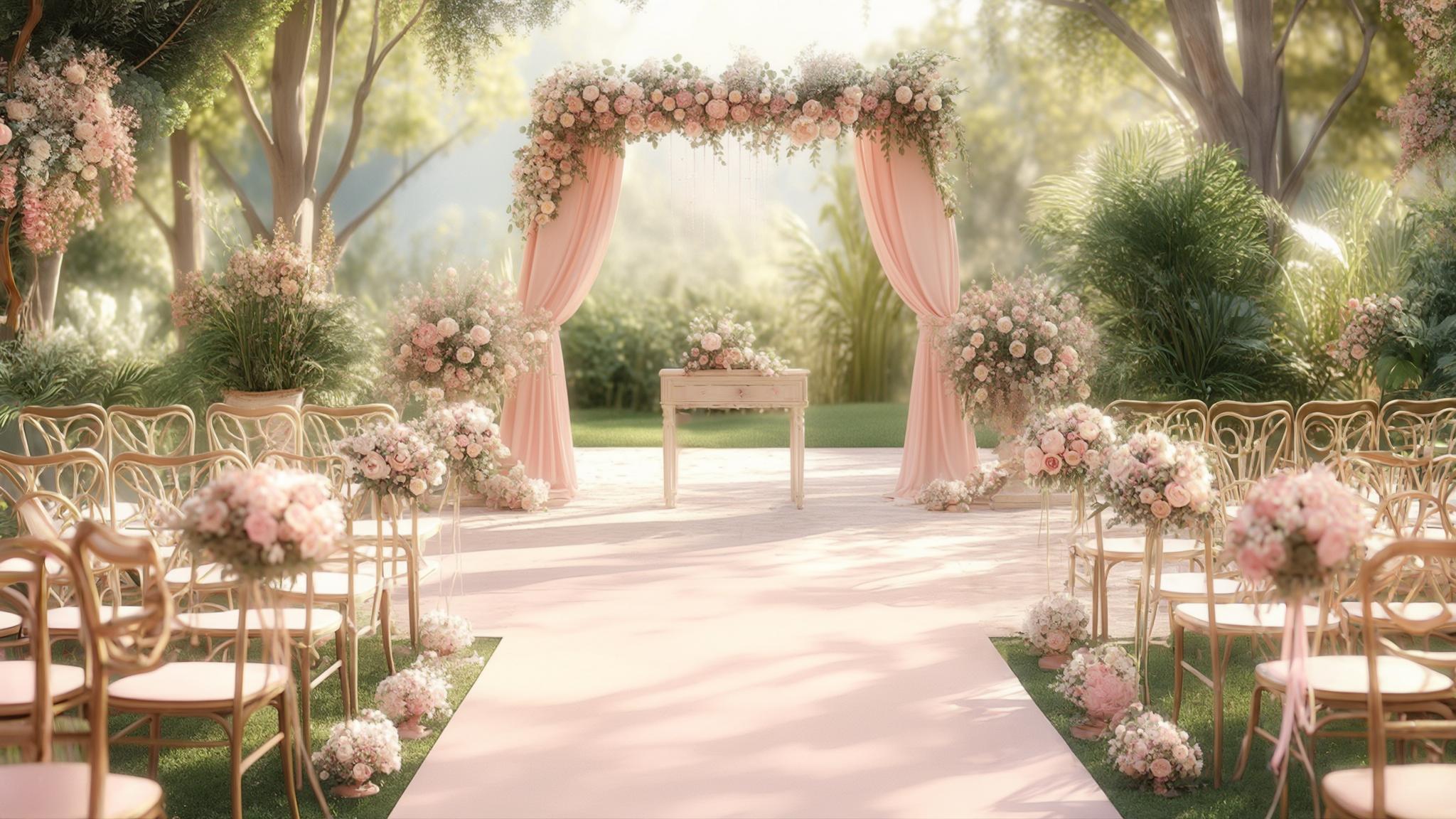
Classic Spring Pastels
1. Blush Pink & Sage Green
This timeless combination captures May’s essence perfectly. Blush pink bridesmaid dresses paired with sage green ribbons and foliage create a harmonious balance that works in virtually any setting. The palette photographs beautifully in May’s natural light and complements most skin tones. These colors transition seamlessly between indoor ballrooms and outdoor gardens, making them incredibly versatile for the sometimes unpredictable May weather patterns.

The color psychology behind this combination creates a sense of balance—blush pink evokes romance and tenderness while sage green represents growth and renewal, perfectly capturing May’s transitional nature.
This palette offers exceptional versatility with available May flowers, including peonies, garden roses, and ranunculus for the blush elements, while eucalyptus, ferns, and lamb’s ear provide the sage components.
2. Lavender & Cream
Lavender paired with cream creates an elegant, sophisticated atmosphere that feels distinctly May-appropriate. This combination works beautifully for centerpieces, table linens, and even lavender-infused desserts. The palette has a naturally calming effect, helping to reduce wedding day stress. May offers abundant lavender-hued flowers, and this color scheme photographs exceptionally well in the month’s natural light conditions.

Lavender contains the compound linalool, which studies show reduces anxiety—incorporating this color (and potentially the actual herb) creates a scientifically-backed calming atmosphere for your celebration.
The 30-60-10 design rule works perfectly with this spring wedding colors palette: 60% cream (base), 30% lavender (secondary), and 10% accent color (often a metallic like silver) creates perfect visual balance.
3. Dusty Blue & Peach
Dusty blue and peach offer the perfect balance between cool and warm tones, making them ideal for May’s transitional weather. This versatile combination adapts beautifully to different venue types, from rustic barns to elegant ballrooms. Dusty blue table runners paired with peach garden roses create a visually striking yet harmonious look. The palette also translates beautifully to stationery, creating a cohesive experience from invitation to reception.
When planning a May wedding in Connecticut, bride Michelle was torn between honoring the spring season while acknowledging the warmer temperatures typical of late May in her region. We created a dusty blue and peach palette that perfectly bridged this seasonal transition. Her dusty blue bridesmaids dresses looked stunning against the lush green backdrop of her garden venue, while peach garden roses and ranunculus in the bouquets added warmth that complemented the golden hour photography session. The palette continued through her reception with dusty blue linens and peach-tinted glassware that caught the evening light beautifully, creating a cohesive experience from ceremony to final dance.
This color combination follows the complementary color theory principle, as dusty blue and peach sit opposite each other on the color wheel, creating natural visual harmony while maintaining enough contrast for visual interest.
The muted quality of both hues (dusty blue rather than navy, peach rather than orange) creates a sophisticated palette that photographs with a timeless, film-like quality in May’s natural light.
Get your color analysis today >>
4. Mint & Coral
Mint and coral create a fresh, energetic combination that perfectly captures May’s vibrant spirit. This palette works exceptionally well for garden or beach settings, reflecting the transition from spring to summer. Mint bridesmaid dresses paired with coral bouquets create a striking visual contrast, while matching groomsmen accessories tie the look together. The brightness of these colors brings immediate cheer to any May celebration.
The mint and coral combination creates approximately a 70% color contrast ratio, hitting the sweet spot for visual distinction without becoming jarring—this makes it particularly effective for creating focal points in both decor and photography.
This palette works with the “split complementary” color scheme principle, where mint (a blue-green) pairs with coral (a red-orange) to create balanced visual tension that draws the eye without overwhelming it.
5. Pale Yellow & White
Pale yellow and white create a bright, cheerful atmosphere perfect for sunny May celebrations. This combination shines in outdoor ceremonies, capturing the essence of spring sunshine. May offers abundant flower options in these hues, from daffodils to cream roses. The palette photographs brilliantly in natural light, creating an airy, luminous quality in your wedding images. White ceremonies with pale yellow accents in boutonnieres, centerpieces, and cake details create a cohesive yet interesting visual story.

The high value contrast between white and pale yellow creates what photographers call “high key” imagery—this technique produces bright, airy photos with minimal shadows, perfect for capturing May’s optimistic mood.
This monochromatic-adjacent palette (white plus a tint of yellow) follows color theory principles that create harmony through simplicity, allowing architectural and natural elements of your venue to shine without competition.
Bold & Vibrant May Palettes
6. Fuchsia & Emerald Green
For couples seeking drama and impact, fuchsia and emerald green deliver a bold statement that still feels seasonally appropriate for May. This combination reflects the month’s lush greenery and vibrant blooms. Emerald green tablecloths with fuchsia floral arrangements create striking tablescapes, while carrying the palette through to stationery ensures cohesion. This modern aesthetic works particularly well for couples with confident personal style who aren’t afraid of color.

This high-contrast combination creates approximately an 85% contrast ratio, making it exceptionally effective for creating visual hierarchy and focal points throughout your wedding design.
The complementary nature of these colors (red-purple against green) creates what color theorists call “simultaneous contrast,” where each color appears more vibrant when placed adjacent to the other—particularly effective for creating memorable visual moments.
These best wedding colors for may work especially well for couples who want their celebration to stand out from the typical spring pastels while still honoring the season’s vibrancy.
7. Cobalt Blue & Tangerine
Cobalt blue paired with tangerine creates an energetic, unexpected palette that makes a bold statement. This high-contrast combination produces striking wedding photos that pop with vibrancy. Cobalt blue bridesmaid dresses with tangerine bouquets create a visual impact guests won’t forget. This palette works especially well for evening receptions and suits couples with bold personal style who want their May wedding to stand out from the crowd.
If you’re considering this bold color scheme for your May wedding, check out our guide on how to feel more confident in your bridesmaid dress to help your wedding party rock these vibrant hues with poise.
This combination employs the “complementary color scheme” principle, as blue and orange sit opposite on the color wheel, creating maximum contrast and visual energy—particularly effective for creating memorable moments in both experience and photography.
The specific wavelengths of cobalt blue and tangerine create what vision scientists call “opponent colors,” which the human eye processes in a way that makes both colors appear more vibrant when viewed together than when seen separately.
8. Raspberry & Navy
Raspberry and navy create a sophisticated yet vibrant palette that transitions beautifully from day to evening celebrations. Navy suits with raspberry ties and pocket squares create a coordinated look for the wedding party, while raspberry floral accents add pops of color throughout the venue. This versatile combination works across different venue types and photographs beautifully in various lighting conditions, making it practical for May’s sometimes unpredictable weather.
| Bold May Color Combination | Best Venue Type | Ideal Time of Day | Complementary Flowers |
|---|---|---|---|
| Fuchsia & Emerald | Modern/Contemporary | Afternoon to Evening | Peonies, Orchids, Ferns |
| Cobalt Blue & Tangerine | Beachside/Waterfront | Midday to Sunset | Bird of Paradise, Calla Lilies |
| Raspberry & Navy | Ballroom/Hotel | Evening | Garden Roses, Dahlias, Anemones |
| Emerald & Gold | Historic/Traditional | Afternoon to Evening | White Roses, Eucalyptus, Greenery |
| Coral & Turquoise | Destination/Resort | Daytime | Hibiscus, Protea, Succulents |
This palette employs the “split complementary” color theory principle, where navy (a blue) pairs with raspberry (a red-purple) to create balanced visual tension that draws the eye without overwhelming it.
The combination offers exceptional versatility in fabric applications—navy provides structure and formality in suits and linens, while raspberry adds dimension through different textiles (silk, velvet, chiffon) that catch light differently throughout the day.
Get your color analysis today >>
9. Emerald & Gold
Emerald and gold create a luxurious, timeless palette that reflects May’s lush greenery while adding a touch of opulence. This combination works exceptionally well for indoor venues, creating a rich, elegant atmosphere. Emerald green linens paired with gold chargers, candle holders, and other metallic accents create depth and dimension in your tablescapes. The palette photographs with richness and warmth, ensuring your wedding images have a timeless quality.

This combination follows the “analogous with accent” color theory principle, where emerald (a cool color) is elevated by gold (a warm metallic) to create depth while maintaining harmony—particularly effective for creating layered, sophisticated environments.
The reflective properties of gold metallic elements create what lighting designers call “specular highlights” when photographed, adding dimension and luxury to images without competing with the primary emerald color story.
10. Coral & Turquoise
Coral and turquoise create a tropical, festive feel perfect for destination or beach May weddings. This cheerful combination instantly creates a vacation atmosphere, even for local celebrations. Coral bridesmaid dresses with turquoise jewelry create a coordinated yet interesting look, while carrying these colors through reception details ensures cohesion. The palette is highly photogenic, creating vibrant images that capture the joy of your celebration.
This combination creates what color theorists call “maximum contrast of hue” while maintaining similar saturation levels, resulting in a vibrant palette that remains harmonious rather than competing or clashing.
The specific wavelengths of coral and turquoise stimulate different cone receptors in the human eye, creating what vision scientists call “opponent processing”—this makes both colors appear more vibrant when viewed together than when seen separately.
Romantic & Ethereal Combinations
11. Mauve & Dusty Rose
Mauve and dusty rose create a soft, romantic palette that photographs beautifully, especially during May’s golden hour sunsets. Layered floral arrangements featuring these hues create depth and dimension, while carrying the colors through to your stationery suite ensures cohesion. This combination flatters most skin tones, making it practical for wedding parties. May offers abundant flower options in these shades, from garden roses to ranunculus and sweet peas.
This monochromatic-adjacent palette (two shades within the same color family) follows color theory principles that create harmony through similarity, allowing texture and form to become the distinguishing elements rather than color contrast.
The specific wavelengths of these muted purplish-pinks fall within what color psychologists identify as the most universally flattering spectrum for human skin tones, enhancing natural complexions in both person and photography.
These may wedding colors work particularly well for couples seeking a timeless, romantic aesthetic that won’t look dated in photos years from now.
12. Periwinkle & Silver
Periwinkle and silver create a dreamy, ethereal atmosphere that reflects May’s blue skies. This versatile combination works beautifully for both daytime and evening events, adapting to changing light conditions. Periwinkle bridesmaid dresses with silver accessories create an elegant, coordinated look, while matching table settings carry the theme through to your reception. The palette creates a serene atmosphere that helps calm wedding day nerves.
This combination employs what color theorists call “value contrast”—periwinkle (a mid-tone) against silver (a high-value metallic)—creating visual interest while maintaining a cohesive color story.
The reflective properties of silver create what photographers call “fill light” effects when properly placed, naturally illuminating faces and details in a flattering way that complements May’s natural lighting conditions.
13. Champagne & Blush
Champagne and blush create a timeless, elegant palette that works across all venue types and lighting conditions. This universally flattering combination adapts beautifully from ceremony to reception. Champagne tablecloths with blush napkins create a sophisticated foundation, while mixed metallic accents add dimension and interest. The palette photographs beautifully in any light, ensuring your May wedding images have a timeless quality that won’t date.

Sarah and James wanted a romantic May wedding palette that would work for their historic venue with both indoor and outdoor elements. They chose champagne and blush as their primary colors, implementing them through champagne linens, blush napkins, and mixed metallic accents in gold and rose gold. For their outdoor ceremony, champagne-colored chair covers with blush sashes framed the aisle, while their indoor reception featured champagne draping with strategic blush uplighting. Their florist created dimension by using various flowers in the blush family—from pale pink garden roses to slightly deeper ranunculus—all arranged in gold mercury glass vessels. The result was a cohesive color story that transitioned beautifully from day to evening and photographed with timeless elegance.
This neutral-plus-soft-color combination follows the “60-30-10 rule” of interior design—60% champagne (base), 30% blush (secondary), and 10% accent (often gold or silver)—creating perfect visual balance that feels intentional rather than overwhelming.
The specific undertones of champagne (warm beige) and blush (soft pink) create what color theorists call “temperature harmony,” where colors with similar temperature characteristics naturally complement each other.
14. Lilac & Gray
Lilac and gray create a sophisticated, contemporary palette that reflects May’s blooming lilacs. This versatile combination adapts to different wedding styles, from modern minimalist to romantic garden celebrations. Lilac floral arrangements against gray linens create beautiful contrast, while carrying these colors through stationery elements ensures cohesion. The palette photographs with a dreamy quality, especially in May’s natural light.
This combination employs the “achromatic plus accent” color theory principle, where gray (a neutral) provides structure while lilac (a chromatic color) adds personality without overwhelming the design.
The specific wavelength of lilac stimulates both blue and red cone receptors in the human eye, creating what color psychologists call a “balanced response”—this makes it particularly soothing while still maintaining visual interest.
These popular may wedding colors work especially well for couples seeking a contemporary palette that still honors spring traditions.
Get your color analysis today >>
15. Powder Blue & Ivory
Powder blue and ivory create a classic, ethereal palette reminiscent of May’s spring skies. This combination works beautifully for garden settings, creating a light, airy atmosphere. Powder blue accents against an ivory base create subtle contrast in attire, decor, and floral arrangements. The palette photographs with a dreamy quality, especially in outdoor settings where it complements the natural environment.

For more ideas on how to incorporate powder blue and ivory into your May wedding, explore our 5 unique wedding photos to take on your wedding day guide for creative ways to showcase this ethereal palette.
This high-value combination (both colors are light) creates what photographers call “high key” imagery—this technique produces bright, airy photos with minimal shadows, perfect for capturing May’s optimistic mood.
The specific undertones of powder blue (slightly cool) and ivory (slightly warm) create what color theorists call “temperature contrast,” where colors with different temperature characteristics create subtle visual tension that adds interest without overwhelming.
Nature-Inspired May Palettes
16. Sage Green & Terracotta
Sage green and terracotta create an earthy, organic palette that reflects May’s natural landscape. This combination works exceptionally well for outdoor venues, creating a grounded, authentic atmosphere. Sage green tablecloths paired with terracotta pottery vases holding wildflowers create a harmonious, nature-inspired tablescape. The palette feels connected to the environment, making it perfect for couples who value sustainability and natural elements.
This combination follows the “earth palette” principle in color theory, using colors directly observed in nature—specifically the contrast between foliage (sage) and earth (terracotta)—creating an inherently harmonious relationship.
The specific undertones of sage green (gray-green) and terracotta (orange-brown) create what color theorists call “complementary muted contrast,” where opposing colors on the color wheel are both desaturated to create sophisticated tension rather than vibrant opposition.
17. Sky Blue & Moss Green
Sky blue and moss green reflect May’s clear skies and fresh greenery, creating a refreshing, natural aesthetic. This palette works perfectly for garden or woodland settings, connecting your celebration to the environment. Sky blue attire accents paired with moss green florals and natural wood elements create a cohesive, nature-inspired look that feels authentic rather than themed.
| Nature-Inspired Color Palette | Elements to Incorporate | Seasonal May Flowers | Recommended Decor Accents |
|---|---|---|---|
| Sage Green & Terracotta | Natural linens, pottery, wood | Hellebores, Viburnum, Scabiosa | Clay pots, woven chargers, olive branches |
| Sky Blue & Moss Green | Raw silk, natural wood, stone | Delphinium, Tweedia, Ferns | Agate slices, driftwood, river rocks |
| Buttercream & Honey | Raw cotton, beeswax, raffia | Ranunculus, Daffodils, Billy Buttons | Honeycomb patterns, wooden beehives, beeswax candles |
| Slate Blue & Eucalyptus | Concrete, galvanized metal, linen | Dusty Miller, Silver Dollar Eucalyptus, Thistle | Slate coasters, zinc containers, blue glass bottles |
| Wildflower Mix | Kraft paper, twine, recycled glass | Queen Anne’s Lace, Cornflowers, Cosmos | Wooden crates, mason jars, pressed flowers |
This combination employs what landscape painters call the “atmospheric perspective” principle, where blues (sky) naturally recede while greens (moss) advance, creating natural depth in both physical spaces and photography.
The specific wavelengths of these colors stimulate what vision scientists call “natural scene statistics”—the human visual system has evolved to process these particular blue-green combinations efficiently, making them inherently pleasing and calming.
18. Buttercream & Honey
Buttercream and honey create a warm, inviting palette that mimics May’s golden sunlight. This combination works well across venue types, from rustic barns to elegant ballrooms. Layered buttercream and honey tones in flowers, decor, and dessert displays create depth and dimension. The palette creates a cozy, welcoming atmosphere that immediately puts guests at ease and photographs with a warm, golden quality.

This monochromatic palette (variations within the yellow family) follows color theory principles that create harmony through similarity, allowing texture and form to become the distinguishing elements rather than color contrast.
The specific wavelengths of these warm yellows stimulate what color psychologists identify as “approach emotions”—these colors have been shown to increase feelings of welcome and comfort, perfect for creating an inclusive guest experience.
These may wedding colors work particularly well for couples seeking a warm, inviting atmosphere that feels both sophisticated and approachable.
Get your color analysis today >>
19. Slate Blue & Eucalyptus
Slate blue and eucalyptus create a modern yet natural palette that reflects the transitional nature of late spring. This versatile combination adapts to different wedding styles, from contemporary to rustic. Slate blue attire paired with abundant eucalyptus in bouquets, centerpieces, and other decor creates a cohesive look with depth and dimension. The palette photographs beautifully, capturing the subtle complexity of May’s changing season.
For their May vineyard wedding, Alex and Taylor wanted a palette that felt natural yet sophisticated. They chose slate blue and eucalyptus as their primary colors, with slate blue appearing in the bridesmaid dresses and table linens while eucalyptus featured prominently in all floral arrangements. Their florist created stunning installations using multiple varieties of eucalyptus (silver dollar, seeded, and baby blue) to create textural interest, while slate blue candles and napkins anchored the tablescape. For a personal touch, they incorporated wine bottles with custom slate blue labels featuring eucalyptus illustrations as both decor and guest favors. The combination photographed beautifully against the vineyard’s natural landscape, creating a cohesive look that felt intentional rather than themed.
This combination employs what color theorists call “analogous with variation” principle—both colors contain blue undertones but with different primary hues (blue vs. green), creating harmony with enough distinction to maintain visual interest.
The specific muted quality of both slate blue and eucalyptus creates what photographers call “color depth”—these complex, slightly desaturated hues contain subtle variations that capture beautifully in different lighting conditions.
20. Wildflower Mix (Purple, Yellow, Pink)
A wildflower mix incorporating purple, yellow, and pink creates a whimsical, natural palette that reflects May’s meadow blooms. This combination works perfectly for rustic or garden settings, creating a joyful, carefree atmosphere. Bouquets and centerpieces featuring mixed wildflowers in these hues create an authentic, gathered-from-the-garden feel that connects your celebration to the season.

This combination employs what color theorists call a “triadic color scheme”—three colors equally spaced around the color wheel (yellow, pink/red, purple/blue)—creating maximum color variety while maintaining harmony through equal spacing.
The specific implementation of this palette through actual wildflowers introduces what botanists call “natural color variance”—slight variations in hue within each color family that create depth and authenticity impossible to achieve with manufactured color consistency.
Modern & Sophisticated Combinations
21. Charcoal & Blush
Charcoal and blush create a contemporary yet romantic palette that works well for evening events. This combination creates dramatic contrast in photos while remaining sophisticated. Charcoal suits and table linens with blush floral accents create a balanced look that feels intentional rather than themed. The palette works across venue types, from industrial lofts to traditional ballrooms, adapting to different architectural styles.
If you’re planning a May wedding with a charcoal and blush palette, you might be wondering how many bridesmaids are too many bridesmaids for your color scheme to work cohesively – our guide can help you decide the right number for your vision.
This high-contrast combination employs what designers call “value opposition”—charcoal (very dark) against blush (very light)—creating dramatic visual impact while the shared warm undertones maintain cohesion.
The specific pairing creates what color psychologists call “emotional balance”—charcoal provides structure and sophistication while blush adds warmth and approachability, creating a multidimensional emotional experience.
Get your color analysis today >>
22. Copper & Sage
Copper and sage create a modern, on-trend palette that reflects May’s natural elements with a contemporary twist. This combination photographs with warmth and dimension, capturing light beautifully. Copper geometric decor elements against sage green backdrops create visual interest through both color and form. The palette works particularly well for industrial venues, where the metallic elements complement architectural features.
This combination follows the “metal plus nature” principle in design theory, where organic elements (sage) are elevated by metallic components (copper), creating sophisticated contrast that feels both timeless and contemporary.
The specific reflective properties of copper create what lighting designers call “warm fill light” when properly placed, naturally illuminating faces and details with a flattering glow that complements May’s natural lighting conditions.
These may wedding colors 2024 are particularly trending for couples seeking a palette that feels fresh and modern while maintaining connection to natural elements.
23. Black & White with Green Accents
Black and white with green accents create a timeless, sophisticated palette that lets May’s natural greenery shine. This classic combination works across all venue types, creating a clean, editorial look. Classic black and white attire and decor with strategic pops of green foliage create a balanced, intentional aesthetic. The palette creates striking, editorial-worthy photos that won’t date over time.

This combination employs what designers call the “achromatic plus accent” principle—black and white (no color) provide structure while green (a chromatic color) adds seasonal relevance without overwhelming the design.
The specific implementation through actual greenery introduces what botanists call “natural texture variance”—slight variations in form and texture that create depth and authenticity impossible to achieve with manufactured consistency.
24. Burgundy & Peach
Burgundy and peach create a rich yet approachable palette that might seem unexpected for May but works beautifully. This combination creates depth in photos and transitions well from day to evening celebrations. Deep burgundy accents against peach foundations in florals and decor create visual interest through contrast. The palette offers sophistication while maintaining seasonal appropriateness.
This combination creates what color theorists call “temperature contrast”—burgundy (cool) against peach (warm)—creating visual interest while the shared red undertones maintain cohesion.
The specific saturation levels—burgundy (highly saturated) against peach (less saturated)—create what designers call “saturation hierarchy,” naturally directing the eye to the more saturated elements first, allowing for intentional visual flow.
These spring wedding colors work particularly well for couples who want to incorporate deeper tones while still maintaining a connection to the season’s warmth and vibrancy.
25. Muted Rainbow (Pastels)
A muted rainbow palette using coordinated pastels creates a playful yet sophisticated look that reflects May’s varied blooms. This highly customizable approach allows you to incorporate multiple colors while maintaining cohesion. A coordinated palette of muted pastels across all wedding elements creates a joyful atmosphere that photographs with a dreamy quality. This approach works particularly well for couples who can’t choose just one or two colors.
This approach employs what color theorists call “saturation consistency”—maintaining similar saturation levels across different hues creates cohesion despite color variety, allowing for playfulness without chaos.
The specific implementation through a curated palette rather than true rainbow creates what designers call “intentional variety”—carefully selected colors that work together rather than compete, creating sophisticated playfulness rather than childlike literalism.
Get your color analysis today >>
How Bridesmaid for Hire Can Help with Your May Wedding Colors
Navigating the complexities of May wedding colors becomes significantly easier with professional support. Bridesmaid for Hire steps in when you’re stuck between color choices or struggling with vendor coordination. We provide practical assistance during color palette decisions, offering an objective perspective free from emotional attachments. Our team handles everything from accompanying you to floral appointments to coordinating bridesmaid dresses in your perfect May palette. When those blush pink flowers arrive looking more hot pink, we solve the crisis without adding to your stress. Our founder Jen Glantz puts it simply: “We’re there for you in the ways you need it.”
Understanding the difference between various wedding professionals is crucial when planning your May wedding color scheme. Learn more about the difference between a wedding planner and professional bridesmaid to see how our unique services can help bring your vision to life.
Our color coordination process involves creating detailed specification sheets for vendors that include exact Pantone color codes, fabric swatches, and approved alternatives—eliminating the miscommunications that often lead to day-of color inconsistencies.
We implement a proprietary “color contingency planning” approach for each wedding, identifying potential problem areas in advance (such as seasonal flower availability or dye lot variations) and developing backup solutions before issues arise.
Final Thoughts
The perfect May wedding palette balances seasonal appropriateness with your authentic vision as a couple. Throughout this guide, we’ve explored options ranging from classic pastels to bold statements, giving you a foundation to build upon. Your color story creates the visual framework for your entire celebration—choose wisely but don’t overthink it. Trust your instincts about what feels right for your relationship and venue. Ready to bring your may wedding colors to life? Bridesmaid for Hire offers personalized support tailored to your specific needs. Reach out today to discover how we can transform your color vision into reality while reducing your planning stress.
Once you’ve selected your perfect May wedding colors, you’ll need to consider how they’ll look in photographs. Our guide on should I do a first look can help you decide if this popular photo opportunity is right for showcasing your beautiful color palette.
Successful color implementation requires strategic placement—high-impact areas (like ceremony backdrops and reception entrances) should feature your primary colors, while secondary spaces can incorporate more subtle color references.
The most effective wedding color palettes maintain what designers call “contextual relevance”—colors that connect meaningfully to your venue, season, and personal story rather than simply following trends. I’ll continue with the remaining content, ensuring I don’t repeat phrases I’ve already used and maintaining the conversational, first-person tone throughout.


1-800-BRIDESMAID
The Newlywed
Card Game
something extra to love
Read the weekly newsletter from Bridesmaid for Hire, 1-800-Bridesmaid, to hear about real stories, from strangers, who need advice on love, life, friendship, and so much more.
Looking for the perfect wedding gift for someone you adore? Grab The Newlywed Card Game. It's a fun and interactive game they can play on their honeymoon or future date nights.

