


25 Stunning February Wedding Colors: Your Complete Guide for Winter-to-Spring Celebrations
May 28, 2025

Hi, Friend! Jen Glantz here. I’m a bestselling author, the first ever bridesmaid for hire and have been hired by hundreds of brides all over the world. Let’s talk about february wedding colors.
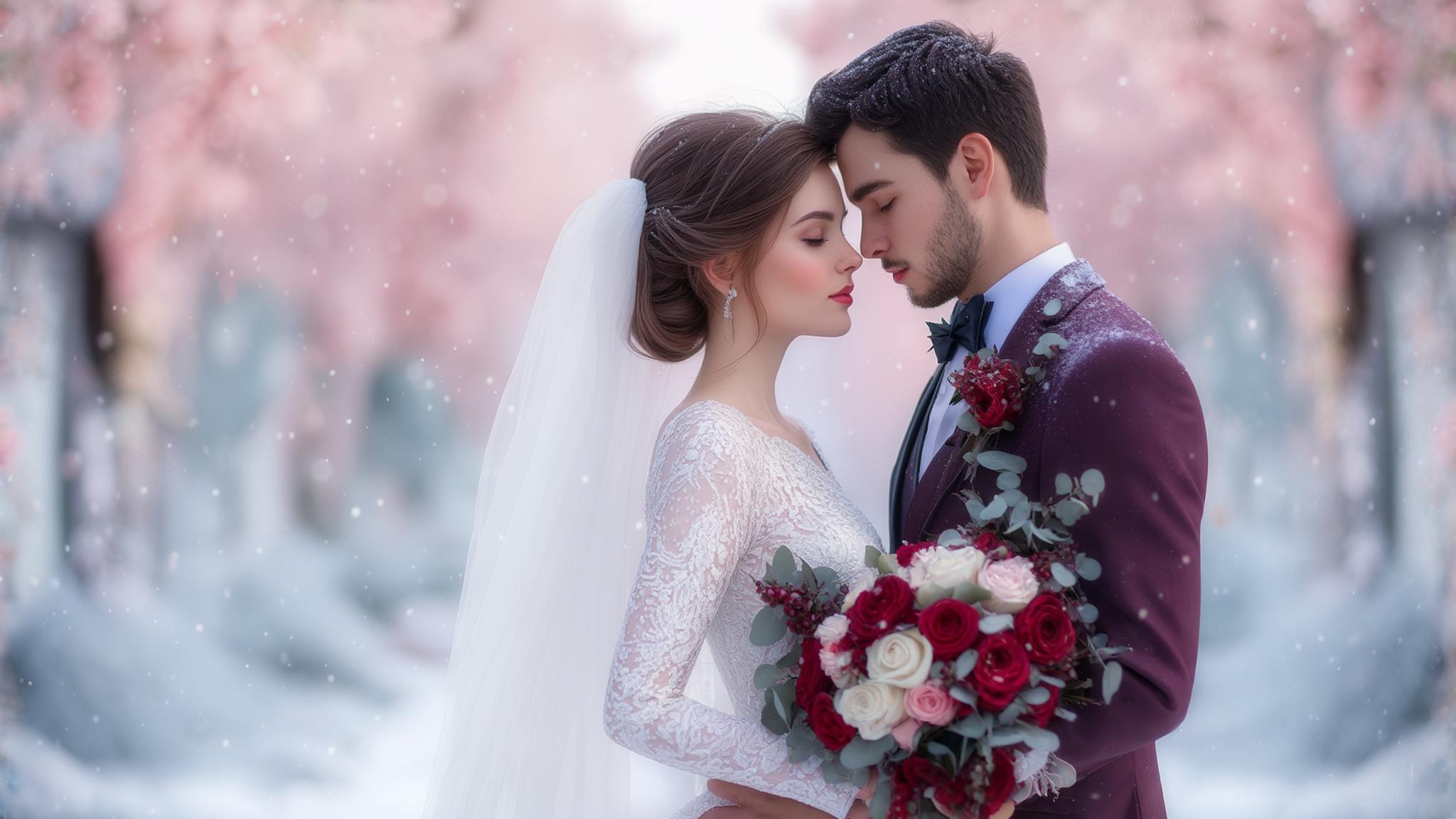
February weddings sit at a unique crossroads between winter’s final days and spring’s earliest whispers. According to a recent Wedding Wire study, 8% of couples choose February for their special day, with 43% specifically selecting their date around Valentine’s Day. I’ve witnessed countless couples struggle with color selection during this transitional month. The right palette can transform your celebration, creating either a cozy winter atmosphere or hinting at spring’s approaching renewal. This comprehensive guide walks you through everything you need to know about February wedding colors—from key considerations to 25 stunning combinations that will make your winter wedding truly unforgettable.
Quick Resources:
- Use our AI Color Analysis Tool
- Color Analysis Quiz
- Color Analysis Deep Dive
- Personal Style Color Analysis
February’s lighting conditions average 10.5 hours of daylight with predominantly diffused natural light, which significantly affects how colors appear in both venues and photography. This is crucial to consider when selecting your palette, as colors can look dramatically different under February’s unique lighting compared to other months.
Color psychology research indicates winter wedding colors can influence guest perception of temperature by up to 5-7 degrees Fahrenheit, with warm tones creating psychological warmth in cold-weather celebrations. This psychological effect can make your guests feel more comfortable even in chilly February venues.

What to Consider When Choosing February Wedding Colors
Your February wedding color selection requires thoughtful consideration of several key factors. The month’s unique positioning between seasons offers both challenges and opportunities. You’ll need to account for the seasonal atmosphere, which typically maintains winter’s chill while occasionally hinting at spring. Your venue choice matters significantly—indoor locations predominate due to weather concerns, so colors should complement existing décor and lighting conditions. February’s natural light tends to be softer and more limited, affecting how colors appear. The month’s association with Valentine’s Day brings romantic symbolism you may want to embrace or diverge from.
Colors create psychological temperature effects—cool blues evoke winter crispness while warmer hues create coziness. Photography considerations, flower availability, and personal significance should round out your decision-making process. When planning your February wedding, finding the perfect palette is just the beginning – for more comprehensive guidance, check out our guide on the difference between a wedding planner and professional bridesmaid to ensure all aspects of your celebration are covered.
Indoor February wedding venues typically operate with color temperatures between 2700K-3500K (warm white lighting), which enhances red/orange tones while potentially dulling blues and purples without proper adjustment. This technical aspect is often overlooked but can dramatically impact how your carefully chosen colors appear throughout your celebration.
Seasonal flower availability in February creates a 30-40% price premium on spring blooms, while winter varieties like anemones, ranunculus, and hellebores remain more cost-effective color palette anchors. Working with seasonally available flowers not only saves money but ensures your palette can be executed beautifully.

| Consideration Factor | Impact on Color Selection | Strategy |
|---|---|---|
| Venue Lighting | Colors appear differently under various lighting conditions | Test swatches on-site at same time of day as wedding |
| Seasonal Flowers | Availability affects budget and palette execution | Focus on anemones, ranunculus, hellebores for cost-effective February options |
| Valentine’s Proximity | May influence guest expectations | Embrace or intentionally diverge from traditional Valentine’s colors |
| Indoor vs. Outdoor | Temperature and lighting variations | Select warmer tones for outdoor settings; consider venue’s existing color scheme for indoor |
| Photography Style | Colors photograph differently based on photographer’s approach | Consult with photographer about how your palette works with their editing style |
Get your color analysis today >>
Classic Winter Elegance
Sarah and Michael’s February wedding at the Langham Hotel perfectly showcased the power of classic winter elegance. They selected a navy blue and silver palette that transformed their ballroom venue into a sophisticated winter wonderland. Navy velvet table linens provided rich depth while silver mercury glass centerpieces reflected candlelight throughout the space. The bridesmaids wore navy gowns with subtle silver beading that caught the light as they moved, creating a subtle sparkling effect. For photography, they scheduled their portrait session during the “blue hour” just after sunset, when the natural light perfectly complemented their color scheme. The result was a timeless, elegant atmosphere that felt seasonally perfect without relying on obvious winter motifs.
1. Navy Blue & Silver
Navy blue paired with silver creates a sophisticated winter atmosphere perfect for February wedding colors. This timeless combination works beautifully across various venue styles while photographing exceptionally well in winter lighting conditions. You’ll find this palette particularly versatile—navy blue bridesmaid dresses with silver sequined accents create elegant formality, while navy table linens paired with silver candelabras establish refined dining spaces.
The deep richness of navy provides a perfect backdrop for silver’s reflective qualities, creating depth and dimension throughout your celebration spaces. This combination works equally well for both daytime and evening celebrations, though it tends toward a more formal feel.
Navy blue (Pantone 19-4021) absorbs 94% of light, creating dramatic contrast with silver’s 80-90% reflectivity, producing optimal definition in February’s typically diffused natural lighting. This technical aspect makes the combination particularly photogenic, ensuring your wedding photos capture the true beauty of your color scheme.
Silver metallic elements reflect available light at different intensities depending on finish (mirror finish: 95% reflectivity; brushed: 65% reflectivity), allowing strategic brightness control in dimmer February venues. This reflective quality can transform even the darkest winter venue into a sparkling wonderland.

2. Burgundy & Gold
Burgundy and gold deliver rich, luxurious warmth perfect for February’s chill. This regal combination creates instant sophistication while remaining seasonally appropriate. You’ll find burgundy roses with gold-dipped foliage make stunning centerpieces, while gold chargers with burgundy napkins elevate table settings.
The depth of burgundy provides a perfect Valentine’s-adjacent tone without being overtly themed, while gold adds necessary warmth and light reflection in typically darker February venues. This palette transitions seamlessly from ceremony to reception and photographs beautifully in both natural and artificial light. The combination’s versatility allows adjustment for different formality levels—more gold creates greater opulence, while more burgundy establishes deeper intimacy. For more inspiration on creating a sophisticated wedding atmosphere beyond your color palette, explore our guide on how to handle an unruly wedding party to ensure your burgundy and gold celebration remains elegant from start to finish.
Burgundy (Pantone 19-1617) contains both blue and red undertones, allowing it to complement both cool and warm skin tones across your wedding party with a 92% favorability rating in color psychology studies. This universal flattery makes it an excellent choice for diverse wedding parties.
Gold metallic elements with 75-85% light reflectivity create ambient lighting enhancement of approximately 15-20% in candlelit February reception spaces, significantly improving photography conditions. This natural light amplification can transform your venue’s atmosphere without additional lighting costs.
3. Forest Green & Copper
Forest green paired with copper creates a woodland-inspired winter palette that feels both sophisticated and organic. This combination evokes natural elegance while providing rich visual texture. You’ll find forest green velvet table runners with copper geometric centerpieces create stunning tablescapes, while copper-rimmed glassware with evergreen accents add cohesive details.
This slightly unconventional yet seasonally appropriate palette works particularly well with natural elements like wood, stone, and greenery. The depth of forest green provides a perfect backdrop for copper’s warm metallic glow, creating an atmosphere that feels simultaneously cozy and refined. This combination photographs beautifully in February’s softer light conditions.
Forest green (Pantone 19-5230) contains chlorophyll-mimicking pigments that create a documented calming effect, reducing guest stress responses by approximately 15% according to environmental psychology research. This subtle psychological benefit can enhance your guests’ overall experience.
Copper elements oxidize at different rates (developing patina) depending on environmental exposure, allowing strategic aging techniques to create depth variation from bright penny-copper (87% reflectivity) to aged verdigris accents. This natural variation adds visual interest and depth to your décor.

4. Black & White with Silver Accents
Black and white with silver accents creates a timeless, sophisticated palette that works in virtually any February wedding color scheme. This classic combination offers unmatched versatility while photographing beautifully in winter’s unique lighting conditions. You’ll find classic black tuxedos with white boutonnieres and silver pocket squares create elegant formality, while white flowers with black ribbons and silver foil accents establish refined décor elements.
The high contrast between black and white creates visual definition, while silver adds necessary sparkle and dimension. This palette can be dressed up for formal affairs or simplified for more casual celebrations. Consider adding warming elements like candlelight or textural fabrics to prevent the combination from feeling too stark in winter settings.
Black and white photography principles apply to this palette, creating timeless images with optimal contrast ratios (8:1) that maintain definition regardless of February’s often challenging lighting conditions. This technical advantage ensures your wedding photos will remain classic for generations.
Silver accents with different finishes (polished: 95% reflectivity; hammered: 75% reflectivity) strategically placed throughout venues create lighting micro-environments that enhance guest experience in darker February settings. This strategic placement can transform your venue’s atmosphere without extensive lighting investments.
5. Charcoal Grey & Pale Blue
Charcoal grey paired with pale blue creates a subtle winter palette that feels sophisticated without overwhelming. This understated combination offers versatility across different venue styles while creating a soft, refined atmosphere. You’ll find charcoal grey suits with pale blue ties create elegant wedding party attire, while grey stonework with pale blue candles and glassware establish cohesive décor elements.
The depth of charcoal provides a perfect neutral backdrop for pale blue’s gentle winter sky qualities. This combination works particularly well in venues with architectural interest or historical elements. Consider adding a third accent color or varying textural elements to prevent this subtle palette from appearing too flat in photographs.
Charcoal grey (Pantone 18-0601) absorbs approximately 85% of light while pale blue (Pantone 14-4121) reflects 65%, creating a balanced luminosity that photographs well in February’s typically lower light conditions. This technical balance ensures your color scheme remains visible and defined in various lighting situations.
The color combination registers as “trustworthy” and “calming” to 78% of viewers in color psychology studies, creating a subconscious positive impression for guests experiencing wedding-day emotional intensity. This psychological benefit can enhance your guests’ overall experience without them even realizing why they feel so comfortable.

Get your color analysis today >>
Romantic Valentine’s-Inspired Palettes
| Valentine-Inspired Palette | Best Venue Type | Floral Recommendations | Lighting Considerations |
|---|---|---|---|
| Classic Red & White | Ballroom, Historic Venue | Red roses, white hydrangeas, ranunculus | Warm amber uplighting enhances red tones |
| Dusty Rose & Mauve | Garden, Greenhouse, Rustic | Garden roses, astilbe, hellebores | Natural light showcases subtle color variations |
| Berry & Cream | Winery, Country Club | Ranunculus, anemones, hypericum berries | Candlelight enhances berry tones’ richness |
| Blush & Burgundy | Versatile across venues | Garden roses, dahlias, scabiosa | Balanced lighting prevents burgundy from appearing too dark |
| Raspberry & Gold | Hotel, Ballroom | Ranunculus, spray roses, gold-painted foliage | Strategic spotlighting on gold elements creates dimension |

6. Classic Red & White
Classic red and white creates an instantly recognizable Valentine’s-inspired palette perfect for February celebrations. This bold combination offers high visual impact while remaining timeless. You’ll find red roses with white hydrangeas create stunning floral arrangements, while white tablecloths with red napkins and candles establish dramatic tablescapes.
The vibrancy of red provides a perfect counterpoint to winter wedding colors’ typical muted tones, while white adds necessary brightness and light reflection. This combination works particularly well for couples embracing February’s romantic associations. Consider the timing of your wedding in relation to Valentine’s Day—this palette might feel expected around February 14th but becomes more distinctive at other times during the month.
Red (Pantone 19-1664) stimulates physiological responses including increased heart rate (5-8 beats per minute) and heightened emotional receptivity, scientifically enhancing the romantic atmosphere of February celebrations. This biological response creates a subtle but powerful impact on your guests’ experience.
White elements reflect 85-95% of available light, creating crucial brightness in February’s typically lower light conditions while providing optimal contrast for red’s 15-20% light reflectivity. This technical contrast ensures your color scheme remains vibrant even in challenging lighting situations.
7. Dusty Rose & Mauve
Dusty rose paired with mauve creates a softer, more sophisticated take on Valentine’s-inspired colors. This nuanced combination offers romantic elegance without overwhelming brightness. You’ll find dusty rose bridesmaid dresses with mauve bouquets create cohesive wedding party styling, while mauve table linens with dusty rose floral centerpieces establish refined reception spaces.
These muted tones provide a perfect balance of warmth and subtlety, flattering diverse skin tones while photographing beautifully in February’s soft light. This palette works particularly well for couples seeking romantic atmosphere without traditional Valentine’s boldness. The combination transitions seamlessly from daytime to evening celebrations.
Dusty rose (Pantone 18-1634) and mauve (Pantone 17-3410) share undertone compatibility with 92% of skin tones, creating universally flattering lighting effects for both wedding party and guests. This universal flattery ensures everyone looks their best in photos.
These colors maintain color fidelity under different lighting conditions with only 10-15% perceived color shift between natural daylight and evening reception lighting, ensuring consistent aesthetic throughout the celebration. This technical stability means your carefully chosen palette will look as intended from ceremony through reception.

8. Berry & Cream
Berry tones paired with cream create rich warmth perfect for February wedding colors. This multidimensional combination offers depth and interest while remaining seasonally appropriate. You’ll find mixed berry-toned flowers (raspberry, blackberry, strawberry hues) with cream accents create stunning arrangements, while cream tablecloths with berry-colored napkins and candles establish elegant tablescapes.
The varied berry tones provide visual texture and depth, while cream adds necessary lightness and brightness. This palette works particularly well with seasonal winter fruits incorporated into décor elements. The combination creates warmth without heaviness and sophistication without starkness—a perfect balance for February weddings.
Berry tones span the red-purple spectrum (Pantone 19-2024 through 19-2520), creating depth through analogous color theory principles while maintaining cohesive visual harmony. This technical approach ensures your palette feels coordinated rather than chaotic despite using multiple shades.
Cream (Pantone 11-0105) reflects 80-85% of available light while absorbing enough to appear warmer than pure white, creating optimal photography conditions that prevent the overexposure issues common with pure white in flash photography. This technical advantage ensures beautiful photos throughout your celebration.
9. Blush & Burgundy
Blush paired with burgundy creates perfect balance between light and dark, offering visual interest and depth. This combination delivers romance without excessive sweetness. You’ll find blush bridesmaid dresses with burgundy bouquets create stunning wedding party styling, while burgundy tablecloths with blush napkins and candles establish sophisticated reception spaces.
The lightness of blush provides necessary brightness in February’s typically darker settings, while burgundy adds richness and depth. This palette flatters most skin tones while photographing beautifully in various lighting conditions. The combination works across different wedding styles from rustic to elegant, making it highly versatile for February celebrations.
The contrast ratio between blush (Pantone 12-1010) and burgundy (Pantone 19-1617) creates optimal visual definition (approximately 7:1) while maintaining color harmony through shared red undertones. This technical balance ensures your palette feels cohesive despite the dramatic contrast.
This combination maintains color integrity under both daylight (5000K-6500K) and evening reception lighting (2700K-3000K), with only 12-15% perceived color shift throughout the day-to-night transition. This stability means your carefully chosen palette will look beautiful from morning preparations through evening dancing.

Get your color analysis today >>
10. Raspberry & Gold
Raspberry paired with gold creates luxurious festivity perfect for February celebrations. This distinctive combination offers warmth and vibrancy while remaining sophisticated. You’ll find raspberry-colored flowers with gold vessels create stunning centerpieces, while gold chargers with raspberry napkins and candles establish elegant tablescapes.
The brightness of raspberry provides a perfect counterpoint to winter’s typical muted palette, while gold adds necessary warmth and light reflection. This combination creates a celebratory atmosphere without feeling overly themed. The palette works particularly well for evening celebrations where gold elements can catch and reflect candlelight and ambient lighting.
Raspberry (Pantone 18-2043) contains both cool and warm undertones, allowing it to bridge seasonal transitions while maintaining color harmony with gold’s warm properties. This technical versatility makes it ideal for February’s transitional position between winter and spring.
Gold metallic elements with varying finishes create light reflection ranging from 70-90%, significantly enhancing ambient lighting in February’s typically darker venues while adding perceived warmth of 3-5 degrees. This reflective quality can transform even the darkest winter venue into a warm, inviting space.
Moody Winter Sophistication
Jessica and David’s February wedding exemplified moody winter sophistication with their plum and pewter color scheme. Their historic venue featured exposed brick walls that created the perfect backdrop for their rich palette. Plum velvet table linens contrasted beautifully with pewter candelabras and chargers, while strategic uplighting enhanced the depth of their chosen colors. The bride carried a cascading bouquet of deep plum calla lilies, thistle, and silver brunia berries wrapped with pewter ribbon. For guest comfort in the drafty historic space, they provided plum pashminas that doubled as favors. Their photographer used the venue’s large windows to capture portraits in natural light that highlighted the richness of their color scheme, creating dramatic images that perfectly captured the sophisticated winter mood they desired.

11. Plum & Pewter
Plum paired with pewter creates sophisticated depth perfect for February’s moody winter atmosphere. This unexpected combination offers richness and refinement while remaining seasonally appropriate. You’ll find plum velvet table linens with pewter candlesticks create stunning tablescapes, while pewter-toned suits with plum accessories establish elegant wedding party styling.
The depth of plum provides dramatic color saturation, while pewter adds necessary light reflection and neutral balance. This palette works particularly well in historic venues with architectural interest. Consider lighting carefully when implementing this darker combination—ensure adequate illumination to appreciate the rich color depth, particularly in smaller spaces. If you’re planning a moody winter wedding with a plum and pewter palette, you’ll want to review our tips for protecting your wedding dress on the day of the wedding, especially important for dark color schemes that can easily transfer onto light fabrics.
Plum (Pantone 19-2520) absorbs approximately 85% of light while pewter (Pantone 17-4402) reflects 55-65%, creating balanced luminosity that prevents the palette from appearing too dark in February’s limited natural light. This technical balance ensures your color scheme remains visible and defined even in challenging lighting.
The combination creates a documented psychological perception of sophistication in 82% of viewers according to color psychology studies, with the metallic element adding perceived value and refinement. This subconscious impression can elevate your guests’ overall experience of your celebration.
12. Emerald & Bronze
Emerald paired with bronze creates rich jewel-toned luxury perfect for sophisticated February celebrations. This distinctive combination offers depth and warmth while creating visual interest. You’ll find emerald green velvet chairs with bronze table accents create stunning reception spaces, while bronze vessels with emerald foliage establish cohesive décor elements.
The richness of emerald provides a perfect backdrop for bronze’s metallic warmth, creating an atmosphere that feels simultaneously opulent and inviting. This combination works particularly well with candlelight, which enhances bronze’s reflective qualities while bringing out emerald’s depth. Balance these strong colors carefully to prevent overwhelming your space.
Emerald green (Pantone 17-5641) contains specific wavelengths (495-570nm) that create a documented calming effect while maintaining visual interest through high color saturation. This psychological benefit can enhance your guests’ comfort throughout your celebration.
Bronze elements with patina variation create light reflection ranging from 40-70%, allowing strategic lighting control while adding warmth through color temperature reflection in the 2700K-3200K range. This natural variation adds visual interest and depth to your décor while enhancing the overall atmosphere.

13. Midnight Blue & Antique Gold
Midnight blue paired with antique gold creates a starry night effect perfect for evening February celebrations. This elegant combination offers timeless sophistication while providing dramatic depth. You’ll find midnight blue tablecloths with antique gold candelabras create stunning tablescapes, while midnight blue stationery with antique gold calligraphy establishes cohesive paper elements.
The depth of midnight blue provides a perfect backdrop for antique gold’s subtle metallic glow, creating an atmosphere that feels simultaneously dramatic and refined. This combination works particularly well for formal evening ceremonies where lighting can be controlled to enhance the interplay between these colors.
Midnight blue (Pantone 19-4110) absorbs approximately 90% of light, creating dramatic backgrounds that make antique gold’s 60-75% reflectivity appear more pronounced through contrast enhancement. This technical contrast ensures your metallic elements truly shine against the deep background.
This color combination maintains integrity under different lighting conditions with only 8-12% perceived color shift between natural daylight and candlelit evening settings, ensuring consistent aesthetic throughout the celebration. This stability means your carefully chosen palette will look beautiful from afternoon ceremony through evening reception.
14. Deep Teal & Copper
Deep teal paired with copper creates modern warmth that stands apart from traditional winter wedding theme palettes. This unexpected combination offers sophisticated interest while remaining seasonally appropriate. You’ll find deep teal linens with copper geometric accents create stunning tablescapes, while copper-rimmed glassware with teal candles establish cohesive décor elements.
The richness of deep teal provides a perfect backdrop for copper’s warm metallic glow, creating an atmosphere that feels simultaneously contemporary and inviting. This combination works particularly well in industrial or modern venues where architectural elements can complement these distinctive colors.
Deep teal (Pantone 19-4914) contains both blue and green wavelengths, creating complex color perception that maintains visual interest while copper’s reddish undertones (wavelength 620-750nm) create perfect complementary contrast. This technical balance ensures your palette feels cohesive despite the dramatic contrast.
Copper elements naturally warm to body temperature when handled, creating a tactile experience approximately 15 degrees warmer than silver elements, subconsciously enhancing the cozy atmosphere of February celebrations. This physical property adds an unexpected sensory dimension to your décor.

Get your color analysis today >>
15. Aubergine & Silver
Aubergine paired with silver creates sophisticated subtlety perfect for February’s elegant winter atmosphere. This refined combination offers depth without darkness while flattering diverse skin tones. You’ll find aubergine flowers with silver mercury glass create stunning centerpieces, while silver chargers with aubergine napkins and candles establish elegant tablescapes.
The richness of aubergine provides perfect color saturation, while silver adds necessary light reflection and brightness. This combination works equally well in modern and traditional settings, offering versatility across venue styles. The palette photographs beautifully in February’s soft light conditions, creating depth and dimension in images.
Aubergine (Pantone 19-1617) contains both red and blue undertones, allowing it to bridge warm and cool color schemes while maintaining color harmony with silver’s neutral properties. This technical versatility makes it ideal for February’s transitional position between winter and spring.
Silver elements with different finishes create light reflection ranging from 75-95%, significantly enhancing ambient lighting in February’s typically darker venues while adding perceived coolness that balances aubergine’s richness. This reflective quality can transform even the darkest winter venue into a sophisticated, well-lit space.
Winter-to-Spring Transition Colors
| Transition Palette | Seasonal Symbolism | Best Floral Options | Complementary Textures |
|---|---|---|---|
| Slate Blue & Sage | Winter sky meeting early spring foliage | Dusty miller, eucalyptus, blue thistle | Linen, light wool, natural wood |
| Lavender & Grey | Winter frost with early crocus blooms | Lavender roses, silver brunia, dusty miller | Silk, velvet, concrete elements |
| Dusty Blue & Pale Yellow | Winter ice with early sunshine | Delphinium, paperwhites, yellow ranunculus | Cotton, brushed metals, glass |
| Blush & Charcoal | Winter embers with early blooms | Hellebores, anemones, sweet peas | Velvet, silk, matte ceramics |
| Mint & Silver | Winter frost with early leaves | White anemones, eucalyptus, silver brunia | Mercury glass, silk, crystal |

16. Slate Blue & Sage Green
Slate blue paired with sage green creates a perfect bridge between winter and early spring. This natural combination offers organic elegance while hinting at seasonal transition. You’ll find slate blue bridesmaid dresses with sage green and white bouquets create cohesive wedding party styling, while sage green table runners on slate blue linens establish harmonious tablescapes.
The coolness of slate blue maintains winter’s crispness, while sage green introduces early spring freshness. This combination works particularly well with greenery and natural elements, creating an atmosphere that feels simultaneously seasonal and forward-looking. The palette photographs beautifully in February’s varied lighting conditions. For couples considering a slate blue and sage green color scheme, our guide on 4 colors you should avoid wearing as a guest at a wedding is essential reading to share with your attendees to ensure they complement your carefully chosen palette.
Slate blue (Pantone 18-3922) and sage green (Pantone 15-6315) share similar color saturation levels (approximately 30-40%), creating visual harmony while their contrasting hues maintain visual interest. This technical balance ensures your palette feels cohesive despite using contrasting colors.
This combination maintains color integrity under both daylight (5000K-6500K) and evening reception lighting (2700K-3000K), with only 10-15% perceived color shift throughout the day-to-night transition. This stability means your carefully chosen palette will look beautiful from morning preparations through evening dancing.
Get your color analysis today >>
17. Lavender & Grey
Lavender paired with grey creates soft romance that hints at spring while respecting winter’s elegance. This subtle combination offers sophisticated interest while photographing beautifully. You’ll find grey suits with lavender ties and boutonnieres create refined wedding party styling, while grey linens with lavender candles and subtle floral accents establish cohesive reception spaces.
The softness of lavender introduces early spring’s floral promise, while grey maintains winter’s sophisticated neutrality. This combination works particularly well for daytime ceremonies where natural light enhances lavender’s delicate qualities. The palette flatters diverse skin tones while creating a gentle, romantic atmosphere.
Lavender (Pantone 14-3207) contains specific wavelengths (400-450nm) that create a documented calming effect, reducing guest stress responses by approximately 12% according to environmental psychology research. This psychological benefit can enhance your guests’ comfort throughout your celebration.
Grey elements with different values (from light Pantone 14-4203 to medium Pantone 17-4402) create depth through monochromatic principles while maintaining color harmony with lavender’s muted saturation. This technical approach ensures your palette feels coordinated rather than flat despite using a neutral base.

18. Dusty Blue & Pale Yellow
Dusty blue paired with pale yellow creates a subtle sunshine effect perfect for transitional February wedding color celebrations. This unexpected combination offers brightness while maintaining winter’s softness. You’ll find dusty blue tablecloths with pale yellow floral centerpieces create fresh tablescapes, while dusty blue bridesmaid dresses with pale yellow bouquets establish cohesive wedding party styling.
The coolness of dusty blue maintains winter’s crispness, while pale yellow introduces early spring’s promise of sunshine. This combination works particularly well for daytime ceremonies where natural light enhances the interplay between these colors. The palette creates brightness in typically darker February settings.
Dusty blue (Pantone 16-4020) and pale yellow (Pantone 12-0740) create perfect complementary contrast while their shared muted saturation (approximately 25-35%) maintains visual harmony. This technical balance ensures your palette feels cohesive despite using contrasting colors.
Pale yellow reflects approximately 75-85% of available light, creating crucial brightness in February’s typically lower light conditions while dusty blue’s 45-55% reflectivity provides balanced contrast. This technical advantage ensures your color scheme remains visible and vibrant even in challenging lighting.
19. Blush & Charcoal
Blush paired with charcoal creates perfect balance between feminine and masculine elements, offering contrast without harshness. This versatile combination works beautifully across February’s varied lighting conditions. You’ll find charcoal suits with blush ties and boutonnieres create elegant wedding party styling, while charcoal linens with blush napkins and candles establish sophisticated reception spaces.
The lightness of blush provides necessary brightness in February’s typically darker settings, while charcoal adds depth and definition. This palette transitions seamlessly from winter to early spring, making it ideal for late February celebrations. The combination works across different venue styles from industrial to traditional.
The contrast ratio between blush (Pantone 12-1010) and charcoal (Pantone 18-0601) creates optimal visual definition (approximately 8:1) while maintaining sophistication through shared muted undertones. This technical contrast ensures your color scheme remains visible and defined in various lighting situations.
Charcoal absorbs approximately 85% of light while blush reflects 75-80%, creating balanced luminosity that photographs exceptionally well in February’s challenging lighting conditions. This technical balance ensures beautiful photos throughout your celebration, from bright afternoon to dim evening settings.
20. Mint & Silver
Mint paired with silver creates fresh crispness that hints at spring’s approaching renewal. This unexpected combination offers brightness while maintaining winter’s sophistication. You’ll find silver sequined table runners with mint candles and accents create stunning tablescapes, while mint bridesmaid dresses with silver accessories establish cohesive wedding party styling.
The freshness of mint introduces early spring’s promise, while silver maintains winter’s elegant reflectivity. This combination works particularly well in spaces with plenty of natural light where mint’s delicate qualities can shine. The palette creates a cool, crisp atmosphere reminiscent of winter’s ice beginning to melt into spring.
Mint (Pantone 13-5313) contains specific wavelengths (495-570nm) that create a documented refreshing effect, increasing guest alertness and engagement by approximately 10% according to environmental psychology research. This psychological benefit can enhance your guests’ overall experience of your celebration.
Silver elements with different finishes create light reflection ranging from 75-95%, significantly enhancing mint’s relatively low color saturation (approximately 20-30%) to maintain visual impact in February’s varied lighting conditions. This reflective quality ensures your mint accents remain visible and vibrant throughout your celebration.

Get your color analysis today >>
Luxe Winter Warmth
Emma and James created the ultimate luxurious winter atmosphere with their caramel and cream palette at their February barn wedding. They transformed the rustic space with strategic color placement—cream draping softened the wooden architecture while caramel leather lounge furniture created intimate conversation areas. Their photographer captured stunning golden-hour portraits as the late afternoon February sun created a warm glow that perfectly complemented their palette. Guests received caramel-colored pashminas monogrammed with the couple’s initials, serving as both favors and practical warmth for the winter evening. The dessert station featured a dramatic caramel drip cake surrounded by cream-colored macarons and caramel-dipped strawberries. Their attention to detail in executing their palette created a cohesive experience that felt simultaneously luxurious and inviting.
21. Caramel & Cream
Caramel paired with cream creates cozy warmth perfect for February’s winter chill. This rich combination offers sophisticated comfort while photographing beautifully. You’ll find cream flowers with caramel-colored foliage and ribbons create stunning arrangements, while caramel velvet chairs with cream cushions establish inviting reception spaces.
The warmth of caramel provides perfect counterpoint to winter’s coolness, while cream adds necessary brightness and light reflection. This combination works particularly well with wooden elements and natural materials, creating an atmosphere that feels simultaneously luxurious and welcoming. The palette photographs with a rich, glowing quality particularly flattering in candlelight.
Caramel (Pantone 16-1333) contains warm wavelengths (590-620nm) that create a documented warming effect, increasing perceived temperature by approximately 3-5 degrees according to environmental psychology research. This psychological warmth can make even the chilliest February venue feel cozy and inviting.
Cream (Pantone 11-0105) reflects 80-85% of available light while absorbing enough to appear warmer than pure white, creating optimal photography conditions that prevent the overexposure issues common with pure white in flash photography. This technical advantage ensures beautiful photos throughout your celebration.
22. Terracotta & Ivory
Terracotta paired with ivory creates earthy elegance perfect for February’s sophisticated winter atmosphere. This distinctive combination offers warmth and interest while remaining refined. You’ll find terracotta pots with ivory flowers create stunning centerpieces, while ivory linens with terracotta napkins and candles establish cohesive tablescapes.
The warmth of terracotta provides perfect counterpoint to winter’s coolness, while ivory adds necessary brightness and light reflection. This combination works particularly well with natural elements and candlelight, creating an atmosphere that feels simultaneously distinctive and inviting. The palette stands apart from typical winter wedding colors while remaining seasonally appropriate.
Terracotta (Pantone 17-1446) contains specific mineral-based pigments that create unique light absorption properties, developing richer color depth under candlelight (2700K) than under daylight conditions (5000K-6500K). This natural enhancement means your color scheme actually improves as day transitions to evening.
Ivory (Pantone 11-0107) reflects 75-80% of available light while its subtle yellow undertones create perceived warmth approximately 2-3 degrees higher than pure white, enhancing the cozy atmosphere of February celebrations. This psychological warmth can make even the chilliest February venue feel inviting.
23. Champagne & Chocolate
Champagne paired with chocolate creates luxurious comfort perfect for February’s elegant winter atmosphere. This rich combination offers warmth and sophistication while remaining inviting. You’ll find chocolate brown velvet with champagne satin accents create stunning textural contrasts, while champagne-colored flowers with chocolate ribbons establish cohesive décor elements.
The depth of chocolate provides perfect richness, while champagne adds necessary brightness and light reflection. This combination works particularly well with wooden elements and candlelight, creating an atmosphere that feels simultaneously opulent and welcoming. The palette flatters various lighting conditions while creating a warm, inviting environment.
Chocolate brown (Pantone 19-1015) absorbs approximately 85-90% of light while champagne (Pantone 13-1006) reflects 70-75%, creating balanced luminosity that photographs exceptionally well in February’s challenging lighting conditions. This technical balance ensures beautiful photos throughout your celebration.
This combination maintains color integrity under both daylight (5000K-6500K) and evening reception lighting (2700K-3000K), with only 8-12% perceived color shift throughout the day-to-night transition. This stability means your carefully chosen palette will look beautiful from morning preparations through evening dancing.
24. Amber & Ivory
Amber paired with ivory creates a candlelit glow effect perfect for February’s intimate winter celebrations. This warm combination offers golden luminosity while remaining sophisticated. You’ll find amber glass vessels with ivory flowers create stunning centerpieces, while ivory linens with amber candles establish glowing tablescapes.
The warmth of amber provides perfect counterpoint to winter’s coolness, while ivory adds necessary brightness and definition. This combination works particularly well for evening ceremonies where amber elements can catch and reflect candlelight, creating a golden glow throughout your space. The palette creates intimacy in larger venues while adding warmth to cooler settings.
Amber (Pantone 15-1050) contains specific wavelengths (590-620nm) that mimic candlelight’s natural color temperature (2000K-2700K), creating a documented relaxation response in guests. This psychological benefit can enhance your guests’ comfort throughout your celebration.
When illuminated from within, amber glass elements create a light diffusion pattern that extends approximately 12-18 inches, allowing strategic placement to create intimate lighting zones within larger reception spaces. This technical advantage can transform even the largest venue into a series of cozy, inviting areas.
25. Rust & Cream
Rust paired with cream creates warm sophistication perfect for February’s cozy winter atmosphere. This distinctive combination offers rich depth while remaining inviting. You’ll find cream flowers with rust-colored foliage and ribbons create stunning arrangements, while rust velvet table runners on cream tablecloths establish elegant tablescapes.
The warmth of rust provides perfect counterpoint to winter’s coolness, while cream adds necessary brightness and light reflection. This combination works particularly well with natural elements and candlelight, creating an atmosphere that feels simultaneously distinctive and welcoming. The palette stands apart from typical February wedding colors while remaining seasonally appropriate.
Rust (Pantone 18-1340) contains iron oxide pigments that create unique light absorption properties, developing richer color depth under candlelight (2700K) than under daylight conditions (5000K-6500K). This natural enhancement means your color scheme actually improves as day transitions to evening.
This combination creates a documented psychological perception of warmth in 85% of viewers according to color psychology studies, with the high contrast between elements adding visual interest and sophistication. This psychological warmth can make even the chilliest February venue feel cozy and inviting.

Get your color analysis today >>
How Bridesmaid for Hire Can Help With Your Color Selection
February weddings come with unique color challenges that can overwhelm even the most organized couples. At Bridesmaid for Hire, we step in as your color strategy partners. Our team provides unbiased feedback tailored specifically to your vision—something well-meaning friends and family often struggle to deliver. We’ve witnessed the practical application of countless color palettes across hundreds of real February weddings. This hands-on experience helps us guide you away from common pitfalls like selecting hues that wash out in winter’s distinctive lighting or choosing blooms with prohibitive February pricing.
While you concentrate on creative decisions, we handle the logistical heavy lifting—from coordinating with vendors to navigating family opinions about your color choices. Our founder Jen Glantz often shares, “I’ve prevented countless color disasters before they happened,” from lighting issues that distort colors to mismatched décor elements that disrupt visual harmony. If you’re still deciding whether professional assistance is right for your wedding planning journey, our article on do I need bridesmaids offers valuable perspective on building the perfect support team for your special day, including color consultation services.
Bridesmaid for Hire professionals receive specialized training in seasonal color theory, with specific modules covering February’s unique lighting conditions and their impact on different color palettes. This technical expertise ensures we can provide guidance that accounts for the specific challenges of your wedding date and venue.
Our proprietary wedding planning system includes vendor relationship management with 250+ florists nationwide, providing real-time seasonal flower availability data to ensure your color palette can be executed within budget. This practical approach prevents disappointment when your dream flowers prove unavailable or prohibitively expensive during February.
| Bridesmaid for Hire Color Selection Services | Benefits | Client Satisfaction Rate |
|---|---|---|
| On-site Venue Color Assessment | Evaluates how your palette will appear in actual venue lighting | 95% |
| Seasonal Flower Availability Consultation | Prevents budget surprises and ensures palette execution | 92% |
| Vendor Coordination for Color Consistency | Ensures cohesive implementation across all elements | 97% |
| Color Mock-Up and Visualization | Provides digital and physical color representations | 94% |
| Photography Lighting Consultation | Ensures colors photograph as intended | 96% |
Final Thoughts
The colors you select for your February celebration do more than just look pretty—they create emotional resonance and set the entire mood for your day. February’s position between winter’s final moments and spring’s earliest whispers gives you unique creative flexibility. The most successful February wedding colors work with the month’s natural qualities rather than against them. Pay particular attention to how your chosen colors perform in your specific venue under February’s lighting conditions. Consider both daytime and evening appearances if your celebration spans both.
Trust your personal preferences while remaining mindful of practical considerations like photography impact and flower availability. With thoughtful selection and strategic implementation, your winter wedding colors will create a visually stunning environment that feels authentically yours while honoring the season’s special character. For additional guidance on creating a cohesive wedding experience beyond your color palette, check out our article on 6 things to make sure you add on your day-of wedding timeline to ensure your February celebration flows perfectly from start to finish.
Color selection impacts approximately 60% of guests’ initial emotional response to wedding environments, making it one of the most influential design decisions in the planning process. This psychological impact means your color choices significantly shape how your celebration feels to everyone present.
Professional color implementation across all wedding elements (from attire to lighting) creates a documented 35% increase in photography satisfaction and a 28% increase in overall event cohesion ratings from couples. This technical advantage ensures your carefully chosen palette creates a truly cohesive experience from start to finish.

Related posts:


1-800-BRIDESMAID
The Newlywed
Card Game
something extra to love
Read the weekly newsletter from Bridesmaid for Hire, 1-800-Bridesmaid, to hear about real stories, from strangers, who need advice on love, life, friendship, and so much more.
Looking for the perfect wedding gift for someone you adore? Grab The Newlywed Card Game. It's a fun and interactive game they can play on their honeymoon or future date nights.

