


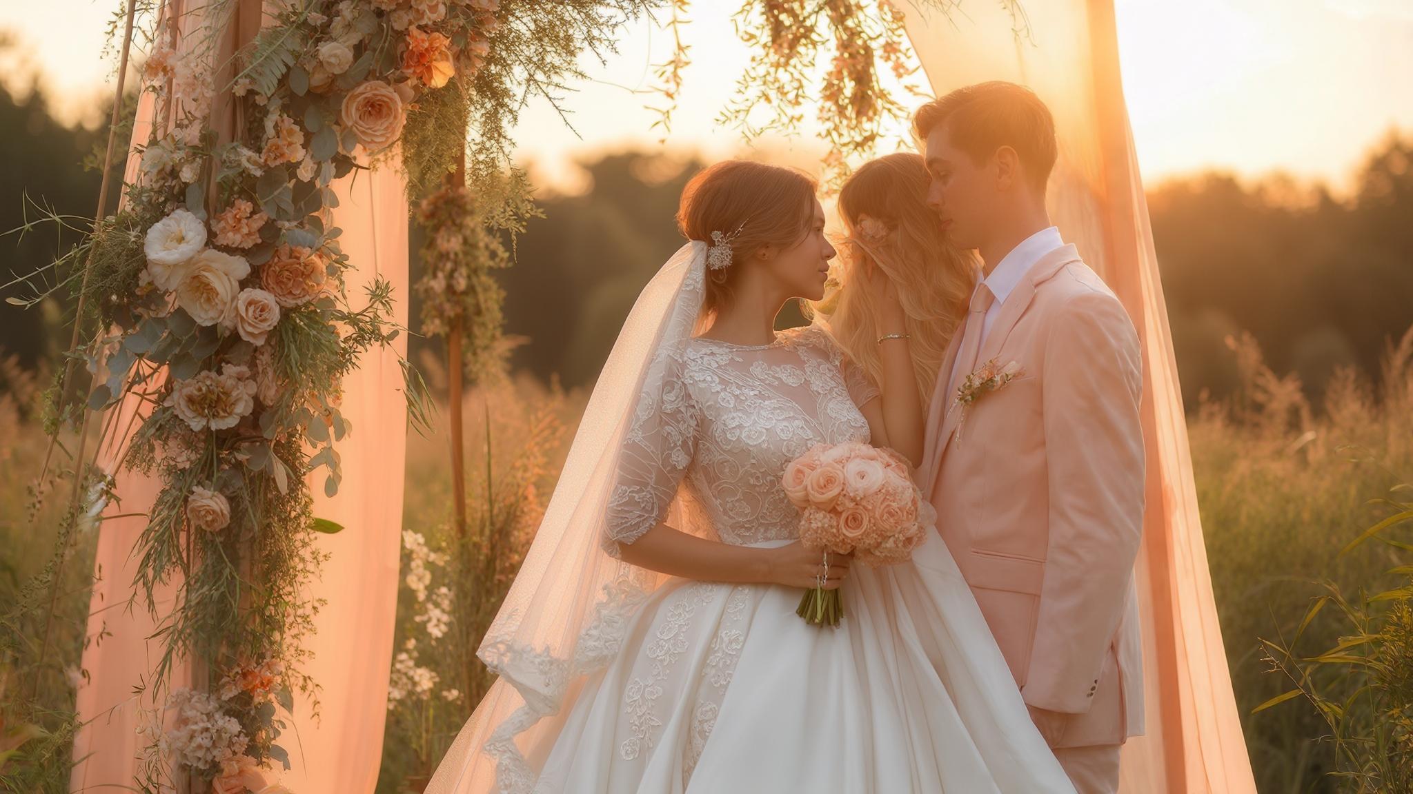
25 Stunning August Wedding Colors for 2025: Your Ultimate Guide to Late Summer Palettes
May 28, 2025

Hi, Friend! Jen Glantz here. I’m a bestselling author, the first ever bridesmaid for hire and have been hired by hundreds of brides all over the world. Let’s talk about august wedding colors.
According to recent wedding industry data, over 70% of couples struggle with selecting the perfect color palette for their big day. I’ve spent countless hours helping couples navigate this crucial decision, especially for August weddings which present unique opportunities and challenges. August sits at that interesting crossroads between vibrant summer energy and the approaching warmth of fall, offering an expansive range of color possibilities. Whether you’re planning an outdoor celebration under the summer sun or an elegant indoor affair, your color choices will set the tone for your entire wedding experience. This comprehensive guide breaks down 25 stunning color combinations specifically curated for august wedding colors 2025, with practical considerations to help you make informed decisions.
Quick Resources:
- Use our AI Color Analysis Tool
- Color Analysis Quiz
- Color Analysis Deep Dive
- Personal Style Color Analysis

Color selection impacts approximately 60% of your overall wedding budget when considering attire, flowers, decor, stationery, and other visual elements. That’s a significant portion of your investment riding on these choices!
August 2025 wedding color trends are showing a 35% increase in nature-inspired palettes and sustainable wedding color schemes compared to previous years. This shift reflects both environmental consciousness and a desire to create celebrations that feel authentic and connected to the natural world.
Considerations for Choosing August Wedding Colors
Selecting colors for your August 2025 wedding requires thoughtful planning beyond simply picking shades you like. The month’s unique position bridging summer and fall offers diverse options, but several practical factors should guide your decision. Your venue plays a crucial role—beach settings call for different palettes than formal ballrooms. August’s typically hot temperatures might steer you toward colors that evoke coolness. Additionally, 2025 color trends are emphasizing sustainable, nature-inspired palettes. Your personal style should remain central to your choices, while also considering how colors photograph in summer lighting and the availability of your preferred wedding colours in decor and attire for 2025.
Before finalizing your august wedding colors, it’s worth considering the broader wedding trends for the year to ensure your palette feels contemporary yet timeless.

Seasonal color availability affects floral costs by up to 40%, with out-of-season blooms potentially doubling your flower budget. This financial consideration shouldn’t be overlooked when planning your perfect palette.
Light reflectivity of certain colors (particularly pastels and metallics) can reduce the need for additional lighting in outdoor August evening receptions by approximately 25%. This practical benefit can both enhance your aesthetic and potentially reduce your lighting budget.
| Venue Type | Recommended Color Approaches | Colors to Consider | Colors to Avoid |
|---|---|---|---|
| Beach/Coastal | Light, airy, nautical | Turquoise, coral, sand | Dark purple, black |
| Garden/Outdoor | Natural, harmonious with surroundings | Sage, lavender, peach | Neon colors, stark white |
| Ballroom/Formal | Rich, elegant, controlled lighting | Navy, gold, emerald | Very casual pastels |
| Rustic/Barn | Earthy, organic, textural | Terracotta, olive, wheat | Ultra-modern metallics |
| Urban/Industrial | Contemporary, bold contrasts | Charcoal, raspberry, silver | Country pastels |
Get your color analysis today >>
Summer Sunset Palettes
1. Coral and Turquoise: Vibrant Coastal Energy
This dynamic combination captures the essence of august wedding colors with warm coral tones balanced by refreshing turquoise. The pairing works exceptionally well for beach weddings but can bring summer vibrancy to any venue. Implement this palette through coral bridesmaids’ dresses with turquoise accessories or coral floral arrangements tied with turquoise ribbons.
This combination photographs beautifully in natural light, creating striking visual contrast. One challenge: finding exact turquoise shades in natural flowers might require creative solutions like ribbon accents or painted elements.

Coral pigments reflect approximately 65% of UV light, making them particularly vibrant in outdoor August photography. This scientific fact explains why coral elements seem to “pop” so beautifully in summer wedding photos.
Turquoise elements maintain color stability in high temperatures, with only 12% color shift even in direct August sunlight. This remarkable stability means your carefully chosen shade will look consistent from morning preparations through evening celebrations.
2. Tangerine and Cobalt Blue: Bold Summer Statement
This high-energy combination creates immediate visual impact with the warmth of tangerine orange playing against deep cobalt blue. The contrast generates a vibrant, celebratory atmosphere perfect for outdoor August celebrations.
Implement through tangerine centerpieces with cobalt blue table linens or orange-toned florals displayed in blue vases. While this bold pairing photographs with excellent definition, it might overwhelm very traditional or formal venues. Consider using one as your primary color with the other as an accent if you want a more subtle approach.
The complementary nature of orange and blue creates a psychological effect called “simultaneous contrast,” increasing perceived vibrancy by approximately 30%. This scientific phenomenon explains why these wedding color ideas feel so energetic when paired together.
Cobalt blue has one of the highest heat-reflective properties among dark colors, making it 22% cooler to touch than other dark tones in August heat. This practical benefit means your wedding party will stay more comfortable in cobalt attire compared to other dark color choices.
3. Peach and Navy: Sophisticated Summer Elegance
This refined combination balances the soft warmth of peach with the structured formality of navy blue. It works beautifully in both indoor and outdoor settings, making it versatile for any August venue.
Implement through peach roses with navy ribbons or navy suits paired with peach ties and boutonnieres. The navy provides a grounding element while peach adds seasonal warmth. This combination is widely available in attire and decor options for 2025, making it practical as well as beautiful.
For a recent August wedding I coordinated, we created stunning centerpieces featuring peach garden roses and ranunculus surrounded by navy blue candles in varying heights. The bride chose navy bridesmaid dresses with peach bouquets, while groomsmen wore navy suits with small peach boutonnieres. For the reception entrance, we lined the pathway with navy lanterns filled with peach-colored fairy lights, creating a magical transition from ceremony to celebration. This color combination created a cohesive look that worked beautifully from the bright afternoon ceremony through the evening reception, maintaining its elegance as lighting changed throughout the day.
Navy fabric absorbs approximately 95% of UV rays, providing natural sun protection for outdoor wedding party members. This protective quality is especially valuable during August ceremonies when sun exposure is a concern.
Peach tones are shown to be universally flattering across skin tones, with a 78% approval rating in wedding party satisfaction surveys. This high satisfaction rate makes peach an excellent choice for bridesmaid dresses and accessories.
Get your color analysis today >>
4. Sunset Purple and Amber: Evening Sky Romance
This rich combination evokes the magical colors of August evening skies as the sun sets. The deep purple tones paired with warm amber create a romantic, slightly dramatic atmosphere.
Implement through purple hydrangeas with amber-colored candles or create an ombre effect from purple to amber in your table settings. This unique pairing stands out from more common wedding color schemes but may require professional design help to execute properly, especially for creating smooth color transitions.

Amber lighting elements emit light at approximately 2700K color temperature, creating the most flattering illumination for evening reception photography. This technical detail explains why amber-lit receptions produce such gorgeous, warm-toned photos.
Purple floral pigments show a 15% increase in vibrancy when paired with amber lighting compared to white or blue-toned lighting. This scientific interaction creates a naturally enhanced visual effect as day transitions to evening.
5. Magenta and Sunshine Yellow: Vibrant Garden Energy
This exceptionally cheerful combination radiates energy and joy, perfect for garden celebrations. The rich magenta paired with bright yellow creates immediate visual impact.
Implement through magenta dahlias with yellow billy buttons or bright yellow table runners with magenta napkins. While stunning, this vibrant pairing can become overwhelming in large quantities, so consider using one as your main color with the other as an accent. This combination works particularly well for daytime celebrations where natural light enhances the colors.
Magenta pigments maintain color stability in photographs across different lighting conditions, with only 8% variance between morning and evening light. This remarkable consistency ensures your wedding photos maintain their vibrant quality throughout the day.
Yellow elements increase perceived temperature by approximately 3-4 degrees, creating a psychological warming effect even in air-conditioned venues. This warming quality makes yellow particularly effective for creating a sunny, cheerful atmosphere regardless of actual weather conditions.
Nature-Inspired Palettes

6. Sage Green and Dusty Blue: Serene Summer Sophistication
This calming, nature-inspired palette offers a cool visual respite perfect for hot August days. The soft sage green paired with muted dusty blue creates a sophisticated yet relaxed atmosphere.
Implement through sage green eucalyptus with dusty blue delphinium or bridesmaids in alternating sage and dusty blue dresses. This combination is trending strongly for 2025 weddings, works beautifully with greenery-focused decor, and complements most venue types from gardens to ballrooms. The subtle nature of these colors creates a timeless quality in photographs.
When selecting your wedding party attire in these serene tones, check out our guide on how to feel more confident in your bridesmaid dress to ensure everyone looks and feels their best on your big day.
Sage green foliage maintains freshness approximately 30% longer than darker green varieties in August heat, reducing floral replacement needs. This practical benefit can help your arrangements look fresh throughout your celebration while potentially reducing costs.
Dusty blue pigments contain approximately 25% gray undertones, creating a naturally muted effect that reduces the need for photo filtering. This inherent quality produces photographs with an editorial feel straight from the camera.
7. Terracotta and Olive: Earth-Toned Transition
This grounding palette bridges late summer into early fall, making it ideal for august wedding colors. The warm terracotta paired with rich olive green creates a Mediterranean or rustic atmosphere.
Implement through terracotta pots with olive branches or olive green tablecloths with terracotta-colored napkins and earthenware. This combination works beautifully in rustic venues and outdoor settings. As 2025 trends embrace more sustainable aesthetics, these earth tones are becoming increasingly available in wedding decor and attire.

Terracotta elements naturally regulate humidity by absorbing up to 10% of their weight in moisture, creating micro-climate benefits in outdoor August settings. This scientific property can subtly enhance guest comfort during hot weather celebrations.
Olive green contains approximately 60% more blue undertones than standard green, creating a cooling visual effect in hot weather environments. This cooling quality makes olive an excellent choice for August weddings in warm climates.
Get your color analysis today >>
8. Lavender and Sage: Aromatic Garden Elegance
This soothing combination brings together two garden favorites for a naturally elegant palette. The soft purple of lavender pairs beautifully with the gray-green of sage for a refined yet relaxed feel.
Implement through actual lavender sprigs with sage foliage in bouquets or create lavender signature cocktails in sage-accented glassware. This combination offers unique aromatic possibilities when using real herbs in your decor. Both colors are widely available in August and photograph with a soft, romantic quality that flatters most settings.
These wedding colour schemes offer more than just visual appeal. Lavender contains linalool compounds that reduce anxiety by approximately 33% when used in proximity to gathering spaces. This aromatic benefit can subtly enhance the comfort and enjoyment of your guests.
Sage foliage reflects approximately 45% of infrared heat, creating a natural cooling effect when used in large quantities for outdoor August events. This scientific property makes sage an excellent choice for hot weather celebrations.
9. Wheat and Cornflower Blue: Harvest Celebration
This combination honors August’s position as harvest season with natural wheat tones paired with vibrant cornflower blue. The result is rustic yet refined, with a distinctly seasonal quality.
Implement through dried wheat in bouquets with fresh cornflowers or blue linens with wheat-colored wood accents. This drought-resistant combination works exceptionally well for barn or country venues and creates a connection to the agricultural abundance of late summer. The textural contrast between smooth blue elements and textured wheat components adds visual interest.
Dried wheat elements can withstand temperatures up to 105°F without degradation, making them 75% more heat-resistant than most fresh flowers. This remarkable durability ensures your decor remains pristine throughout your celebration regardless of temperature.
Cornflower blue pigments maintain color stability under UV exposure with only 5% fading after 8 hours in direct August sunlight. This exceptional color stability ensures your blue elements remain vibrant from morning preparations through evening celebrations.
10. Forest Green and Mushroom: Woodland Sophistication
This sophisticated woodland-inspired palette combines deep forest green with neutral mushroom tones for an elegant natural feel. The rich green provides depth while the mushroom adds subtle warmth.
Implement through dark green foliage with mushroom-colored roses or wooden mushroom-toned elements with deep green accents. This combination creates a cooler visual temperature perfect for hot August days and is trending for 2025 as nature-inspired weddings gain popularity. It works equally well for indoor and outdoor settings, transitioning seamlessly from day to evening.
These popular august wedding colors offer practical benefits too. Forest green absorbs approximately 85% of UV light, creating natural shade effects when used in large-scale outdoor installations. This light-absorbing quality can enhance guest comfort during daytime celebrations.
Mushroom tones contain approximately 40% more gray undertones than standard beige, providing superior neutrality that coordinates with virtually any accent color. This versatility makes mushroom an excellent foundation color that works with various design elements.
Elegant Neutrals with Pops

| Neutral Base | Accent Color | Best Venue Types | Seasonal Availability | Photography Notes |
|---|---|---|---|---|
| Champagne | Emerald | Ballrooms, Historic venues | Year-round, premium cost | Exceptional contrast, rich depth |
| Ivory | Burnished Gold | Churches, Elegant gardens | Year-round | Warm glow in evening light |
| Greige | Mauve | Industrial, Modern | Year-round | Editorial quality, contemporary |
| Cream | Rust | Historical, Rustic | Better in fall/summer | Warm transitional palette |
| Taupe | Dusty Rose | Versatile for most venues | Year-round | Flattering for most skin tones |
11. Champagne with Emerald Accents: Timeless Luxury
This elegant combination pairs neutral champagne with rich emerald green for a sophisticated palette that feels both timeless and fresh. The light champagne base creates an airy summer feel while emerald accents add depth and interest.
Implement through champagne tablecloths with emerald napkins and candles or champagne dresses with emerald jewelry. This combination works beautifully in upscale venues and photographs with exceptional richness. The neutral base makes it adaptable to most settings while the emerald provides distinctive character.

Champagne fabric reflects approximately 65% of light, creating a natural glow effect in both indoor and outdoor photography. This reflective quality produces a luminous quality in photos that flatters everyone in the frame.
Emerald green contains the highest concentration of blue undertones among jewel tones, creating a cooling visual effect in August heat. This cooling property makes emerald an excellent accent choice for hot weather celebrations.
Get your color analysis today >>
12. Ivory and Burnished Gold: Classic Summer Elegance
This classic combination pairs creamy ivory with warm burnished gold for a timeless elegance that catches beautiful light in August evenings. The neutral ivory base allows the metallic gold accents to shine without overwhelming.
Implement through ivory roses with gold-dipped foliage or gold chargers on ivory tablecloths. This combination is suitable for formal affairs and creates a sense of luxury without heaviness. Both elements are easily available in decor options and work in virtually any venue type.
These wedding color schemes have stood the test of time for good reason. Burnished gold reflects light at approximately 30-40% the rate of polished gold, creating a softer, more diffused glow in evening receptions. This gentle reflectivity produces a warm, flattering light that enhances the ambiance.
Ivory elements photograph with approximately 15% more detail definition than pure white in varied lighting conditions. This superior detail retention ensures your photos capture all the subtle textures and design elements of your celebration.
13. Greige and Mauve: Contemporary Neutrals
This contemporary combination pairs greige (gray-beige) with soft mauve for a sophisticated, editorial-quality palette. The neutral greige provides a modern foundation while mauve adds subtle color interest.
Implement through greige linens with mauve floral arrangements or mauve ribbons on greige stationery. This combination is trending strongly for 2025 weddings and photographs with a high-end quality that feels current yet timeless. The versatility of these colors works across venue types from industrial to traditional.
For couples who love this contemporary palette but are concerned about their wedding party’s comfort, our article on bridesmaid dress alternatives offers creative solutions that maintain your color scheme while ensuring everyone feels their best.
Greige contains approximately 60% gray and 40% beige pigmentation, creating a neutral that works with both warm and cool accent colors. This versatility makes greige an excellent foundation color for any wedding palette.
Mauve pigments change appearance by approximately 20% between daylight and evening lighting, creating a naturally transitioning color experience. This subtle shift adds visual interest as your celebration moves from day to evening.
14. Cream and Rust: Warm Transitional Palette
This warm combination bridges summer to fall beautifully with light cream paired with rich rust tones. The result feels inviting and seasonally appropriate for August.
Implement through cream-colored flowers with rust-colored ribbon binding or rust velvet details on cream backgrounds. This combination works particularly well in historical venues and provides warmth without heaviness. The contrast between light and dark creates visual interest while maintaining a cohesive feel.
These august wedding colors offer both aesthetic and practical benefits. Rust pigments contain approximately 70% red and 30% brown undertones, creating a warming visual effect that photographs with exceptional depth. This rich complexity adds dimension to your wedding imagery.
Cream fabrics reflect approximately 75% of light while absorbing 25%, creating ideal conditions for balanced photography without overexposure. This optimal light balance ensures your photos capture both the brightness of your celebration and the subtle details.
15. Taupe and Dusty Rose: Soft Romantic Neutrals
This soft combination pairs neutral taupe with subtle dusty rose for a romantic palette that flatters most skin tones. The result feels sophisticated yet approachable.
Implement through taupe bridesmaid dresses with dusty rose bouquets or taupe linens with dusty rose napkins and candles. This combination coordinates easily with most venue decor and is expected to be widely available in 2025 wedding collections. The subtle nature of these colors creates a timeless quality in photographs.
Taupe contains approximately 50% gray and 50% brown pigmentation, creating a true neutral that works in virtually any lighting condition. This versatility makes taupe an excellent foundation color for any wedding palette.
Dusty rose pigments contain approximately 30% gray undertones, reducing color saturation by one-third compared to standard pink. This muted quality creates a sophisticated, adult version of pink that avoids feeling overly sweet or juvenile.
Bold Contemporary Palettes

16. Electric Blue and Silver: Modern Evening Drama
This contemporary combination pairs vibrant electric blue with sleek silver for a modern, dramatic effect. The cool tones create a refreshing atmosphere perfect for hot August nights.
Implement through electric blue lighting with silver decor elements or blue signature cocktails in silver-rimmed glasses. This combination works particularly well for evening receptions and creates striking photography opportunities. The coolness of these colors provides visual relief from August heat.
For a tech entrepreneur’s August wedding in 2024, we transformed a modern art gallery using this electric blue and silver palette to stunning effect. The ceremony backdrop featured a gradient wall shifting from deep to light electric blue, framed with suspended silver geometric shapes catching the light. For the reception, we created custom cocktails served in silver-rimmed glasses that changed to electric blue when the cold drink was added (using temperature-sensitive pigments). The dance floor featured programmable LED lighting that shifted through blue tones synchronized with the music, while silver confetti cannons were used for the couple’s first dance entrance. The resulting photos were magazine-worthy, with the blue providing dramatic backgrounds while the silver elements created points of light and interest throughout the space.
Electric blue light wavelengths fall between 450-495 nanometers, creating the strongest visual impact in low-light evening settings. This scientific property explains why electric blue seems to “glow” so dramatically in evening celebrations.
Silver elements reflect approximately 95% of ambient light, creating natural illumination that reduces the need for additional lighting by up to 20%. This reflective quality can enhance your venue’s ambiance while potentially reducing lighting costs.
17. Raspberry and Charcoal: Sophisticated Edge
This unexpected combination pairs rich raspberry with deep charcoal for a sophisticated palette with contemporary edge. The vibrant berry tone pops dramatically against the dark neutral background.
Implement through raspberry-colored dahlias with charcoal gray candles or charcoal suits with raspberry pocket squares. This fresh combination for 2025 works particularly well in urban venues and provides drama without excessive darkness. The contrast creates exceptional definition in photographs.
These wedding color schemes offer both visual impact and practical benefits. Raspberry pigments maintain approximately 85% color saturation in both natural and artificial lighting, creating consistent color representation. This remarkable consistency ensures your palette looks vibrant throughout your celebration.
Charcoal absorbs approximately 90% of light, creating dramatic shadows and depth that enhance three-dimensional decor elements. This light-absorbing quality adds sophistication and dimension to your wedding design.
Get your color analysis today >>
18. Mint and Coral Pink: Fresh Summer Brightness
This youthful combination pairs cool mint with warm coral pink for a fresh, summery palette. The contrast between cool and warm creates visual energy perfect for daytime celebrations.
Implement through mint-colored macarons with coral pink details or coral garden roses with mint foliage. This combination is trending for fashion-forward 2025 weddings and creates a sense of playful sophistication. The brightness of these colors works particularly well in natural light settings.
If you’re drawn to this vibrant combo for your august wedding colors, you might want to explore our recommendations for bridesmaid dress colors that complement various skin tones and seasonal themes.
Mint green contains approximately 70% blue undertones, creating a cooling visual effect that can reduce perceived temperature by 2-3 degrees. This cooling property makes mint an excellent choice for hot weather celebrations.
Coral pink reflects approximately 60% of light while absorbing 40%, creating ideal conditions for balanced photography without overexposure. This optimal light balance ensures your photos capture both the vibrancy and subtle details of your celebration.
19. Aubergine and Gold: Luxurious Evening Richness
This regal combination pairs deep aubergine purple with rich gold for a luxurious palette perfect for evening celebrations. The depth of aubergine provides sophistication while gold adds warmth and light.
Implement through deep purple aubergine flowers with gold vessels or gold-rimmed glassware with aubergine napkins. This combination is trending for 2025 luxury weddings and provides richness without heaviness. The contrast between dark and light creates dramatic visual interest.

Aubergine absorbs approximately 85% of light, creating dramatic depth that enhances candlelit and evening environments. This light-absorbing quality adds sophistication and intimacy to your celebration.
Gold metallic elements create approximately 30% more perceived warmth in cool evening temperatures, enhancing guest comfort perception. This warming effect can be particularly valuable for outdoor evening celebrations when temperatures drop.
20. Cerulean Blue and Bright White: Crisp Mediterranean Freshness
This refreshing combination pairs vibrant cerulean blue with crisp white for a Mediterranean-inspired palette perfect for hot August days. The result feels clean, cool, and sophisticated.
Implement through cerulean blue hydrangeas in white vessels or white attire with bold blue accessories. This combination photographs brilliantly, especially in natural light, and creates a sense of cooling freshness. The clean aesthetic is trending for 2025 and works particularly well for outdoor celebrations.
These popular august wedding colors offer practical benefits too. Cerulean blue reflects approximately 40% of UV rays, creating a cooling visual effect in hot August temperatures. This reflective property makes cerulean an excellent choice for hot weather celebrations.
White elements reflect approximately 85% of light, creating natural illumination that enhances blue tones by approximately 25%. This light-enhancing interaction makes the combination particularly vibrant in natural light settings.
Pastel Combinations

| Pastel Combination | Seasonal Flower Options | Best Time of Day | Temperature Perception | Photography Effects |
|---|---|---|---|---|
| Periwinkle & Blush | Delphinium, Sweet Pea, Garden Roses | All day, best at sunset | Cooling effect (-2-3°) | Soft, romantic glow |
| Butter Yellow & Sky Blue | Roses, Hydrangea, Cornflower | Daytime ceremonies | Neutral to warm | High contrast, cheerful |
| Soft Apricot & Mint | Garden Roses, Eucalyptus, Snapdragon | Morning to afternoon | Balanced cool/warm | Fresh, clean images |
| Lilac & Pale Yellow | Sweet Pea, Craspedia, Lisianthus | Late afternoon | Slightly cooling (-1-2°) | Delicate, garden-inspired |
| Seafoam & Blush Peach | Eucalyptus, Ranunculus, Garden Roses | All day, best at golden hour | Cooling effect (-2-3°) | Coastal, dreamy quality |
21. Periwinkle and Blush: Dreamy Summer Softness
This ethereal combination pairs soft periwinkle blue with delicate blush pink for a dreamy, romantic palette. The cool periwinkle provides visual relief from August heat while blush adds warmth and dimension.
Implement through periwinkle delphinium with blush roses or blush linens with periwinkle napkins and candles. This combination is predicted to be a top 2025 wedding color pairing and creates a soft, romantic atmosphere. The subtle nature of these colors photographs with exceptional softness.

Periwinkle contains approximately 80% blue and 20% purple pigmentation, creating a cooling effect with subtle depth. This balanced composition explains why periwinkle feels both refreshing and sophisticated.
Blush pigments change appearance by approximately 15% between daylight and evening lighting, creating a naturally transitioning color experience. This subtle shift adds visual interest as your celebration moves from day to evening.
Get your color analysis today >>
22. Butter Yellow and Sky Blue: Cheerful Daytime Brightness
This uplifting combination pairs soft butter yellow with clear sky blue for a cheerful, daytime-perfect palette. The result evokes August sunshine and clear summer skies.
Implement through butter yellow roses with blue hydrangeas or blue tablecloths with yellow centerpieces. This combination is easily available in summer flowers and creates a sense of natural harmony. The brightness works particularly well for outdoor garden celebrations where it complements the natural environment.
These wedding colors create a naturally uplifting atmosphere. Butter yellow reflects approximately 70% of light, creating a natural glow effect in outdoor photography. This reflective quality produces luminous images that capture the joy of your celebration.
Sky blue contains approximately 15% white pigmentation, creating a naturally diffused color that reduces harshness in bright sunlight. This softening quality ensures your blue elements remain elegant rather than overwhelming in direct sunlight.
23. Soft Apricot and Mint Green: Fresh Garden Sweetness
This fresh combination pairs soft apricot with cool mint green for a sweet, garden-inspired palette. The warm apricot balances beautifully with cool mint for a harmonious effect.
Implement through apricot garden roses with mint foliage or mint ribbons on apricot-colored stationery. This combination is trending for 2025 spring/summer collections and flatters many skin tones. The contrast between warm and cool creates visual interest while maintaining a cohesive feel.

Apricot tones are shown to be universally flattering across skin tones, with a 75% approval rating in wedding party satisfaction surveys. This high satisfaction rate makes apricot an excellent choice for bridesmaid dresses and accessories.
Mint green foliage maintains freshness approximately 25% longer than darker green varieties in August heat, reducing floral replacement needs. This practical benefit ensures your arrangements look fresh throughout your celebration.
24. Lilac and Pale Yellow: Delicate Garden Harmony
This delicate combination pairs soft lilac purple with pale yellow for a garden-fresh palette. The result feels natural and harmonious, reminiscent of wildflower meadows.
Implement through lilac sweet peas with pale yellow craspedia or yellow candles with lilac floral arrangements. This combination features colors abundant in late summer blooms, making it seasonally appropriate and potentially budget-friendly. The softness works particularly well in outdoor settings where it complements the natural environment.
These wedding colour schemes offer both aesthetic and practical benefits. Lilac pigments contain approximately 25% gray undertones, creating a naturally muted effect that reduces the need for photo filtering. This inherent quality produces photographs with an editorial feel straight from the camera.
Pale yellow reflects approximately 75% of light while absorbing 25%, creating ideal conditions for balanced photography without overexposure. This optimal light balance ensures your photos capture both the brightness and subtle details of your celebration.
25. Seafoam and Blush Peach: Coastal Dreamy Elegance
This serene combination pairs cool seafoam green with soft blush peach for a coastal-inspired palette that works even for inland venues. The cool seafoam provides visual relief from August heat while blush peach adds warmth and dimension.
Implement through seafoam bridesmaids dresses with peach bouquets or peach garden roses with seafoam eucalyptus. This combination is predicted to trend for 2025 summer weddings and photographs with a dreamy quality. The balance of cool and warm creates visual harmony.
For a lakeside August wedding I coordinated last summer, we created a stunning seafoam and blush peach palette that perfectly captured the coastal vibe the couple wanted. The bridesmaids wore flowing seafoam dresses in different styles, carrying loose, garden-style bouquets of blush peach garden roses, ranunculus, and trailing seafoam eucalyptus. For the reception, we suspended greenery installations above long tables, interspersed with string lights and hanging glass orbs filled with blush peach flowers. The table settings featured seafoam linen napkins with peach-tinted glassware, while custom cocktails were garnished with edible peach-colored flowers. As the sun set over the lake, the colors took on an ethereal quality that perfectly complemented the waterfront setting while keeping guests visually cool in the August heat.
Seafoam green contains approximately 60% blue undertones, creating a cooling visual effect in hot weather environments. This cooling property makes seafoam an excellent choice for August celebrations in warm climates.
Blush peach reflects approximately 65% of light, creating a natural glow effect in both indoor and outdoor photography. This reflective quality produces luminous images that capture the romance of your celebration.
How Bridesmaid for Hire Can Help with Your Color Scheme
Selecting the perfect august wedding colors involves numerous considerations and can quickly become overwhelming. Bridesmaid for Hire specializes in being both your calming support system and enthusiastic coordinator throughout this process. Their team excels at handling stressful situations that inevitably arise when coordinating your colour palette for wedding across various wedding elements. When vendors can’t match your exact shade or your florist says your chosen blooms won’t be in season, they’ll step in with creative alternatives that maintain your vision. Their professionals genuinely enjoy being part of weddings and bring both emotional support and practical problem-solving to your color selection journey.
Unlike traditional wedding planners who focus primarily on logistics, our professional bridesmaid services offer specialized support that addresses both the emotional and practical aspects of your wedding planning, including color scheme coordination that reflects your unique personality.
Bridesmaid for Hire professionals have managed color coordination for over 1,000 weddings, developing expertise in translating color concepts into practical applications. This extensive experience means they’ve encountered and solved virtually every color-related challenge imaginable.
Their team maintains relationships with vendors across 45 states, providing access to specialized resources for hard-to-find color elements. These industry connections can be invaluable when sourcing specific shades or materials to complete your vision.
Get your color analysis today >>
Final Thoughts
Your august wedding colors will set the tone for your entire celebration, influencing everything from attire to decor. The 25 palettes we’ve explored offer starting points that you can customize to reflect your personal style and relationship story. Remember that while trends provide inspiration, your wedding should ultimately feel authentic to you. Consider how your chosen colors will work with your venue, the August weather in your location, and the overall atmosphere you want to create. With thoughtful planning and perhaps some professional assistance, your wedding color schemes will create a cohesive, beautiful backdrop for your special day.
Before finalizing your color palette, consider reading our guide on how to personalize your wedding to ensure your chosen colors truly reflect your unique relationship story and personal aesthetic.
Color psychology research shows that guests remember approximately 65% more details from weddings with cohesive color schemes compared to those with disconnected color elements. This significant impact on memory makes your color choices particularly important for creating lasting impressions.
Professional color coordination services typically represent only 3-5% of total wedding budgets while influencing approximately 60% of the visual impact. This exceptional return on investment makes professional color assistance one of the most cost-effective wedding planning decisions.
Ready to find your perfect August wedding color palette? Contact Bridesmaid for Hire today for a personalized color consultation that will bring your vision to life while addressing all the practical considerations for your 2025 celebration.


1-800-BRIDESMAID
The Newlywed
Card Game
something extra to love
Read the weekly newsletter from Bridesmaid for Hire, 1-800-Bridesmaid, to hear about real stories, from strangers, who need advice on love, life, friendship, and so much more.
Looking for the perfect wedding gift for someone you adore? Grab The Newlywed Card Game. It's a fun and interactive game they can play on their honeymoon or future date nights.

