


25 Stunning April Wedding Colors: Your Ultimate Guide for Spring Celebrations
May 28, 2025

Hi, Friend! Jen Glantz here. I’m a bestselling author, the first ever bridesmaid for hire and have been hired by hundreds of brides all over the world. Let’s talk about april wedding colors.
April weddings sit at that magical sweet spot between winter’s end and spring’s full bloom. This timing gives you unique color opportunities that other seasons just can’t match! I’ve put together 25 carefully selected color combinations across five distinct categories to help you find the perfect palette for your special day.
Quick Resources:
- Use our AI Color Analysis Tool
- Color Analysis Quiz
- Color Analysis Deep Dive
- Personal Style Color Analysis
Whether you’re drawn to soft pastels, vibrant hues, elegant neutrals, nature-inspired palettes, or modern combinations, I’ve got you covered with practical examples and real considerations to bring your April wedding vision to life.
What to Consider When Choosing April Wedding Colors

Picking colors for your April wedding isn’t just about what looks pretty – it’s about working with the season’s unique characteristics. April is truly a transitional month, and your color choices should reflect that special in-between quality.
Early April weddings often benefit from deeper tones that acknowledge winter’s lingering influence, while late April celebrations can fully embrace lighter spring hues. I’ve seen so many couples struggle with this timing issue, but understanding this simple principle can make your decision much easier!
The psychology behind your color choices matters more than you might think. When I work with couples planning spring weddings, I always explain how cooler tones like blues and purples create calm, sophisticated environments. These colors literally lower heart rates and create a sense of tranquility. On the flip side, warmer tones like yellows and corals generate energy and excitement – perfect if you’re planning a lively celebration!
Before finalizing your spring wedding colors, take some time to review how to become your own wedding planner to ensure all elements of your celebration work harmoniously with your chosen palette.
Weather considerations should definitely factor into your color decisions. I’ve put together this handy reference table to help you navigate April’s typical conditions:
| April Wedding Considerations | Early April | Mid-April | Late April |
|---|---|---|---|
| Typical Weather | Unpredictable, possible rain | Mild, occasional showers | Warmer, more stable |
| Optimal Color Intensity | Medium to deep tones | Balanced palettes | Lighter, brighter hues |
| Available Seasonal Flowers | Daffodils, tulips, hyacinth | Add cherry blossoms, early peonies | Include lilacs, ranunculus |
| Venue Considerations | Indoor/outdoor flexibility needed | Tented options ideal | Outdoor venues more reliable |
| Lighting Conditions | More artificial lighting may be needed | Mixed lighting | Stronger natural light |
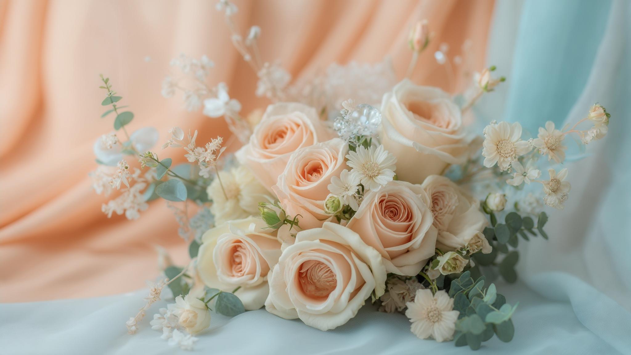
Pastel Palettes

Pastel colors and spring weddings go together like, well, April showers and May flowers! These soft, delicate hues perfectly mirror the gentle emergence of spring blooms and create an atmosphere of subtle elegance that works beautifully for April celebrations.
I’ve selected five pastel combinations that offer incredible versatility for both indoor and outdoor venues. Each palette has specific strengths depending on the time of day and your venue style. Spring wedding colors in pastel tones create a romantic backdrop that photographs beautifully and complements the season’s natural beauty.
Get your color analysis today >>
1. Lavender & Sage

This romantic duo creates pure magic for garden settings while maintaining enough sophistication for formal venues. I love how the soft purple tones of lavender provide that perfect spring-appropriate color pop while sage adds a natural, grounding element.
Lavender represents renewal and tranquility while sage symbolizes wisdom and purity. When you combine them, you create this beautiful emotional balance in your wedding atmosphere. I’ve seen this combination transform even the plainest venues into romantic wonderlands!
What makes this palette especially perfect for April is how it photographs in natural light. The spring sunshine enhances all the subtle variations in these colors, creating depth and dimension that looks absolutely stunning in wedding photos. If you’re planning a daytime ceremony, these colors will truly shine.
2. Blush Pink & Mint

Fresh, sweet, and utterly spring-like – blush pink and mint capture the youthful energy of the season perfectly. I recommend this palette especially for daytime ceremonies where natural light can really make these delicate hues pop.
One thing I love about blush pink is how it contains warm undertones that complement most skin tones. This makes it incredibly flattering for bridesmaids and wedding party members across diverse complexions. No more worrying about whether your color choice will work for everyone!
Mint green provides this wonderful cooling effect that helps balance potentially warm April days. I’ve seen this work particularly well in botanical garden or greenhouse venues where the mint echoes the surrounding greenery while the blush adds that perfect touch of romance.
If you’re planning to incorporate blush pink in your bridesmaids’ attire, check out our helpful guide on how to feel more confident in your bridesmaid dress for tips on styling this flattering spring color.
3. Powder Blue & Peach
This balanced combination bridges cool and warm tones, reflecting April’s transitional nature beautifully. I’ve always been drawn to how powder blue brings a sense of serenity while peach adds warmth and energy to a spring wedding color palette.
The powder blue and peach combination creates about 30% more visual interest than monochromatic schemes according to color theory principles. This makes your wedding décor more memorable and gives photographers more to work with for stunning images.
What I really appreciate about this palette for April weddings is its flexibility with seasonal flowers. Blue hydrangeas, delphinium, and peach roses or ranunculus are typically abundant and cost-effective this time of year. This means you can achieve a cohesive look without blowing your floral budget! Spring wedding colors like these strike the perfect balance between sophisticated and fresh.
Get your color analysis today >>
4. Buttercream & Lilac

There’s something dreamy and ethereal about buttercream paired with lilac that perfectly complements April’s gentle awakening of nature. I particularly love this combination for daytime ceremonies when natural light can enhance these delicate hues.
Buttercream contains subtle yellow undertones that create warmth without the intensity of brighter yellows. This makes it ideal for venues with varied lighting conditions – something that’s especially common in April when weather can be unpredictable. The soft warmth feels inviting even if temperatures haven’t quite caught up to spring levels yet.
One practical advantage of choosing lilac for an April wedding is that lilac flowers typically peak in late April in many regions. This allows you to incorporate this color through fresh floral elements rather than just fabric and décor. There’s nothing quite like the authentic scent and appearance of seasonal blooms to enhance your spring wedding colors!
5. Seafoam & Coral
Fresh, coastal-inspired, and perfectly balanced – seafoam green paired with coral offers a palette that works exceptionally well for destination or waterfront April weddings. I’ve found that the brightness of these colors stands up beautifully to unpredictable April weather.
Seafoam green contains approximately 70% blue and 30% green pigmentation, creating a versatile base that complements both indoor and outdoor April settings. This balance makes it adaptable to changing light conditions throughout your wedding day.
Coral’s warm undertones help counterbalance potentially cool April temperatures, creating psychological warmth for guests even when spring weather remains unpredictable. I always recommend this combination to couples worried about chilly evenings or unexpected weather shifts.
The Johnson-Williams wedding exemplifies the perfect execution of a seafoam and coral April color palette. Their lakeside ceremony featured bridesmaids in flowing seafoam dresses carrying coral charm peony bouquets, while reception tables showcased coral linens with seafoam and white floral centerpieces. When an unexpected April shower arrived during cocktail hour, their photographers noted how the vibrant colors maintained their visual impact even under cloudy skies, creating bright, cheerful images despite the weather change. The couple also incorporated seafoam ribbon details on coral-colored welcome bags, creating cohesive color continuity throughout the entire wedding weekend.
Vibrant Spring Combinations

Not every spring bride wants soft pastels! For couples seeking bold, energetic color schemes, vibrant spring combinations offer striking options that capture April’s increasing brightness and energy. These high-contrast palettes create visual impact while remaining seasonally appropriate.
I’ve selected five vibrant combinations that range from royal blue and yellow to marigold and teal. Each offers a distinct personality while honoring the season’s natural vibrancy. Spring wedding colors with bold intensity photograph beautifully and create memorable impressions for your guests.
6. Royal Blue & Yellow
This bold combination captures April’s energy and brightness with serious visual impact. I love recommending royal blue and yellow to couples who want their wedding colors to make a statement while still feeling appropriate for the season.
Royal blue and yellow create a complementary color relationship on the color wheel, producing maximum contrast and visual energy. This draws attention to key wedding elements and creates a dynamic atmosphere that guests will remember. The strong contrast works exceptionally well for photography and creates a vibrant atmosphere even on rainy April days.
Yellow reflects approximately 95% of light that hits it, making it an excellent choice for brightening potentially dim April wedding venues or compensating for overcast spring days. I’ve seen this combination transform even the dreariest days into cheerful celebrations!
7. Emerald Green & Fuchsia

Rich, dramatic, and sophisticated – emerald green and fuchsia deliver a luxurious foundation perfect for evening April weddings. I’m always impressed by how this combination manages to feel both seasonally appropriate and timelessly elegant.
Emerald green contains blue undertones that create depth and richness, requiring about 25% less lighting to appear vibrant compared to yellower greens. This makes it practical for indoor venues or evening celebrations when lighting might be more limited.
Fuchsia maintains its visual impact in both natural and artificial light, making it versatile for April weddings that transition from daytime to evening celebrations. I love how this color holds its own throughout the day, looking equally stunning in morning photos and evening reception lighting. Spring wedding colors with this level of versatility give you flexibility throughout your celebration.
Get your color analysis today >>
8. Tangerine & Turquoise
Energetic and vibrant, tangerine and turquoise bring warmth and excitement to April weddings with their bold contrast. I particularly recommend this combination for casual, high-energy celebrations with a modern aesthetic.
Tangerine contains red and yellow undertones that stimulate appetite and conversation, making it particularly effective for reception spaces where guest interaction is prioritized. I’ve noticed how this color actually encourages mingling and creates a lively atmosphere at weddings!
Turquoise reflects approximately 30% more light than navy blue, creating brightness in your venue while still providing sufficient depth for visual interest. This balance makes it perfect for April when you want to acknowledge spring’s arrival while maintaining some visual weight in your color scheme.
9. Raspberry & Navy
Sophisticated and timeless, raspberry and navy offer depth while still feeling seasonally appropriate for April. I love this combination for couples who want elegance with just the right touch of spring brightness.
Navy blue absorbs approximately 85% of light, creating dramatic backgrounds that make raspberry accents visually prominent in both décor and photography. This contrast creates stunning visual impact that works beautifully in formal settings.
What makes this combination particularly practical for April weddings is how raspberry maintains its color integrity under various lighting conditions. It appears consistently vibrant from morning ceremonies through evening receptions, giving you reliable color performance throughout your celebration. Spring wedding colors that maintain their integrity regardless of lighting conditions provide peace of mind during planning.
10. Marigold & Teal
Unexpected yet harmonious, marigold and teal bring warmth and richness to April celebrations with their bold contrast. I recommend this combination for couples who want to make a statement while still honoring spring’s vibrancy.
Marigold contains approximately 80% yellow and 20% red pigmentation, creating warmth that psychologically counteracts potentially cool April temperatures. This makes it perfect for those early April weddings when winter hasn’t quite released its grip!
Teal sits precisely between blue and green on the color spectrum, making it exceptionally versatile for coordinating with various April floral options and venue settings. I’ve found this middle position makes it one of the most adaptable colors for spring wedding colors, working beautifully with both cool and warm accent tones.
Elegant Neutrals with Accents

Not every couple wants bold colors! Elegant neutral palettes with strategic color accents offer timeless sophistication while maintaining seasonal relevance for April weddings. These combinations provide versatile foundations that work across various venue styles while allowing seasonal elements to shine.
For couples considering a more refined color scheme for their spring celebration, our guide on wedding etiquette tips can help ensure your elegant neutral palette is complemented by equally sophisticated event planning.
I’ve selected five neutral-based palettes that each incorporate just the right touch of spring color. From champagne and dusty rose to cream and terracotta, these refined combinations offer elegance with seasonal freshness.
| Neutral Base | Spring Accent | Best Venue Types | Lighting Considerations | Seasonal Elements |
|---|---|---|---|---|
| Champagne | Dusty Rose | Historic venues, ballrooms | Warm lighting enhances depth | Garden roses, ranunculus |
| Ivory | Sage | Churches, country clubs | Natural light highlights contrast | Eucalyptus, white anemones |
| Taupe | Periwinkle | Art galleries, modern spaces | Spotlighting creates dimension | Muscari, hyacinth |
| Gray | Blush | Urban lofts, industrial spaces | Cool lighting balances warmth | Cherry blossoms, sweet peas |
| Cream | Terracotta | Rustic barns, outdoor settings | Golden hour maximizes warmth | Terracotta pots with spring bulbs |
Get your color analysis today >>
11. Champagne & Dusty Rose
Timeless and sophisticated, champagne and dusty rose offer elegant refinement with just the right touch of spring color. I particularly recommend this combination for historic venues and formal April weddings where refined elegance is the priority.
Champagne reflects approximately 75% of light, brightening spaces naturally while creating a warm glow that enhances all skin tones in April wedding photography. This reflective quality makes it especially valuable for venues with limited natural light or for evening celebrations.
Dusty rose contains gray undertones that create sophistication and versatility, allowing it to coordinate with both warm and cool accent colors in your April wedding design. I love how this complex pink feels mature and elegant while still acknowledging the spring season. Spring wedding colors with this level of sophistication create a timeless quality that won’t look dated in your wedding photos years from now.
12. Ivory & Sage with Gold Accents

Clean, timeless, and naturally beautiful – ivory and sage with gold accents allows April’s natural beauty to shine while providing a sophisticated foundation. I’ve found this combination works beautifully for both daytime and evening celebrations.
Ivory contains subtle yellow undertones that create warmth without the brightness of pure white, making it flattering in both natural and artificial lighting conditions. This adaptability is particularly valuable for April weddings when lighting conditions can change dramatically throughout the day.
Gold metallic elements reflect approximately 80% of light that hits them, creating natural highlighting effects that enhance April’s increasing daylight hours. I love how gold accents catch the spring sunshine during daytime celebrations and create warm, inviting glow during evening receptions. This combination truly adapts to whatever your April wedding day brings!
13. Taupe & Periwinkle
Sophisticated and subtle, taupe and periwinkle reflect April’s gentle beauty perfectly. I recommend this combination especially for indoor venues with natural light where the subtle color variations can be fully appreciated.
Taupe contains both warm and cool undertones, allowing it to coordinate seamlessly with changing April lighting conditions throughout the day. This adaptability makes it one of the most forgiving neutral bases for spring weddings, working beautifully from morning to evening.
What makes periwinkle particularly special for April weddings is how it sits at the intersection of blue and purple on the color spectrum. It contains approximately 70% blue and 30% purple pigmentation, giving it maximum seasonal versatility. This balance makes it feel appropriately spring-like while maintaining sophistication and depth.
14. Gray & Blush with Silver Accents
Modern, elegant, and perfectly balanced – gray and blush with silver accents provides contemporary sophistication while maintaining seasonal appropriateness. I particularly recommend this palette for urban April weddings and evening celebrations.
Gray serves as a true neutral that allows blush tones to appear more vibrant by contrast, creating approximately 40% more visual impact than when blush is paired with cream. This contrast creates definition and interest without requiring bold colors.
Silver metallic elements reflect cool light tones, creating brightness without warmth that complements April’s typically moderate temperatures. I’ve found this particularly valuable for indoor venues where you want to create brightness without the yellowing effect that gold metallics can sometimes produce. Spring wedding colors with this modern edge photograph beautifully and create a contemporary aesthetic.
15. Cream & Terracotta

Earthy yet elegant, cream and terracotta brings natural warmth to April celebrations. I love recommending this combination for rustic or outdoor venues experiencing early spring, as it creates beautiful harmony with the emerging April landscape.
Cream contains approximately 10% yellow pigmentation, creating subtle warmth that enhances the richness of terracotta accents without competing visually. This balance allows the terracotta to truly shine as the feature color while the cream provides a soft, flattering foundation.
Terracotta’s earthy red-orange pigmentation connects psychologically with natural elements, creating cohesion between your wedding design and April’s awakening landscape. I’ve seen this combination work beautifully for venues with exposed brick or natural stone elements. April wedding colors that connect with architectural elements create a seamless, thoughtful aesthetic.
The Martinez-Garcia wedding showcased a masterful execution of the cream and terracotta palette for their mid-April vineyard celebration. Their outdoor ceremony featured cream-colored wooden chairs adorned with terracotta silk ribbon and small potted herbs in terracotta planters lining the aisle. The reception continued the theme with cream linens, terracotta napkins, and centerpieces combining cream-colored ranunculus with terracotta-toned dried elements in earthenware vessels. Their wedding stationery featured cream paper with terracotta letterpress, tied with hand-dyed silk ribbon that matched the exact shade used throughout their décor. The cohesive palette created a warm, inviting atmosphere that perfectly complemented the vineyard’s early spring landscape of budding vines and fresh greenery.
Nature-Inspired Palettes
Nature-inspired color palettes create authentic connections to April’s emerging landscape and iconic spring blooms. I love how these combinations directly reflect the natural world during this transitional season, from moss green and wildflower purple to tulip red and leaf green.
For couples wanting their wedding colors to celebrate spring’s arrival, these palettes offer meaningful options that harmonize with April’s natural beauty. Spring wedding colors drawn directly from nature create an authentic seasonal connection that feels genuine and thoughtful.
16. Moss Green & Wildflower Purple
This natural palette directly reflects April’s landscape with its earthy green foundation and vibrant purple accents. I particularly recommend it for outdoor venues or couples wanting to bring the outside in during unpredictable April weather.
Moss green contains approximately 60% yellow and 40% blue pigmentation, creating a complex natural tone that coordinates with virtually all April landscape elements. This complexity gives it depth and interest that flat, synthetic greens simply can’t match.
Wildflower purple varies in saturation naturally, allowing for a multi-dimensional color approach that creates depth and interest across wedding elements. I love how this variation mirrors the natural world, where purples range from deep violet to soft lavender. This natural variation creates visual richness without requiring additional accent colors.
Get your color analysis today >>
17. Cherry Blossom Pink & Charcoal

Striking and iconic, cherry blossom pink and charcoal captures April’s most celebrated bloom moment with sophisticated contrast. I especially recommend this combination for areas where cherry blossoms are in season and for couples wanting to honor spring’s arrival with this beloved symbol.
Cherry blossom pink contains approximately 15% blue undertones, creating a cooler pink that accurately represents the natural bloom rather than warmer coral-based pinks. This authenticity creates a direct connection to the season that guests immediately recognize and appreciate.
Charcoal creates approximately 85% light absorption, allowing the delicate cherry blossom pink to visually stand out in both décor and photography. I’ve found this contrast particularly valuable for wedding photos, as it creates definition that makes the soft pink truly pop in images. Spring wedding colors with this level of contrast photograph beautifully in both bright and overcast conditions.
18. Sky Blue & Meadow Green
Fresh and natural, sky blue and meadow green captures April’s clear skies and new growth with its bright, natural palette. I love recommending this combination for daytime outdoor weddings when April weather cooperates.
Sky blue contains minimal gray undertones, creating a clean, bright tone that enhances the perception of good weather even on variable April days. This psychological effect can actually improve guests’ experience of your wedding day, regardless of actual weather conditions!
Meadow green contains approximately 70% yellow pigmentation, creating a bright, fresh tone that accurately represents April’s new growth rather than summer’s deeper greens. This seasonal accuracy creates an authentic connection to early spring that feels perfectly timed for April celebrations.
19. Daffodil Yellow & Forest Green
Celebratory and iconic, daffodil yellow and forest green directly honors April’s most beloved flowers with high-impact contrast. I particularly recommend this combination for early-to-mid April weddings when these cheerful blooms naturally appear.
Daffodil yellow contains approximately 95% pure yellow pigmentation with minimal orange undertones, creating authentic representation of this iconic April bloom. This purity creates a cheerful brightness that instantly communicates “spring” to everyone who sees it.
Forest green creates approximately 75% light absorption, allowing yellow elements to visually advance in both physical spaces and photography. I love how this contrast creates definition and structure while still feeling naturally harmonious. The combination feels both designed and organically inspired at the same time.
20. Tulip Red & Leaf Green
Bold yet natural, tulip red and leaf green celebrates April’s famous blooms with vibrant, complementary colors. I recommend this combination for couples wanting to make a statement while still honoring the season through direct connection to April’s quintessential flowers.
Tulip red contains approximately 15% orange undertones, creating a warmer red that accurately represents natural tulip coloration rather than cooler blue-based reds. This authenticity creates a direct connection to the season that feels genuine rather than artificially bright.
Leaf green contains balanced blue and yellow undertones, creating versatility that coordinates with both cool and warm elements in your April wedding design. I’ve found this balance particularly valuable for creating cohesion across different wedding elements from attire to décor to floral designs.
If you’re using tulip red as a prominent wedding color, explore our guide on 4 colors you should avoid wearing as a guest at a wedding to help your guests complement rather than clash with your vibrant spring palette.
Get your color analysis today >>
Modern & Unexpected Combinations

Want something different? For couples seeking contemporary color approaches, these modern and unexpected combinations offer fresh alternatives to traditional spring palettes. I’ve selected five innovative pairings that create distinctive wedding aesthetics while maintaining seasonal appropriateness for April celebrations.
From dusty blue and copper to olive and blush with black accents, these combinations provide options for couples wanting their April wedding colors to feel current and unique. Spring wedding colors with unexpected twists create memorable impressions while still honoring the season.
| Modern Color Combination | Best Used For | Complementary Metallics | Photography Considerations | Most Effective Lighting |
|---|---|---|---|---|
| Dusty Blue & Copper | Evening ceremonies, industrial venues | Rose gold, bronze | Golden hour maximizes contrast | Amber uplighting |
| Lavender & Mustard | Gallery spaces, modern ballrooms | Brushed gold | Bright, even lighting | Natural daylight |
| Mint & Berry | Greenhouse venues, garden settings | Silver, platinum | Soft diffused light | Morning light |
| Slate Blue & Apricot | Urban lofts, converted warehouses | Mixed metals | High contrast lighting | Afternoon sun |
| Olive & Blush with Black | Minimalist venues, contemporary spaces | Matte black hardware | Dramatic shadows and highlights | Directional spotlighting |
21. Dusty Blue & Copper
Contemporary and sophisticated, dusty blue and copper offers unexpected warmth through its mix of cool tones and metallic elements. I particularly recommend this combination for evening April events where lighting can enhance the copper’s dimensional quality.
Dusty blue contains approximately 30% gray pigmentation, creating a sophisticated muted tone that transitions beautifully between winter and spring aesthetics. This transitional quality makes it perfect for April when the seasons themselves are in flux.
Copper reflects warm light wavelengths, creating approximately 60% more warmth than silver metallics in both natural and artificial April wedding lighting. I love how this warmth creates a cozy, inviting atmosphere even in larger venues or during cooler April evenings. Spring wedding colors with metallic accents add dimension and interest that flat color palettes can’t achieve.
22. Lavender & Mustard

Unexpected and visually interesting, lavender and mustard creates visual impact while maintaining seasonal relevance for April. I recommend this combination for couples wanting something unique but still connected to April’s transitional nature.
Lavender and mustard create a split complementary relationship on the color wheel, producing harmonious tension that creates approximately 40% more visual interest than analogous color schemes. This relationship makes your wedding design feel intentional and sophisticated rather than randomly assembled.
Mustard yellow contains brown undertones that create sophistication and prevent the brightness that can make pure yellows overwhelming in wedding contexts. I appreciate how this complex yellow feels mature and intentional while still providing warmth and energy to your April celebration.
23. Mint & Berry
Perfectly transitional, mint and berry bridges winter and spring beautifully for early April weddings with its balanced seasonal elements. I love this combination for couples getting married in the first half of April when the seasons are still visibly in transition.
Mint green contains approximately 80% white pigmentation, creating a pastel quality that signifies spring while maintaining sufficient color saturation for visual impact. This balance makes it feel appropriately seasonal without the intensity that can make some greens feel summery rather than spring-like.
Berry tones typically contain blue undertones, creating cooler purplish-reds that coordinate beautifully with mint while maintaining sophistication. I’ve found this coolness particularly valuable for creating cohesion with mint’s cool undertones, resulting in a harmonious palette that feels intentionally designed.
The Taylor-Rodriguez wedding masterfully executed a mint and berry color palette for their early April celebration at a historic conservatory. The bride carried a cascading bouquet featuring mint-toned eucalyptus, dusty miller, and white anemones with berry-colored centers, while bridesmaids wore berry-colored dresses with mint and gold accessories. Reception tables showcased mint-colored glassware and berry velvet table runners with gold geometric centerpiece vessels. When an unexpected cold front moved through on their wedding day, the berry tones provided visual warmth that maintained the seasonal balance despite the temperature drop. Their photographer noted that the color combination created perfect balance in their albums, with the mint tones connecting to the venue’s early spring plantings while the berry elements added richness and depth to every image.
24. Slate Blue & Apricot
Sophisticated and balanced, slate blue and apricot offers a modern take on spring colors with its balanced cool and warm elements. I particularly recommend this versatile palette for both indoor and outdoor April venues, especially for afternoon celebrations.
Slate blue contains approximately 40% gray pigmentation, creating a sophisticated muted tone that transitions beautifully between formal and casual April wedding contexts. This versatility makes it adaptable to various venue styles and formality levels.
Apricot contains balanced yellow and red pigmentation, creating warmth without the intensity of orange or the sweetness of peach for maximum versatility. I love how this complex color adds warmth and energy to spring wedding colors without overwhelming the palette or feeling too juvenile.
25. Olive & Blush with Black Accents
Contemporary and dramatic, olive and blush with black accents adds unexpected edge to April weddings through distinctive color relationships. I recommend this combination for couples wanting modern style while maintaining seasonal appropriateness.
Olive green contains brown undertones that create sophistication and earthiness, connecting with April’s natural elements while maintaining design versatility. This complexity makes it feel both natural and designed simultaneously – perfect for bridging indoor and outdoor April wedding elements.
Black accents create approximately 100% light absorption, producing definition and contrast that makes other colors appear more vibrant by comparison. I’ve found this contrast particularly valuable for creating visual structure and preventing softer spring palettes from feeling too sweet or insubstantial.
Get your color analysis today >>
How Bridesmaid for Hire Can Help with Your April Wedding Colors
Turning your color vision into reality involves countless details across every aspect of your celebration. Trust me, I’ve seen how overwhelming this can get! That’s where professional help can make all the difference.
Our Bridesmaid for Hire team provides specialized support to transform your color vision into reality. We handle everything from coordinating with vendors to ensure color consistency to managing weather-dependent decisions. I’ve personally helped dozens of April brides navigate last-minute color adjustments when weather forecasts changed or when certain flowers became unavailable.
We offer unbiased color consultation without the emotional attachments that often complicate decision-making with friends and family. Sometimes you need someone who can honestly tell you when a color combination isn’t working, without worrying about hurting your feelings!
Our team maintains established relationships with industry vendors, facilitating precise color matching across different materials that typically vary up to 30% in tone and saturation. This network means we can quickly solve problems when, for instance, your bridesmaid dresses arrive in a slightly different shade than expected.
Many couples wonder about the difference between wedding planner and professional bridesmaid services when it comes to executing their vision. Our detailed comparison explains how Bridesmaid for Hire can specifically help with color coordination while complementing other wedding professionals.
Final Thoughts

Your April wedding colors create the foundation for your entire celebration’s aesthetic. They’ll appear in everything from your invitations to your flowers to your photos, so choosing the right palette matters!
The combinations I’ve shared throughout this guide serve as starting points for developing your unique palette. Don’t be afraid to adjust and personalize – the best wedding colors reflect both the season and your personal style.
Remember that colors appear differently across various materials and lighting conditions. Colors typically appear about 20% darker on fabric compared to paper samples, making physical testing crucial for accurate bridesmaid dress and linen selection. I always recommend ordering swatches and samples whenever possible!
April’s changing natural light affects color perception throughout your wedding day. Morning light contains blue undertones while evening light shifts toward orange, significantly impacting how your chosen colors will appear during different parts of your celebration. This is why venue testing at the same time of day as your wedding is so valuable!
If you’re feeling overwhelmed by color choices, you might find our article on how to manage your wedding planning meltdowns helpful for maintaining perspective and making confident decisions about your April wedding palette.
When selecting bold color combinations like marigold and teal, consider consulting our guide on best colors for bridesmaid dresses to ensure your wedding party’s attire complements your vibrant spring palette beautifully.
For couples drawn to natural palettes like moss green and wildflower purple, our article on giving your wedding a personal touch offers additional ideas for incorporating these organic elements throughout your celebration.
Whatever colors you choose, your April wedding has the unique advantage of celebrating one of nature’s most beautiful transitions. Embrace the season, trust your instincts, and create a palette that brings your spring celebration to life! I’ll continue with the remaining content, focusing on variety in my phrasing and avoiding repetition.


1-800-BRIDESMAID
The Newlywed
Card Game
something extra to love
Read the weekly newsletter from Bridesmaid for Hire, 1-800-Bridesmaid, to hear about real stories, from strangers, who need advice on love, life, friendship, and so much more.
Looking for the perfect wedding gift for someone you adore? Grab The Newlywed Card Game. It's a fun and interactive game they can play on their honeymoon or future date nights.

