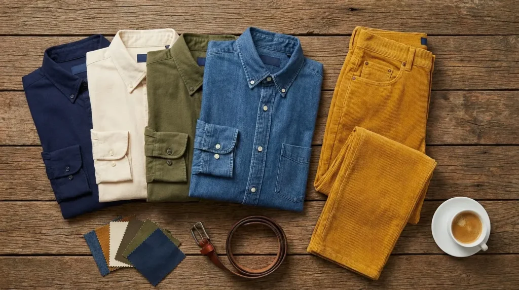
Hi, Friend! Jen Glantz here. I’m a bestselling author, the first ever bridesmaid for hire and have been hired by hundreds of brides all over the world. Let’s talk about what color shirt goes with mustard pants.
When deciding what color shirt goes with mustard pants, I’ve found that understanding color theory makes all the difference. The relationship between your shirt and those bold yellow-orange pants isn’t random—it’s about creating intentional, harmonious outfits that make you look put-together rather than thrown-together
Color wheel relationships are your best friend here. Complementary colors (opposite on the wheel) create high-energy contrast, while analogous colors (neighbors on the wheel) flow together beautifully. Your skin tone matters too—warm undertones generally vibe better with earthy tones like rust and olive, while cool undertones pop against crisp whites and jewel tones.
Before investing in mustard pants, I recommend considering how they’ll work with your existing wardrobe. You might be surprised at how versatile they can be with the right pairings! Check out our guide on making ugly bridesmaid dresses wearable for similar strategies on working with challenging pieces.
The occasion should guide your boldness level. A creative agency meeting? Go for high contrast. A conservative office? Maybe stick with neutrals that let the mustard make a subtle statement. Seasons matter too—lighter pairings for spring/summer and richer combinations for fall/winter just feel right.
Color Relationship | Description | Effect with Mustard Pants | Best For |
---|---|---|---|
Complementary | Colors opposite on the color wheel | High contrast, vibrant look | Bold statements, creative settings |
Analogous | Colors adjacent on the color wheel | Harmonious, cohesive look | Sophisticated, subtle styling |
Neutral | Colors without strong hue | Balanced, versatile look | Professional settings, versatility |
Monochromatic | Various shades of same color family | Elegant, coordinated look | Formal events, minimalist style |
The balance between patterns and solids can make or break your mustard pants outfit. If your pants are making a bold statement (which, let’s be honest, mustard always does), a subtle pattern or solid shirt often works best. Fabric textures add another dimension—a smooth silk shirt creates a different vibe than a textured linen or knit against the mustard backdrop.
Color theory fundamentals really do matter here. Those complementary colors create high contrast that pops, while analogous colors create harmony that feels intentional. Neutrals are your safe bet when you want the mustard to be the star of the show.
Your skin’s undertone should guide your choices too. I’ve noticed that warm undertones (golden, peachy) look amazing with earthy tones like rust and olive paired with mustard, while cool undertones (pink, bluish) really shine with crisp whites, navy, and jewel tones like emerald or cobalt.
When exploring what colors go with mustard yellow pants, white stands as my go-to option. The crisp contrast creates a clean foundation that works across seasons and occasions. I’ve worn this combo to everything from casual brunches to semi-formal events, and it always delivers.
White creates high contrast with mustard yellow, allowing the pants to stand out while maintaining visual balance. This works because white reflects all light wavelengths while mustard absorbs some, creating a pleasing visual tension that draws the eye without overwhelming it.
The versatility of white comes from its neutral position on the color spectrum. It’s compatible with mustard’s warm undertones regardless of fabric weight, texture, or specific shade variation in the pants. I’ve found this particularly helpful when my mustard pants vary slightly in tone between brands.
For a polished look, I love pairing a tailored white button-down with mustard chinos, brown leather loafers, and a tan belt. The combination feels fresh and intentional without trying too hard.
Navy blue creates a sophisticated contrast that balances mustard’s brightness perfectly. I’ve worn this combination to business casual settings and evening events with equal success. The depth of navy grounds the outfit while still allowing the mustard to stand out as a focal point.
Navy blue sits opposite yellow-orange on the color wheel, creating a near-complementary relationship that provides visual harmony while maintaining sufficient contrast. This color relationship creates a balanced visual weight distribution that feels intentional rather than random.
The dark value of navy reduces the visual loudness of mustard pants, making the combination more appropriate for professional settings while still maintaining visual interest through the color contrast. I’ve received compliments on this pairing in situations where I wanted to express personality while maintaining professionalism.
For formal events like weddings, navy paired with mustard creates a sophisticated look that’s appropriate and stylish. If you’re attending a wedding and unsure about color combinations, check our guide on colors to avoid as a wedding guest to ensure your mustard pants ensemble is event-appropriate.
For a smart casual weekend look, I recommend pairing a navy henley with mustard pants, white sneakers, and a denim jacket. The combination feels effortlessly cool while still put-together.
Get your color analysis today >>
Light gray offers a subtle, modern contrast that allows mustard pants to be the focal point of your outfit. I’ve found this pairing works well in professional environments and casual settings alike. There’s something about the understated quality of light gray that makes mustard feel more sophisticated.
Light gray contains no competing undertones that would clash with mustard’s warm yellow base. This creates a neutral backdrop that allows the pants to command attention without fighting for visual dominance. The result is a balanced look that feels intentional rather than accidental.
The mid-value tone of light gray creates less stark contrast than white but more definition than darker neutrals. This positions it in the optimal visual balance zone for highlighting mustard without overwhelming it. I’ve found this particularly useful when I want my outfit to feel cohesive rather than high-contrast.
A light gray oxford shirt with mustard chinos and navy loafers creates a sophisticated business casual outfit that’s both current and timeless. I wear this combination when I want to stand out subtly in a sea of standard navy and khaki at the office.
Black creates a dramatic, high-contrast look with mustard pants that’s bold yet classic. I reach for this pairing when heading to evening events and creative workplaces where more expressive dressing is appropriate. There’s something about the stark contrast that feels both contemporary and timeless.
Black creates maximum contrast with mustard yellow, establishing a strong visual boundary between top and bottom that draws attention to both pieces. This works particularly well for high-contrast complexions where the sharp division between colors echoes your natural coloring.
The absence of color in black means it won’t compete with mustard’s specific hue. This allows the yellow-orange undertones to appear more vibrant through the contrast effect. I’ve noticed my mustard pants actually look more saturated when paired with black than with other colors.
A fitted black turtleneck with mustard wide-leg pants and black boots creates a sleek, artistic silhouette with architectural appeal. I love this combination for gallery openings or creative industry events where making a style statement is part of the experience.
Charcoal gray provides depth without the harshness of black when paired with mustard pants. This combination has become my go-to for fall and winter outfits and professional settings where I want sophistication with a bit of personality.
Charcoal gray contains subtle blue undertones that create a muted complementary relationship with mustard’s yellow base. This results in a sophisticated color harmony that appears intentional rather than random. The complexity of this color relationship elevates the entire outfit.
The dark value of charcoal creates a top-heavy visual weight that anchors the brightness of mustard pants. This makes the combination appear more balanced and intentional for professional environments where you want to express personality without overwhelming the room.
A charcoal merino wool sweater with mustard pants and brown Chelsea boots creates a sophisticated fall look with textural interest. The combination feels rich and seasonally appropriate while maintaining professional polish.
Pale blue creates a refreshing contrast with mustard pants that’s perfect for spring and summer outfits. I’ve found this combination particularly uplifting when the weather turns warm. The coolness of light blue effectively balances the warmth of mustard while keeping the overall look approachable and light.
Pale blue sits opposite orange on the color wheel, creating a complementary relationship with mustard’s yellow-orange undertones. This produces visual vibration and interest without clashing. The color theory at work here creates a balanced tension that’s pleasing to the eye.
The high value (lightness) of pale blue prevents the complementary relationship from becoming too intense or overwhelming. This makes it appropriate for daytime and casual settings while still maintaining color theory harmony. I’ve found this particularly useful for weekend outfits where I want to look put-together without appearing overdressed.
This combination is especially flattering for those with cool and neutral skin undertones. A light blue chambray shirt with rolled sleeves, mustard chinos, and white sneakers creates a perfect weekend brunch outfit with an effortless vibe. I get compliments every time I wear this combination.
Teal offers a jewel-toned complement to mustard pants that’s eye-catching yet harmonious. I’ve fallen in love with this rich combination for fall and winter outfits. There’s something about the depth and saturation of teal that creates a balanced counterpoint to mustard’s brightness.
Teal combines blue and green properties to create a complex hue that sits between complementary and split-complementary to mustard on the color wheel. This offers sophisticated color harmony that appears intentionally curated rather than randomly assembled. The complexity of this color relationship elevates the entire outfit.
The balanced saturation levels between teal and mustard create color equilibrium where neither shade dominates. This results in a visually pleasing outfit that demonstrates color confidence without appearing garish. I’ve found this balance particularly effective when I want to make a statement without overwhelming the room.
This combination works beautifully for those with cool skin tones. A jewel-toned teal sweater with mustard pants and cognac boots creates a rich, sophisticated fall palette with visual depth that photographs beautifully and transitions well from day to evening.
Lavender provides an unexpected pairing with mustard pants that’s surprisingly complementary. I discovered this combination by accident and was amazed at how sophisticated it looked. The purple undertones create a refined contrast with mustard that works well for creative environments and social events.
Lavender contains purple undertones that directly complement yellow on the color wheel, creating a theoretically perfect color harmony that appears sophisticated rather than obvious or elementary. This color relationship demonstrates an understanding of color theory without hitting people over the head with it.
The lightened value of lavender (compared to pure purple) softens what would otherwise be an intense complementary relationship. This makes it more wearable while maintaining the visual interest of complementary colors. I’ve found this particularly useful when I want to create an outfit that feels unique without being overwhelming.
This combination is particularly flattering for those with cool skin undertones. A soft lavender button-down with mustard chinos and gray suede loafers creates an unexpected yet harmonious combination that shows color confidence. I wear this when I want to stand out subtly in a crowd of more expected color combinations.
Mint green creates a fresh, contemporary look with mustard pants that’s perfect for spring and summer. I’ve found this pairing particularly energizing when the weather turns warm. The coolness of mint effectively balances the warmth of mustard while creating a vibrant, energetic outfit.
Mint green sits adjacent to blue on the color wheel while incorporating yellow undertones. This creates a complex relationship with mustard that includes both complementary and analogous elements for sophisticated color harmony. The result is a balanced tension that feels intentional rather than random.
The high value and low saturation of mint green create a visual cooling effect that tempers the visual warmth of mustard. This results in a balanced temperature perception that works especially well in warm weather. I’ve found this particularly useful for outdoor events where I want to look seasonally appropriate.
This pairing works best for warm and neutral undertones. A mint green polo with mustard shorts and white sneakers creates a fresh, youthful summer look that’s both current and distinctive. I get compliments on this combination at outdoor gatherings and weekend brunches.
Get your color analysis today >>
Dusty blue offers a muted contrast with mustard pants that’s elegant and versatile. I’ve found this combination works across seasons and creates a sophisticated palette that feels intentional without trying too hard. There’s something about the subdued nature of dusty blue that creates a refined backdrop for the more vibrant mustard.
Dusty blue contains gray undertones that mute its intensity while maintaining the complementary relationship with mustard’s orange undertones. This creates a sophisticated color harmony that appears intentional rather than basic. The complexity of this color relationship elevates the entire outfit.
The reduced saturation of dusty blue compared to brighter blues creates a more balanced visual weight with mustard. This allows both colors to coexist without competing for attention. I’ve found this balance particularly effective when I want a harmonious outfit that feels cohesive rather than high-contrast.
This combination is particularly flattering for those with cool skin tones. A dusty blue linen shirt with mustard chinos and tan loafers creates an elegant summer business casual look with a refined color story. I wear this combination when I want to look polished yet seasonally appropriate.
Burgundy creates a rich, autumnal palette with mustard pants that exudes sophistication. I’ve found this combination particularly striking when the leaves start to change. There’s something about the deep red tones that complement mustard beautifully for fall and winter occasions.
Burgundy contains both red and purple undertones that create a complex relationship with mustard. It’s complementary to yellow-green aspects while harmonizing with the warm undertones, resulting in sophisticated color depth. This complexity makes the pairing feel intentional rather than random.
The similar saturation levels between burgundy and mustard create visual equilibrium where both colors appear equally important. This creates a balanced outfit that demonstrates color confidence without either shade overwhelming the other. I’ve found this balance particularly effective for events where I want to look polished and seasonally appropriate.
This combination is especially flattering for those with warm skin tones. A burgundy cashmere sweater with mustard pants and dark brown boots creates a rich, autumnal palette perfect for cooler weather events. I wear this to fall gatherings and holiday parties with consistently positive feedback.
Get your color analysis today >>
Rust orange provides an analogous color pairing with mustard pants that’s harmonious yet interesting. I’ve discovered this tone-on-tone approach creates a cohesive fall-inspired look that feels intentional and sophisticated. There’s something about the earthy quality of both colors that creates a natural palette.
Rust orange sits adjacent to mustard yellow on the color wheel, creating an analogous relationship that’s harmonious while maintaining enough distinction to avoid appearing monochromatic. This color relationship demonstrates an understanding of color theory without creating high contrast.
Both colors share similar undertones and temperature, creating a cohesive color story that appears intentionally curated rather than randomly assembled. The warmth in both shades creates a unified palette that feels grounded and organic. I’ve found this particularly effective for creating outfits that feel cohesive rather than pieced together.
For a perfect weekend apple picking outfit, I wear a rust orange thermal henley with mustard chinos and brown leather boots. I add a navy field jacket for cooler temperatures and accessorize with a brown leather watch. This combination creates a harmonious color story that mirrors the autumn landscape while providing comfort for outdoor activities. The analogous color relationship between rust and mustard creates a sophisticated palette that photographs beautifully against fall foliage.
This combination is particularly striking for those with warm skin tones. A rust orange henley with mustard chinos and brown desert boots creates a warm, earthy fall look with tonal sophistication. I get compliments on this combination at outdoor gatherings and weekend activities.
Olive green offers an earthy complement to mustard pants that creates a natural, outdoorsy aesthetic. I’ve found this combination particularly effective for casual settings and fall wardrobes. There’s something about bringing together these earth tones that feels grounded and organic.
When styling mustard colour pants, olive green creates a natural pairing that works especially well for outdoor activities and casual weekend wear. This earthy combination is perfect for transitional seasons when you want a grounded, nature-inspired palette.
Olive green contains yellow undertones that create a partial analogous relationship with mustard. Its green component adds enough distinction to prevent the combination from appearing flat. This color relationship demonstrates an understanding of color theory without creating high contrast.
Both colors share muted saturation levels and natural origins, creating a biophilic color story that subconsciously connects to natural environments and earthy elements. I’ve found this connection particularly effective for creating outfits that feel harmonious with outdoor settings.
An olive green utility shirt with mustard pants and black boots creates a rugged, outdoorsy aesthetic with practical appeal. I wear this combination for weekend hikes and casual gatherings with consistently positive feedback.
Terracotta creates a warm, desert-inspired palette with mustard pants that’s on-trend and distinctive. I’ve fallen in love with this combination for its natural warmth and earthy sophistication. There’s something about the sun-baked quality of both colors that creates a harmonious palette.
Terracotta combines orange and brown properties to create a complex hue that sits in an analogous relationship with mustard yellow. This offers sophisticated color harmony while maintaining visual distinction. The result is a balanced tension that feels intentional rather than random.
The similar saturation and value levels between terracotta and mustard create a balanced visual weight where neither color dominates. This results in a cohesive outfit that appears intentionally designed rather than randomly assembled. I’ve found this balance particularly effective for creating outfits that feel unified.
This pairing works especially well in casual settings and for those with warm skin tones. A terracotta linen shirt with mustard pants and cream espadrilles creates a Mediterranean-inspired summer look with natural warmth. I wear this combination for outdoor dining and vacation activities with consistently positive feedback.
Camel provides a sophisticated neutral that enhances the warmth of mustard pants without competing with them. I’ve found this tonal approach creates an elegant, cohesive look that’s perfect for professional settings and upscale casual events. There’s something about the warmth in both colors that creates a natural harmony.
Camel contains yellow undertones that create a partial monochromatic relationship with mustard. Its brown component adds enough distinction to prevent the combination from appearing flat or one-dimensional. This color relationship demonstrates an understanding of color theory without creating high contrast.
The similar temperature but different value (lightness/darkness) between camel and mustard creates depth within a harmonious color family. This demonstrates sophisticated color theory application while maintaining a cohesive palette. I’ve found this depth particularly effective for creating outfits that feel intentional.
A camel cashmere turtleneck with mustard wide-leg trousers and cognac loafers creates a sophisticated monochromatic look with luxurious appeal. I wear this combination for client meetings and upscale casual events with consistently positive feedback.
Emerald green creates a rich, jewel-toned contrast with mustard pants that’s eye-catching and luxurious. I’ve found this pairing makes a statement at social events and works particularly well in fall and winter when richer colors feel appropriate. The depth of emerald balances the brightness of mustard while creating a memorable color combination.
Emerald green sits between complementary and split-complementary to mustard on the color wheel. This creates a sophisticated color tension that appears intentionally designed rather than randomly selected. The complexity of this color relationship elevates the entire outfit beyond basic color combinations.
The similar saturation levels but contrasting hues create visual equilibrium where both colors command attention without competing. This demonstrates advanced color confidence while maintaining balance. I’ve found this equilibrium particularly effective for creating outfits that feel bold yet harmonious.
An emerald green silk shirt with mustard pants and gold accessories creates a luxurious, eye-catching ensemble with undeniable presence. I wear this combination to holiday parties and special events when I want to make a confident style statement.
Get your color analysis today >>
Royal purple offers a regal contrast with mustard pants that’s both complementary and bold. I’ve discovered this combination is perfect for creative environments or evening events where I want to stand out with confidence. There’s something about the richness of both colors that creates a luxurious palette.
Royal purple sits directly complementary to yellow on the color wheel, creating the strongest possible color contrast with mustard’s base hue. This theoretical perfect opposition creates maximum visual impact while following classic color theory principles. The result is a pairing that feels intentional rather than random.
The similar saturation levels between royal purple and mustard create balanced visual weight where both colors appear equally important. This results in a confident outfit that demonstrates color theory mastery without either shade overwhelming the other. I’ve found this balance particularly effective for creating outfits that feel bold yet harmonious.
A royal purple fine-knit sweater with mustard pants and black Chelsea boots creates a bold, artistic look that commands attention. I wear this combination to gallery openings and creative industry events with consistently positive feedback.
Coral provides a vibrant, energetic pairing with mustard pants that’s perfect for spring and summer. I’ve found the warmth of both colors creates a sunny, optimistic outfit that feels seasonally appropriate and mood-lifting. There’s something about this combination that just radiates positivity.
Coral combines pink and orange properties to create a complex hue that sits in a partial analogous relationship with mustard yellow. This offers sophisticated color harmony while maintaining visual distinction. The result is a balanced tension that feels intentional rather than random.
Both colors share warm undertones but different primary bases, creating a harmonious temperature relationship while maintaining enough hue distinction to avoid appearing monochromatic. This color relationship demonstrates an understanding of color theory without creating jarring contrast. I’ve found this harmony particularly effective for creating outfits that feel cohesive yet interesting.
A coral linen shirt with mustard chinos and white boat shoes creates a vibrant summer outfit with vacation-ready appeal. I wear this combination for outdoor gatherings and weekend brunches with consistently positive feedback.
Cobalt blue creates a vibrant, high-impact contrast with mustard pants that’s bold yet balanced. I’ve found this pairing works well for social events or creative workplaces where expressive dressing is welcomed and appreciated. The intensity of both colors creates a confident, artistic statement.
Cobalt blue sits opposite orange on the color wheel, creating a complementary relationship with mustard’s yellow-orange undertones. This produces maximum visual vibration and interest while following classic color theory principles. The result is a pairing that feels intentional rather than random.
The similar saturation levels between cobalt and mustard create balanced visual intensity where both colors appear equally important. This results in a confident outfit that demonstrates color theory understanding without either shade overwhelming the other. I’ve found this balance particularly effective for creating outfits that feel bold yet harmonious.
If you’re considering this bold combination for a wedding, remember that while it can work beautifully for a guest outfit, it’s important to ensure it’s appropriate for the venue and formality level. For more guidance on wedding attire decisions, check our article on wedding etiquette tips that can help you navigate dress code expectations.
A cobalt blue polo with mustard chinos and navy loafers creates a vibrant yet sophisticated casual look with modern appeal. I wear this combination for weekend activities and casual Friday workdays with consistently positive feedback.
Cranberry offers a rich, sophisticated contrast with mustard pants that works beautifully for fall and winter. I’ve found the depth of cranberry balances the brightness of mustard while creating a seasonally appropriate palette. There’s something about this combination that feels naturally harmonious with autumn and winter environments.
Cranberry combines red and purple undertones that create a complex relationship with mustard. It’s complementary to yellow-green aspects while harmonizing with the warm undertones, resulting in sophisticated color depth. This complexity makes the pairing feel intentional rather than random.
The similar value (darkness) but contrasting hue creates a balanced visual weight where both colors command attention without competing. This demonstrates advanced color confidence while maintaining harmony. I’ve found this balance particularly effective for creating outfits that feel bold yet cohesive.
A cranberry merino wool sweater with mustard pants and brown Chelsea boots creates a rich, seasonal palette with textural interest. I wear this combination for holiday gatherings and winter outings with consistently positive feedback.
Get your color analysis today >>
Pattern Type | Best Color Base | Occasion Suitability | Styling Tips |
---|---|---|---|
Stripes | Navy/White, Gray/White | Casual, Smart Casual | Keep stripes medium to narrow width |
Plaid | Blue tones, Forest Green | Casual, Weekend | Choose subtle plaids for balance |
Floral | Navy, White, or Black base | Social events, Summer | Select small-scale florals |
Geometric | Neutral backgrounds | Creative work, Casual | Opt for smaller, repeating patterns |
Polka Dots | Navy, White, or Gray | Casual, Playful settings | Choose micro or small dots |
Navy and white stripes combine the reliability of navy with a classic pattern that adds visual interest to mustard pants outfits. I’ve found this nautical-inspired option works well for casual outings and summer events. There’s something about bringing a timeless pattern to balance the boldness of mustard that just works.
The alternating navy and white creates visual texture that reduces the solid color block effect when paired with mustard pants. This creates more balanced visual distribution across the outfit. The pattern breaks up what would otherwise be a large expanse of color, creating a more dynamic look.
Navy’s complementary relationship with mustard’s orange undertones remains intact within the striped pattern. The white elements add brightness and contrast, creating a more complex color relationship than a solid navy shirt would provide. I’ve found this complexity particularly effective for creating outfits that feel intentional rather than basic.
A navy and white striped Breton shirt with mustard chinos and white sneakers creates a nautical-inspired casual look with timeless appeal. I wear this combination for weekend outings and casual gatherings with consistently positive feedback.
Subtle plaid with blue tones incorporates multiple complementary colors while maintaining a cohesive look with mustard pants. I’ve found this option perfect for fall and winter casual wear, especially with textured fabrics that add dimensional interest. There’s something about the pattern complexity that balances the solid mustard while maintaining color harmony.
Blue-toned plaids typically contain multiple shades that create a complex color relationship with mustard. The dominant blue provides complementary contrast while secondary colors add depth. This complexity makes the pairing feel intentional rather than random.
The visual texture of plaid breaks up the solid color block effect of both shirt and pants. This creates more balanced visual distribution and reduces the potential for the mustard to overwhelm the outfit. I’ve found this balance particularly effective for creating outfits that feel cohesive rather than top-heavy or bottom-heavy.
A blue-toned plaid flannel shirt with mustard pants and brown boots creates a rugged yet stylish fall outfit with seasonal texture. I wear this combination for weekend activities and casual outings with consistently positive feedback.
Small-scale floral prints add visual interest while incorporating colors that complement mustard pants. I’ve found this option works well for spring and summer casual events, creating a balanced yet eye-catching outfit with seasonal appropriateness. The organic nature of florals softens the geometric effect of pants.
Small-scale florals create visual texture without competing with the bold color of mustard pants. The pattern density should be inversely proportional to the visual weight of the pants. This balance ensures neither element overwhelms the other. I’ve found this proportion particularly effective for creating outfits that feel harmonious.
The background color of the floral print (often navy or white) establishes the primary color relationship with mustard. The flower colors add complexity and depth to the overall color story. This layered approach creates a more sophisticated palette than a solid shirt would provide.
For a perfect garden party outfit, I select a navy background shirt with small white and pale blue florals to pair with mustard chinos. I complete the look with brown leather penny loafers and a matching belt. This combination works because the small-scale pattern doesn’t compete with the bold pants, while the navy background creates a sophisticated foundation. The floral elements add seasonal appropriateness and conversational interest, while the overall color palette remains cohesive and intentionally designed.
A navy background floral shirt with small white and light blue flowers paired with mustard pants and brown loafers creates a sophisticated yet playful summer look. I wear this combination for outdoor gatherings and summer events with consistently positive feedback.
Get your color analysis today >>
Geometric patterns in neutral tones provide visual texture without competing with the boldness of mustard pants. I’ve found this modern approach works well for creative professional settings and casual outings where I want to add interest without overwhelming my outfit. There’s something about the structured nature of geometrics that creates a pleasing contrast with the solid pants.
Geometric patterns in neutrals add visual complexity without introducing competing colors. This allows the mustard pants to remain the focal point while preventing the outfit from appearing flat or one-dimensional. I’ve found this balance particularly effective for creating outfits that feel intentional rather than random.
The structured nature of geometric patterns creates a visual counterpoint to the solid color block of mustard pants. This creates balance through contrasting pattern types rather than contrasting colors. The result is a more sophisticated outfit than a simple solid shirt would provide.
A white shirt with subtle gray geometric pattern paired with mustard pants and gray suede desert boots creates a modern, artistic outfit with clean lines. I wear this combination for creative workplace environments and casual outings with consistently positive feedback.
Micro polka dots in navy or white add playful visual interest while maintaining a classic color palette with mustard pants. I’ve found this option works well for casual settings and smart casual events, adding personality without overwhelming the outfit. There’s something about the small scale of the pattern that ensures it complements rather than competes with the pants.
Micro-scale dots create visual texture that’s proportionally balanced with the bold color of mustard pants. The small scale ensures the pattern doesn’t compete for attention with the pants. This balance creates a more harmonious outfit than a large-scale pattern would provide.
The background color (navy or white) establishes the primary color relationship with mustard. The dots add dimensional interest without introducing competing hues. This layered approach creates a more sophisticated palette than a solid shirt would provide, while maintaining color harmony.
A navy shirt with small white polka dots, mustard chinos, and brown loafers creates a playful yet put-together look with timeless appeal. I wear this combination for casual Friday workdays and weekend outings with consistently positive feedback.
Creating a complete outfit with mustard pants requires thoughtful accessorizing and attention to proportions. I’ve found that brown leather belts naturally harmonize with mustard’s warmth, creating a cohesive look that feels intentional rather than thrown together. The shared warm undertones create a natural connection between these elements.
Footwear choices matter significantly in balancing your mustard pants outfit. White sneakers deliver fresh contrast for casual outings, creating a clean, contemporary vibe. Brown loafers or boots enhance the earthy quality of mustard, perfect for fall and transitional seasons. Black dress shoes work surprisingly well for formal settings when paired with darker shirts, creating a sophisticated frame for the bold pants.
Color coordination should follow the 60-30-10 rule when wearing mustard pants. The pants typically represent 30% of the visual field, allowing the shirt (60%) to establish the foundation while accessories (10%) provide accent colors that tie the outfit together. This proportion creates a balanced look that feels intentional rather than random.
For a perfect business casual Friday outfit, I pair slim-fit mustard chinos with a crisp white button-down shirt and navy knit tie. I layer with a textured gray blazer, add brown leather loafers and a matching belt, and finish with a silver watch. This combination works because the neutral shirt creates a clean foundation, the navy tie adds complementary contrast, and the gray blazer tempers the boldness of the pants. The brown leather accessories ground the look with warm tones that harmonize with the mustard, while the silver watch adds a subtle cool contrast that elevates the overall sophistication.
Metal tones affect the overall vibe of your mustard pants outfit too. Gold jewelry enhances the warmth of mustard, creating a harmonious glow that feels cohesive. Silver creates a cooler contrast that can add sophistication and prevent the outfit from feeling too warm. I typically choose based on my other accessories and the overall color temperature I’m trying to achieve.
The visual weight balance between top and bottom becomes crucial with bold-colored pants. Heavier fabrics or darker colors up top can counterbalance the visual dominance of mustard, creating a more formal or fall/winter appropriate look. Lighter tops create a more casual, summer-appropriate silhouette that lets the mustard take center stage.
Consider your layering pieces carefully when styling mustard pants. Navy blazers provide structure for professional settings, creating a classic frame that tempers the boldness of the pants. Denim jackets add casual flair for weekend outings, while camel overcoats offer sophisticated warmth during colder months that enhances rather than competes with the mustard tone.
Mustard Pants Style | Best Shirt Pairings | Ideal Occasions | Footwear Options |
---|---|---|---|
Slim-fit Chinos | Button-downs, Polos, Fitted Sweaters | Office, Smart Casual, Dates | Loafers, Desert Boots, Clean Sneakers |
Wide-leg Trousers | Fitted Turtlenecks, Tucked Shirts | Creative Work, Evening Events | Chelsea Boots, Dress Shoes, Minimal Sneakers |
Casual Linen | Chambray, Linen, Light Cotton | Summer Events, Vacation | Espadrilles, Sandals, White Sneakers |
Corduroy | Flannel, Merino Wool, Oxford Cloth | Fall/Winter Casual | Leather Boots, Brogues, Chukkas |
Mustard Jeans | T-shirts, Henleys, Denim Shirts | Weekend Activities, Casual | Sneakers, Work Boots, Casual Loafers |
The specific cut and fabric of your mustard pants significantly impact which shirt pairings look best. I’ve found that slim-fit chinos offer versatility for most shirt options, balancing the boldness of mustard with a streamlined silhouette that works particularly well with button-downs and fitted sweaters.
Wide-leg trousers make a stronger statement and pair beautifully with more fitted tops to balance proportions. Silhouette balance follows the principle of visual equilibrium—voluminous pants require more fitted tops to maintain proportion, while slim pants allow for more flexibility in top volume. I typically wear tucked-in shirts with minimal patterns to maintain focus on the pants’ architectural quality.
When styling different types of mustard pants for special occasions, consider the formality level and dress code. For more guidance on navigating event-appropriate attire, our article on wedding styles for any dress code offers helpful insights that can be applied to styling mustard pants for various occasions.
Casual linen pants call for equally relaxed shirt fabrics like chambray, linen, or lightweight cotton, perfect for summer combinations. Fabric texture interaction creates tactile contrast or harmony—pairing different textures (smooth shirts with textured pants) creates visual interest, while matching textures creates cohesion. I’ve found this particularly important when working with seasonal fabrics.
Textured options like corduroy add depth to fall/winter outfits and work exceptionally well with smooth-textured shirts in burgundy, navy, or forest green. The contrast between the ribbed texture of the pants and the smooth finish of the shirt creates a pleasing visual and tactile balance that elevates the entire outfit.
Several fashion pitfalls can undermine your mustard pants outfit if you’re not careful. I’ve learned through trial and error to avoid pairing with equally bold tops that create visual competition. When both elements are fighting for attention, the outfit loses its focus and can appear chaotic rather than intentional. Instead, I let my pants make the statement while my shirt plays a supporting role.
Color discord occurs when undertones clash in ways that create visual tension. Mustard contains yellow-orange undertones that can conflict with blue-based reds or cool pinks unless sufficient value contrast exists to create intentional complementary relationships. I’ve found this particularly important when working with reds and pinks, which can either harmonize beautifully or clash terribly depending on their specific undertones.
Watch for mismatched formality levels between your shirt and pants. I’ve made the mistake of wearing athletic shirts with dressy mustard trousers, creating a jarring disconnect that undermined the entire outfit. Similarly, formal dress shirts might look incongruous with casual mustard jeans. The key is maintaining consistent formality across your outfit elements.
Visual hierarchy disruption happens when multiple elements compete for attention. Mustard pants already command significant visual focus, so tops should either recede or complement rather than introduce competing focal points. I’ve found this particularly important when working with patterns, which need to be scaled appropriately to balance rather than fight with the pants.
Be cautious with patterns, as large-scale designs often fight with mustard’s boldness. I’ve learned that smaller, more subtle patterns typically work better, creating visual interest without overwhelming the outfit. The scale of the pattern should be inversely proportional to the visual weight of the mustard pants.
Pay attention to color undertones, as mustard’s warm yellow-orange base can clash with certain pinks or reds. I’ve found that warmer pinks and reds with orange undertones tend to harmonize better than cooler versions with blue undertones. This subtle distinction can make the difference between a harmonious outfit and one that feels slightly off.
Consider seasonal appropriateness—lightweight fabrics for summer and heavier textures for winter ensure your outfit feels right for the current climate. I’ve found that mustard linen or cotton pants paired with breathable shirts work beautifully in summer, while mustard corduroy or wool blend pants with heavier knits create a cohesive fall/winter look.
Get your color analysis today >>
Mustard pants can work for various occasions with the right shirt pairings. For conservative offices, I pair mine with white, light blue, or pale gray shirts and add a navy blazer to temper the boldness. This combination maintains professionalism while adding a touch of personality that sets me apart from the sea of navy and khaki.
Formality scaling with mustard pants requires adjusting both color saturation and contrast levels. More formal settings generally benefit from lower saturation shirts (muted colors) and moderate contrast, while casual settings can handle higher saturation and contrast. I’ve found this principle particularly helpful when transitioning the same pair of mustard pants between different occasions.
Creative workplaces allow for experimentation with jewel tones like emerald or cobalt. These bolder combinations express creativity while maintaining a put-together appearance that works in professional settings. I’ve received compliments from both colleagues and clients when wearing these combinations in design-focused environments.
Context-appropriate color psychology plays a role in occasion dressing. Cooler tones (blues, grays) project professionalism in business settings, while warmer tones (burgundy, rust) create intimacy for date nights. I consciously choose my shirt colors based on the impression I want to make in different contexts.
For date nights, navy and white striped shirts offer personality without overwhelming on first dates. The pattern adds interest while the classic colors keep the look approachable. For established relationships, burgundy or forest green create sophisticated dinner date looks that show more color confidence. I’ve found these combinations particularly effective for making a positive impression without appearing to try too hard.
Weekend activities call for different approaches depending on the specific context. Pale blue button-downs or white linen shirts work perfectly for brunch, creating a fresh, clean look that’s appropriate for daytime social gatherings. Earth-toned shirts complement mustard pants for outdoor adventures, creating a nature-inspired palette that feels appropriate for the setting. Black, navy, or jewel-toned shirts pair beautifully with mustard pants for evening events, creating a more dramatic look that transitions well into nighttime activities.
Mustard pants work year-round with seasonally appropriate shirt pairings. I’ve found that adapting my shirt choices to the current season creates outfits that feel harmonious with the environment and weather conditions.
Seasonal color theory follows natural environmental shifts. Spring/summer pairings typically feature higher value (lighter) and sometimes higher saturation shirts, while fall/winter combinations incorporate lower value (darker) and often more muted saturation levels. This alignment with seasonal color shifts creates outfits that feel intuitively appropriate.
Spring calls for fresh combinations with mint green, lavender, or light blue that echo seasonal renewal. These cooler, lighter tones balance the warmth of mustard while creating a palette that harmonizes with spring flowers and new growth. I’ve found these combinations particularly effective for transitional weather when I want to look seasonally appropriate without being too summery.
Summer demands breathable options like white linen, coral, or navy and white patterns that offer nautical flair. The lightness of these combinations feels appropriate for hot weather while maintaining style. Fabric weight and texture coordination becomes crucial across seasons—lightweight, smooth fabrics pair with mustard pants in warm weather while heavier, textured fabrics create appropriate visual weight for colder months.
Fall is perfect for rich combinations with burgundy, rust, or forest green that complement autumn’s palette. These deeper, warmer tones create a cohesive look that harmonizes with changing leaves and cooler temperatures. I’ve found these combinations particularly effective for creating outfits that feel seasonally appropriate without being costumey.
Winter styling works best with charcoal, camel, or deep jewel tones like emerald or sapphire that provide rich contrast against winter’s muted backdrop. These deeper, more saturated colors create visual warmth that counterbalances the coldness of the season. I’ve found these combinations particularly effective for holiday gatherings and winter social events.
If you’re considering wearing mustard pants to a wedding, professional guidance can help ensure your bold choice enhances rather than distracts from the celebration. I’ve found that getting expert input prevents fashion missteps at important events where appropriate attire matters.
Wedding color scheme coordination requires understanding both complementary and analogous relationships. Bridesmaid for Hire professionals can help determine if mustard pants will harmonize with or disrupt the wedding’s established palette. This analysis prevents unintentional clashes with wedding colors or standing out in photos in ways that might distract from the couple.
Bridesmaid for Hire professionals understand how to navigate wedding attire decisions, helping you determine if mustard pants work for the specific wedding’s formality level and color scheme. They can advise on the perfect shirt pairing—perhaps a crisp white or light blue for daytime ceremonies, or navy or black for evening events.
Formality assessment for wedding attire involves analyzing multiple factors beyond basic dress codes. Venue characteristics, time of day, seasonal considerations, and couple preferences all factor into appropriate mustard pants styling decisions. This comprehensive approach ensures your outfit is contextually appropriate rather than just technically adhering to a dress code.
When considering mustard pants for a wedding, professional advice can be invaluable. Our team at Bridesmaid for Hire offers personalized guidance similar to our wedding day helper services, ensuring your attire choices are both stylish and appropriate for the specific wedding you’re attending.
Adding a blazer in a complementary neutral tone elevates the look for formal settings. This simple addition can transform mustard pants from casual to wedding-appropriate, creating a balanced outfit that shows personality while respecting the formality of the occasion. I’ve found this particularly effective for creative or outdoor weddings where some personality in guest attire is welcomed.
Finding your perfect shirt pairings for mustard pants is a personal journey that depends on your existing wardrobe, typical activities, and comfort level with bold fashion choices. I’ve found that starting with versatile options like white, navy, or light blue builds confidence if you’re new to wearing mustard. These foolproof combinations create a foundation for gradually experimenting with more adventurous pairings.
Personal color analysis goes beyond basic skin tone categorization. Factors like hair color, eye color, and even personal color preferences influence which shirt colors will work best with your mustard pants. This individualized approach creates more harmonious outfits than following generic rules without considering your unique characteristics.
Style evolution follows a confidence curve. Starting with lower-risk pairings (neutrals, subtle contrasts) allows you to build comfort with mustard pants before advancing to higher-impact combinations (bold complementary colors, complex patterns). This gradual progression builds both your confidence and your color intuition over time.
As you experiment with different shirt colors for your mustard pants, remember that confidence is key to pulling off any bold fashion choice. Much like our advice for bridesmaids feeling confident in their dresses, finding the right pairing can transform how you feel in your outfit. For more confidence-boosting style tips, check out our article on how to feel more confident in your bridesmaid dress, which offers principles that apply equally well to styling bold pieces like mustard pants.
Remember that personal style evolves through experimentation, and the perfect combination for you might not be what works for someone else. The key is finding pairings that make you feel confident and authentic while expressing your unique personality through your clothing choices. Have you found your perfect mustard pants pairing yet? I’d love to know which combination works best for you!
Read the weekly newsletter from Bridesmaid for Hire, 1-800-Bridesmaid, to hear about real stories, from strangers, who need advice on love, life, friendship, and so much more.
Looking for the perfect wedding gift for someone you adore? Grab The Newlywed Card Game. It's a fun and interactive game they can play on their honeymoon or future date nights.