


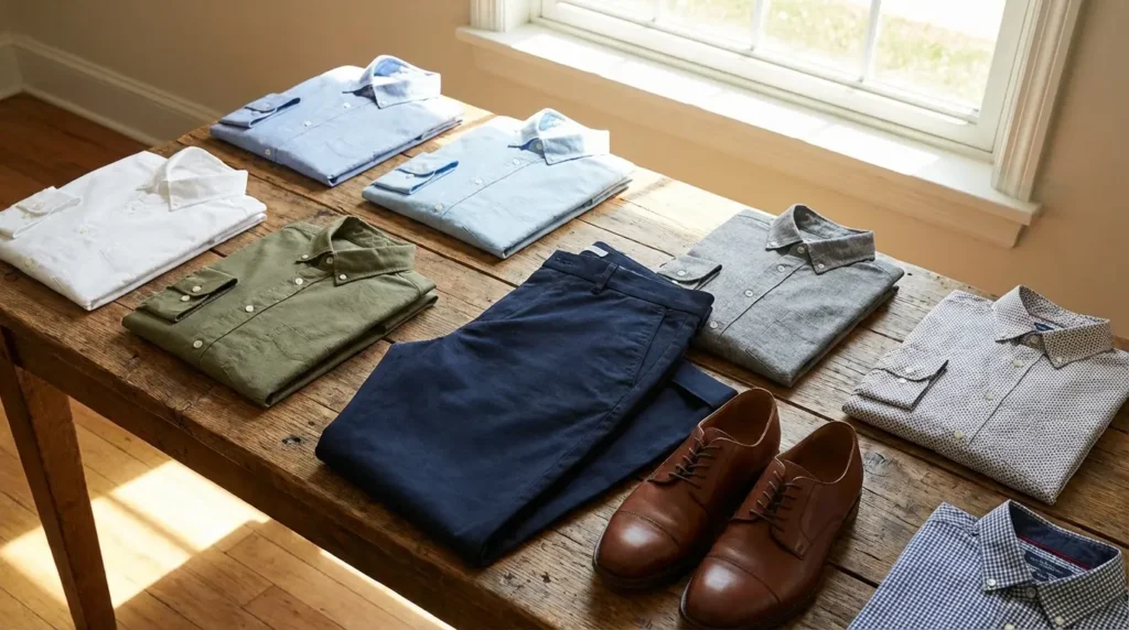
25 Shirt Colors for Navy Blue Pants That Will Upgrade Your Style Instantly
January 9, 2026

Hi, Friend! Jen Glantz her. I’m a bestselling author, the first ever bridesmaid for hire and have been hired by hundreds of brides all over the world. Let’s talk about shirt colors for navy blue pants.
I basically live at weddings for a living, and every single weekend, I see the same thing happen. I spot guys stuck in a “safety loop,” terrified to wear anything other than the white button-down they bought five years ago. Look, I get it. You don’t want to mess up. But you have way more options than you realize, and most of them are probably already hanging in your closet.
Sure, Blue, Pink, and White are the colors everyone gravitates toward, but limiting yourself to just those three is doing your style a disservice. Let’s talk about the specific shirt colors for navy blue pants that turn a basic pair of trousers into an actual outfit.
Quick Resources:
-
Find your most flattering shades with the free Color Analysis Quiz
-
Explore styling and planning support with all wedding tools
TL;DR
Rushing out the door? Here is the cheat sheet so you don’t have to scroll.
-
The Undertone: Navy is a “cool” color. It likes other cool tones (grey, blue) or warm contrasts (rust, burgundy).
-
Read the Room: Light shirts mean business; dark shirts (black, charcoal) mean evening/social; pastels are for the spring.
-
Texture Check: Match the weight. Don’t wear a heavy wool shirt with light linen pants.
-
Shoes: Black or dark brown leather for cool shirts. Cognac or tan leather for warm shirts.
-
The “Old Money” Vibe: Stick to crisp white, ice blue, or cream. It always looks expensive.
-
Modern Update: Wearing black shirts with navy pants isn’t a mistake anymore—it’s actually a huge trend for 2026.
|
Shirt Color Family |
Shoe Choice |
Best For |
The Vibe |
|---|---|---|---|
|
Cool (White, Grey, Blue) |
Black, Dark Brown, Oxblood |
Office, Formal Weddings |
Sharp, Professional |
|
Warm (Pink, Cream, Yellow) |
Tan, Cognac, Loafers |
Spring Events, Day Dates |
Preppy, Approachable |
|
Dark (Black, Charcoal) |
Black Leather, Chelsea Boots |
Nightclubs, Dinner Dates |
Sleek, Modern |
|
Earth (Rust, Olive, Beige) |
Suede, White Sneakers |
Weekends, Casual Fridays |
Relaxed, Trendy |
Before You Pick a Color: The Ground Rules
You can’t just grab a shirt blindly and hope it works. Navy is a neutral powerhouse, but it has requirements. I always tell clients to check the undertone first. If you understand what color analysis is and why it matters, you can stop yourself from looking washed out. Navy is inherently cool, so you have to decide: do you want to blend in (cool shades) or pop (warm contrast)?
Identify your undertone in minutes using the free Color Analysis Quiz
Figure out which shades actually suit you with the free Color Analysis Quiz
Also, respect the event. Dark shirts lower the formality (unless it’s black tie), while light shirts usually scream “I am at work.” And please, watch your shoes. Your shirt choice actually dictates your footwear more than the pants do. Cool shirt? Dark leather. Warm shirt? Tan leather.
Category A: The “Old Money” Classics (Business & Formal)
These are the timeless options. If you have a job interview, a board meeting, or a traditional church wedding, you live in this category. These colors say, “I know what I’m doing.”
Confirm your best formal colors with the free Color Analysis Quiz
1. Crisp White
The gold standard. You want a high-thread-count broadcloth or poplin here. It works for literally anything, from high-stakes boardrooms to black-tie optional weddings. You can pair this with any shoe color, though black keeps it formal and brown adds a bit of flavor.
2. Ice Blue
Think of a blue so pale it’s barely there. It creates a monochromatic look that is easy on the eyes without being as stark as bright white. This is my go-to recommendation for video calls—it looks professional but slightly less stiff.
3. Light Grey
Just like when we pick shirt colors to wear with grey pants, a soft, heathered grey or dove grey shirt with navy bottoms creates a modern, architectural vibe. It mutes the outfit down, making you look sleek. I suggest wearing this with black shoes and a black belt. Fair warning: if you sweat when you’re nervous, light grey shows moisture instantly.
4. Ivory / Cream
This is the warmer, vintage alternative to stark white. Usually found in an Oxford cloth, ivory softens the contrast against the navy. It’s an excellent choice for older guys or anyone with a warmer skin tone. Pair this with brown leather accessories to highlight that warmth.
The “Summer Associate” vs. “The Partner” Strategy:
Picture two guys at a law firm. The young associate wears a stark, bright white shirt—he looks crisp, new, and eager. The senior partner wears an ivory or cream shirt. That slight yellow undertone suggests age, vintage appeal, and a relaxed confidence that says he doesn’t need to try as hard. If you want to project authority rather than eagerness, swap the bright white for ivory.
5. White with Thin Blue Stripes (The Banker Stripe)
Vertical pinstripes or Bengal stripes scream “business power.” The pattern adds visual height to your frame and breaks up the solid block of navy. Keep this strictly for work or business lunches; it can look a little too corporate for a fun party.
Category B: The Wedding Guest Pastels (Spring/Summer)
When the invite says “garden party” or the venue is outdoors, lighten up. These shades are perfect for spring and summer when you want to look festive but approachable.
See which pastels flatter your skin tone with the free Color Analysis Quiz
|
Season/Setting |
Best Pastel Choice |
Why It Works |
|---|---|---|
|
Spring Garden Party |
Pale Pink or Lavender |
Mimics the flowers; high contrast with navy. |
|
Summer Beach Wedding |
Mint Green or Soft Peach |
Reflects tropical vibes; looks great with a tan. |
|
Easter/Daytime Brunch |
Butter Yellow |
Sunny and cheerful; complementary color to blue. |
6. Pale Pink
A classic preppy staple. A solid pink Oxford button-down creates a high-contrast, confident pairing with navy. It is absolutely perfect for spring weddings. I love seeing this paired with tan shoes or loafers for a breezy, sophisticated look.
7. Lavender
Lavender sits opposite yellow on the color wheel, and since navy often has yellow components, this light purple shade really pops. It suggests creativity. It’s a fantastic way to show you put thought into your outfit without being loud about it.
8. Mint Green
This is a very subtle green, bordering on white. It feels fresh and airy, making it ideal for summer casual events. I recommend wearing this with navy chinos rather than formal suit trousers to keep the vibe relaxed.
9. Butter Yellow
Go for a soft, pastel yellow rather than neon or mustard. Yellow and blue are complementary colors, so this look is bold and sunny. It works best in natural daylight—think Easter brunch or daytime garden parties.
10. Soft Peach
Warmer than pink but softer than orange, peach enhances a summer tan beautifully. It creates a warm glow against the cool navy pants. Great for sunset events or warm-weather dates.
Category C: Dark & Moody (Evening/Date Night)
For a long time, people thought you couldn’t mix navy with dark colors. That rule is dead. In 2026, dark shirt colors for navy blue pants are a massive trend for nightlife and winter wear. It looks sleek and expensive.
Test whether dark shades work for you using the free Color Analysis Quiz
11. Jet Black
A fitted black shirt in a satin finish or high-quality cotton creates a sophisticated “midnight” palette. It used to be a fashion faux pas, but now it is a staple in 2025 groom and groomsmen style trends and the ultimate sleek look for a night out. You must wear black shoes with this combination. Don’t mix browns here.
12. Charcoal Grey
If black feels too harsh, go for a dark slate grey. It creates a low-contrast, slimming silhouette that appeals to modern minimalists. This is a great look for creative industries—like architecture or design—where you want to look sharp but not corporate.
13. Deep Burgundy / Maroon
A rich wine color provides a warm, regal contrast to navy. This is my top pick for holiday parties or winter dates. The deep red tones pair exceptionally well with dark brown boots, giving you a cozy yet refined appearance.
The “Company Holiday Party” Upgrade:
Most guys show up to the company Christmas party in the same blue shirt they wore to the office that morning. Don’t be that guy. Bring a deep burgundy shirt to change into at 5:00 PM. The rich red tone instantly signals “festive” and “off-the-clock” while maintaining the professionalism of your navy trousers. It separates your work persona from your party persona.
14. Forest Green
A dark pine green offers an understated, masculine combo. It feels outdoorsy but still refined enough for dinner. It’s a winter casual staple that separates you from the sea of blue and grey shirts.
15. Navy (Tone-on-Tone)
This is the “monochrome suit” look. You match the shirt closely to the pants, or go slightly lighter with a French Navy. To pull this off, the textures must differ—think a denim shirt with wool trousers—so you don’t look like you’re wearing a mechanic’s uniform.
Category D: Earth Tones (Smart Casual)
The “nature” palette is huge right now. These colors create a relaxed, smart-casual vibe that works for weekends, resorts, and creative offices.
16. Beige / Oatmeal
A linen or textured cotton shirt in a sandy hue is the ultimate “resort” look. It looks expensive and relaxed. Pair this with loafers and no socks for a summer vibe that feels effortless.
17. Rust / Burnt Orange
This muted, brownish orange vibrates against the blue pants. It’s incredibly trendy for fall fashion. The orange undertones warm up the navy, making it a standout choice for autumn casual wear.
18. Olive Drab
This muted, military-style green pairs best with navy denim or heavy cotton chinos. It is a rugged, workwear-inspired look that is perfect for weekends and casual Fridays. It says you’re ready for anything.
19. Terracotta
Terracotta is an earthy, clay-red color. It’s similar to rust but has more pink and red undertones. It adds warmth without the aggression of a bright red shirt. It gives off an artistic, bohemian vibe.
20. Slate Blue
This is a blue with heavy grey undertones. It’s a safe bet if you want some color but hate standing out. It falls into the “cool casual” category and works well for guys who want a low-maintenance look.
Category E: Patterns & Textures (Personality)
Sometimes a solid color just isn’t enough. When you want to show some personality or need to navigate wedding styles for any dress code, patterns are your best friend to bridge the gap between formal and casual.
|
Pattern Type |
Best Pant Material |
Formality Level |
|---|---|---|
|
Gingham / Check |
Cotton Chinos |
Business Casual / Smart Casual |
|
Chambray / Denim |
Wool or Textured Cotton |
Weekend Casual / Creative Office |
|
Tattersall |
Corduroy or Tweed |
Academic / Country Club |
|
Micro-Floral |
Fine Wool Suit Pants |
Social Events / Weddings |
21. Blue Gingham
This small checkered pattern in white and mid-blue is the business casual standard. The pattern hides wrinkles well, which is a huge plus. It easily bridges the gap between a day at the office and happy hour drinks.
22. Chambray / Denim
A textured, indigo-dyed fabric contrasts perfectly with the smoothness of navy trousers. This is a rugged, weekend look. I love seeing this paired with brown leather boots or clean white sneakers.
The “Saturday Errands to Dinner” Transition:
You have a busy Saturday that involves running errands, maybe a coffee date, and then a casual dinner with friends. A T-shirt feels too sloppy, but a dress shirt feels too stiff. Enter the Chambray shirt. Worn untucked with white sneakers, it handles the errands. Tucked in with boots, it handles the dinner. The texture of the denim makes the navy pants feel less like “work clothes” and more like “style choices.”
23. Tattersall Check
This thin grid pattern usually involves two colors, like red and blue, on a white background. It’s a very traditional British look that fits well in academic settings or country clubs. It adds subtle color without overpowering the pants.
24. Micro-Floral
A tiny flower print on a white or navy base shows confidence. It is a fantastic choice for a wedding guest or a party. Just keep the rest of the outfit simple—no loud ties—to let the shirt do the talking.
25. Breton Stripe
These horizontal nautical stripes, usually on a knit polo or long-sleeve tee, create the classic “sailor” look. It is ideal for weekends near the water. Pair it with boat shoes or loafers to complete the nautical aesthetic.
Why We Care About Your Pants (The Bridesmaid for Hire Perspective)
You might be wondering, “Why is a professional bridesmaid company giving me fashion advice?” Simple: Weddings are a visual ecosystem. Nothing stresses a bride out more than a groom, dad, or guest who looks wildly out of place in the photos. At Bridesmaid for Hire, we’ve spent over a decade working behind the scenes at hundreds of weddings. We handle the chaos so you don’t have to.
If you’re a groom struggling to coordinate your groomsmen, or a guest panicking about a dress code, we offer coaching and “pop-up problem” solving. We are the unbiased voice of reason you can turn to when you need a script for your speech, a professional to manage drama, or just a sanity check on your outfit.
Get a quick style sanity check with the free Color Analysis Quiz
Final Thoughts
You don’t have to reinvent the wheel to look good; you just have to rotate your tires. Swapping out that standard white shirt for a lavender, rust, or charcoal option completely changes how people perceive you. Start with one new color from this list that feels slightly outside your comfort zone. Wear it, see how you feel, and watch the compliments roll in. Fashion is about confidence, and nothing builds confidence like knowing you nailed the details.
Related posts:


1-800-BRIDESMAID
The Newlywed
Card Game
something extra to love
Read the weekly newsletter from Bridesmaid for Hire, 1-800-Bridesmaid, to hear about real stories, from strangers, who need advice on love, life, friendship, and so much more.
Looking for the perfect wedding gift for someone you adore? Grab The Newlywed Card Game. It's a fun and interactive game they can play on their honeymoon or future date nights.

