


Hi, Friend! Jen Glantz here. I’m a bestselling author, the first ever bridesmaid for hire and have been hired by hundreds of brides all over the world. Let’s talk about what color shirt goes with cream pants.
“Cream pants are timeless and versatile.” That’s what I read on French Crown immediately after impulsively buying my first pair. But when I got home and actually stood in my closet, holding up shirt after shirt, I didn’t feel “timeless.” I felt confused. That versatility they promised? It started to feel a lot more like “hard to match.”
You’ve probably been there. You bought the trousers because they looked killer on the mannequin, but now you have to wear them in the real world without looking like you’re going to a bad 80s costume party. If you’re struggling to figure out exactly what to wear with cream pants, don’t sweat it. I’ve done the trial and error so you don’t have to.
Quick Resources:
-
Find your best shirt colors with the free Color Analysis Quiz
-
Explore the full planning suite in All Wedding Tools

The Cheat Sheet (TL;DR)
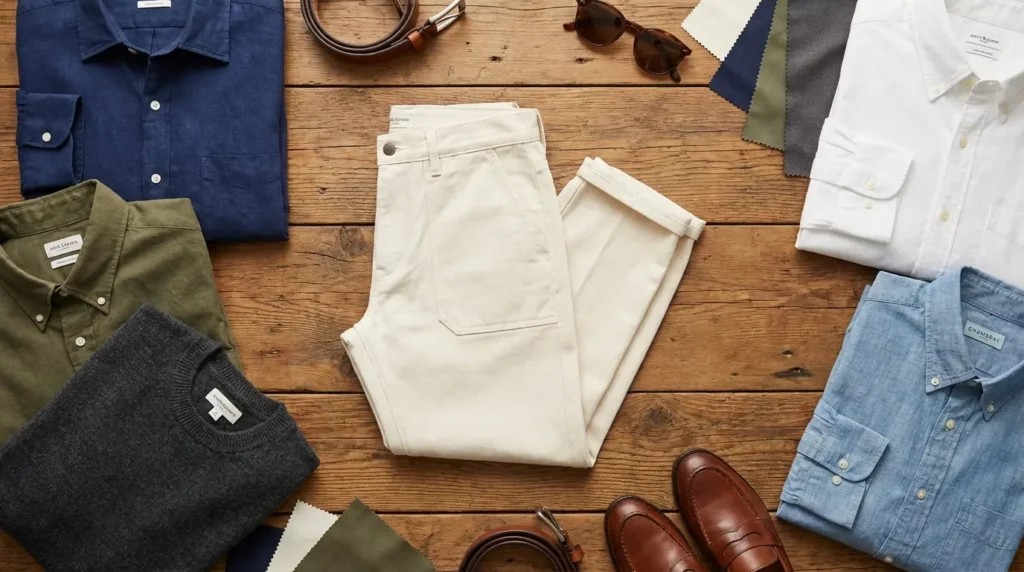
Styling cream trousers is really just about deciding what “vibe” you want. It’s all about contrast. Dark shirts make you look sharp and authoritative; light shirts make you look like you’re on vacation. The only trap? Undertones. Cream has a warm, yellowish tint. You want to either lean into that warmth (with earth tones) or cool it off completely (with blues). Just avoid colors that are too close to the pants but slightly “off,” or you’ll look muddy.
Also, texture is your friend. In 2026, nobody wants to look flat. Mixing denim with chino adds depth. And obviously, read the room—don’t wear a linen pastel shirt to a board meeting.
One last thing: don’t ruin a great outfit with the wrong shoes. Knowing the right shirt colors is only half the battle. Do yourself a favor and check out this guide on shoe colors to pair with cream pants so you don’t trip up at the finish line.
Figure out which shades actually flatter you with the free Color Analysis Quiz
| The Vibe | Go-To Shirt Colors | Where to Wear It |
|---|---|---|
| Sharp & Bossy | Navy, Charcoal, Black | Meetings, fancy dinners |
| Chill & Natural | Olive, Rust, Linen White | Brunch, Casual Friday |
| Party Ready | Lavender, Sky Blue, Dusty Rose | Weddings, Garden parties |
| Bold & Artsy | Teal, Burgundy, Mustard | Galleries, Date nights |
4 Things to Check Before You Get Dressed
You can’t just grab the first clean shirt you see. Cream is a weird neutral—it’s warmer than white but cleaner than khaki. If you’re used to darker pants, you have to shift your mindset. It’s a little trickier than picking shirt colors for tan pants, because cream is unforgiving if you get the tone wrong. Run your outfit through this quick checklist:
1. Contrast
This is the easiest rule. High contrast (cream pants + dark shirt) looks serious and dressy. Low contrast (cream pants + light shirt) looks breezy and summery. Pick the one that matches where you’re going.
2. The Undertone Check
Cream isn’t white. It has yellow in it. Your shirt needs to play nice with that yellow. Blues and purples are great because they are “opposites” on the color wheel, so they balance the warmth. Earth tones work because they share that warmth.
If you honestly don’t know what colors look good on you specifically, it might be worth learning what a color analysis is. It helps you stop buying shirts that wash you out.
Learn your undertones in minutes using the free Color Analysis Quiz
| Your Skin Tone | Quick Tip | Colors to Try |
|---|---|---|
| Cool / Fair | You need contrast so you don’t disappear. | Navy, Charcoal, Deep Plum |
| Warm / Olive | Earth tones will make you glow. | Olive, Rust, Chocolate Brown |
| Deep / Dark | Go for bright pops or crisp whites. | Crisp White, Teal, Lavender |
3. Read the Room
Cream pants are inherently a bit flexible. They can be “Old Money” fancy or “Backyard BBQ” casual. The shirt is what tips the scale. A crisp white button-down says you own a yacht; a rust camp-collar shirt says you’re grabbing a beer.
4. Fabric Matters
Don’t mix a heavy winter flannel with lightweight linen pants. It just looks weird. Try to match the weight of the fabrics.
| Pant Fabric | Best Shirt Match | The Vibe |
|---|---|---|
| Heavy Chino | Oxford, Flannel, Denim | Rugged, Smart Casual |
| Linen | Linen, Seersucker | Vacation Mode |
| Wool Dress Pant | Poplin, Merino Knit | Professional |
| Corduroy | Chambray, Heavy Twill | Vintage / Professor |
The Office Staples (Category A)
These are your safe bets. If you’re heading to the office or a meeting and don’t want to take a fashion risk, stick to these. They rely on classic color theory to keep you looking professional.
The “Big Presentation” Look: Imagine you have a review with the VP. Wear mid-weight cream wool trousers, tuck in a Navy Blue Poplin shirt, and throw on a brown belt. It commands attention without being as boring as a grey suit.
Confirm which workwear colors suit you best with the free Color Analysis Quiz
1. Navy Blue
The gold standard. A crisp navy shirt provides maximum contrast, neutralizes the yellow in the pants, and looks good on literally everyone.

2. Charcoal Grey
Want to look modern? Go for charcoal. It strips the warmth out of the outfit for a sleek, urban, “architect” kind of look.
3. Crisp White
This is a high-risk, high-reward move. It screams luxury, but you have to be careful not to spill coffee. Make sure the cream pants are dark enough that they don’t blend into the shirt.
4. French Blue
A mid-tone blue. It’s richer than a light blue but not as severe as navy. Great for client meetings.
5. Black
For a sharper edge, pair a fitted black tee or button-down with the trousers. It anchors the lightness of the pants. Perfect for a creative office or a dinner date.

Weekend Vibes (Category B: Earth Tones)
These colors shine on weekends, while traveling, or just hanging out. They lean into the natural warmth of the pants for a cozy, approachable look.
See if earth tones are your power colors with the free Color Analysis Quiz
6. Olive Green
Olive and cream is a match made in heaven. It feels organic and harmonious.

7. Rust / Terracotta
Perfect for late summer or autumn. A burnt orange shirt makes the outfit feel warm and inviting.
8. Chocolate Brown
Brown and cream gives off a sophisticated 70s vibe. A brown knit polo looks expensive and soft.
9. Taupe
A greige or taupe shirt creates a seamless look. It’s subtle, monochromatic, and very stylish if the fabrics are nice.
10. Slate Grey
Slate has blue undertones, which cools down the outfit. It’s a great balance for overcast days.

Wedding Season (Category C: Pastels)
Spring weddings, Easter, garden parties—this is where you shine. These colors are festive and fresh. In fact, if you check out lists for top spring wedding guest colors, you’ll see these paired with cream pants constantly because they photograph so well.
Pick pastels that won’t wash you out using the free Color Analysis Quiz
11. Pale Lavender
Lavender looks amazing against cream. It’s a soft purple that feels youthful and trendy without trying too hard.
12. Dusty Rose
Real men wear pink. A “dusty” pink linen shirt offers a romantic vibe that isn’t too loud. It’s grounded and looks great with a tan.
The “Summer Wedding Guest” Look: Outdoor ceremony in July? Go for cream linen trousers and a Dusty Rose linen shirt. Unbutton the top button, wear loafers, and you’ll look festive without sweating through a dark suit.
13. Sage Green
Think of this as the lighter, breezier cousin of olive. Great for beach events.

14. Butter Yellow
This is a bold monochromatic move. A pale yellow seersucker shirt is for the confident guy at a sunny outdoor party.
15. Sky Blue
If you’re nervous about color, start here. A sky blue shirt is friendly, classic, and impossible to mess up.

Date Night (Category D: Bold Contrasts)
When the sun goes down and you want to make a statement, ditch the pastels and go deep.
16. Burgundy / Merlot
A deep red wine color looks rich and regal. It provides formal structure to the lighter pants.
17. Teal
Teal pops against cream like crazy. A polished cotton shirt in this blue-green jewel tone feels luxurious.

18. Mustard Gold
Feeling artistic? A mustard corduroy overshirt is a cool, vintage-inspired choice.
19. Deep Plum
A sophisticated alternative to navy. It’s mysterious and rare—you won’t look like every other guy in the room.
20. Midnight Green
Under indoor lighting, this looks almost black, but softer. It’s sleek and elegant.
Texture & Patterns (Category E)
Sometimes the color isn’t enough. If you’re bored with solids, patterns are the answer. If your pants are very light, looking at advice for shirt colors to pair with white pants can give you some good ideas on how to use patterns to break up the “blank canvas” look.
21. Oatmeal (Textured)
Since the colors are close, use texture to create interest. Try a waffle-knit henley.
22. Breton Stripe (Navy/White)
A striped boat-neck tee breaks up the solid block of cream. It gives off a major French-riviera vibe.

23. Gingham (Light Blue/White)
Small checks add complexity without being loud. It makes the cream pants feel a bit preppy.
24. Vertical Stripe (Grey/White)
Elongate your torso with bold stripes. The grey connects with the cream for a modern look.
25. Denim (Indigo Wash)
A denim shirt offers rugged contrast. The roughness of denim pairs perfectly with the smoothness of chinos.
The “Saturday Morning Coffee” Look: You want to look put-together but comfy. Pull on heavy cream denim jeans and a Western Denim Shirt. The texture contrast is killer.
Why Decision Fatigue Shouldn’t Ruin Your Big Events
Honestly, figuring out undertones and contrast requires a lot of mental energy. You have to think about the venue, the crowd, and the vibe. It’s a lot like planning a wedding. If stressing over a “Dusty Rose” shirt feels overwhelming, imagine the stress of managing an entire bridal party or writing a Maid of Honor speech.
Take the guesswork out of color choices with the free Color Analysis Quiz

We Handle the Chaos So You Don’t Have To
That’s where Bridesmaid for Hire comes in. Just as this guide helps you cheat your way to a better outfit, we offer the cheat codes for the wedding industry. Whether you are a bride needing a “professional bestie” to handle the logistics, or a Maid of Honor looking for speech-writing help, Jen Glantz and the team are there to smooth over the sticky situations.
Support for Every Role
For the bride, we’re the calm in the storm. For the guest or bridal party, we tell you what to say, how to act, and how to survive the season. From 100+ AI wedding tools to professional onsite support, Bridesmaid for Hire ensures your experience is stress-free.
Final Thoughts
You now have the toolkit to wear those cream pants anywhere, from the boardroom to the beach. Start with the “Office Staples” if you want to play it safe, or get weird with the “Bold Contrasts” if you’re feeling adventurous. Fashion should be fun, not a math problem. Use this list to build a wardrobe that actually works for you.


1-800-BRIDESMAID
The Newlywed
Card Game
something extra to love
Read the weekly newsletter from Bridesmaid for Hire, 1-800-Bridesmaid, to hear about real stories, from strangers, who need advice on love, life, friendship, and so much more.
Looking for the perfect wedding gift for someone you adore? Grab The Newlywed Card Game. It's a fun and interactive game they can play on their honeymoon or future date nights.

