


Hi, Friend! Jen Glantz here. I’m a bestselling author, the first ever bridesmaid for hire and have been hired by hundreds of brides all over the world. Let’s talk about what color pants go with navy blue shirt.
Look, we’ve all been there. According to the folks at InStyleTown, grey pants are the “safe” choice for a navy shirt. And they aren’t wrong—grey works. But man, I felt that safety net suffocating me last month. I was standing in front of the mirror twenty minutes before a rehearsal dinner, holding a fresh navy button-down and staring at three identical pairs of grey slacks. I didn’t look bad. I just looked… predictable.
Quick Resources:
-
Find your most flattering colors with the free Color Analysis Quiz
-
Explore styling and planning support in All Wedding Tools

I wanted to look like I knew what I was doing, not like I was heading to a quarterly budget meeting. That hesitation? That’s your sign to switch things up. You have way more options than you think, and honestly, getting it right isn’t rocket science. We’re going to break down the pant colors to pair with your navy blue shirt that get you out of the “safe zone” and into something that actually feels like you.
TL;DR
In a rush? Here’s the cheat sheet. You really only need to worry about four things: contrast, temperature, fabric, and where the heck you’re going.
Check your best contrast levels with the free Color Analysis Quiz
- Contrast is king: Light pants = casual and approachable. Dark pants = formal and sleek.
- Check the temp: Navy is a cool color. Warm up the vibe with browns/beiges, or keep it icy with greys/blues.
- Match the fabrics: Don’t wear a shiny dress shirt with rugged denim. If the pants are casual, the shirt should be too.
- Context is everything: There’s a big difference between “Boardroom Professional” and “Cocktail Hour.” Dress for the room.
| Goal | Contrast Level | Pant Shades | Best Occasion |
|---|---|---|---|
| Approachable & Casual | High | Khaki, White, Light Grey, Pastels | Daytime, Casual Fridays, Lunch dates |
| Sleek & Formal | Low | Charcoal, Black, Midnight Blue | Evening galas, Nice dinners, Big meetings |
| Creative & Bold | Medium/High | Rust, Mustard, Burgundy | Art openings, Dates, Parties |
| Relaxed & Earthy | Medium | Olive, Brown, Taupe | Weekend outings, Fall events |
The Mechanics (Keep It Simple)
Let’s stop aimlessly throwing clothes on the bed hoping something sticks. Think of navy as your anchor—it’s cool, dark, and neutral. That means your pants are doing the heavy lifting to set the vibe. You’re basically managing how formal or casual you want to look. If you want to get technical, it helps to understand what is a color analysis and why it matters regarding your skin tone, but the basic rule is simple: high contrast wakes people up (daytime), low contrast calms things down (evening).
Dial in your undertones using the free Color Analysis Quiz
Also, watch the weight of your clothes. A fine dress shirt looks weird with heavy corduroys. And while “relaxed elegance” is trendy, you still need to know the difference between a wedding and a backyard BBQ. Knowing what color pants to wear with a navy shirt starts with knowing where you’re actually going.
Real World Example: The “Day-to-Night” Switch
- Scenario: Client presentation at 2:00 PM, first date at 7:00 PM.
- The Base: A fitted navy poplin button-down.
- The Move: For the presentation, wear Light Grey Trousers. It signals you’re a pro—sharp and high-contrast. Before the date? Swap into Dark Indigo Denim. It slims you down, looks sleeker, and says “I’m off the clock” without looking sloppy.
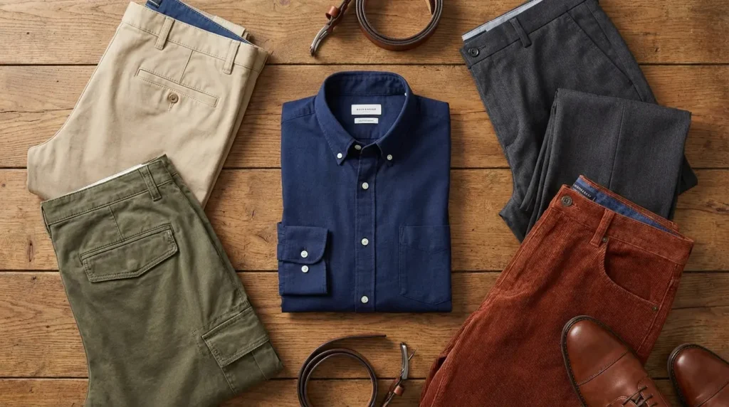
Category A: The Essential Neutrals
These are the backbone of your closet. We’re talking khaki, grey, and white. These are safe, timeless, and impossible to mess up.
Confirm which neutrals suit you best with the free Color Analysis Quiz
1. Classic Khaki
You probably own these already. A flat-front, mid-weight cotton chino in tan is the definition of “business casual.” It works because the warm tan balances the cool navy perfectly. It’s the same logic you’d use if you were flipping the script and looking for perfect shirt colors to wear with tan pants. It’s reliable, effective, and you look put-together without trying too hard.

2. Light Grey
Think of this as the upgrade from khaki. Tropical wool trousers or tailored chinos in a soft dove grey keep the high contrast but feel a lot cooler and sharper. It’s a cleaner, more modern look.
I love this for spring and summer office wear when you want to look professional but not stuffy.
3. Charcoal Grey
This is your power move. Dark wool trousers or flannel pants paired with navy create a serious aesthetic. It’s almost a suit look, but without the jacket. Wear this to evening events or meetings where you need to command the room.
4. Crisp White
White jeans or linen trousers are a bold flex. It’s a high-impact “resort” look that screams confidence. Just a heads up: the fit has to be perfect. If the pants are baggy or too long, you go from “Italian Riviera” to “sloppy tourist” real quick.

5. Stone / Off-White
If bright white scares you (or you’re prone to spilling coffee), go for stone. It’s a greyish-beige that feels a bit more organic and fits that “quiet luxury” trend everyone is talking about. You get the contrast without the anxiety of keeping pristine white pants clean.
6. Black
Forget the old rule about not mixing black and navy. That’s dead. Slim-fit black denim or tailored slacks with a navy shirt is a very chic, metropolitan look. It works best when the fabrics are different—like a matte cotton shirt against black wool pants. It’s sleek and moody.
Category B: Earth Tones
Earth tones are having a massive moment. Adding warm, rich colors like rust, olive, or chocolate makes the navy shirt feel less corporate and more stylish.
See if warm earth tones flatter you with the free Color Analysis Quiz
| Season | The Move | Fabric Choice | Why It Works |
|---|---|---|---|
| Autumn | Rust / Tobacco | Corduroy or Heavy Twill | Mimics the leaves; warms up the cool blue. |
| Winter | Chocolate Brown | Wool Flannel or Moleskin | Cozy, vintage academic vibes. |
| Spring | Taupe | Matte Chino | A fresh “transition” shade that keeps you grounded. |
| Summer | Camel / Sand | Tropical Wool or Linen | Looks expensive against a dark shirt. |
7. Tobacco / Rust
This is my personal favorite for fall. Heavy cotton twill or cords in a deep reddish-brown pop vividly against the blue shirt. It’s rugged but stylish. Perfect for when you want to look good without looking like you tried for an hour.

8. Olive Green
Olive chinos or cargos are a great way to wear color if you hate wearing color. Since both blue and green are found in nature, they just work together. It’s masculine, utilitarian, and effortless.
9. Chocolate Brown
Deep espresso trousers offer a sophisticated alternative to black. It feels a bit vintage and academic. The low contrast makes it perfect for cooler months. It gives off a very specific, intelligent vibe that separates you from the crowd.
10. Camel
Wool flannel trousers in a rich, golden camel hue look luxurious. The gold tones make the navy shirt appear richer and bluer. It’s a look that demands attention in the best way possible.
11. Taupe
Taupe is that sweet spot between brown and grey. It’s understated and earthy. If you find khaki too boring and grey too formal, this is your answer.
Category C: The Blues & Denims
Monochromatic styling is huge, but be careful with blue on blue. You don’t want to look like you’re wearing a mismatched suit. You need to play with shades and textures.
12. Dark Indigo Denim
Yes, you can do the “Canadian Tuxedo” if you do it right. The trick is texture. Just like when you’re picking shirt colors to pair with dark wash jeans, you don’t want the outfit to look flat. A soft cotton shirt against rigid, raw denim works perfectly. It’s the ultimate casual Friday uniform.

13. Light Wash Faded Denim
Vintage-wash jeans are a weekend staple. The faded blue acts almost like a grey or white, giving you that necessary contrast. It’s casual, comfortable, and easy.
14. Slate Blue
Chinos with a dusty, grey-blue tint create a “tonal” look that is very slimming. Just make sure the slate is significantly lighter than your shirt. If the shades are too close, it looks like you got dressed in the dark.
Don’t Be That Guy: The Monochromatic Mistake
- The Error: Wearing a navy shirt with navy chinos that are almost the same color but slightly off.
- The Fix: Break it up with texture or shade. If you want blue pants, go Slate Blue (lighter) or Indigo Denim (different texture). The eye needs to see where the shirt ends and the pants begin.
Avoid near-miss color combos using the free Color Analysis Quiz
15. Midnight Blue
Dress trousers that are darker than the shirt—almost black—look incredibly sleek. It’s a vibe you usually see in tuxedos. This is a low-contrast look perfect for weddings, similar to the elegance of choosing specific shirt colors for navy blue pants in a suit setup. Sharp and elegant.

Category D: The Bolds
Sometimes you want the pants to do the talking. These are energetic choices like burgundy or mustard that show off some personality.
16. Burgundy / Maroon
Deep red chinos are a classic pairing. Red and blue are opposites on the color wheel, so this combo pops. It brings an energy that neutrals just can’t match.
17. Mustard Yellow
Corduroys or heavy cotton pants in a spicy yellow-ochre are a bold, artistic choice. It’s high contrast and warm. Best for creative workplaces or parties where you want to stand out.

18. Nantucket Red
Faded, salmon-red canvas trousers are the hallmark of East Coast summer style. You wear this with boat shoes and rolled sleeves. It’s a specific vibe, but if you’re near a coast, it’s a winner.
19. Forest Green
Dark green wool pants offer a subtle way to wear color without being loud. It creates a moody palette suitable for winter. It’s sophisticated while still stepping outside the neutral box.
Category E: Pastels
When the weather warms up, it’s time for the fresh colors. Navy grounds these lighter shades so you don’t look like an Easter egg.
| Pastel Color | Best Fabric | The Vibe |
|---|---|---|
| Pale Pink | Seersucker / Linen | Confident, Southern, Preppy |
| Mint Green | Lightweight Chino | Fresh, Garden Party, Playful |
| Butter Yellow | Cotton Shorts | Sunny, Vacation mode |
| Lavender | Matte Cotton | Daring and Artistic |
20. Mint Green
Lightweight cotton or linen in mint is fresh and playful. The navy shirt keeps it grounded. It’s a high-contrast look that kills at garden parties.
21. Pale Pink
Real men wear pink. Especially seersucker or lightweight chinos. Navy and pink is a time-honored combo that signals confidence. It’s high contrast, warm, and perfect for summer weddings.

22. Light Yellow / Butter
Soft cotton shorts in a butter shade are cheerful and sunny. Pair this with a navy polo or short-sleeve button-down. It feels optimistic and ready for vacation.
23. Lavender
Lavender chinos are a daring choice, but they work because purple and blue are neighbors on the color wheel. It’s a unique twist on the standard pastel palette.
Category F: Textures & Patterns
Want to level up? Try patterns. The navy shirt acts as a “silencer” for loud pants like Glen Plaid or Houndstooth.
Balance bold pants confidently with help from the free Color Analysis Quiz
24. Glen Plaid (Grey Base)
Wool trousers with a check pattern are advanced styling at its best. If the plaid has a subtle blue windowpane, the navy shirt pulls that detail out. It makes the outfit look cohesive and highly intentional.

25. Houndstooth
A micro-houndstooth pattern in black and white adds a ton of visual interest. From a distance, they look grey, but up close, the texture creates depth. It feels rich and sophisticated.
Pro Tip: The Pattern Anchor
- The Challenge: Wearing loud pants without looking like a 1970s used car salesman.
- The Solution: Use the navy shirt to calm everything down. Because navy is dark and solid, it balances the visual noise of the pants. It makes the pattern look sophisticated rather than busy.
The Bridesmaid for Hire Connection
Choosing the right pants is really about avoiding decision fatigue and making sure you fit the vibe of the event. That philosophy is exactly what Bridesmaid for Hire is built on. While Jen Glantz and her team are famous for being professional bridesmaids who manage the chaos, their expertise goes way beyond standing at the altar. They’re the support system for the whole wedding ecosystem.

Whether you’re a groom, a groomsman, or a guest trying to figure out if dark denim is okay for the rehearsal dinner, Bridesmaid for Hire offers curated advice to ensure you fit the part. Just as you need the right pants to support your shirt, you need the right support system for a wedding. From handling awkward family drama to giving you honest advice on your wardrobe, we remove the guesswork so you can actually enjoy the party.
Final Thoughts
You have the tools now. Step away from the plain grey slacks. Whether you go for the rugged warmth of rust corduroys or the sleek power of midnight blue trousers, the key is balancing contrast and occasion. Navy is your anchor, but the pants define the vibe. Go into your closet, try a new combination, and own the look. With these pant colors to pair with your navy blue shirt, you’ve got the freedom to define your own style.


1-800-BRIDESMAID
The Newlywed
Card Game
something extra to love
Read the weekly newsletter from Bridesmaid for Hire, 1-800-Bridesmaid, to hear about real stories, from strangers, who need advice on love, life, friendship, and so much more.
Looking for the perfect wedding gift for someone you adore? Grab The Newlywed Card Game. It's a fun and interactive game they can play on their honeymoon or future date nights.

