Make styling decisions faster with the Free Color Analysis Quiz


25 Pant Colors to Pair With Dark Blue Shirts That Instantly Upgrade Your Look
January 15, 2026

Hi, Friend! Jen Glantz here. I’m a bestselling author, the first ever bridesmaid for hire and have been hired by hundreds of brides all over the world. Let’s talk about what color pants go with dark blue shirt.
I distinctly remember watching a friend spiral into a panic thirty minutes before his own rehearsal dinner. He was standing there in a perfectly tailored dark blue button-down, staring at a bed covered in pants ranging from neon orange to jet black. He was paralyzed. He had the right shirt, but he suddenly realized the pants dictate the vibe of the room. We sorted it out, but that panic? It’s real. You want to look intentional, not like you got dressed in the dark.
Let’s be honest: a dark blue shirt is a wardrobe cheat code. It’s masculine, sharp, and hides coffee spills better than white. According to The Pant Project, it gives you a polished look that works for almost anything. But while the shirt is easy, figuring out the pant colors to pair with dark blue shirts can trip people up. The good news? It’s actually pretty hard to mess up if you follow a few basic guidelines.
Quick Resources:
-
Use the Color Analysis Quiz to find pant colors that match your undertones (Free)
-
Browse the full suite of styling help in All Wedding Tools
If you’re dealing with a slightly different shade, check out our guide on pant colors for navy blue shirts to make sure you’re matching the right hue.

TL;DR
Running late? Here is the cheat sheet to avoid a fashion disaster:
- Contrast is Everything: You need a difference in brightness between your shirt and pants. If they are too close in shade, you look like a walking bruise.
- Check the Undertones: Cool pants (greys, blues) look modern. Warm pants (browns, beige) look classic. Pick a lane.
- Read the Room: Wool is for weddings and meetings; denim is for the bar. Don’t mix them up.
- Watch the Calendar: Lighter colors for Spring/Summer, deeper tones for Fall/Winter.
Take the Free Color Analysis Quiz to identify pant colors that work with your undertones
4 Ground Rules Before You Choose
Before you grab the first pair of clean pants you see, take a second to think about where you’re actually going. A dark blue shirt is versatile, but the wrong pants can make the whole outfit fall flat.
1. Contrast Levels
If your shirt and pants are too similar in darkness—like dark blue and black—it often looks like a mistake, not a choice. You want enough contrast to break up the silhouette. High contrast looks crisp and energetic; low contrast looks moody and formal.
| Contrast Level | The Vibe | When to Use It | Go-To Colors |
|---|---|---|---|
| High Contrast | Crisp, energetic, pops | Daytime, Business Casual, Summer | White, Khaki, Light Grey, Beige |
| Medium Contrast | Balanced, approachable | Office, Dates, Casual Fridays | Olive, Medium Denim, Burgundy |
| Low Contrast | Sleek, slimming, serious | Galas, Winter, Big Meetings | Charcoal, Black, Chocolate Brown |
2. Undertones: Warm vs. Cool
Dark blue is inherently cool. Pairing it with cool pants (greys, silvers) gives you that sleek “city” look. Pairing it with warm pants (browns, tans, burgundies) creates a nice, dynamic balance.
Not sure what “undertone” your pants have? Look at your accessories. If you usually grab a silver watch and black belt, stick to Cool Undertones (Grey, Slate, White). If you prefer gold watches and brown leather, your outfit will probably look better with Warm Undertones (Khaki, Camel, Brown).
Not sure if you’re warm or cool? Try the Color Analysis Quiz
Struggling with the footwear? Our guide on shoe colors to pair with navy pants has solid advice that applies here too.
3. Formality & Occasion
The fabric tells the story. Wool trousers say “I’m here to do business.” Cotton chinos say “I’m here to work, but I might grab a beer after.” Light wash denim says “I am strictly off the clock.”
For a deeper dive on how not to underdress, check out our wedding outfits guide.
4. Seasonality
In 2026, dressing for the season is huge. White, stone, and light grey are your best friends in Spring and Summer. Once the leaves turn, switch to olive, chocolate, and burgundy.
Use the Color Analysis Quiz to see which seasonal colors flatter you most
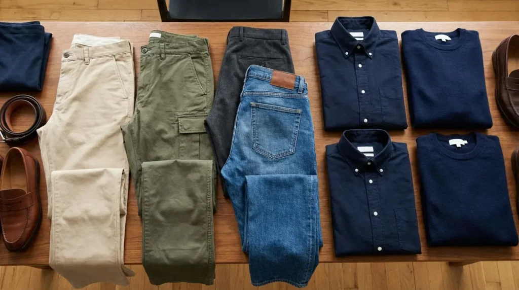
Category A: The Classics (Business & Smart Casual)
These are the failsafe options. You could get dressed in the dark with these and still look good. When hunting for pant colors to pair with dark blue shirts, start here.
Confirm your best neutral options with the Color Analysis Quiz
1. Classic Khaki
The bread and butter. It’s clean, it’s crisp, and it bridges the gap between casual and professional perfectly. The contrast between the warm khaki and the cool blue just works.

2. Light Grey
Think of this as the sharper, more modern cousin of khaki. Light grey wool trousers make the blue shirt pop without giving off that “prep school” vibe. It’s a great look for the city.
3. Charcoal Grey
This is for when you want to look serious. It’s the closest you can get to black while still having enough contrast to look intentional. Perfect for evening events or winter meetings.

4. Beige
A little lighter and less yellow than khaki. It’s a softer neutral that screams “summer afternoon.”
5. Olive Green
A rugged classic. The earthy green tones look fantastic against dark blue. It’s a masculine combo that works perfectly for a casual Friday.
This is the ultimate “Monday Morning” hack. You have a presentation at 10 AM but drinks at 5 PM? Dark blue shirt + Olive Green Chinos. You look creative in the meeting, but relaxed at the bar.
Category B: The Modern Neutrals (Sleek & Minimalist)
If you want to look a bit more trendy and 2026-appropriate, look at these clean, minimalist options. (For more on this vibe, check the 2025 groom and groomsmen style trends).
| Occasion | The Move | The Vibe |
|---|---|---|
| Summer Wedding | Crisp White or Stone | Expensive, Riviera Style |
| Tech Office | Slate Grey | Modern, Smart, “I code things” |
| First Date | Taupe | Warm, Approachable |
| Rooftop Bar | Off-White / Cream | Sophisticated, High-Status |
6. Crisp White
The ultimate power move. White denim or linen with a dark blue shirt gives off major “I’m on vacation in Italy” energy. Just be careful with red wine.

7. Off-White / Cream
If pure white feels too harsh (or risky), go for cream. It adds a touch of luxury and warmth. Great for summer nights.
8. Stone
It’s not quite grey, not quite beige. Stone is a versatile, contemporary color that works year-round.

9. Slate Grey
A grey with blue undertones. It creates a near-monochromatic look that isn’t quite a suit, but looks very put-together.
10. Taupe
A brownish-grey that brings warmth without committing to full brown trousers. Excellent for spring or autumn.
Category C: The Earth Tones (Rich & Autumnal)
These colors add depth and texture. They look best in cooler months or when you want to look a bit more “rugged gentleman.”
Find out if earth tones work for you with the Color Analysis Quiz
11. Chocolate Brown
Deep, rich, and sophisticated. Pair this with a dark blue shirt and you instantly look like you own a library full of leather-bound books. Great for winter.
12. Camel
Punchier than khaki, camel adds a golden tone that looks expensive, especially in wool or corduroy.

13. Tobacco
A reddish-brown that is super trendy right now. It adds a rustic flair—think leather boots and a weekend getaway.
14. Rust / Burnt Orange
Bold but scientifically proven to work. Orange sits opposite blue on the color wheel, which is just fancy art-talk for “these look awesome together.” Ideally suited for fall.
15. Sand
A pale, desaturated yellow-brown. It’s got a beachy, relaxed vibe. Strictly for warm weather and linen fabrics.
Category D: The Bolds (Creative & Statement)
For when you want to stand out at a wedding, party, or creative workplace.
16. Burgundy / Maroon
A classic collegiate combo. Deep red wines pair exceptionally well with dark blue.
Picture this: You’re at a company holiday party. The invite says “Festive Casual.” Don’t wear the ugly sweater. Wear your dark blue shirt tucked into Burgundy Corduroys. You hit the red/blue theme without looking like a costume.
17. Nantucket Red
That faded, salmon-red color usually found in chinos. It’s very specific to East Coast prep style, yacht clubs, and summer parties.
18. Mustard Yellow
A muted, spicy yellow. Because blue and yellow are opposites, this pops aggressively. It’s a bold move, but it works in artistic settings.

19. Forest Green
A dark, cool green. Pairing this with dark blue is subtle, stylish, and moody.
20. Teal
A blue-green mix. It plays off the shirt but adds a different dimension. Good for cocktail attire.
Category E: Denim & Texture (Casual & Relaxed)
Here, the texture matters just as much as the color.
| Fabric | Season | Vibe | Shoes |
|---|---|---|---|
| Linen | Summer | Resort | Loafers |
| Chino | All Year | Smart Casual | Sneakers / Boots |
| Wool | Winter | Business | Oxfords |
| Denim | All Year | Casual | Boots |
| Corduroy | Autumn | Academic | Leather Boots |
21. Light Wash Denim
This creates a contrast that works because the shades are far apart. It’s a “double denim” look that doesn’t look like a uniform.
22. Medium Wash Denim
The standard blue jean. Just make sure the shirt is significantly darker than the jeans so you don’t look like you’re wearing a Canadian Tuxedo.
Got the jeans picked out? Complete the look by checking out what color shoes go with blue jeans.
23. Grey Denim
Faded black or grey jeans add a bit of a rock-and-roll edge. Great for concerts or dive bars.
24. Herringbone / Tweed
Patterned wool trousers add texture and visual interest. Ideal for a rustic winter setting.
25. Seersucker
That striped, puckered fabric. It’s a high-contrast, bold look specific to things like the Kentucky Derby or humid summer weddings.
When the Outfit is Just the Tip of the Iceberg
Trying to figure out pant colors is often just one small stressor in a sea of decision fatigue. Whether you’re a groom styling your guys, a guest decoding a dress code, or part of the wedding party, the pressure to get it “right” can be a lot.
This is exactly where Bridesmaid for Hire steps in.
We can definitely help you decide between Charcoal Grey and Chocolate Brown, but our expertise goes way beyond the wardrobe. Jen Glantz and the team at Bridesmaid for Hire are basically professional calm-in-the-chaos.

Wedding planning involves thousands of tiny decisions. We act as that unbiased voice of reason to help you make a choice and move on. If a groomsman spills wine on his khakis 10 minutes before photos? We’re the ones with the fix.
We aren’t just there to make sure you look good; we’re there to make sure you feel good. From handling family drama to just being a friend on the big day, we’ve got your back.
Whether you need a “fake” bridesmaid, a logistics pro, or just someone to tell you that, yes, the burgundy pants look sick—Bridesmaid for Hire is your go-to.
Final Thoughts
The dark blue shirt is a power tool in your closet, but the pants tell the rest of the story. Whether you go for the sharp contrast of light grey or the rich vibe of chocolate brown, just be intentional about it. Experiment with these options, trust your gut, and wear it with confidence.


1-800-BRIDESMAID
The Newlywed
Card Game
something extra to love
Read the weekly newsletter from Bridesmaid for Hire, 1-800-Bridesmaid, to hear about real stories, from strangers, who need advice on love, life, friendship, and so much more.
Looking for the perfect wedding gift for someone you adore? Grab The Newlywed Card Game. It's a fun and interactive game they can play on their honeymoon or future date nights.

