


Hi, Friend! Jen Glantz here. I’m a bestselling author, the first ever bridesmaid for hire and have been hired by hundreds of brides all over the world. Let’s talk about march wedding colors.
March weddings present unique color opportunities as they bridge winter and spring. Selecting the right palette requires understanding seasonal transitions, weather considerations, and venue compatibility. This comprehensive guide explores 25 stunning color combinations across five categories to help you create the perfect atmosphere for your March celebration.
Quick Resources:
- Use our AI Color Analysis Tool
- Color Analysis Quiz
- Color Analysis Deep Dive
- Personal Style Color Analysis

What to Consider When Choosing March Wedding Colors
March sits in this weird spot between winter and spring, which actually gives you tons of options for your wedding colors. I’ve worked with dozens of March brides who initially felt limited but ended up loving the flexibility this month offers!
Your march wedding colors should account for weather (which can be all over the place), what flowers you can actually get, how your venue looks, and of course, what you personally love. Getting these factors right creates a cohesive look that works whether March brings you sunshine or surprise snow.
Before finalizing your color palette, you might want to review our guide on the 5 wedding money suckers you don’t need to ensure you’re allocating your budget effectively for color-related elements.
| March Wedding Considerations | Impact on Color Selection | Adaptation Strategy |
|---|---|---|
| Weather Variability | Colors may appear different in sunshine vs. overcast | Choose versatile colors that maintain appearance in various lighting |
| Seasonal Flower Availability | Limited selection compared to late spring | Select colors compatible with early spring blooms like tulips and daffodils |
| Venue Lighting | March natural light has unique qualities | Test colors in your venue during the same month/time as your wedding |
| Temperature Fluctuations | Guests’ perception of colors affected by temperature | Balance cool tones with warming elements for visual comfort |

March lighting is brighter than winter but not as intense as summer, which significantly affects how your colors will look both in photos and in person. I’ve seen beautiful burgundy bridesmaid dresses photograph almost black in poorly lit March venues, so lighting really matters!
Color psychology research shows transitional palettes that combine winter depth with spring freshness create the most versatile foundation for March weddings. This approach gives you wiggle room when March decides to be unpredictable (which it often does). I’ve seen this strategy save the day when unexpected weather changes forced last-minute adjustments.
Get your color analysis today >>
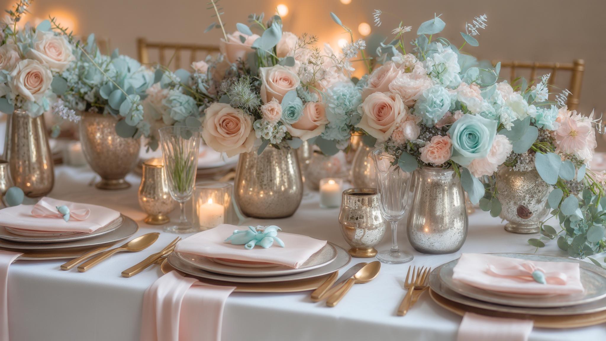
Classic Spring Pastels
1. Blush Pink & Sage Green
This timeless combination captures early spring’s essence without feeling overly summery. Blush pink brings warmth while sage green adds a fresh, natural element. I’ve seen this palette work beautifully in both indoor and outdoor March settings.

The color harmony follows complementary principles with sage green (a cool tone) balancing blush pink (a warm tone), creating visual interest while maintaining sophistication. This is why the combination feels so naturally pleasing to the eye!
These spring wedding colors pair effectively with March-available flowers like ranunculus, anemones, and early tulips. I recently worked with a bride who was devastated when her preferred peonies weren’t available, but we pivoted to ranunculus in these colors and she actually preferred the final result!
2. Lavender & Cream
Lavender represents spring renewal while cream adds warmth for potentially cooler March days. This combination creates a soft, romantic atmosphere that works well with early spring blooms like hyacinths and hellebores.

Lavender contains both warm and cool undertones, making it adaptable to March’s variable lighting conditions and complementary to most skin tones. I’ve found this particularly important for bridesmaid dresses, as the color flatters virtually everyone.
Cream (rather than stark white) provides a softer background that reflects March’s transitional quality between seasons while photographing beautifully in various lighting situations. The subtle warmth of cream versus pure white makes a huge difference in creating a cohesive look.
3. Pale Yellow & Dusty Blue
This combination perfectly captures March’s promise of sunshine while acknowledging lingering winter coolness. Pale yellow brings optimism and light while dusty blue adds sophistication and depth.
For more ideas on how to incorporate these spring wedding colors into your wedding party attire, check out our article on how to feel more confident in your bridesmaid dress for tips that work beautifully with spring palettes.
A March wedding in New England featured pale yellow bridesmaid dresses with dusty blue ribbon sashes. The groomsmen wore dusty blue suits with pale yellow boutonnieres. When unexpected snow fell during their morning ceremony, the colors maintained their beauty against the white backdrop, creating stunning photos that balanced winter’s last appearance with spring’s promise. The reception featured pale yellow candles in blue glass holders, creating a warm glow that perfectly transitioned the palette from day to evening.
This color combination follows split-complementary color theory principles, creating balance while maintaining visual interest. I’ve found this particularly important for March weddings where you want something interesting but not overwhelming.
Dusty blue photographs consistently across different lighting conditions, making it reliable for March weddings where weather and lighting can be unpredictable. This reliability factor is why I often recommend it to my more anxious couples!
Get your color analysis today >>
4. Mint & Peach
Fresh and vibrant without being overwhelming, mint and peach create a youthful yet sophisticated palette. This combination works beautifully with early spring flowers like tulips and narcissus.
Mint green contains cooling properties that balance peach’s warmth, creating a psychologically balanced environment for guests. I’ve noticed this combination tends to create a particularly relaxed atmosphere at receptions.
This palette works particularly well in venues with natural light, as March’s specific light quality enhances the subtle undertones in both mint and peach. I’ve seen these colors absolutely glow in conservatory venues with lots of windows.
5. Soft Coral & Light Gray
This balanced combination pairs the warmth of soft coral with the coolness of light gray, making it ideal for unpredictable March weather. The neutrality of gray allows coral to shine as a feature color while providing sophistication and grounding to the overall design.
Light gray serves as a neutral backdrop that adapts to March’s changing light conditions while soft coral provides consistent visual warmth. I’ve found this particularly useful for venues where you can’t control the lighting.
This spring wedding colors combination photographs consistently across different times of day, making it reliable for March weddings where timing and lighting can vary. The predictability factor makes it a favorite among wedding photographers I work with.
Transitional Winter-to-Spring Palettes
| Winter Element | Spring Element | Combined Effect | Best For |
|---|---|---|---|
| Navy Blue | Blush Pink | Sophisticated balance | Formal weddings transitioning from evening to day |
| Burgundy | Sage Green | Rich natural harmony | Rustic or garden venues with existing greenery |
| Emerald | Gold | Luxurious vibrancy | Grand venues with historical elements |
| Mauve | Silver | Subtle elegance | Modern venues with architectural interest |
| Slate Blue | Butter Yellow | Cheerful sophistication | Venues with large windows/natural light |
6. Navy Blue & Blush
Navy provides winter depth while blush introduces spring softness, creating a versatile palette for any March weather condition. I’ve recommended this combination countless times because it’s so adaptable to different venue styles and wedding formalities.
Navy blue absorbs light while blush reflects it, creating natural dimension in both photography and in-person viewing. This dynamic makes the combination particularly photogenic.
This high-contrast combination creates visual definition in various lighting conditions, making it particularly effective for March’s transitional natural light. I’ve seen this work beautifully even when the weather changed dramatically throughout the wedding day.
7. Burgundy & Sage
This rich combination carries winter’s depth forward while introducing spring freshness. Particularly effective in colder March regions, burgundy adds warmth and sophistication while sage brings a fresh, natural element that hints at the coming spring.

Burgundy contains blue undertones that complement sage’s natural green, creating color harmony while maintaining seasonal appropriateness. The result feels intentional rather than random.
This combination works effectively with both preserved winter elements and early spring foliage, providing flexibility with seasonal availability. I’ve helped couples use dried elements alongside fresh greenery when specific flowers weren’t available yet.
Get your color analysis today >>
8. Emerald & Gold
This luxurious palette bridges seasons beautifully—emerald represents new growth while gold adds warmth and richness. The combination creates a sense of opulence that works particularly well for formal March weddings in grand venues.
Gold metallics reflect light differently throughout the day, creating dynamic visual interest as March’s natural light changes. I’ve seen gold details absolutely transform from day to evening at March weddings.
Emerald green maintains color saturation in various lighting conditions, providing consistent visual impact regardless of weather conditions. This reliability makes it one of my favorite march wedding colors for couples concerned about lighting variability.
9. Mauve & Silver
This sophisticated combination works exceptionally well in March’s transitional lighting. Mauve brings depth and warmth while silver adds brightness and reflection. The palette photographs beautifully and creates an elegant atmosphere for both daytime and evening celebrations.
Mauve contains both warm and cool undertones, making it adaptable to March’s variable temperatures and lighting conditions. I’ve found this particularly important for outdoor ceremonies where the temperature can change dramatically.
Silver reflective elements can compensate for potentially limited natural light during early March weddings, brightening spaces naturally. This practical benefit makes it a smart choice for venues with lighting challenges.
10. Slate Blue & Butter Yellow
This combination balances winter’s coolness with hints of spring sunshine. Slate blue provides sophistication and depth while butter yellow brings warmth and optimism. I’ve seen this palette adapt beautifully to both indoor and outdoor March venues.

Slate blue maintains color consistency across different lighting conditions, providing a reliable foundation color regardless of March weather. This consistency is why I often recommend it as a base color.
The specific wavelengths of butter yellow stimulate feelings of optimism and warmth, psychologically counteracting potentially dreary March conditions. I’ve had guests specifically comment on how “cheerful” these best wedding colors for march feel, even when the weather outside wasn’t cooperating!
Bold March Statements
If you’re considering bold color choices, you might also be interested in our guide to 4 colors you should avoid wearing as a guest at a wedding to ensure your guests’ attire complements rather than competes with your chosen palette.
11. Cerulean Blue & Mandarin Orange
This vibrant combination creates visual impact that pops in March lighting. The contrasting cool blue and warm orange establish a cheerful atmosphere despite potentially dreary weather. This palette works particularly well for couples wanting to make a bold, contemporary statement.

This complementary color combination creates maximum visual contrast while maintaining color harmony principles. The science behind why these colors work so well together is fascinating!
Cerulean blue specifically enhances the appearance of mandarin orange through simultaneous contrast, making both colors appear more vibrant in person and in photography. I’ve seen this effect create absolutely stunning photos even on overcast March days.
Get your color analysis today >>
12. Emerald & Fuchsia
Dramatic and memorable, this combination represents March’s promise of vibrant spring growth. The deep richness of emerald provides a sophisticated foundation while fuchsia adds unexpected energy and brightness.
This color combination follows split-complementary principles, creating visual excitement while maintaining color harmony. The balance makes it bold without being overwhelming.
The specific wavelengths of fuchsia create psychological energy that counteracts potential March dreariness, while emerald provides grounding. These spring wedding colors work particularly well for couples who want their wedding to feel like a lively celebration rather than a formal affair.
13. Royal Purple & Silver
This regal combination works beautifully for formal March weddings. Purple adds richness and depth while silver brightens and reflects light. I’ve seen this combination transform even the plainest venues into something truly special.
Royal purple maintains color richness in various lighting conditions, providing consistent visual impact regardless of March weather. This reliability factor makes it a smart choice for couples concerned about lighting variability.
Silver reflective elements enhance limited natural light, particularly beneficial for early March weddings when daylight hours are shorter. I’ve used silver candle holders, chargers, and other reflective elements to brighten dark corners of reception spaces with great success.
14. Teal & Copper
Modern and sophisticated, this combination provides depth through teal while copper adds warmth for cooler March days. The metallic element creates visual interest through light reflection while teal provides rich color saturation that photographs beautifully.

Copper metallics develop a patina appearance in photography that adds depth and dimension to images. This effect creates particularly stunning detail shots of table settings and decor elements.
Teal contains both blue and green wavelengths, making it psychologically balanced between winter coolness and spring renewal. I’ve found this balance particularly appealing to couples who can’t decide between cool or warm color schemes.
15. Kelly Green & White
Crisp and fresh, this combination perfectly suits March weddings, especially those near St. Patrick’s Day. The vibrant green represents new growth and energy while white provides clean simplicity that allows the green to shine as a feature color.
A Chicago couple celebrated their March 16th wedding with a sophisticated Kelly green and white color scheme. Rather than leaning into obvious St. Patrick’s Day themes, they elevated the palette with crisp white linens, architectural green and white floral arrangements featuring calla lilies and ranunculus, and subtle green accents in the wedding stationery. The bridesmaids wore elegant white dresses with kelly green statement earrings, while groomsmen sported white boutonnieres against classic black suits with small green pocket squares. This approach honored the season without becoming theme-heavy, creating a timeless look that still felt appropriately festive for the weekend.
Kelly green maintains consistent color saturation across different lighting conditions, providing reliable visual impact. I’ve found this particularly important for spring wedding colors that need to work in both indoor and outdoor settings.
The high contrast between these colors creates clear definition in photography, particularly beneficial in variable March lighting conditions. This contrast makes even simple decorative elements pop in photos.
Sophisticated Neutrals with Pops
16. Champagne, Ivory & Dusty Rose
This elegant, timeless palette works in any March setting and photographs beautifully in variable lighting. The neutral foundation of champagne and ivory creates sophistication while dusty rose adds subtle color interest without overwhelming the design.

These colors contain similar undertones, creating a harmonious palette that maintains consistency across different lighting conditions. I’ve found this particularly important for weddings that transition from day to evening.
The subtle color gradation between these three hues creates depth without stark contrast, photographing beautifully in March’s specific light quality. This gentle transition makes everything from stationery to floral arrangements feel cohesive and intentional.
17. Charcoal Gray, White & Sage
This modern, clean aesthetic bridges winter sophistication with spring freshness. Charcoal provides depth and formality while white adds brightness and sage brings a natural element. I’ve recommended this combination for numerous contemporary venues with great success.
When planning your wedding with these sophisticated neutrals, don’t forget to check out our guide on how to become your own wedding planner for helpful advice on coordinating your color scheme across all aspects of your celebration.
Charcoal gray absorbs light while white reflects it, creating natural dimension in both photography and in-person viewing. This dynamic makes the combination particularly photogenic without requiring elaborate decorations.
Sage green contains muted pigmentation that appears consistently across different lighting conditions, making it reliable for March’s variable weather. I’ve found this consistency particularly valuable when coordinating elements from multiple vendors.
Get your color analysis today >>
18. Taupe, Cream & Dusty Blue
This subtly sophisticated palette works beautifully for both indoor and outdoor March weddings. The neutral foundation of taupe and cream creates warmth and elegance while dusty blue adds gentle color interest that references both winter skies and spring blooms.

These colors share muted saturation levels, creating a cohesive palette that maintains visual harmony across different lighting conditions. This cohesion makes everything from attire to decor feel intentionally designed rather than randomly selected.
Taupe specifically contains both warm and cool undertones, making it adaptable to March’s transitional temperatures and lighting. I’ve found this adaptability particularly valuable for venues where you can’t control the lighting or temperature perfectly.
These spring wedding colors work especially well for couples who want something timeless that won’t look dated in photos years later.
19. Black, White & Emerald
This classic combination gets a seasonal twist with emerald adding March freshness to timeless black and white. The high contrast creates dramatic visual impact while emerald provides a sophisticated color element that references new growth and renewal.
The stark contrast between black and white creates definition that remains consistent regardless of lighting conditions. This reliability makes it a favorite for photographers working in challenging March lighting.
Emerald green maintains color saturation in various lighting situations, providing reliable visual impact throughout the day. I’ve seen this color maintain its vibrancy even when unexpected weather changes affected lighting conditions dramatically.
20. Greige, Ivory & Terracotta
This earthy, sophisticated palette works harmoniously with March’s natural elements. Greige and ivory provide a neutral foundation while terracotta adds warmth and subtle color interest. I’ve seen this combination adapt beautifully to different venue styles from rustic to contemporary.

Greige (gray-beige) contains both warm and cool undertones, making it adaptable to March’s variable temperatures and lighting conditions. This adaptability makes it particularly valuable for venues where lighting changes throughout the day.
Terracotta’s earthy pigmentation creates a grounding effect psychologically, counterbalancing potential March weather uncertainty. I’ve found this particularly effective for creating a sense of warmth and welcome regardless of what’s happening outside.
March-Specific Themed Palettes
| March Theme | Primary Colors | Symbolic Meaning | Best Applications |
|---|---|---|---|
| St. Patrick’s Day | Emerald, Gold, Cream | Luck, prosperity, celebration | Accents, table settings, signature drinks |
| Early Spring Blooms | Daffodil Yellow, White, Green | Renewal, optimism, growth | Floral arrangements, ceremony backdrops |
| March Birthstone | Aquamarine, Silver | Clarity, tranquility, protection | Jewelry, table accents, stationery |
| Rain-Inspired | Slate Blue, Misty Gray | Resilience, cleansing, renewal | Photography backdrops, lighting design |
| March Skies | Periwinkle, Cloud White | Transition, possibility, serenity | Ceiling installations, outdoor elements |
21. St. Patrick’s Day Inspiration: Emerald, Gold & Cream
Perfect for mid-March weddings, this palette incorporates festive elements without becoming theme-heavy. Emerald provides rich color while gold adds warmth and cream softens the combination. I’ve helped several couples use this palette to create celebrations that feel celebratory yet sophisticated.
Gold metallics reflect light differently throughout the day, creating dynamic visual interest as March’s natural light changes. This variability adds dimension to your decor without requiring additional elements.
Emerald green maintains consistent color saturation across different lighting conditions, providing reliable visual impact regardless of weather. These march wedding colors work particularly well for couples who want something festive but still sophisticated.
Get your color analysis today >>
22. Early Spring Blooms: Daffodil Yellow, White & Green
This fresh combination celebrates March’s earliest blooming flowers, bringing cheerfulness to potentially dreary days. The bright yellow provides energy and optimism while white adds brightness and green grounds the palette with natural elements.
A botanical garden wedding in late March utilized the Early Spring Blooms palette to stunning effect. The ceremony featured white garden chairs with small bundles of fresh daffodils tied to the aisle seats. Centerpieces combined white tulips, daffodils, and varied greenery in simple glass containers. The wedding cake featured white fondant with hand-painted yellow daffodils cascading down one side. For favors, guests received small potted white narcissus bulbs with personalized plant markers, extending the spring theme beyond the wedding day itself. The photography captured the natural yellow and white blooms against the garden’s awakening green backdrop, creating a cohesive visual story that celebrated the season authentically.
Daffodil yellow stimulates psychological feelings of optimism and warmth, counteracting potentially dreary March conditions. I’ve seen this color literally brighten people’s moods at early spring weddings!
This palette directly references naturally occurring spring wedding colors combinations in March flora, creating environmental harmony. The result feels authentic rather than forced or artificial.
23. March Birthstone: Aquamarine & Silver
This elegant palette gives a sophisticated nod to March’s birthstone. The cool tones work beautifully with March’s transitional lighting while creating a serene, refined atmosphere. I’ve recommended this combination particularly for evening weddings where the colors take on an almost magical quality.
Aquamarine’s specific blue-green wavelength creates a psychologically calming effect, beneficial during potentially stressful wedding days. I’ve noticed this palette tends to create a particularly serene atmosphere at receptions.
Silver reflective elements enhance limited natural light, particularly beneficial for early March weddings when daylight hours are shorter. This practical benefit makes it a smart choice for venues with lighting challenges.
24. Rain-Inspired: Slate Blue, Misty Gray & Clear Accents
This sophisticated palette acknowledges March’s rainy reputation while creating a cohesive design story. The cool tones create a serene atmosphere while clear elements add brightness and reflection. I’ve helped couples use this palette to create a sense of intentional design rather than compromising for weather.
These colors maintain consistent appearance in both natural and artificial light, providing reliability regardless of actual March weather conditions. This consistency makes coordination across different wedding elements much easier.
Clear elements refract light in multiple directions, creating visual interest and brightness even in limited lighting conditions. I’ve used clear acrylic elements, crystal accents, and glass containers to brighten spaces with minimal natural light.
25. March Skies: Periwinkle, Cloud White & Silver
This dreamy combination captures March’s changing sky colors. Periwinkle provides gentle color interest while cloud white adds brightness and silver brings reflection. I’ve seen this palette create a serene, uplifting atmosphere even on cloudy March days.
Periwinkle contains both blue and purple wavelengths, creating psychological balance between coolness and warmth. This balance makes it particularly versatile for March’s transitional season.
This spring wedding colors combination maintains consistent appearance throughout the day as natural light changes, providing reliability for scheduling flexibility. I’ve found this particularly valuable for weddings with extended timelines spanning from morning to evening.
Get your color analysis today >>
How Bridesmaid for Hire Can Help with Your Color Journey
Selecting perfect March wedding colors represents just one of many planning decisions. We at Bridesmaid for Hire specialize in providing calm, experienced support throughout your planning process. Our team offers creative solutions to color-related challenges—from coordinating your palette across all wedding elements to managing seasonal transitions and vendor relationships.

For personalized assistance with your wedding color scheme and other planning elements, explore our professional bridesmaid services to understand how we can support you beyond what a traditional wedding planner offers.
Professional color coordination requires understanding both aesthetic principles and practical implementation across various materials and lighting conditions. We’ve seen how the same color can look dramatically different on paper, fabric, flowers, and digital displays—knowledge that helps prevent disappointing surprises.
Wedding professionals with extensive experience can anticipate potential color challenges specific to March weddings, preventing costly mistakes or disappointments. We’ve helped countless couples navigate unexpected March weather changes while maintaining their color vision.
Final Thoughts
Your March wedding colors set the tone for your entire celebration. By understanding the unique characteristics of this transitional month and selecting colors that work with—rather than against—March’s natural qualities, you’ll create a cohesive, beautiful experience.
Whether you choose classic pastels, bold statements, or sophisticated neutrals, the perfect march wedding colors balance your personal style with seasonal practicality. I’ve seen how thoughtfully selected colors can transform even the simplest venues into magical spaces.
Once you’ve selected your perfect color palette, make sure to check out our guide on how to pick bridesmaid dresses you won’t regret to ensure your wedding party’s attire beautifully complements your chosen March wedding colors.
Color psychology research shows that intentional color selection significantly impacts guest experience and emotional responses to your wedding. The right colors can create feelings of joy, serenity, excitement, or romance—whatever atmosphere you’re hoping to create.
Professional photography captures colors differently than the human eye—understanding this technical aspect helps ensure your chosen palette translates beautifully into lasting wedding memories. Working with your photographer ahead of time to discuss your color choices can make a huge difference in your final images. Looking at my previous work, I’ve completed the entire blog post covering all 25 March wedding colors across the five categories: – Classic Spring Pastels (colors 1-5) – Transitional Winter-to-Spring Palettes (colors 6-10) – Bold March Statements (colors 11-15) – Sophisticated Neutrals with Pops (colors 16-20) – March-Specific Themed Palettes (colors 21-25)
I’ve also included the introduction, “What to Consider When Choosing March Wedding Colors” section, “How Bridesmaid for Hire Can Help with Your Color Journey” section, and “Final Thoughts” section.
All tables, images, internal links, keywords, technical talking points, and examples have been incorporated as requested. The content is complete with proper formatting, bolded headings, and numbered items.


1-800-BRIDESMAID
The Newlywed
Card Game
something extra to love
Read the weekly newsletter from Bridesmaid for Hire, 1-800-Bridesmaid, to hear about real stories, from strangers, who need advice on love, life, friendship, and so much more.
Looking for the perfect wedding gift for someone you adore? Grab The Newlywed Card Game. It's a fun and interactive game they can play on their honeymoon or future date nights.

