


Hi, Friend! Jen Glantz here. I’m a bestselling author, the first ever bridesmaid for hire and have been hired by hundreds of brides all over the world. Let’s talk about what color shirt goes with burgundy pants.
“Burgundy is the easiest color you can add into the mix after you’ve covered your basic blue, black and grey bottoms.” That’s a direct quote from Supreet Chahal, and honestly? She nailed it. I still remember standing in a dressing room three years ago, gripping a pair of deep red chinos. I wanted them bad. But I also froze because I had absolutely no clue what to actually wear with them.
Finding the right burgundy pants outfit felt like trying to solve a puzzle in the dark. I bought them anyway, and naturally, they collected dust for six months. Every time I tried to wear them, I panicked and retreated to the safety of my blue jeans. Don’t let that be you. It’s actually way easier to pull this off than you think.
Quick Resources:
-
Figure out which burgundy, maroon, and shirt tones actually flatter you with the free Color Analysis Quiz
-
Explore styling, planning, and wedding support with All Wedding Tools
TL;DR
- Contrast is key: Want to look sharp and professional? Go high contrast (white shirts). Want a moody, evening vibe? Go low contrast (black shirts).
- Check the undertones: Maroon is brownish-red (think earth tones). Burgundy is purplish-red (think cool greys and blues).
- Texture matters: For 2026, we’re moving away from flat fabrics. Look for knits, linens, and anything with a bit of “quiet luxury” weight to it.
- Read the room: The pants don’t set the dress code—the shirt does. A tee makes it casual; a crisp button-down makes it cocktail-ready.
Not sure which contrast level works best for you? Take the free Color Analysis Quiz
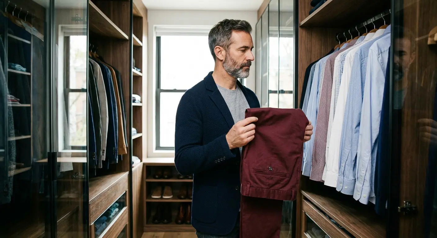
The Ground Rules (Before You Start)
Understanding a few basics helps you build a solid outfit before you even touch a hanger. Burgundy is a statement color—it sits right in that sweet spot between red and purple. The shirt you choose effectively controls the “volume” of the outfit. When you’re hunting for shirt colors to pair with burgundy pants, just keep a little color physics in mind.
Contrast Levels
Ask yourself: How much attention do I want today? High-contrast pairings (like white or light blue) create a sharp line between your shirt and pants. It looks professional and clean. Low-contrast pairings (like black or navy) blend everything together for a streamlined, modern look that kills at evening events.
| Contrast Level | Shirt Colors | The Vibe | Best For |
|---|---|---|---|
| High Contrast | White, Light Blue, Mint | Sharp, Professional, Crisp | The Office, Day Weddings |
| Medium Contrast | Grey, Chambray, Camel | Relaxed, Approachable | Weekends, Casual Friday |
| Low Contrast | Black, Navy, Charcoal | Sleek, Slimming, Moody | Date Night, Bars |
The Maroon vs. Burgundy Thing
People use these words like they’re the same thing, but they really aren’t. Maroon has brown undertones; think autumn leaves. It looks best with earthy stuff like olive and mustard. Burgundy has purple undertones; think fine wine. It looks sharper with cool tones like grey, blue, and crisp white. If you’re stuck, checking a guide on pants colors to wear with a maroon shirt can help you figure out exactly which end of the spectrum your trousers fall onto.
Getting this wrong is usually why a maroon pants outfit feels slightly “off.” You might be mixing a warm pant with a cool shirt. When you nail the undertone, the whole look just clicks.
Identify whether your pants lean maroon or true burgundy with the free Color Analysis Quiz
The “Undertone Check”: Grab an Olive Green shirt. Hold it against your red pants. If the pants look rich and warm, congratulations, they’re Maroon. If the pants suddenly look clashy or weirdly neon, they’re likely True Burgundy (purple-based), and you should swap that olive shirt for a Slate Blue or Grey one.
Confirm your undertones in minutes using the free Color Analysis Quiz
Formality and Trends
Dark pants naturally look a bit dressier, but the shirt does the heavy lifting. A burgundy chino with a t-shirt? Casual. The same pants with an Oxford button-down? You’re ready for a nice dinner. As we head toward 2026, fashion is leaning into “quiet luxury.” Texture is huge right now. A flat cotton shirt reads totally differently than a knit polo or a linen button-down.
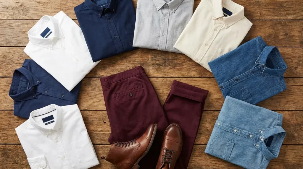
The Safe Bets: Crisp Neutrals
If you’re nervous about color, start here. These work for the office or formal events because they let the pants be the star of the show without fighting for attention. This is the foundation of a great burgundy pants outfit.
See which neutrals make you look sharper with the free Color Analysis Quiz
1. Crisp White
A stiff-collared white Oxford dress shirt creates high contrast. It’s the gold standard for a reason—it looks intentional, sharp, and clean.
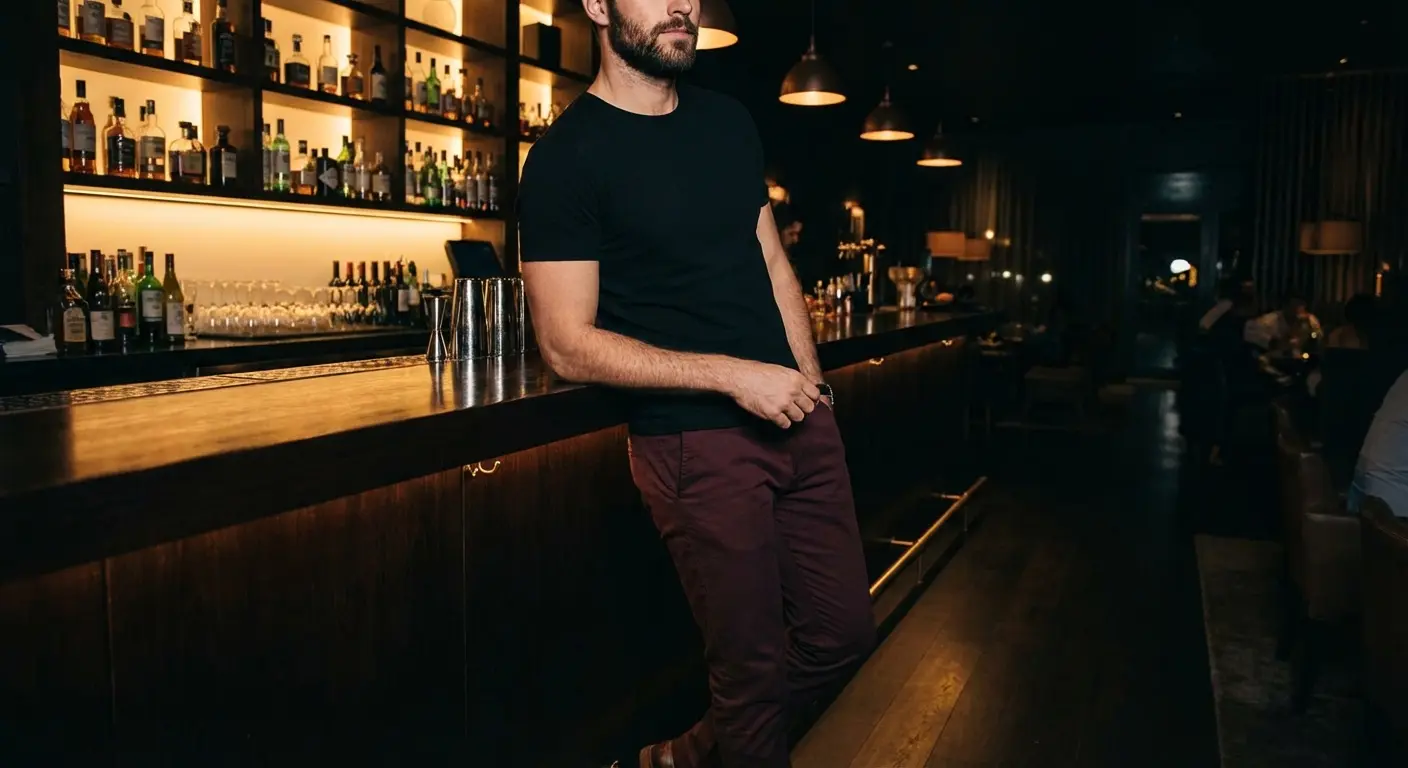
2. Jet Black
Whether it’s a fitted crew neck tee or a black silk button-down, this creates a sleek silhouette. It’s low-contrast, slimming, and has a bit of an edge. Perfect for a date night.
3. Heather Grey
A soft, heather grey henley cools down the warmth of the burgundy. It’s casual, effortless, and comfortable. This is my go-to for weekend wear.
If you happen to have the reverse combo in your closet, knowing the right shirt colors for light grey pants helps you get more mileage out of your wardrobe.
The Sunday Coffee Run: You want to look put-together but not like you tried too hard. Pair the burgundy chinos with a heather grey henley and clean white sneakers. The grey keeps the red from looking too “loud” for 10:00 AM.
4. Charcoal Grey
Think of this as the sophisticated older brother to heather grey. A charcoal cashmere sweater or flannel looks expensive and formal. It pairs exceptionally well with wool trousers.
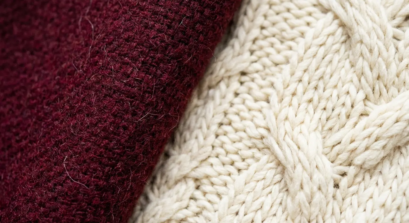
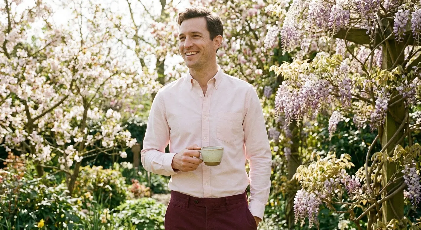
5. Cream / Off-White
A chunky cream cable-knit sweater or a linen shirt softens the whole vibe. Cream leans into that vintage, “old money” aesthetic better than bright white does.
The Natural Partner: Blues
Blue sits opposite the red family on the color wheel, which means they are chemically engineered to look good together.
| Blue Shade | Pro Level | Best Undertone Match | The Vibe |
|---|---|---|---|
| Navy | 10/10 (High) | Universal | The Executive |
| Chambray | 6/10 (Medium) | Maroon (Warm) | The Rugged Casual |
| Powder Blue | 9/10 (High) | Burgundy (Cool) | The Preppy Classic |
| Slate Blue | 8/10 (High) | Burgundy (Cool) | The Modern Creative |
Find the blue shades that best balance your burgundy pants with the free Color Analysis Quiz
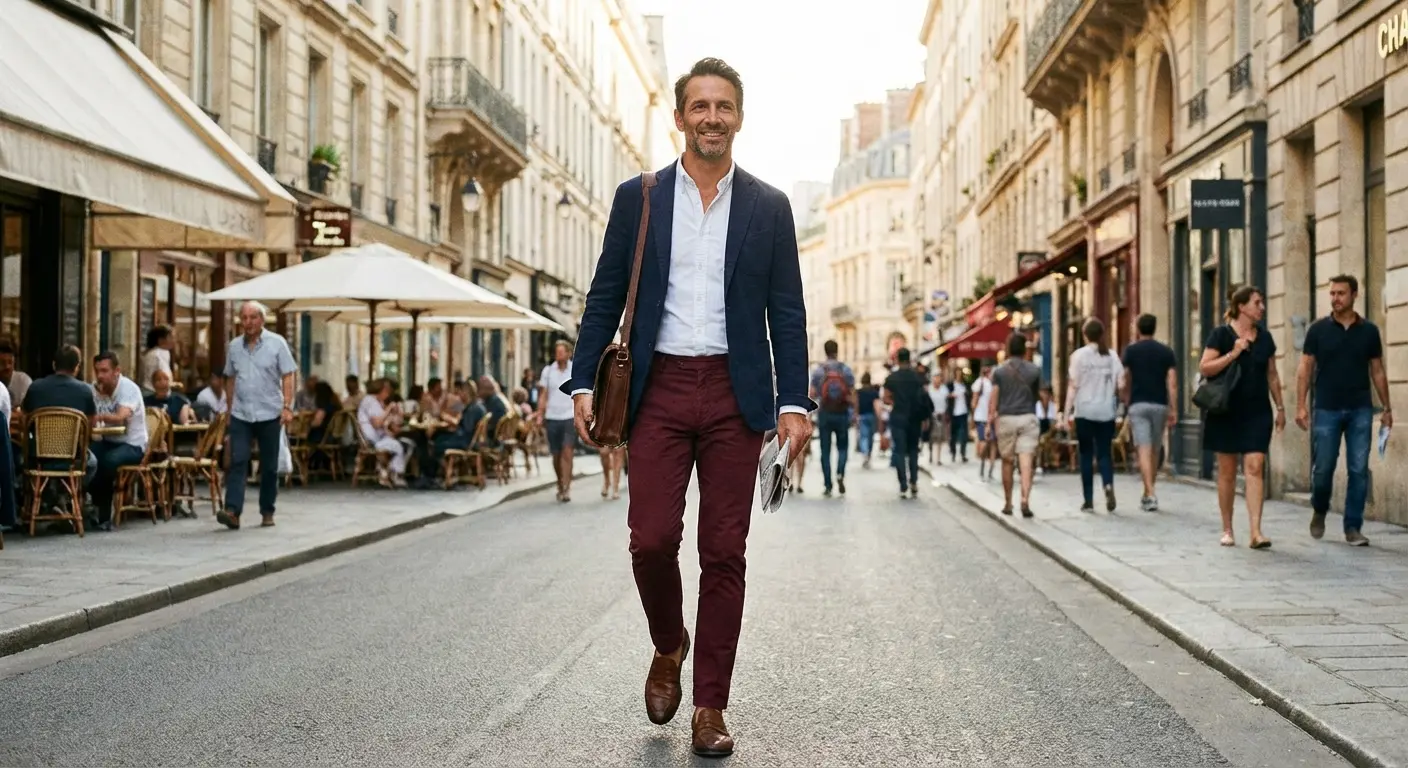
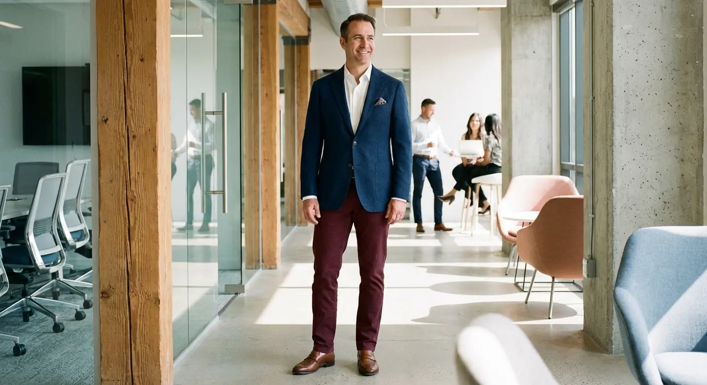
6. Navy Blue
A navy blazer over a light shirt, or just a solid navy button-down, provides a heavy anchor. It grounds the look and stops the red from feeling too aggressive.
On the flip side, if you’re wearing blue bottoms, understanding shirt colors for navy blue pants ensures you keep that same professional energy.
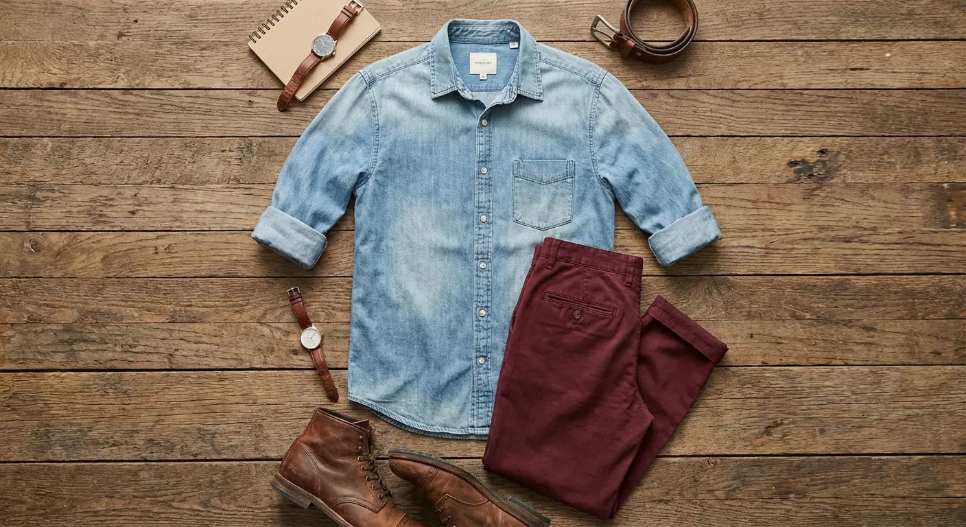
7. Chambray / Light Denim
A light wash denim button-up with rolled sleeves adds some much-needed texture. The ruggedness of denim perfectly balances out the inherent preppiness of chinos.
8. Powder Blue
Traditional business dress shirts in light blue offer a softer alternative to white. It really brings out those cool purple undertones in true burgundy pants.
9. Slate Blue
Matte slate blue usually has grey undertones, making it a muted, sophisticated option for business casual settings where you want to look sharp but not stuffy.
10. Midnight Blue
A satin or high-sheen midnight blue shirt looks nearly black but catches the light with a hint of color. Excellent for holiday parties or evening weddings.
The Earthy Vibe: Warm Tones
These options are your best friends when styling a maroon pants outfit where those brown undertones are present.
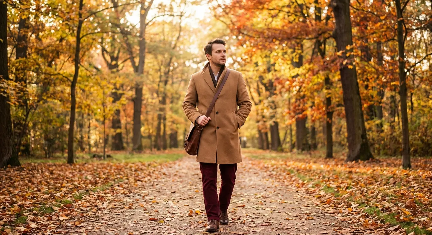
11. Camel / Tan
A camel overcoat worn over a tee, or a tan corduroy shirt, creates a warm, autumnal palette. It looks rich and expensive—ideal for Fall styling.
12. Olive Green
Military-style olive jackets or field shirts create a sophisticated pairing. Think of olive and burgundy as the “grown-up” version of red and green.
Avoiding the “Santa Effect”: The key to wearing olive and burgundy without looking like a Christmas decoration is saturation. Do not wear bright kelly green with bright red. Instead, choose a washed-out, drab olive military jacket and pair it with deep, brownish-maroon pants. You want rugged, not festive.
13. Mustard Yellow
A mustard cardigan or flannel is a bold choice, but it works. This is best for casual settings when you want to add a pop of personality to a maroon pants outfit.
14. Chocolate Brown
A dark brown turtleneck creates a monochromatic-adjacent look. It’s very fashion-forward for 2026 and feels incredibly grounded.
15. Taupe
A relaxed-fit taupe t-shirt sits comfortably between grey and brown. It’s unassuming, neutral, and lets the pants do the talking.
The Soft Touch: Pastels
Sometimes you need to lighten the heavy look of burgundy, especially for Spring and Summer events.
16. Blush Pink
Pale pink Oxford shirts create a stylish monochromatic look since pink is basically just light red. This works incredibly well for spring weddings.
17. Lavender
Light purple dress shirts complement the purple DNA in burgundy. It avoids the harsh contrast of white while still adding some color.
18. Mint Green
A very pale, washed-out mint tee provides fresh contrast. Just keep it very pastel to avoid looking like a cartoon character.
19. Butter Yellow
Soft, pale yellow polos look cheerful and preppy. This pairs well with boat shoes and lighter fabrics like burgundy linen.
Leveling Up: Patterns & Prints
Solid colors are safe, but patterns add energy. If you want to elevate your maroon pants outfits, texture and print are the way to go.
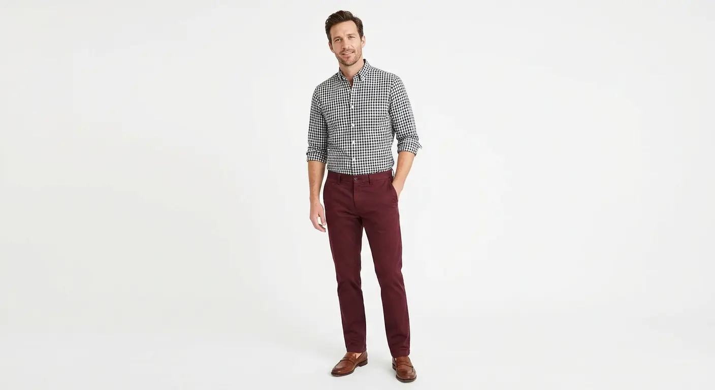
20. Black and White Gingham
Small-check gingham button-downs add visual complexity. The black and white neutrality grounds the pants, while the pattern keeps it interesting.
21. Blue Vertical Stripes
Banker stripe shirts elongate the torso. You get the professionalism of blue and white, but with added visual texture.
22. Tartan Plaid (Red base)
Flannel shirts featuring reds, blacks, and creams create the ultimate winter cabin look. It ties the pants into the shirt for a cohesive, rugged outfit.
23. Polka Dot (Navy base)
Navy shirts with small white micro-dots are playful yet dressy. The pattern breaks up the solid block of color that a plain navy shirt would create.
24. Graphic / Band Tee (Greyscale)
A vintage washed charcoal band t-shirt creates a streetwear look. The faded black and grey of the graphic creates a cool aesthetic against the clean pants.
25. Breton Stripe (Horizontal)
Long-sleeve French sailor shirts feel nautical and sophisticated. This classic Parisian look is perfect for a coastal vibe.
| Shirt Style | Shoe Pairing |
|---|---|
| Crisp White / Dress Shirt | Brown Loafers or Oxford Shoes |
| Black Tee / Dark Knit | Black Chelsea Boots or Minimalist Sneakers |
| Chambray / Flannel | Brown Leather Boots (Iron Rangers or Chukkas) |
| Breton Stripe / Polo | White Canvas Sneakers or Boat Shoes |
When you’re finishing the look, footwear is just as critical as the shirt; checking out the best shoe colors to pair with burgundy pants will ensure you look cohesive from head to toe.
Cutting Through the Noise
Choosing between “Slate Blue” and “Charcoal Grey” for a pair of pants takes mental energy. You worry about making the wrong choice. You worry about looking out of place. Now imagine that same pressure applied to a wedding.
You have to manage a bridal party, handle family dynamics, and execute a timeline perfectly. The stakes are a little higher than just picking a maroon pants outfit.
That’s where Bridesmaid for Hire steps in. Jen Glantz and her team curate the wedding experience to essentially remove the guesswork. Whether you need a professional bridesmaid to walk down the aisle and handle pop-up problems, or just access to their curated lists of outfits and gifts, they remove the stress.
Take the guesswork out of color decisions with the free Color Analysis Quiz
Think of Bridesmaid for Hire as a professional bestie. They offer expert advice and manage the chaos so you don’t have to.
Need help with more than just your wardrobe? Check out the Bridesmaid for Hire packages to see how a professional can turn wedding chaos into a stress-free celebration.
Final Thoughts
Fashion is mostly about experimentation. You have 25 solid options here, but the “best” one is just the one that makes you feel confident. Put on the pants. Own the room. Your next burgundy pants outfit is waiting for you.
Related posts:


1-800-BRIDESMAID
The Newlywed
Card Game
something extra to love
Read the weekly newsletter from Bridesmaid for Hire, 1-800-Bridesmaid, to hear about real stories, from strangers, who need advice on love, life, friendship, and so much more.
Looking for the perfect wedding gift for someone you adore? Grab The Newlywed Card Game. It's a fun and interactive game they can play on their honeymoon or future date nights.

