


25 Pants Colors That Make Red Shirts Look Expensive (and How to Style Them)
January 11, 2026

Hi, Friend! Jen Glantz her. I’m a bestselling author, the first ever bridesmaid for hire and have been hired by hundreds of brides all over the world. Let’s talk about pants colors to pair with red shirts.
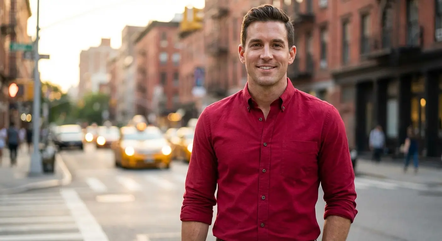
I’m going to start this off with a hard truth: wearing red is a total power move, but only if you actually stick the landing. There’s a reason you feel different when you put it on—it’s bold, it’s loud, and it demands attention.
I still remember the first time I wore a deep crimson button-down to a networking event. I felt unstoppable… until I caught a glimpse of myself in a full-length mirror. I had paired it with these old, mismatched khaki trousers, and honestly? It killed the vibe immediately. I looked less like a CEO and more like a valet parker. You have to get the bottom half right to respect the energy of the top half. Finding the right pants colors red shirts require is the only way to balance this look without looking like a stop sign.
Quick Resources:
-
Organize outfits, events, and timelines with the AI Wedding Planner
-
Explore the full planning suite in All Wedding Tools
The Cheat Sheet (TL;DR)
If you’re in a rush and just need to get dressed, here is the quick-and-dirty version:
-
Check the “Temperature”: If your shirt is orange-red, go for high contrast (black/white). If it’s a bluish-red (burgundy), go for earthy tones.
-
Read the Room: Neutrals (grey/navy) tone it down for work; complementary colors (green/brown) make it a fashion statement.
-
Pick a Lane: Go for crisp high contrast or moody low contrast. The middle ground usually looks accidental.
-
Texture Saves Lives: If the red feels too bright, wool, corduroy, or tweed pants will soak up that light and soften the look.
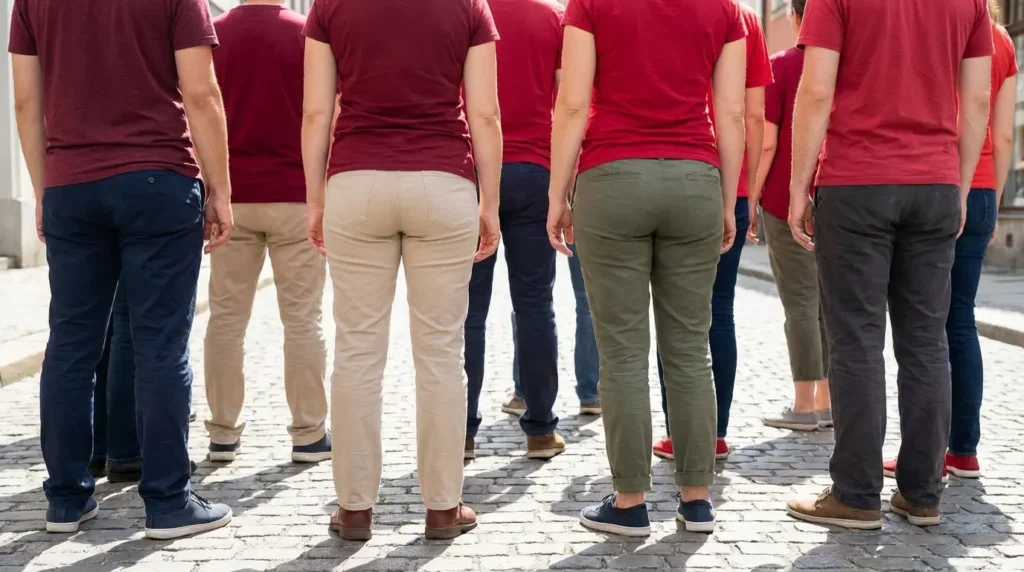
The Ground Rules: Anchoring the Loudness
Red screams for attention. You can’t just throw on whatever clean laundry you have and hope for the best. The pants need to act as an anchor.
Make confident wedding-style decisions faster with the AI Wedding Planner
The biggest thing to watch out for is color analysis—specifically, undertones. Bright “fire engine” reds usually have orange undertones. They look best with sharp contrast (think black or white). Deep burgundies usually have blue undertones and sit better with chill, earthy colors.
|
Red Shade |
The Vibe |
The Strategy |
Go-To Pants |
|---|---|---|---|
|
Fire Engine / Scarlet |
Warm / Orange-y |
High Contrast |
Black, White, Navy, Light Wash Denim |
|
Burgundy / Maroon |
Cool / Blue-y |
Moody / Low Contrast |
Charcoal, Camel, Chocolate Brown, Olive |
|
Brick / Rust |
Earthy / Warm |
Natural Flow |
Tan, Khaki, Dark Brown, Raw Denim |
|
Cherry / Berry |
Cool / Blue-y |
Crisp Neutral |
Slate Grey, Stone, Navy Pinstripe |
The “Undertone” Trap: Imagine wearing a bright, orange-based tomato red polo with cool, slate-grey pants. It feels disjointed, right? Like the colors are arguing. Swap those grey pants for a warm beige, and suddenly the outfit looks intentional.
Plan coordinated wedding looks using the AI Wedding Planner
The Safety Nets: Essential Neutrals
When in doubt, stick to these. These are for when you need to look professional or authoritative. They strip away the “noise” and let the shirt do the talking.
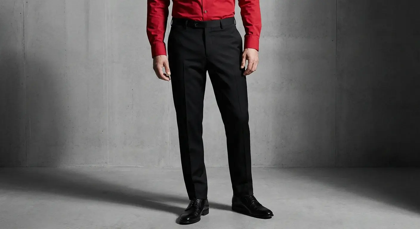
1. Jet Black Trousers
You can’t really mess this up. A slim black pant creates a sharp silhouette. It works with every shade from crimson to maroon. It’s the “I mean business” look.
2. Charcoal Grey Wool
Black can sometimes feel a bit aggressive or like a waiter’s uniform. Charcoal softens the blow. It’s perfect for the office. If you are looking for groom tuxedo and suits advice, charcoal is often the MVP because it’s formal but approachable.
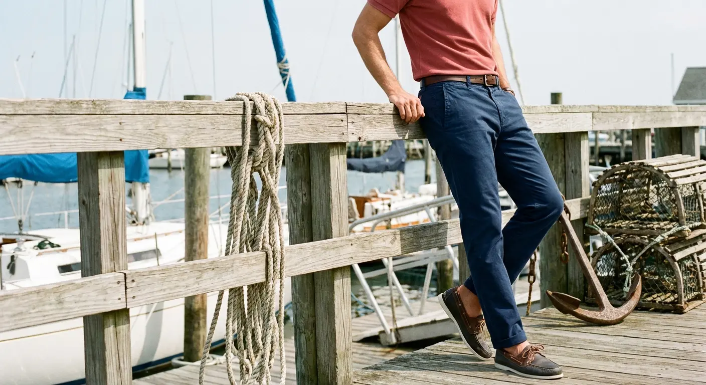
3. Navy Blue Chinos
Red and blue are a classic combo. Flat-front navy chinos work great with bright or brick reds. It gives off a slightly nautical, preppy feel without looking stiff.
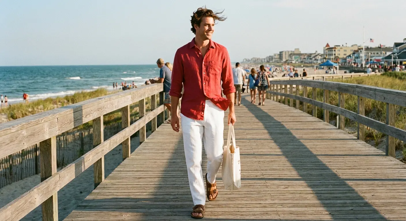
4. Crisp White Denim or Linen
Save this for summer (and maybe avoid red wine). White pants create maximum contrast, making the red shirt pop like crazy. It’s a bold, wealthy look.
5. Slate Grey Slacks
Slate is grey with a hint of blue. It pairs way better with cooler reds (like raspberry) than a flat, cement grey would.
Keep wedding outfits polished and consistent with the AI Wedding Planner
6. Stone or Off-White Trousers
If optic white feels a bit too “Miami Vice” for you, go with Stone. It’s creamier and looks a bit more sophisticated. Pairs beautifully with darker reds like oxblood.
The Trendy Route: Earth Tones
Earth tones are having a massive moment. They ground the high energy of a red shirt, making the outfit feel organic rather than just loud.
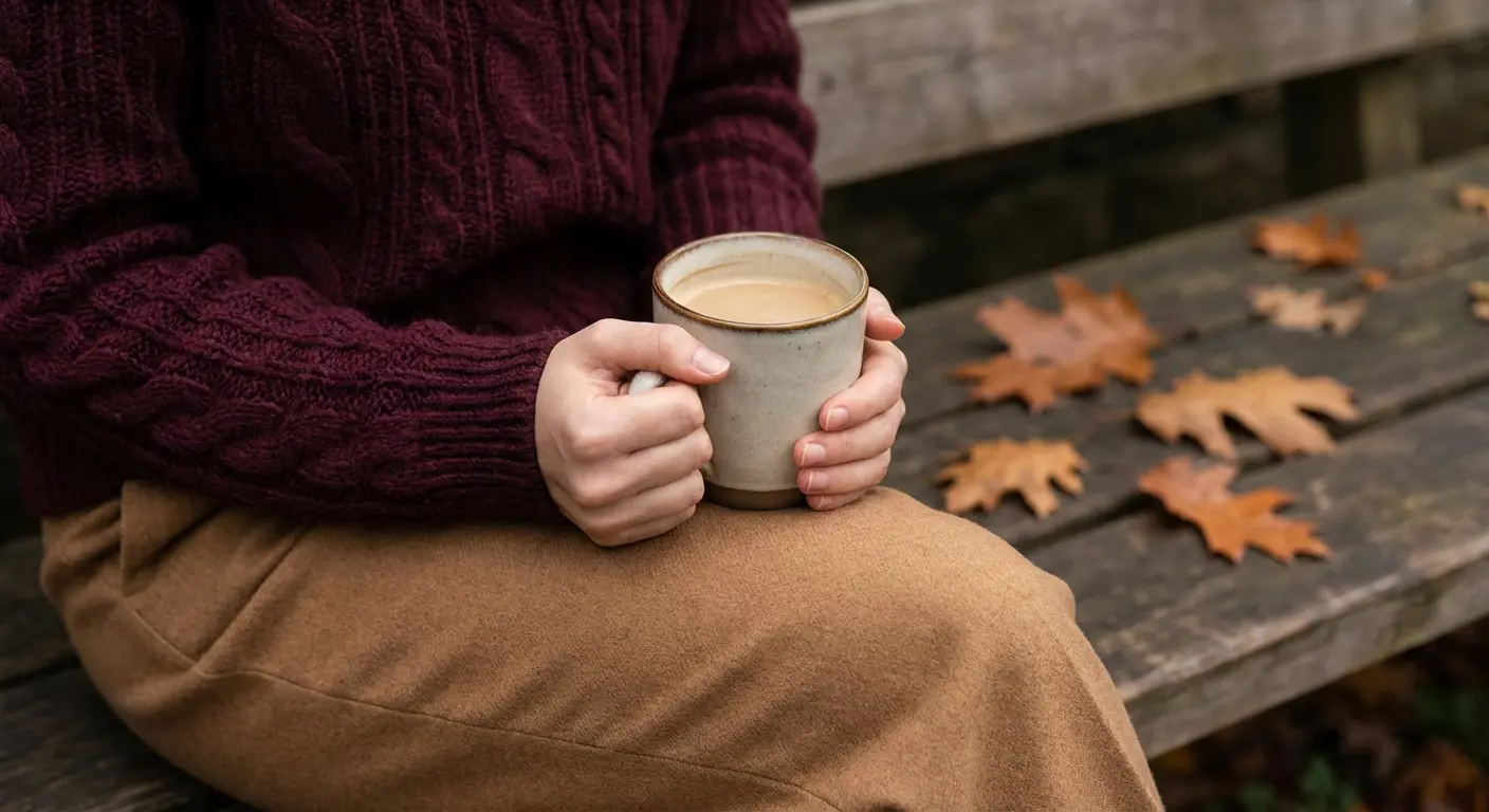
7. Camel or Tan Trousers
A timeless fall staple. The warmth of camel enhances the warmth of the red shirt. It creates a scholarly, classic look—very “tenured professor on a weekend.”
8. Chocolate Brown Corduroys
Texture is your friend here. Deep brown corduroys create a low-contrast, moody vibe. Since brown and red are neighbors on the warm side of the color wheel, this combo feels vintage and cozy.
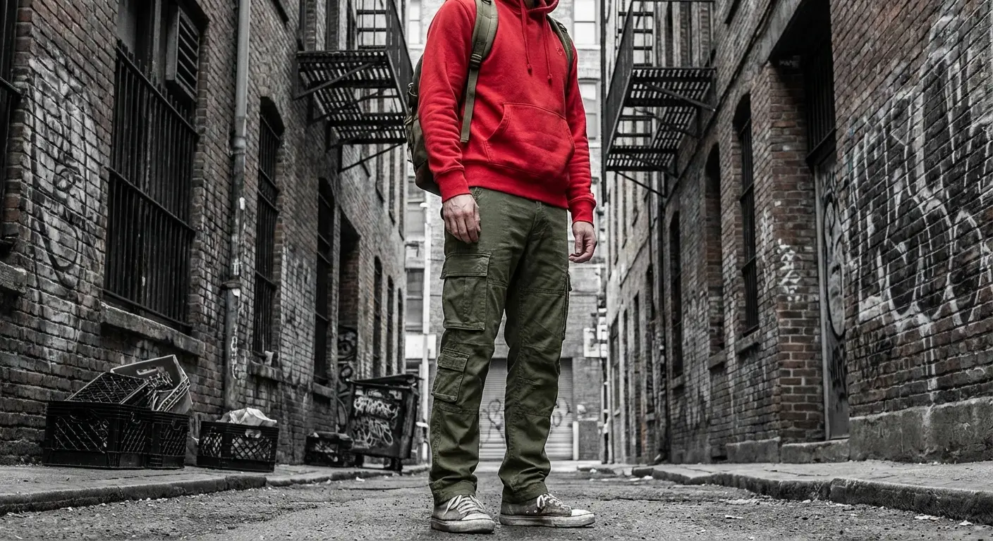
9. Olive Green Cargos
Green is the opposite of red, so they naturally complement each other. The trick is to avoid looking like a walking Christmas tree. Choose a muted, dark olive to keep it rugged.
10. Taupe Dress Pants
Taupe sits somewhere between grey and brown. If your shirt is neon or very loud, taupe grounds the outfit without the harsh line that black pants create. It acts as a bridge between the colors.
Coordinate wedding-weekend outfits effortlessly with the AI Wedding Planner
11. Sand or Khaki Pants
We all know the standard “State Farm” look. You can update it by just ensuring the fit is tailored. Light beige pants are safe for almost any casual Friday or backyard BBQ.
The Daily Drivers: Denim
Sometimes you just need to get out the door. Denim is the go-to, but the wash changes the whole vibe.
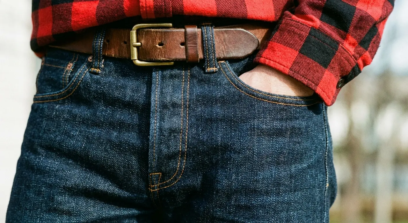
12. Dark Wash Indigo Jeans
Raw or rinsed denim acts like a neutral dress pant but with the comfort of jeans. Polished enough for a date night, casual enough for a bar.
13. Light Wash or Bleached Jeans
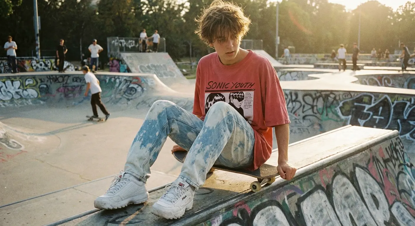
This leans into a vintage 90s aesthetic. Pale blue denim works best with oversized red t-shirts or flannels. It’s youthful and doesn’t take itself too seriously.
14. Grey Denim
Grey denim separates you from the sea of blue jeans. It adds a rock-and-roll edge to the outfit. Gritty and cool.
15. Black Ripped Jeans
Pure streetwear. Distressed black denim pairs with red to create a high-energy, punk-inspired look. Great for concerts.
For the Bold: Monochromatic & Analogous
This is for the fashion-forward crowd. We aren’t doing contrast here; we’re doing “mood.”
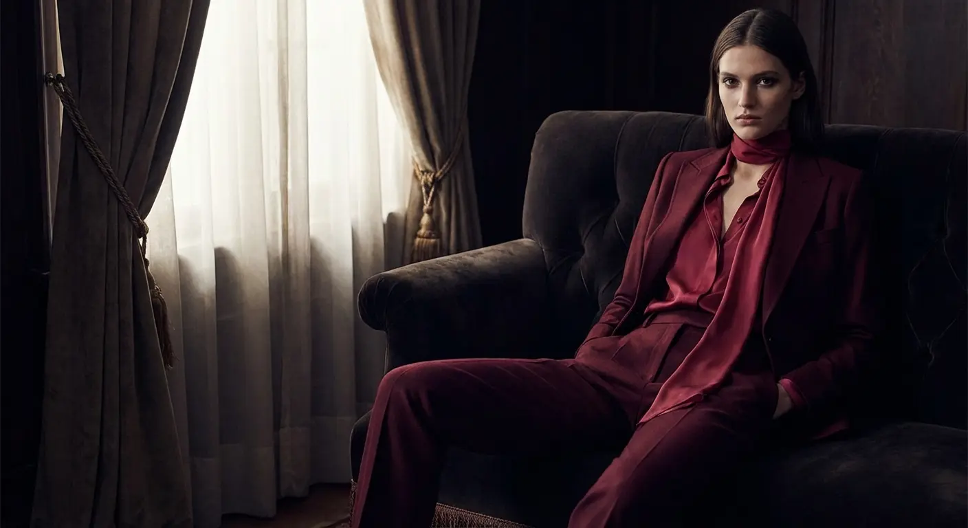
16. Burgundy Trousers
Wearing red on red is a flex. The secret is ensuring the pants are significantly darker than the shirt. It creates a sleek column of color. (See also: styling a maroon shirt).
17. Rust or Burnt Orange Pants
These colors sit right next to red on the color wheel. Pairing them creates a sunset palette that looks incredibly artistic, especially in autumn.
18. Pale Pink Chinos
Pink is basically just light red. This creates a soft contrast that feels preppy and bold. It takes confidence, but it kills at summer weddings. If you know how to style a pink shirt, you can handle this.
19. Eggplant or Deep Purple Slacks
Dark violet slacks create a regal, luxurious palette. It’s a moody, low-contrast look suitable for creative black-tie events.
Leveling Up: Patterns and Textures
Advanced styling involves breaking up the solid block of color. Patterns add visual interest and can actually help diffuse the intensity of a bright red top.
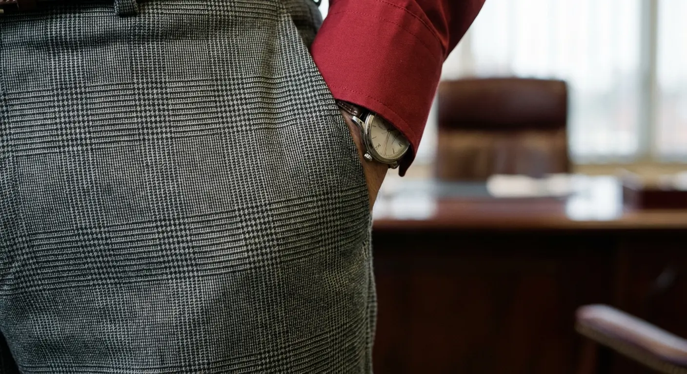
20. Glen Plaid (Grey Base)
Grey trousers with a subtle check pattern break up the visual field. It looks professional but with a bit more personality.
21. Navy Pinstripe
Pinstripes add immediate formality. A red shirt paired with a navy pinstripe suit is a classic “Wall Street” look. Power dressing 101.
22. Houndstooth (Black and White)
From a distance, houndstooth looks grey. Up close, it’s chaotic in a good way. This complexity pairs exceptionally well with a solid, bright red shirt.
Organize detailed style plans in one place using the AI Wedding Planner
23. Herringbone Tweed (Brown)
Perfect for that academic, rustic vibe. The thick, woven texture of herringbone absorbs light, which softens the impact of a bright red shirt.
The “Professor” Aesthetic: To nail the academic look without looking like a costume, take a dark red (maroon) knit sweater and pair it with brown herringbone tweed pants. Add leather boots, and you have a sophisticated winter outfit.
24. Camouflage
A polarizing streetwear staple, but it works. The green in the camo compliments the red, while the busy pattern hides wear and tear.
25. White with Black Windowpane
This combines the crispness of white pants with a geometric element. The large, thin black grid balances the solid red top. Very modern.
Coordination is Hard (Especially for Weddings)
You probably just spent five minutes reading about pants because you want to avoid clashing colors and looking awkward. Now, imagine applying that same level of stress to an entire wedding party.
Just like you need to tailor your pants to make the outfit work, you need to tailor the people managing your big day. Emotional baggage, family drama, and unasked-for opinions clash way harder than a neon shirt and khaki pants ever could.
That’s where Bridesmaid for Hire comes in. We act as the ultimate neutralizer.
Reduce wedding decision fatigue with the AI Wedding Planner
Whether you need a professional to wrangle a chaotic bridal party, an unbiased voice of reason to solve pop-up problems, or a “secret agent” bridesmaid to blend in and keep the peace, we handle it. We manage the dynamics so you don’t have to.
Check out our wedding outfits guide for more styling help, or let us handle the people logistics completely.
Final Thoughts
Styling red is really just about confidence and intention. You have the rules, and you have the list. Now go experiment. Try the monochromatic burgundy look or swap your blue jeans for grey ones. Find the combo that makes *you* feel powerful. Mastering pants colors red shirts need will elevate your whole wardrobe game.
Related posts:


1-800-BRIDESMAID
The Newlywed
Card Game
something extra to love
Read the weekly newsletter from Bridesmaid for Hire, 1-800-Bridesmaid, to hear about real stories, from strangers, who need advice on love, life, friendship, and so much more.
Looking for the perfect wedding gift for someone you adore? Grab The Newlywed Card Game. It's a fun and interactive game they can play on their honeymoon or future date nights.

